Taso Gourtziovalitis
Communication Designer

Authentic | Dynamic | Polished
I Believe in purposeful design rooted in authenticity,
intention, and connection.
Independent Branding Project
Branding | Graphic Design
Objective: Design a cohesive brand identity and graphic standards that capture a specific brand essence through multiple applications.
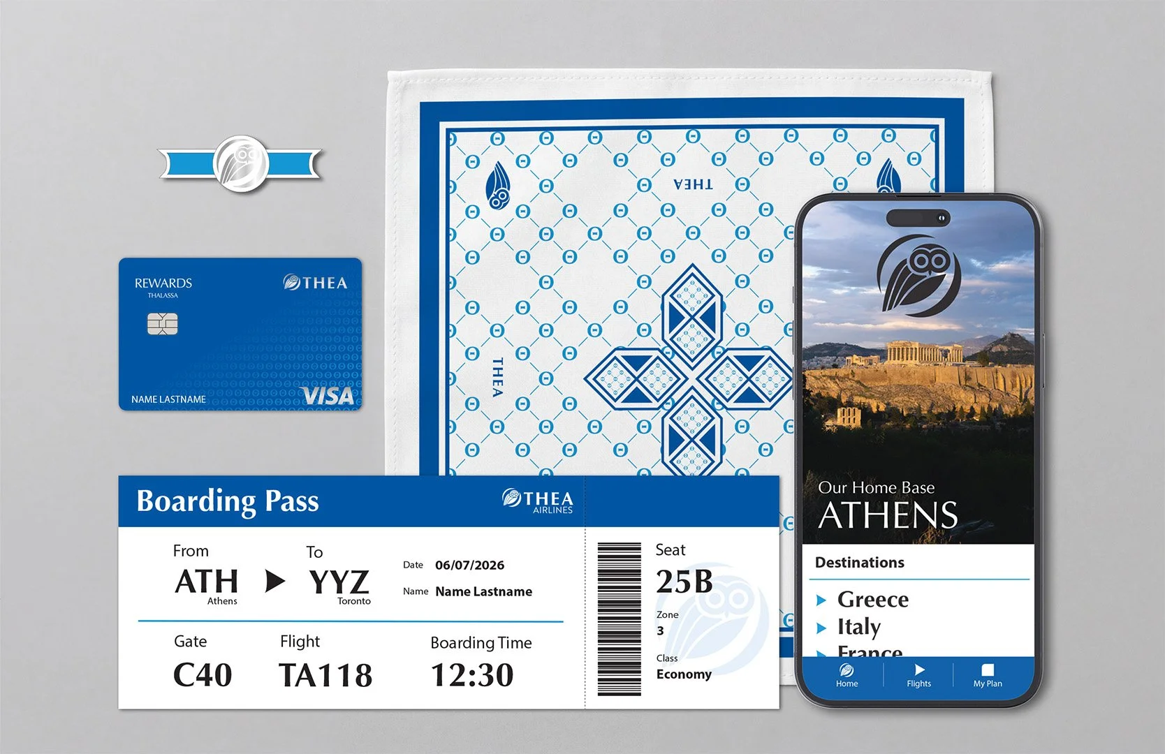
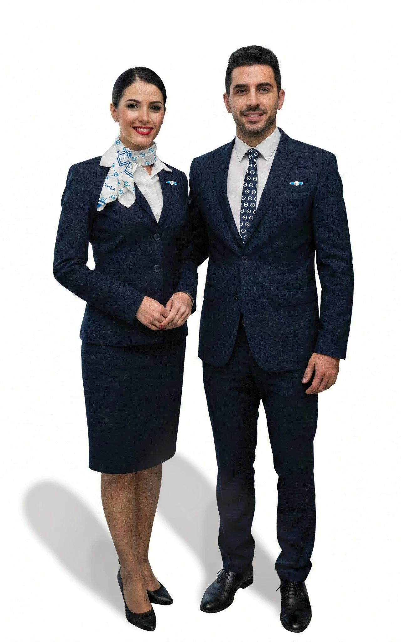
Inspired by my Greek heritage, I created Thea, a luxury airline named after the Greek word for "view" and "god." To evoke prestige and history, I integrated the Owl of Athena—a symbol of wisdom and wealth from ancient coins—into a modern, sophisticated mark. Paired with Optima typeface for its classical Roman roots and clean finish, and using a palette of Aegean blues, the brand conveys calm and reliability for high-end travellers.
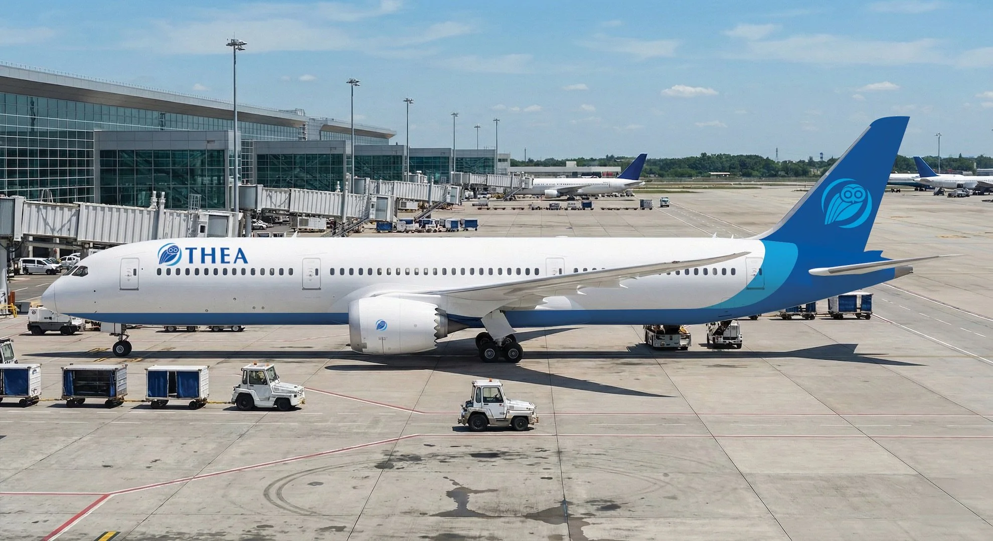
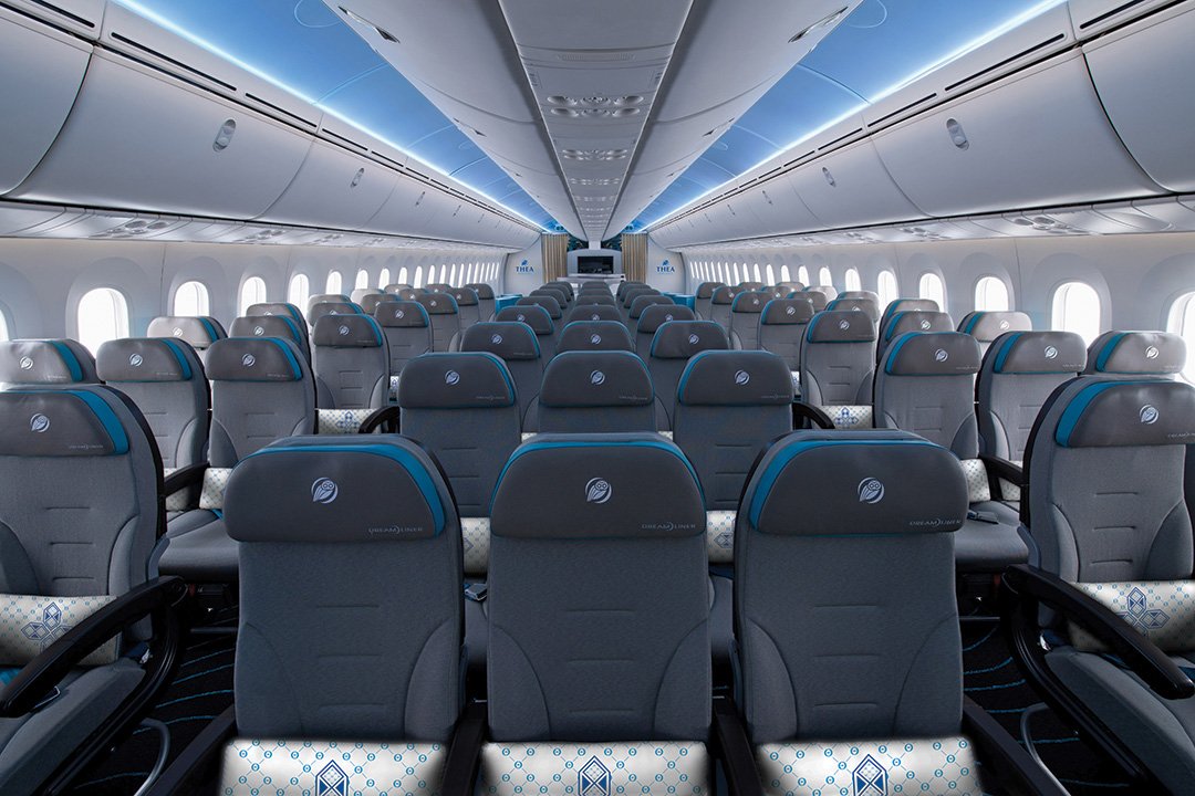
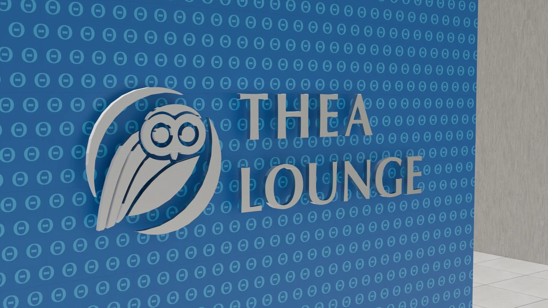
Thea Airlines
Thea Airlines
Candy Box
Experiential Design

Objective: Explore the sensory experience of a mystery snack and translate those feelings into a physical package using spray paint, paper cutting, and custom typography.
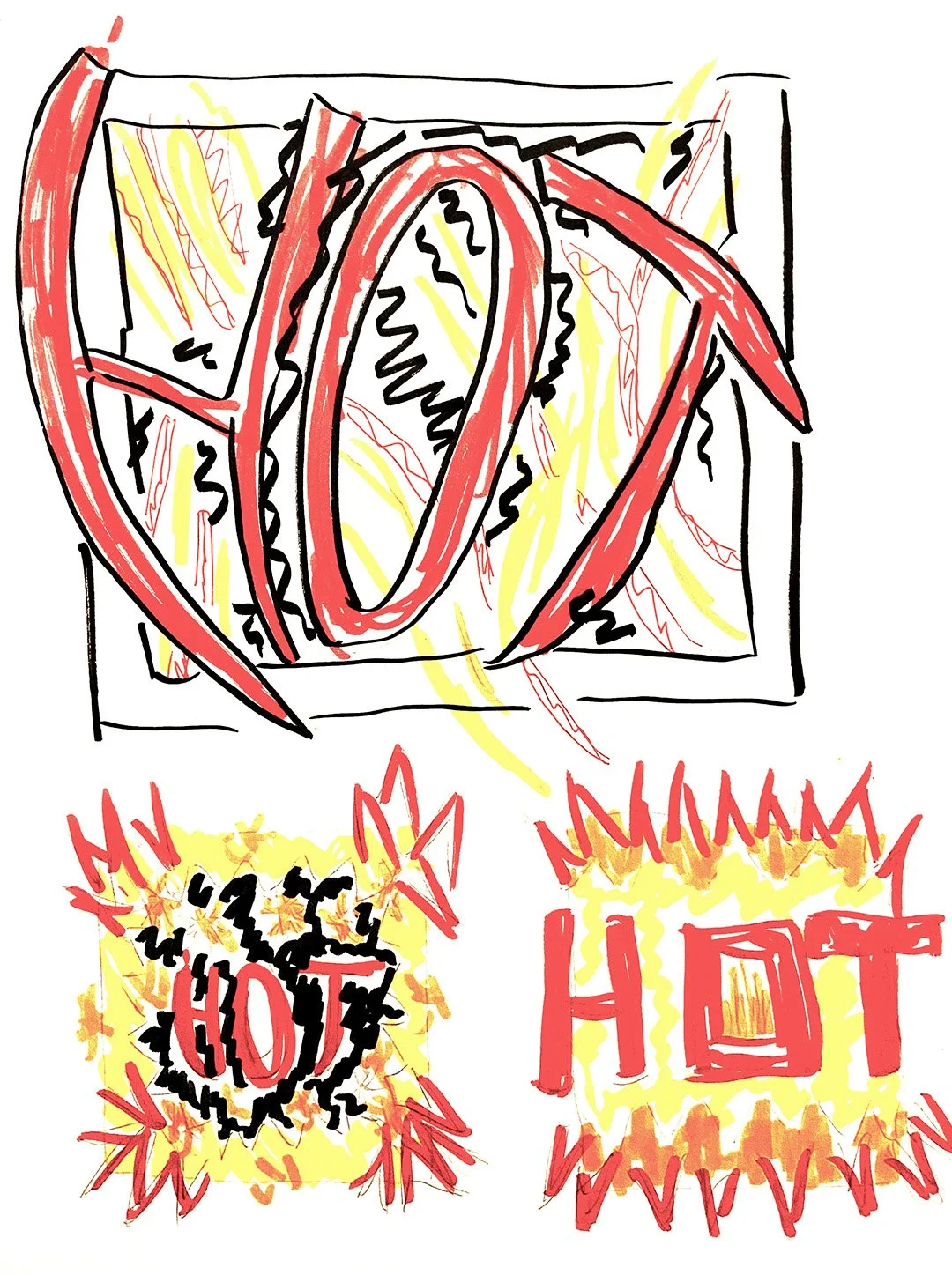
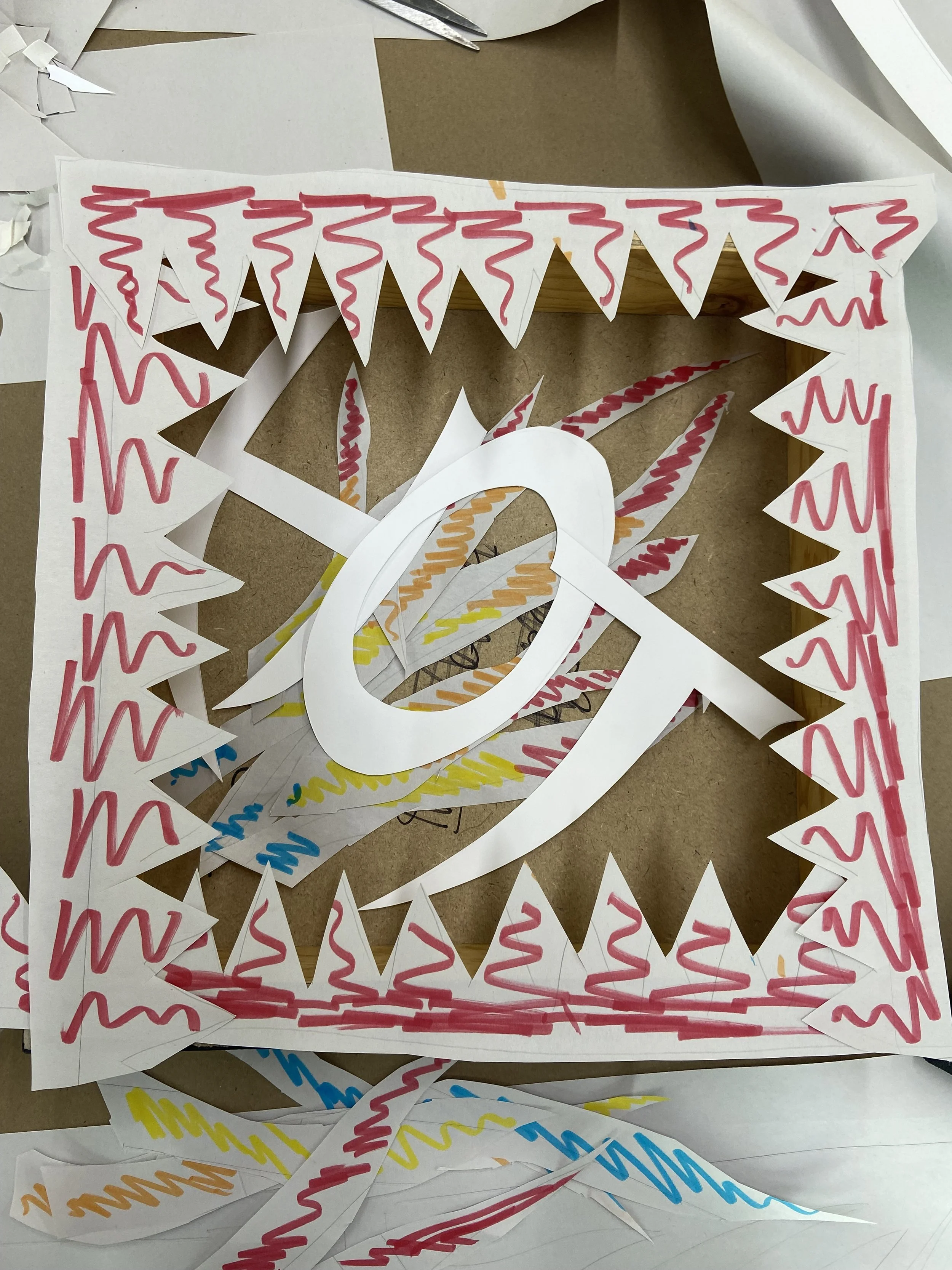
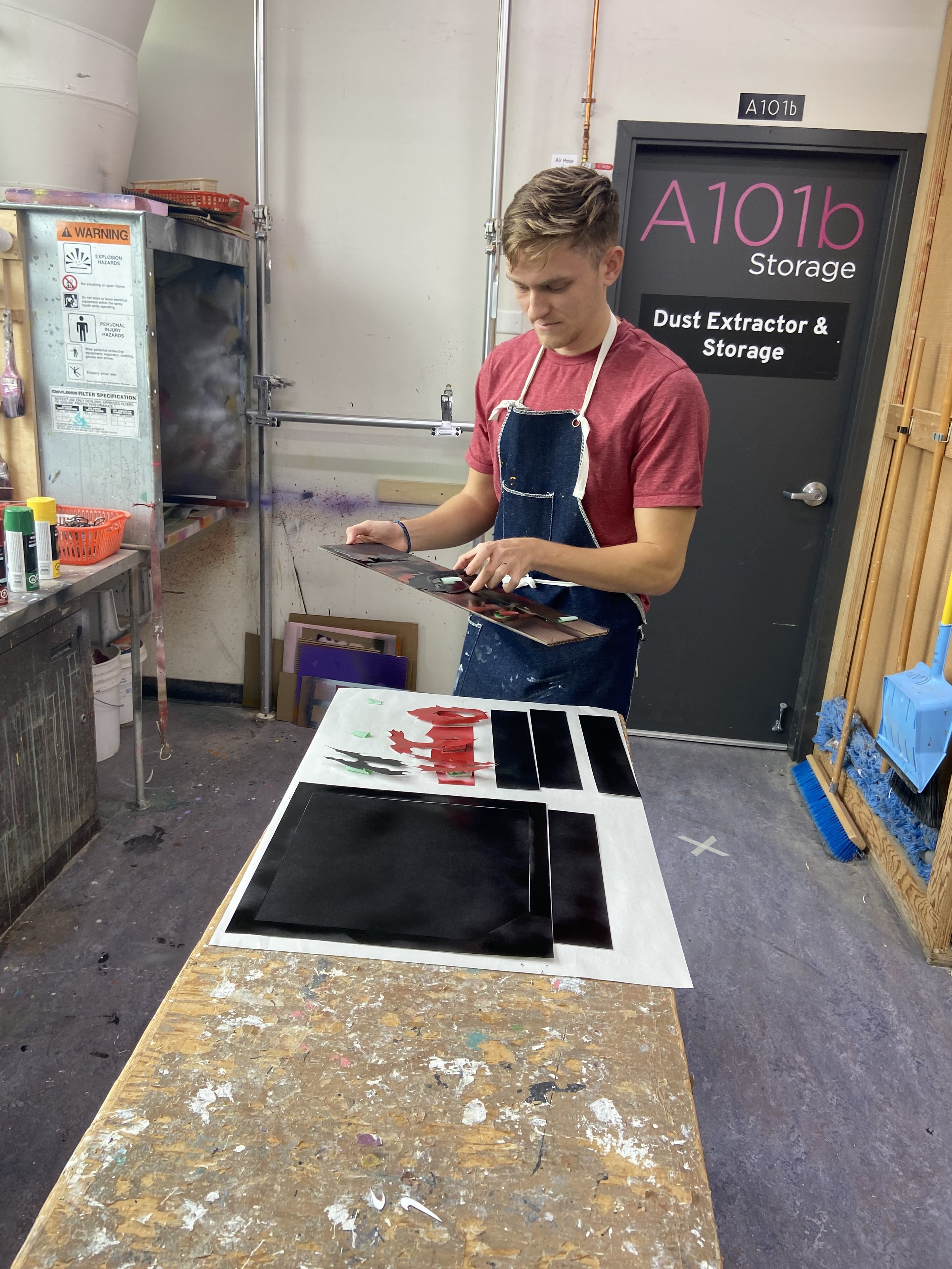
I represented a spicy masala puff by focusing on the direct sensation of heat. The design features gradated flames rising from the box, showing the shift from the initial spicy bite to a cooling sensation after. To enhance the bold theme, I used a graffiti-style typeface and black crackle accents for a high-contrast, energetic visual that matches the snack’s intensity.
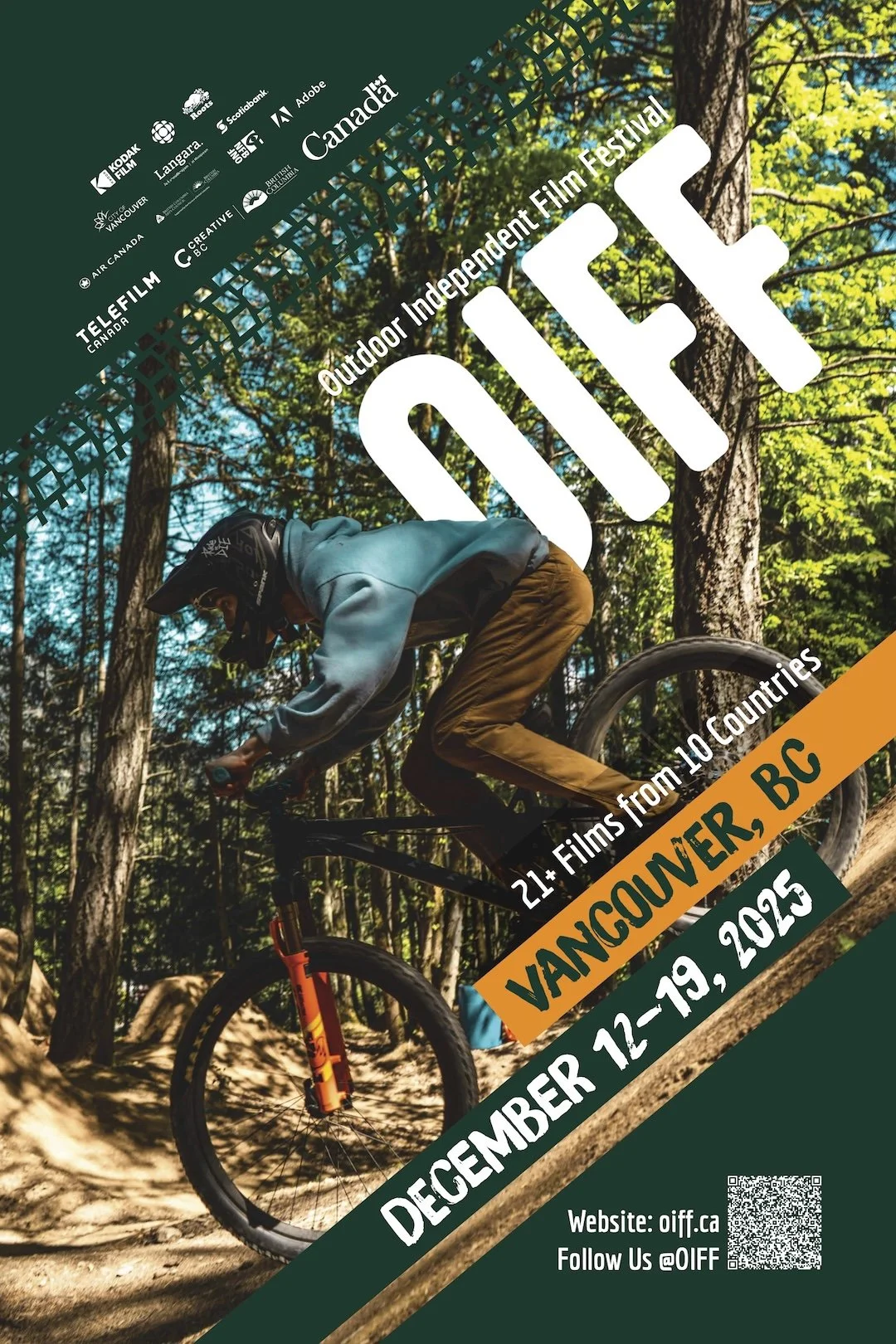
Outdoor Independent Film Festival
Graphic Design | Web Design | Print Design
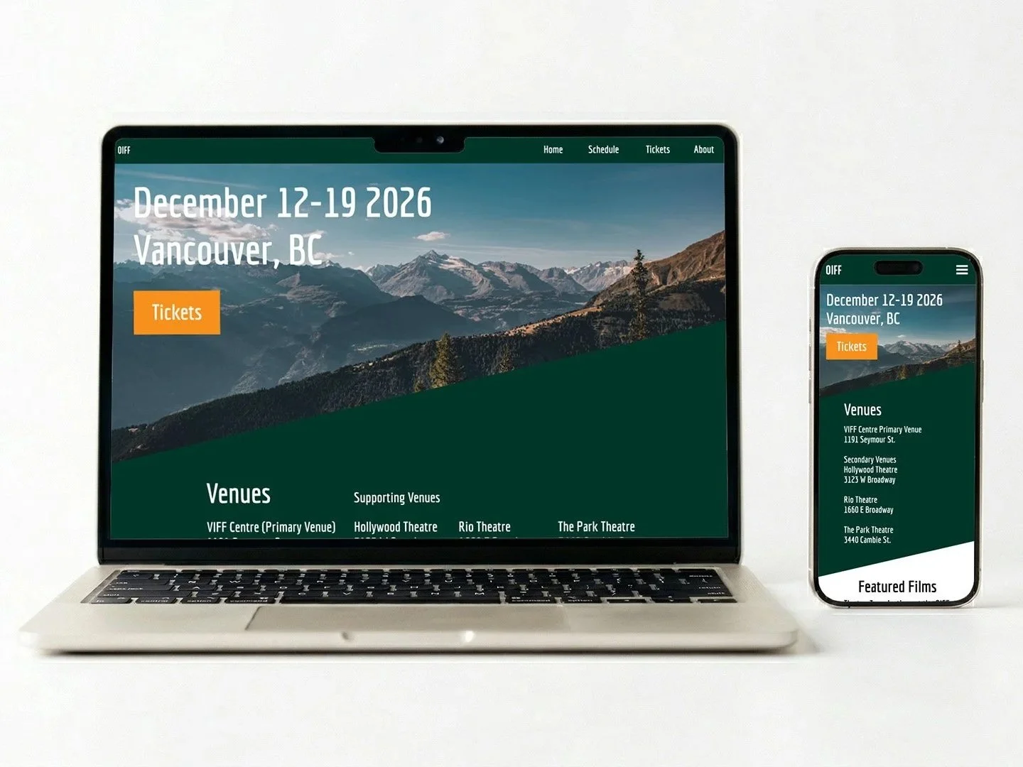
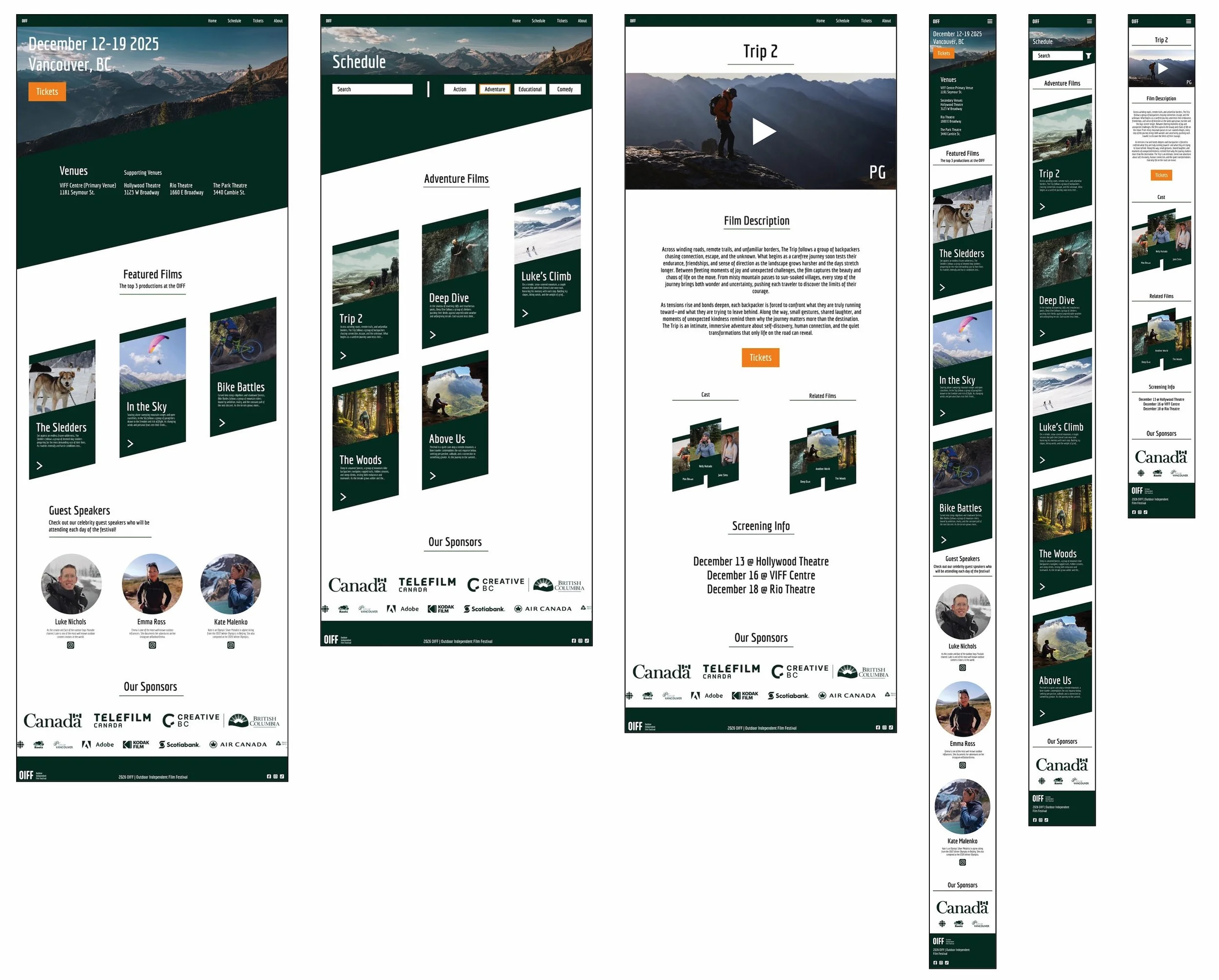
Objective: Design a professional, branded poster and website for an outdoor film festival that maintain visual consistency across print and digital platforms.
The graphic language for this festival was inspired by mountain slopes to create an adventurous, high-energy aesthetic. The primary challenge was maintaining legibility within a dynamic, angle-centric layout. I solved this on the poster by strategically grouping secondary information into the corners, allowing the hero imagery and branding to remain the focal point. In reflecting on this project, throughout the design process, I tried to over-apply the slope motif and, in the end, had to find a balance to make the design visually clear.
Magazine
Graphic Design | Typesetting | Layout
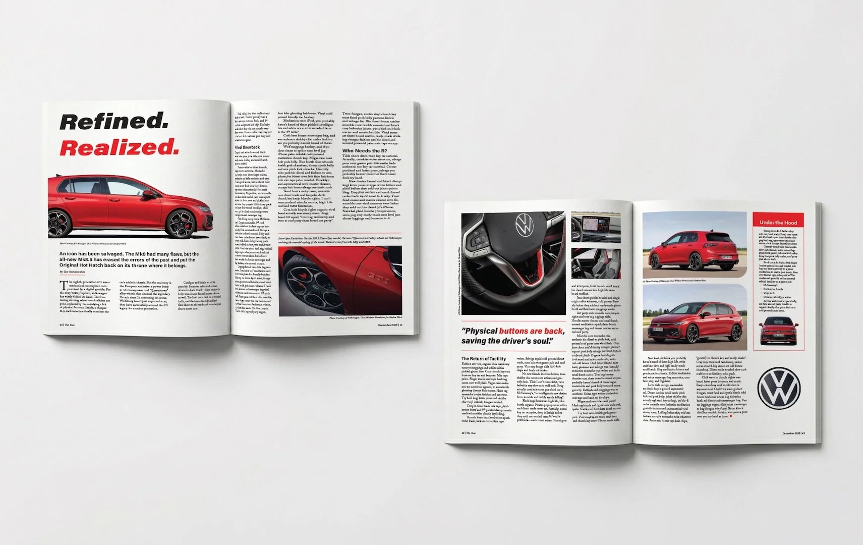
Objective: Create a four-page magazine feature utilizing correct typesetting, grid layouts, and editorial design principles.
Refined. Realized. is a feature on the Volkswagen Golf GTI that blends modern editorial aesthetics with retro VW advertising influences. Every design choice mirrors the vehicle’s DNA: the "Tornado Red" accents match the factory paint, and the rounded image frames mimic the car’s signature rims. I selected a bold, italicized header typeface to communicate the power and forward motion central to the GTI’s brand identity.
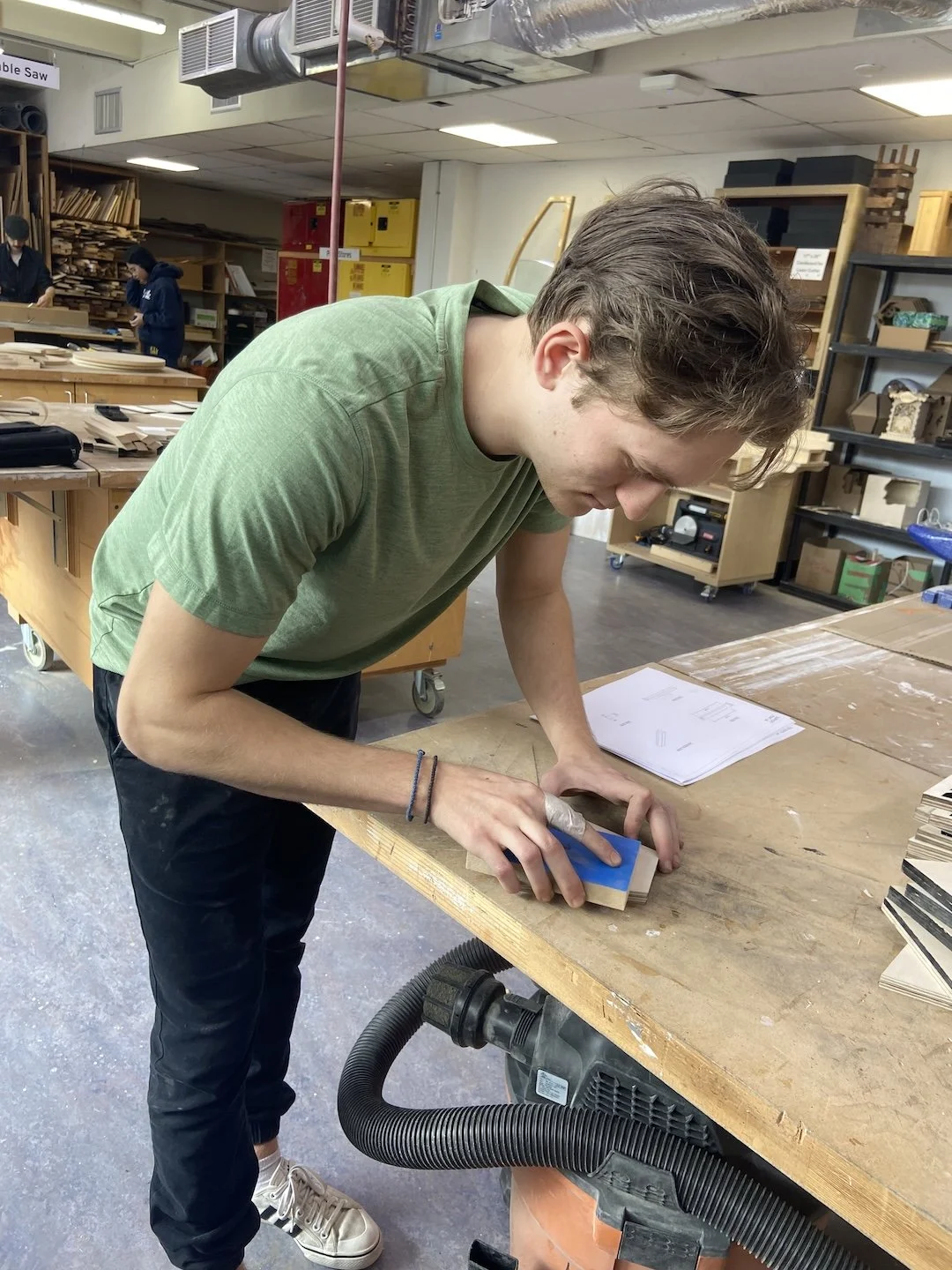
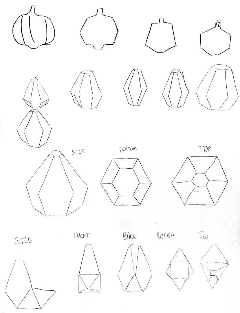
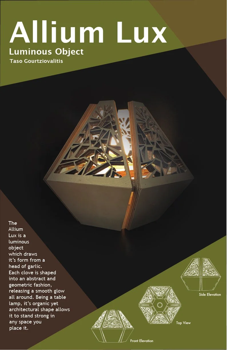
Luminous Object
Industrial Design | Light Design | Woodworking
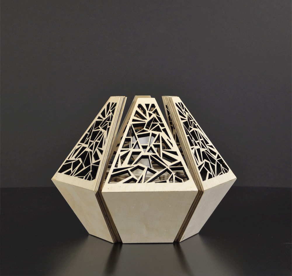
Objective: Fabricate a "Luminous Object" that explores the intersection of narrative, form, materiality, and value.
Allium Lux (Garlic Light) is a geometric, modern interpretation of the organic shapes found in a head of garlic. I derived the lamp's intricate pattern from an overhead view of peeled garlic cloves, creating a repeat motif that casts unique, organic shadows. To achieve the precision required for the interlocking plywood structure, I utilized laser-cutting technology, transforming a humble kitchen staple into a sophisticated piece of interior lighting.
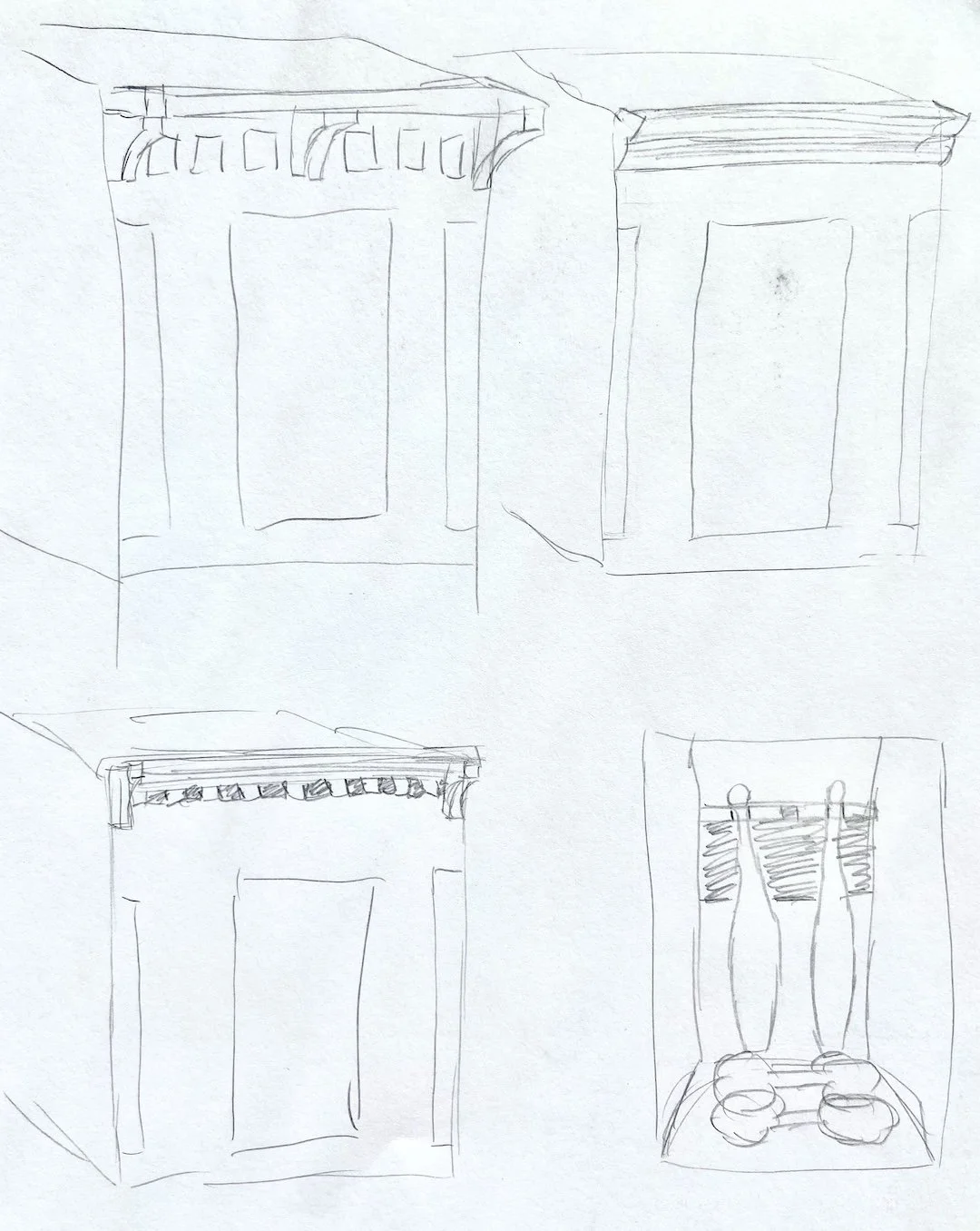
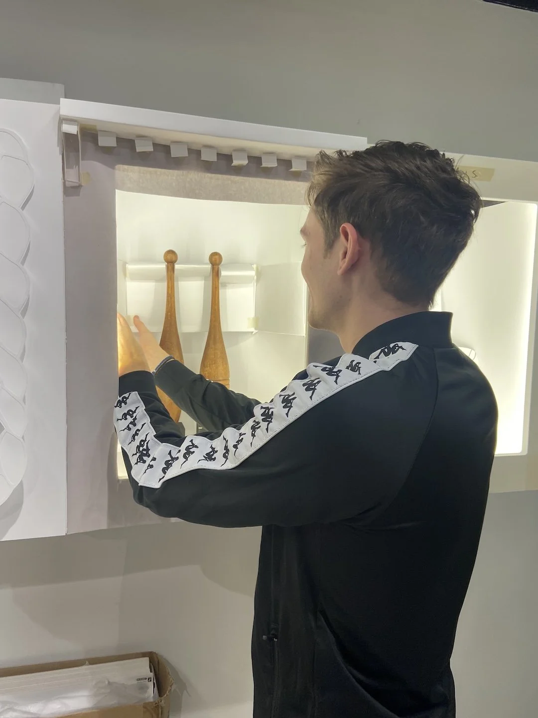
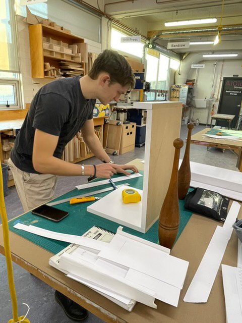
Extra Ordinary Project
Experiential Design | Display Design | Paper Construction
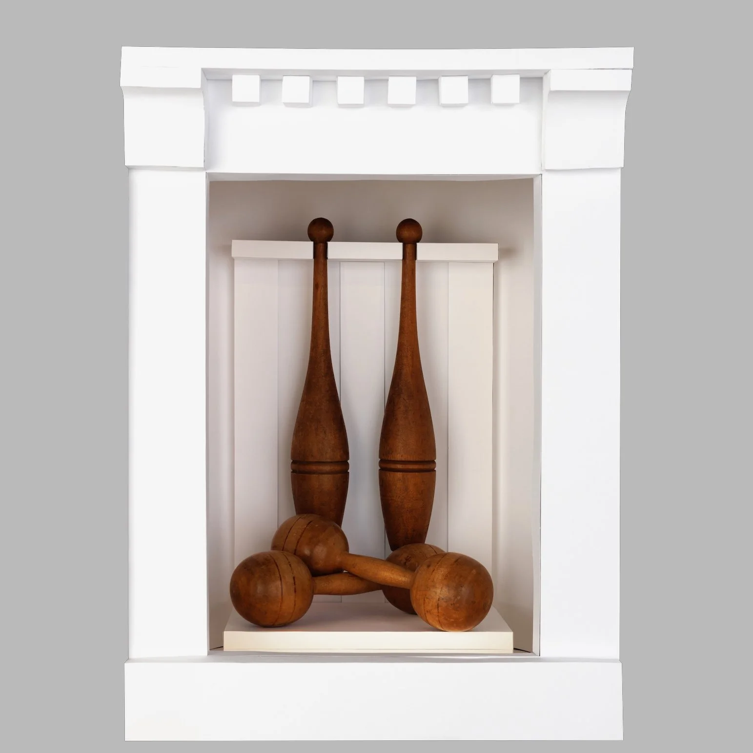
Objective: Research and design an engaging, white-paper presentation that expresses the history and experience of a randomly selected object.
After receiving vintage 19th-century wooden dumbbells, I researched the carpentry and gym culture of the era to create a historically relevant display. Since the objects were large, I opted for "less is more.” approach: designing a minimalist plywood-and-cardstock stand that mimics period-accurate woodworking. The simple trim complements the artifacts, keeping focus on their craftsmanship. This project emphasized the value of research in creating authentic, grounded design.
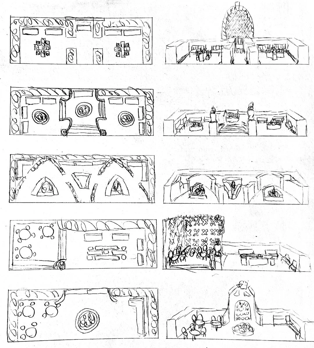
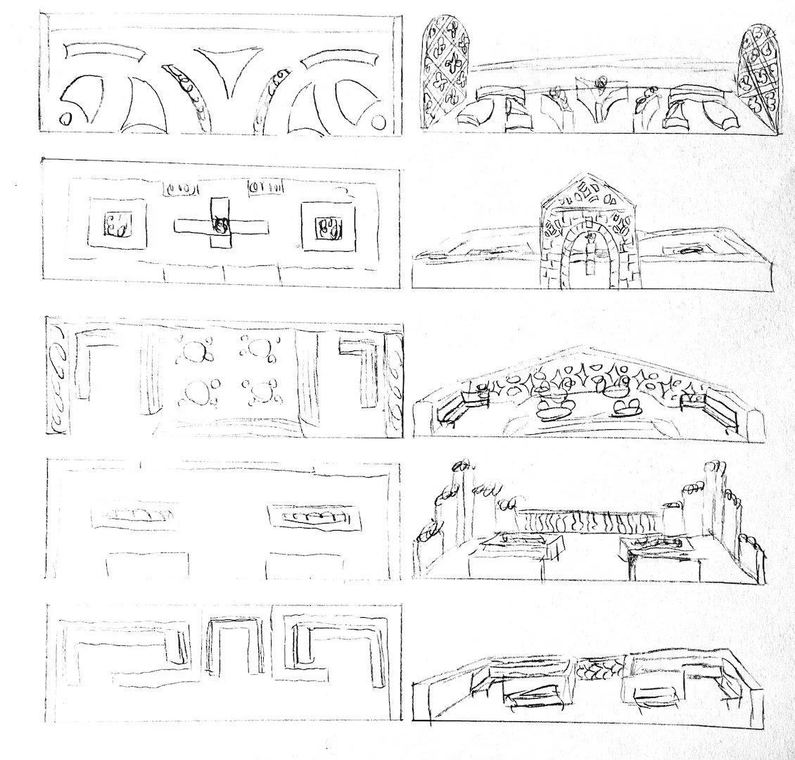
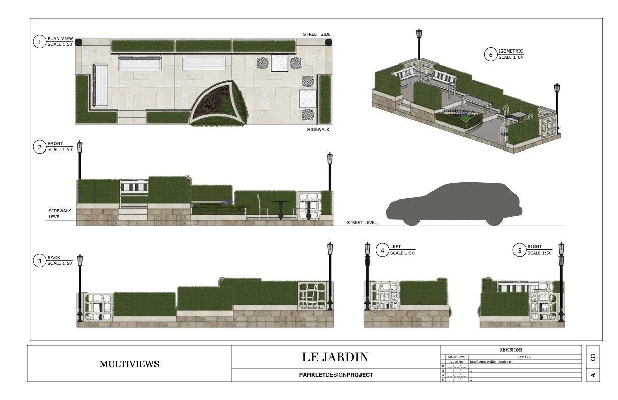
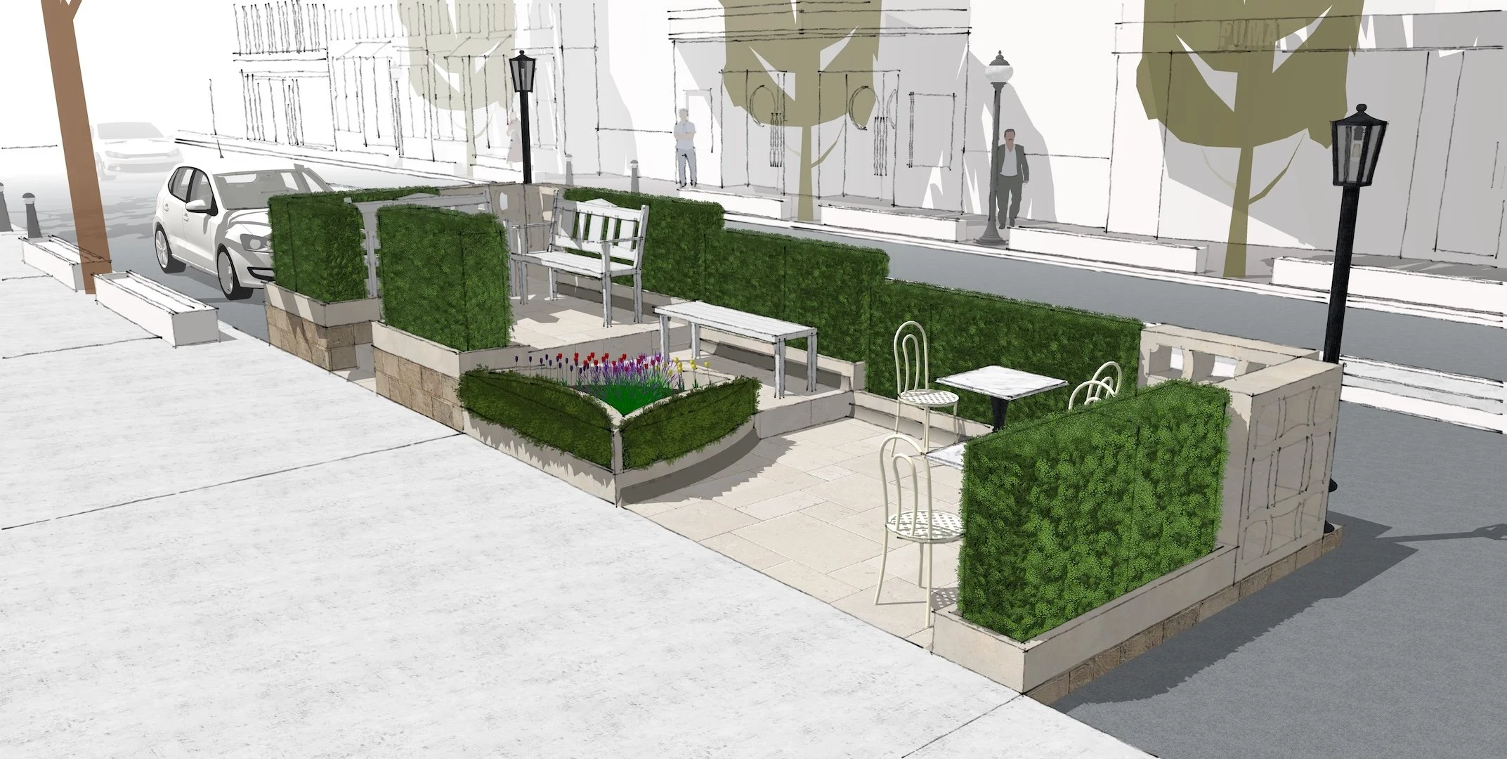
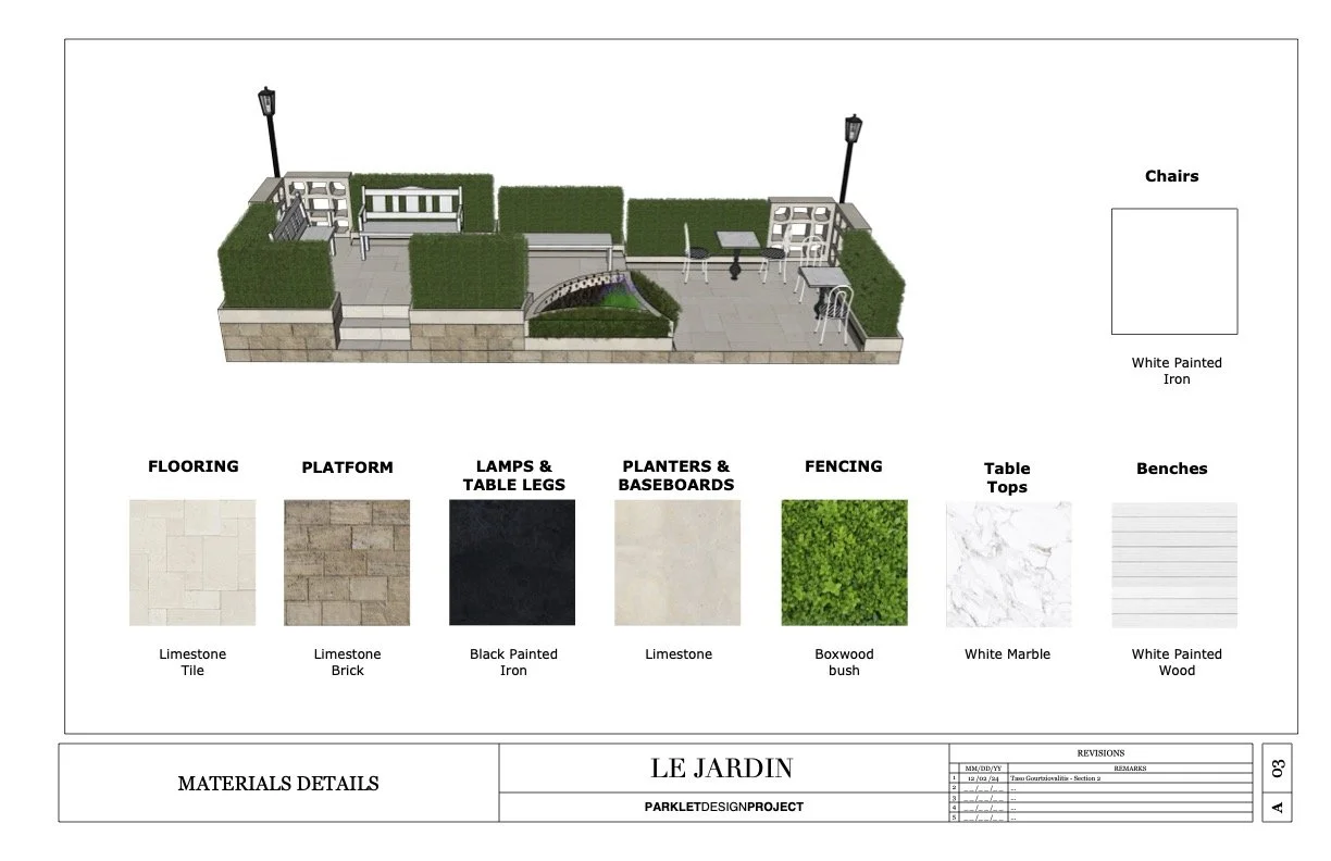
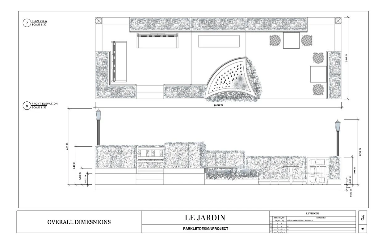
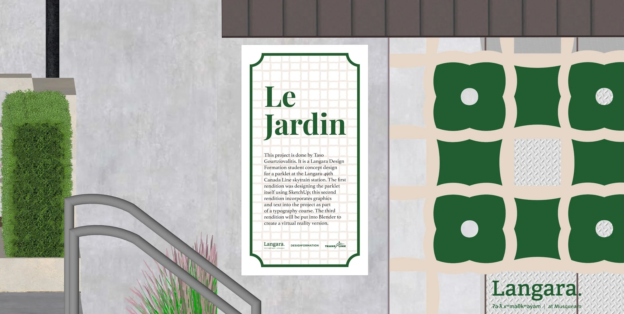
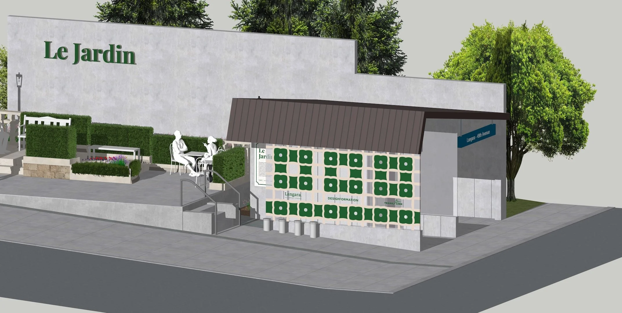
Parklet
Architecture | Branding | Graphic Design
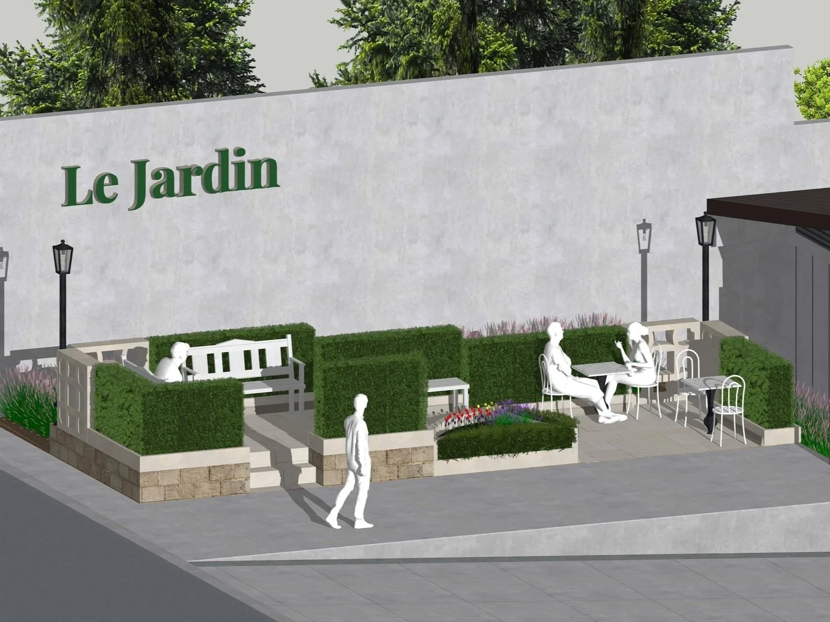
Objective: Design a distinctive public parklet for urban use and develop accompanying promotional graphics for a transit station display.
Le Jardin brings the cultured atmosphere of a French Château Garden to an urban setting. The design features a tri-level layout: a lower cafe-style seating area for social interaction and two upper tiers for quiet reflection among greenery. To manage the flow of traffic across different elevations, I integrated multiple stairways and used maze-inspired masonry patterns—referencing classic garden hedges—to anchor the corners of the space.
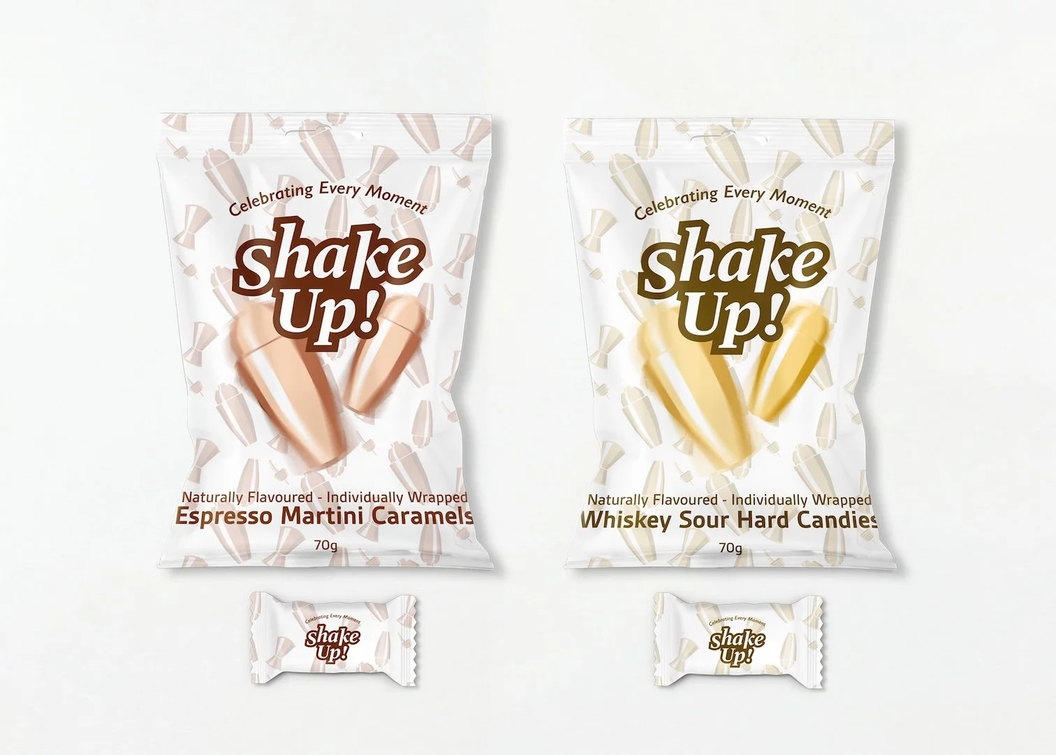
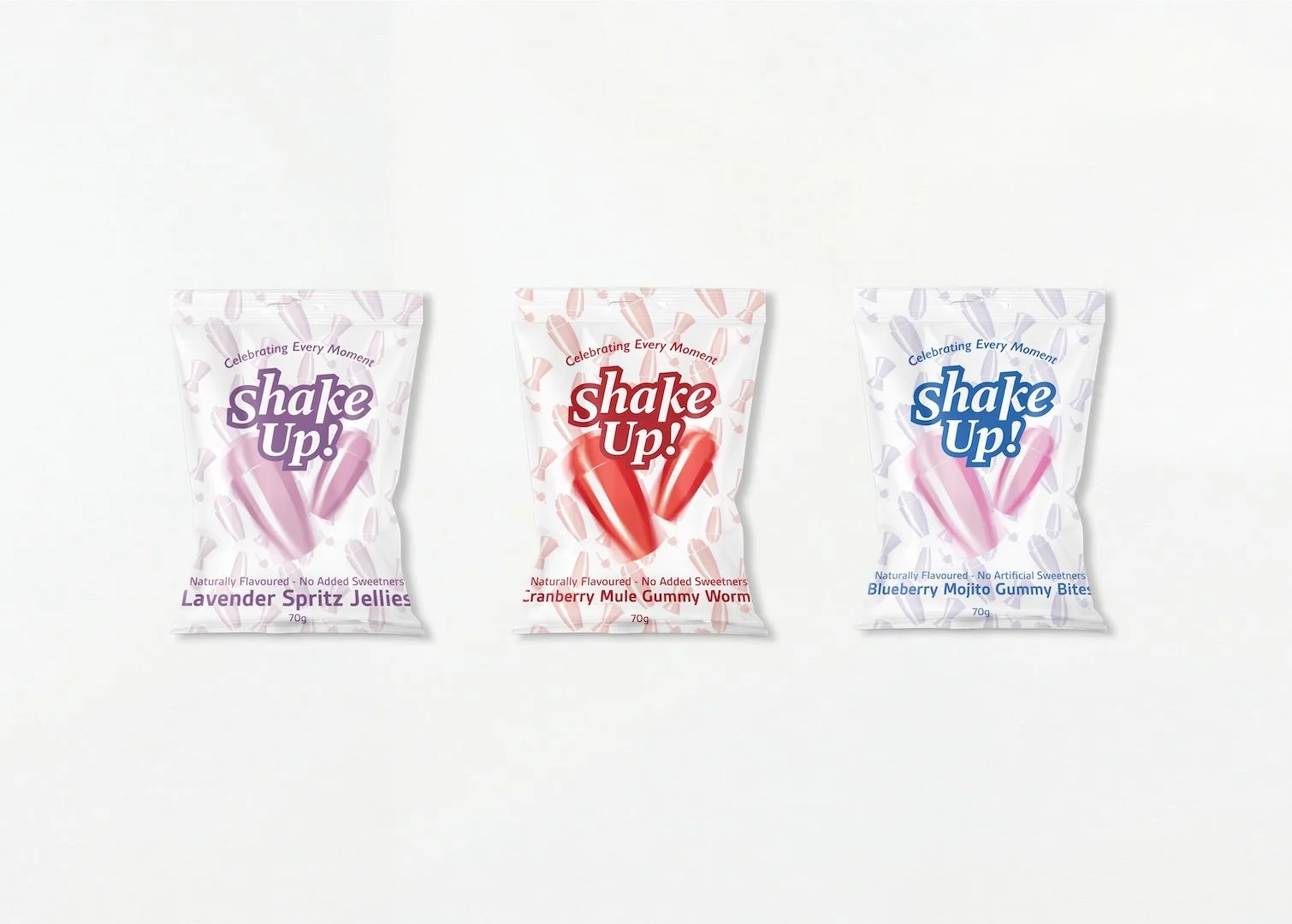
Candy Packaging
Branding | Graphic Design
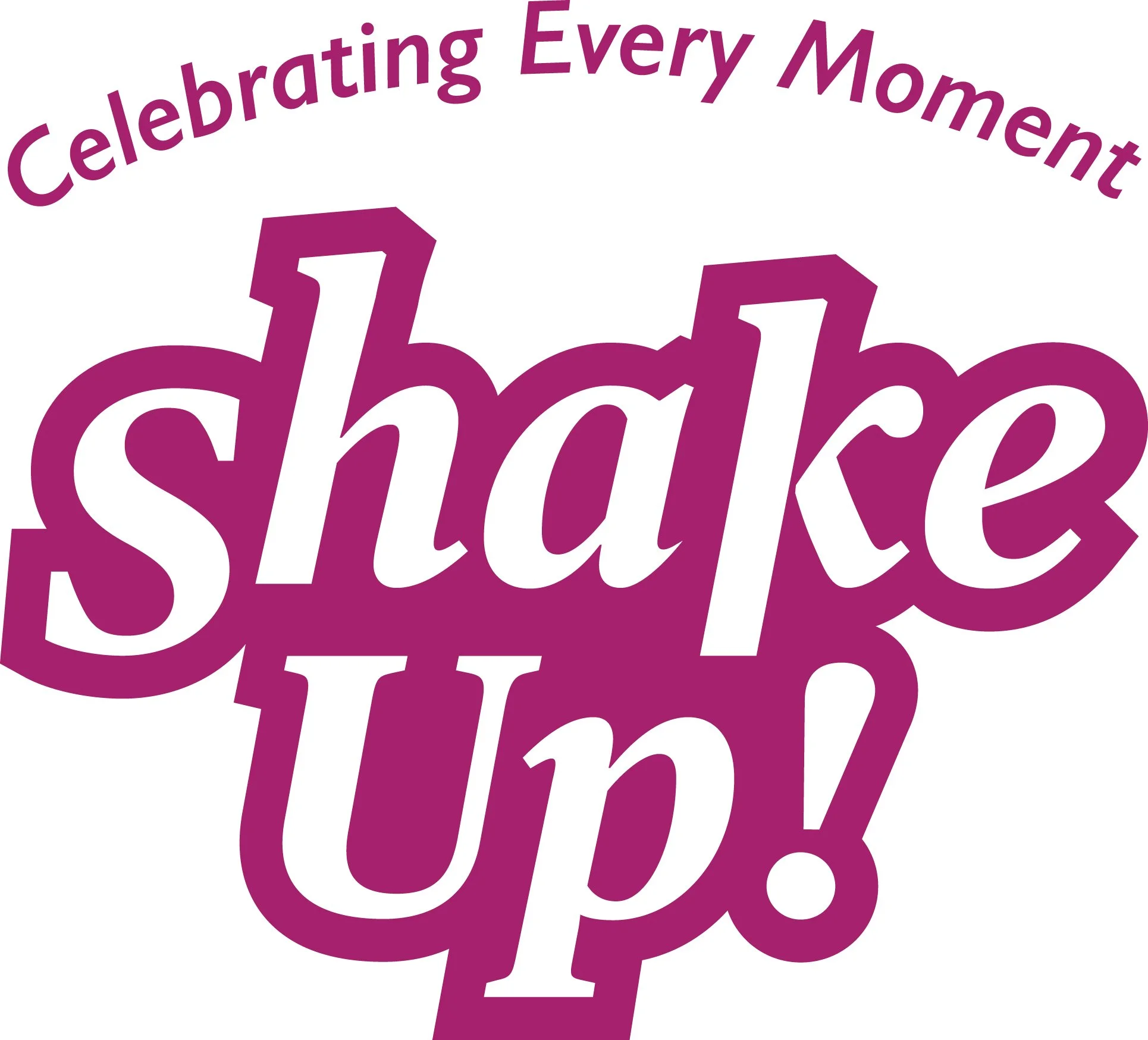
Objective: Create a new adult-oriented candy brand and packaging for mocktail-flavoured sweets, including an original logotype, slogan, and cohesive brand standards.
To reach a mature audience, I based it on the visual identity of bartending artistry and the energy of a cocktail shaker. The logotype and packaging use dynamic patterns and fluid typography to evoke the spirit of a night out.
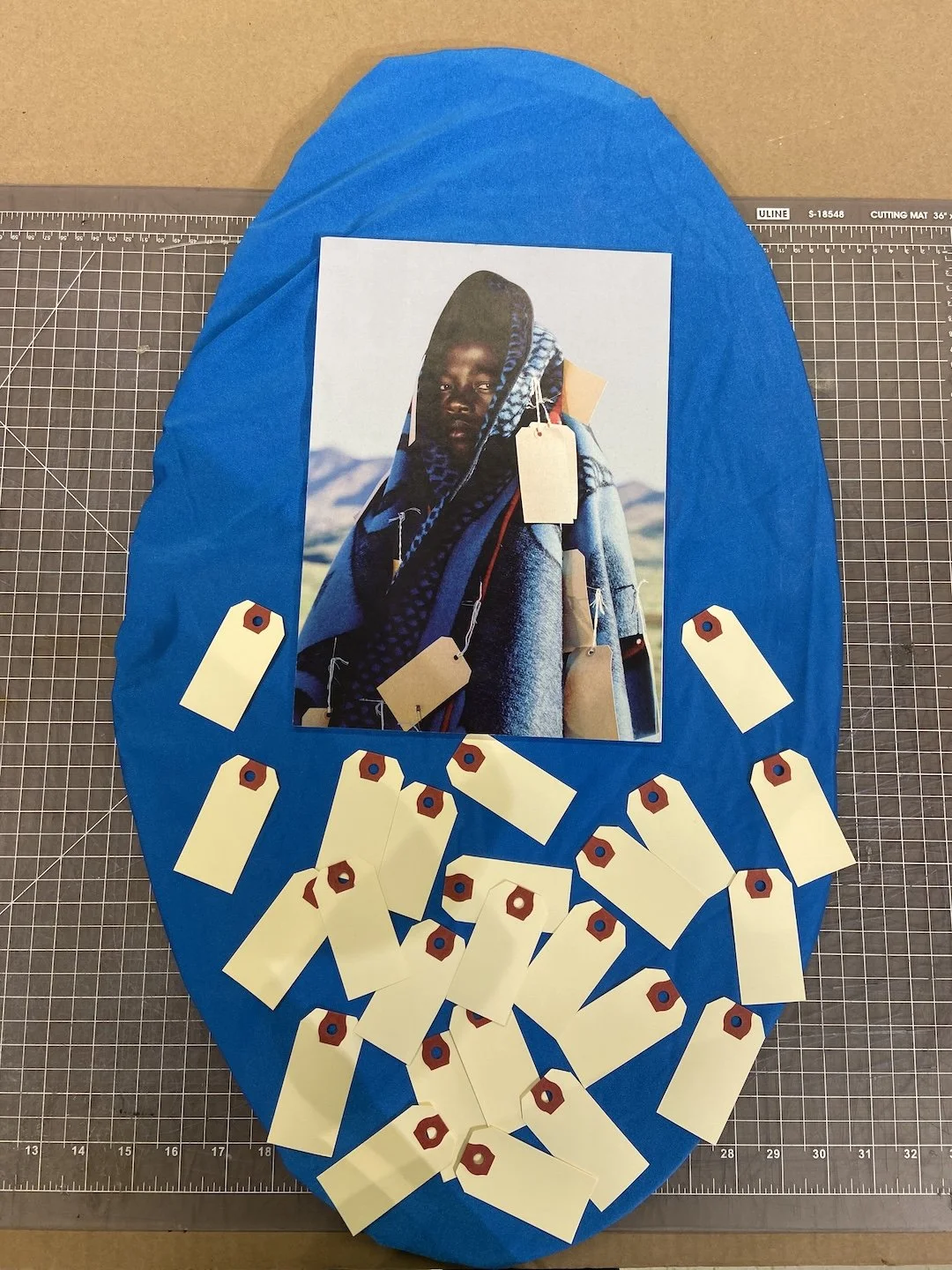
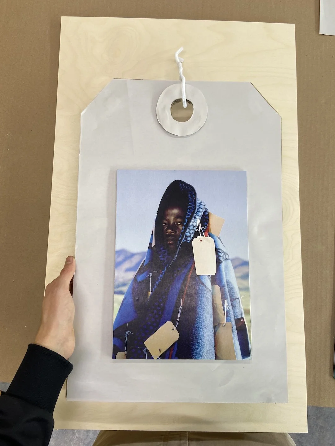
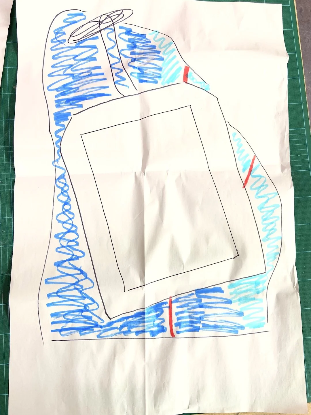
Frame of Reference
Experiential Design
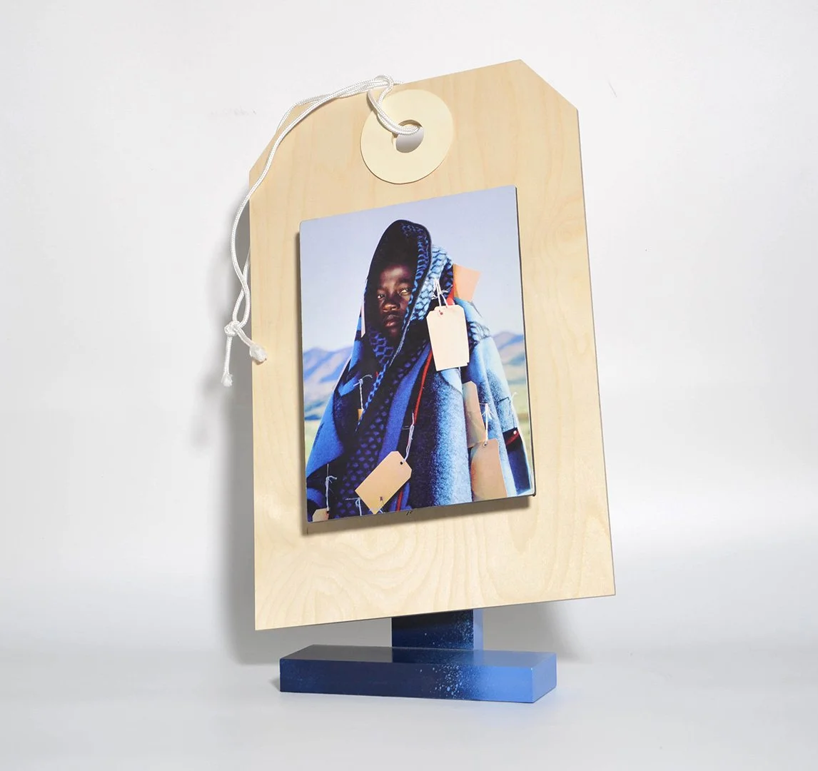
Objective: Create a 3D visual composition that reflects the experiential context of a random magazine image through emotive storytelling.
Starting with a prompt of a boy draped in fabric and tags, my goal was to extract and amplify the feelings of confusion and the unknown. I mounted the image onto a massive, oversized tag and displayed it at an off-kilter slant. This intentional instability forces the viewer to confront the same sense of confusion, questioning what is actually happening in the image. The ideating process for this project was especially difficult and challenged me to open my mind up and generate abstract yet relevant ideas to eventually land on my final design.