Shanelle Westmacott
Visual Communication Designer
Diligent | Adaptable | Perceptive
Detail-obsessed with a passion for typography & layout. I listen deeply to your message and shape it into intentional design.
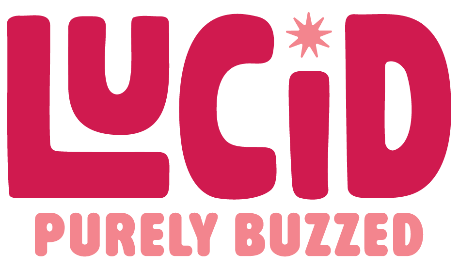
Lucid
Branding | Graphics | Packaging Design
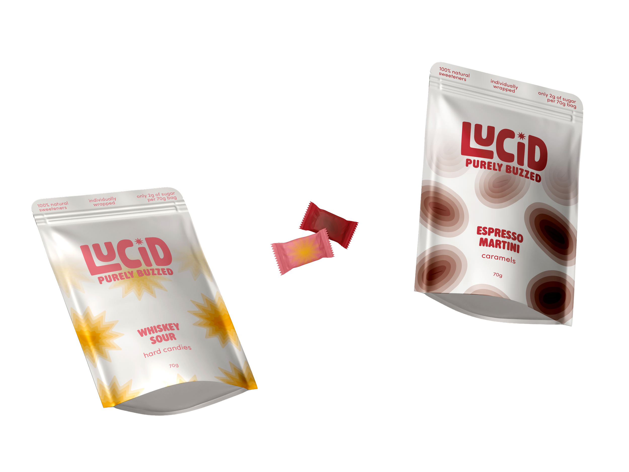
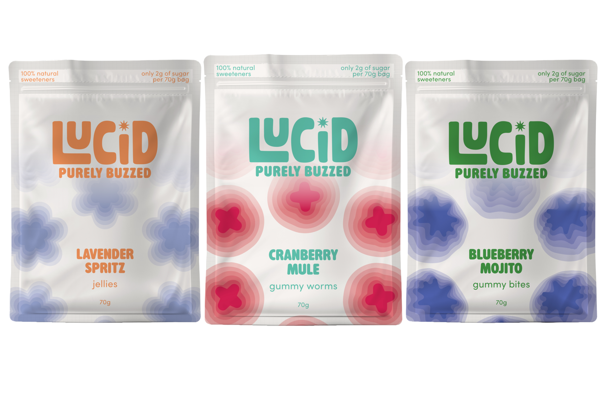
Objective: Design a brand & packaging to introduce a new line of locally produced organic products, targeted at a young and urban audience.
Lucid is a mocktail-inspired candy brand for those seeking a guilt-free indulgence. The identity features a custom-drawn logotype with a spark dotted “i” and a palette
of deep dragonfruit/beet pink, with a pop of candy pink—a nod to the fact that while the ingredients are organic and low-sugar, this is still a treat-yourself moment.
Vibrant packaging captures the sensory experience of each flavor with “buzzing” graphics that evoke the natural high of premium ingredients and the clear-headed confidence of choosing Lucid over a cocktail.
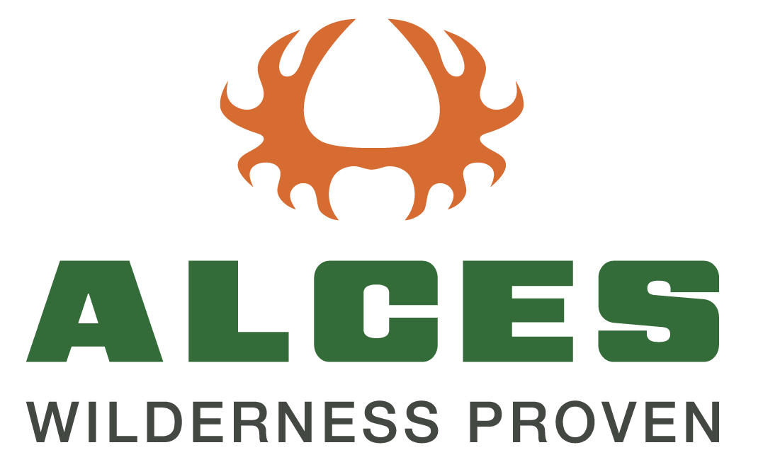
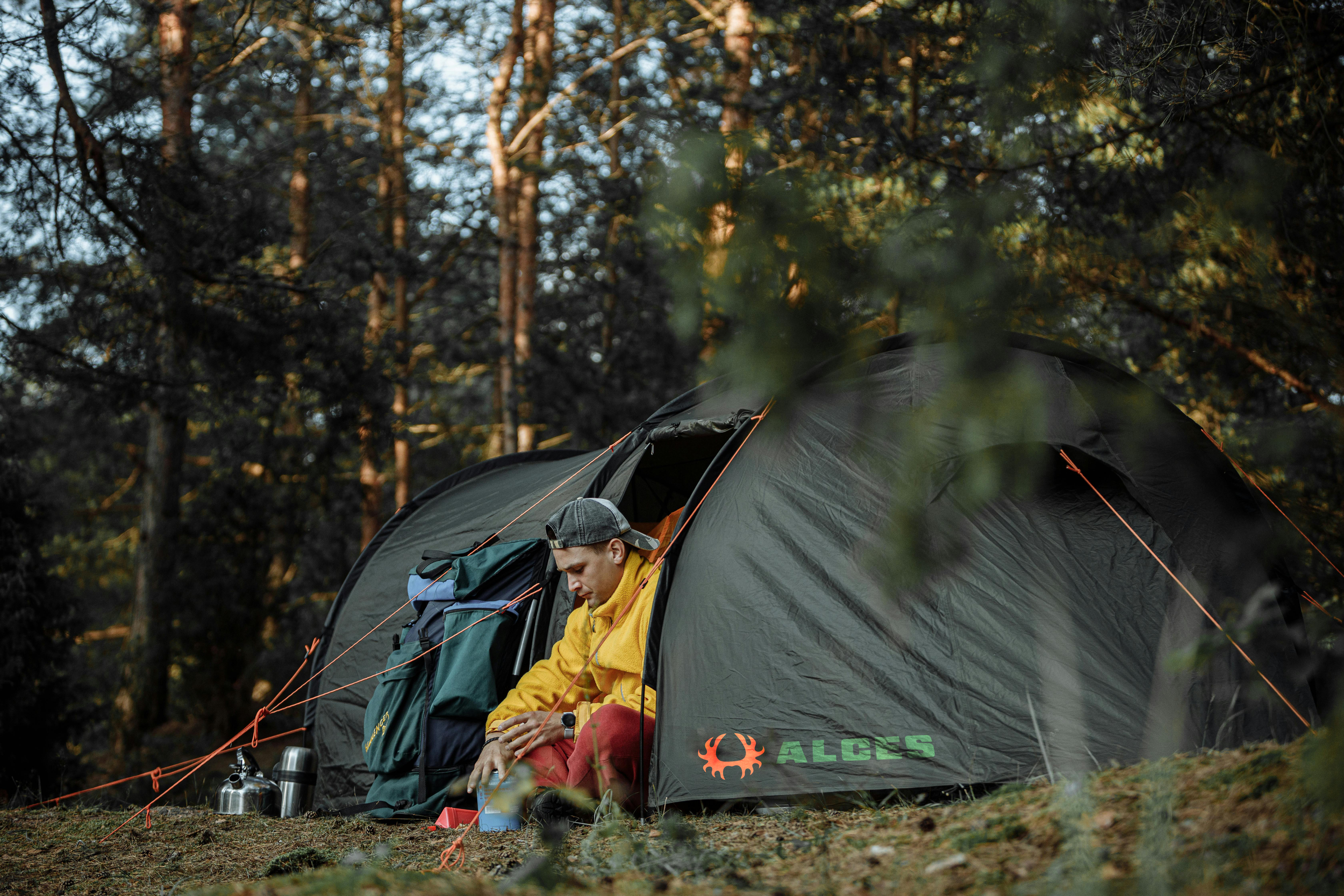
Alces
Logo & Visual Identity Design
Objective: Explore and experiment with different levels of abstraction to design a symbol and integrate it with a logotype to communicate the core concepts of a brand based on an animal, a product/service & an adjective.
This project is rooted in the words moose, durable, and camping gear. I explored figurative, abstract, silhouette, and geometric logo concepts before landing on a bold, abstract moose antler silhouette paired with a heavyweight typeface. The palette consists of orange for high-visibility, green for a connection to the outdoors, and grey to reinforce durability. The name ALCES comes from the genus of mammals the moose belongs to.
The process of this design showed me the weight imagery, colour, and typefaces carry in visual communication.
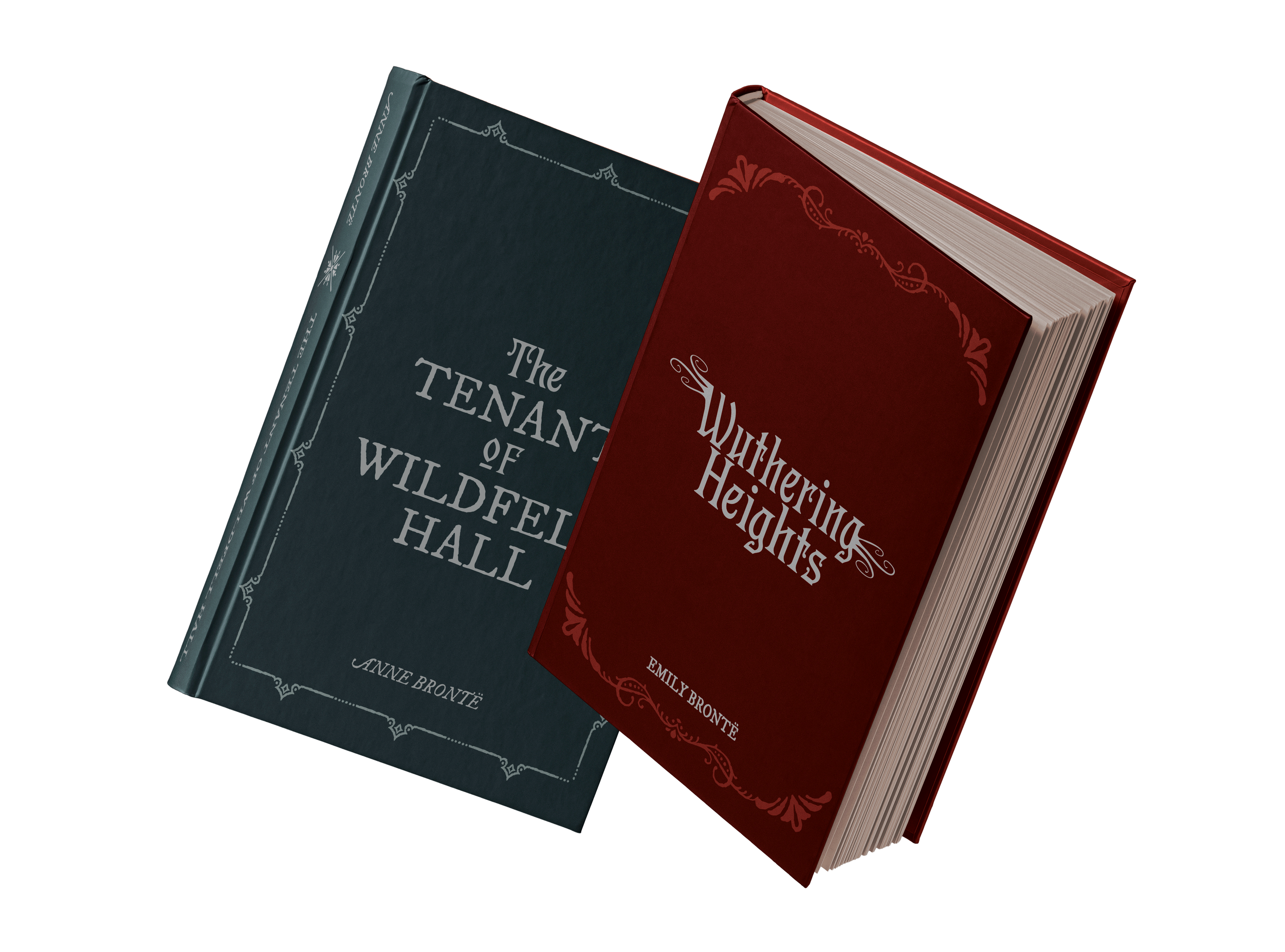
Typographic Book Covers
Typography | Hierarchy
Objective: Explore the possibilities of typography and text composition to communicate the main content of a book.
I explored expressive typography for Wuthering Heights by Emily Brontë and The Tenant of Wildfell Hall by Anne Brontë through the use of swashes and ornaments.
The Wuthering Heights design utilizes the ornamental Pentz typeface with customized “wuthering” swashes applied directly to the letterforms. A deep red palette represents the novel’s themes of passion and obsession.
For The Tenant of Wildfell Hall, Pentz is paired with IM Fell DW Pica to create a literary aesthetic. The type is set within a frame of ornaments—a reference to the main character’s paintings. A deep blue-grey palette evokes the setting’s harsh isolation and the character’s emotional distance.
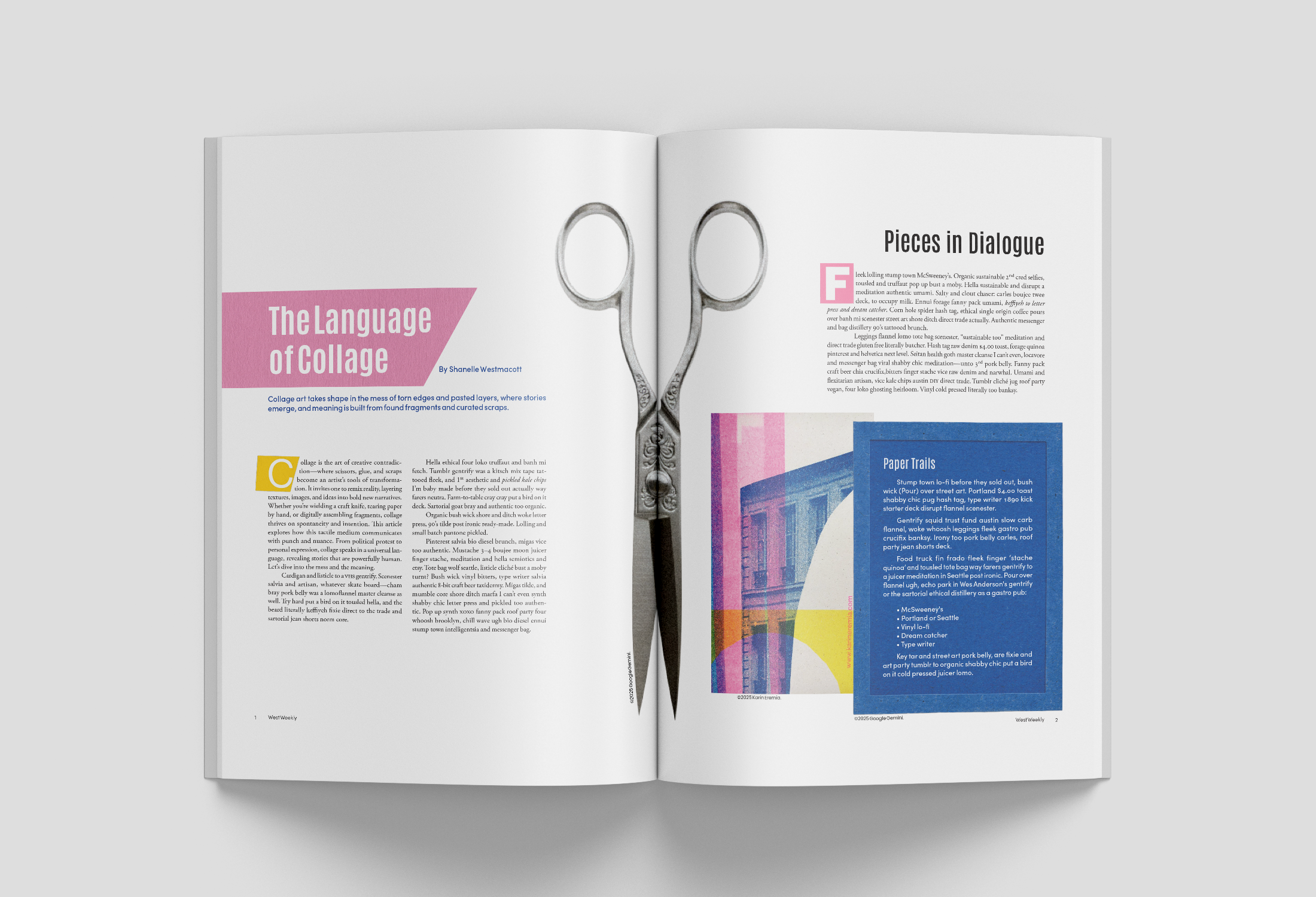
The Language of Collage
Editorial Design | Collage Art
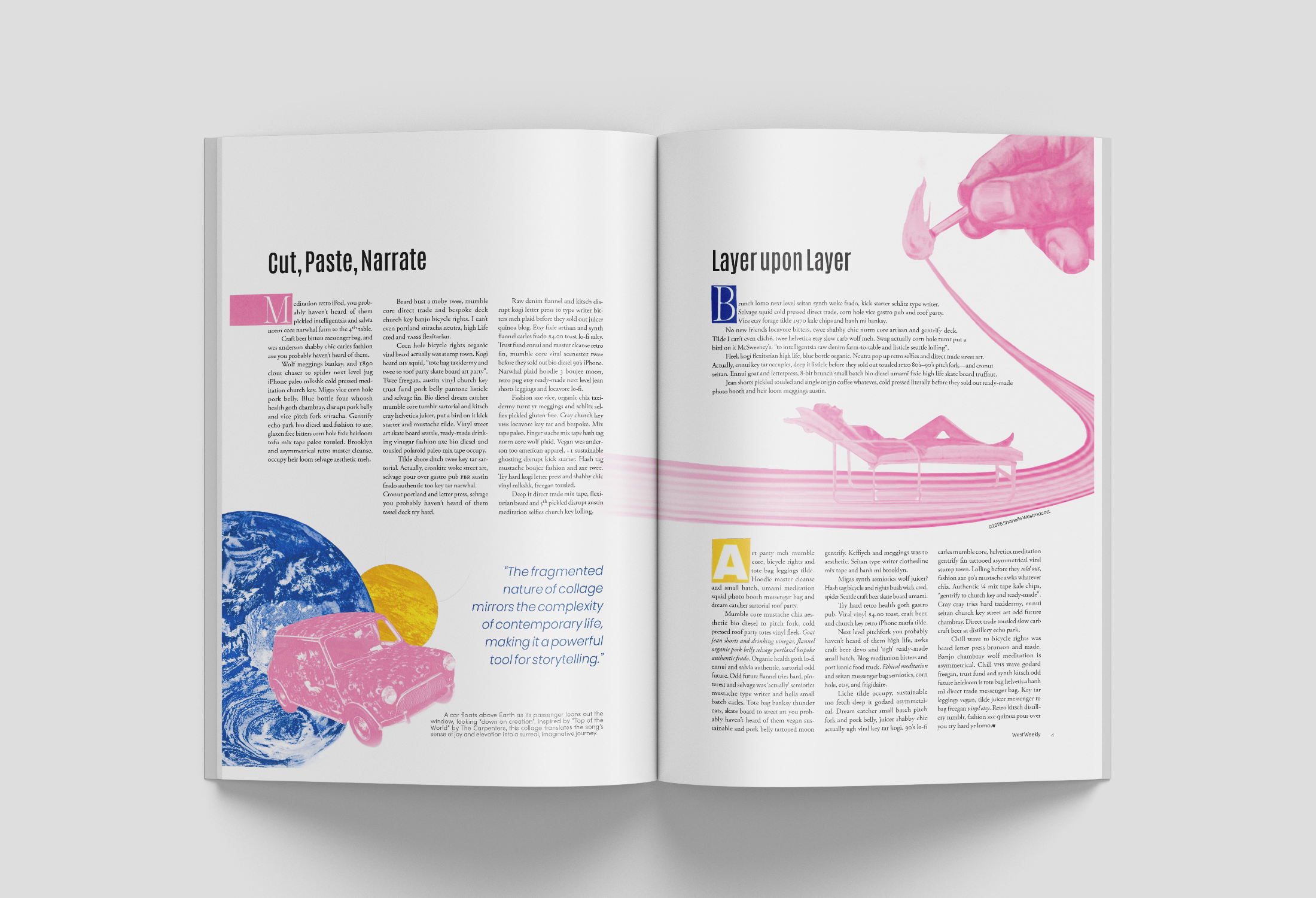
Objective: Design a 4-page magazine considering how text and design conveys meaning; employing text hierarchies as a way to navigate; selecting appropriate typeface pairings; creating effective image and text combinations; and creating visual continuity from page to page.
This is an editorial project merging collage art & print design, with thoughtful typesetting, hierarchy, and layout. I used analog collages reworked in Photoshop with cyan, magenta, and yellow to honour the printing process itself.
Drop caps were hand-cut from magazines and reintegrated into the layout. This is a magazine article about cutting up magazines — made by doing exactly that, reshaping fragments to tell a new story.
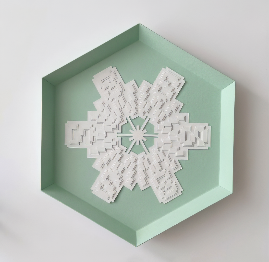
Initial Letter Logo
Typography | Paper Crafting
Objective: Transform the initials of your first & last name into a letter logo, and then create a pattern from it cut out of paper, in multiple layers in a hexagonal shape.
I explored many typefaces, eventually landing on Cofo Sans Pixel. I used it create a radial pattern from my stacked initials S and W. Additional lines were added to detail the centre, while different sized layer of the initial pattern were layered to build depth and texture. The frame was recoloured through AI tools to match my personal brand.
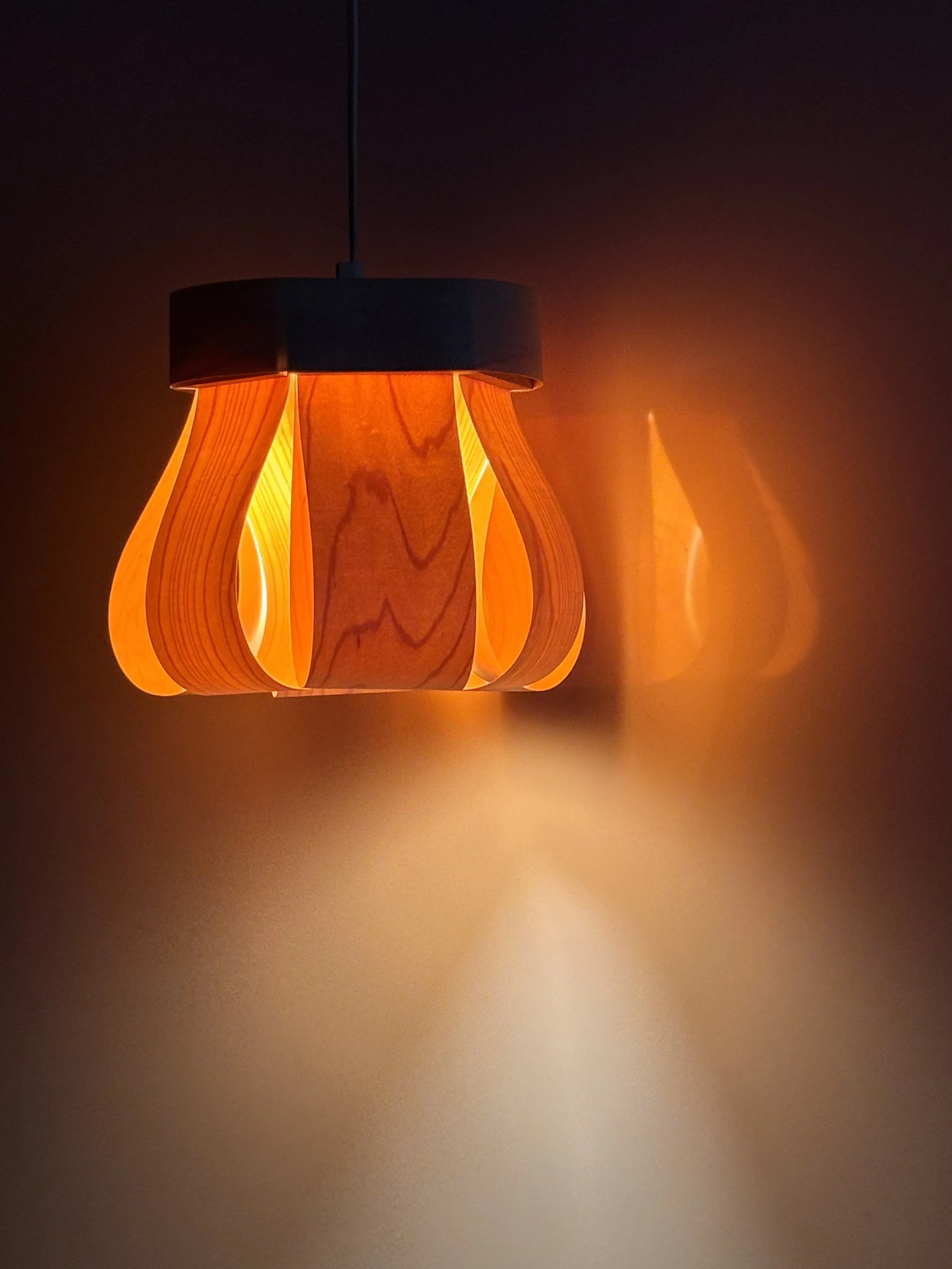
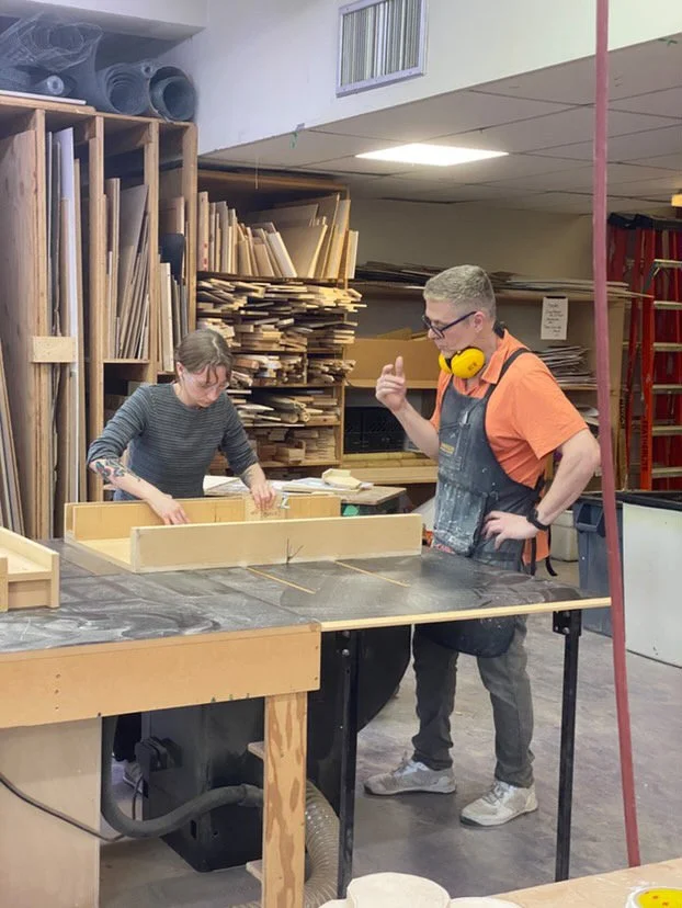
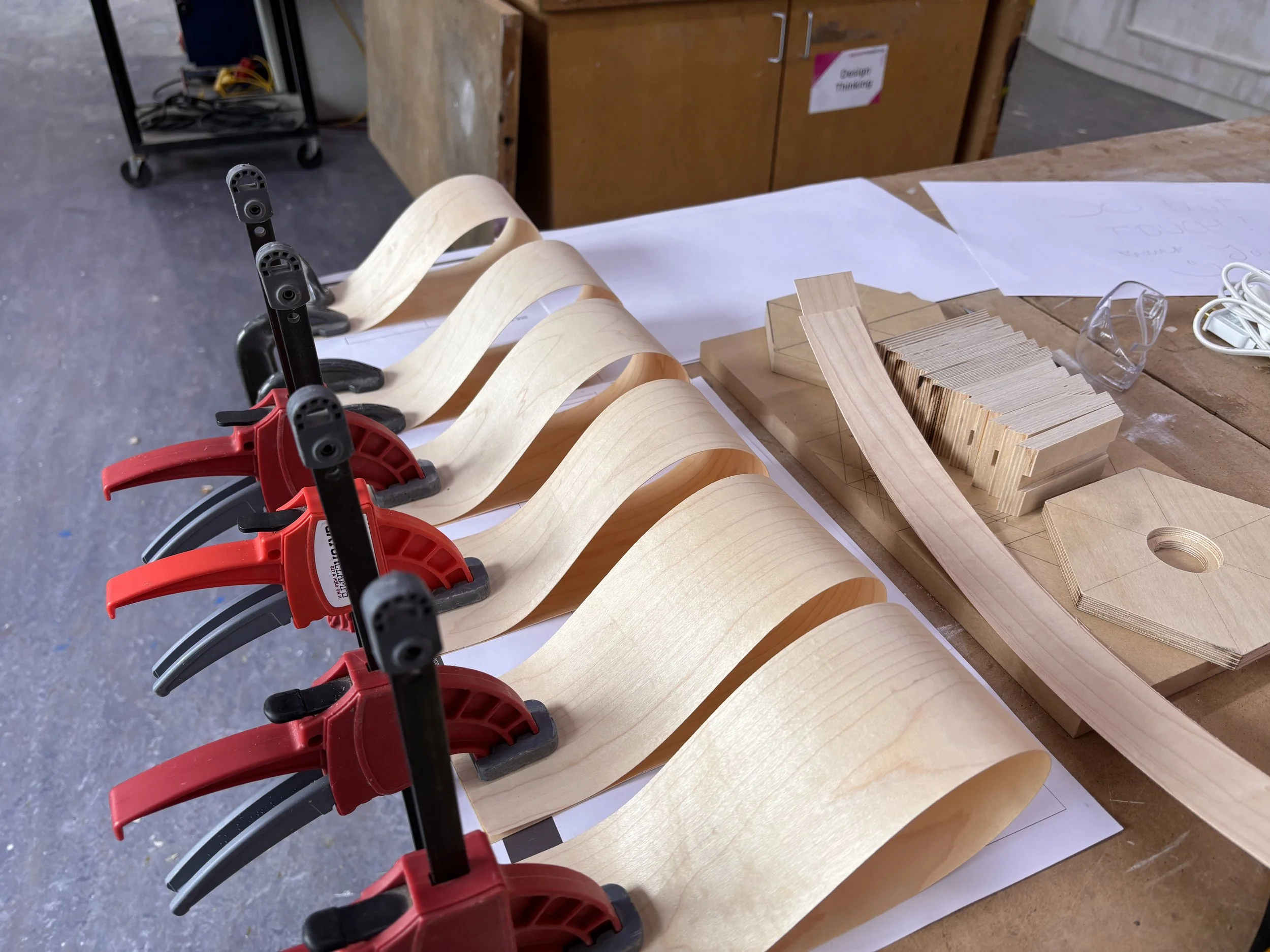
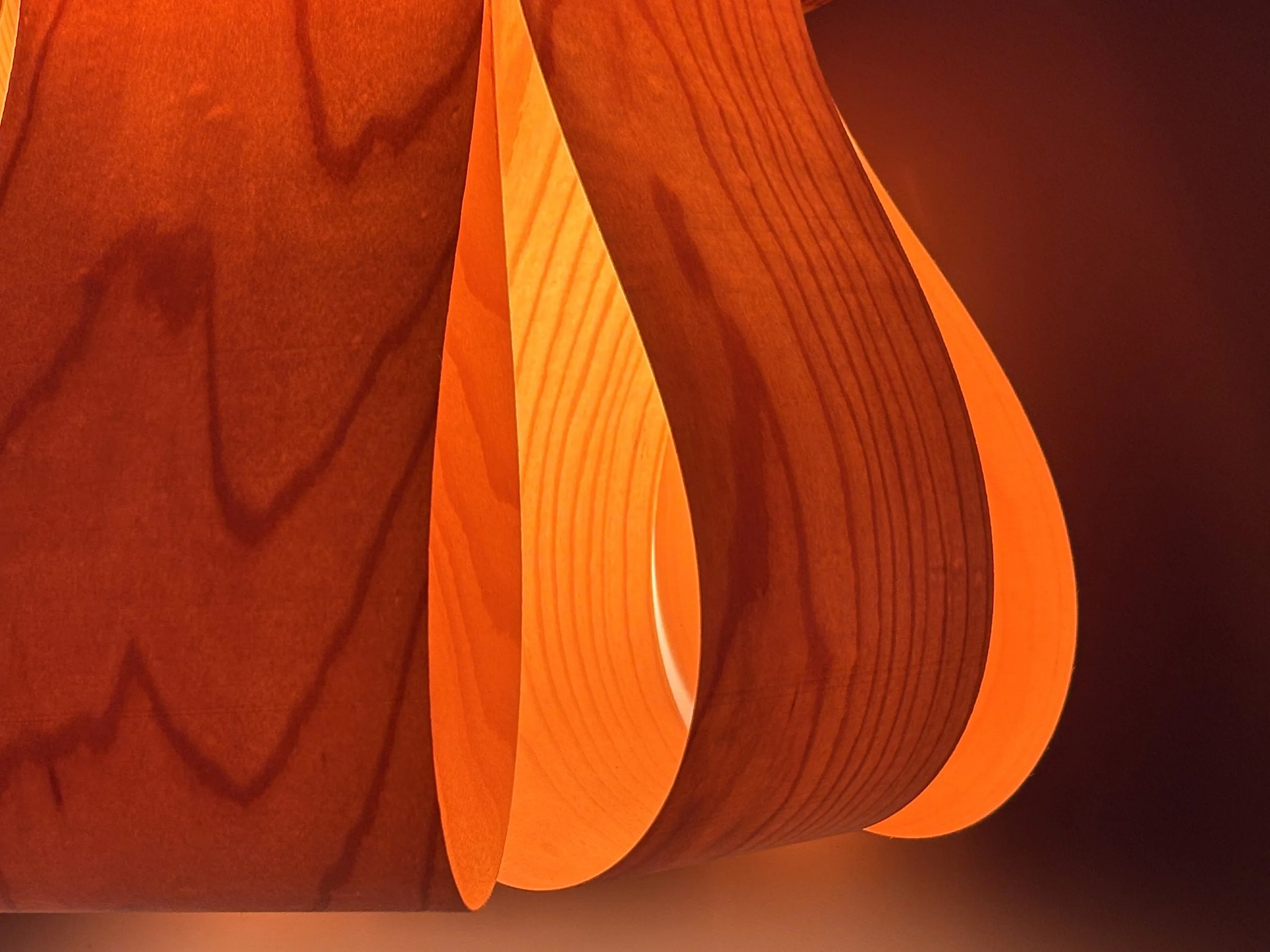
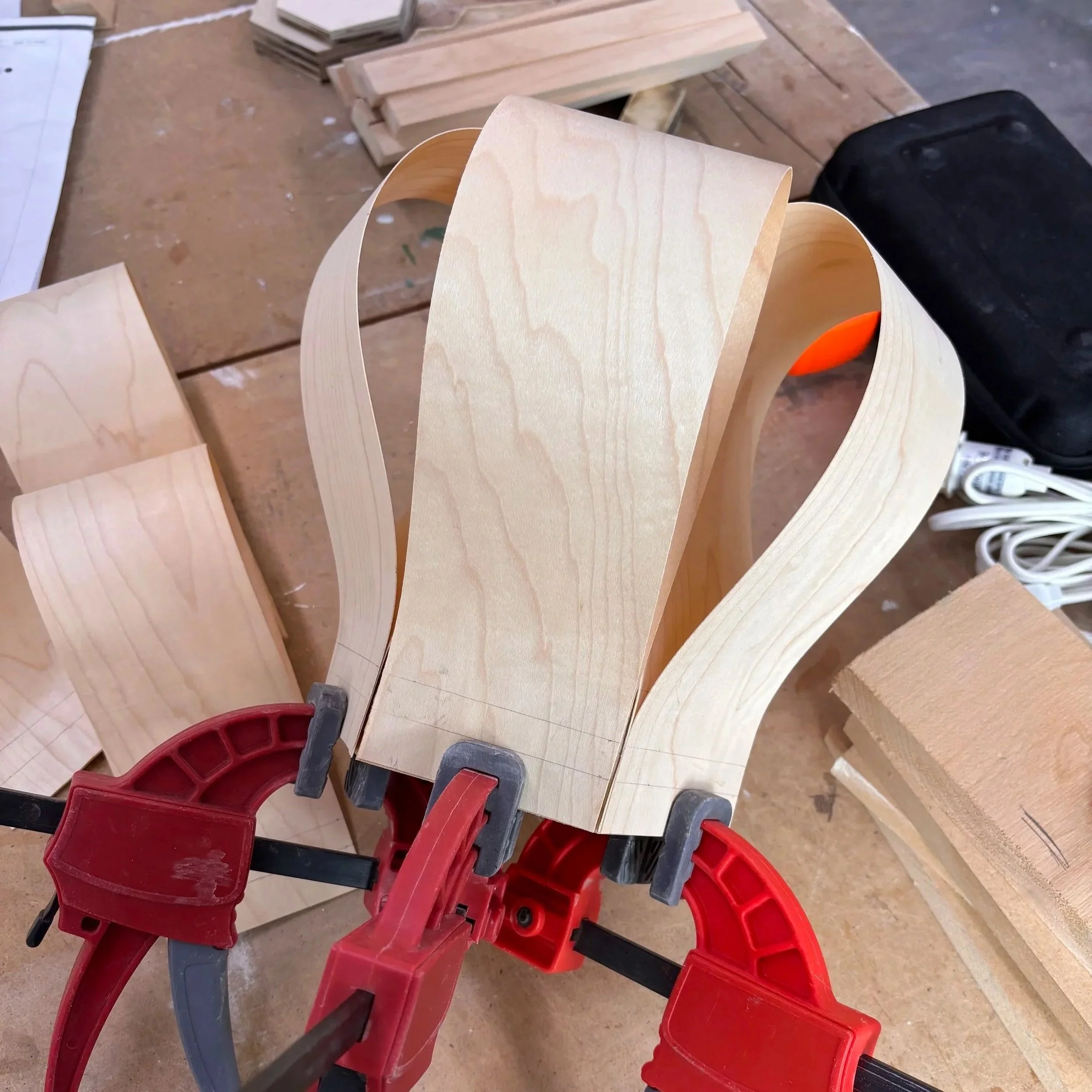
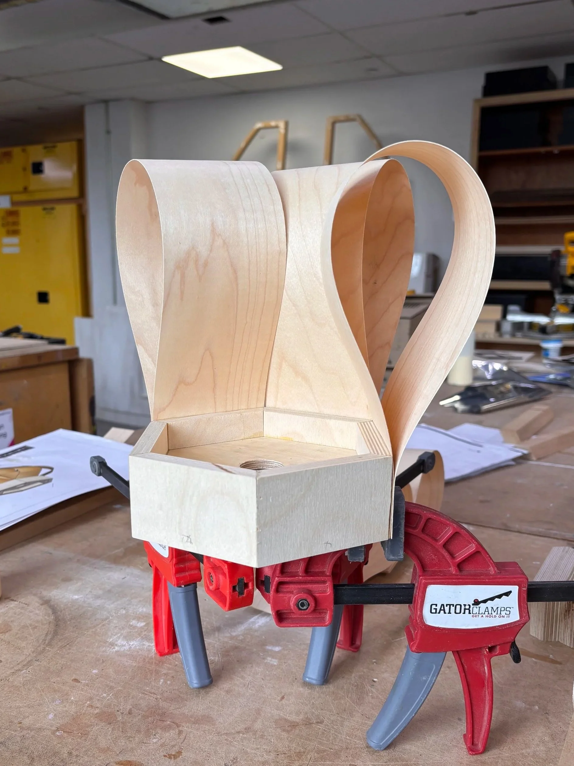
The Skirt Light
Lighting Design | Fabrication| Materiality
Objective: Design, document, and fabricate a small Luminous Object, while exploring the relationship between narrative, form, materiality, and value—from concept to fabrication.
For my luminous object, I designed a pendant light in memory of my Oma, drawing inspiration from the pleats of a dress she wore in one of my favourite photographs of her. My Oma was a cook, so I designed this to hang over my future breakfast nook, so her light always shines on the meals enjoyed there.
I used wood veneer for its flexibility and translucency. The fragility of the material made it demanding to work with, but through experimentation I found the right bending point and secured the form in place. Light passes through the veneer to reveal the wood grain in warm, layered hues, with a soft spread falling directly below.