
Sahara Richards
Graphic Designer
Lively | Intentional | Structured
I believe great design connects emotionally while staying clear and intentional, through the creative use of colour, images, and structured layouts.
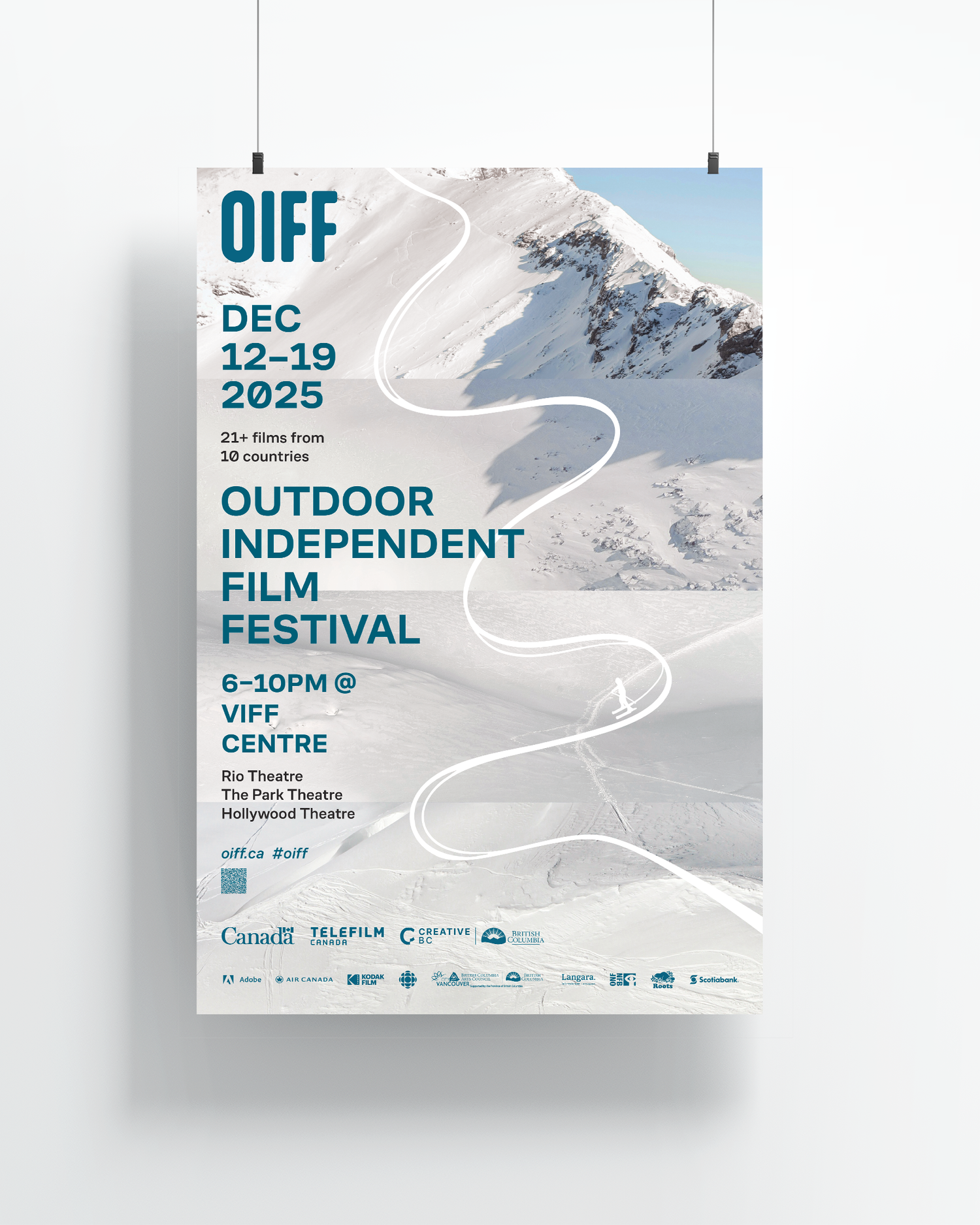
Outdoor Independent Film Festival
Page Layout | Web Design | Graphic Design
Software Used:
-Figma (Website Wireframe/Prototype)
-Indesign (Page Layout)
-Photoshop (Photo Editing)
-Illustrator (Artwork)
Poster
Project Objective: Design a professional poster for an Independent Film Festival—a fictional but realistic film festival. This project will help master advanced InDesign skills, including layout design, typography hierarchy, image manipulation, and sponsor logo integration.
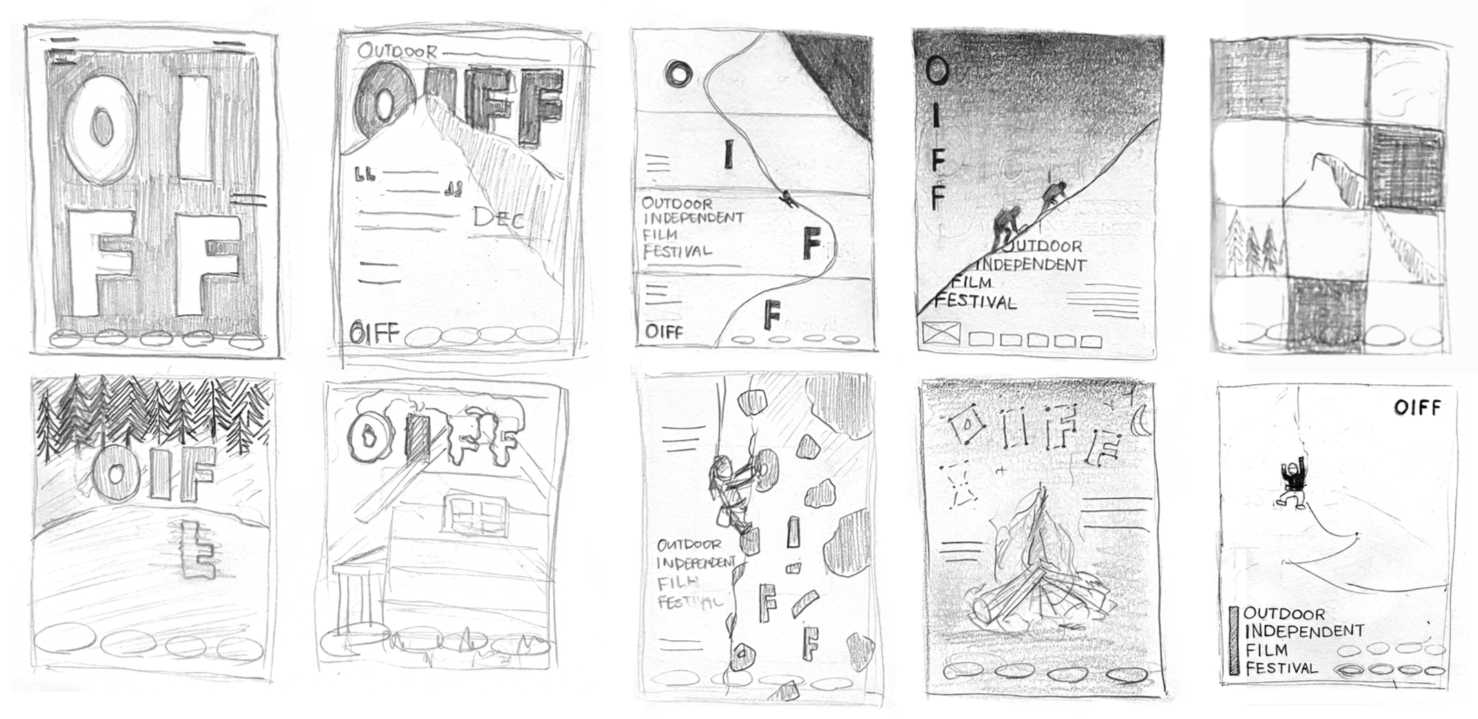
Poster Sketches
My core keywords were dynamic, adventurous, and connection.
As my creative practice, I experimented with a grid structure on both applications. For the poster, the challenge was visualizing the link between film and outdoor sports. Both share a sense of connection whether between people, disciplines, or nature. After sketching multiple concepts, I created a sequence of four images that read as a single landscape at first glance. They are divided into horizontal rows to reference the cinematic frame. I added an illustration to show movement, as it is the key element in both film and sports.
Website
Project Objective: Design a responsive website layout for your Independent Film Festival that complements the poster design from a previous course. This project will help master digital design principles, responsive layouts, and user experience design while maintaining brand consistency across print and digital mediums.
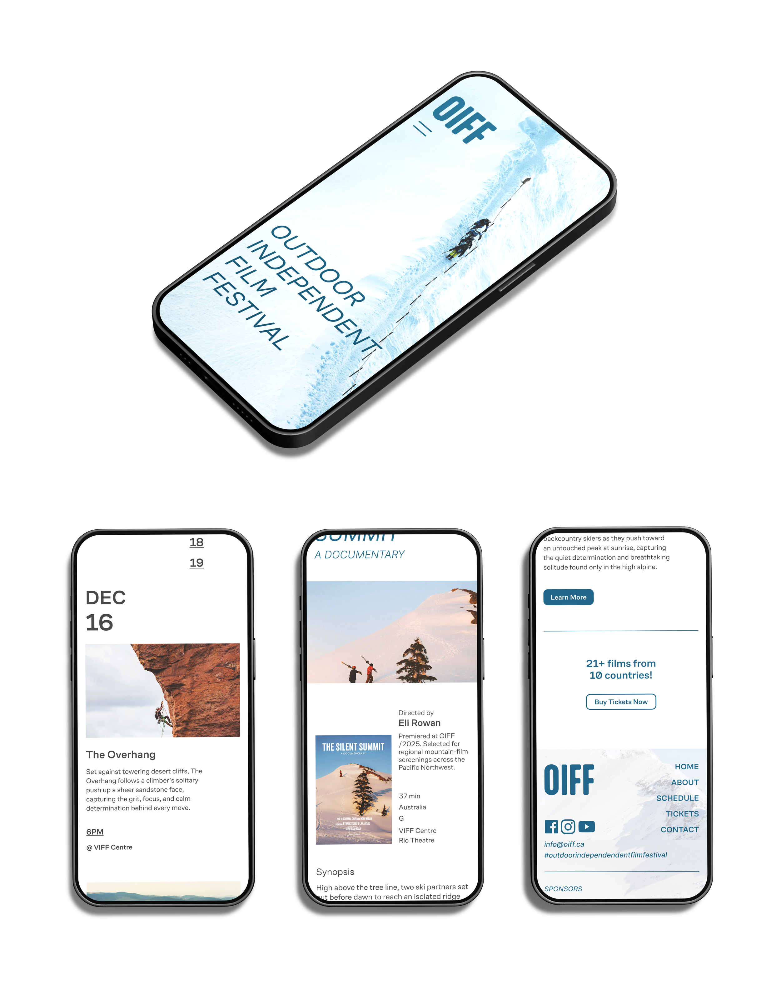
For the website, the challenge was maintaining the style without sacrificing usability. The layout was simplified to prioritize individual films. The poster image was moved to the footer, as its subtle transitions may not read clearly on all screens. A more direct image was selected for the hero to better communicate the dynamic, adventurous tone.
Independent Brand Project
Branding | Packaging | Graphic Design
Software Used:
-Illustrator (Artwork)
-Indesign (Page Layout)
-Sketchup (3D Modelling)
-Blender (Render)
-Photoshop (Mockup)
-Figma (Website/Presentation)
Project Objective: Design a brand identity, graphic standards and applications by completing a self-initiated design project to meet professional development goals.
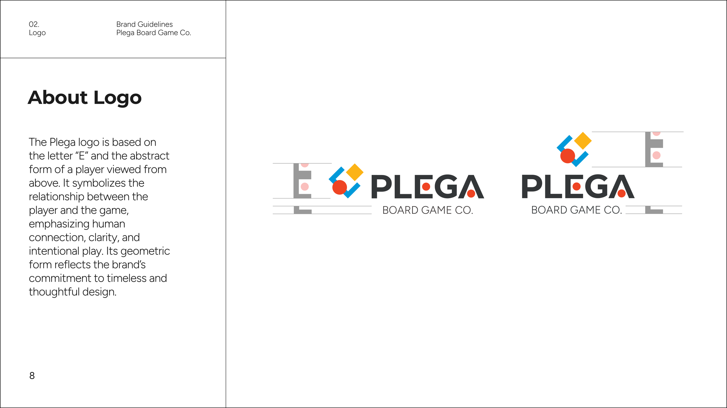
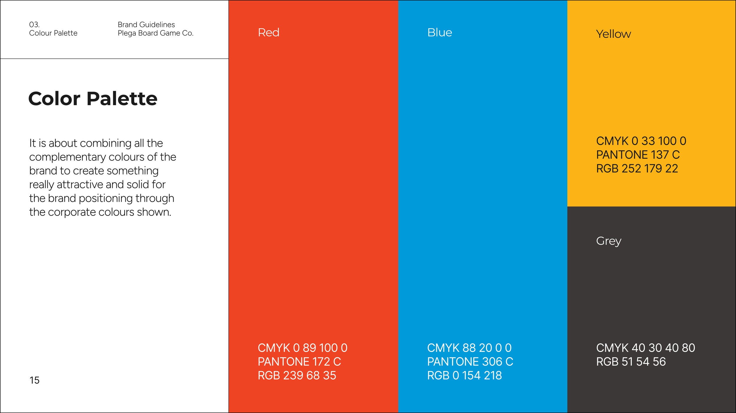
I created a board game brand to address the lack of consistent branding in the tabletop game industry. The goal was to build a cohesive visual identity that extends across packaging, digital presence, and marketing. The identity was designed to be recognizable and appeal to a wide audience.
The visual direction was inspired from Bauhaus principles to create a timeless brand. The logo uses simple geometric shapes to communicate connection between our game and its players. This system extends consistently across all applications.
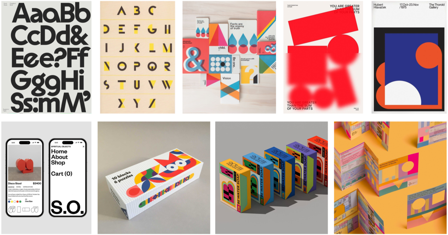
Moodboard
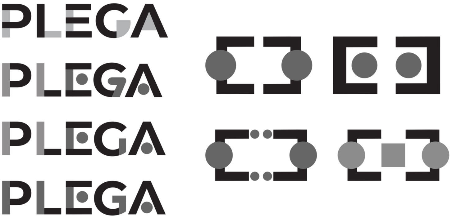
Logo Iterations
-
![Falling playing cards including the 13 of clubs, the 1 of hearts, the 5 of spades, the 10 of diamonds, and a pack of playing cards with a colorful geometric pattern and text 'playing cards' and 'Plega' logo on the packaging.]()
Playing Cards / Packaging
-
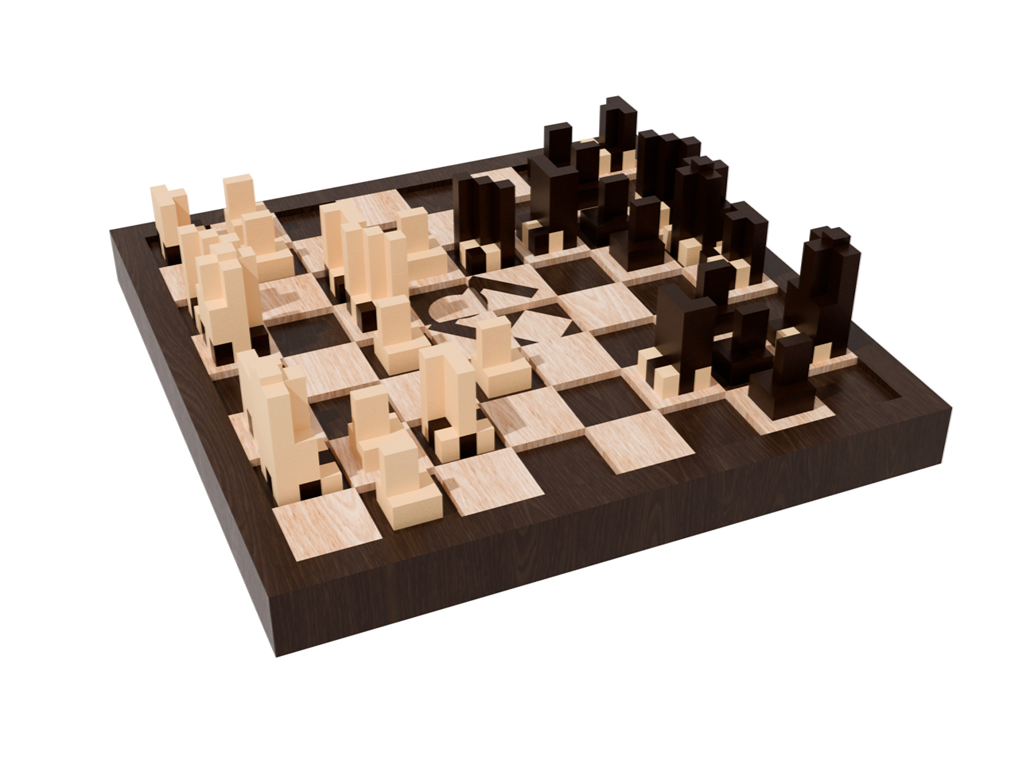
![Chessboard with wooden and dark pieces arranged for a game.]()
Chess Set
-
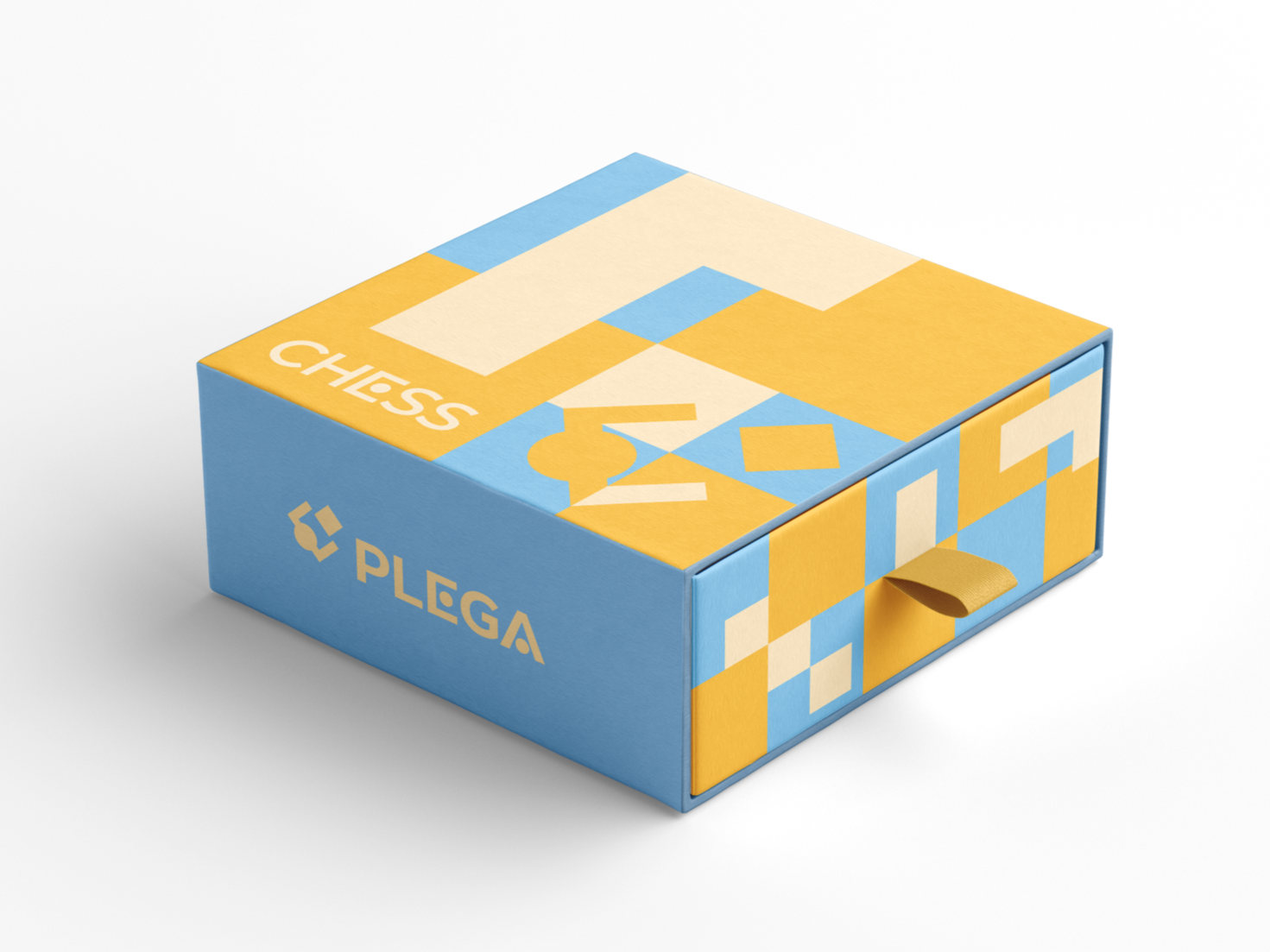
![A colorful box with a blue, yellow, and beige geometric design. The box features the text 'CHESS' and a logo on the top, and 'PLEGA' with a logo on the side. It has a pull tab on the front.]()
Chess Packaging
-
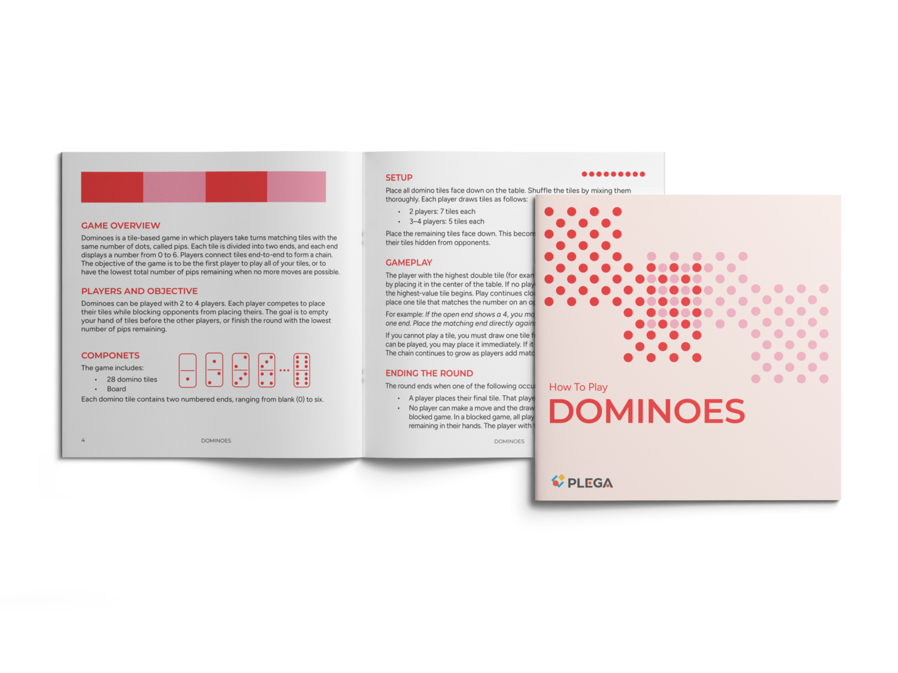
![Open booklet displaying instructions and overview for playing dominoes, with a separate cover page showing the title "How To Play Dominoes" and the PLEGA logo.]()
Instruction Manual

Cook Book Design
Typography | Graphic Design | Illustration
Software Used:
-Indesign (Page Layout)
-Illustrator (Artwork)
-Procreate(Illustration)
-Photoshop (Image Editing/Mockup)
Project Objective: Design a cookbook, ensuring its recipes, graphics, and the other ancillary information, work together as part of a coherent concept, that brings the story, the foods, and the dishes to life, while considering the hierarchy of the typography, professional typesetting of the main text, the connection between text and images, and the continuity of all pages.
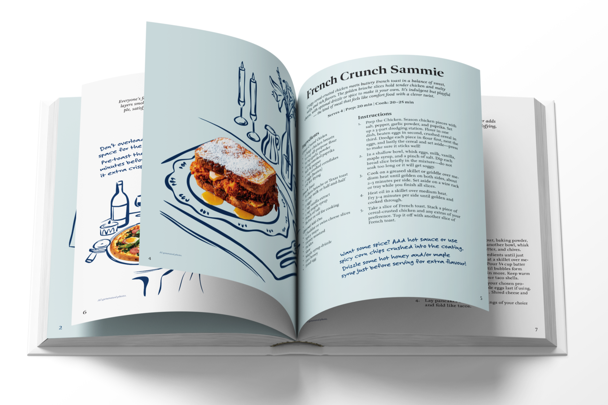
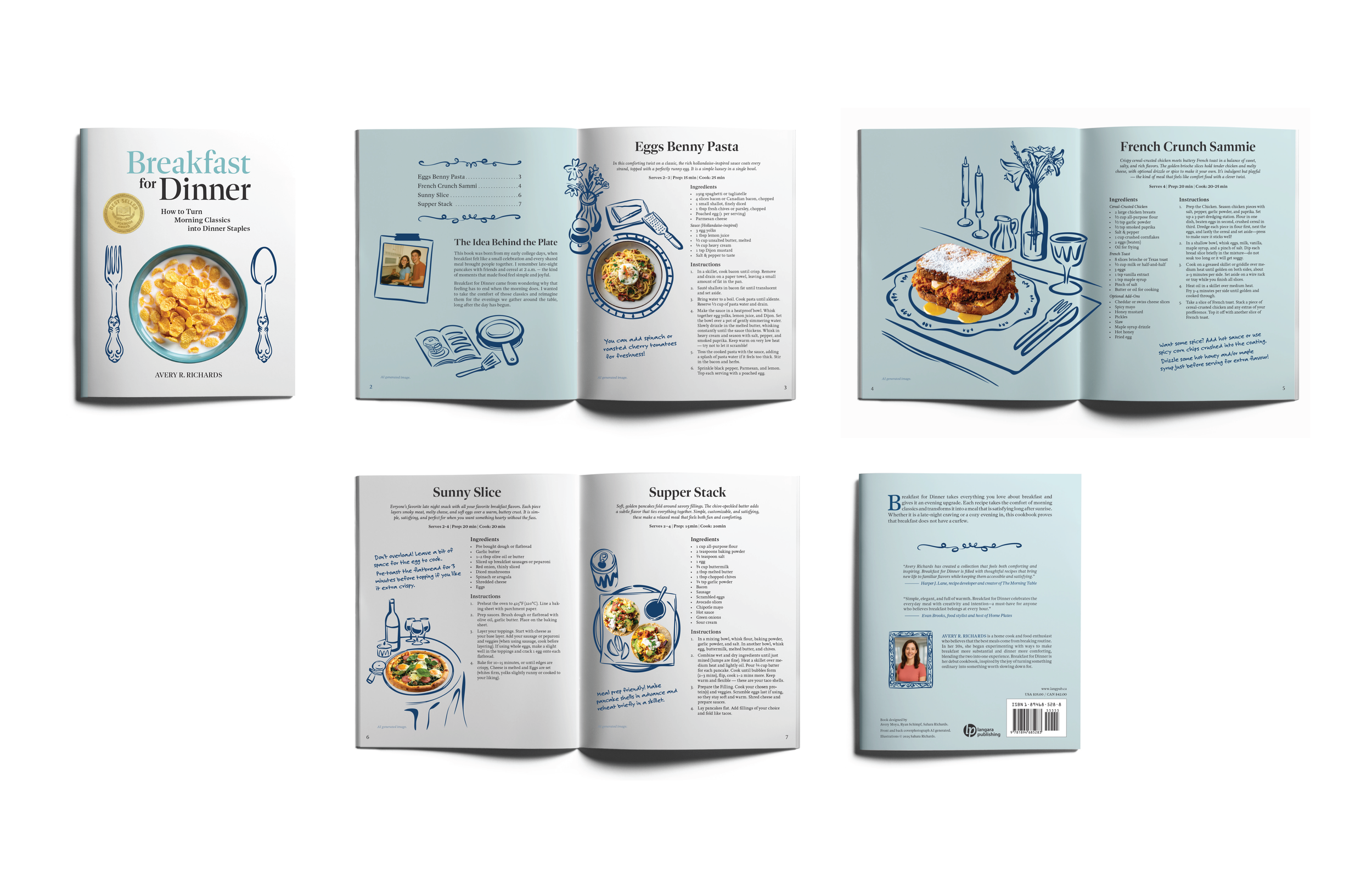
Our team aimed to reintroduce breakfast foods as dinner-appropriate meals by reworking familiar dishes with a twist. The visual direction was inspired by recipe annotation. This reflects the process of adapting and personalizing existing recipes.
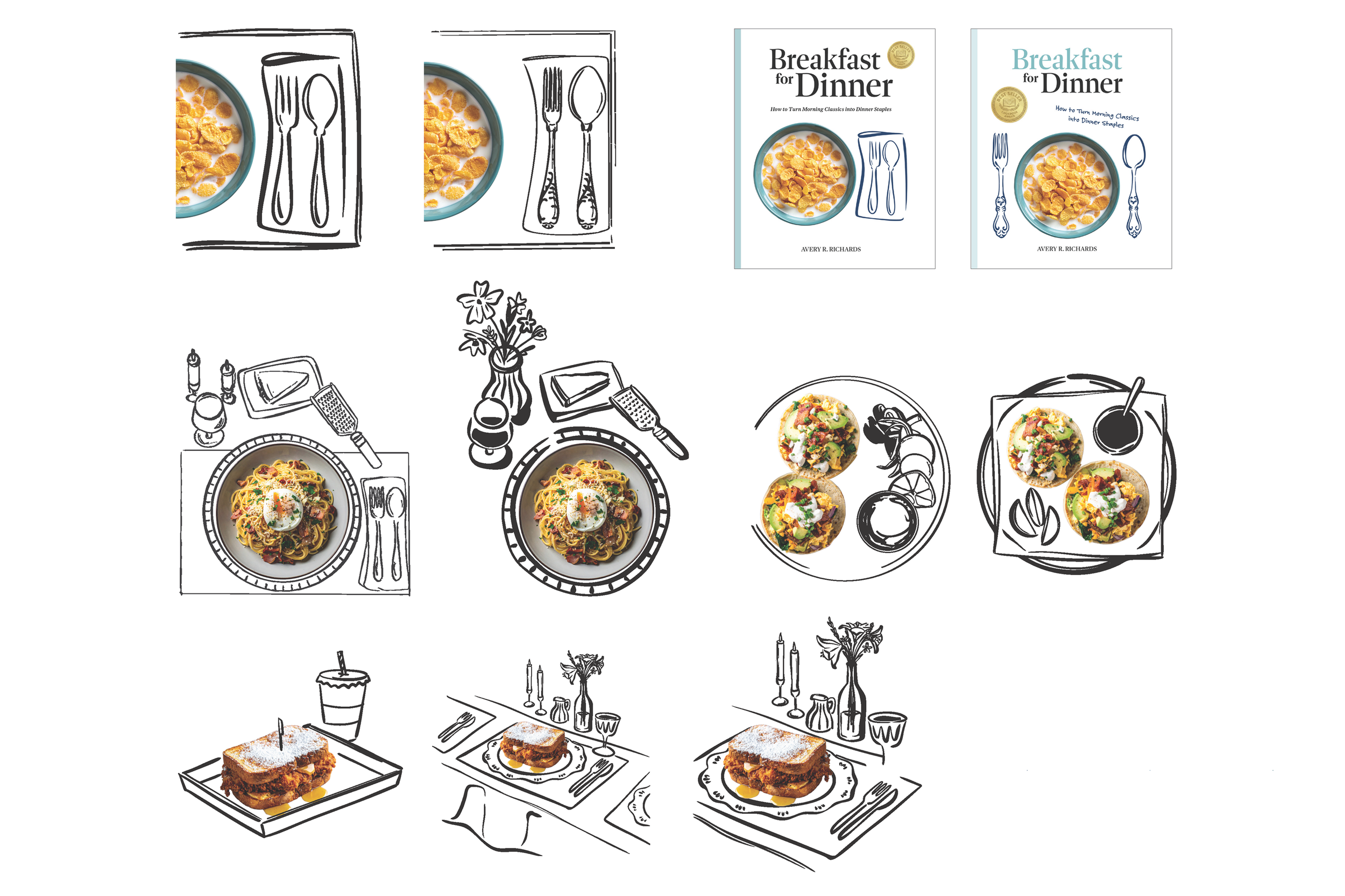
I was responsible for the illustration. The challenge was to maintain the warmth and familiarity of breakfast while clearly distinguishing it from a typical breakfast cookbook. Through an annotation-inspired style, I drew table settings unique to each dish to create an elevated, dinner-like context. As a team, we also focused on strong visual hierarchy to support clarity in text-heavy layouts. The palette was limited to shades of blue to maintain cohesion and avoid visual clutter.
-
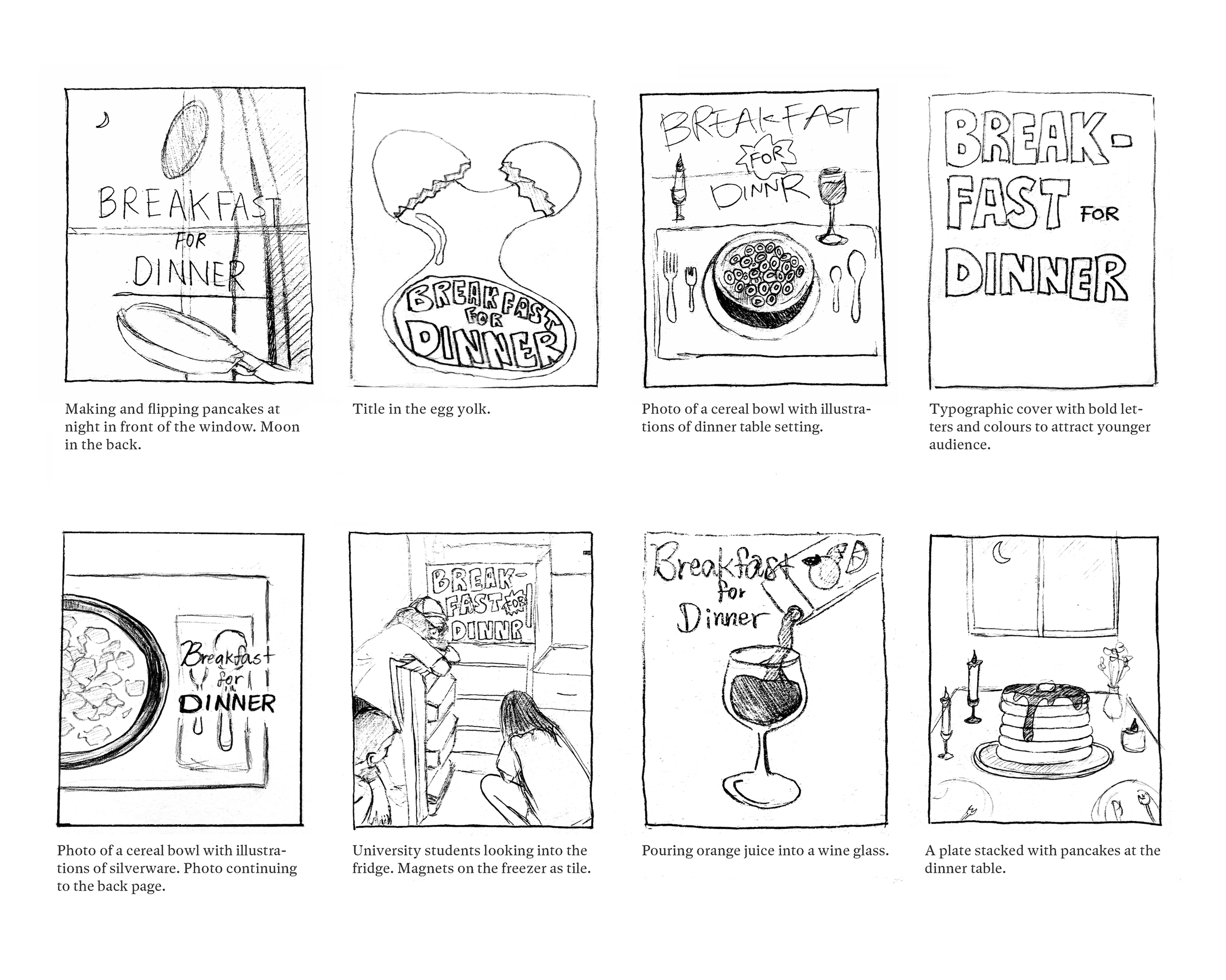
![Sketches of signs and scenes related to breakfast and dinner, including a cereal bowl, university students by a fridge, pouring orange juice into a wine glass, and a plate of stacked pancakes.]()
Cover Ideas
-
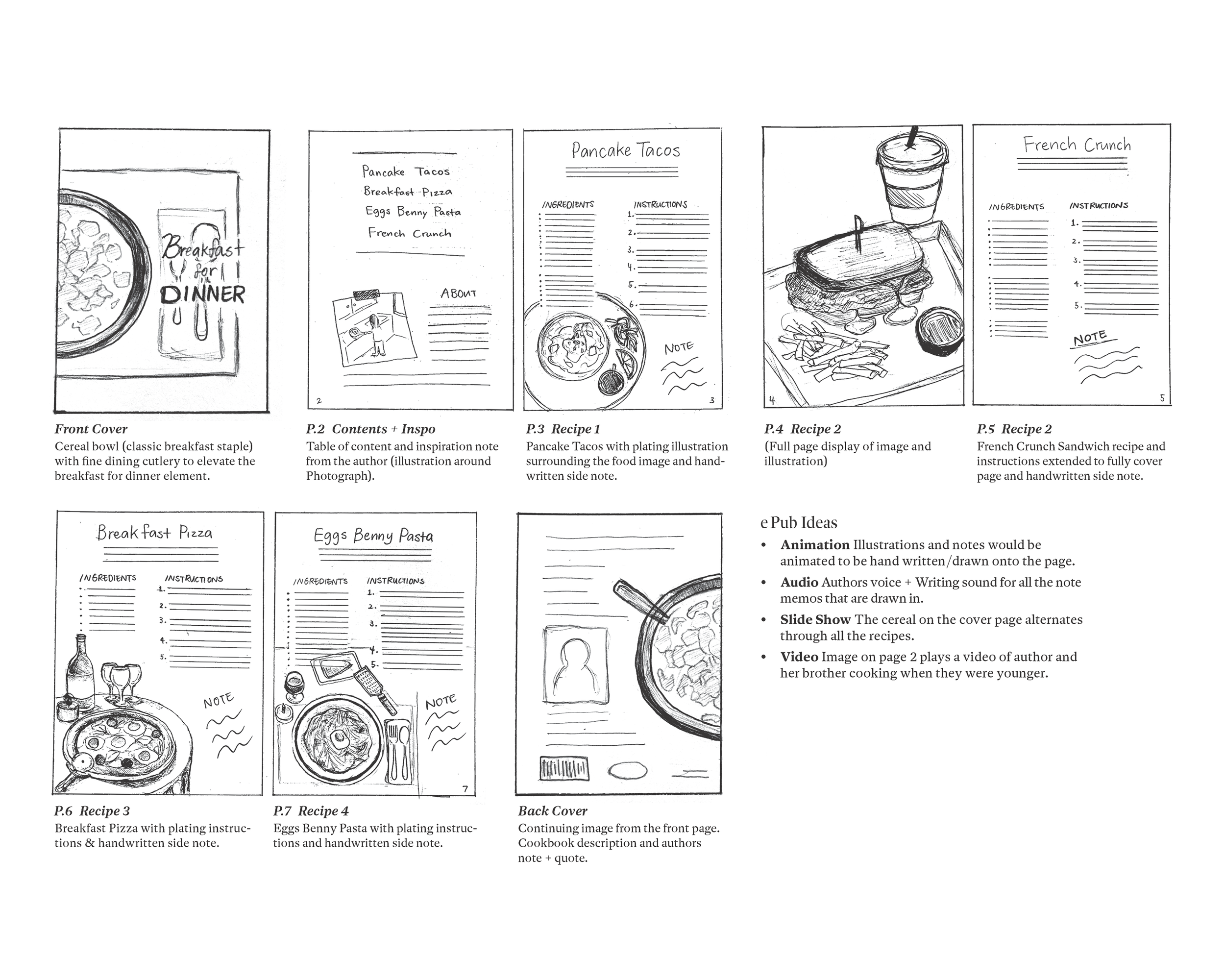
![Sketch of a cookbook page with recipes for breakfast foods, including a cereal bowl, a pizza, pancake tacos, eggs Benny pasta, and French crunch sandwich. Handwritten notes and illustrations accompany each recipe.]()
Map-out
-
![The image features illustrations of a dining setup and food, including two books titled 'Breakfast for Dinner' by Avery R. Richards, one with a blue cover and one with a white cover. The books have illustrations of cereal and cutlery on their covers. There are also printed illustrations of plates of spaghetti with sauce and a poached egg, as well as sandwiches, tableware, and decor items such as candlesticks and flowers.]()
Illustrations
-
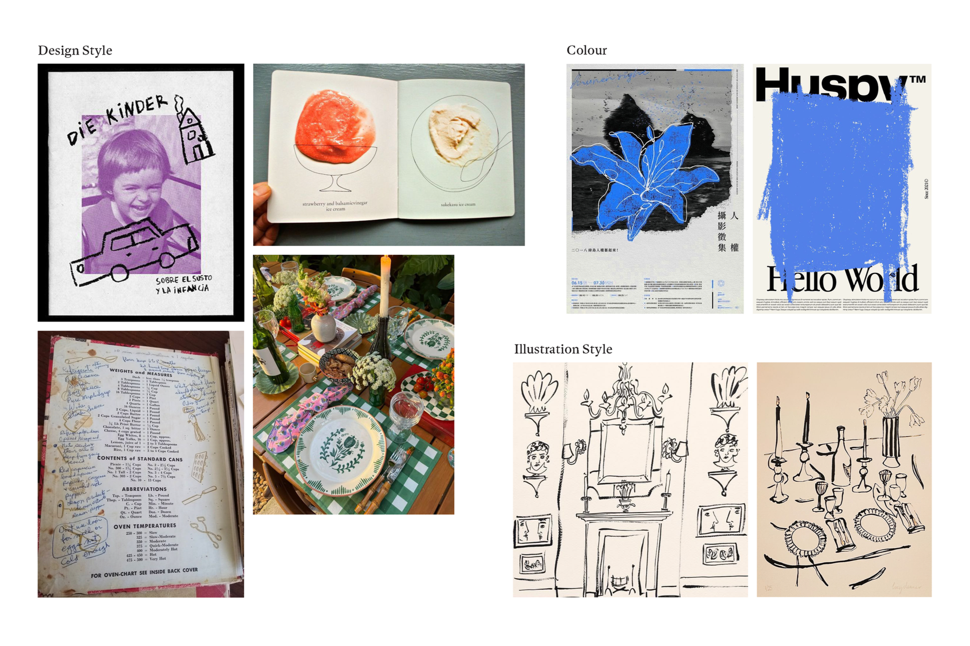
![Collage of various images including a child's drawing with a car and house, a photo of an open sketchbook with strawberry and sakésasu ice cream, a picture of a decorated table with plates, flowers, and candles, a recipe page, a poster with abstract blue and black artwork, and black and white sketches of interior decor and candelabras.]()
Mood Board
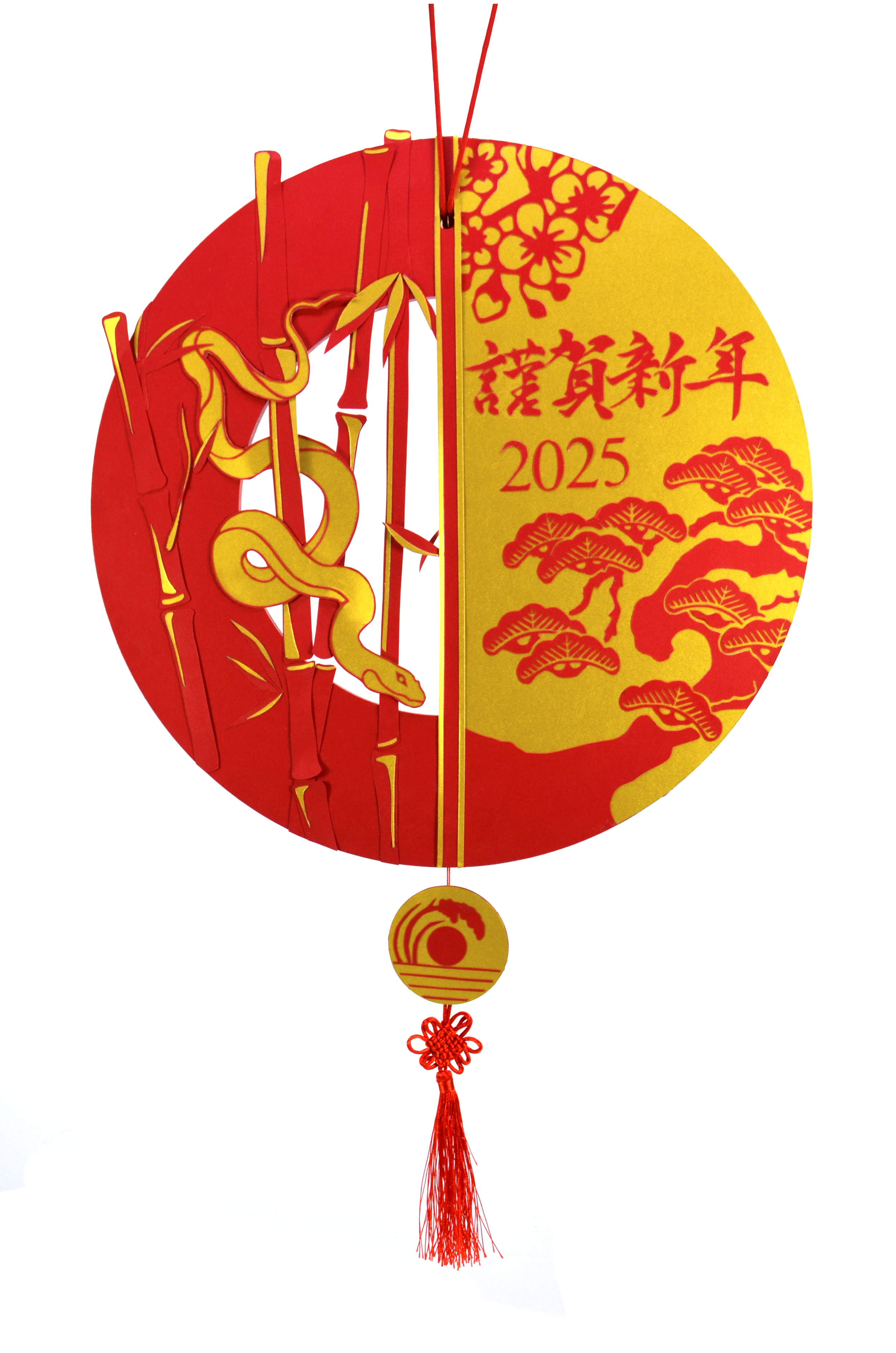
Lunar New Years Wreath
Paper Cutting | Experiential Design
Project Objective: Researching the multitude of meanings held
within the visual cliches and motifs of Lunar New Year, hand craft a decorative wreath executed in traditional Asian paper cutting techniques.
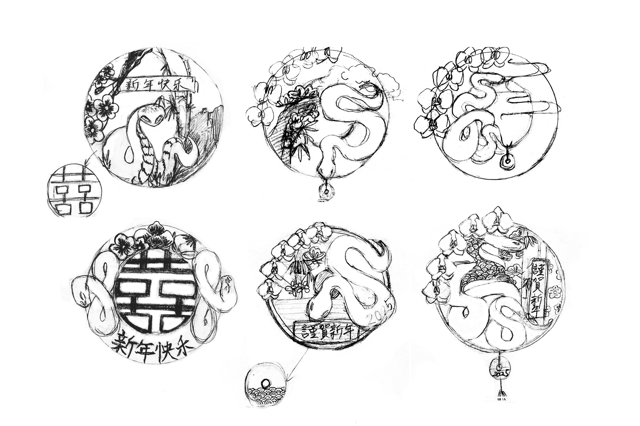
Wreath Sketches
I created a Lunar New Years wreath with my own unique twist. To showcase my culture, I integrated Japanese motifs. The challenge was to implement meaningful elements cohesively. Throughout process, I questioned every design choice, asking exactly why a specific motif, layout, or pattern was necessary.
Parklet Design
3D Model | Architecture | Graphic Design
Software Used:
-Sketchup (3D Modelling)
-Layout (Plan Presentation)
-Illustrator (Artwork)
Project Objective:
1) Design a Parklet using 3D modelling and 2D drawing tools, while exploring design principles and spatial awareness concepts.
2) Place the Parklet in a public setting and create graphics related to the design while carefully choosing text for different environments.
Environmental Graphics
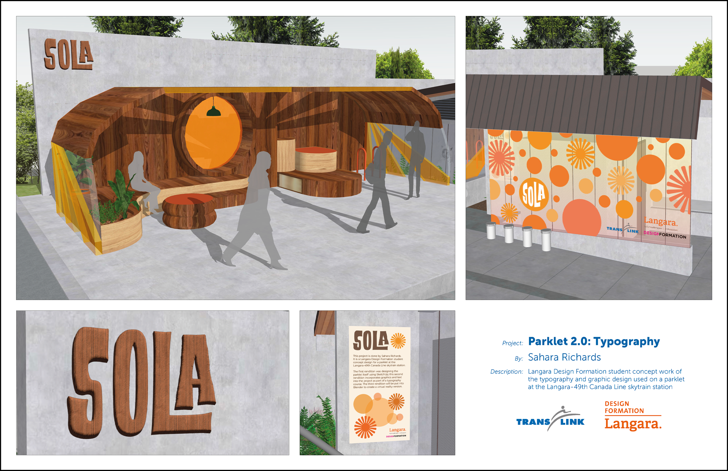
Parklet Plans
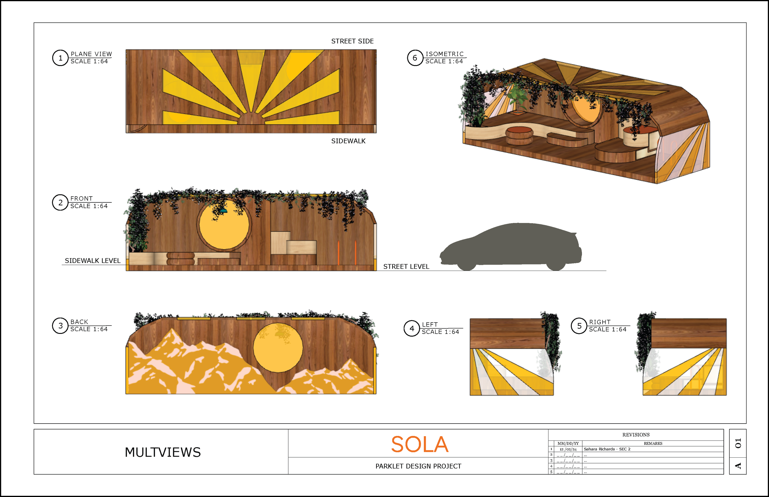
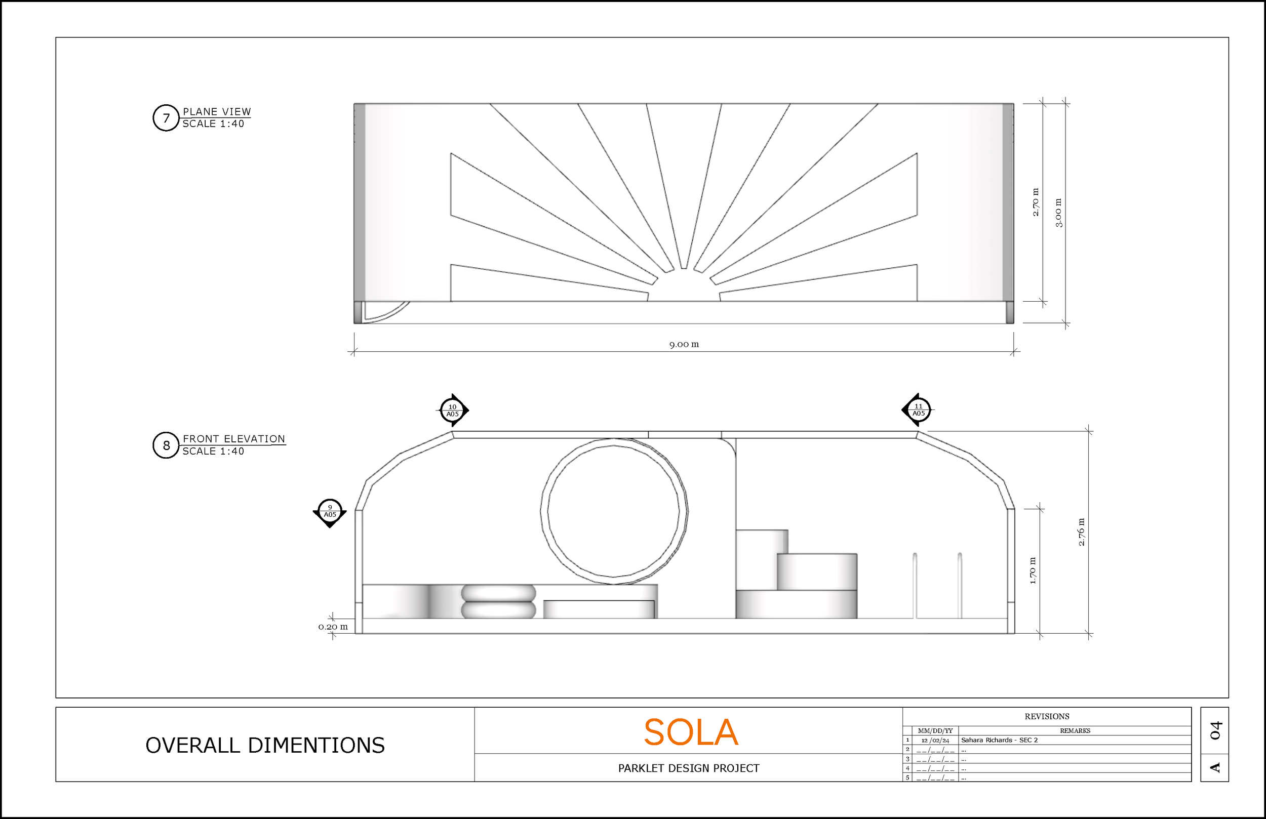
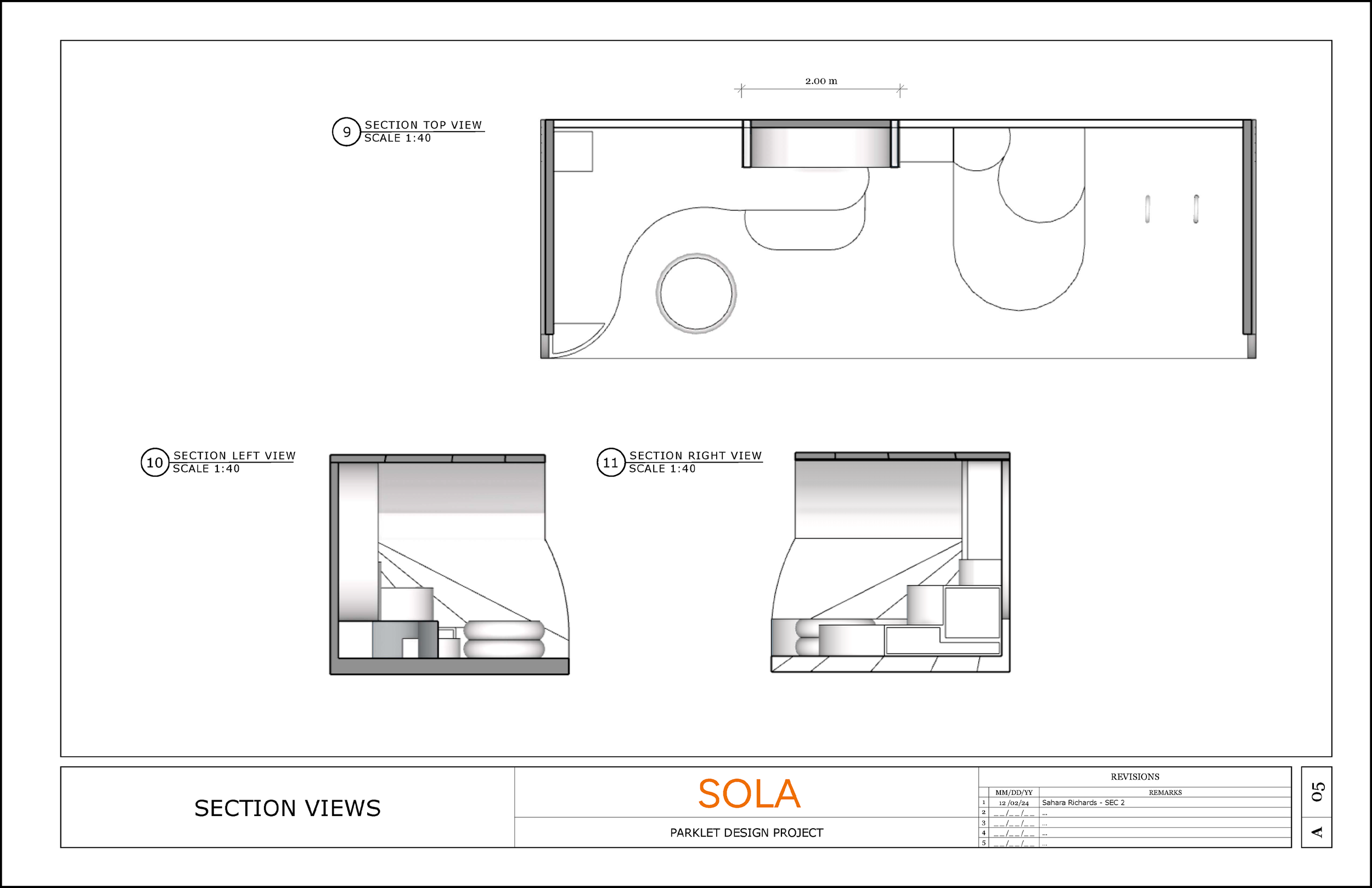
In the first phase, I designed a functional parklet that provides shelter during Vancouver’s rainy season. The focus was on creating a physical structure that responds to a clear community need.
For the environmental graphics, the goal was to introduce warmth and complement the structure. Through the use of colour and bold forms, my aim was to intentionally brighten the space and engage commuters.