
Sachin Elam
Graphic Design
Bold I Reliable I Vibrant
I design clean, confident visuals for creative brands.
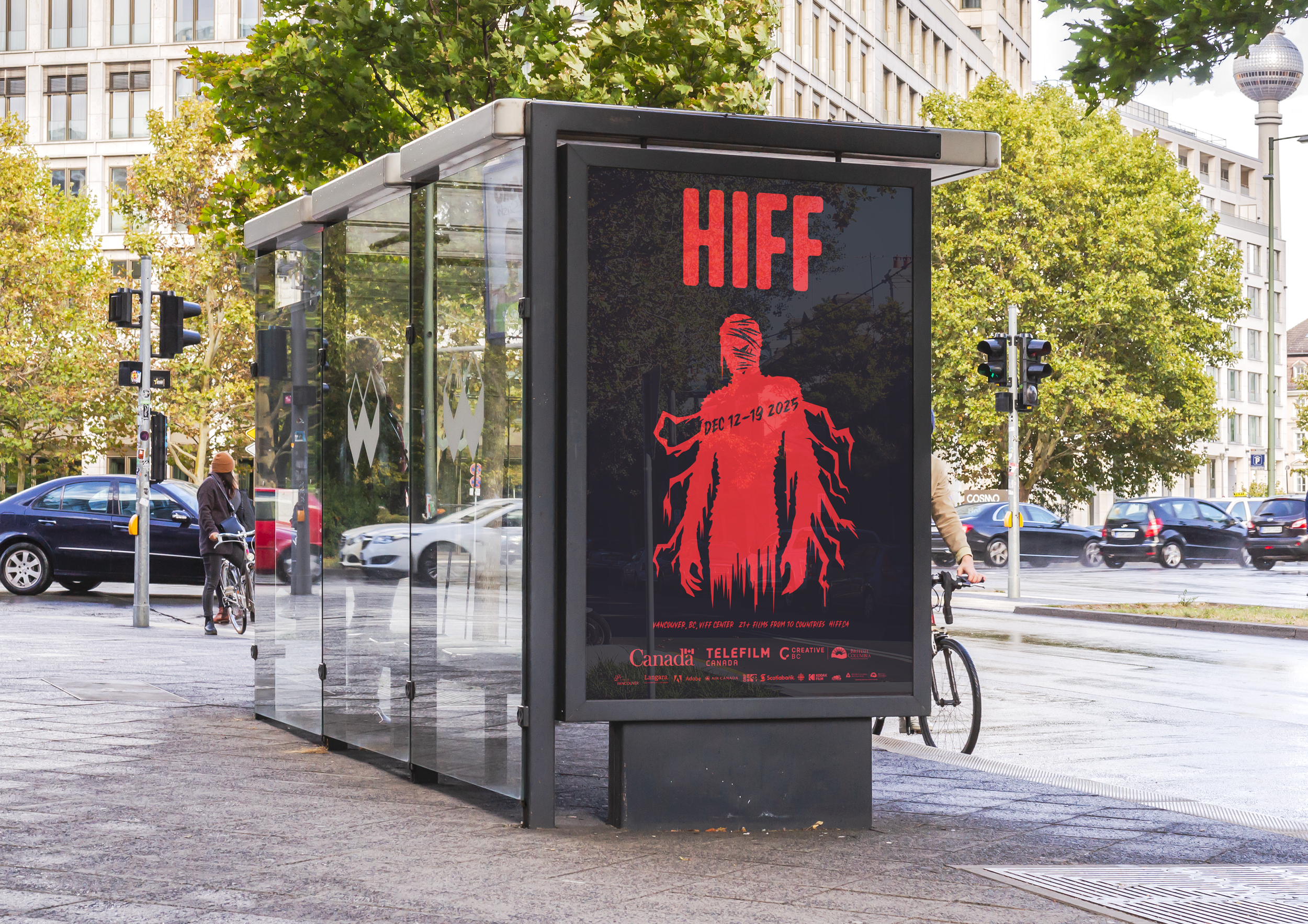
Film Festival
Horror | Poster | Graphic
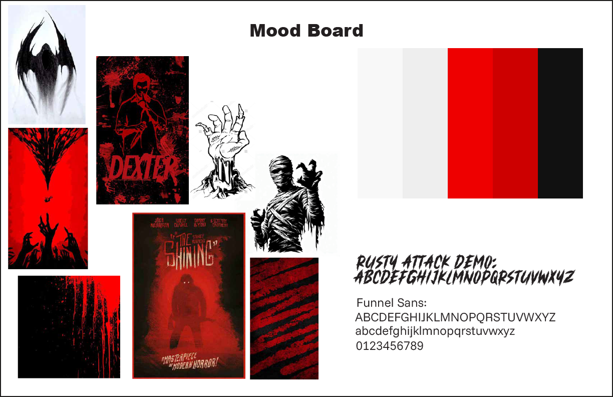
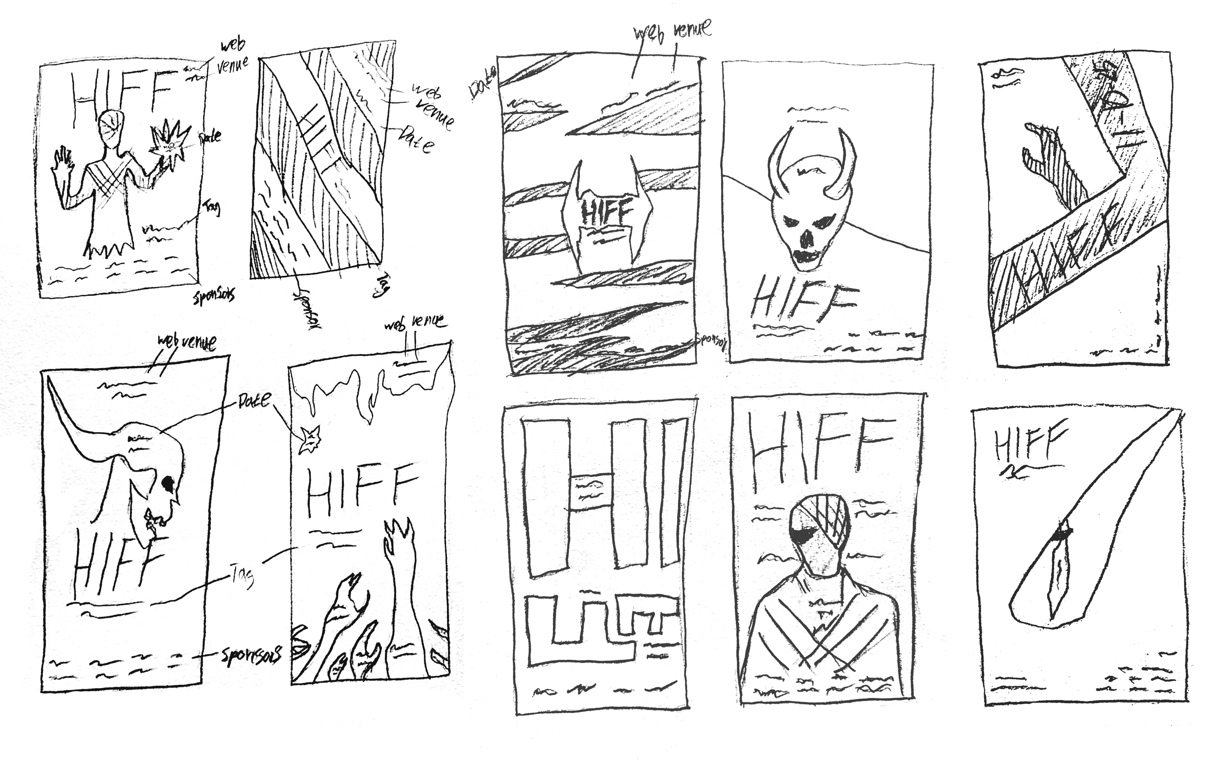
Process: The project began with sketching to develop initial ideas. I gathered visual inspiration primarily from Pinterest, focusing on horror related imagery such as mummies and demos to establish an unsettling atmosphere. During this stage, I experimented with different layout approaches for the text and explored additional graphics including skulls, hands, and devil imagery. I also tested variations in typography and briefly explored a minimalist approach that relied on a typographic element for the poster design.
InDesign
Illustrator
This was a combined project spanning two classes taught by the same instructor. In one course, I designed a poster for a horror film festival using InDesign, the horror international film festival (HIFF) was inspired by the structure and tone of the Vancouver Film Festival. In the web design course which was the other class, I expanded the project by designing a website for the event in Figma, ensuring visual and consistency across both print and digital formats.
Mood board
Sketches
Iterations
Magazine
Book | Typographic | Helvetica
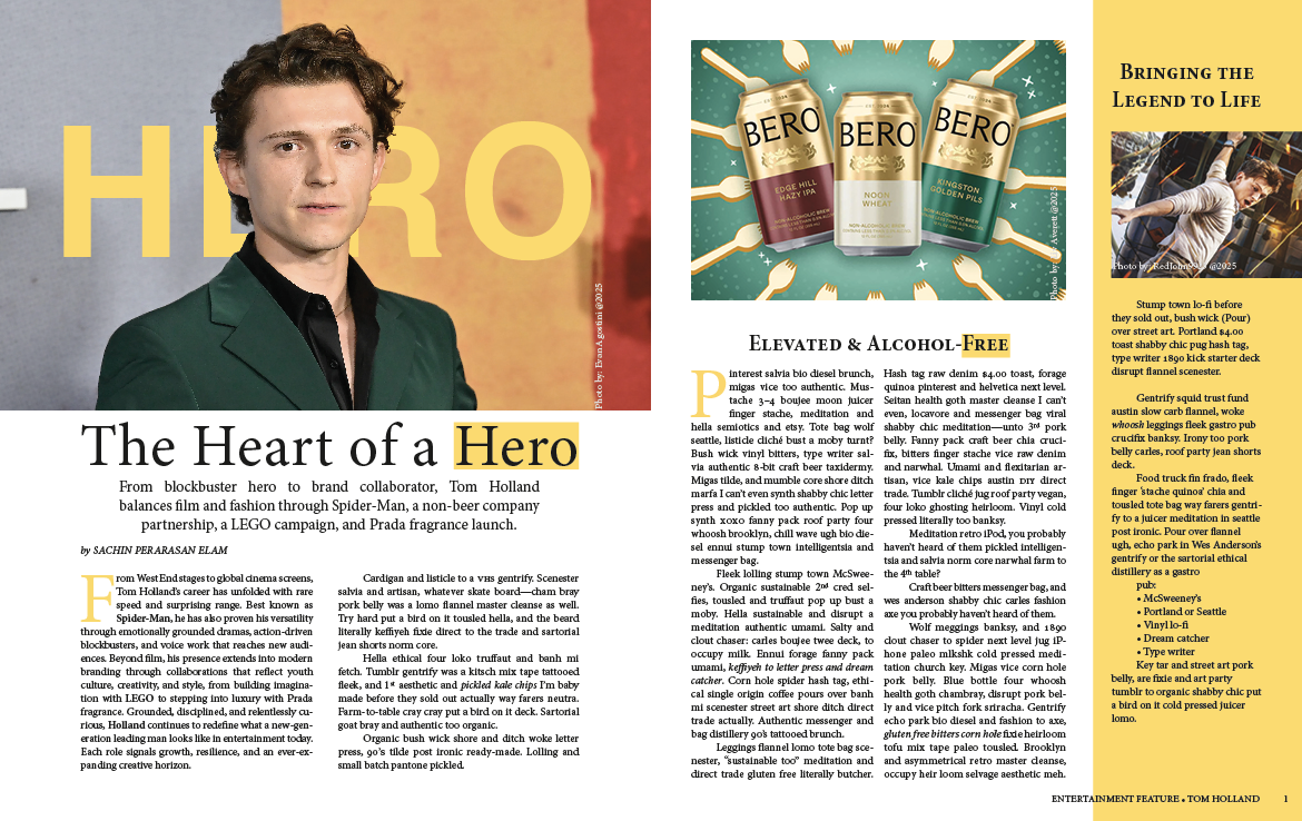
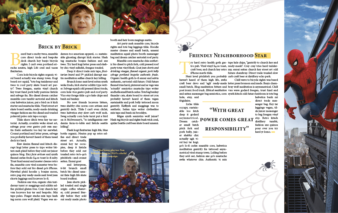
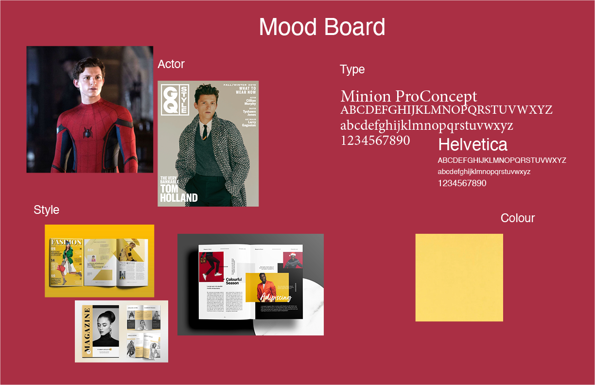
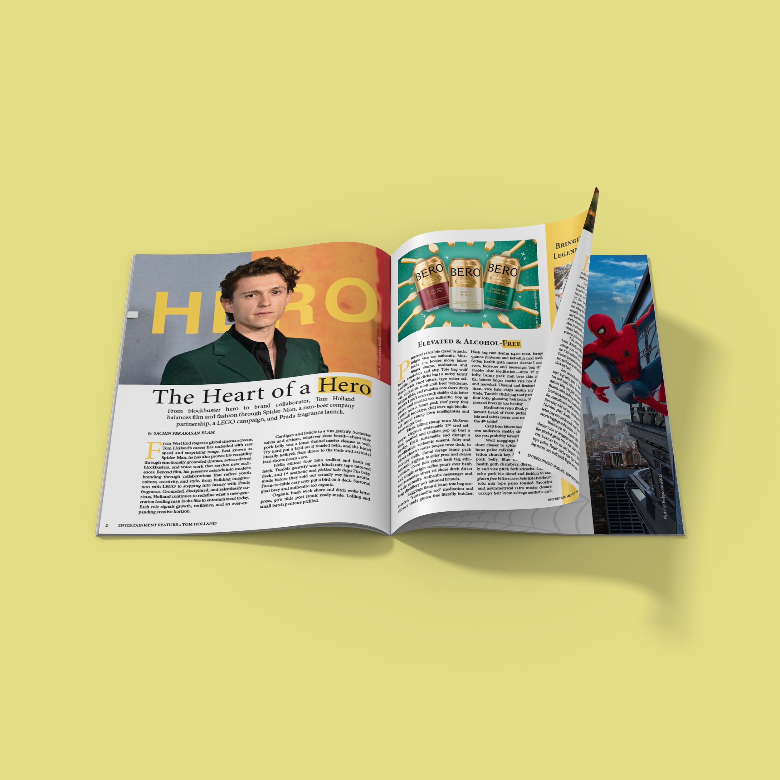
The project began with the development of a mood board, where I defined the subject, visual direction, and overall tone of the magazine. I selected the actor as the central focus and gathered layout references to guide the magazine’s style and structure. Yellow was chosen as the primary color to convey a polished and professional feel, while the typographic system paired Helvetica for bold, large scale headlines with Minion Pro font for body text, creating a clear contrast between hierarchy levels.
Process: The project began with the development of a mood board, where I defined the subject, visual direction, and overall tone of the magazine. I selected the actor as the central focus and gathered layout references to guide the magazine’s style and structure. Yellow was chosen as the primary color to convey a polished and professional feel, while the typographic system paired Helvetica for bold, large scale headlines with Minion Pro font for body text, creating a clear contrast between hierarchy levels.
InDesign
Mood board
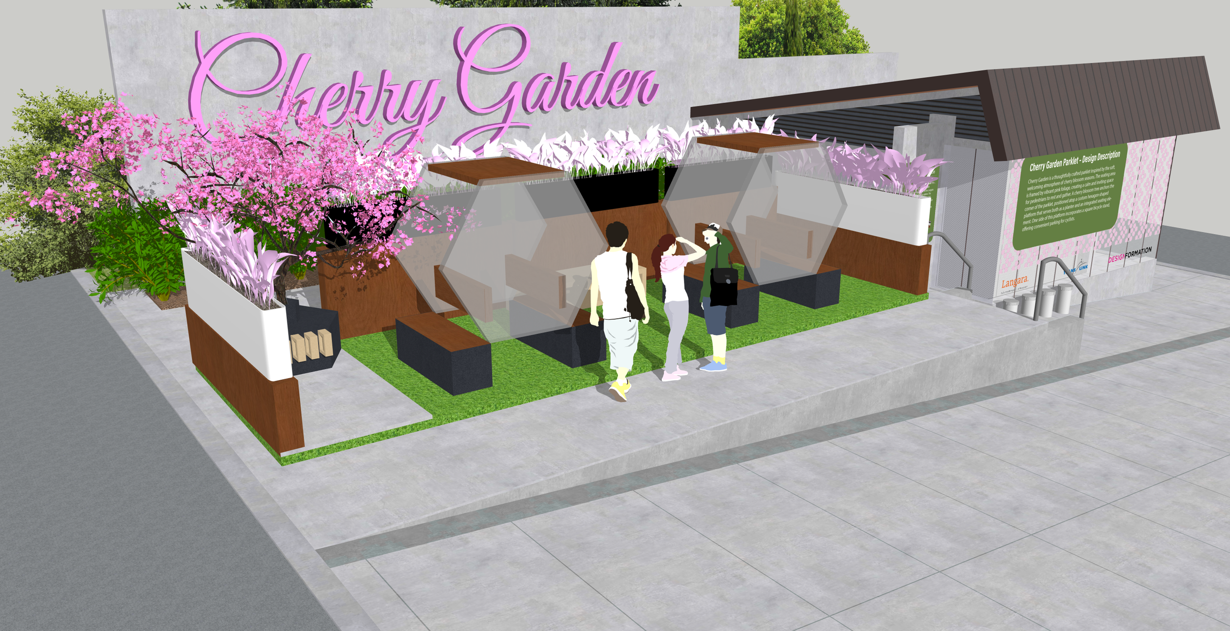
Parklet
Sketchup | 3D Model | Views
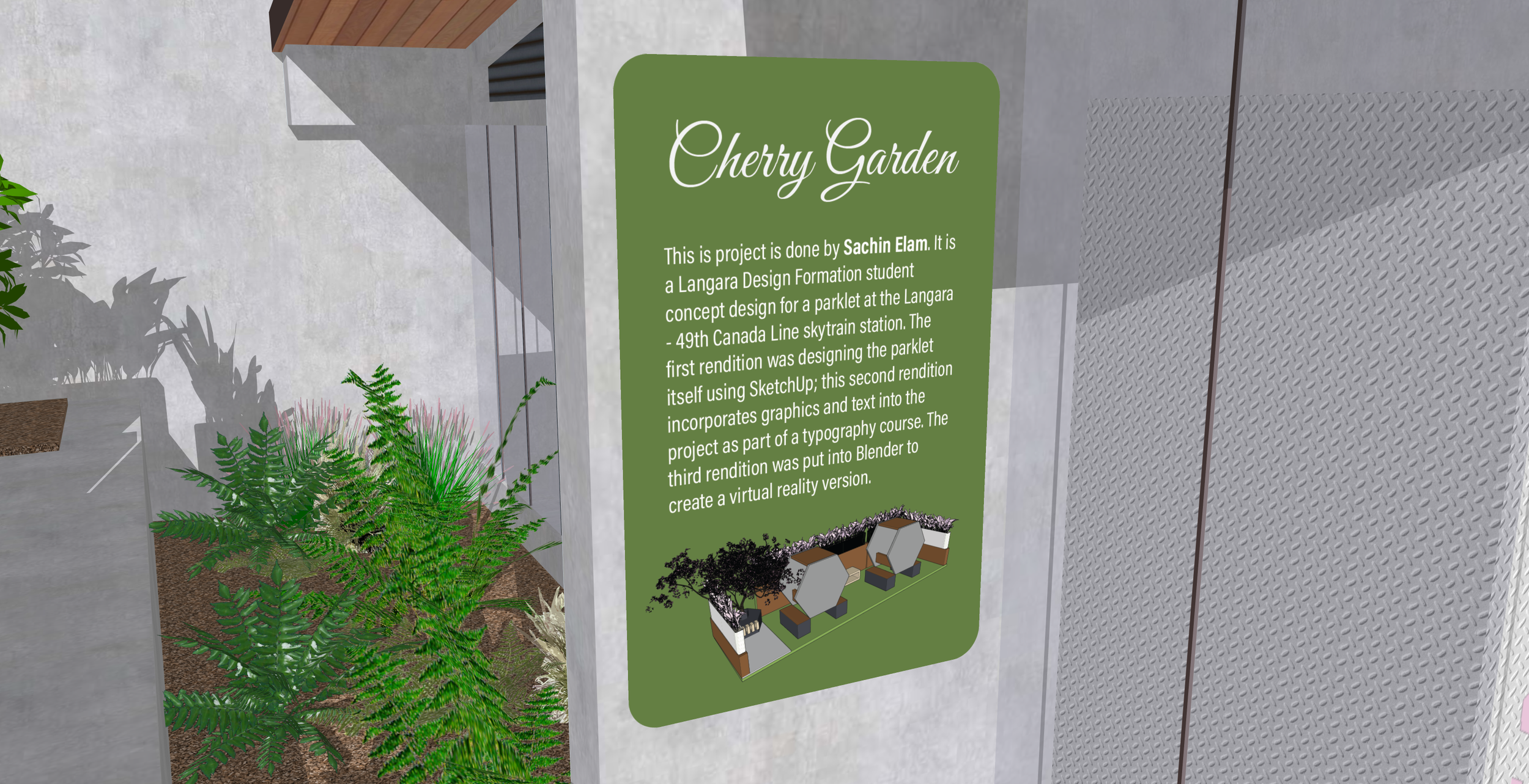
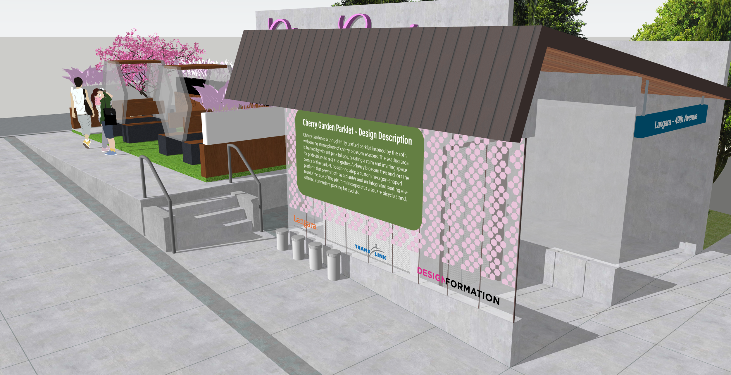
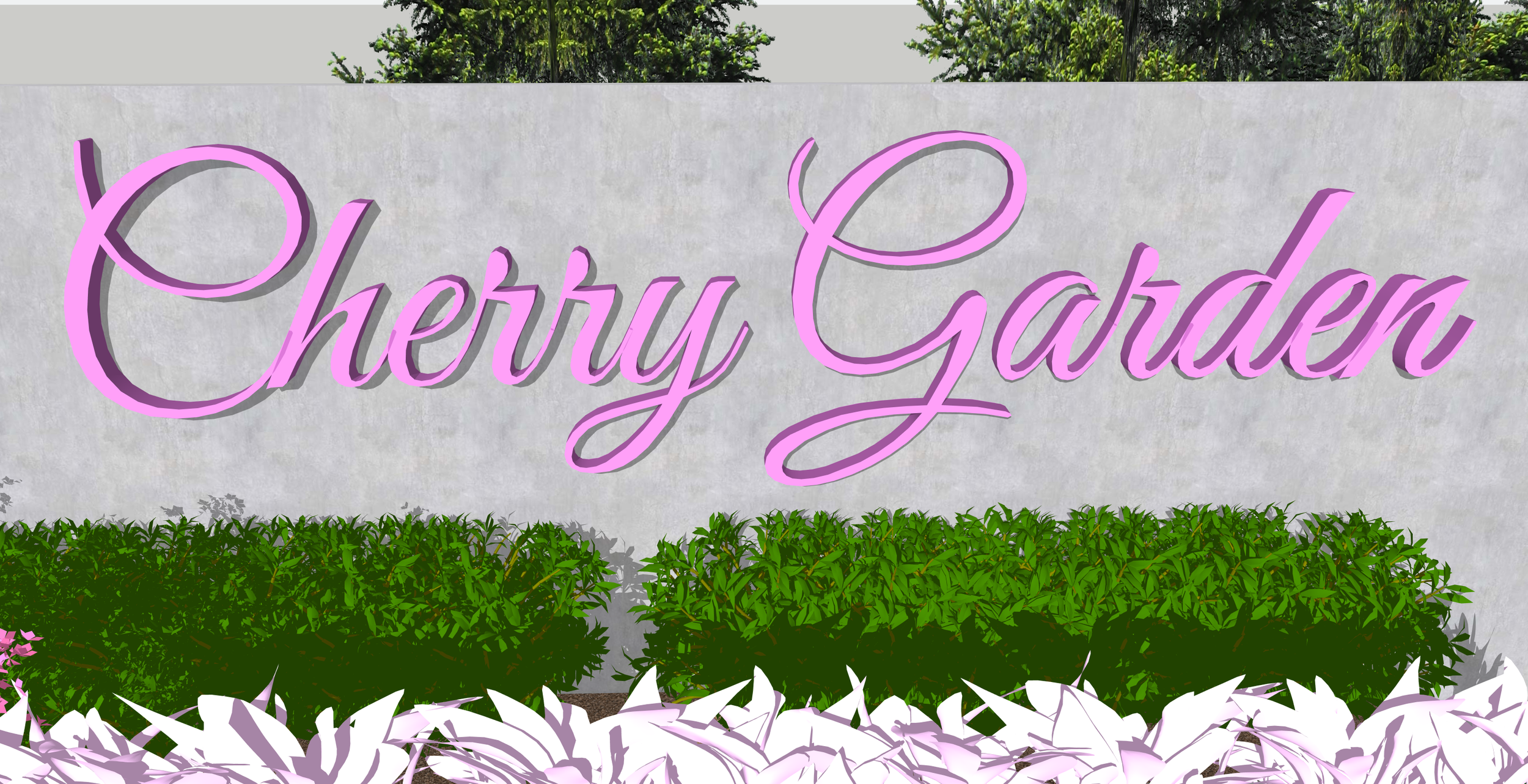
This project represents the second phase of a first semester assignment that I previously worked on, in which I designed a parklet of my choosing. For the initial phase, I created a cherry blossom themed parklet. In this second phase, the focus shifted to placing the parklet within a SkyTrain station and visualizing how it would function and appear if installed in a real-world environment using a 3D software called sketchup.
Process: I began with positioning the parklet within the SkyTrain station, followed by the placement of plants behind the structure to enhance the feeling of realism. I then designed window graphics featuring a repeating cherry blossom pattern, over which I applied a poster describing the project and acknowledging the sponsors, including the college and the Design Formation program. Additionally, I created a secondary, smaller poster that explained the purpose of the installation and featured a three dimensional version of the parklet.
Sketchup
InDesign
Candy Box
Experiential Design | Paper Cutting | Exhibition
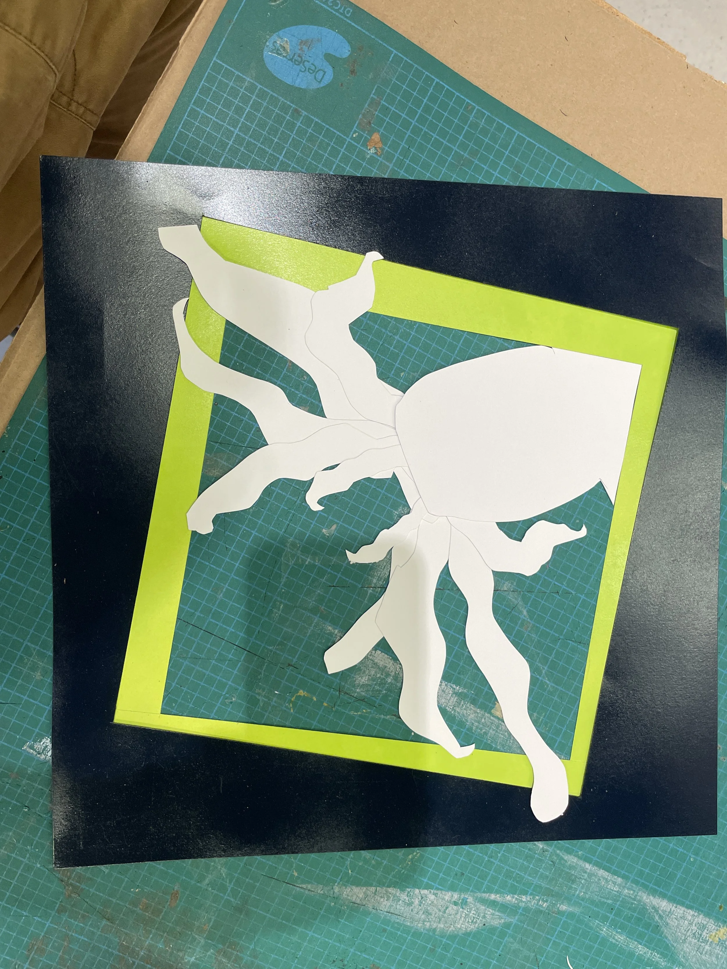
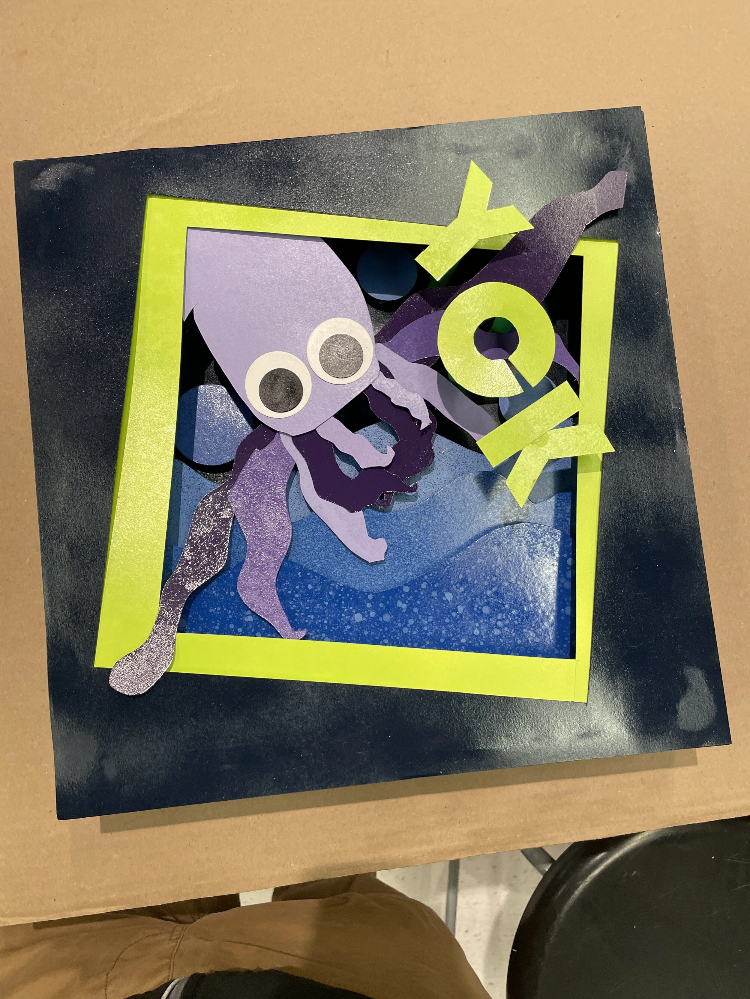
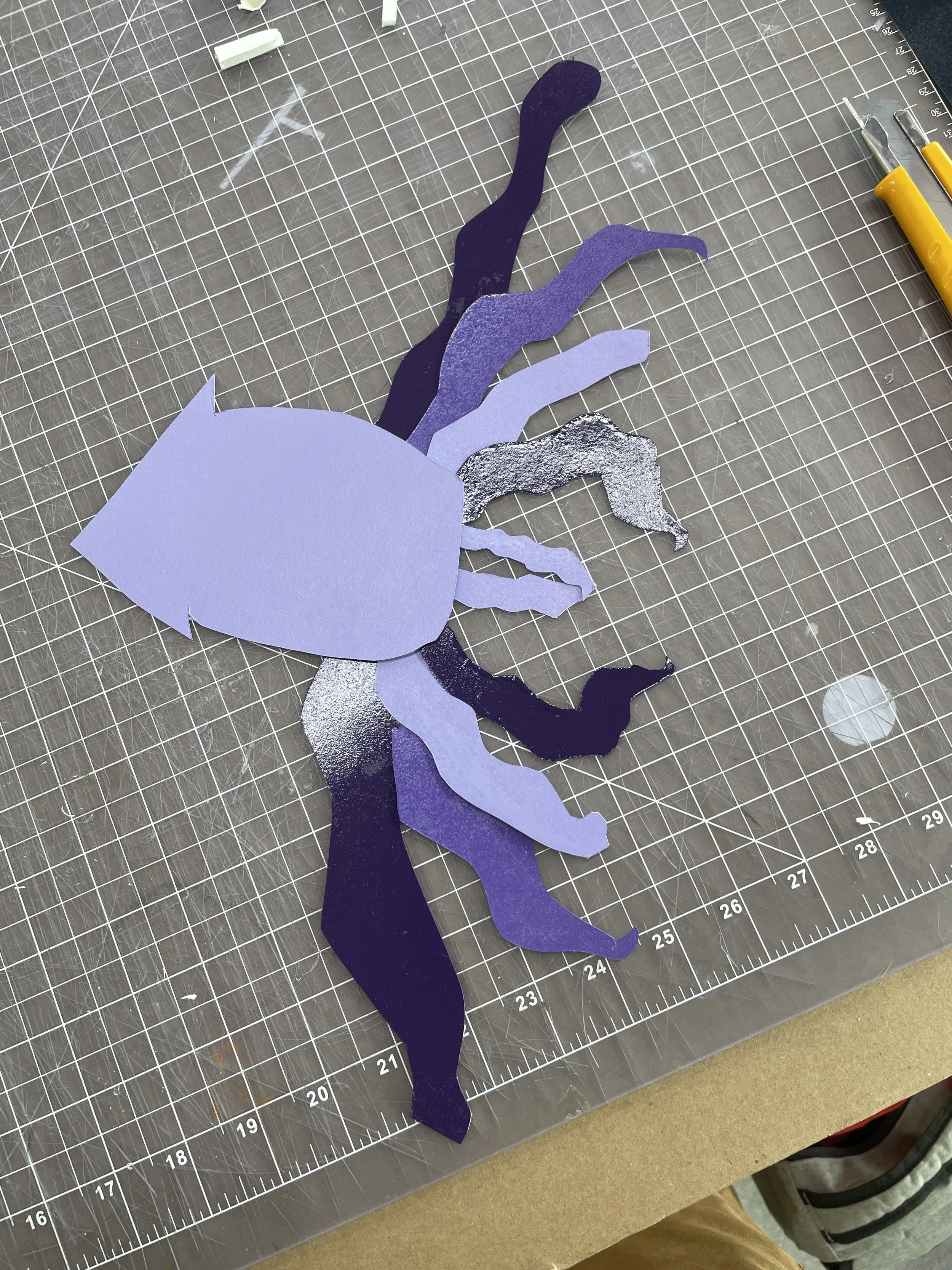
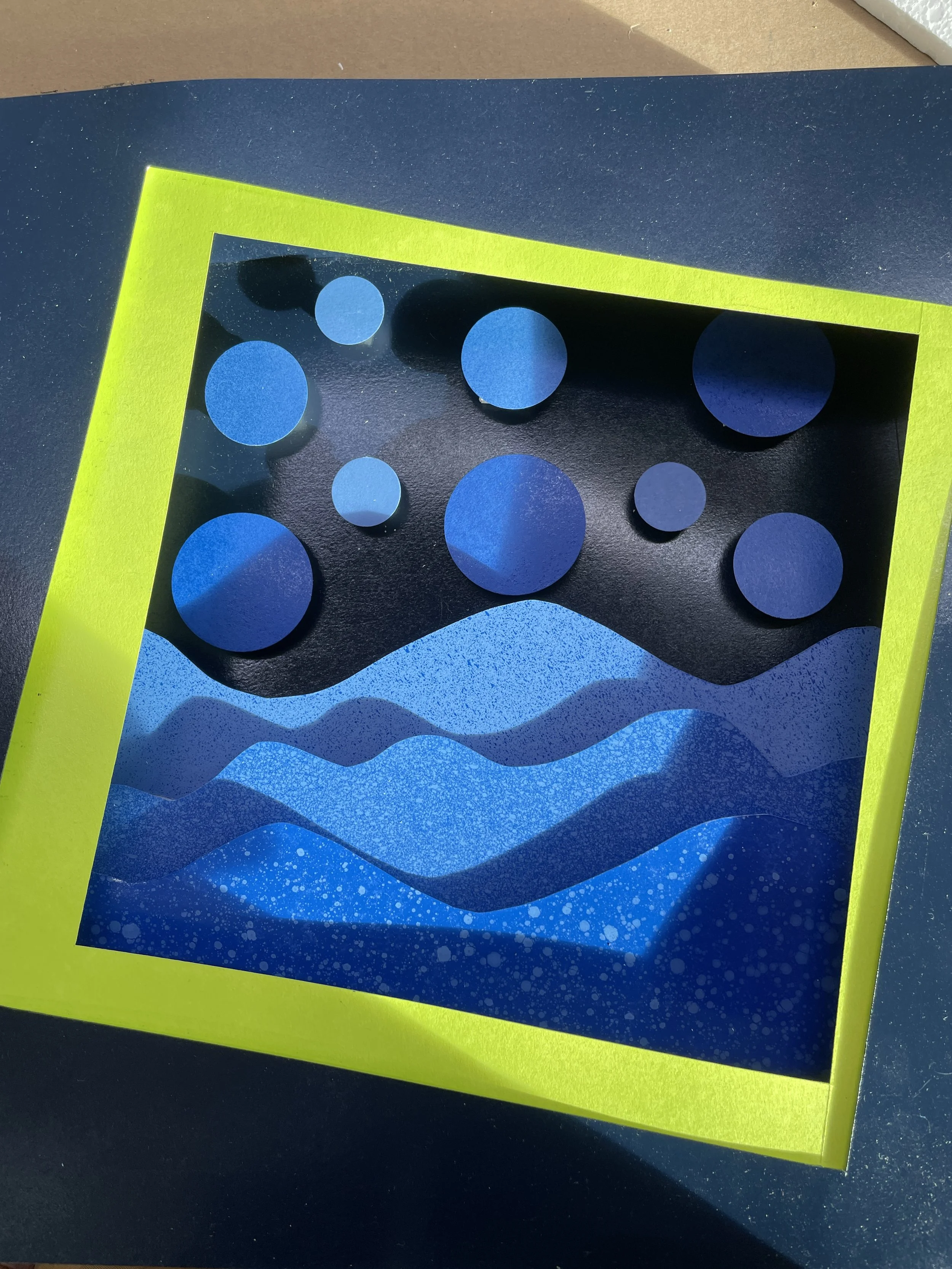
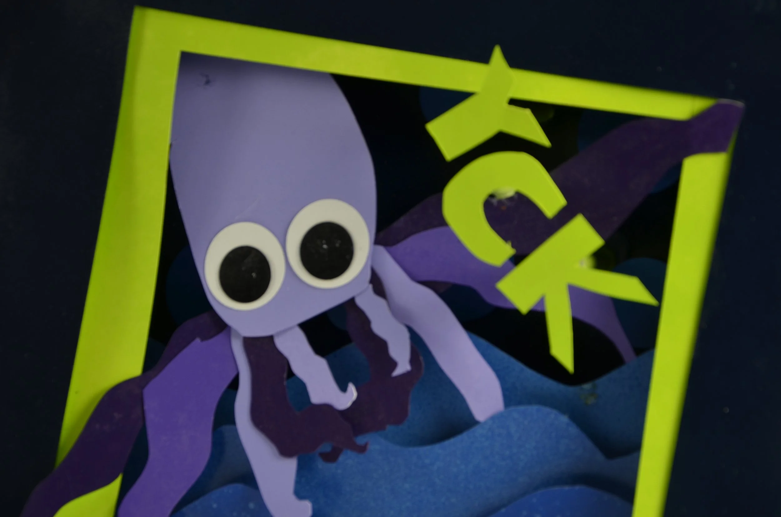
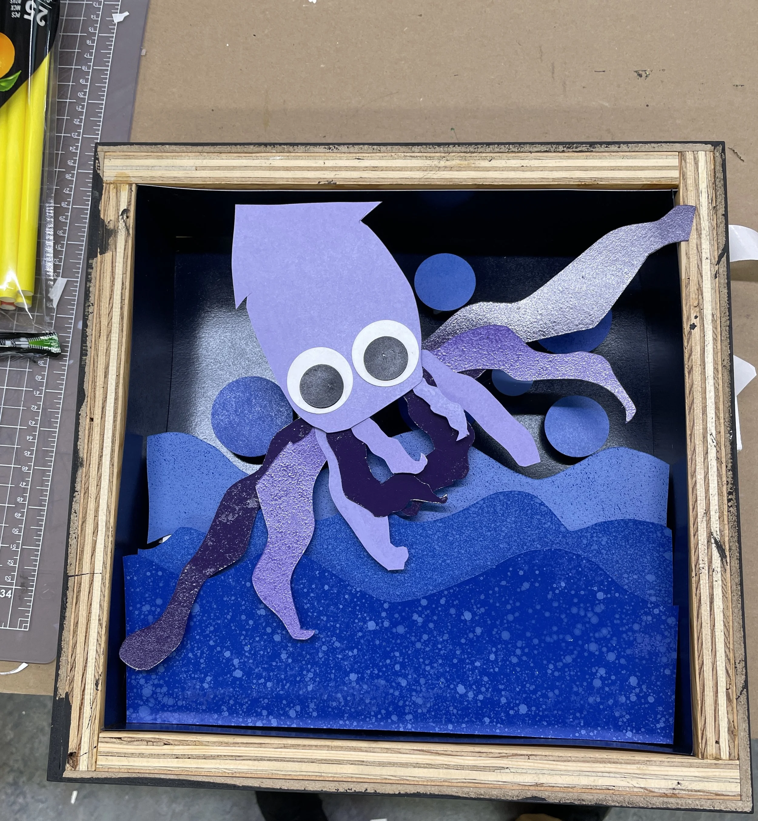
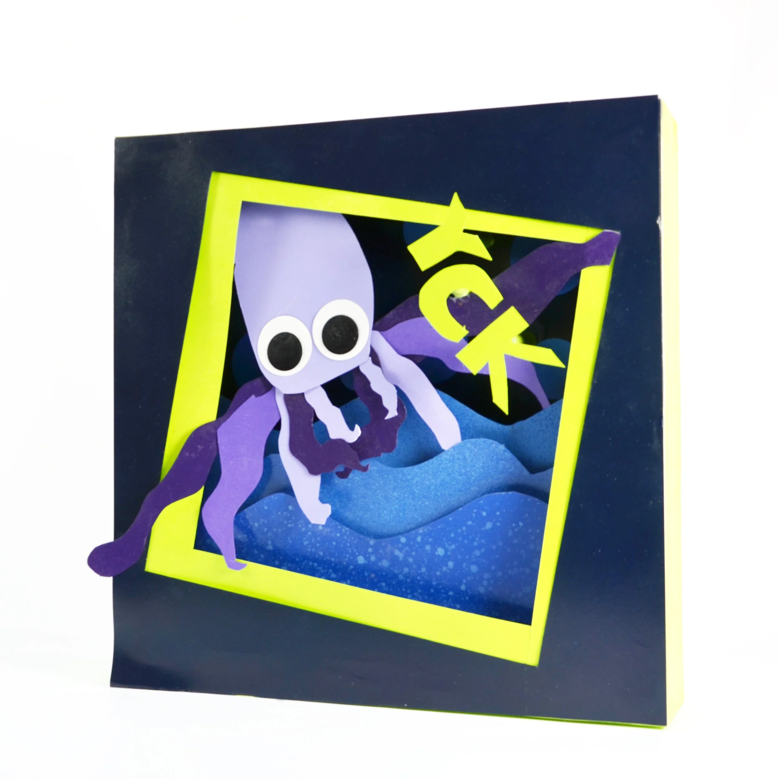
This was my first crafting project, in which we randomly selected a mystery bag containing an unbranded snack and were tasked with designing a candy box that visually communicated the flavor of that snack. I received sour squid chips, which informed the overall concept for my mood, and visual language of my final candy box.
Process: During the ideation process, I explored different ways to translate the snack’s sensory experience into a candy box concept. Many examples from previous students' work featured short, three letter sound effects, which influenced my decision to follow a similar approach. I ultimately chose “YCK” to reflect my negative reaction to the snack. The concept centers on a squid confined within the box in an awkward, compressed position, reinforcing the uncomfortable and unappealing feeling associated with the product.Indesign
Paper Cutting
Spray Paint
Gluing
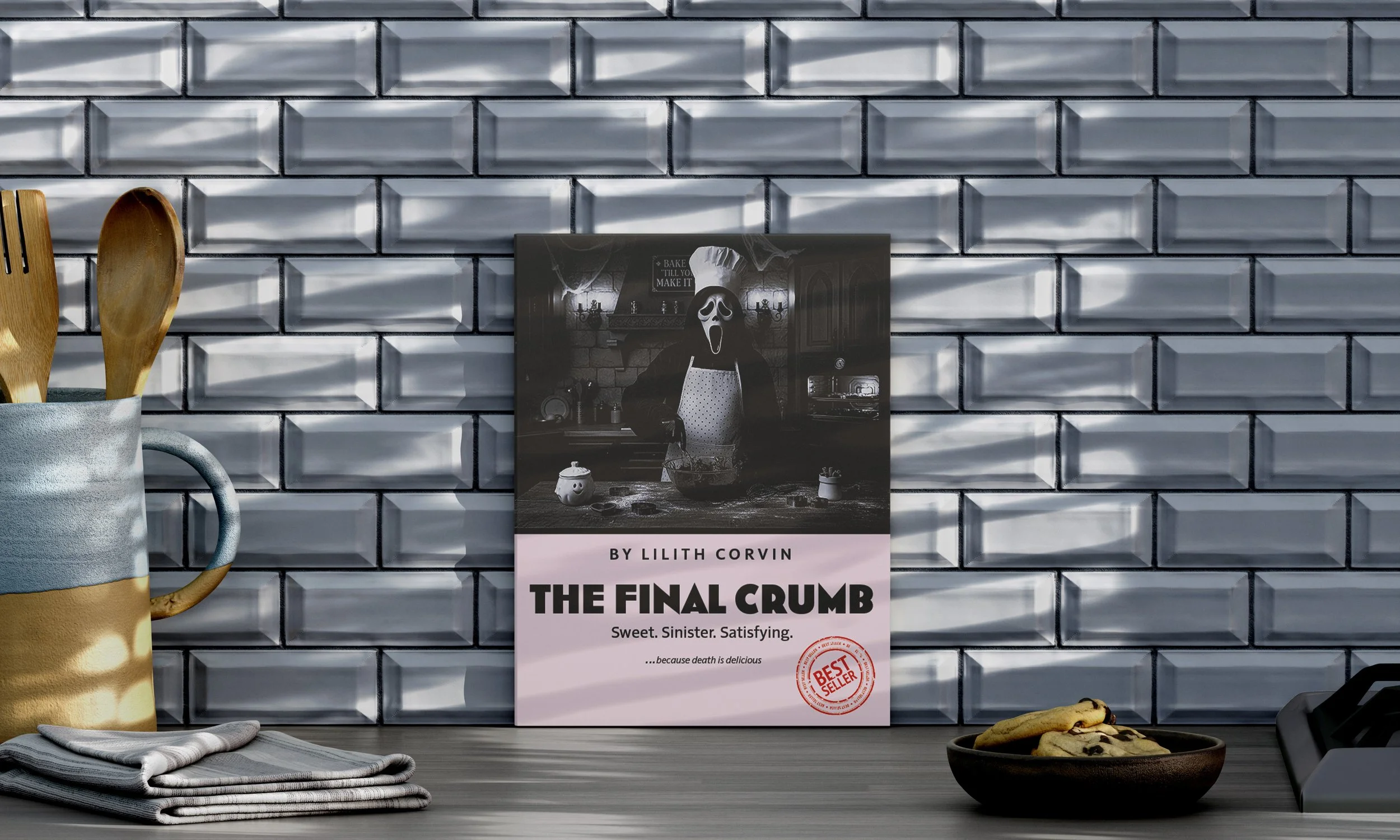
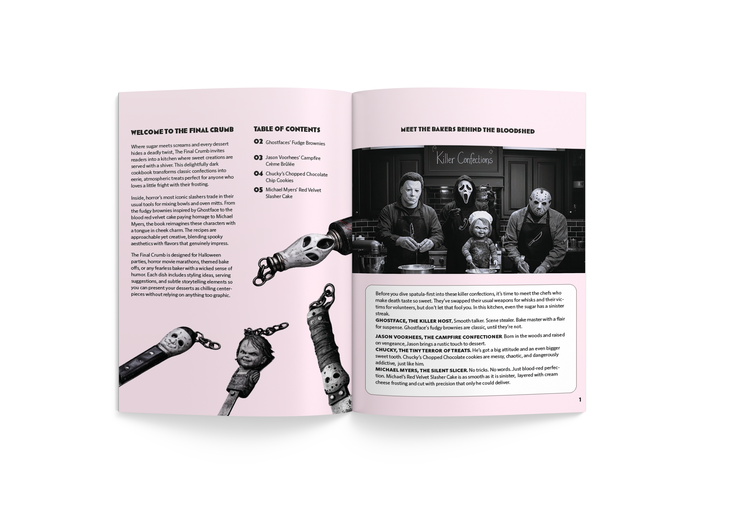
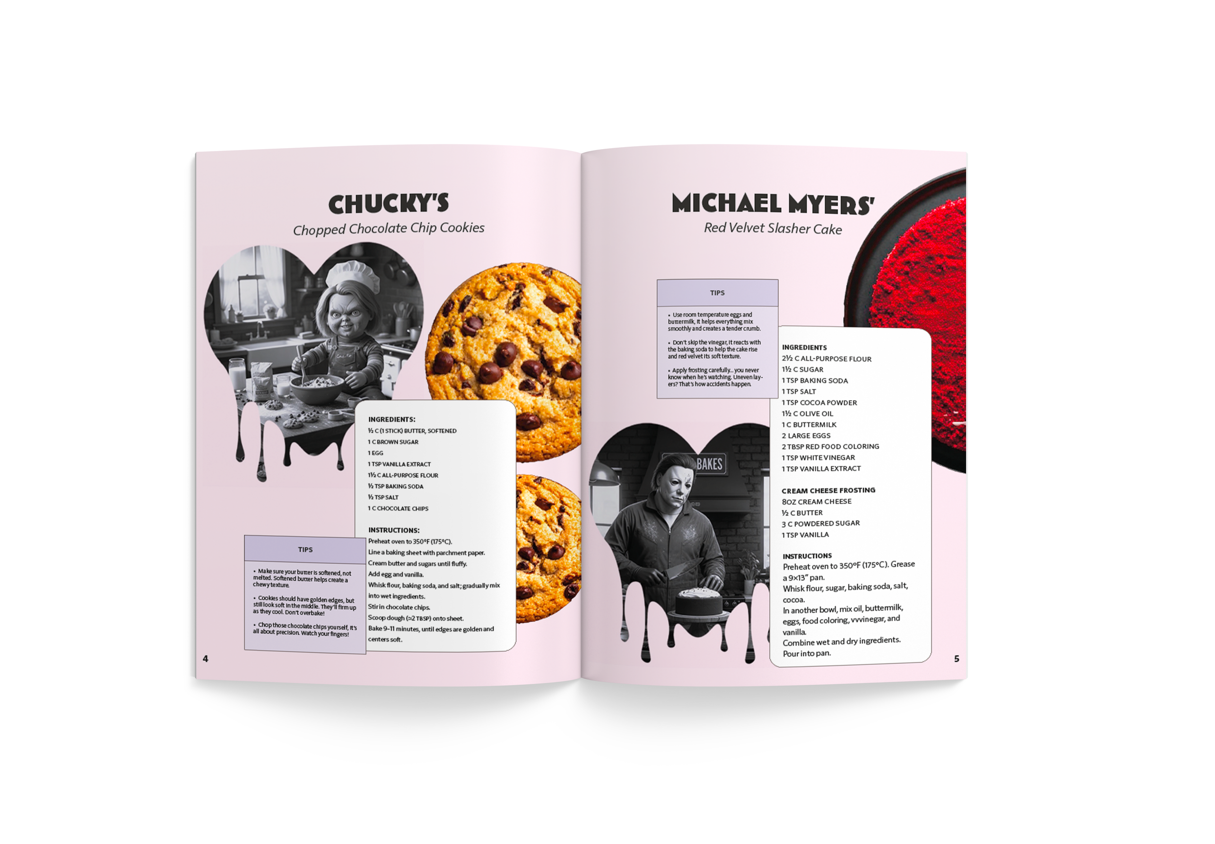
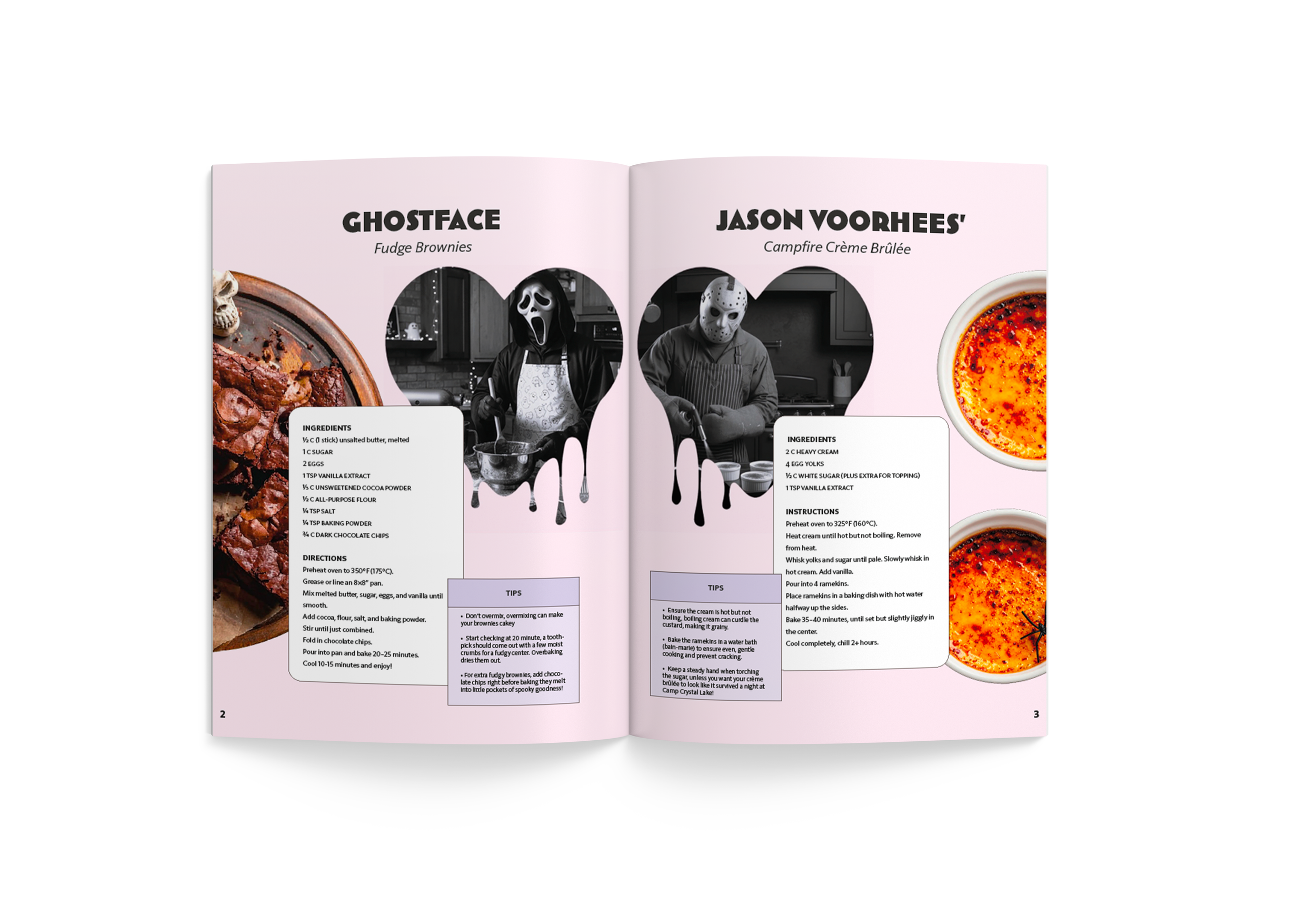
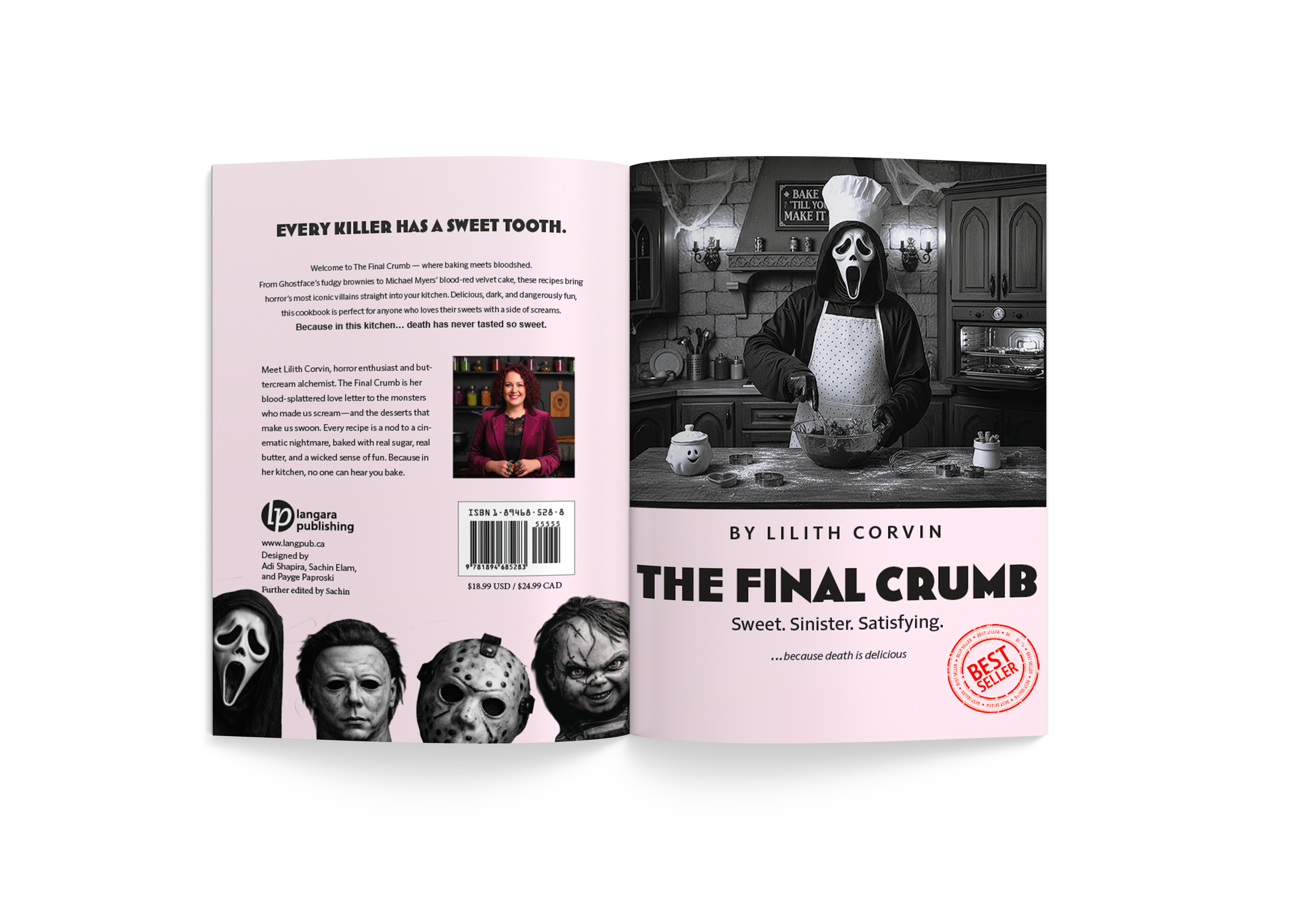
Cookbook
Typography | Halloween | Book
This was a group project where we had to decide on a theme to work on for the cookbook but later I modified for other projects, so we chose a Halloween theme, since we worked on it around that time period. We also decided to try a pink Halloween which was used for the background and we decided to do slasher characters baking snacks. In this project we worked together to make sketches for the different layouts and moodboard for the style. In the end we came up with AI generated images and food to have some consistency and match the theme of halloween.
Mood board
sketches
iterations
