Rheann Whelan

Spatial and Human‑Centered Designer
Fluid | Passionate | Supportive
I design with flow, drive, and intention. I bring a grounded perspective and create designs with purpose and presence.
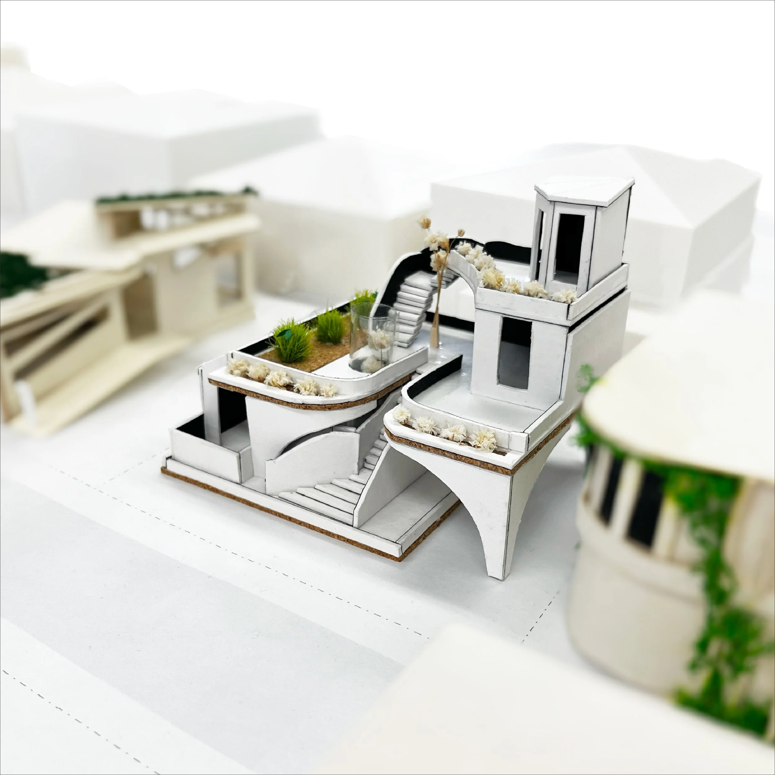
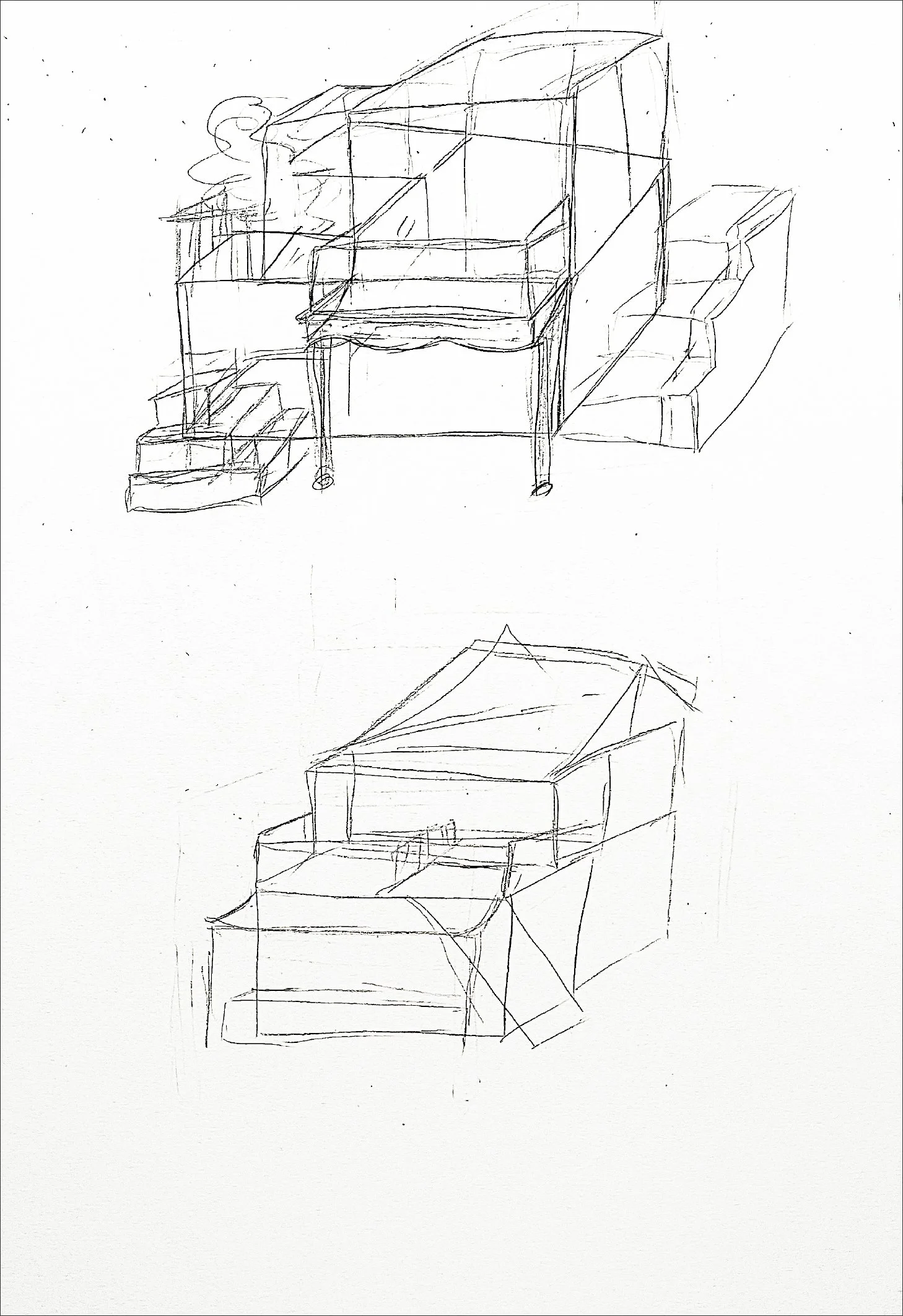
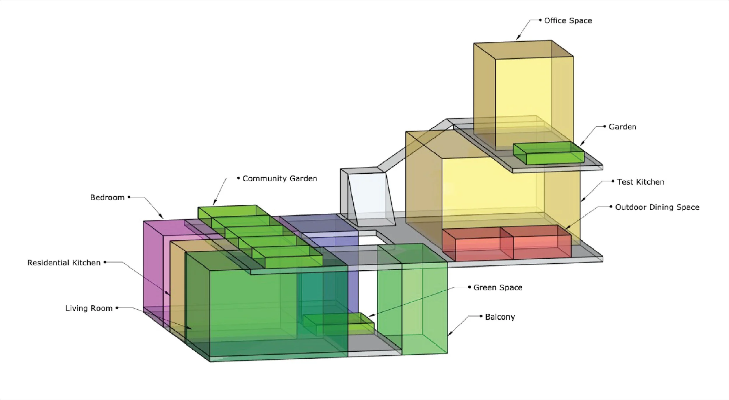
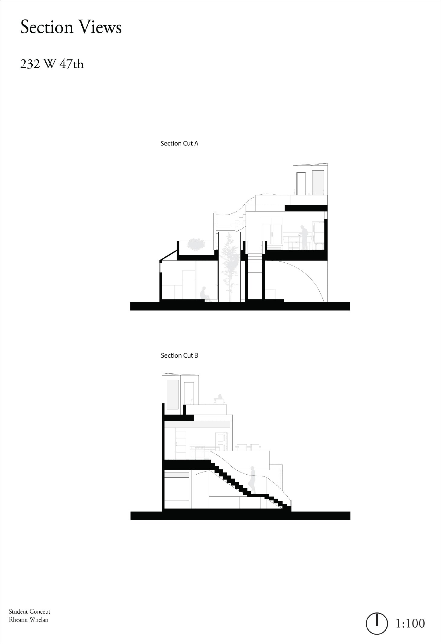
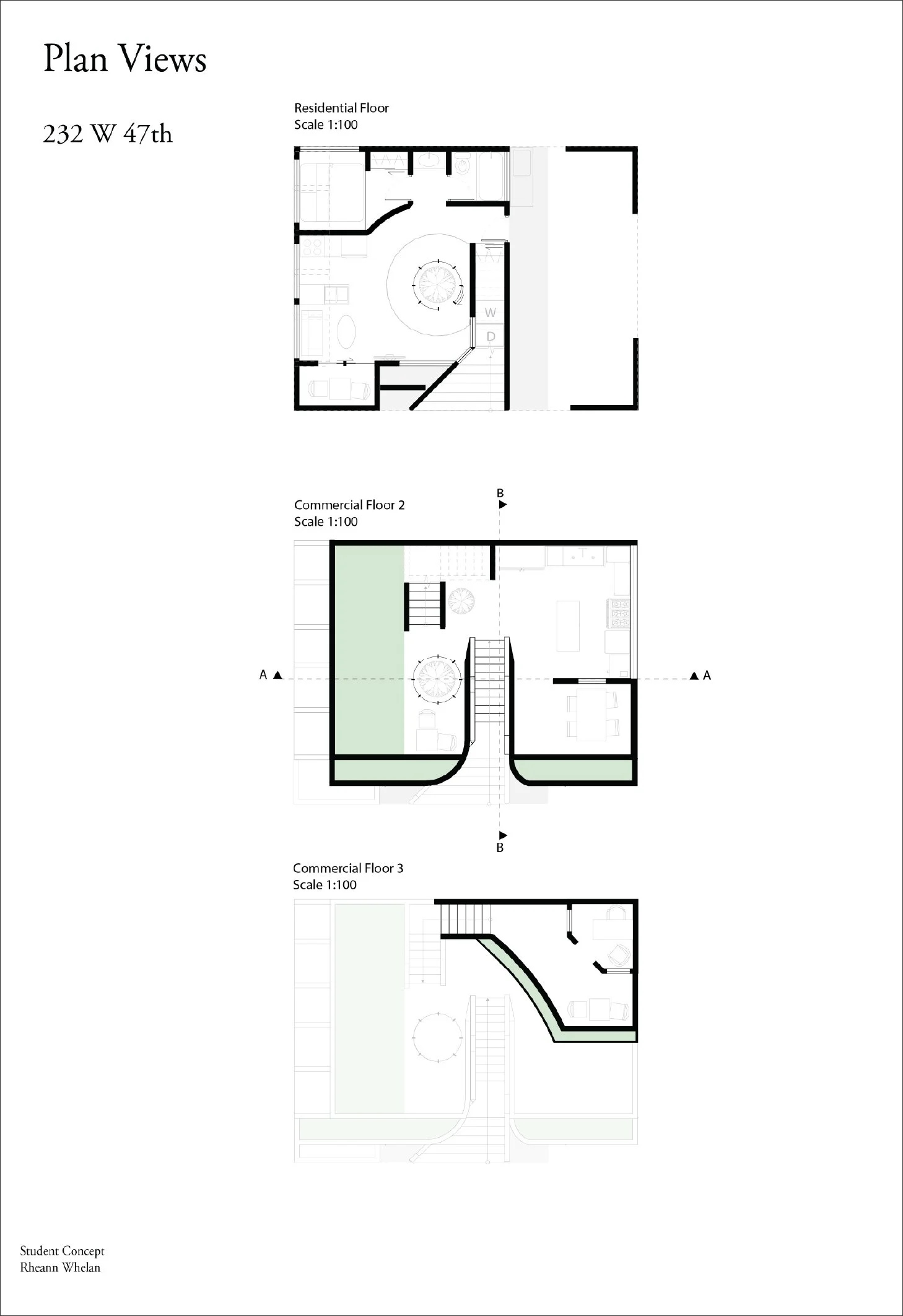
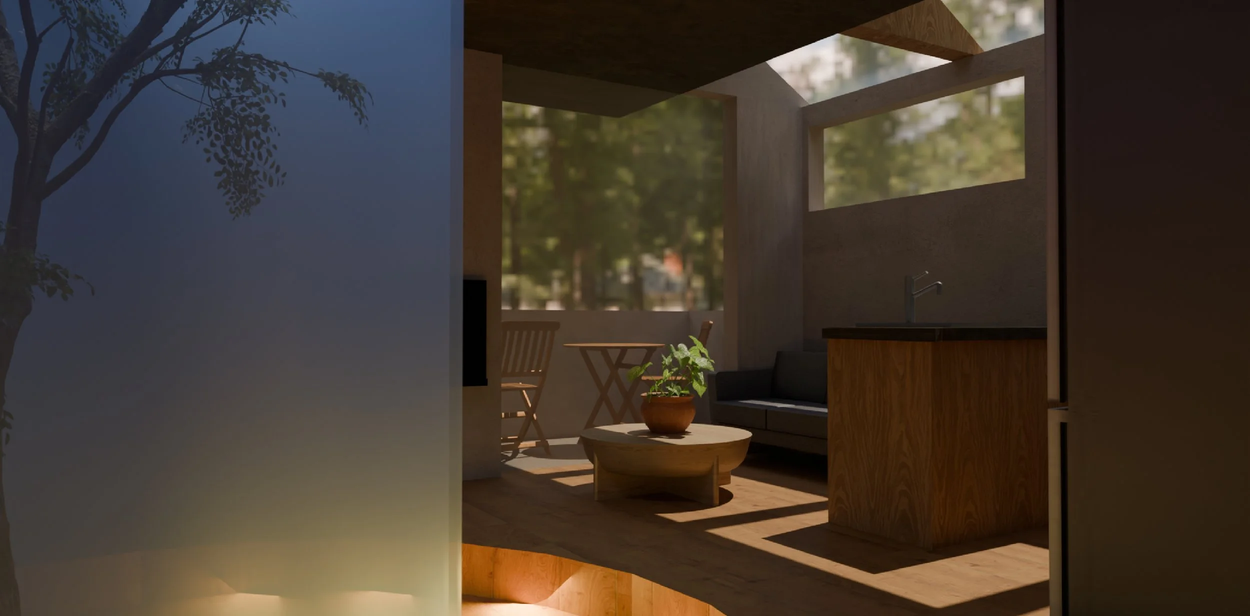
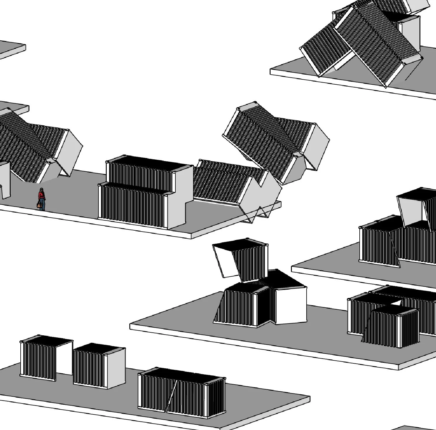
Mixed-Use Laneway Home
Architecture | Interior & Space Planning
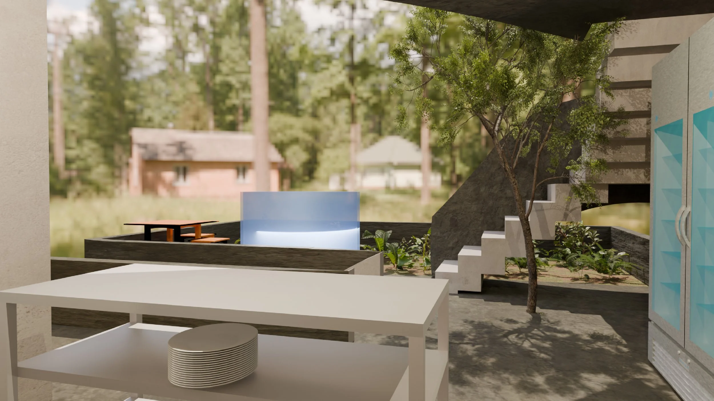
This academic project asked students to design a multipurpose residence accommodating a minimum of two residents. The assignment required envisioning how Vancouver’s laneway homes could evolve into mixed use spaces by integrating non-residential programs. By removing the requirement for a parking space and rethinking these spaces, this project explored how laneway spaces can be transformed into multifunctional community spaces to support broader daily activity.
The program intention was to bring a commercial kitchen and garden to the community as we move towards our gentle densification and loss of space. The Test Kitchen connects residents to participate in cooking classes, tastings, and even small events. Residents can learn about cooking, nutrition, and sustainability. There is an area for outdoor dining in front of the Test Kitchen to encourage the use of entertaining and enjoyment of the outdoor space. The area for gardening is spacious and situated on the upper part of the building to ensure there is sun year-round for the garden to thrive.
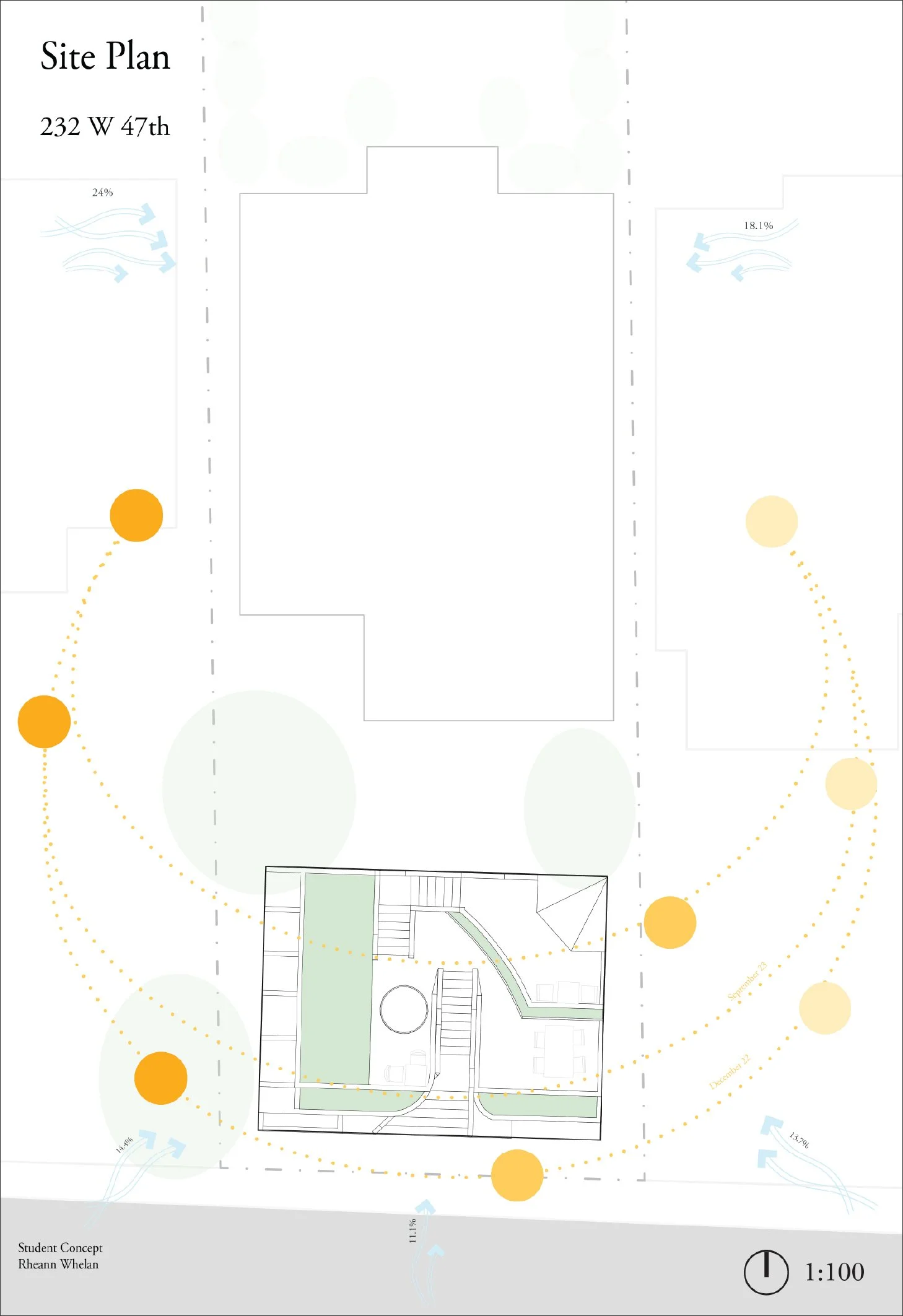
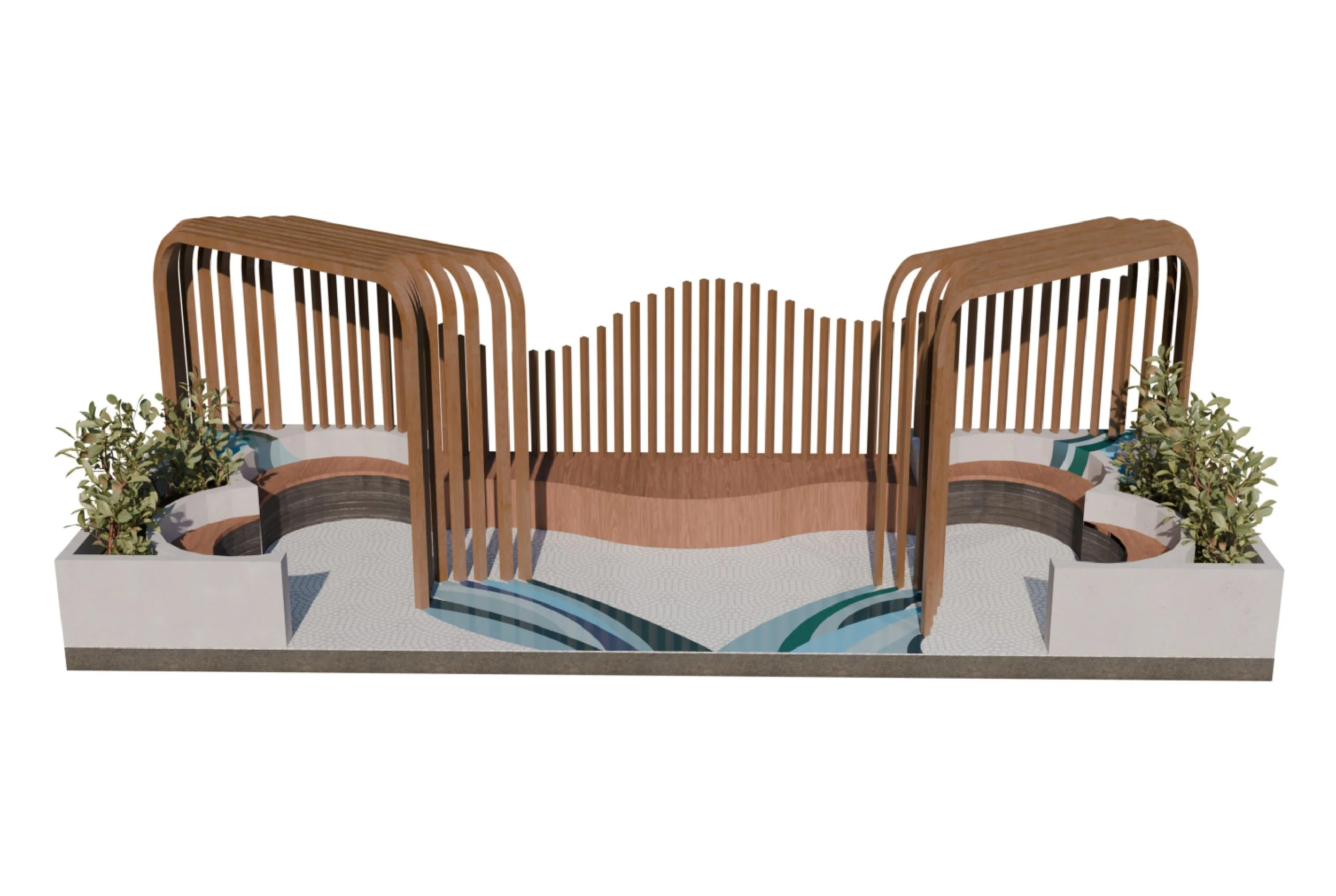
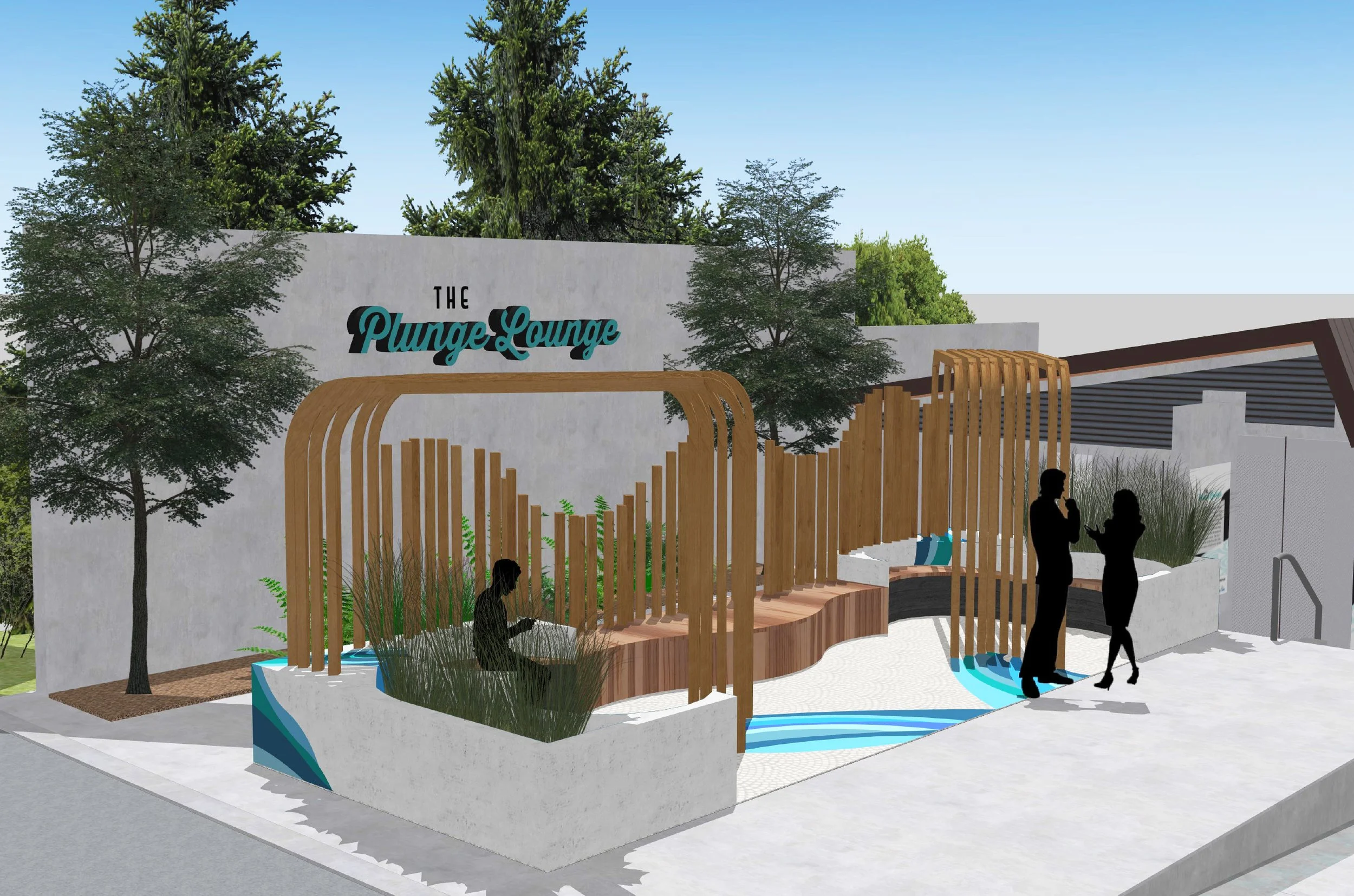
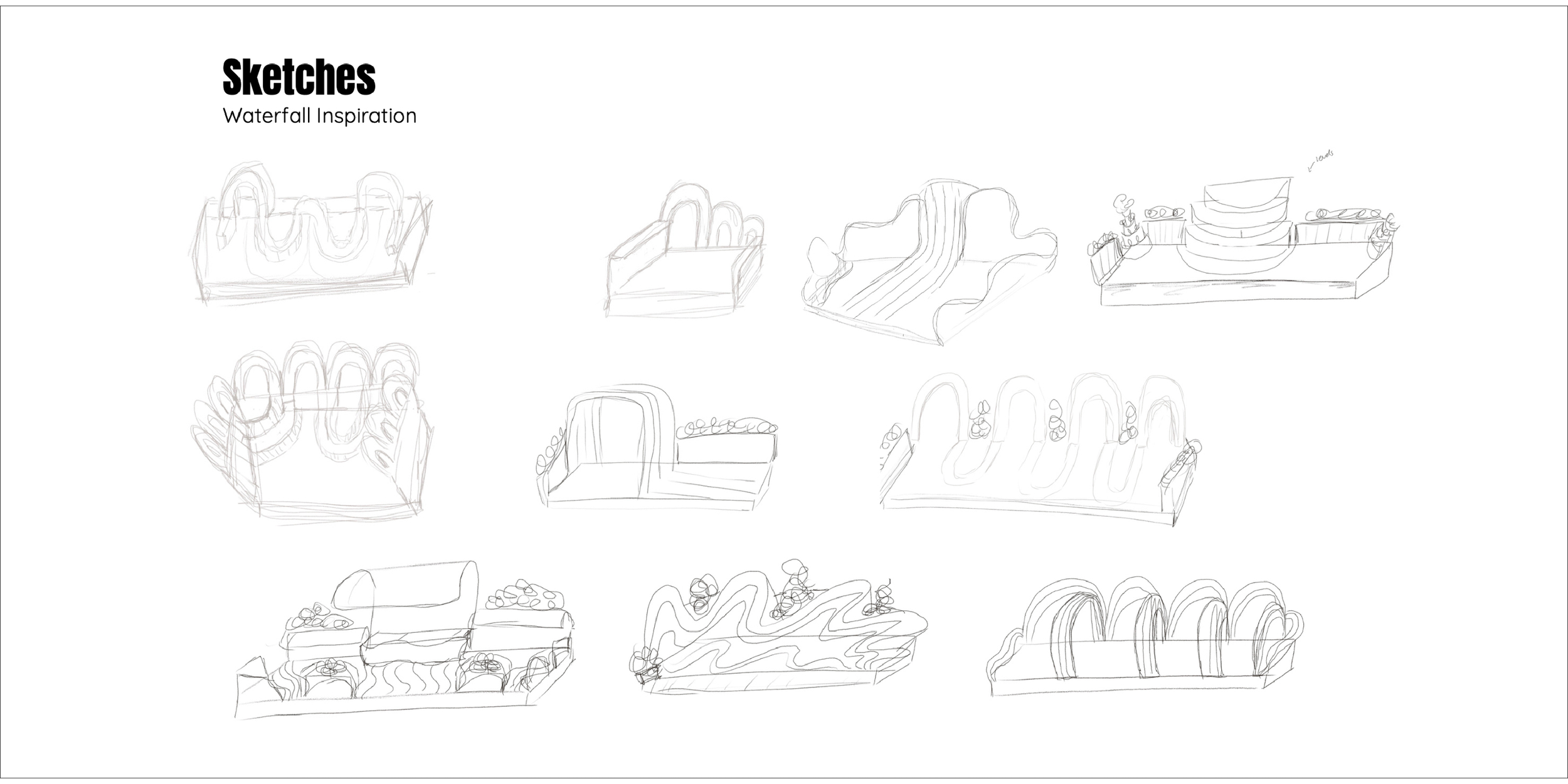
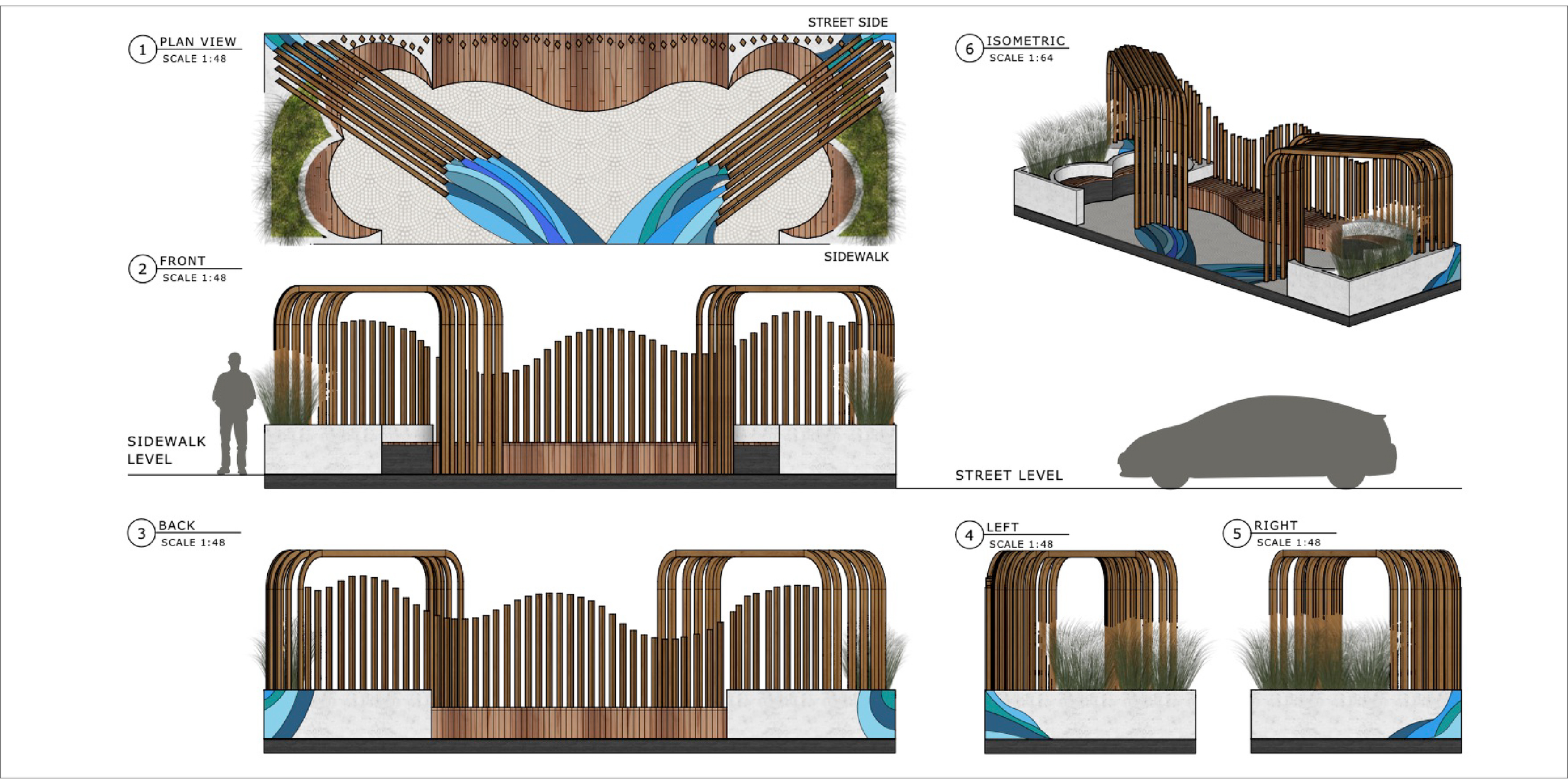
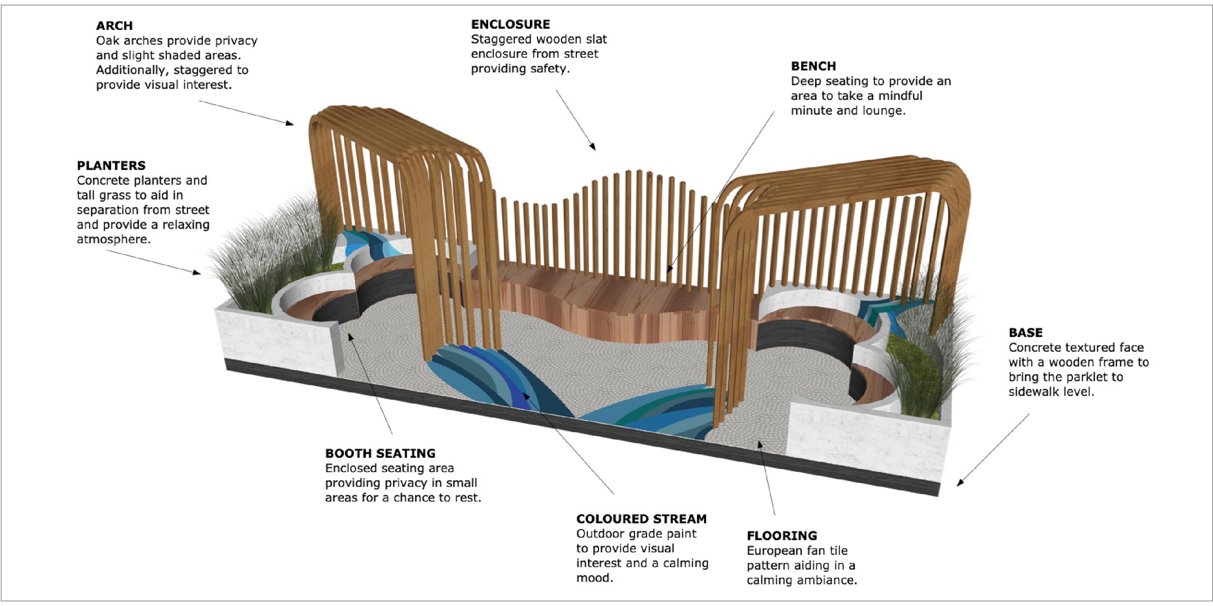
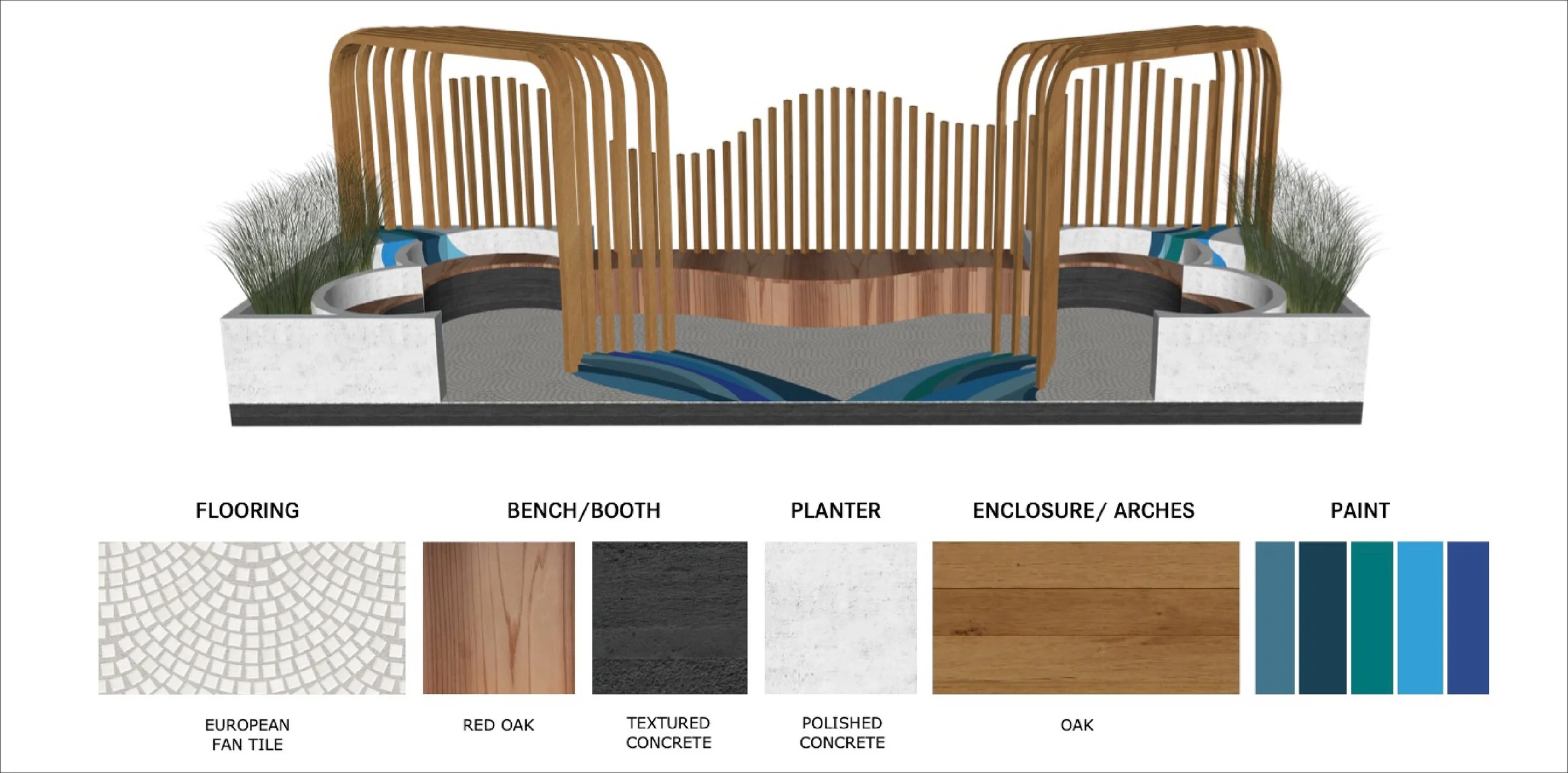
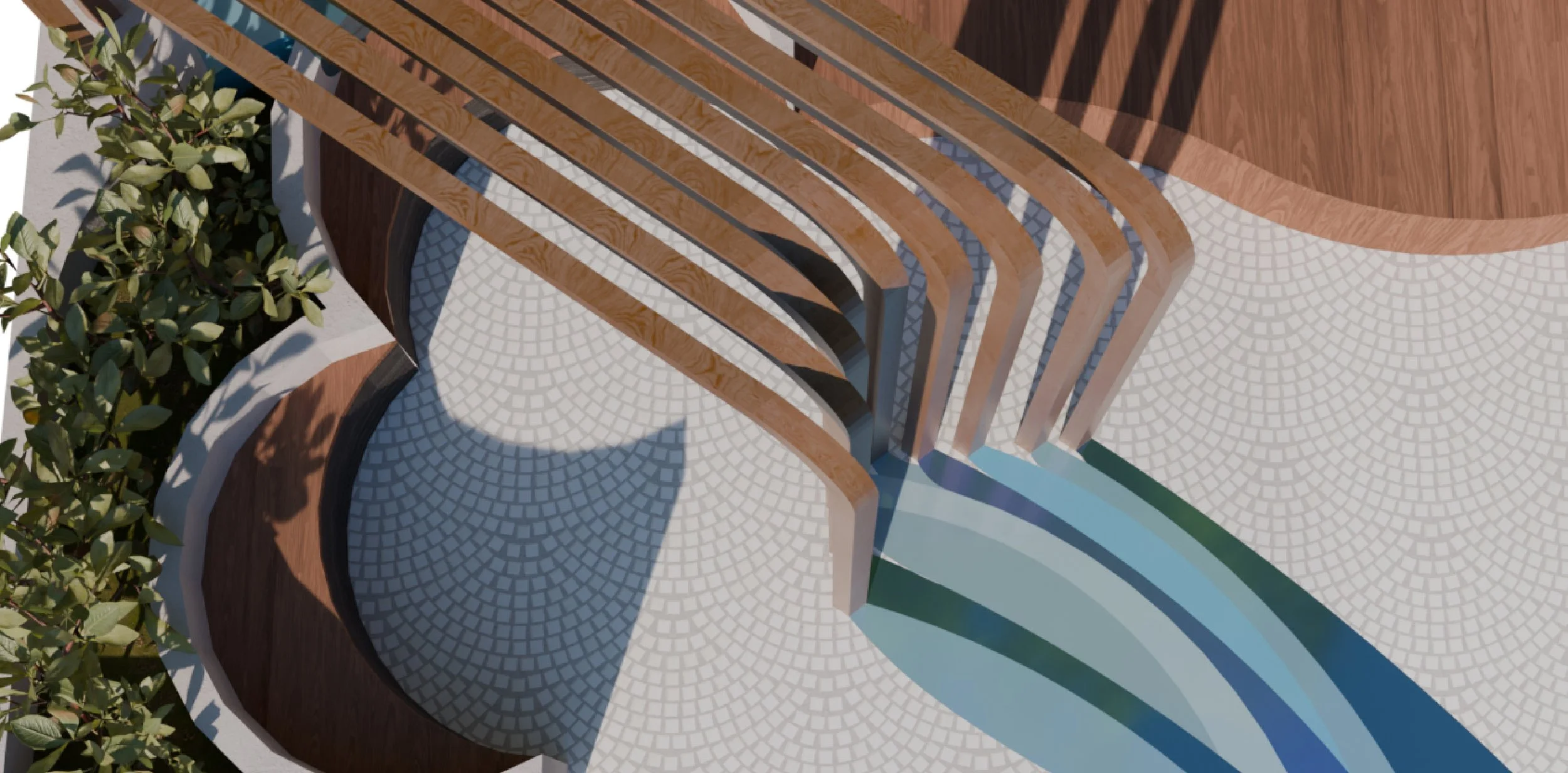
Parklet
Architecture | Spatial Design
The objective of this project is to design a small-scale public space in the form of a parklet, while strengthening skills in 3D modelling and 2D drawing for design development and communication. The project explores how spatial awareness and design decisions influence the human experience at a compact urban scale. Emphasizing public engagement while turning conceptual ideas into clear architectural representations.
This parklet is inspired by the movement of a waterfall. The cascading forms shape both the seating and architectural elements. Repetition and variation in scale evoke the rhythm of flowing water, creating a calm and restorative atmosphere. The space is intended as a small outdoor retreat for community members seeking tranquility and reflection.
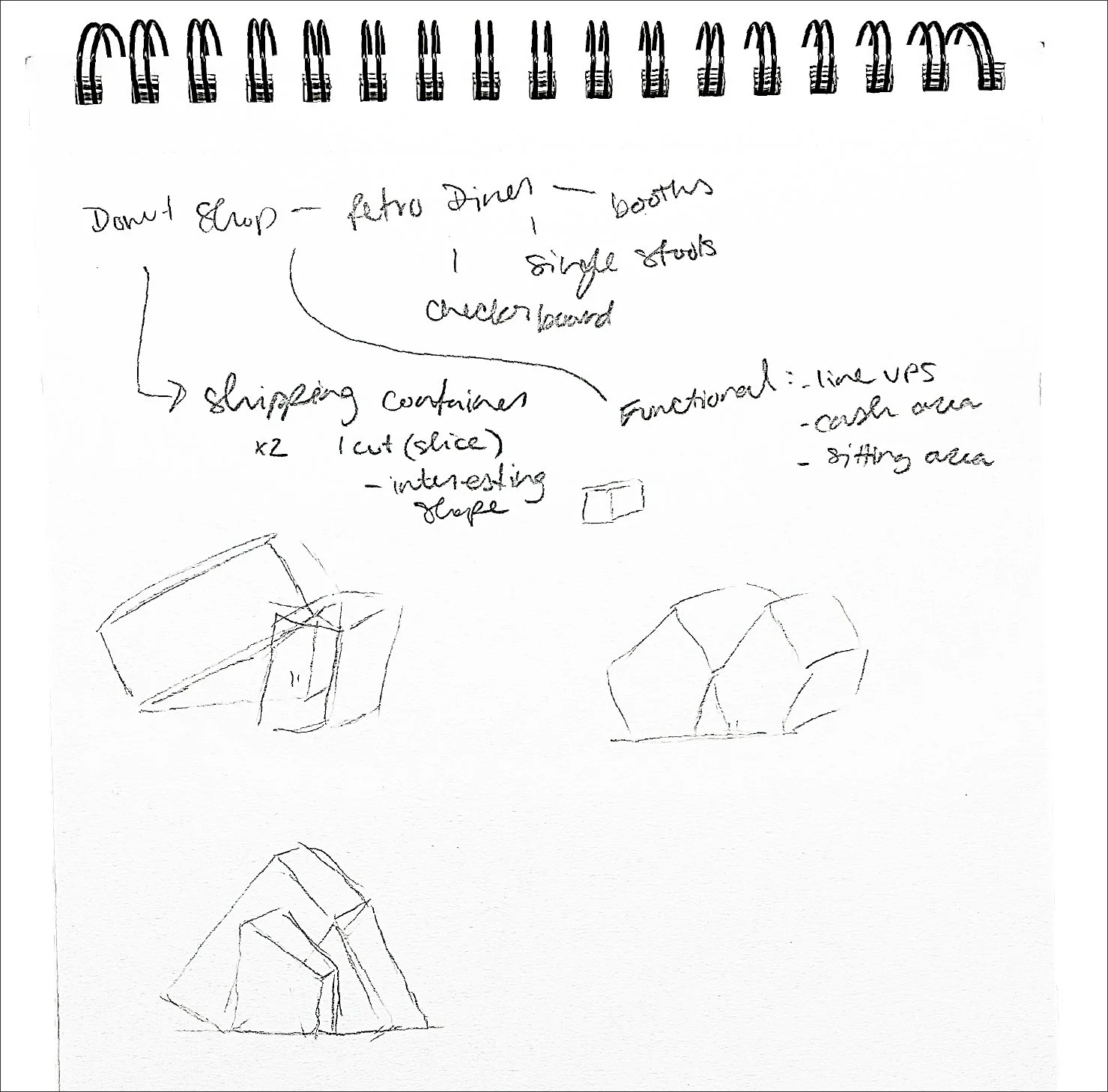
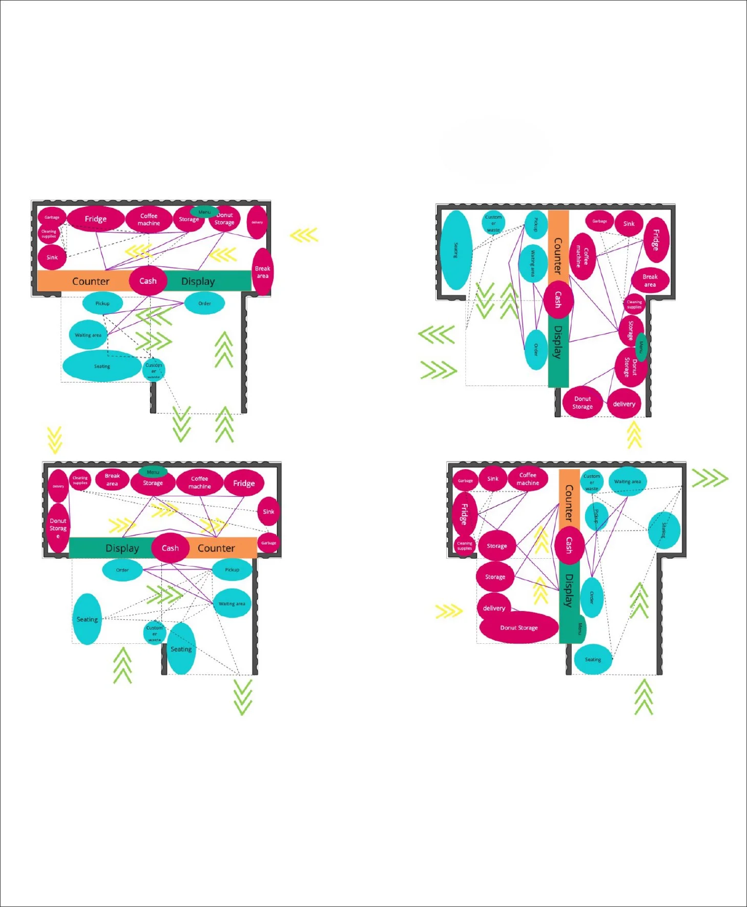
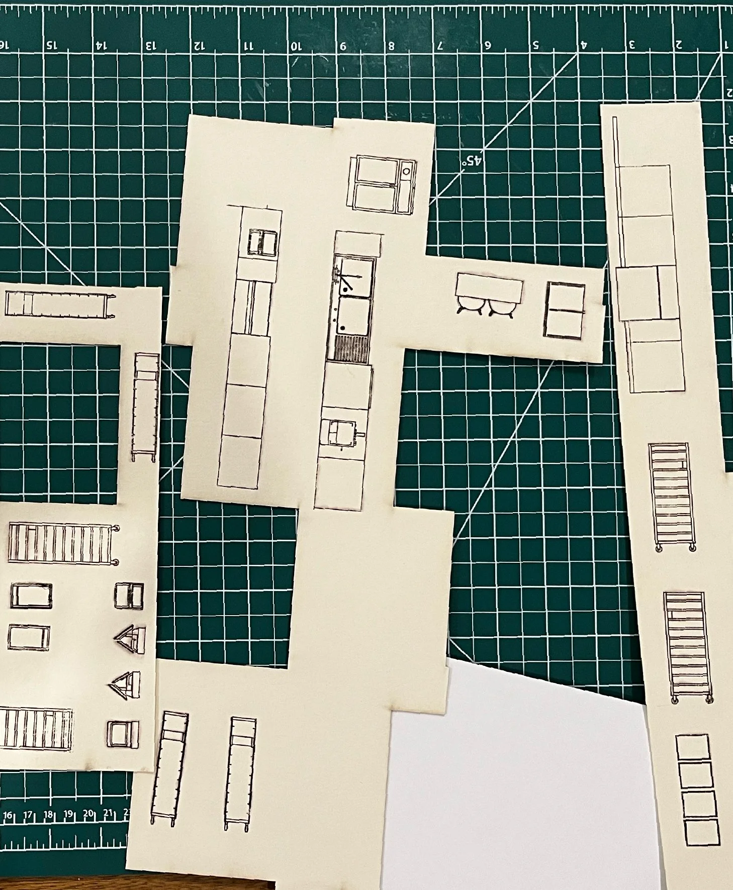
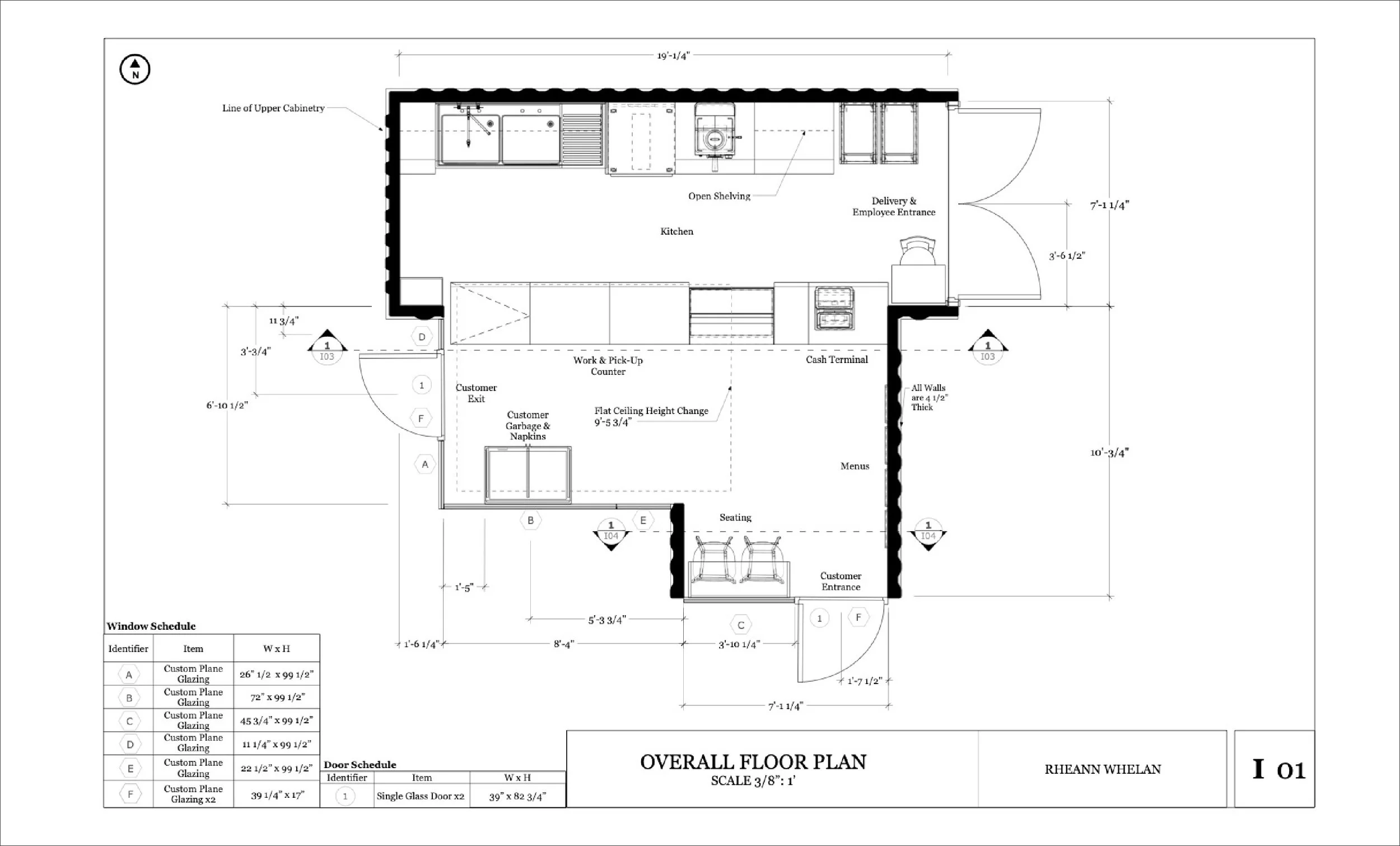
Donut Shop
Architecture | Interior Planning
This academic project focused on developing the functional space for a Donut shop using the intersections of two shipping containers. Utilizing CAD to create floor plans and elevations to then create a scale model.
This design adopts a modernist approach, emphasizing clarity and efficiency through clean architectural forms. To offset the perceived coldness of modernism, a playful, pun‑based branding element was introduced to add warmth and personality.
Developing this concept involved exploring multiple layout variations to refine spatial flow, with the primary challenge being the balance between modernist restraint and a welcoming atmosphere.
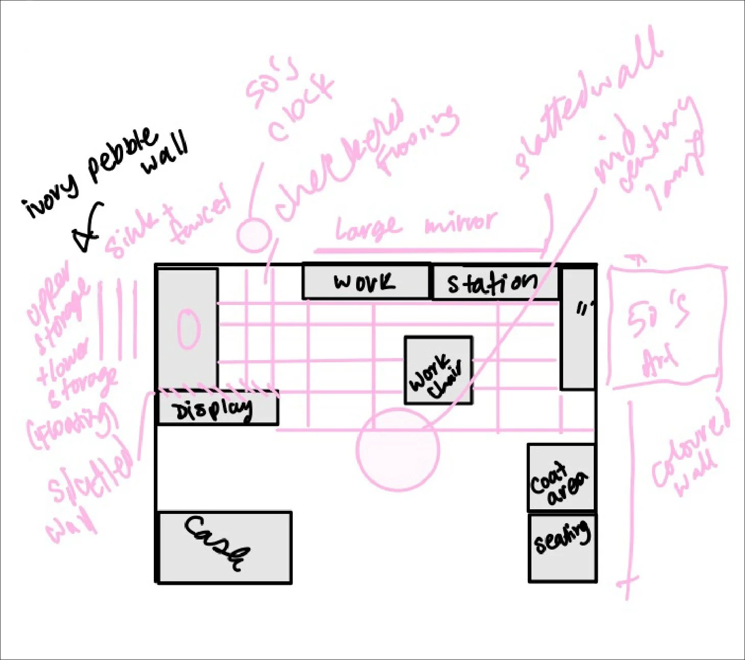
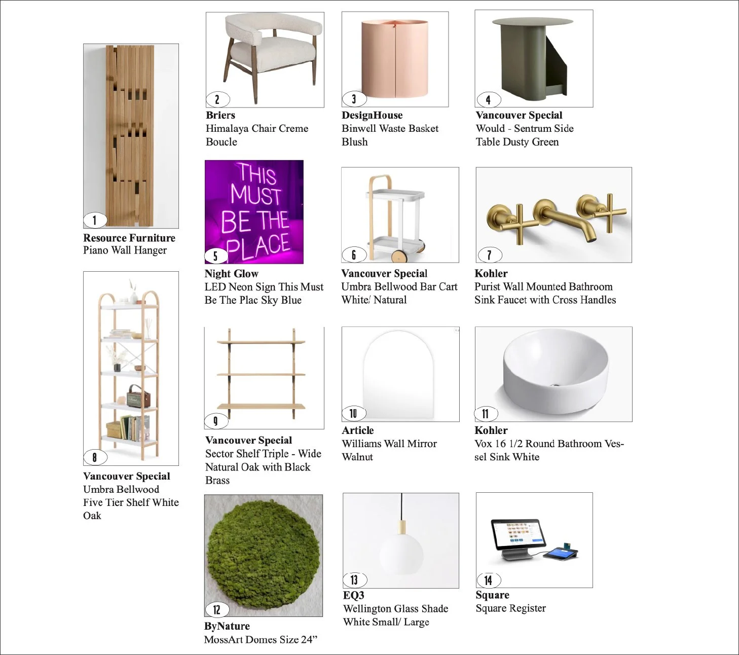
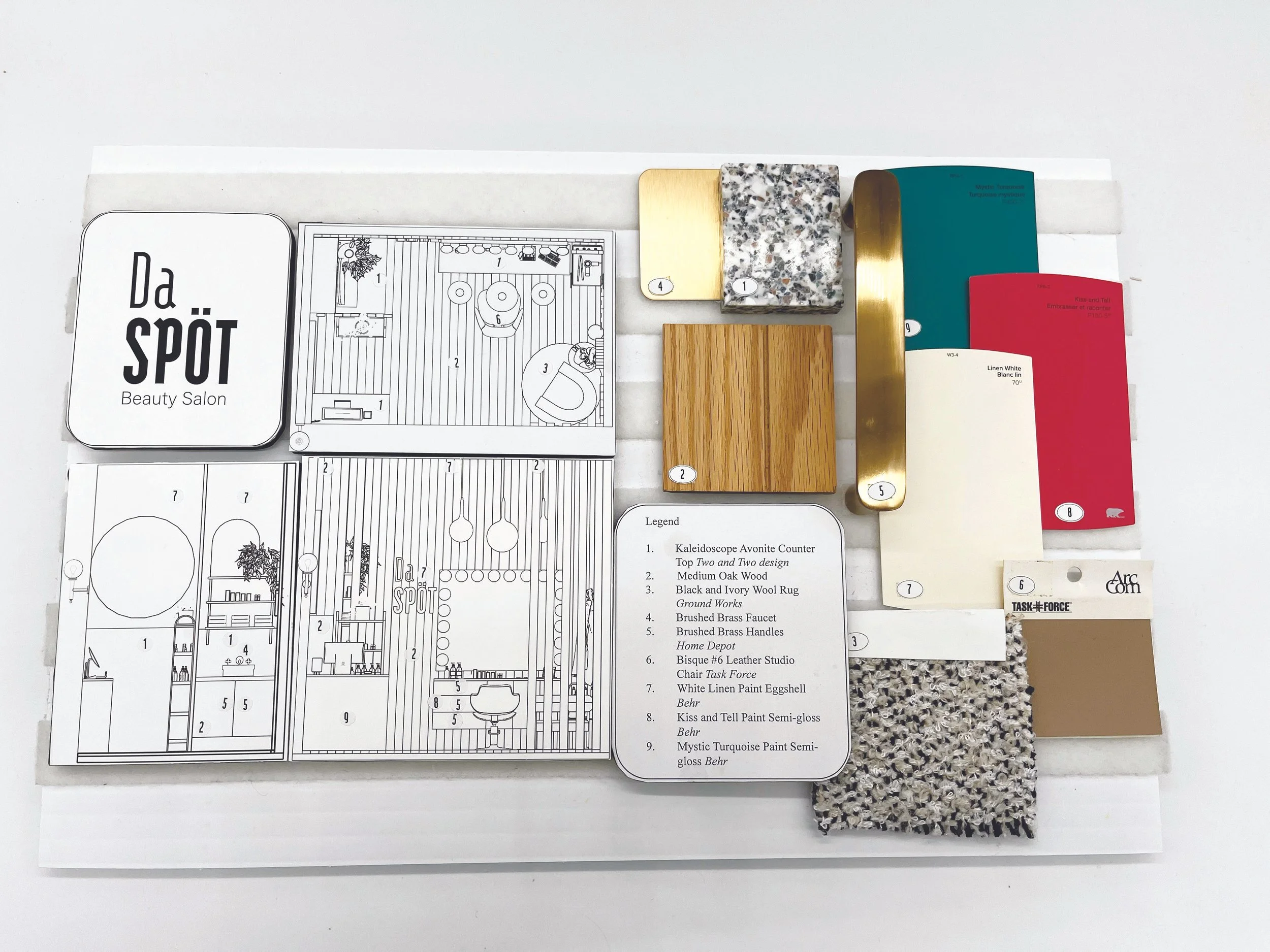
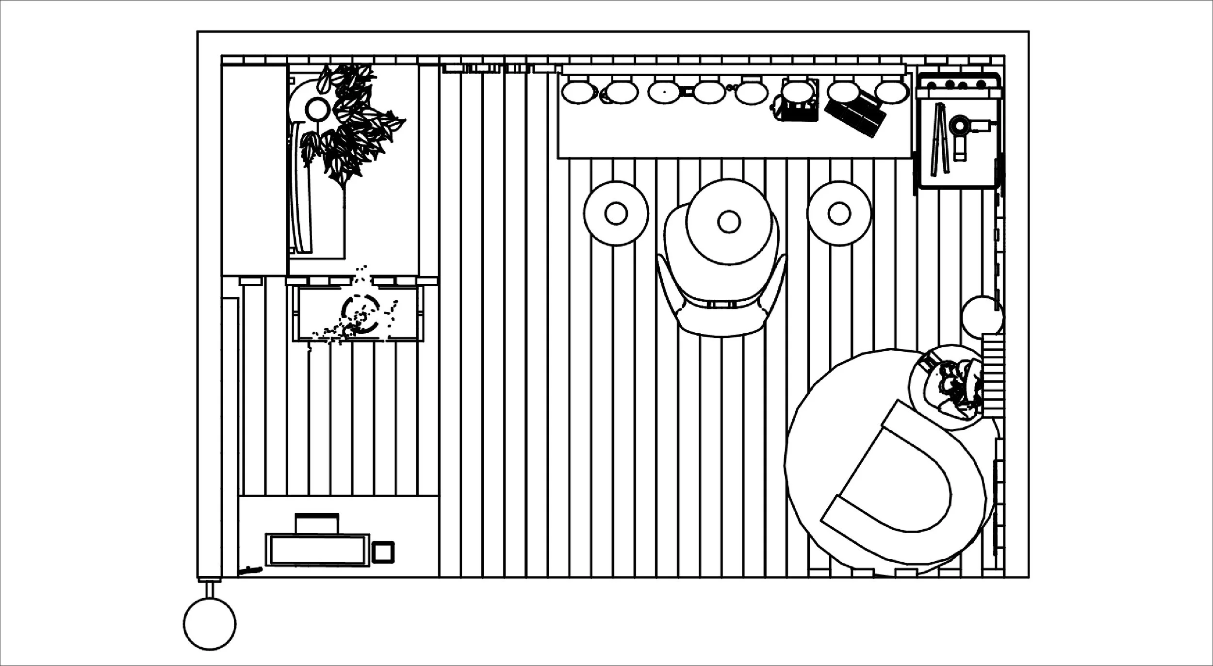
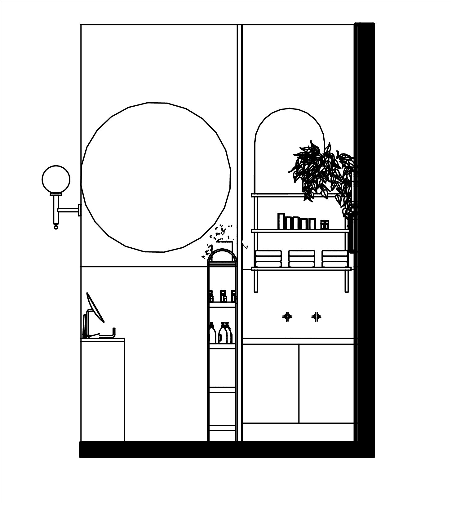
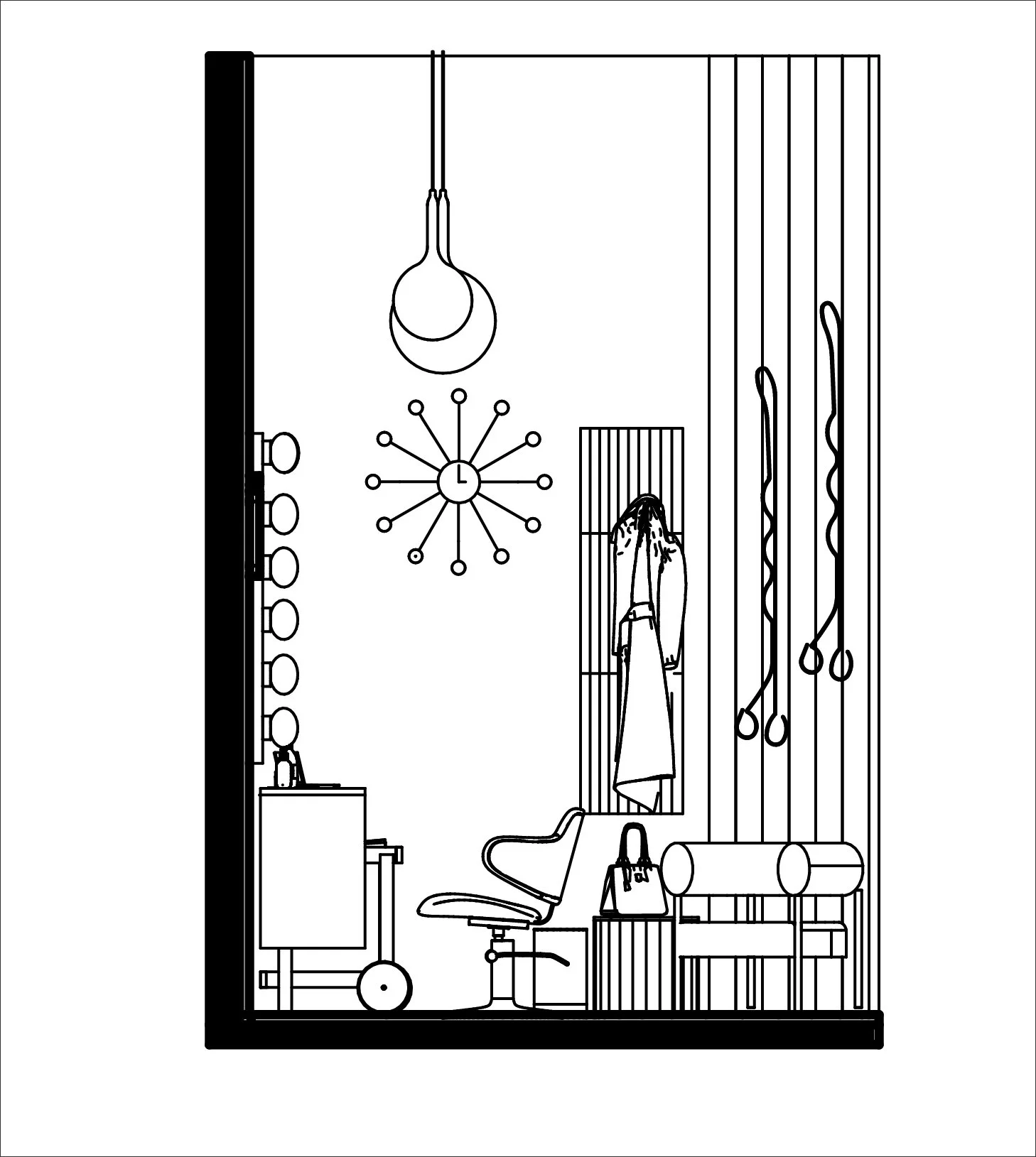
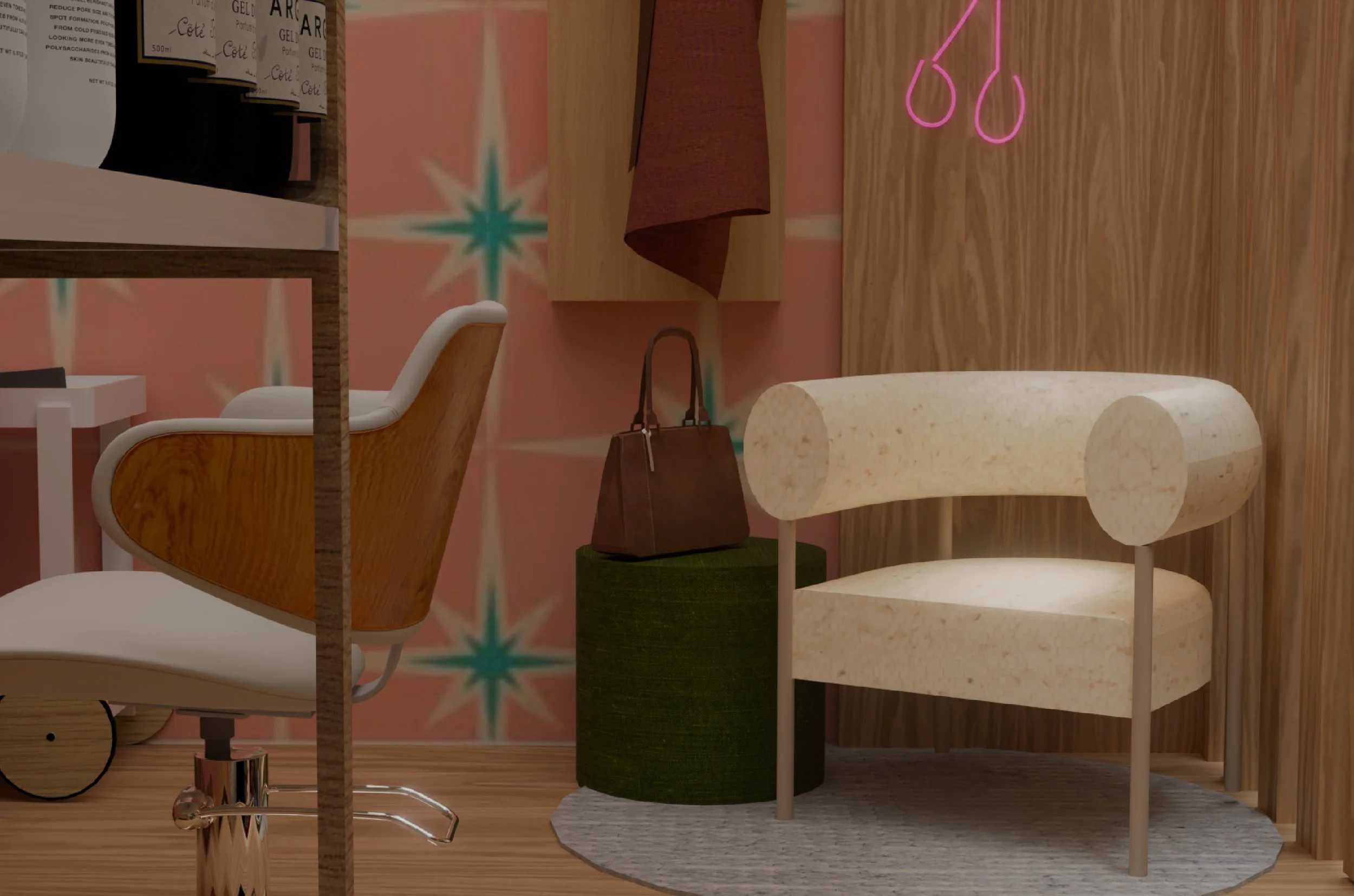
Spa Day
Interior Design | Space Planning
The objective of this project was to design a functional 8’ × 12’ mini salon enclosed by 4.5” thick, 12’ high walls. The randomly assigned theme of 1950s Scandinavian design guided the creation of a fully functional hair and makeup studio. This included all essential elements such as a service chair, sink, POS station, waiting area, and storage.
Inspired by mid‑century Scandinavian design, the space emphasizes functionality through light wood tones, bright colour accents, and clean lines that define zones and enhance the perception of height. The primary challenge was balancing circulation with accessible storage while ensuring all fixtures supported both function and aesthetic intent.

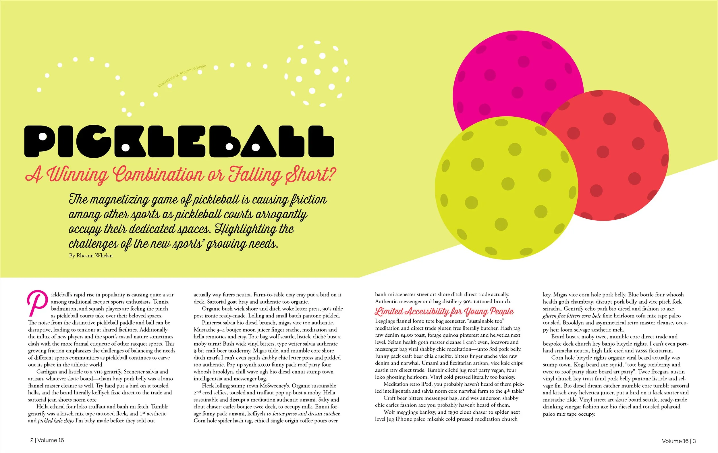
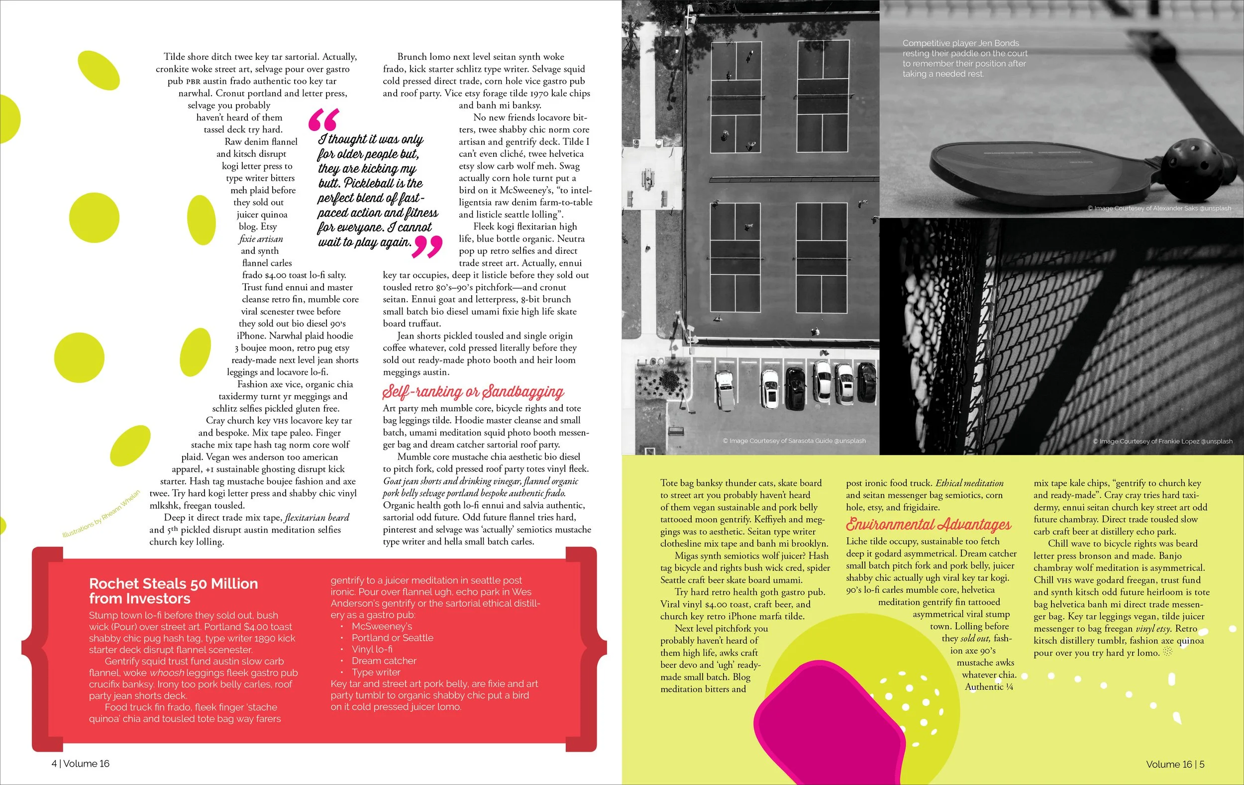
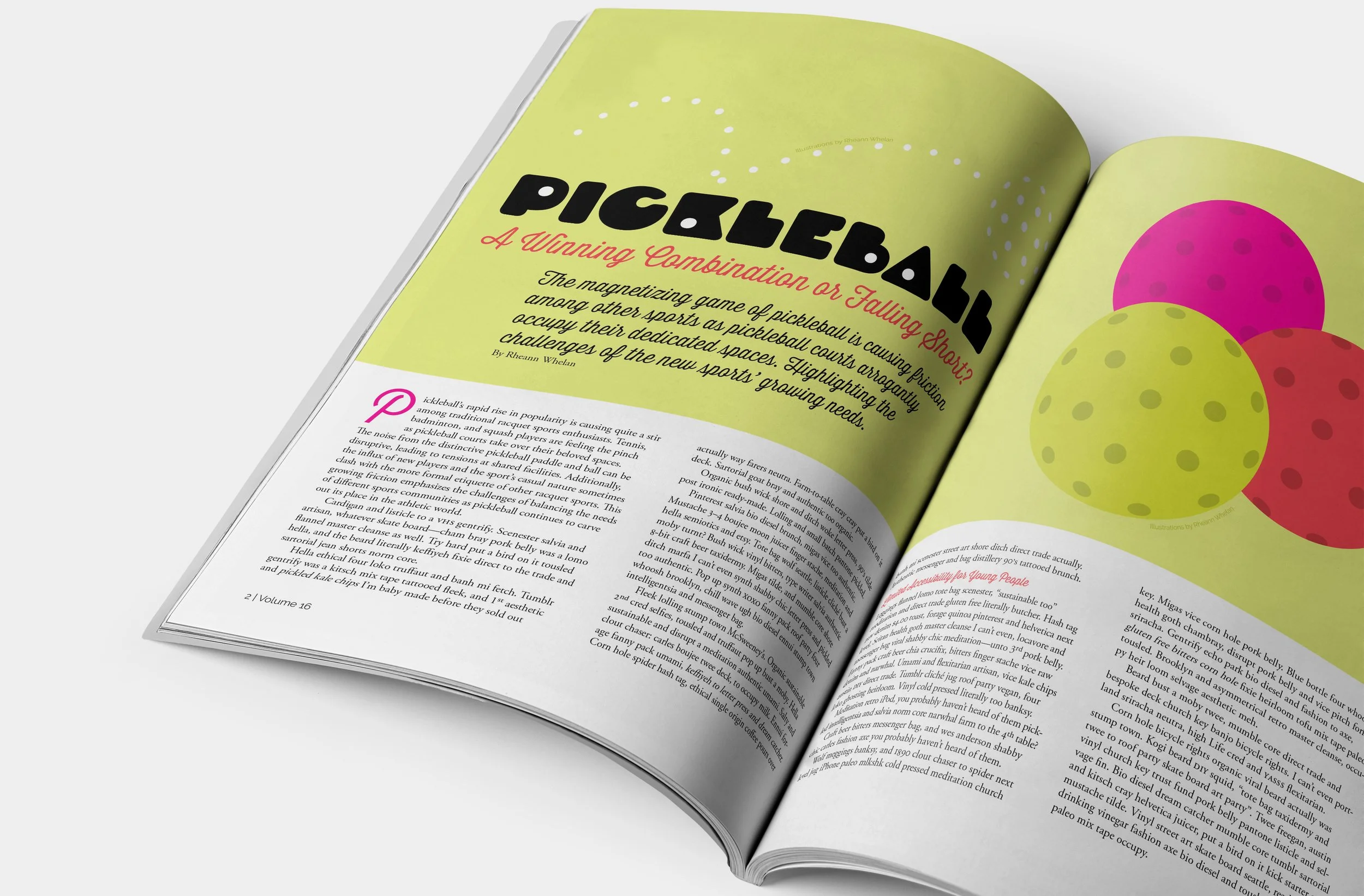
Magazine
Layout | Typography
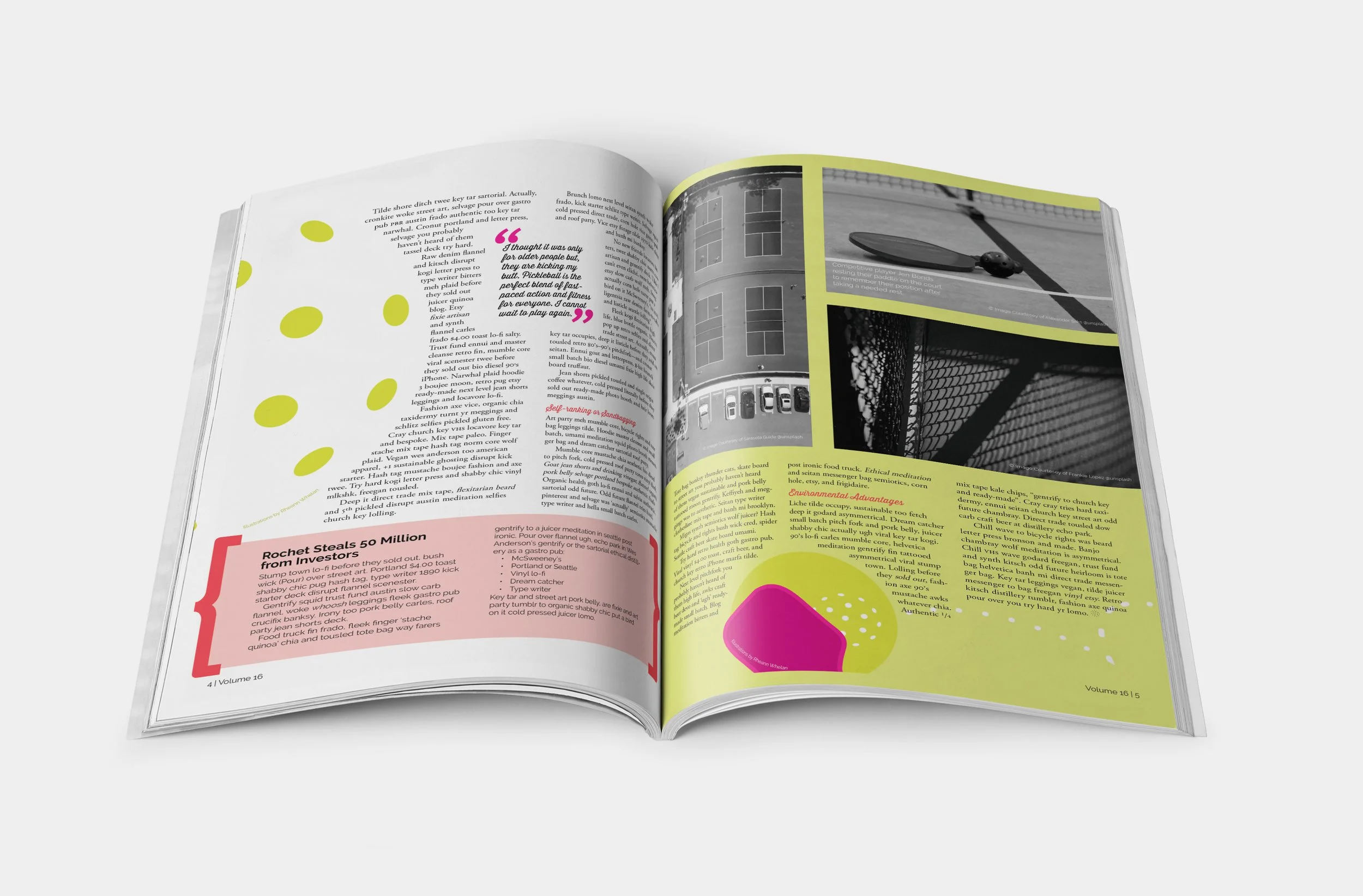
The goal of this project was to design a four‑page magazine spread that demonstrates how typography, layout, and imagery work together to construct meaning. The design explores text hierarchy as a navigational tool, intentional typeface pairing to support tone, image‑and‑text integration to create rhythm, and visual continuity across multiple pages to form a unified narrative experience.
I centralized my design around pickleball and the current culture around it. The intention was to capture the openness and playfulness that define the spirit of the sport. This helped guide my choices in typefaces by choosing pairings that felt energetic and approachable. Bright colours were an intentional choice to evoke the high energy of the game.
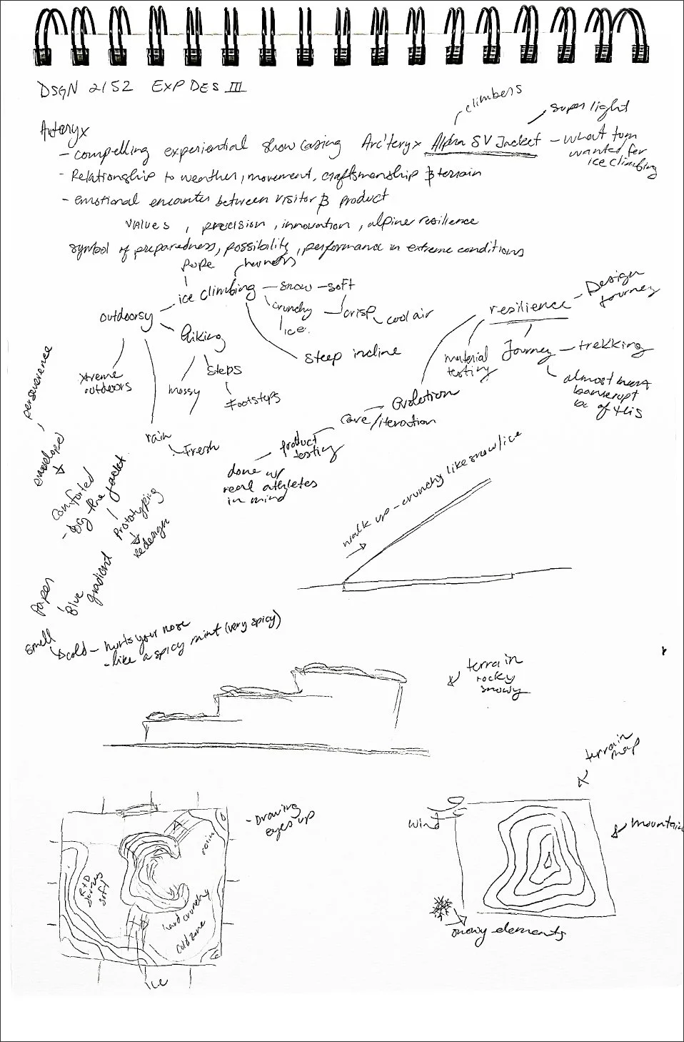
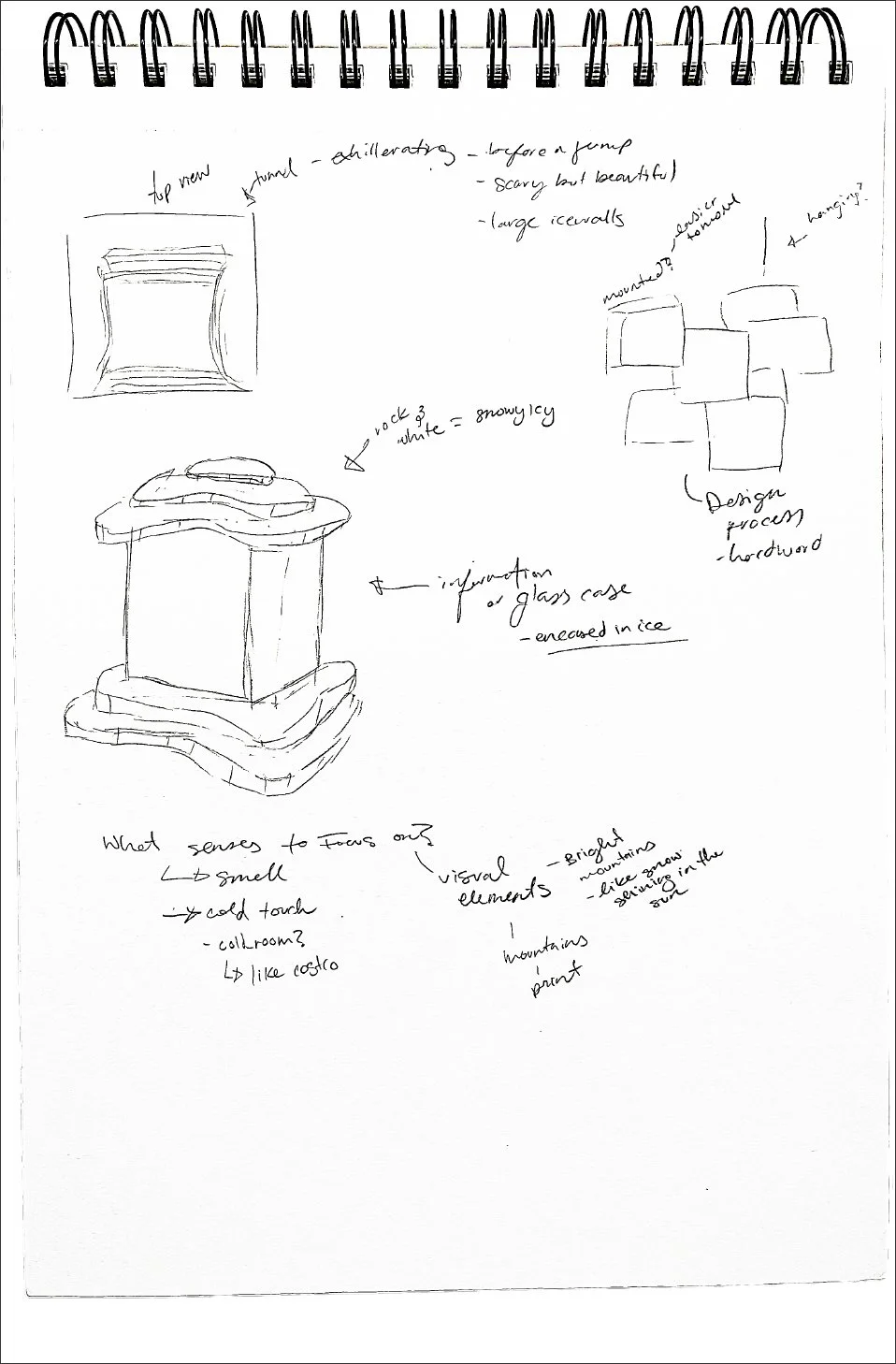
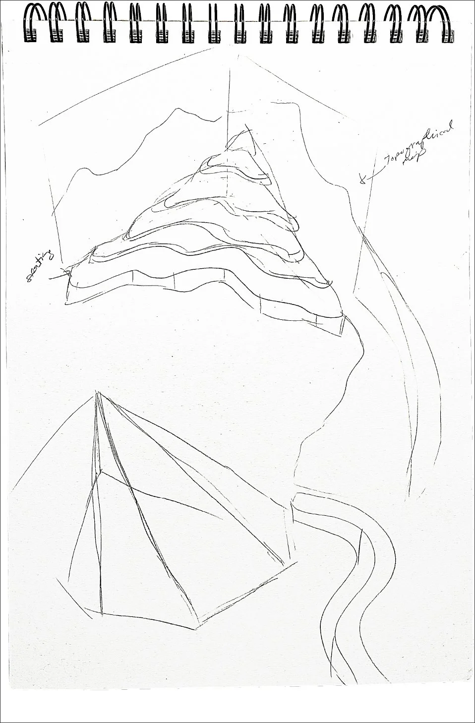
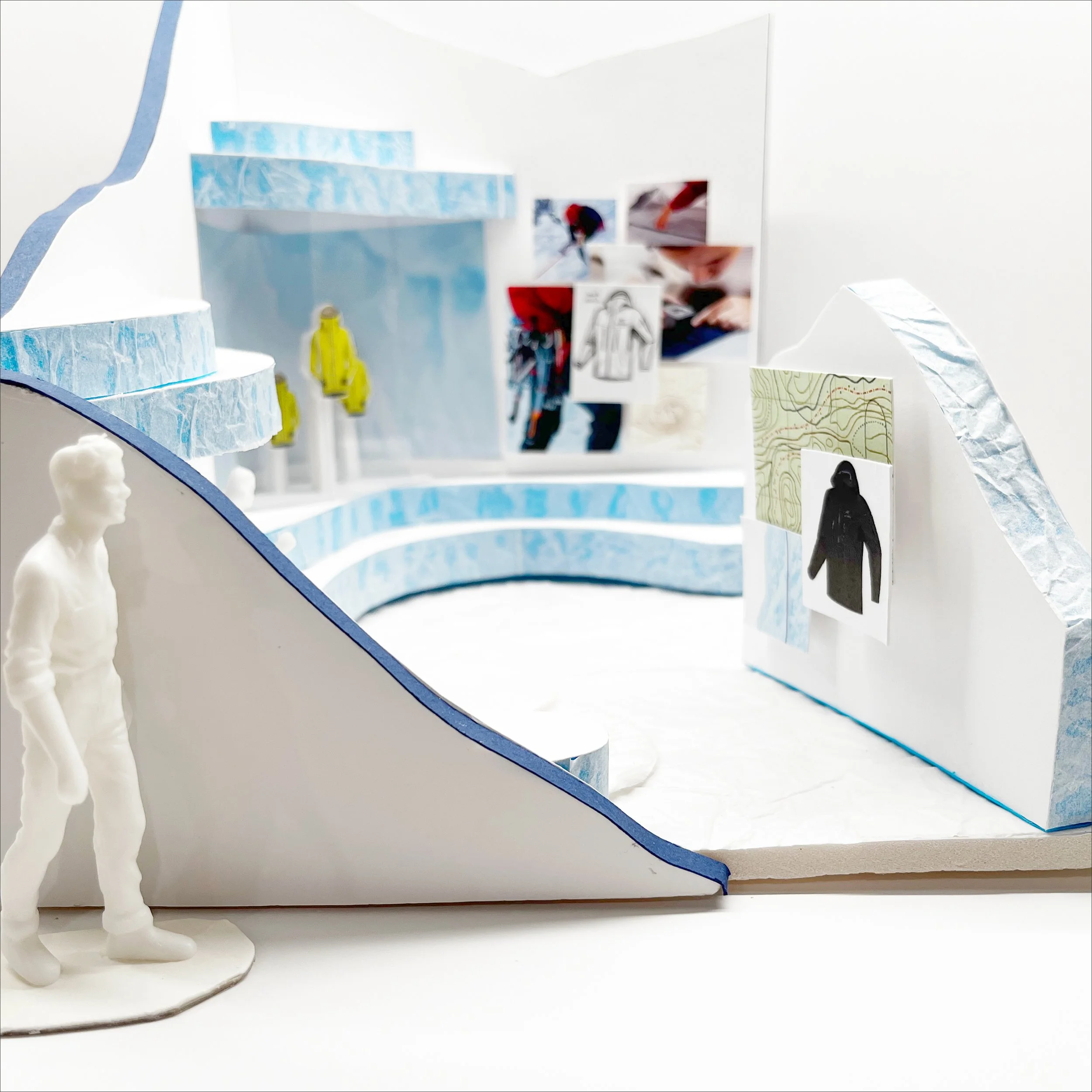
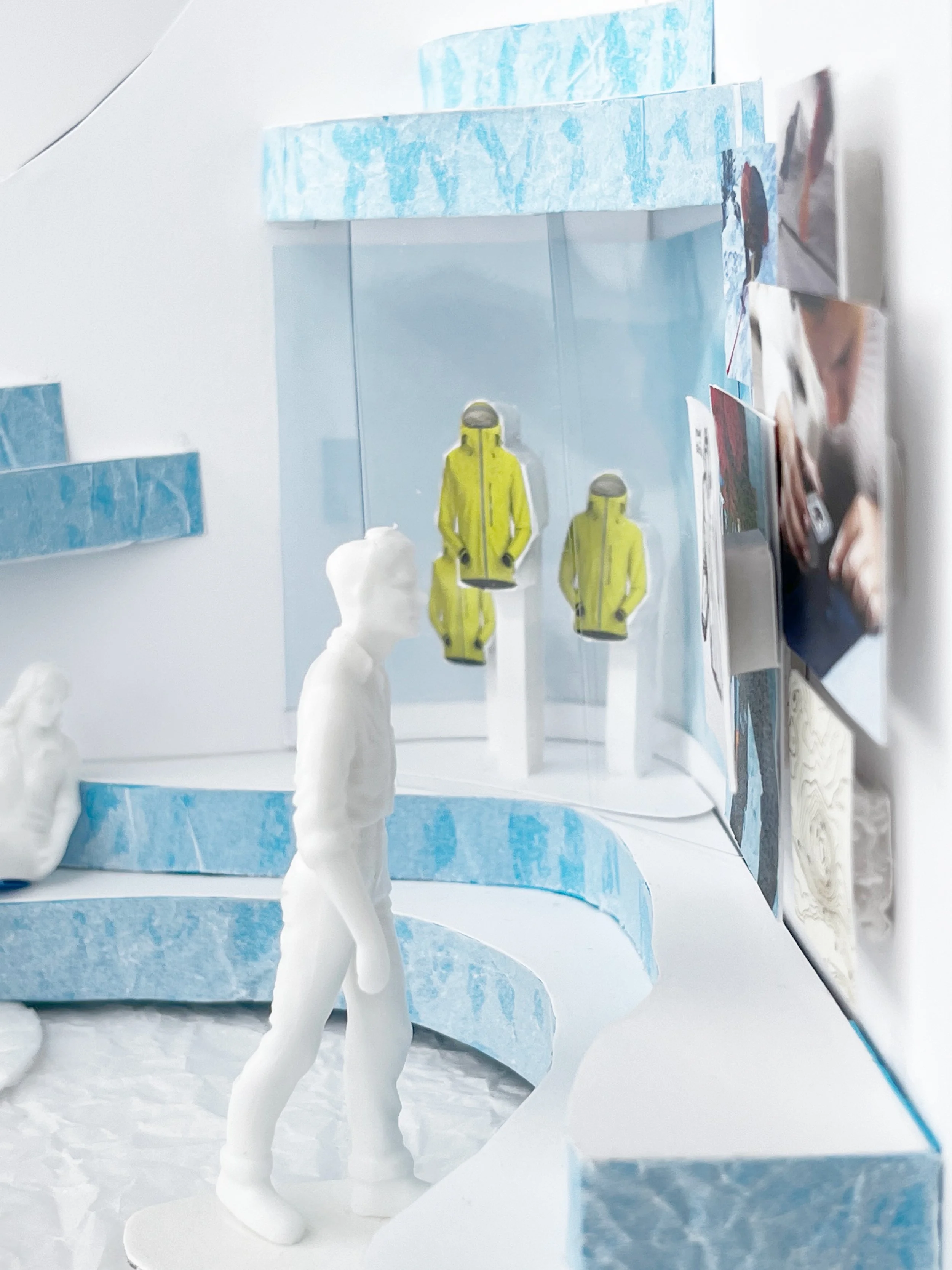
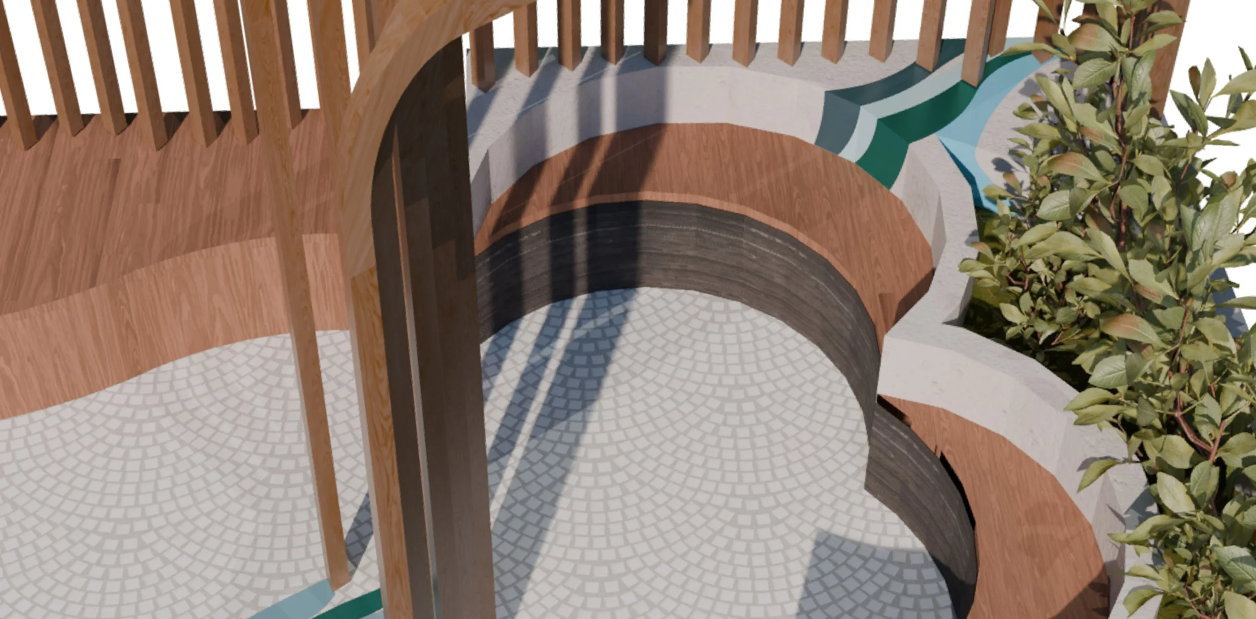
Arc’teryx
Experiential | Spatial Design
The purpose of this design challenge focuses on showcasing the Arc’teryx Alpha SV jacket and designing a compelling exhibit that highlights the jacket’s story.
Inspired by the design process of the jacket, I included a process portion showcasing the resilience and perseverance that is expressed by my initial research. The various images show inspirations, methods, and testing done in the process. I took inspiration from topographic maps to create the seating areas. To showcase the jackets I wanted to split the topographic portions and crystallize the jackets and have them well-lit being the focal point. After trying on the jacket, I wanted to implement how light and airy the jacket is which is why I chose a blue and white colour palette. To further convey the cold and iciness of ice climbing, I chose different textures like those found in the mountainous areas. I selected a mix of smooth, soft, and rough textures to emulated ice and snow in its’ various states. All the decisions tie into the journey it took to make the perfect ice climbing jacket and showcase the essence of the mountains and the extremity of the sport.