Mika Cheng
Web & Graphic Designer
Bold | Minimal | Intentional
I create experiences that blend creativity with logic to solve problems effectively.
Independent Brand Project
Communications | Branding
Objective: Design a brand identity, graphic standards and applications by completing a self-initiated design project to meet professional development goals.
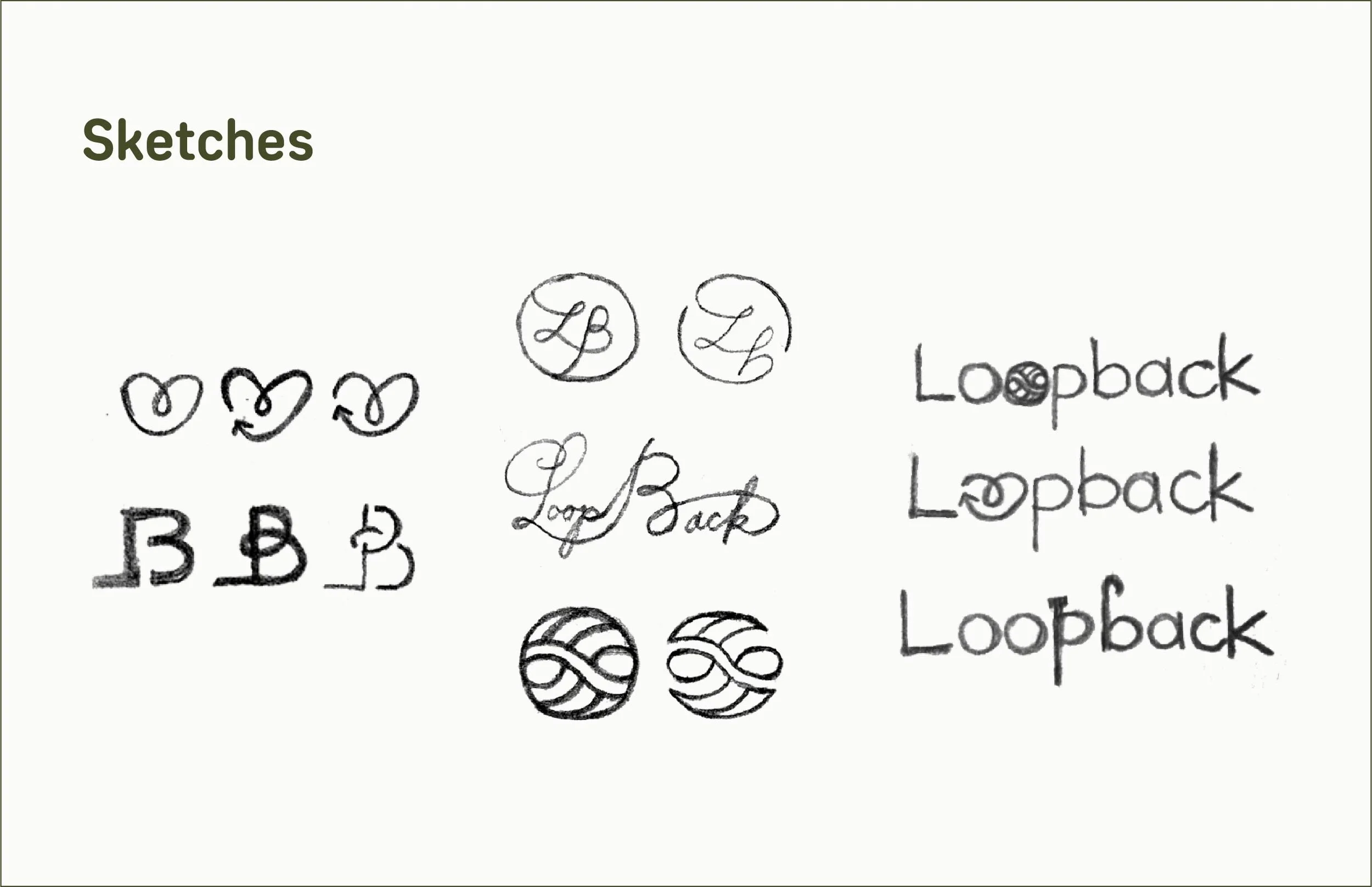
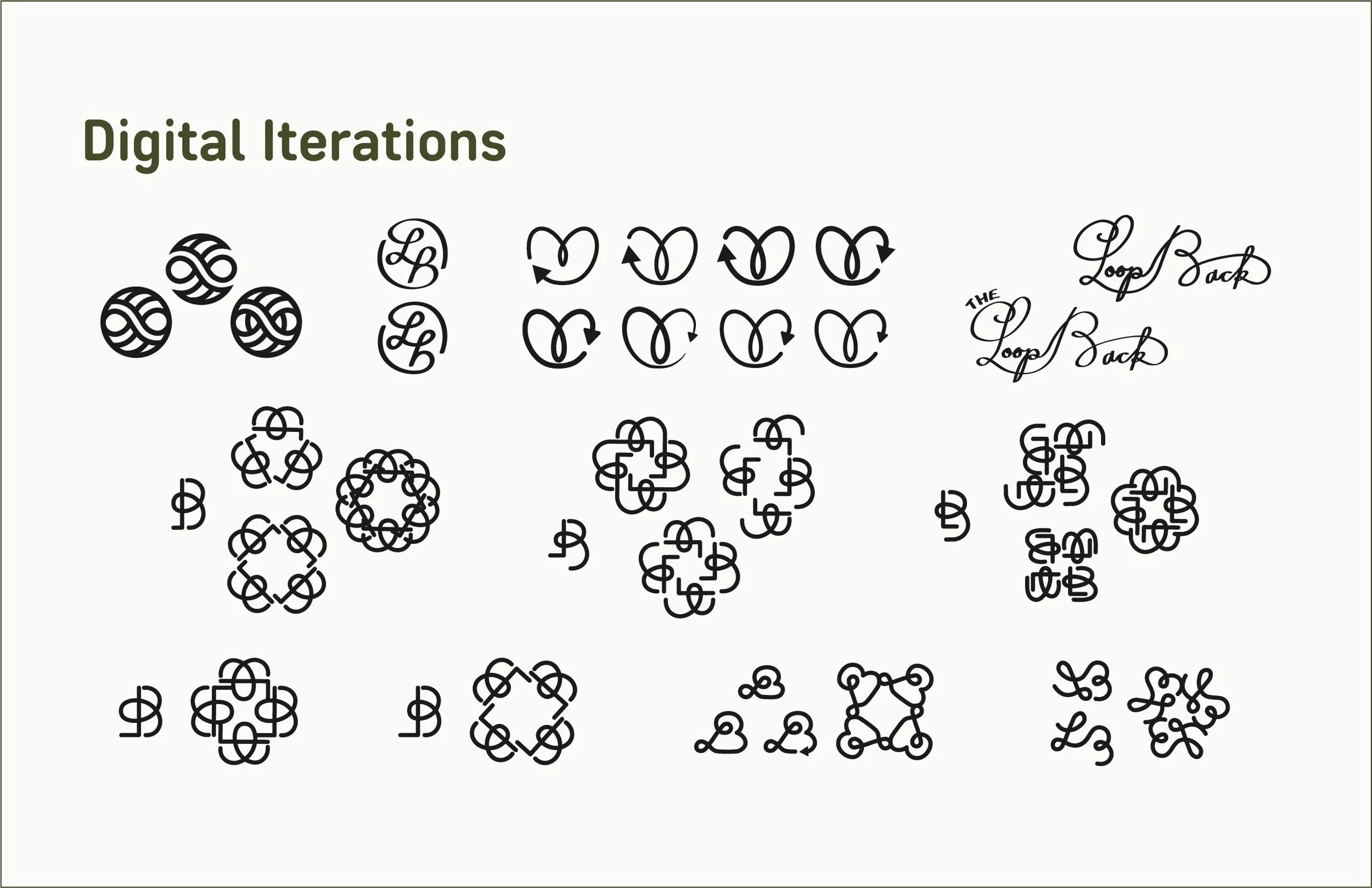
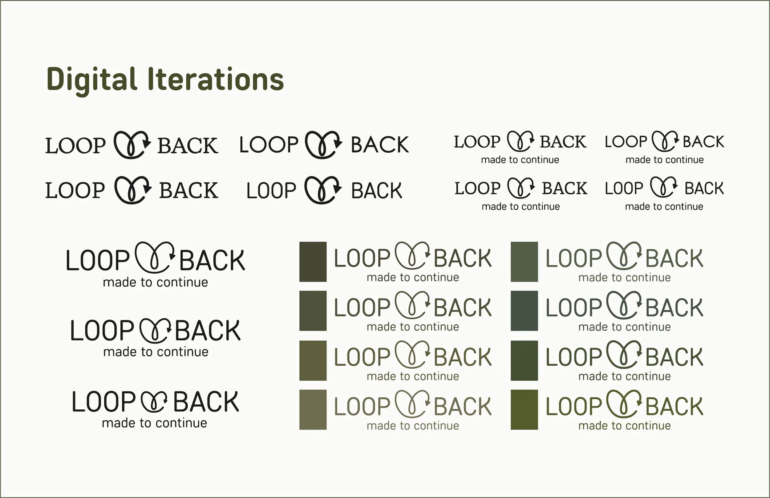
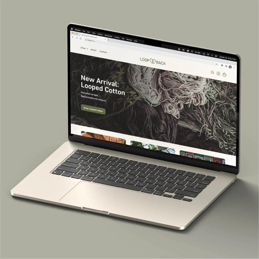
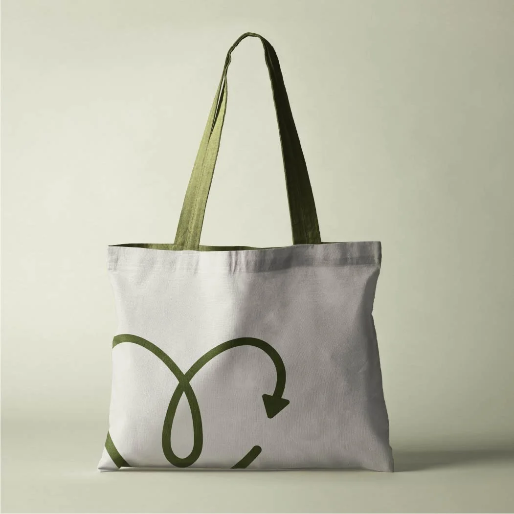
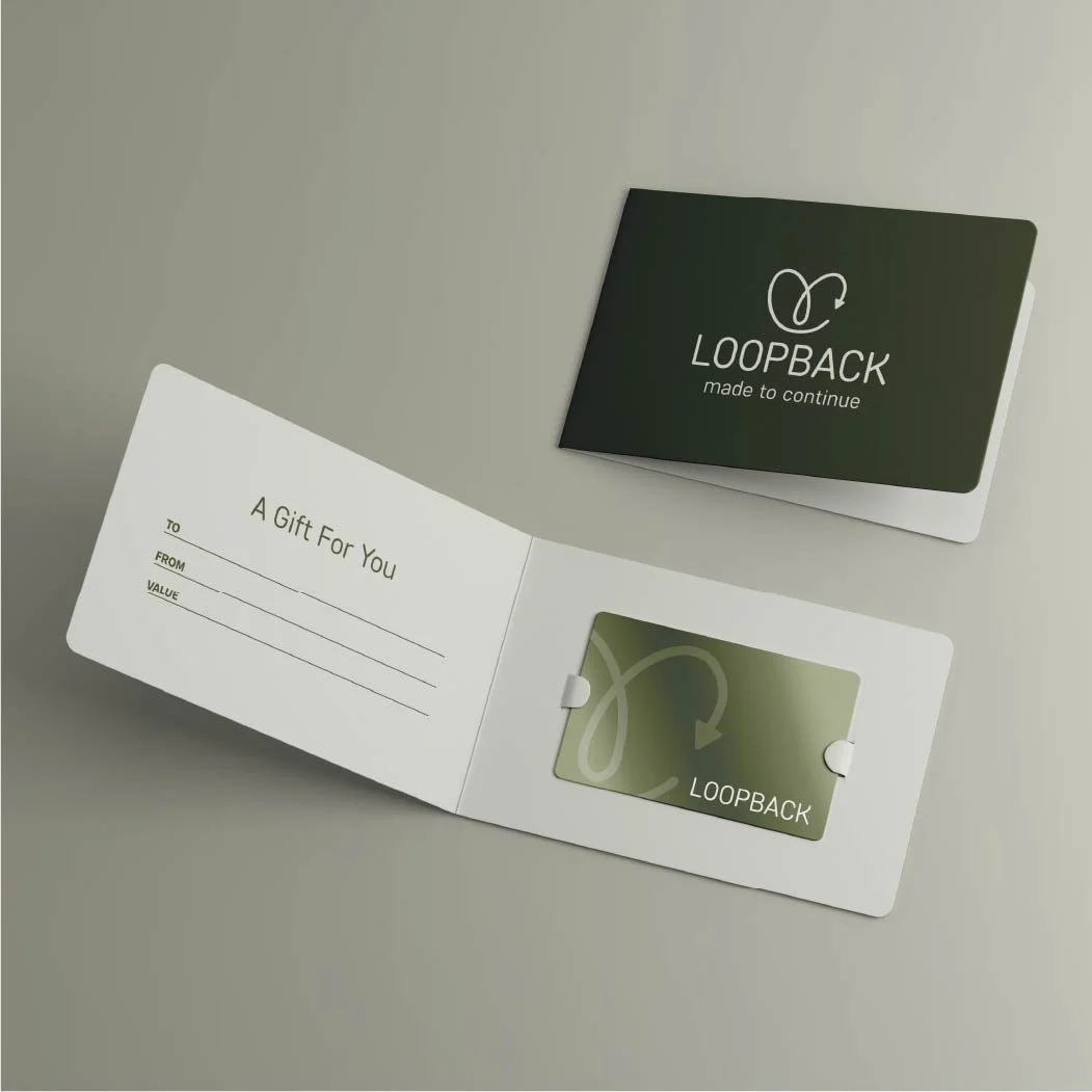
Loopback is a circular brand that produces yarn made from natural fibres and reclaimed materials. I chose yarn to focus on because I had recently gotten into crocheting, which made me aware of the amount of scraps and waste that can build up over time.
The name “Loopback” comes from the brand’s proposed recycling program, where customers can donate their scraps to be reprocessed into new yarn that is then resold; this idea informed the concept and identity. Granny square patterns were incorporated into the yarn labels as decoration and as a functional element, giving users a simple pattern they can follow or experiment with.
-
![Laptop_Web_Mockup.jpg]()
Desktop Website
-
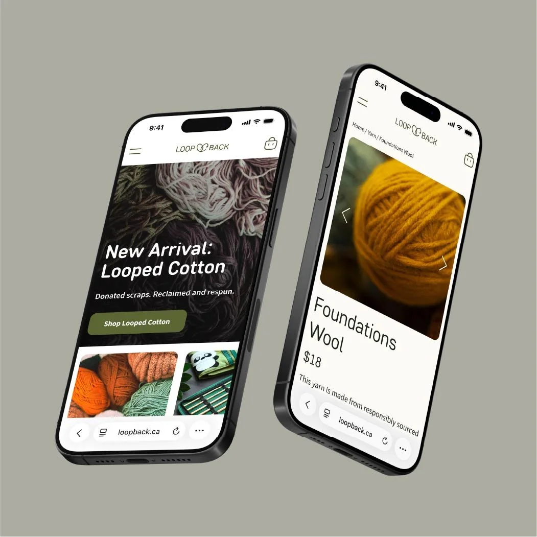
![Mobile_Web_Mockup.jpg]()
Mobile Website
-
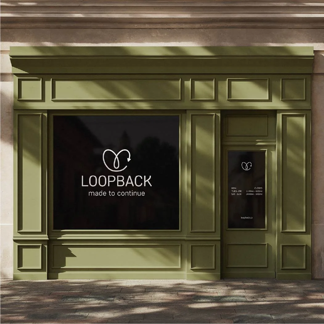
![Storefront_Mockup.jpg]()
Storefront
-
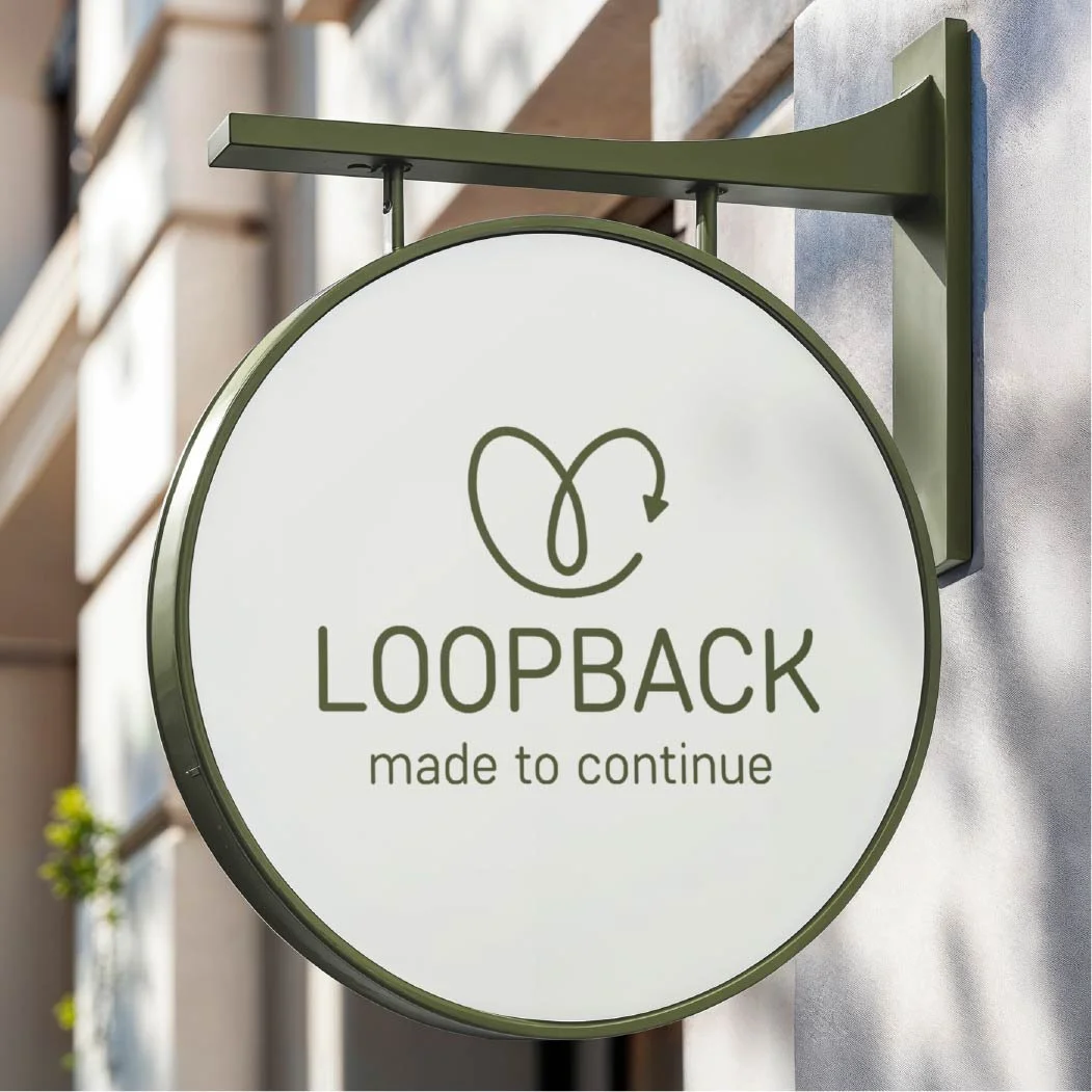
![Store_Sign_Mockup.jpg]()
Store Sign
-
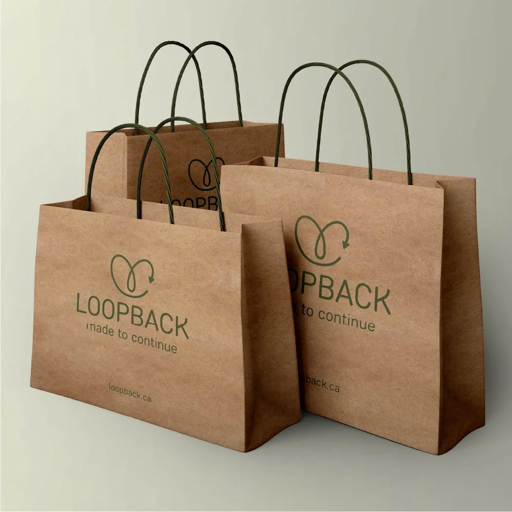
![Paper_Bag_Mockup.jpg]()
Paper Bags
-
![Tote_Mockup.jpg]()
Tote Bag
-
![Gift_Card_Mockup.jpg]()
Gift Card
Objective: Create cohesive restaurant brand collateral through two interconnected design pieces that demonstrate consistent visual language, typography, and layout principles across different formats and functions.
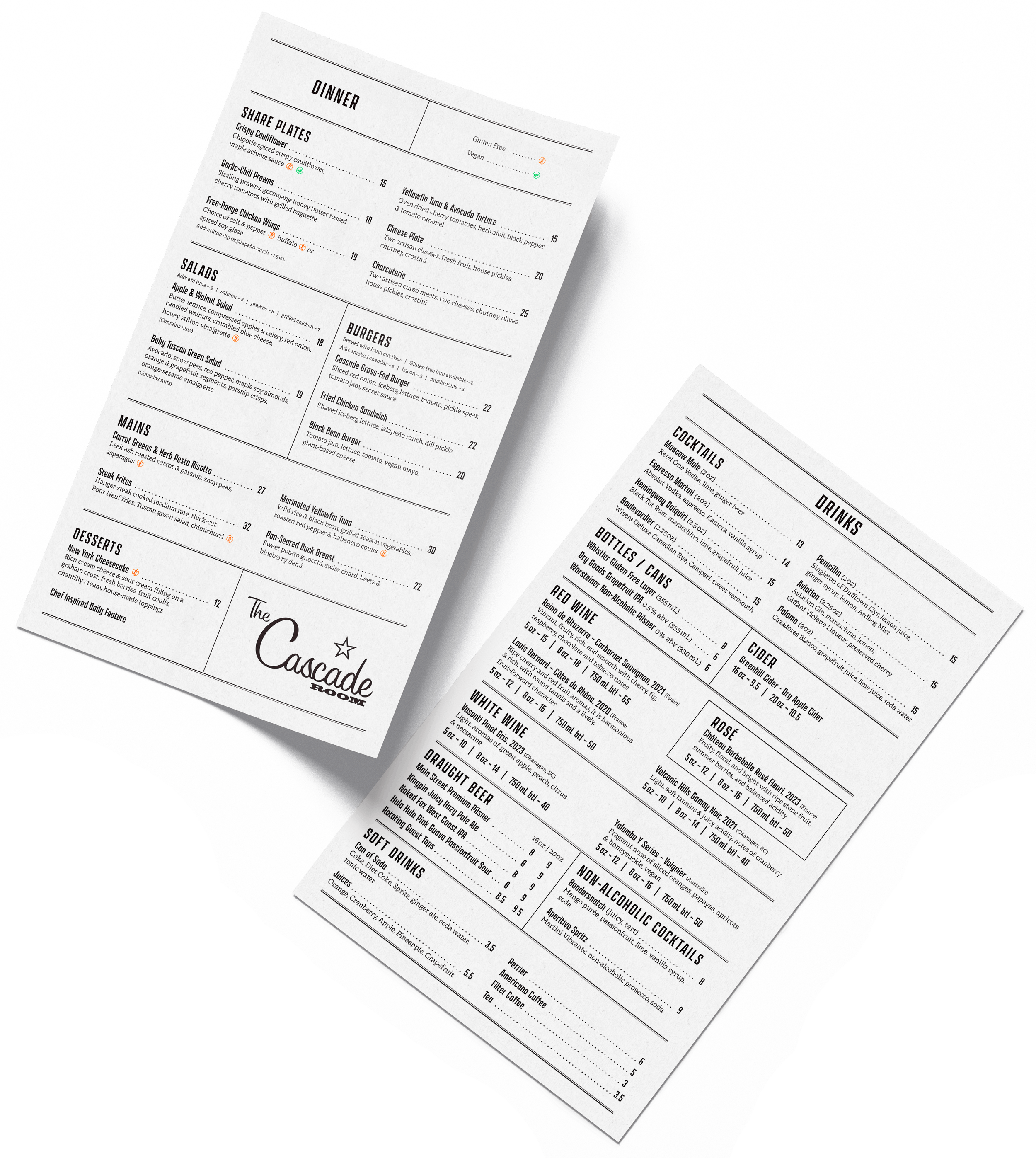
The Cascade Room is a restaurant known for its upscale but relaxed British pub-inspired atmosphere. The defining graphic feature is the use of Oxford rules—divider lines consisting of one thick and one thin stroke. This choice serves two purposes:
Historical context: The rules reference traditional British editorial and print design, aligning with the restaurant’s nod to British culture.
User experience: The dividers break up the information, allowing customers to navigate the different sections, even in the restaurant’s low-light atmosphere.
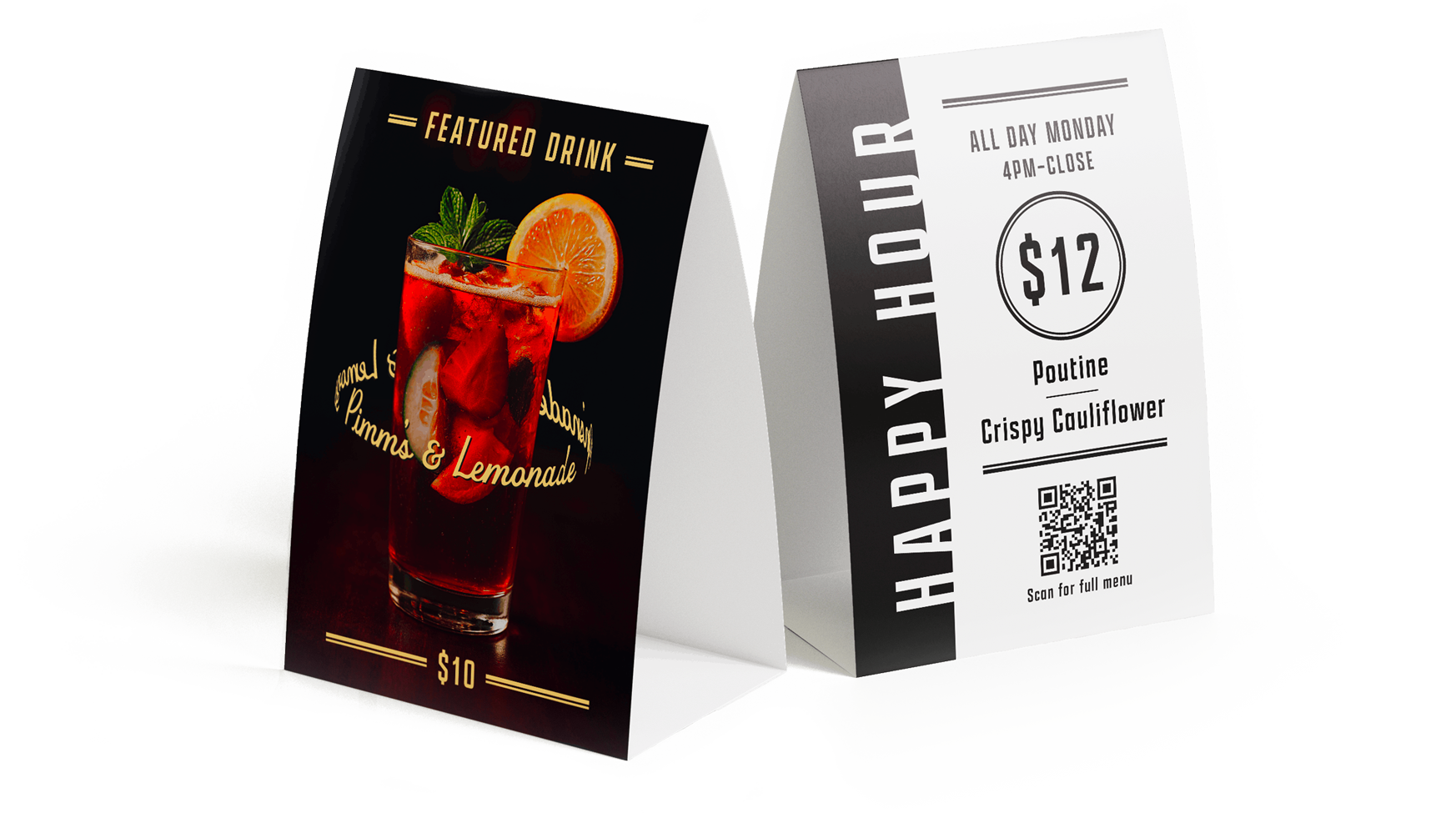
The tent card follows the same visual language, using the Oxford rules and minimal colour to make it stand out on the table while still feeling like part of the overall system.
Menu + Tent Card
Branding | Layout | Typography
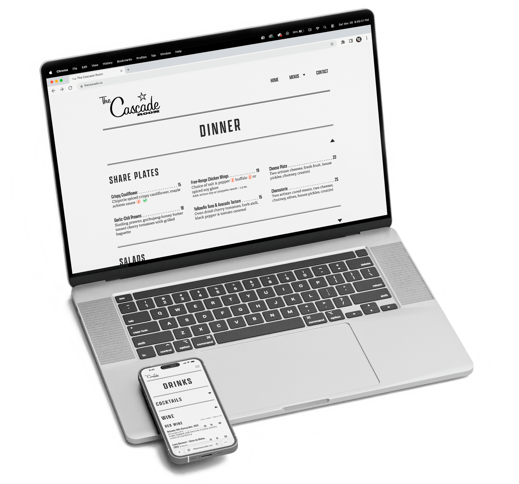
Objective: Transform the restaurant menu from a previous course into a responsive web-friendly design using Figma. This project focuses on user experience, information hierarchy, and responsive design principles without requiring any coding.
For the digital version, the menu was separated into two pages, dinner and drinks, to simplify navigation and reduce visual clutter. Within each page, menu categories are organized as dropdowns, allowing users to expand only the sections they need. This keeps the layout clean and works well on mobile, where space is limited.
The visual language remains consistent with the print version through the continued use of Oxford rules and the same typographic system. This continuity helps the menu feel familiar across formats, translating the same experience from print into a digital context.
Digital Restaurant Menu
Web Design | Layout
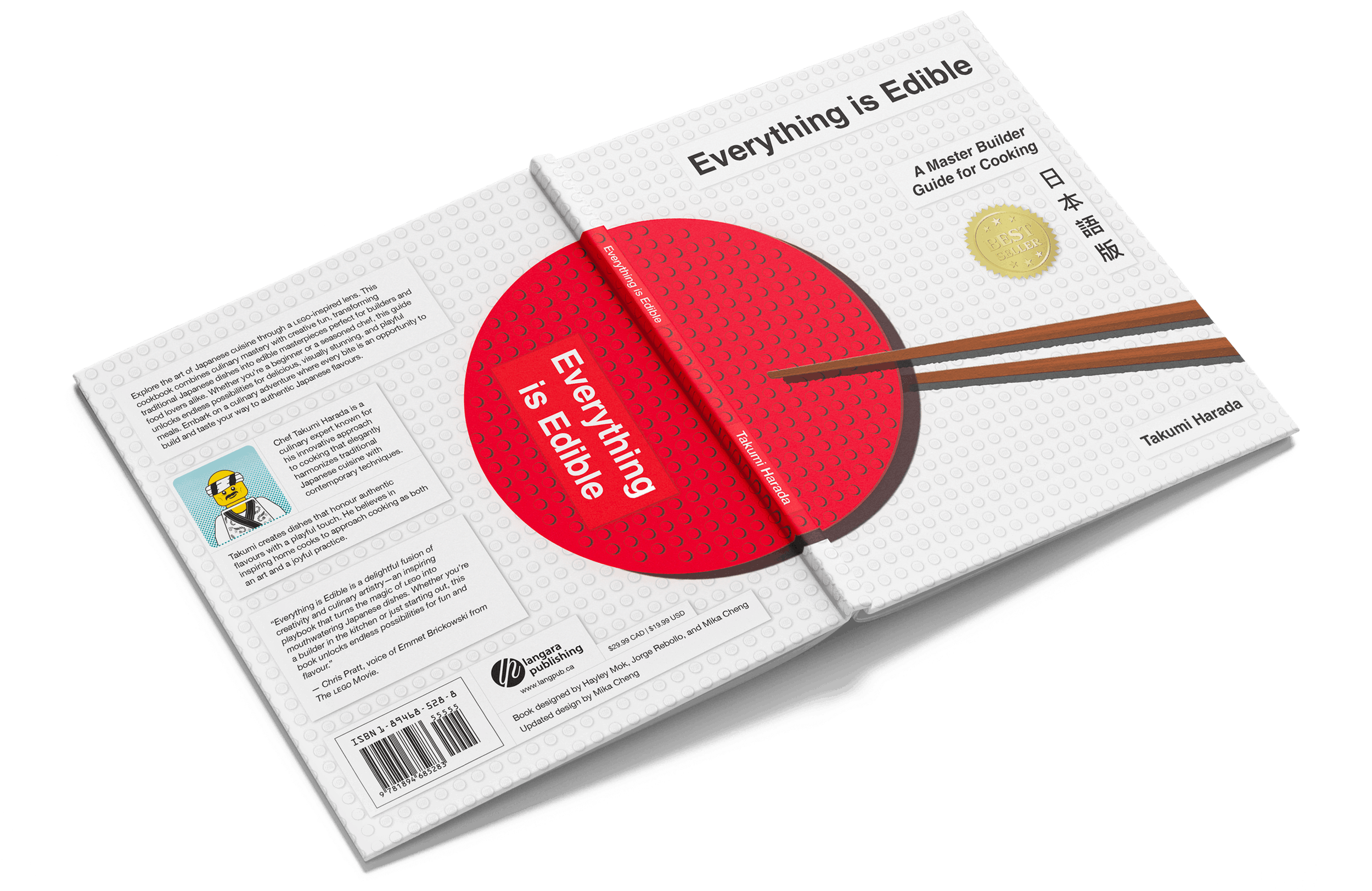
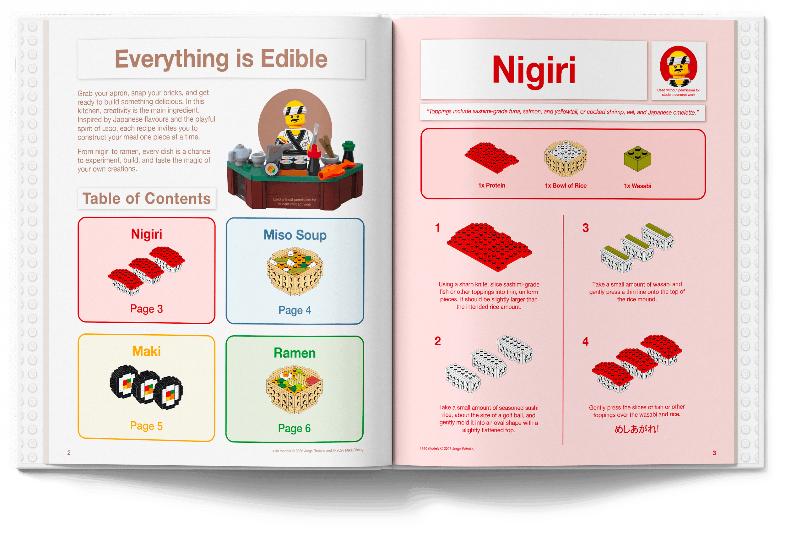
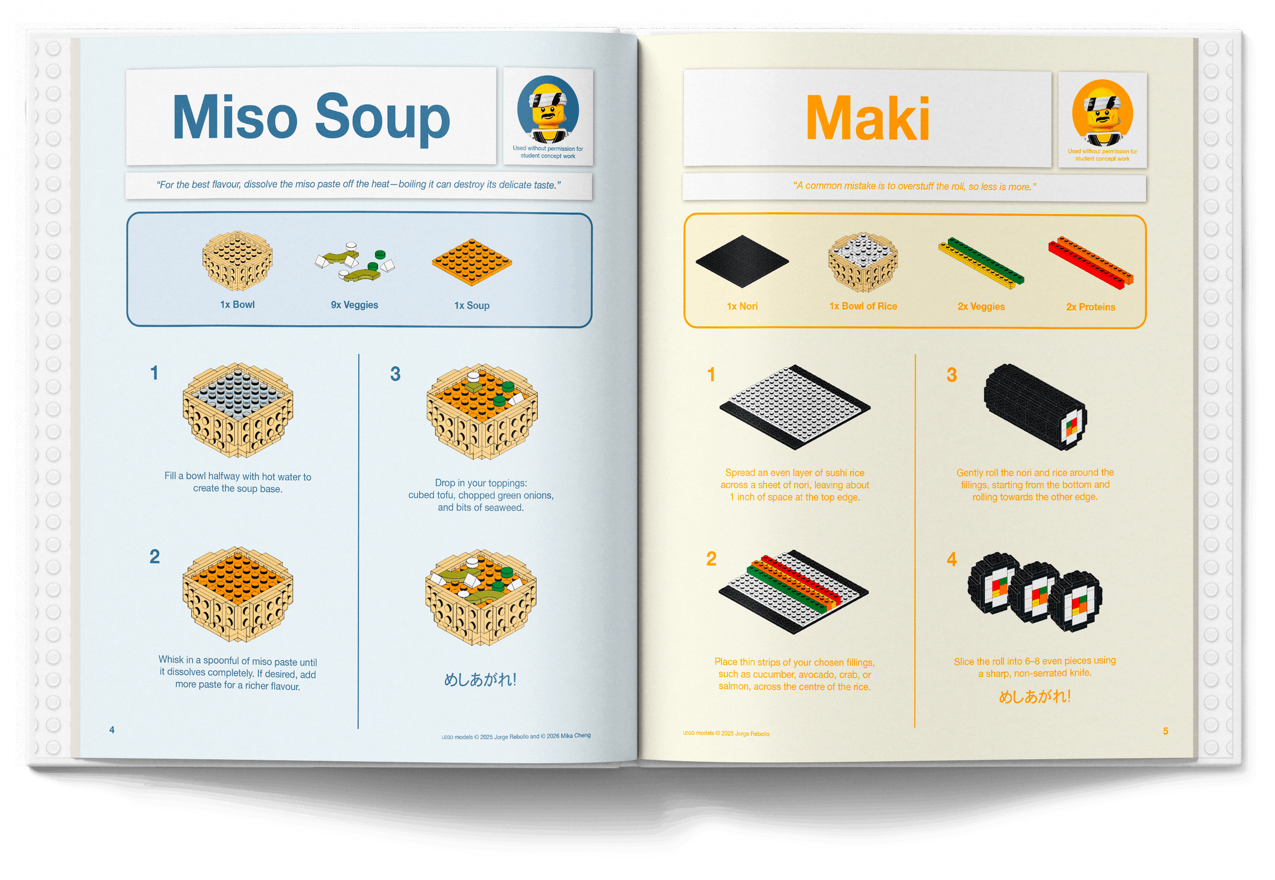
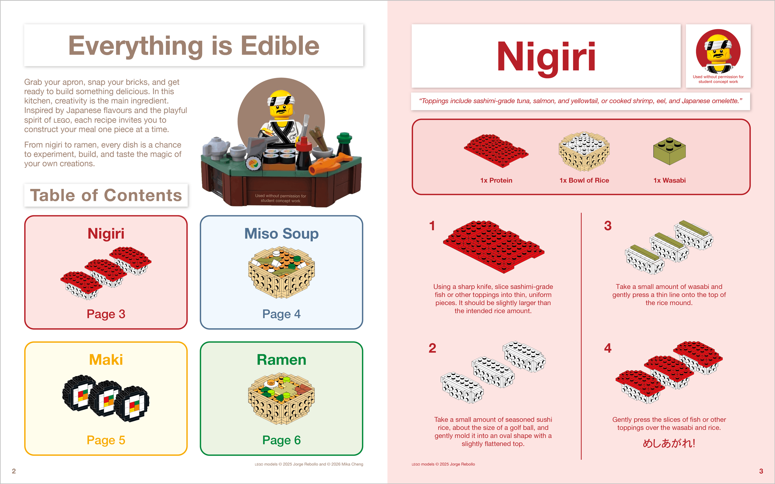
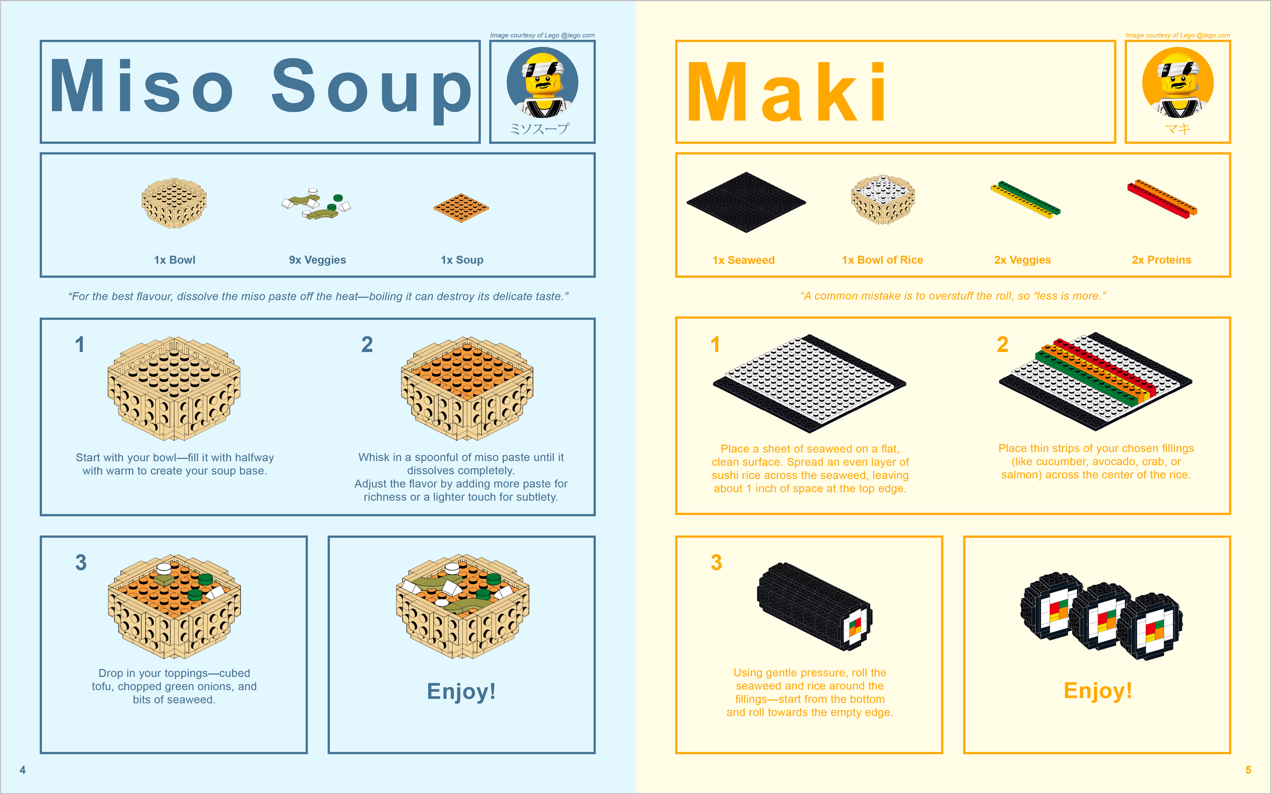
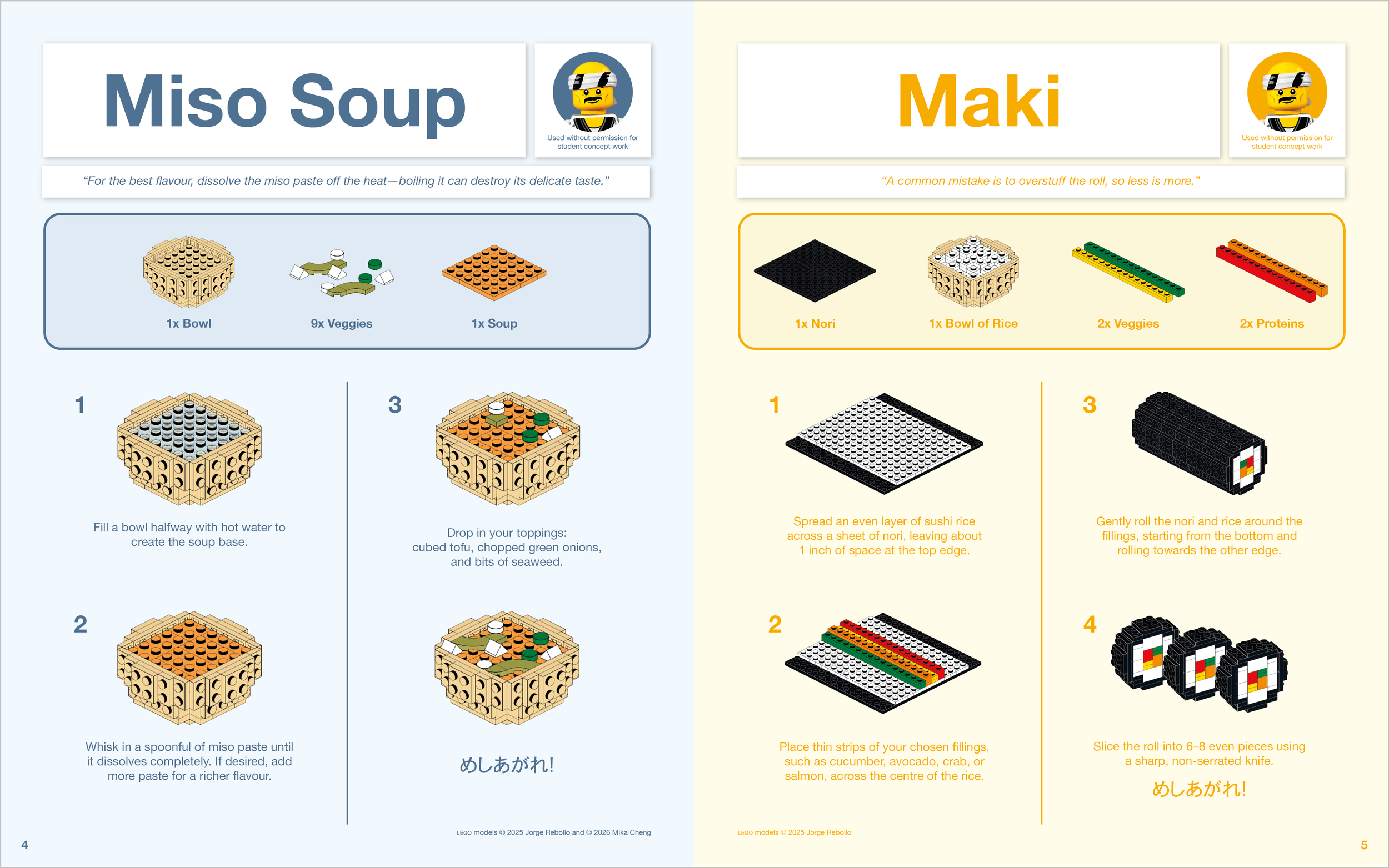
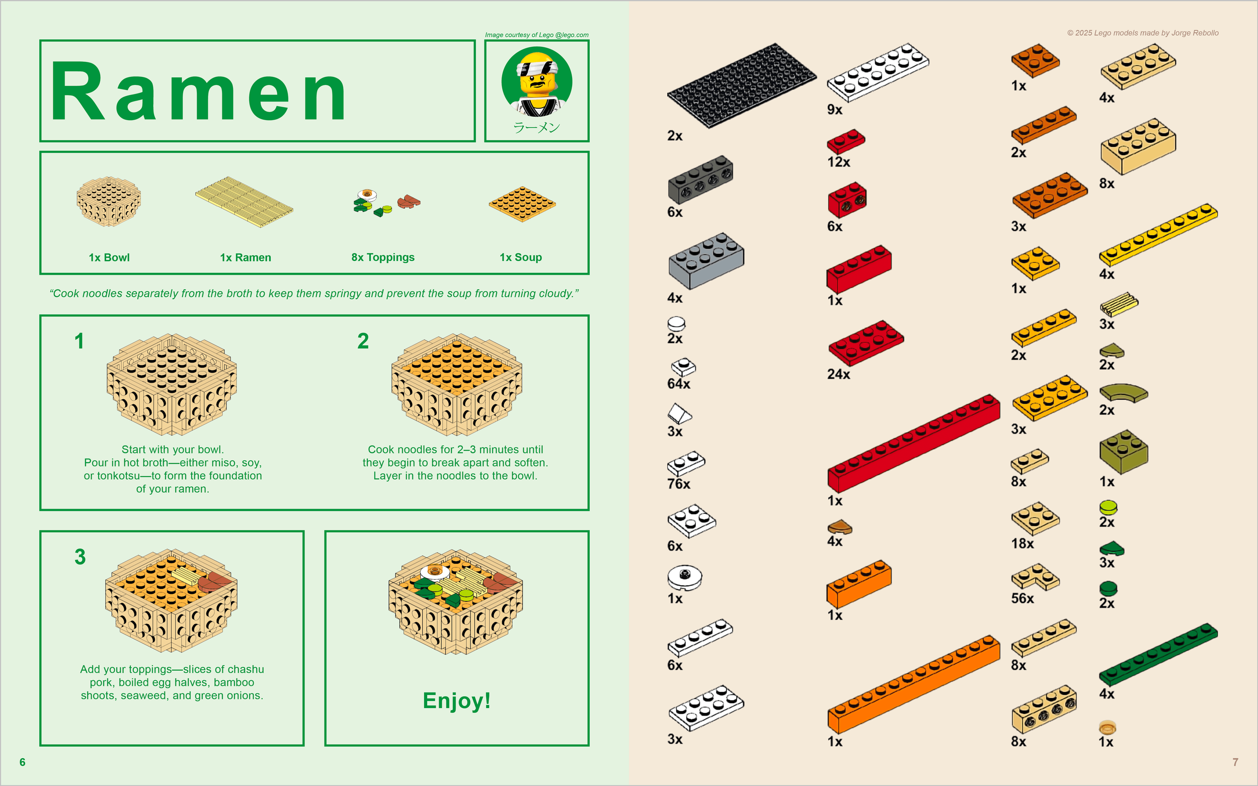
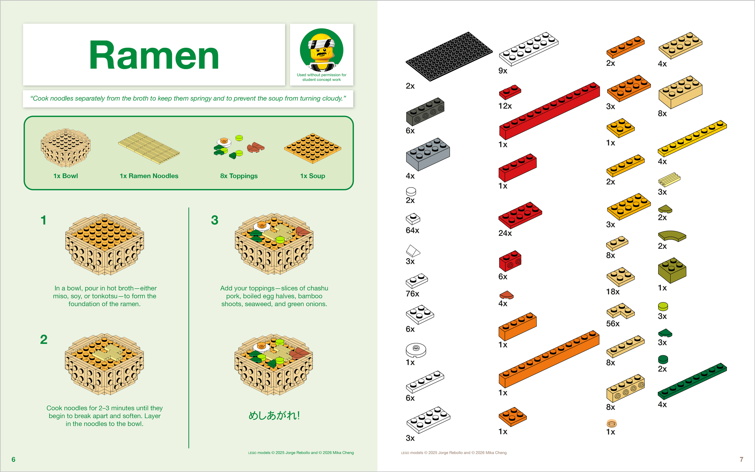
Objective: Design a cookbook, ensuring its recipes, graphics, and the other ancillary information, work together as part of a coherent concept, that brings the story, the foods, and the dishes to life, while considering the hierarchy of the typography, professional typesetting of the main text, the connection between text and images, and the continuity of all pages.
This cookbook was developed as a group project, and we decided on a concept inspired by LEGO instruction manuals.The intention was to use the familiar step-by-step visual language of LEGO building guides into a culinary context, using digestible steps, simplified diagrams, and sequential layouts to communicate each recipe.
Building on this idea, I later made adjustments independently to refine the design and better unify the concept. This involved standardizing the grid structure, improving alignment and spacing, and creating a more consistent typographic hierarchy to enhance readability and flow.
Cookbook
Communication | Layout | Typography
-
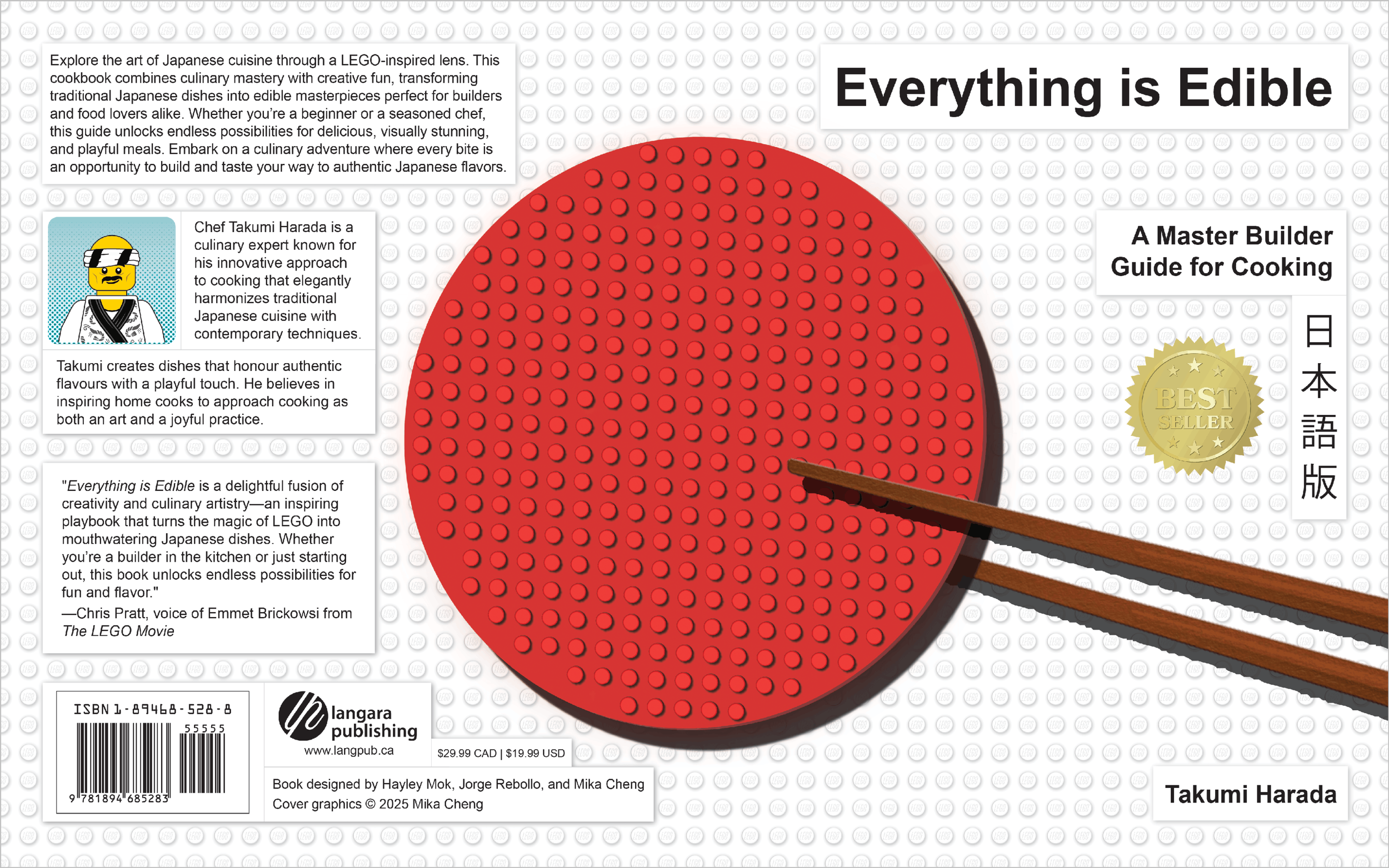
![Cookbook_Cover_Original.png]()
Original Group Spread
-
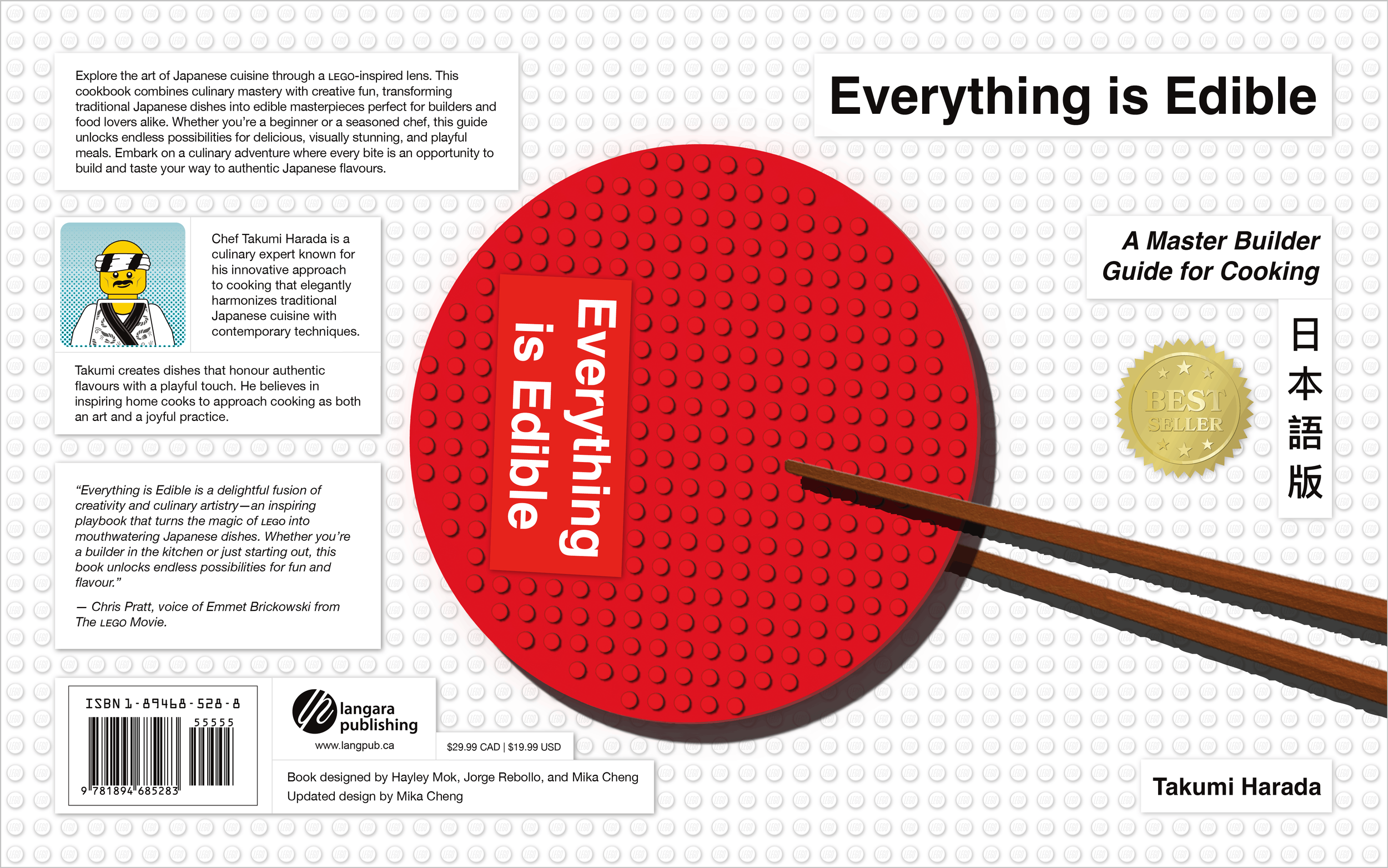
![Cookbook_Cover_Updated.png]()
Individually Refined Spread
-
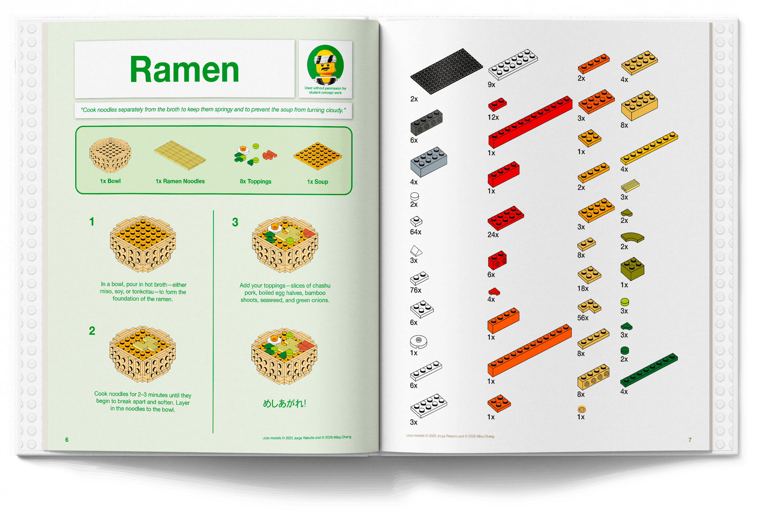
![Cookbook_Spread_1_Original.png]()
Original Group Spread
-
![Cookbook_Spread_1_Updated.png]()
Individually Refined Spread
-
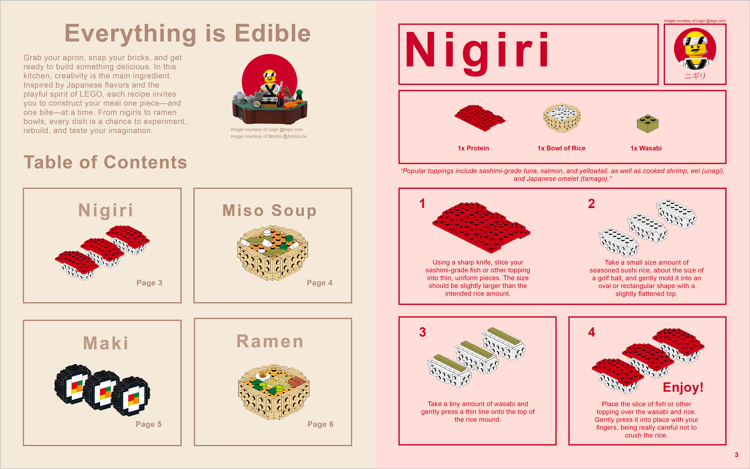
![Cookbook_Spread_2_Original.png]()
Original Group Spread
-
![Cookbook_Spread_2_Updated]()
Individually Refined Spread
-
![Cookbook_Spread_3_Original.png]()
Original Group Spread
-
![Cookbook_Spread_3_Updated.png]()
Individually Refined Spread
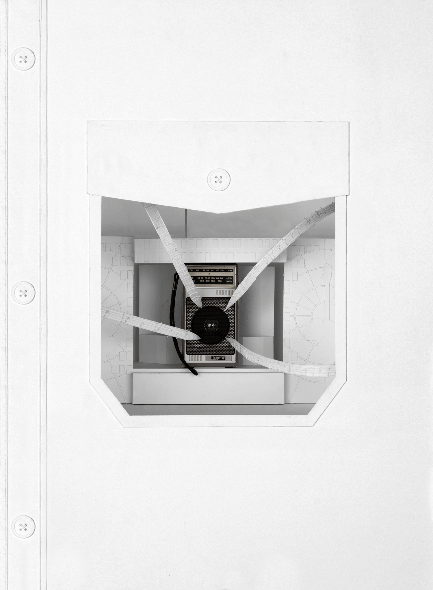
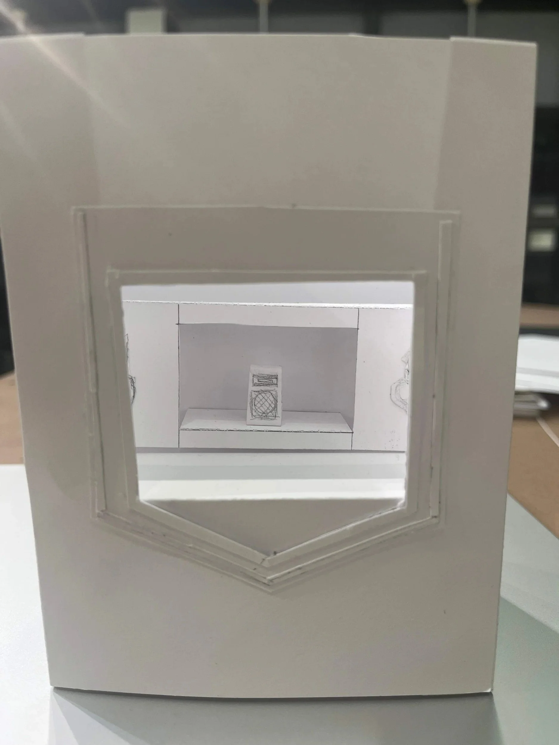
Objective: From a lottery selection of random objects, identify, research and then design an engaging presentation that expresses the experience of an object in only white paper.
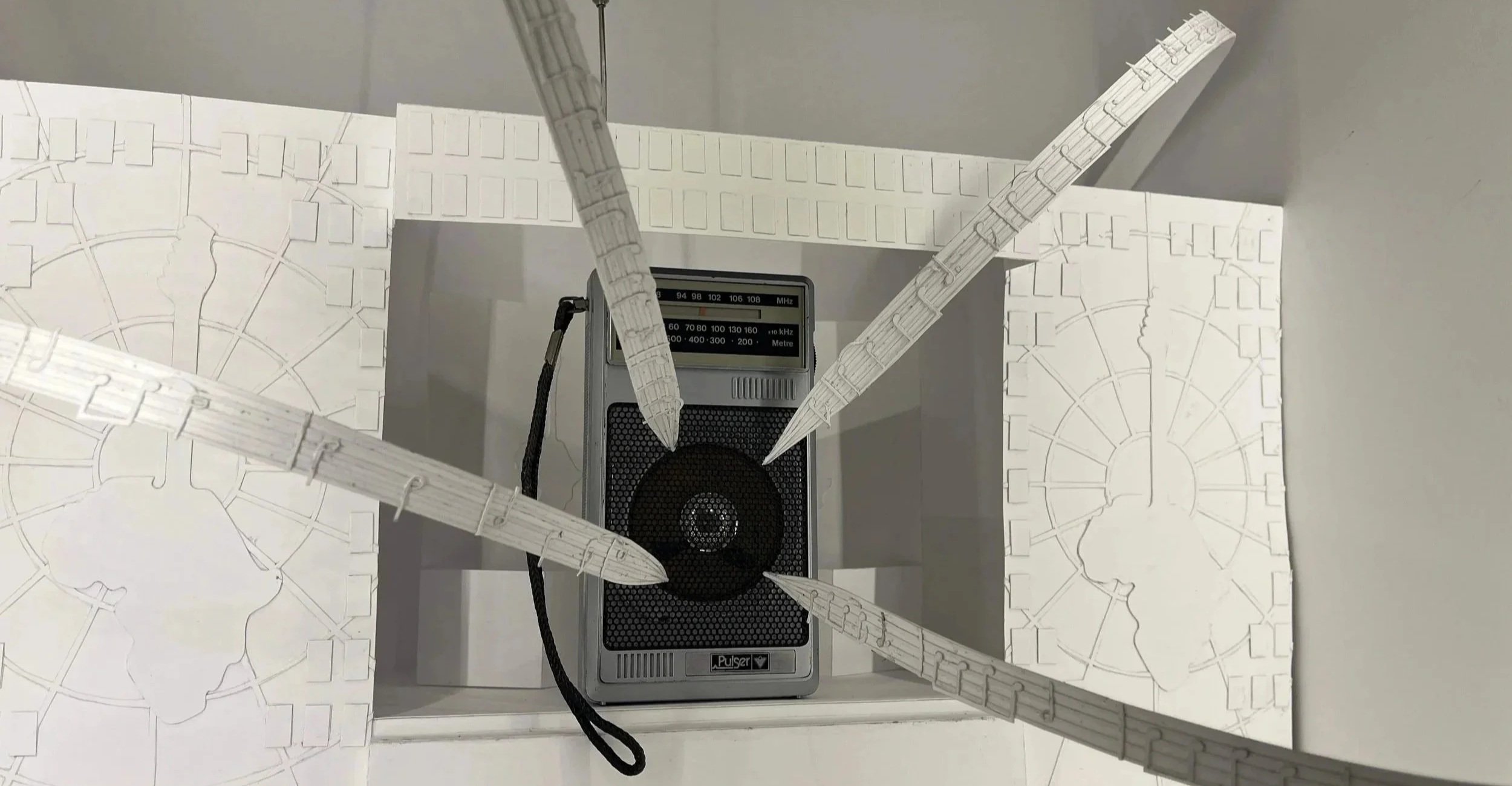
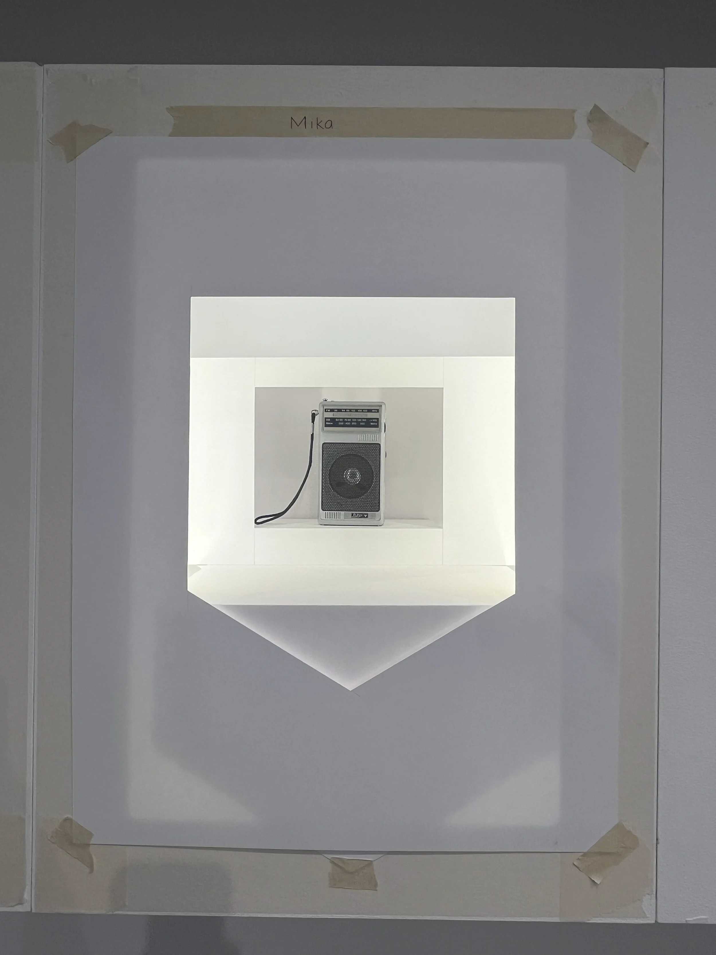
The object showcased is an ’80s pocket radio produced by Canadian Tire’s in-house electronics brand, Pulser. The concept was inspired by Queen’s performance of Radio Ga Ga at Live Aid. The song reflects on the decline of the radio’s prominence in the face of emerging visual media, while also expressing nostalgia for its role as a shared listening experience,which parallels how pocket radios were becoming less popular with the rise of personal devices like the Sony Walkman.
The exterior of the showcase takes the form of a button-up shirt, referencing how pocket radios were originally designed to be small enough to fit inside a shirt pocket. A cutaway opening in the pocket allows viewers to see inside, bridging the everyday function of the object with its larger cultural significance.
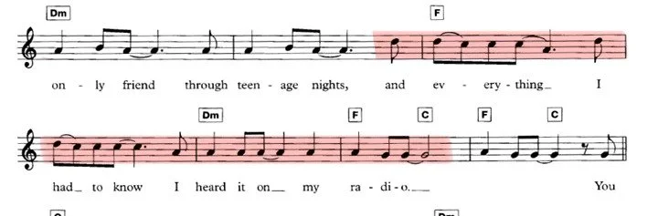
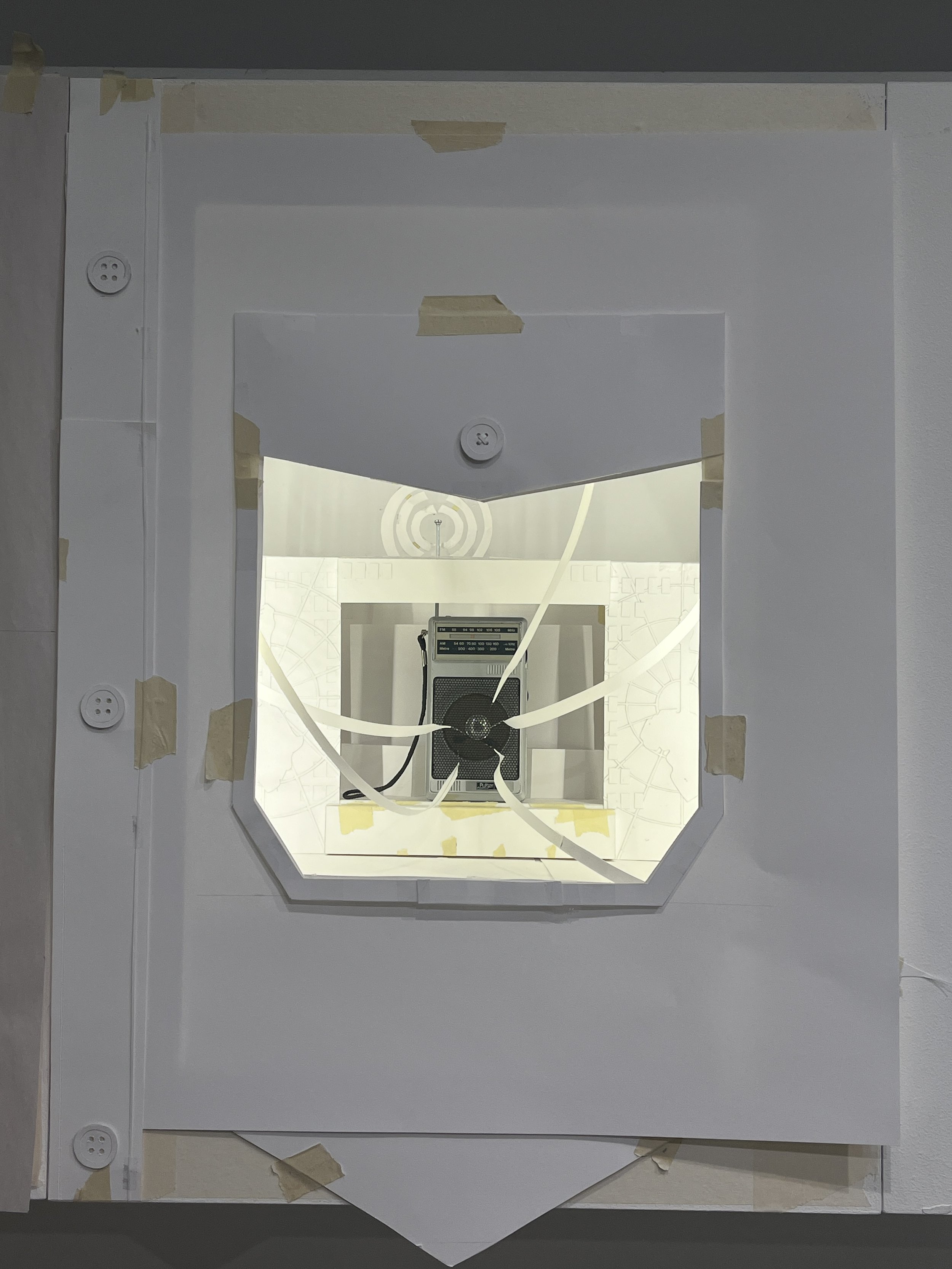
The interior is a miniature recreation of the Live Aid stage. At the centre sits the radio, positioned as the source of sound and energy. Extending outward from the speaker are strips of musical notes, which have some of the lyrics from Radio Ga Ga.
Extra Ordinary
Experiential Design | Papercutting
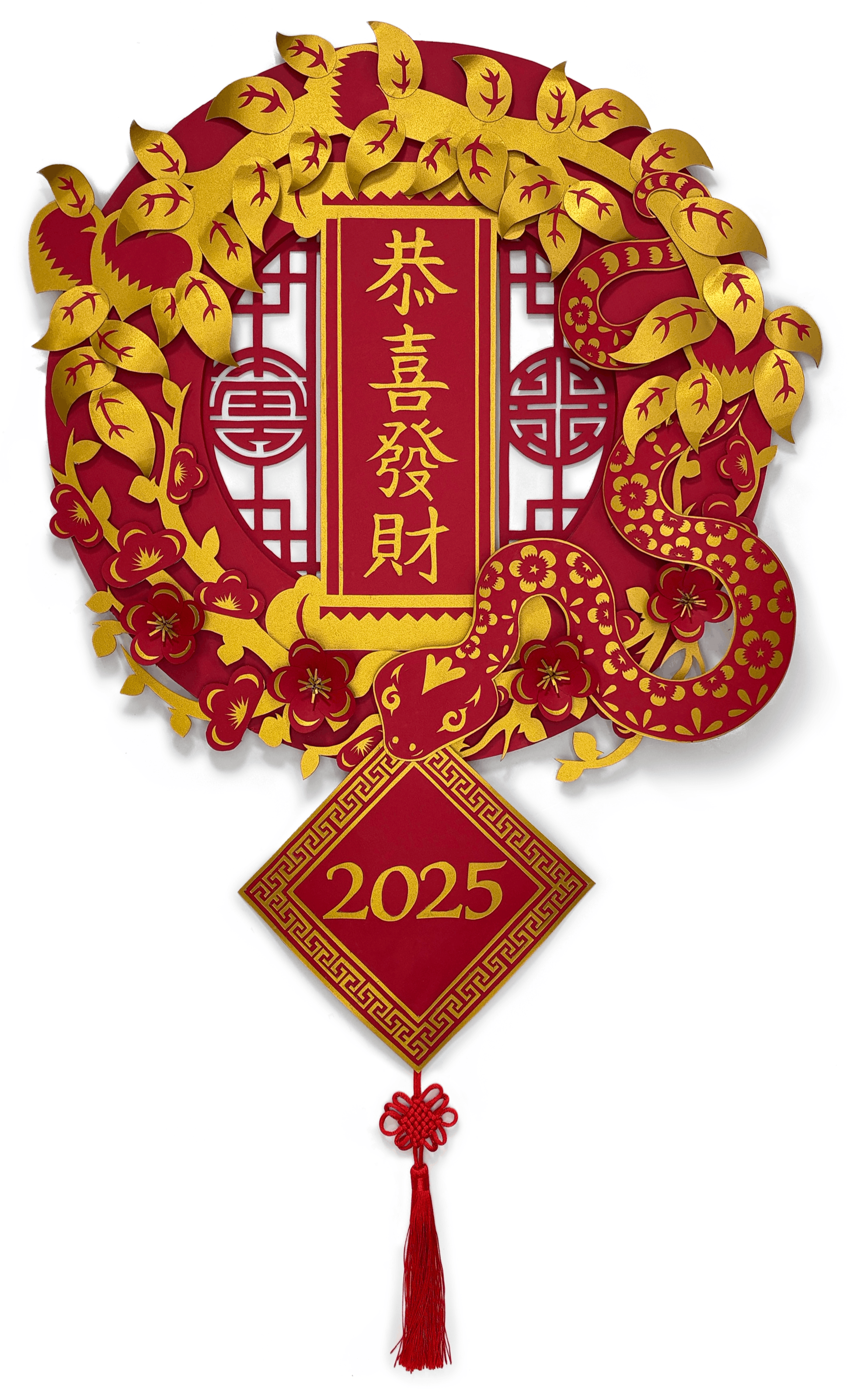
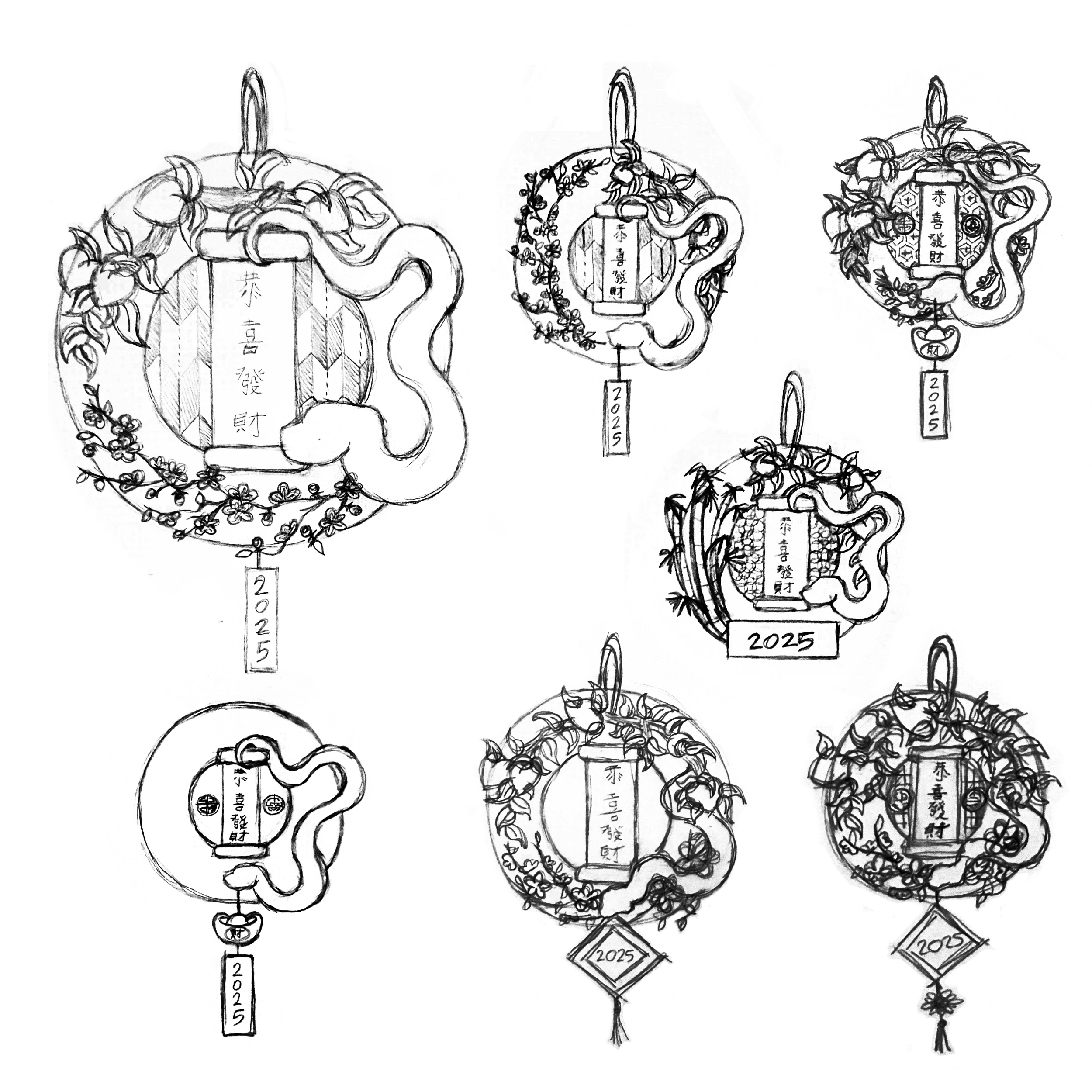
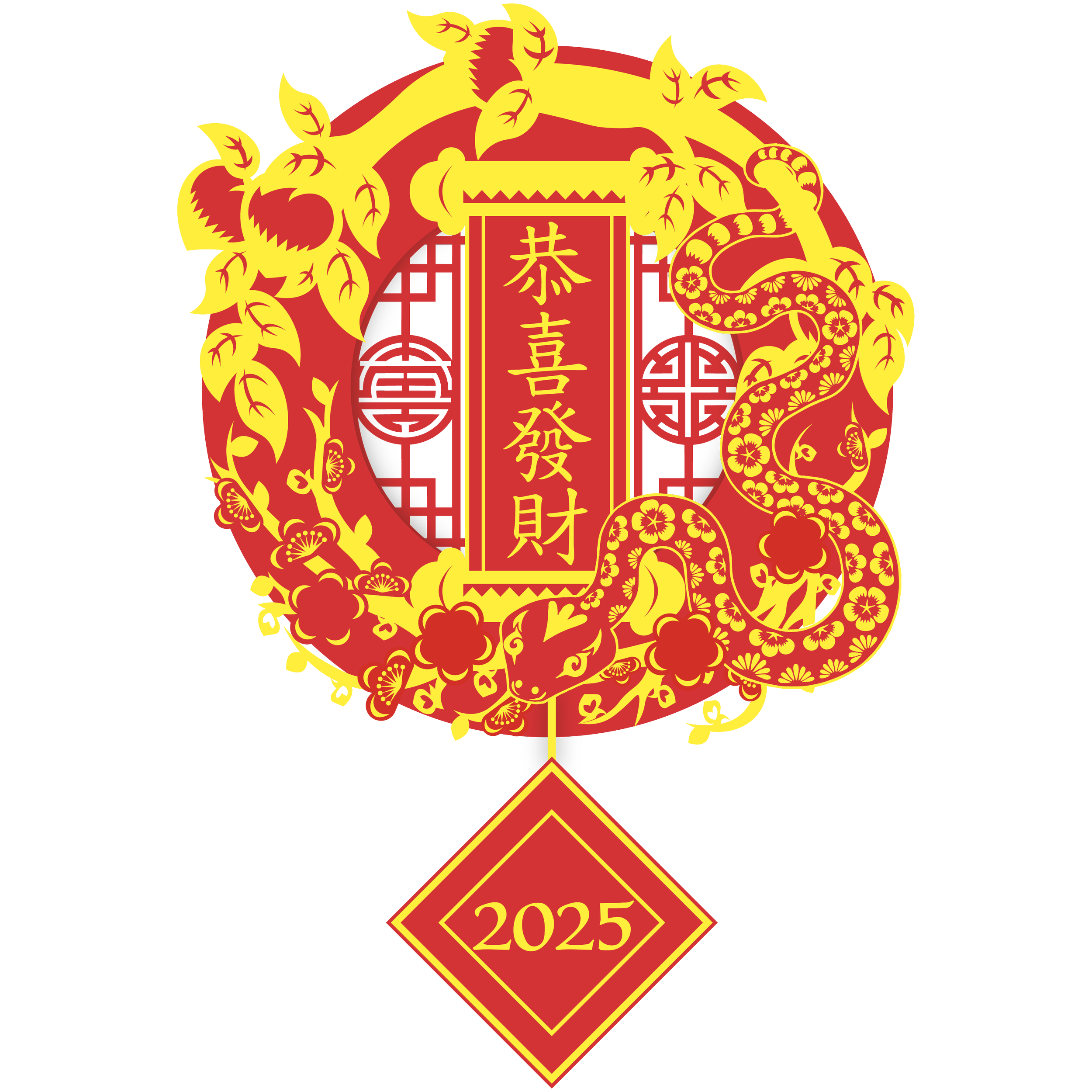
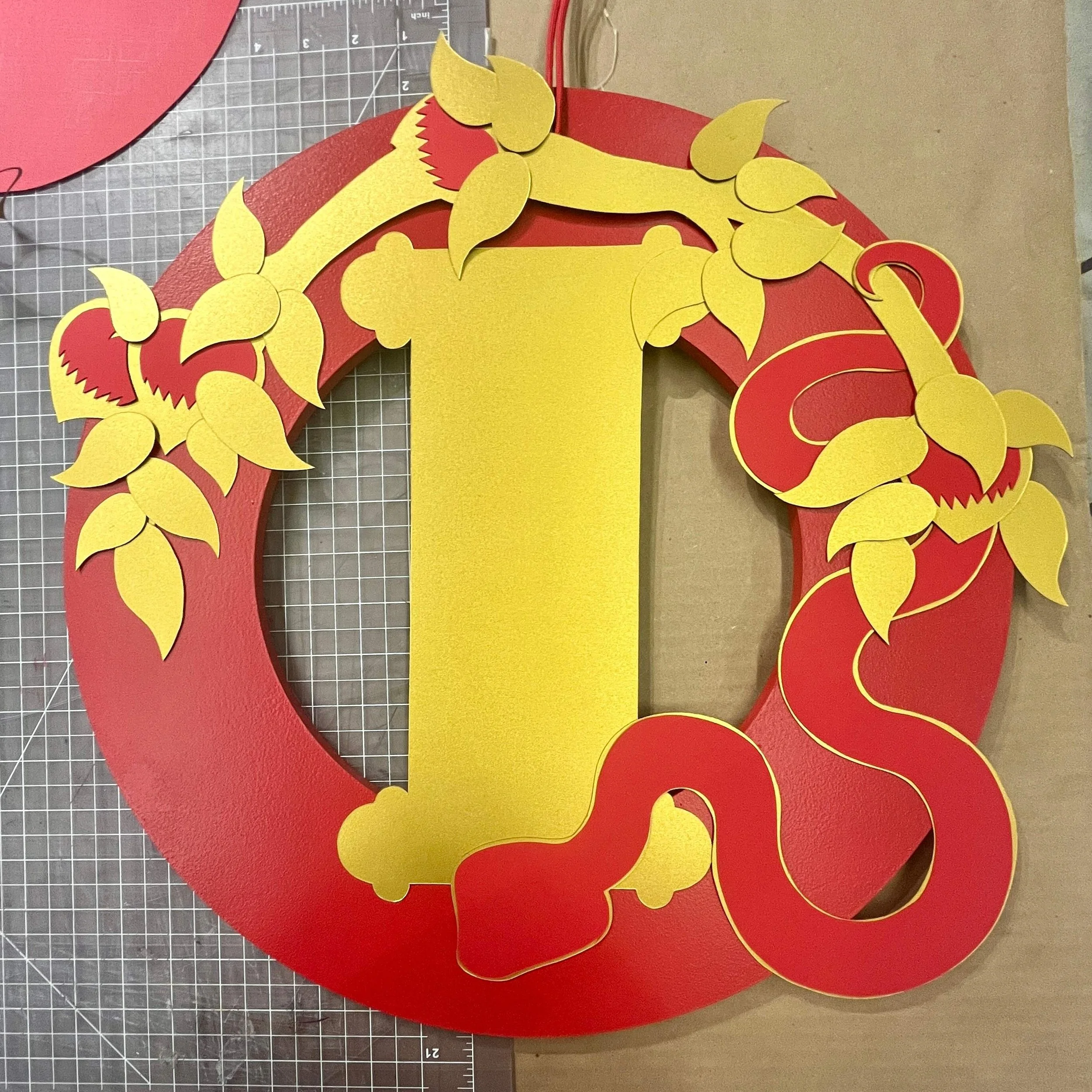
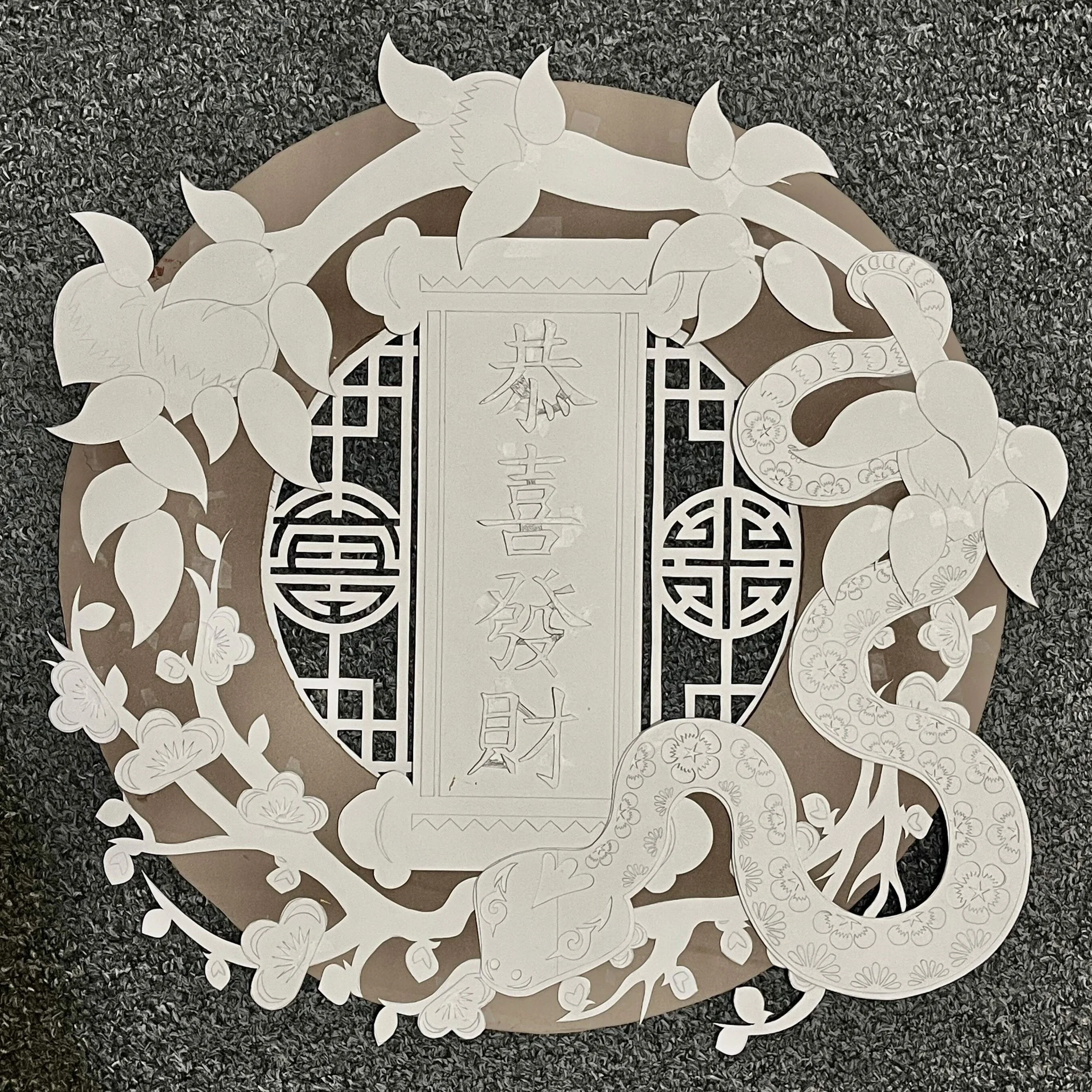
Objective: Researching the multitude of meanings held within the visual cliches and motifs of Lunar New Year, hand craft a decorative wreath executed in traditional Asian papercutting techniques.
The wreath is centred around the narrative of a snake that journeys to gather symbols of good fortune, assembling them into a wreath to help people face the upcoming year.
My original idea was to combine both Chinese and Japanese motifs to reflect my heritage, but they didn’t integrate well visually. I instead focused on Chinese motifs and found that some of them carried meanings that aligned with my narrative in Japanese culture too.
Lunar New Year Wreath
Experiential Design | Papercutting