
Lyn So
Multidisciplinary Designer
Sincere | Purposeful | Reliable
Guided by sincerity and reliability, I create purposeful designs that extend beyond aesthetics to shape meaningful experiences.
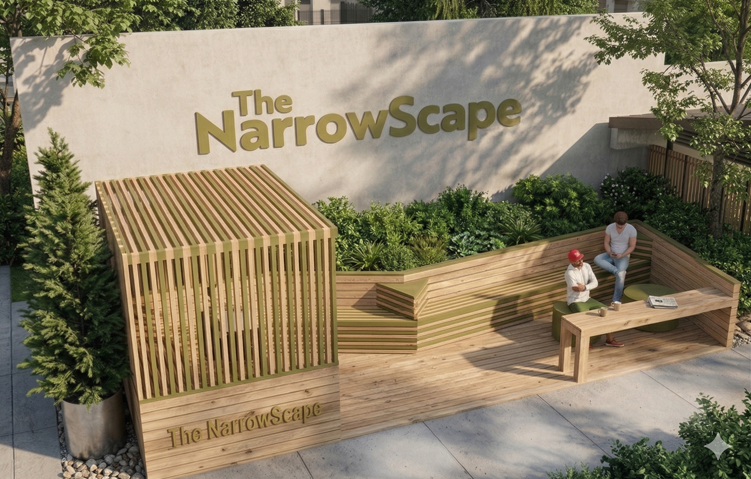
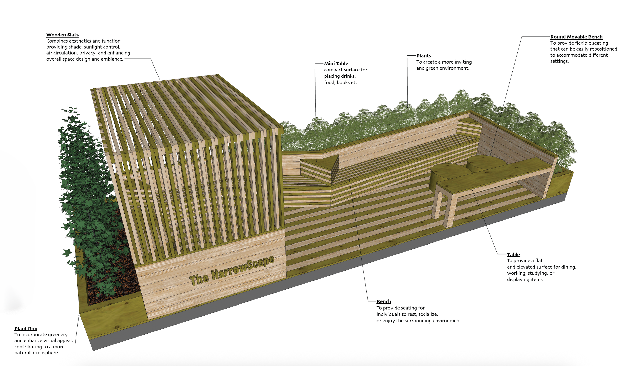
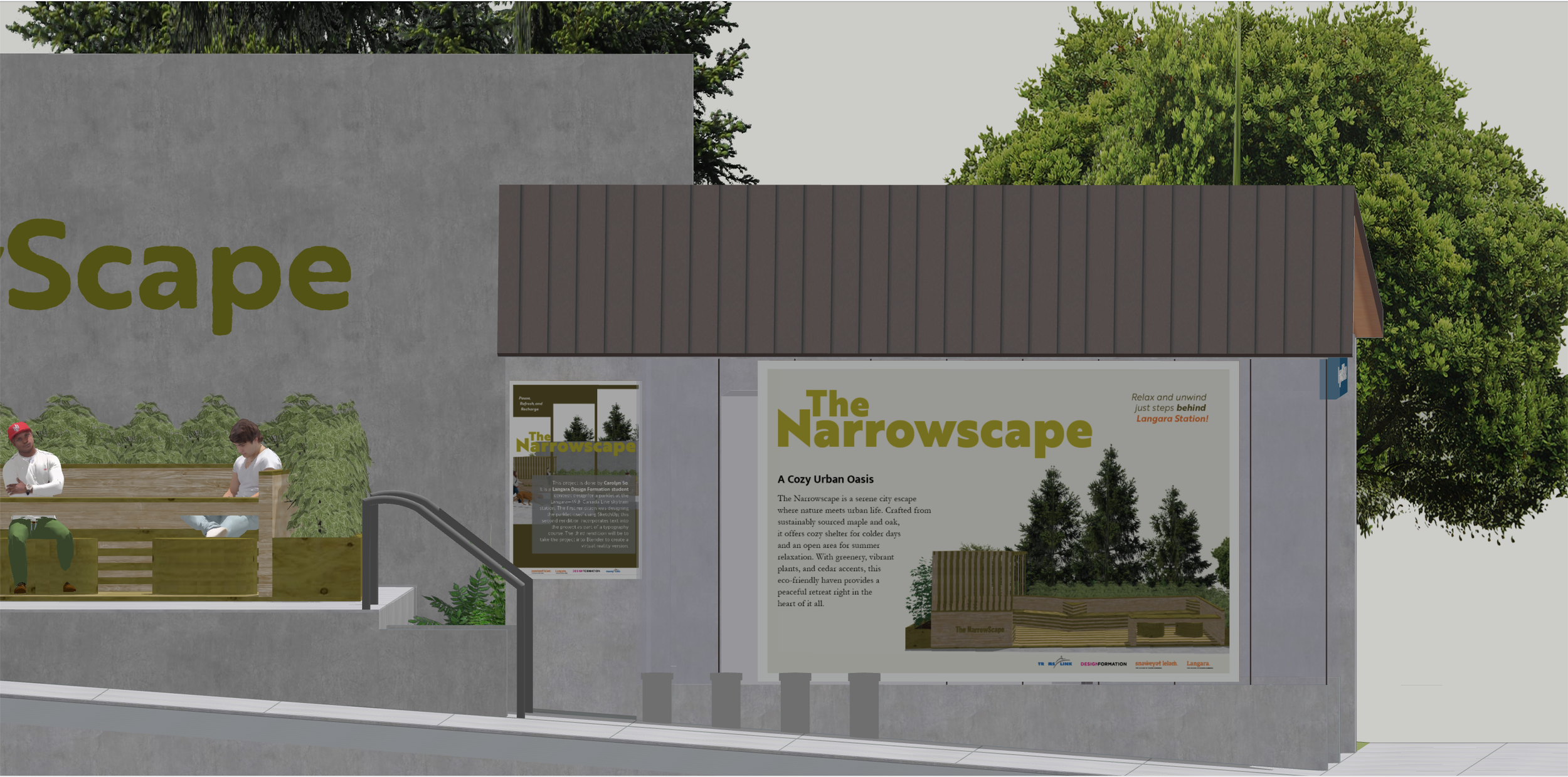
The Parklet
Interiors & Architecture | Typography
Two-Phase Project

Phase 1 Objective
Design a small Architectural Public Space: a Parklet. Review, apply, and strengthen skills with 3D modelling and 2D drawing tools across the design development and communication processes, while exploring design principles and spatial awareness concepts.
Design Concept
I started with loose hand sketches to explore the initial flow and rhythm of the space. From there, I moved into SketchUp to build out a model of my design, then used LayOut to generate the plans and sections required for a real-world build. To finish the project, though not required, I tried using AI as a rendering engine to breathe life into my SketchUp model, adding realistic lighting while making sure it copied my textures and actual design.
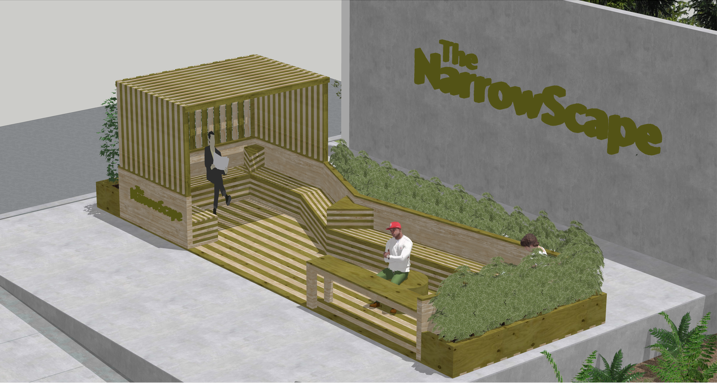
Phase 2 Objective
Place the Parklet project in a public setting and create graphics related to the design that can then be used as extruded text and as small and large posters, while carefully choosing text for different environments, e.g., reading from a distance, on an angle, in 3D, or with contrasting materials.
I designed the 2D visual identity and typographic hierarchy using InDesign and Illustrator, focusing on high-impact headings to catch the eye and invite passersby into the space.
I then integrated these graphics directly into my SketchUp model as textures, ensuring the branding felt like a seamless part of the architectural structure rather than an afterthought.
Extraordinary Project
Experiential Design I Spatial Planning
2-Phase Project
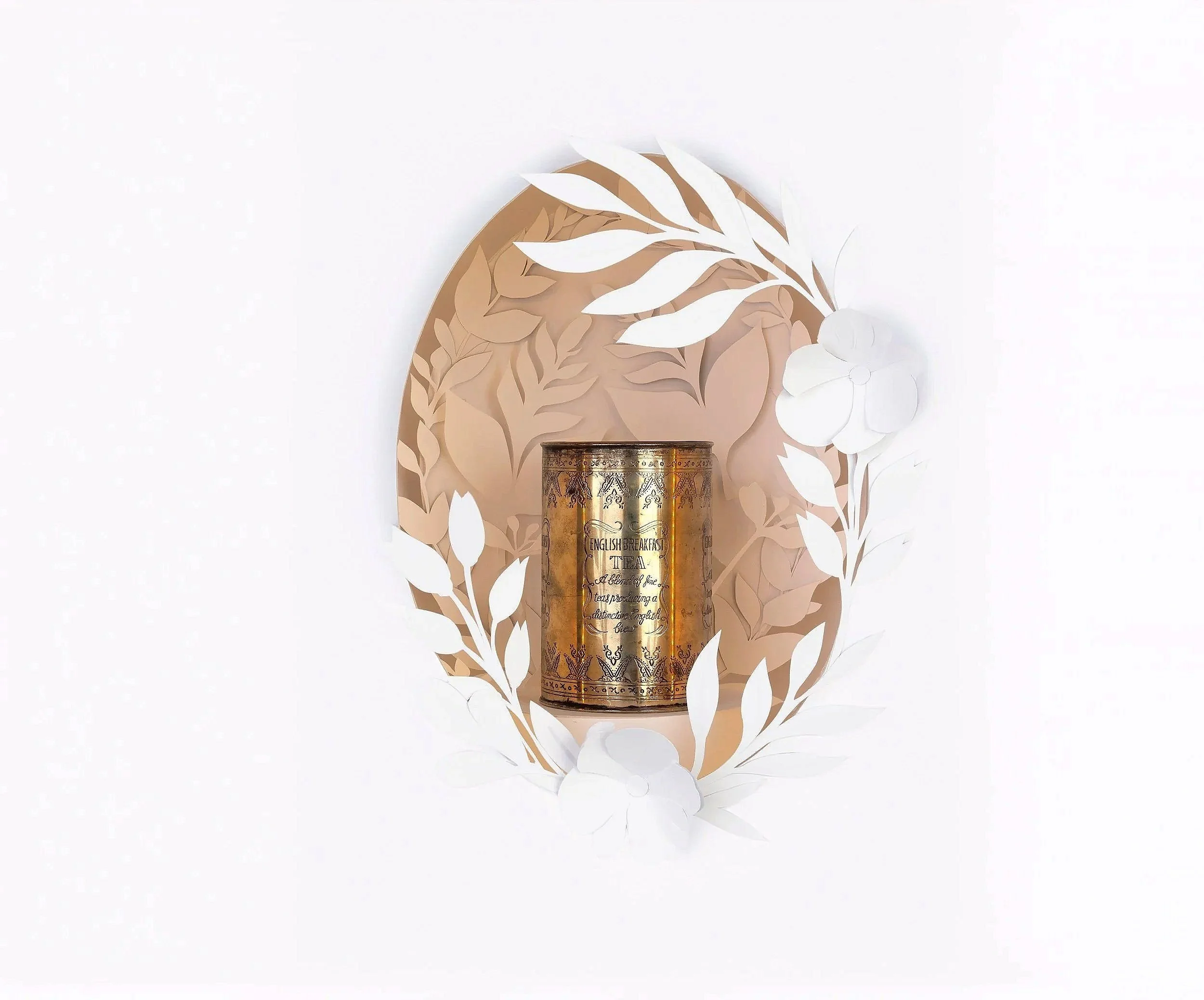
Phase 1 Objective : The Extraordinary Object Display
From a lottery selection of random objects, identify, research and then design an engaging presentation that expresses the experience of an object in only white paper.
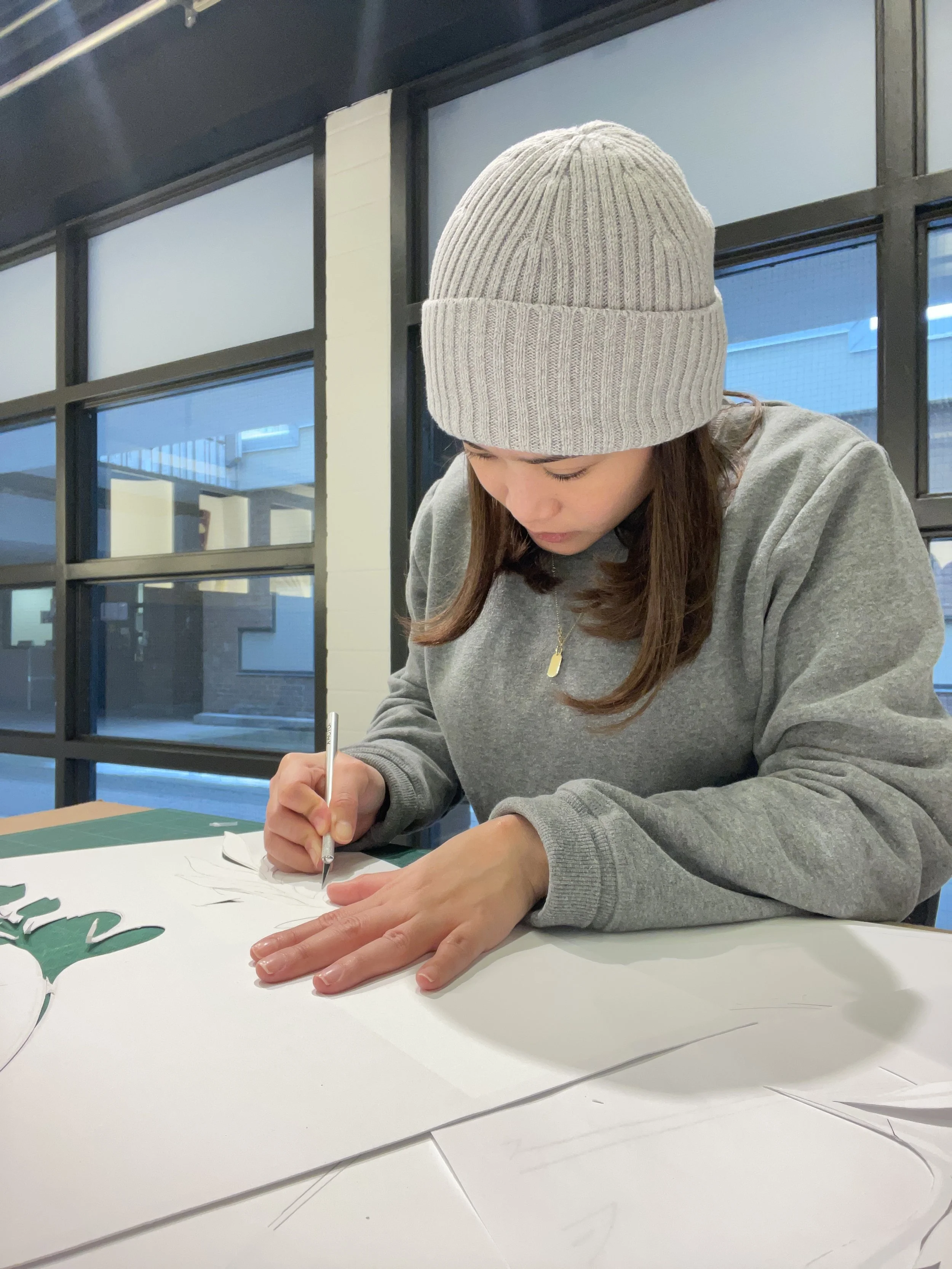
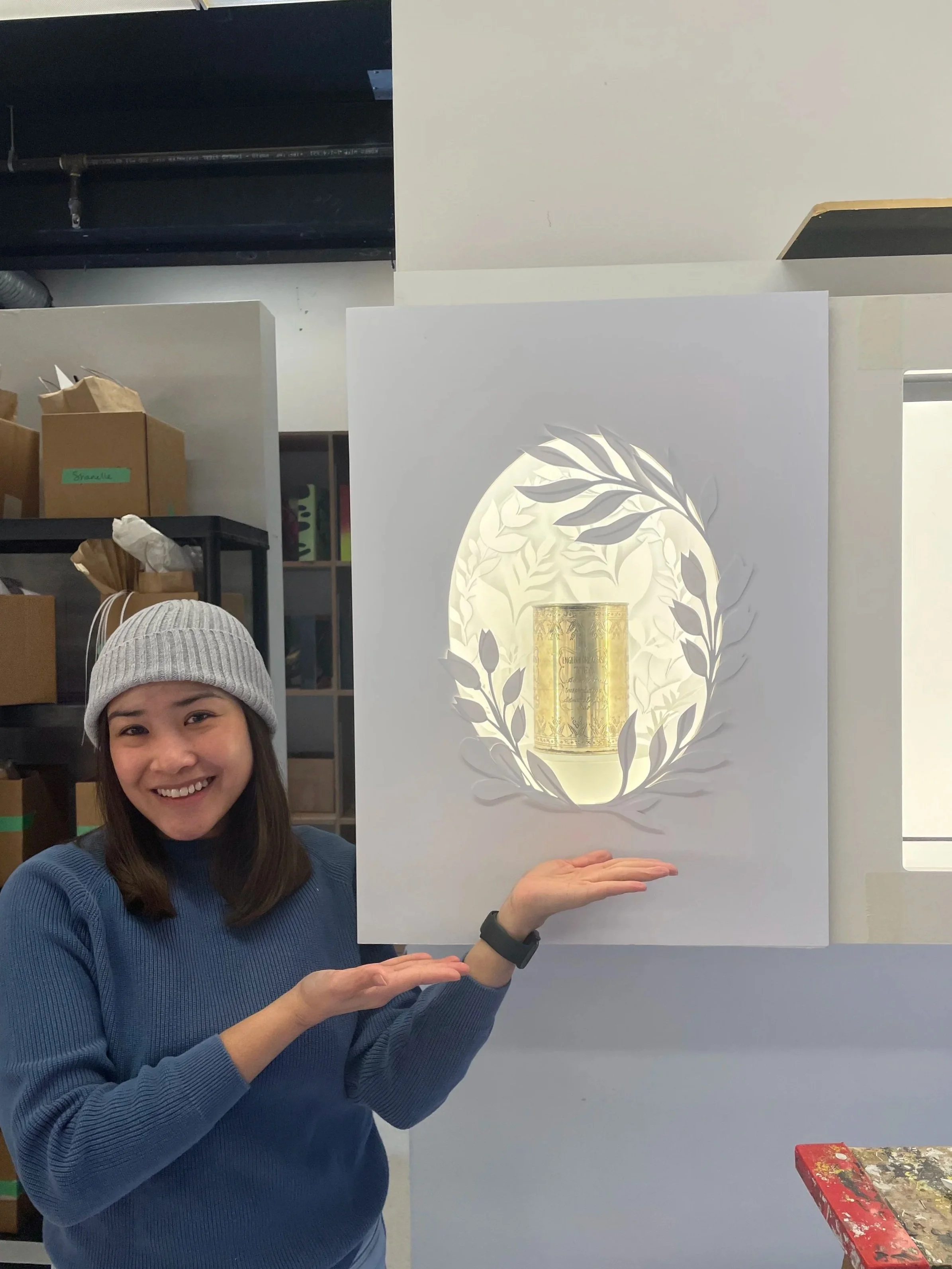
The initial process focused on removing colour to highlight the tea tin's silhouette using only white paper. I hand-drew and hand-cut intricate botanical patterns. These were arranged in multiple layers to create a high-relief effect.
To enhance spatial experience, I designed a geometric background with forced perspective. This creates a three-dimensional illusion, drawing the viewer’s eye toward the central artifact.
Meticulous layering transformed the "ordinary" object into a sculptural study, emphasizing the tactile and formal qualities of tea leaves in monochrome.
Phase 02 Objective : Dimensional Experience
Render a 20-foot-square exhibition space as a model to examine how people interact with objects in a three-dimensional environment. This directly builds on foundations set in previous explorations.
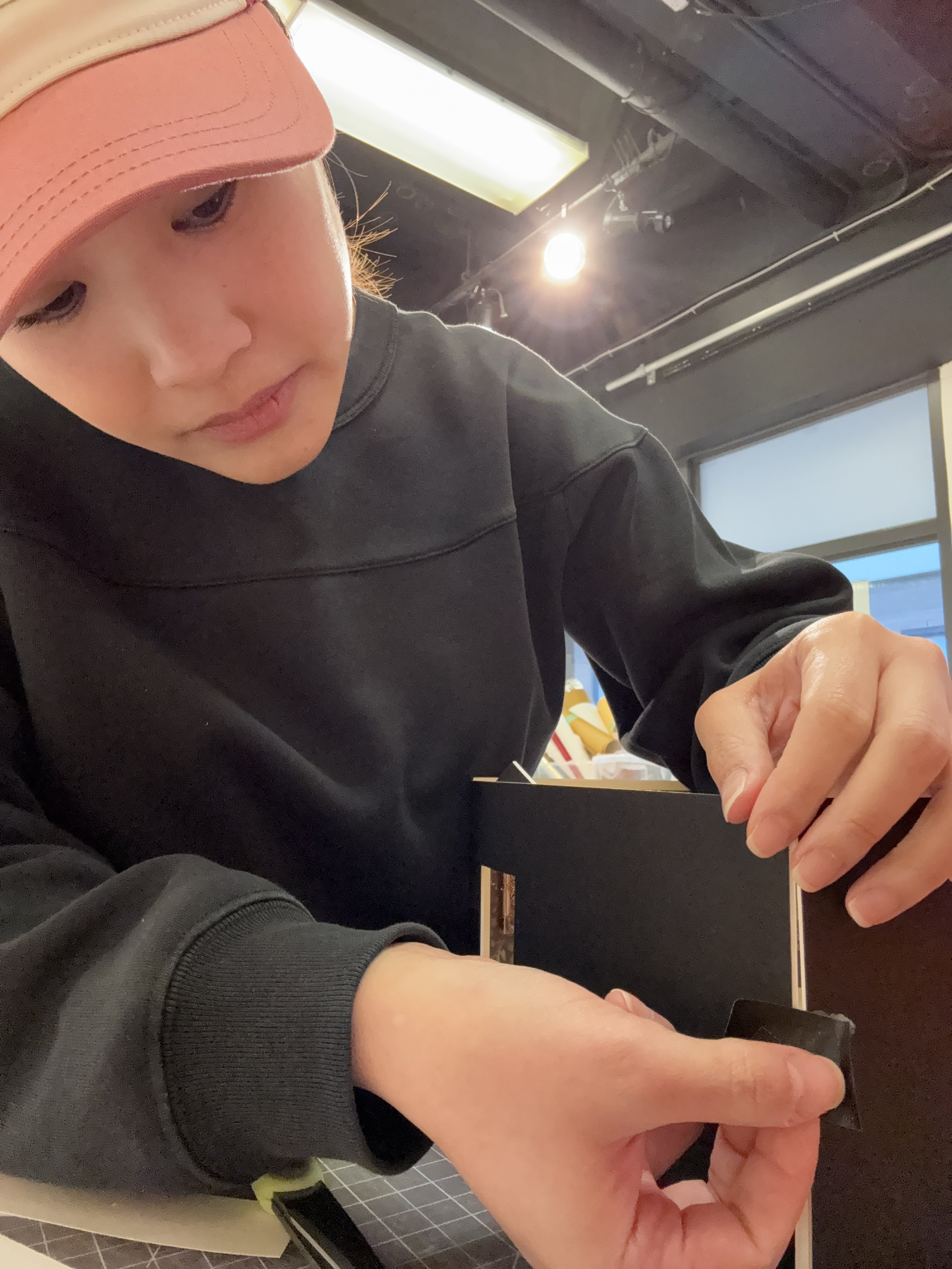
Building on Phase 01, I transitioned the project to a 1:25 scale physical mock-up to map out a 400-square-foot interior experience. Because specific historical records of the tin itself were limited, I shifted my research toward its functional purpose and the cultural era of its origin. This direction then led me to explore the influence of Queen Victoria, whose reign soldified tea as a global cultural staple.
The resulting spatial journey is organized into five distinct narrative zones:
The Global History Walls (2 Zones): Two dedicated spaces exploring the origins and global journey of tea leaves, connecting the object to its industrial and agricultural roots.
The Interactive Portrait Station (Photo Op): Positioned beside the video wall, this zone features a life-size standee of Queen Victoria. To create an immersive and playful "photo-op," I incorporated over-sized versions of the ceramic tea set, allowing visitors to interact with the history by simulating a tea-taking moment with the Queen at a monumental scale.
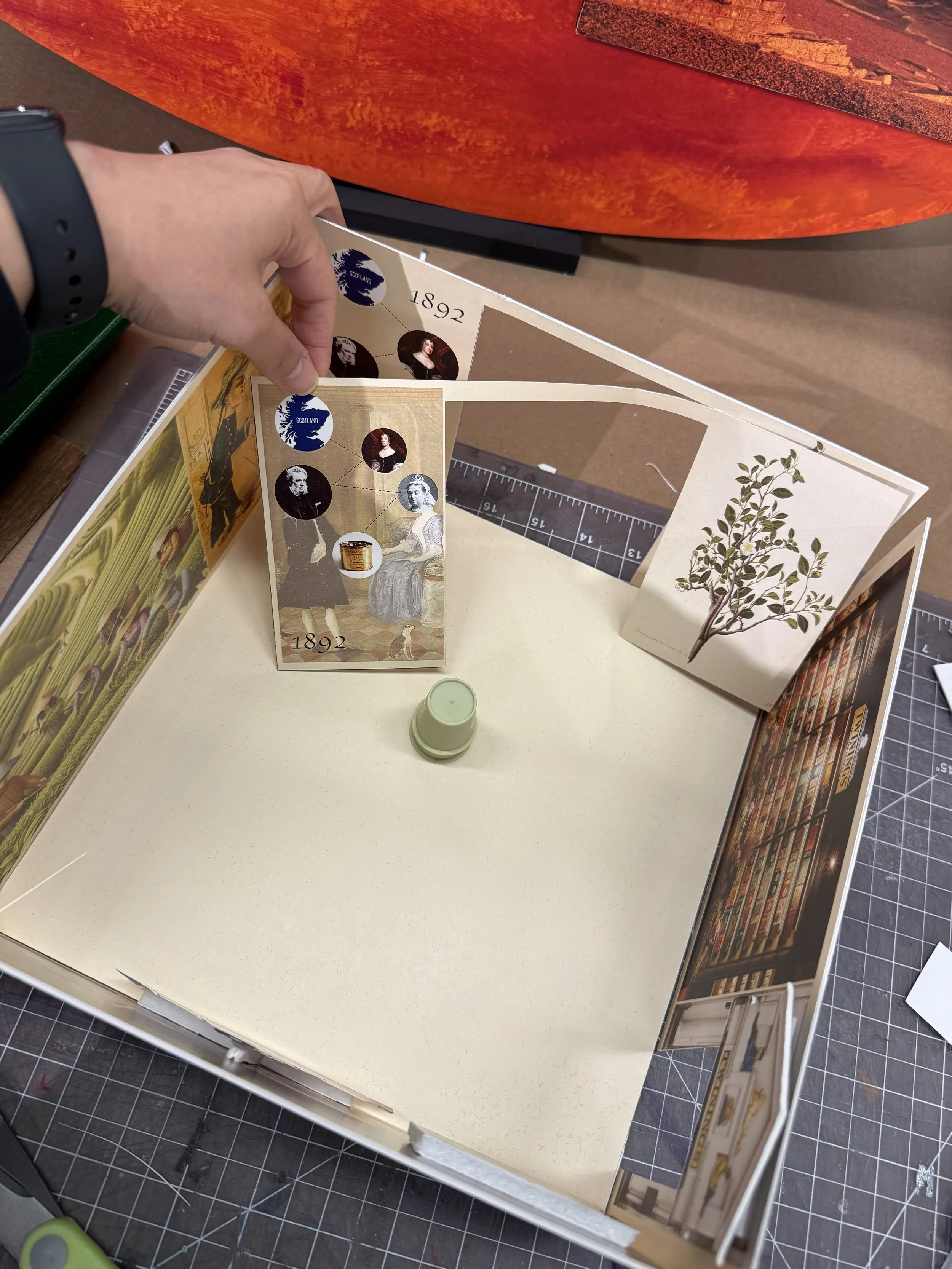
The Etiquette Video Installation: A digital display focused on the social choreography of the Victorian era, specifically teaching visitors the "refined art" and the strict rules for properly drinking tea during that period.
The Botanical Display & Tasting: A sensory station where visitors can engage with tea leaves and participate in a tasting, bridging the gap between history and the present.
The Central Pedestal: At the very heart of the exhibit, the original vintage tea tin, the "Extra-Ordinary Object", is displayed as the core inspiration and anchor for the entire environment.
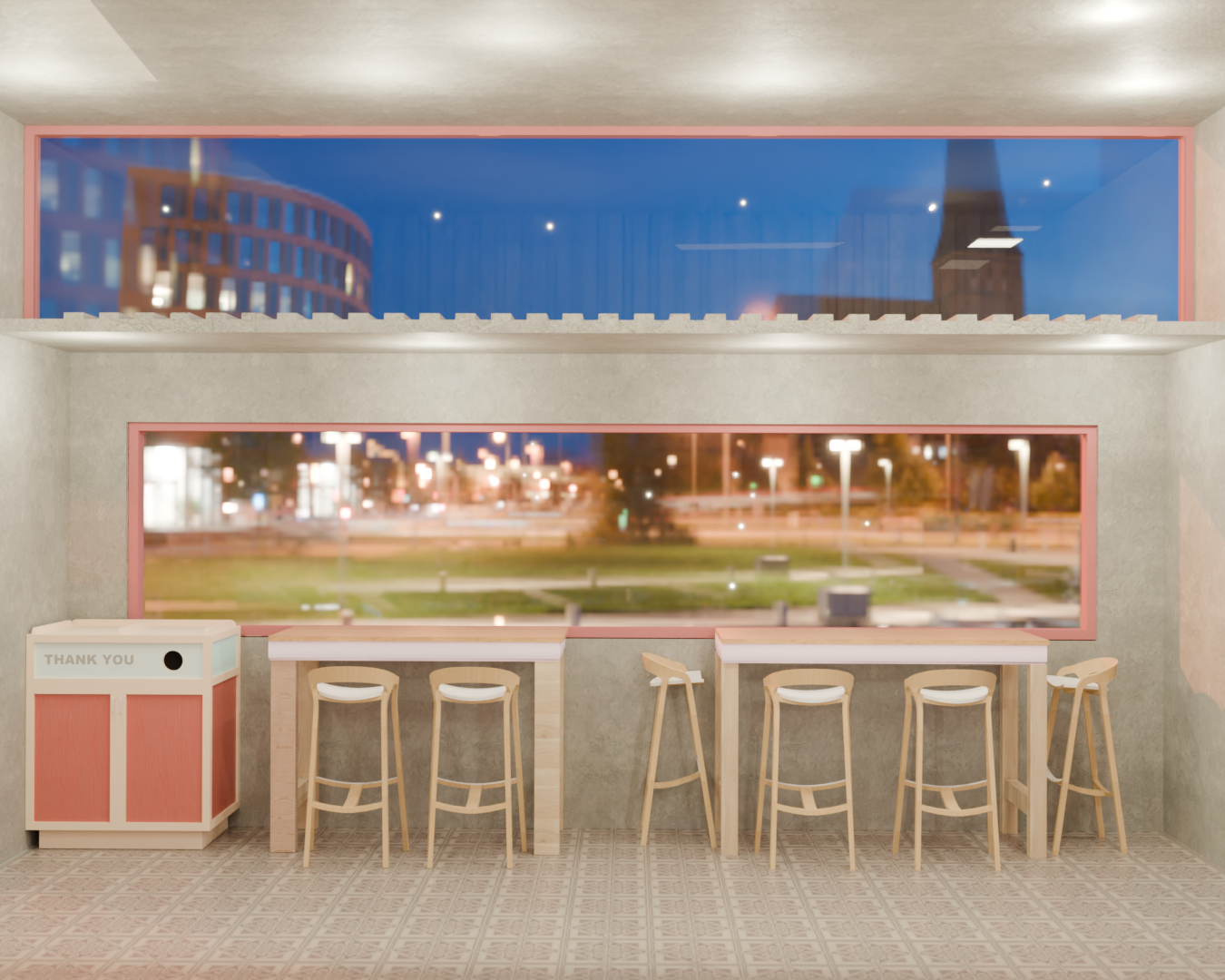
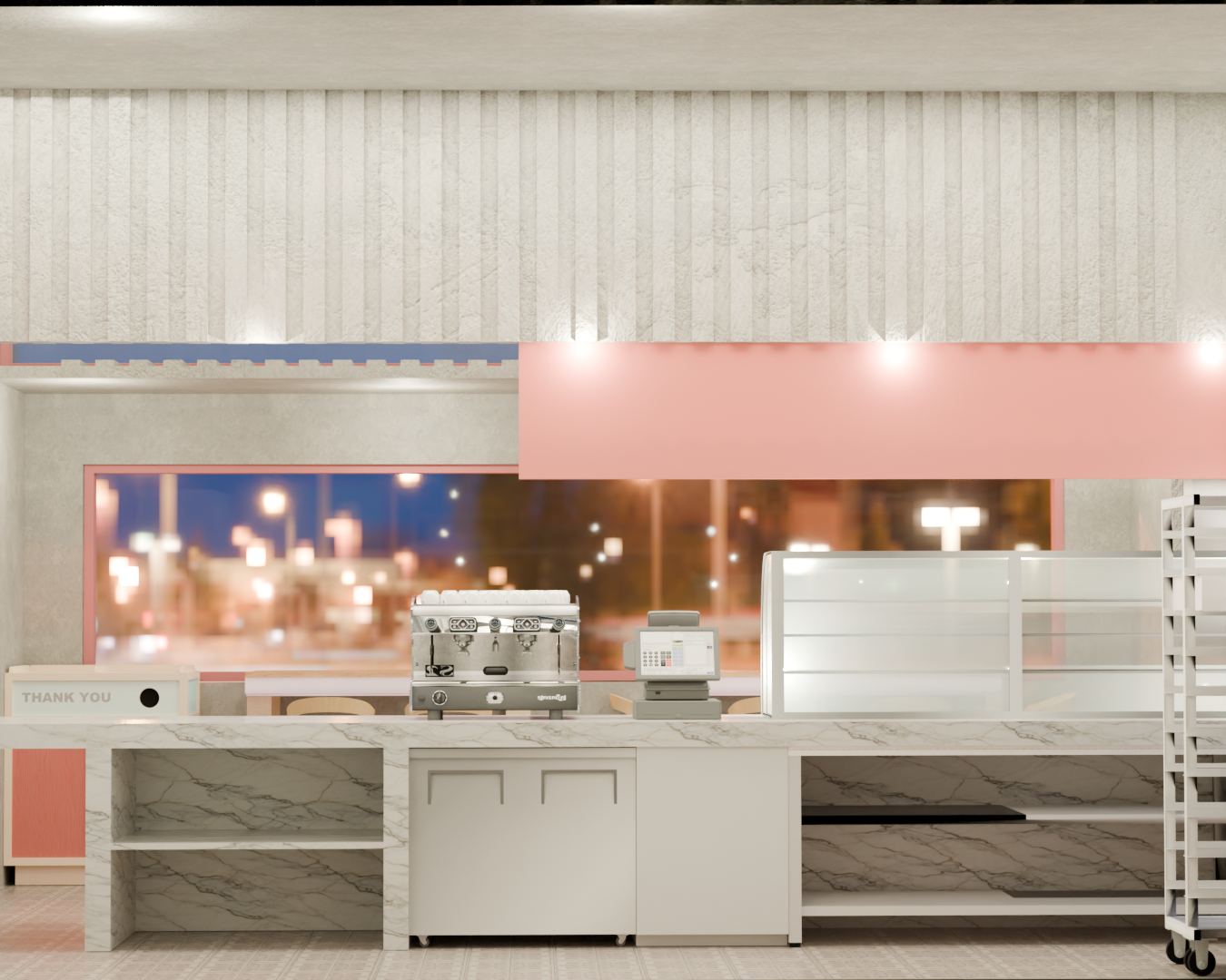
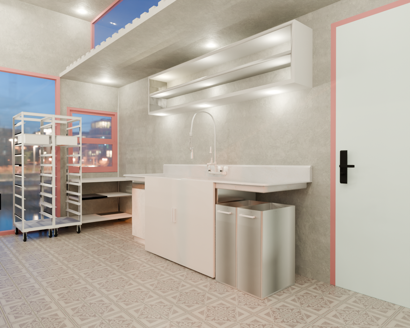
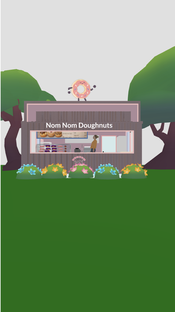
Donut Shop
Interiors & Architecture | Experiential Design Four-Phase Project
Objective:
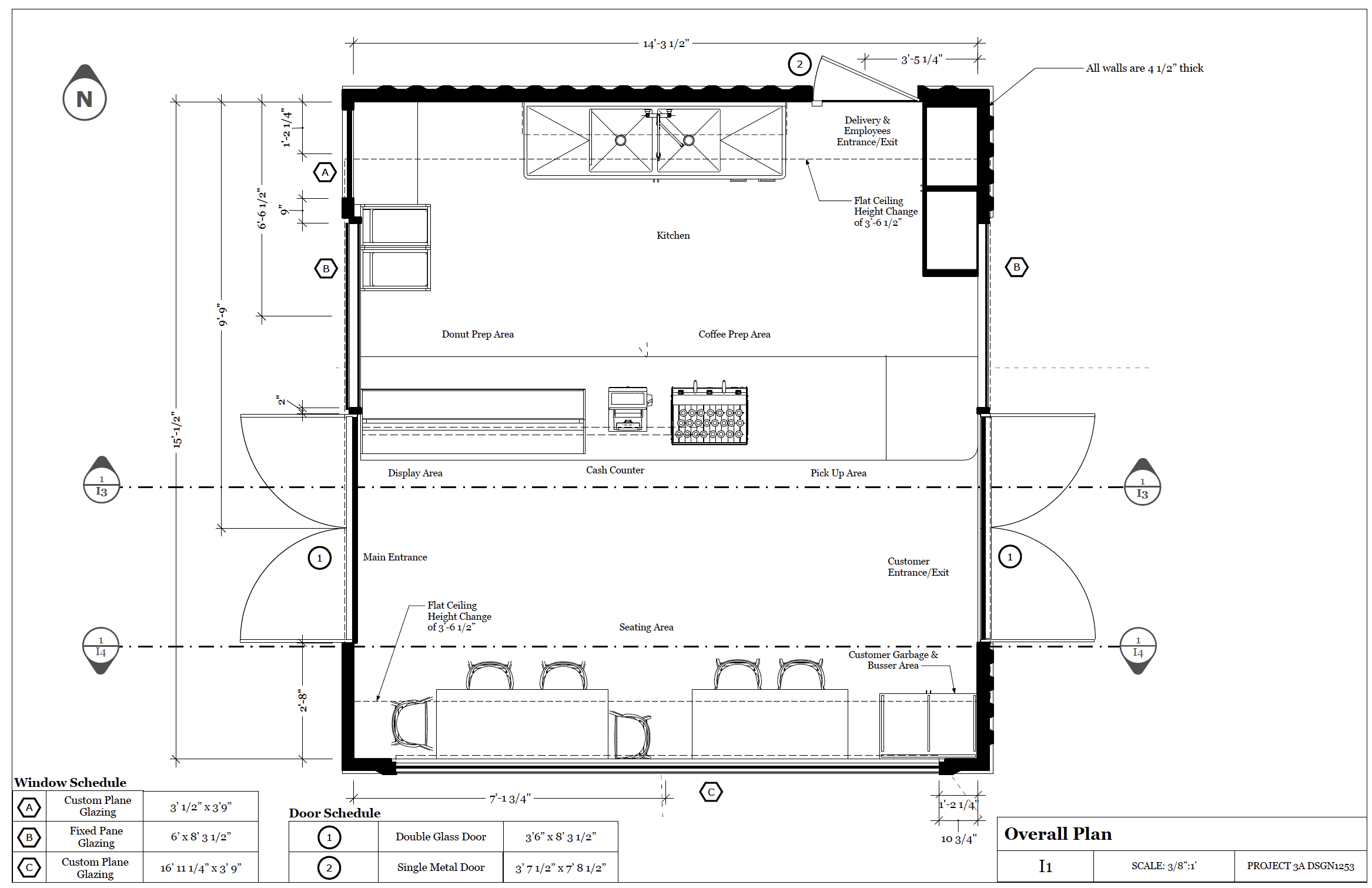
Develop the functional space for a Donut shop using the intersections of two shipping containers. Use LayOut to create floor plans and elevations to then build a scale model.
Phase 1 - Concept & Spatial Flow:
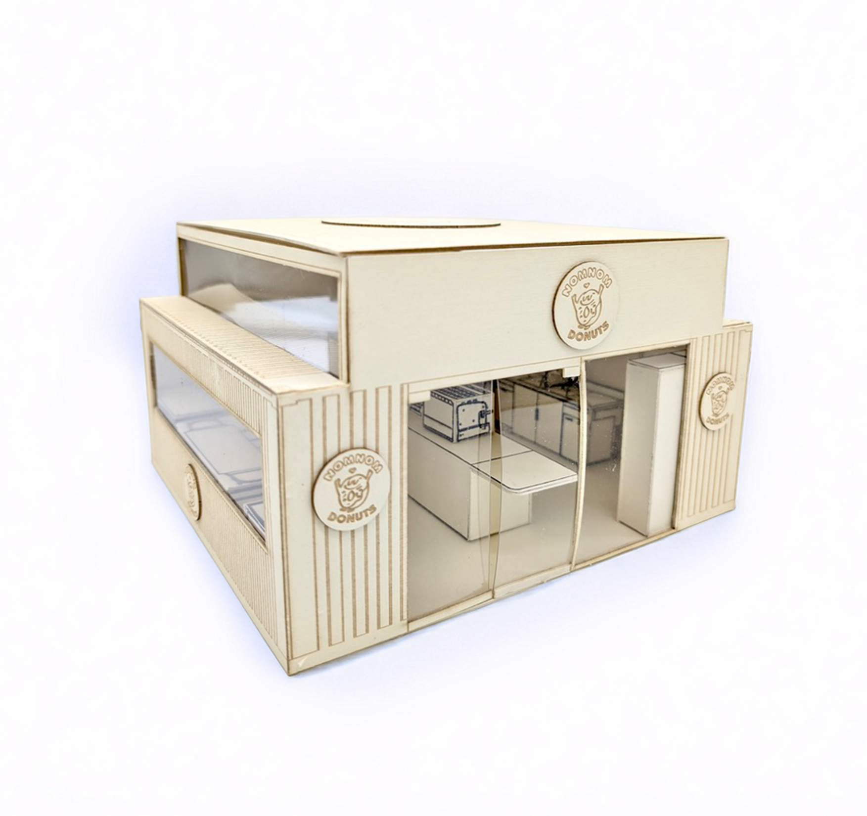
Using SketchUp, I designed approximately around 20sq.ft shop within two shipping containers. Faced with a "two-cut" structural limit, I allocated the cuts for large glass storefronts to maximize light. I arranged a linear flow, with entry through glass doors, moving past the display, and exiting, to keep the small space functional and open.
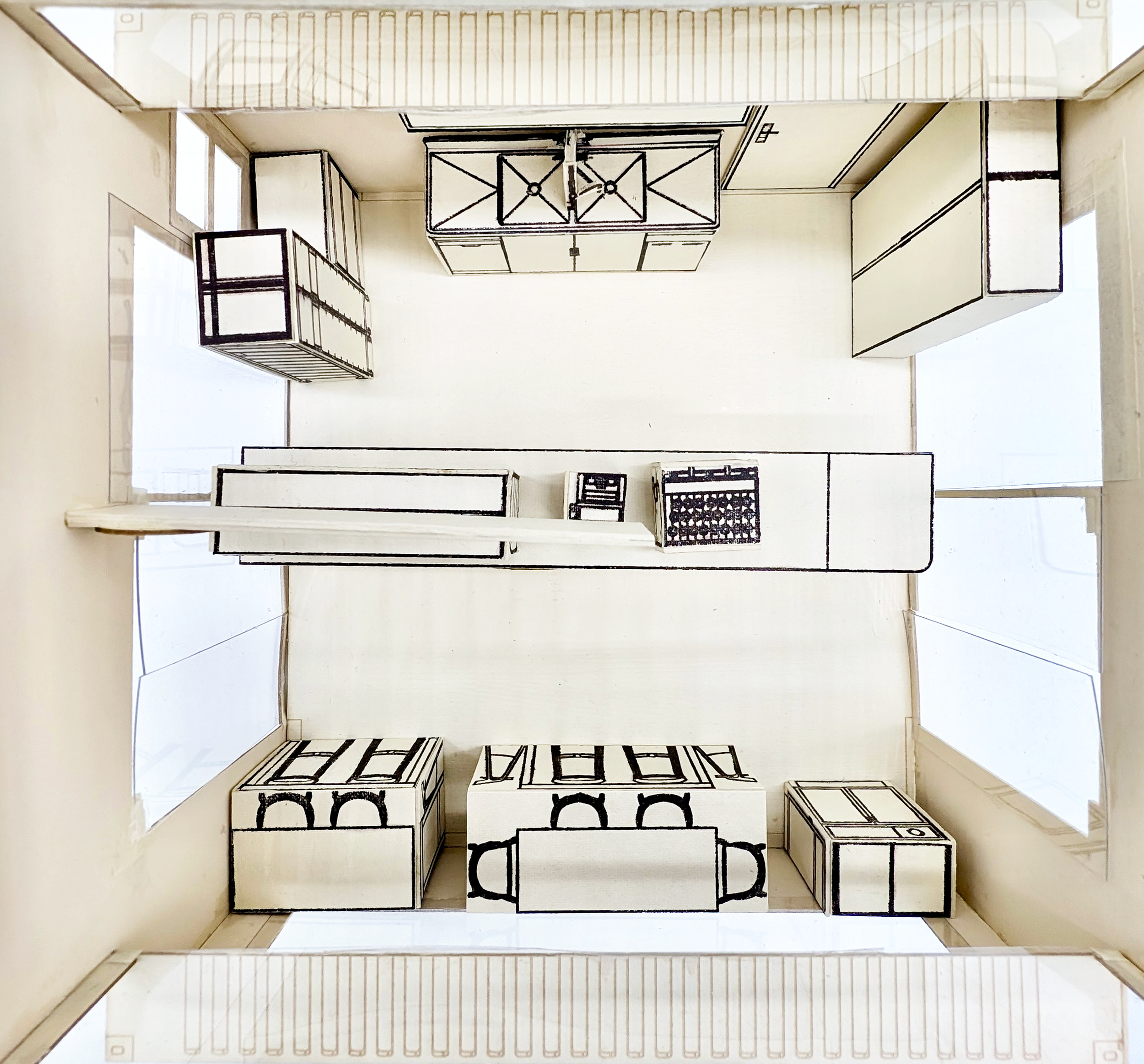
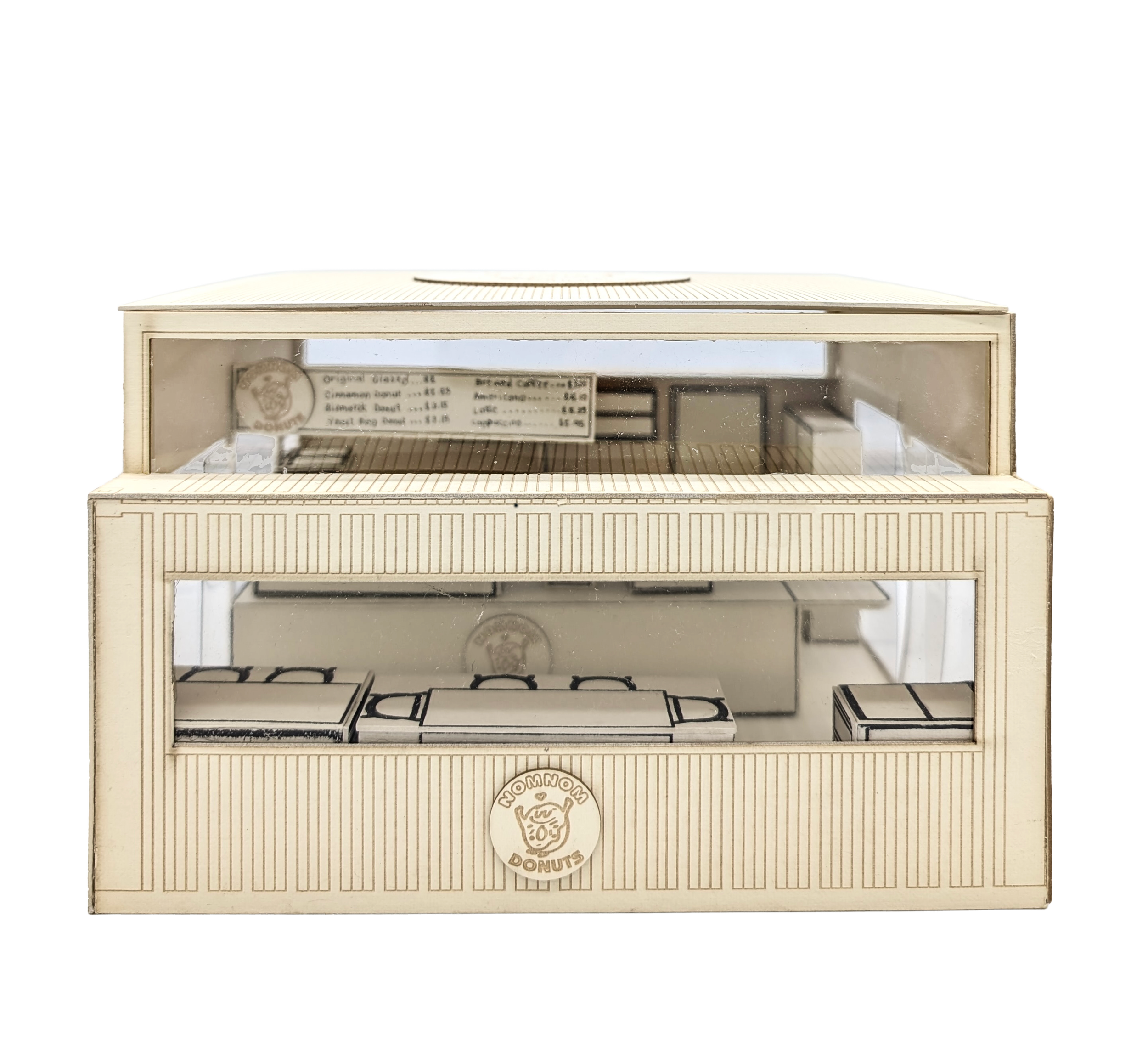
Phase 2 - Physical Model:
After completing the SketchUp model, we exported it to LayOut to generate floor plans. These files were then prepared in Illustrator for laser-cutting the container components and furniture from task board.
For the graphics, we employed an acetone-and-cotton method to transfer toner-based designs directly onto materials before assembling everything with glue.
Phase 3 Objective:
Maintain design intent despite new technology.
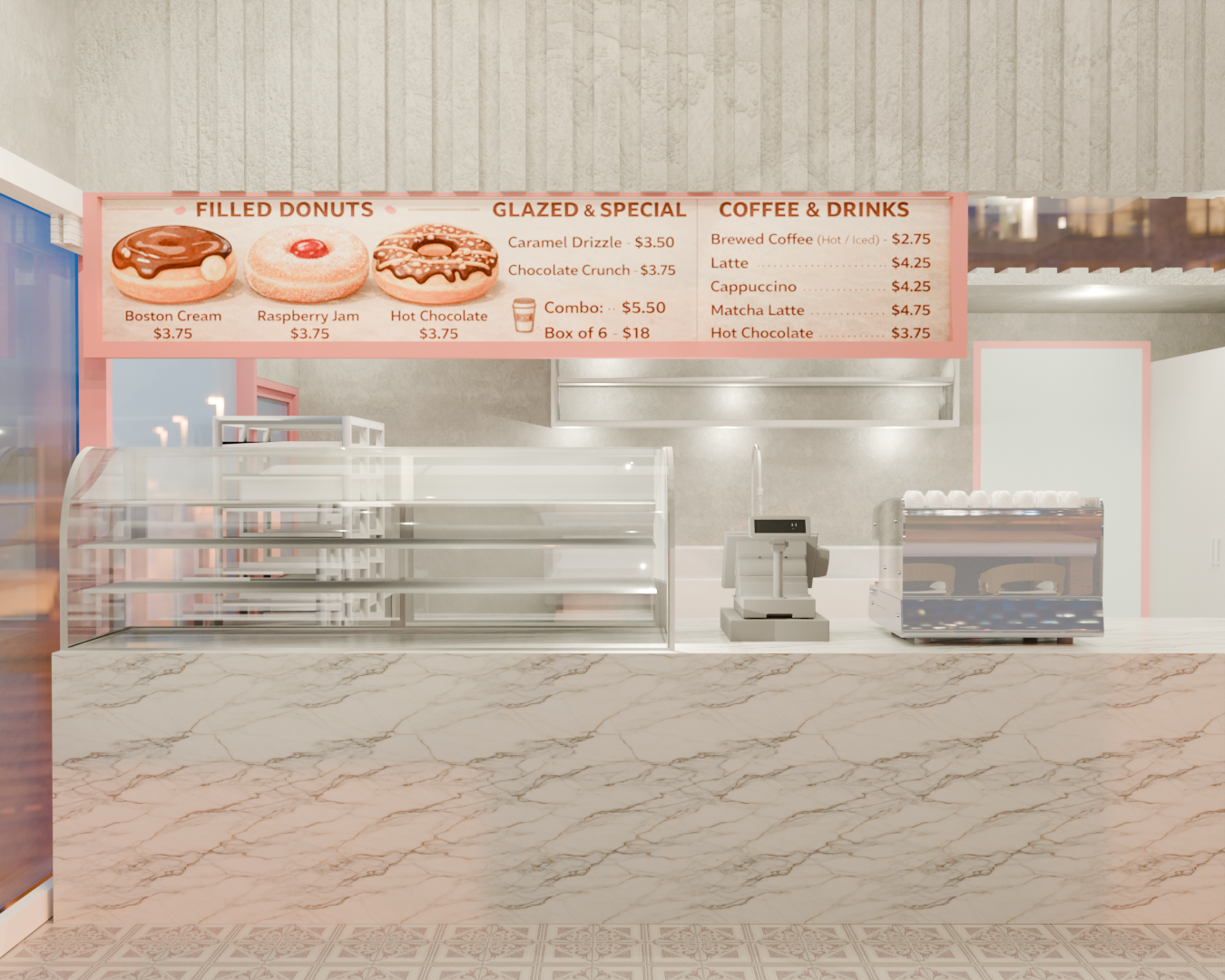
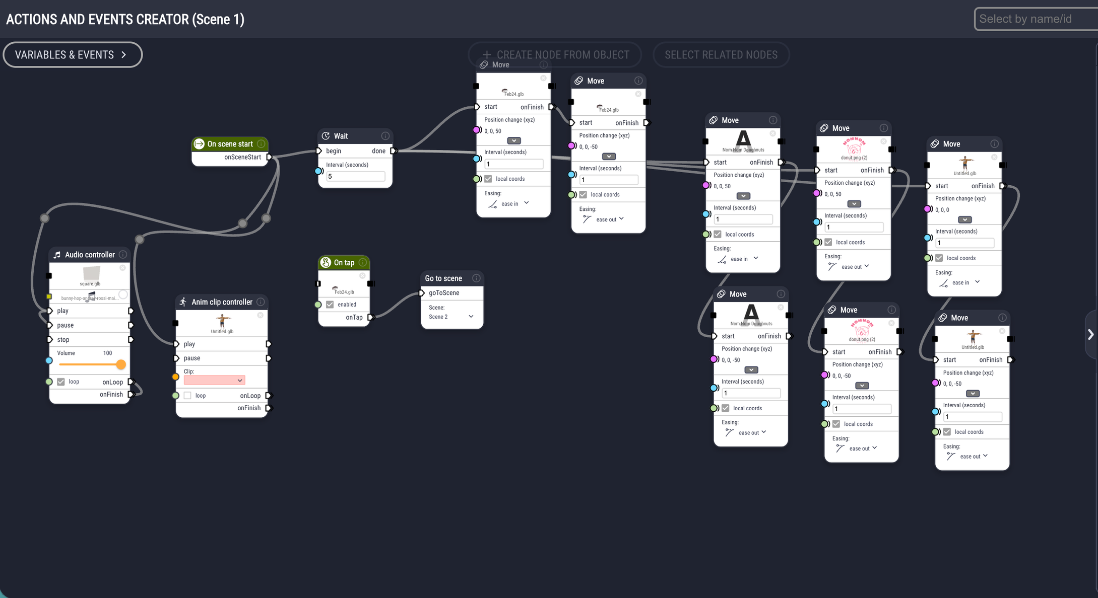
Using SketchUp, Blender, and Apple Vision Pro, create an AR experience from a design project of a Donut Shop.
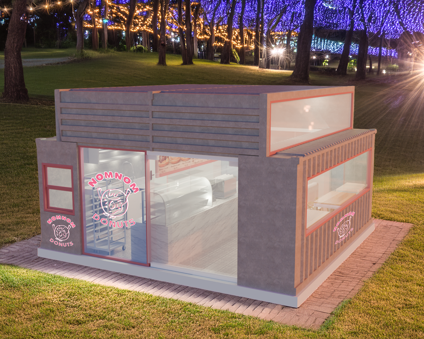
In Blender, I focused on lighting to create a narrative contrast: the warm, inviting glow of the interior donut cases set against a dusk exterior. My goal was a clean, minimalist interior, using the lighting to highlight the textures and refined finishes of the flooring, countertops, and cabinetry. To complete the scene, the surrounding environment was digitally integrated using Photoshop.
Phase 4 Objective
The project is finalized in Blippar as an immersive experience. Using node-based logic, I developed an interactive AR scene with seamless transitions that allow users to explore the interior. To enhance realism, I integrated 3D assets, environmental animations, and a branded donut mascot to create an engaging brand encounter.
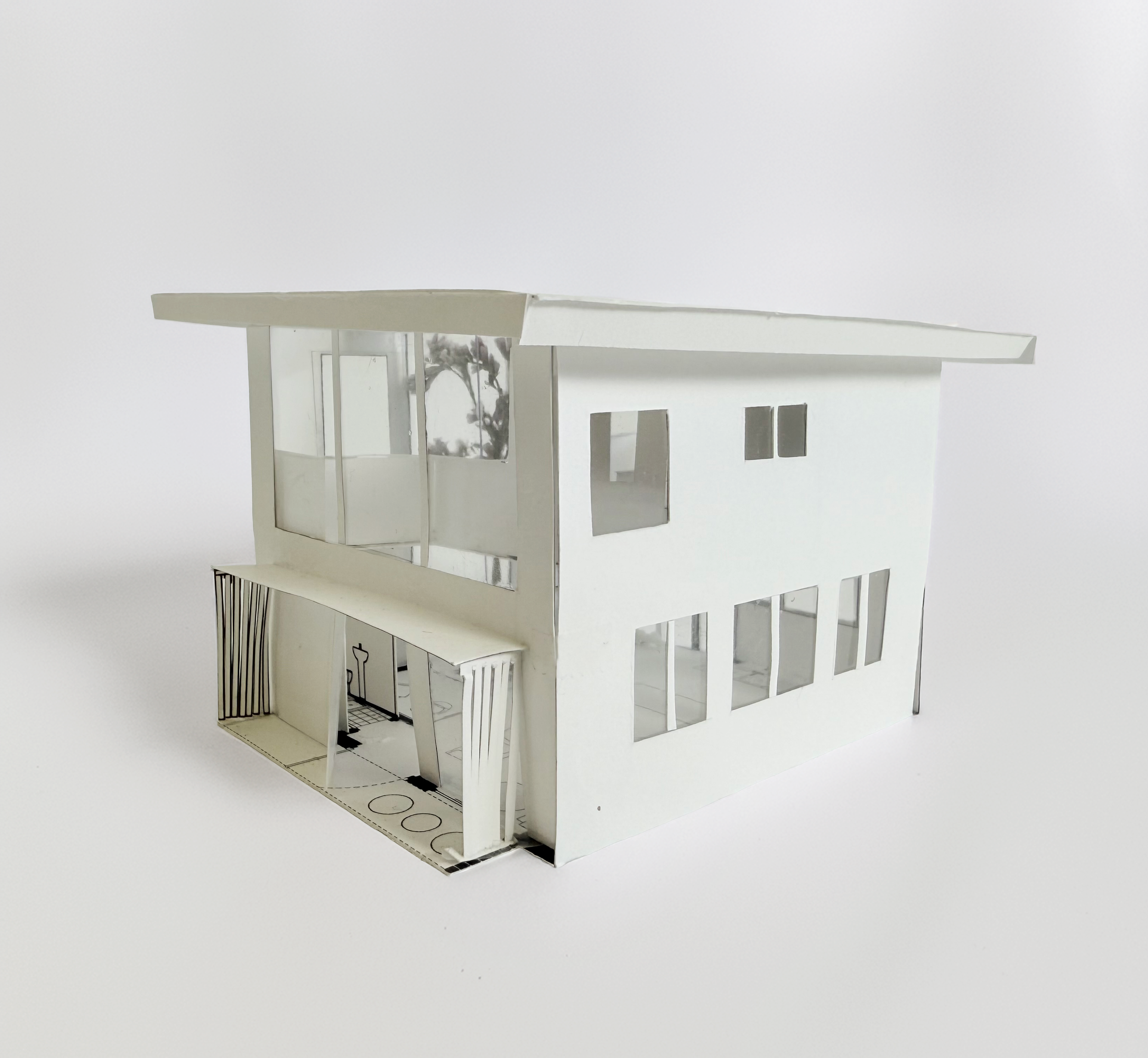
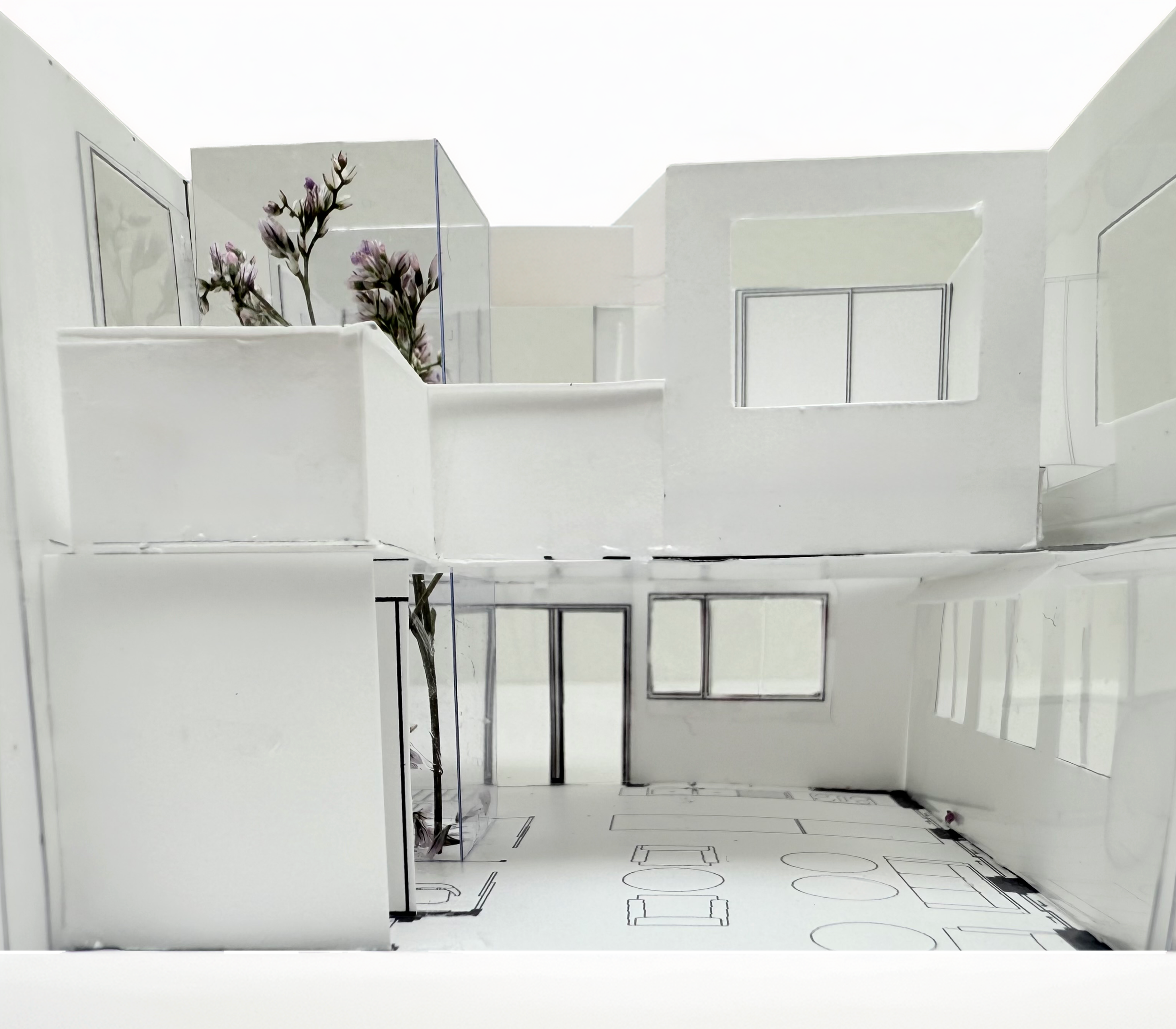
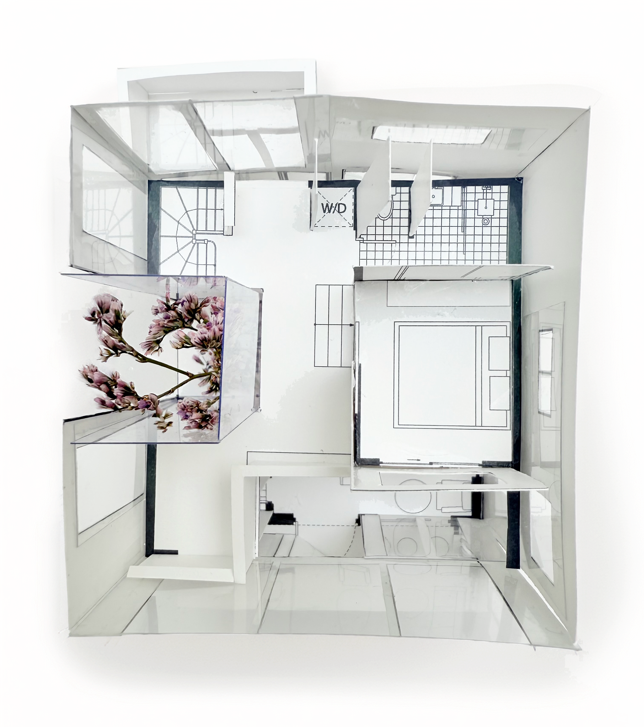
Laneway House
Interiors & Architecture
Two-Phase Project
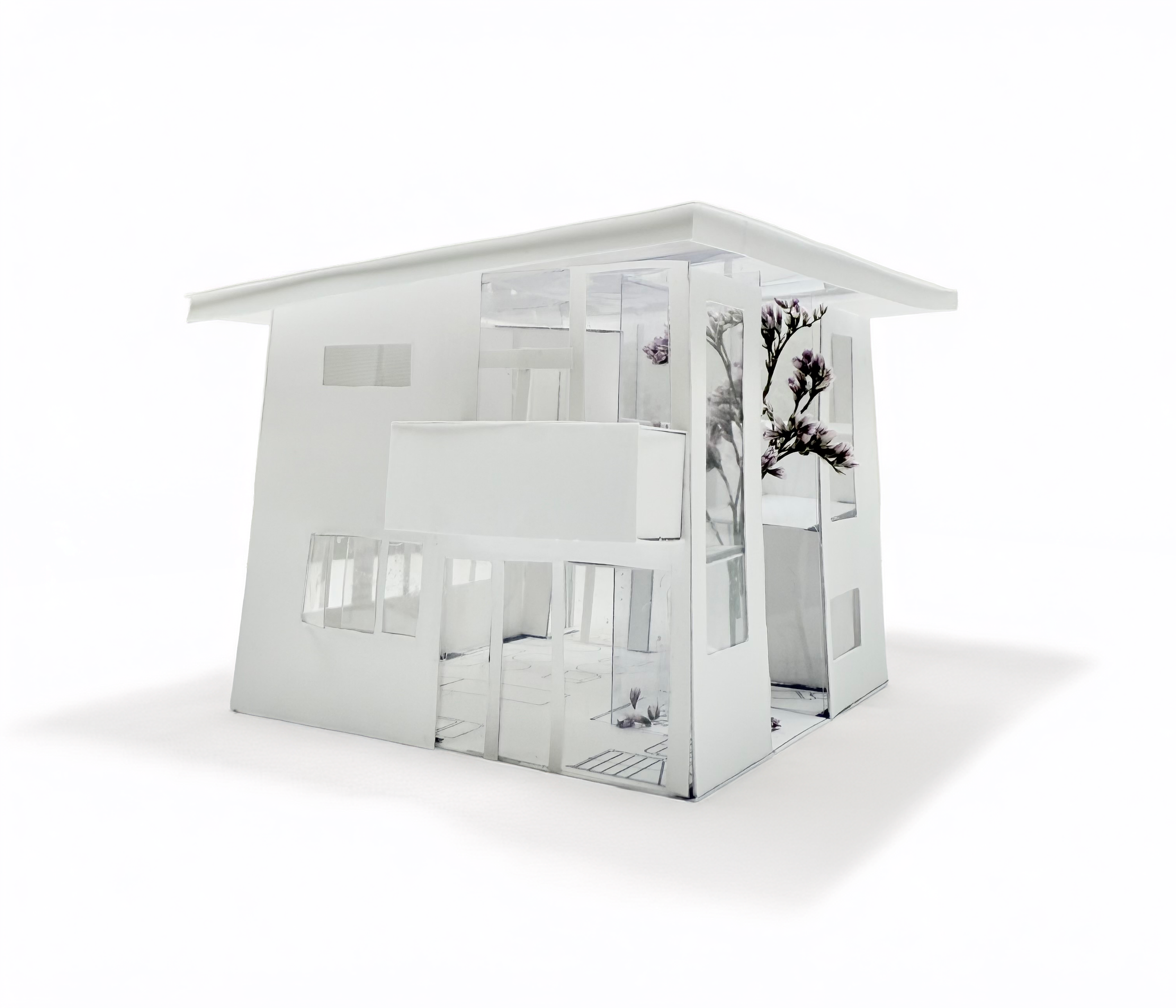
Objective
Design laneway houses that re-imagine the potential of Vancouver’s urban fabric by integrating nonresidential programs to create dynamic, mixed-use corridors. Explore how these often overlooked spaces can evolve into vibrant community hubs, balancing residential living with broader neighbourhood engagement.
Design & Development Process
Site Analysis & Planning:
I began by visiting the location on Columbia Street to assess the site conditions. I developed a detailed site plan to ensure the new structure would harmonize with the existing neighbourhood architecture.
3D Modelling (SketchUp):
I recreated the existing house and my new design in SketchUp, optimizing the files for 3D printing to ensure all structural components were ready for physical fabrication.
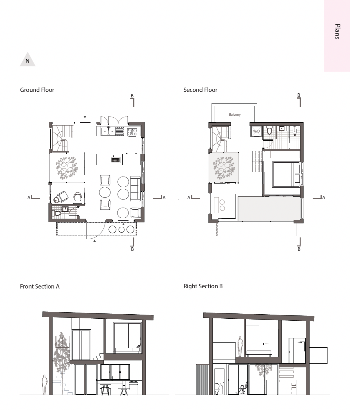
Technical Floor Plans (LayOut):
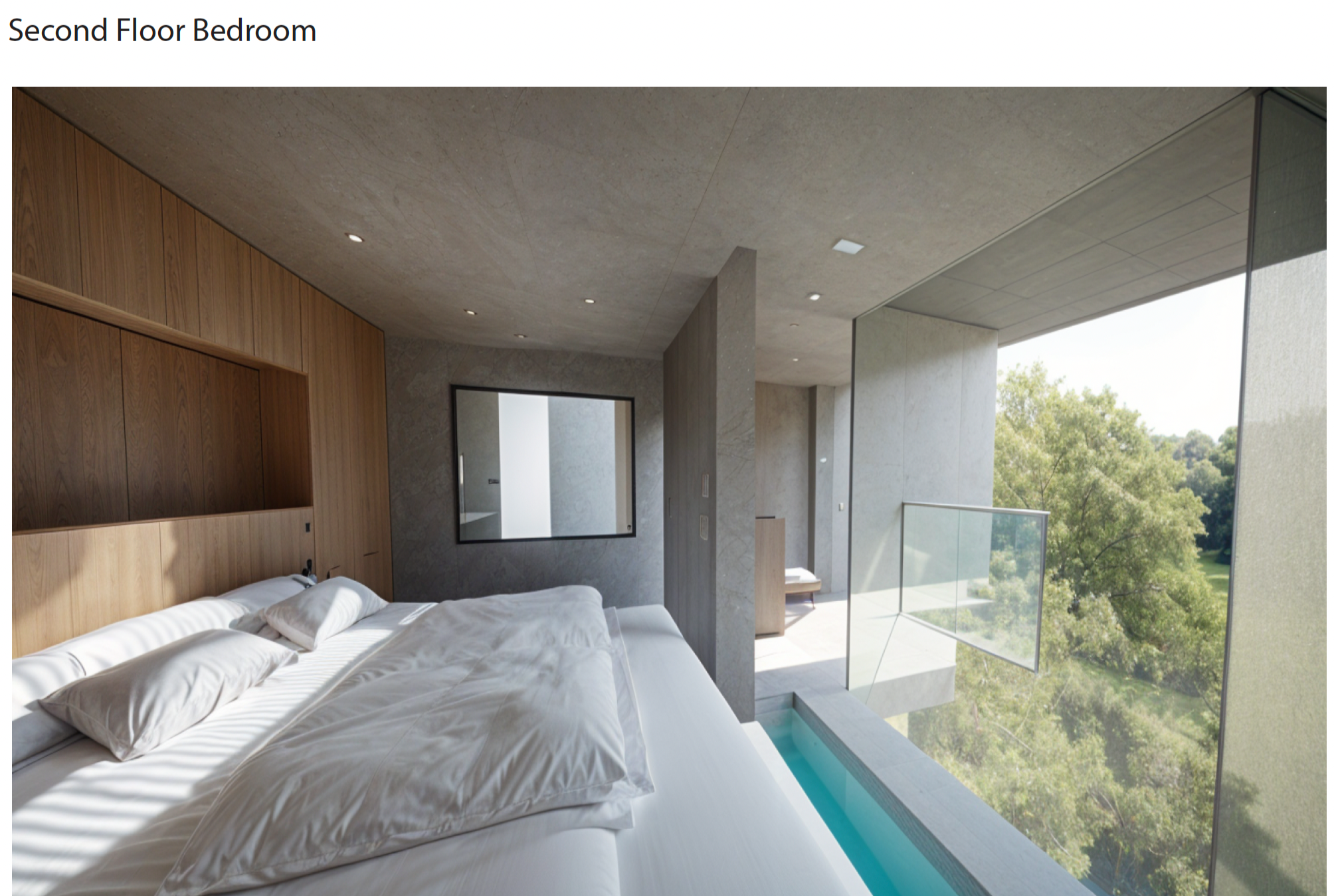
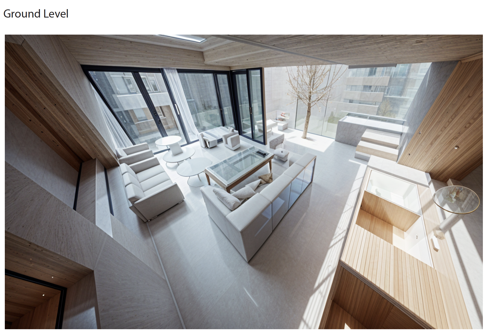
After finalizing the 3D model, I used LayOut to generate precise 2D technical floor plans. This allowed me to clearly define the functional spaces, including the ground-floor cafe salon and the private second-floor bedroom.
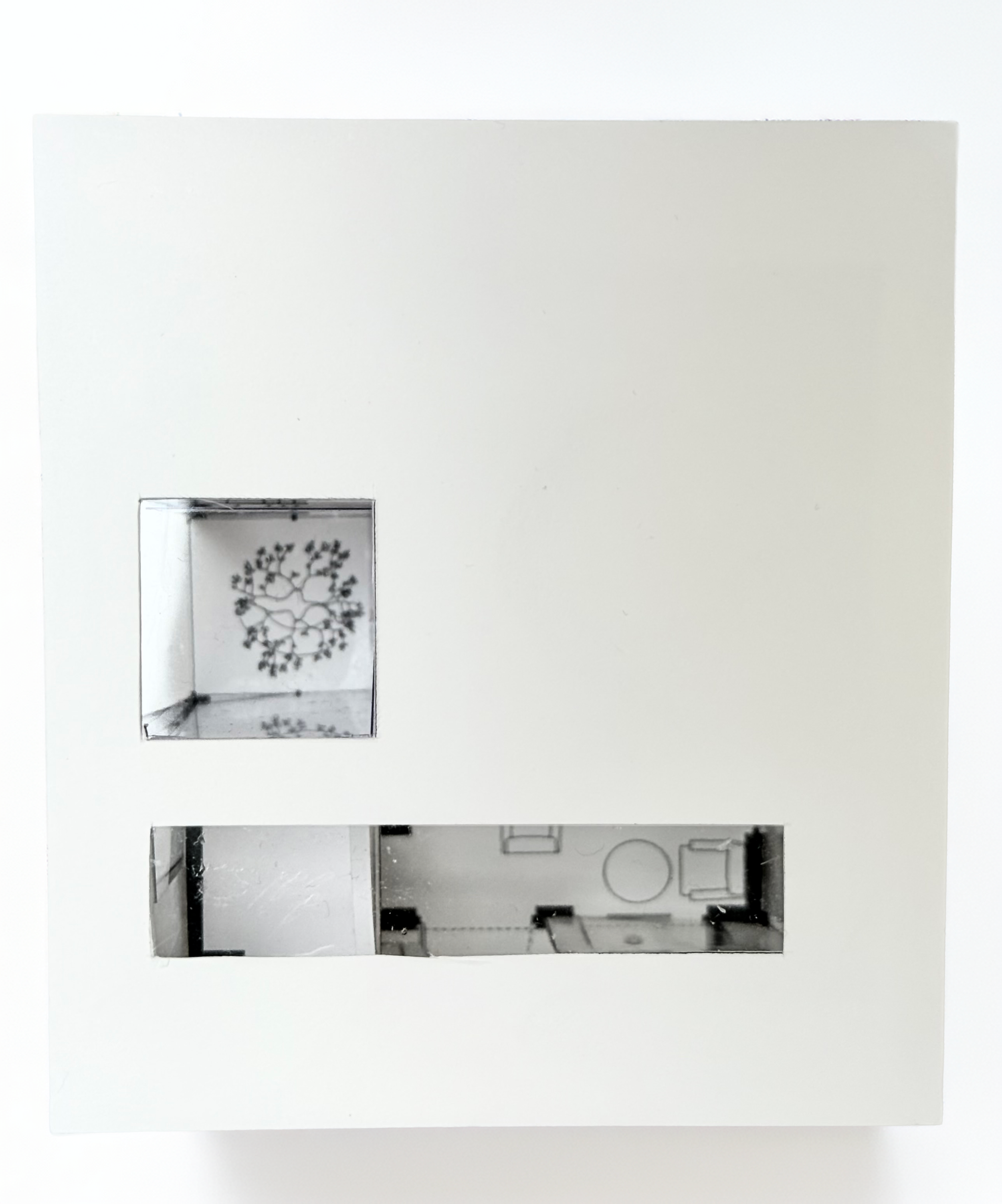
Physical Study Model:
I also hand-crafted a miniature scale model using paper, acetate and dried flowers to mimic a flowering tree. The acetate was essential for representing the expansive glass windows and the seamless connection between the indoor cafe and the outdoor garden.
Rendering: To breathe life into the SketchUp models and design, we were tasked to use Archsynth for the interior renderings. This allowed for a more realistic feel, especially when playing with the lighting and textures of the indoor spaces.
Frame of Reference
Experiential Design
Objective
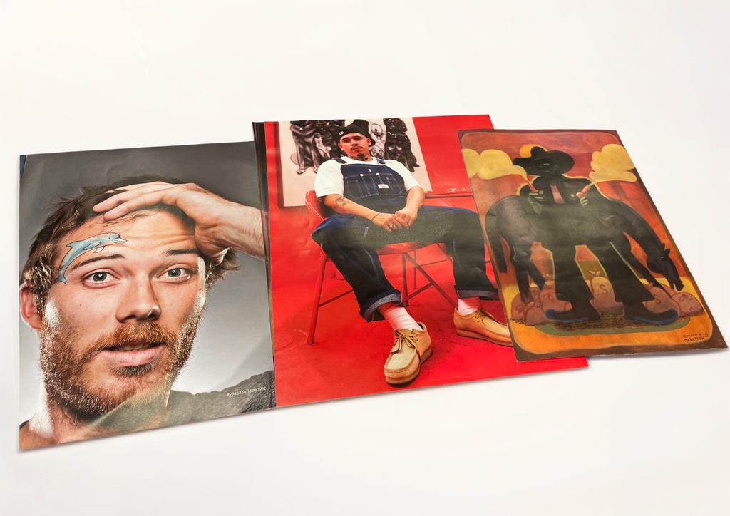
Inspired by a lottery choice of random magazine images, create a composition using a wide variety of techniques, methods, and materials. The emphasis is on reflecting the images’ experiential context through 3D visual storytelling.
Process
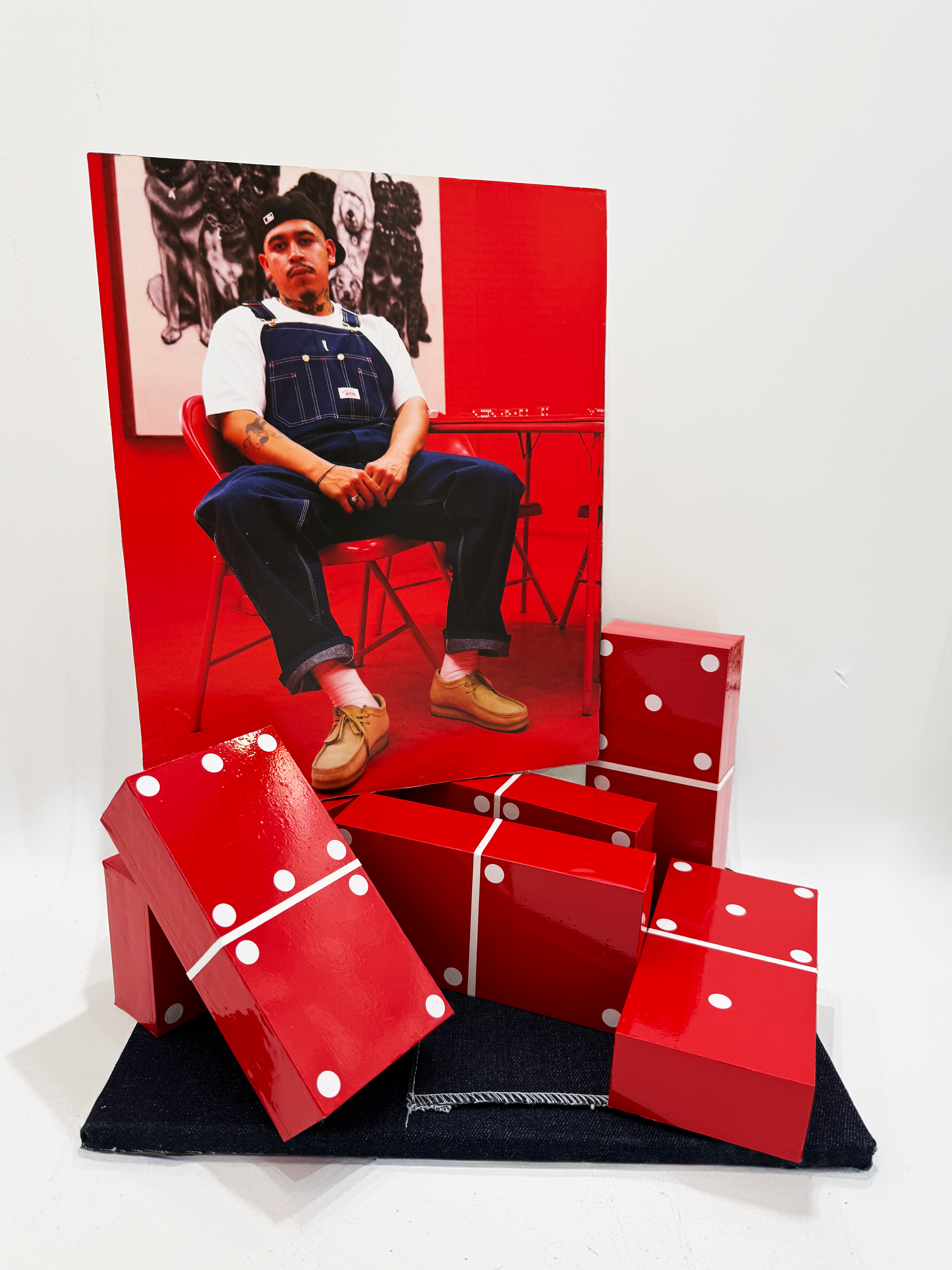
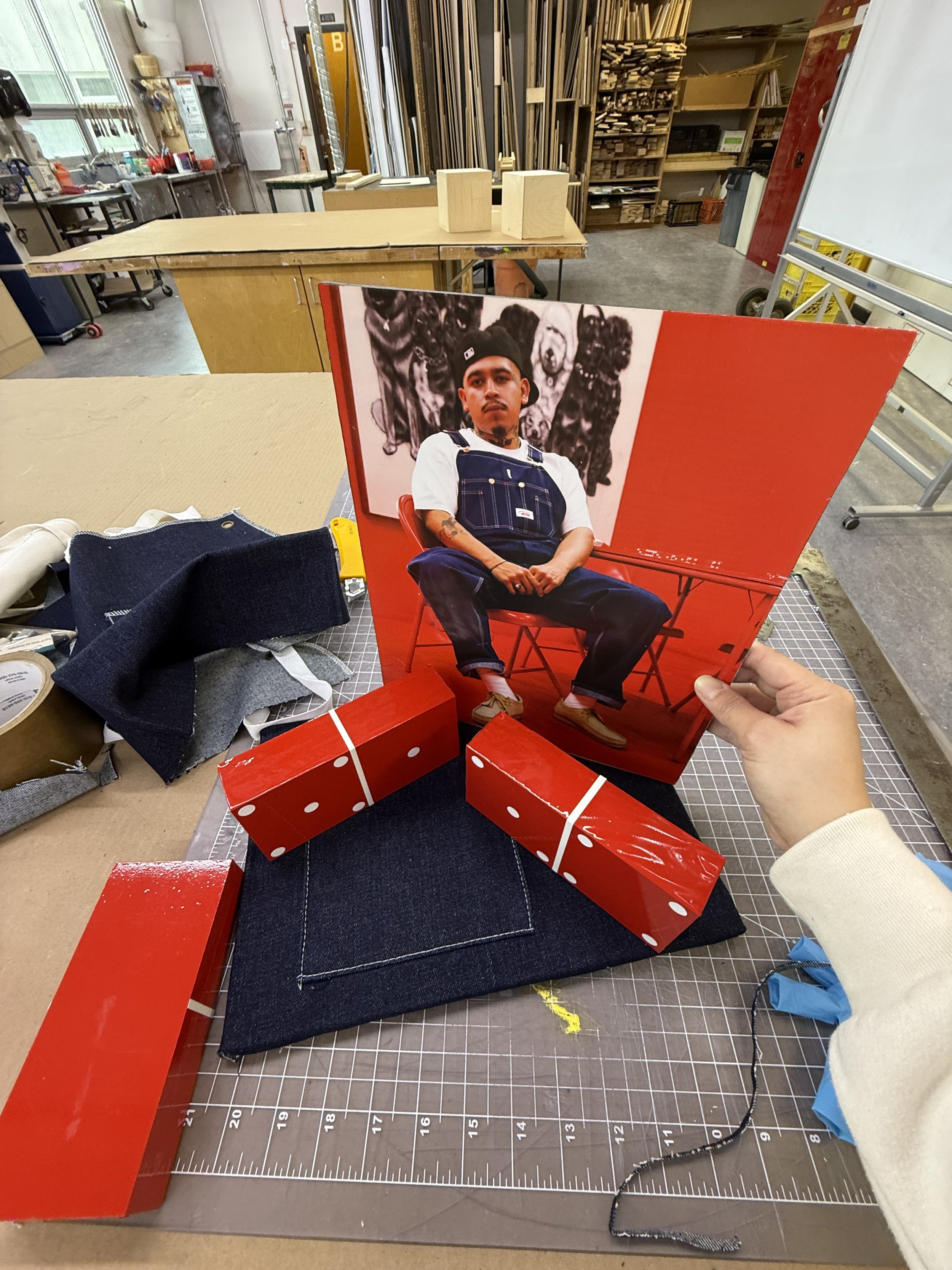
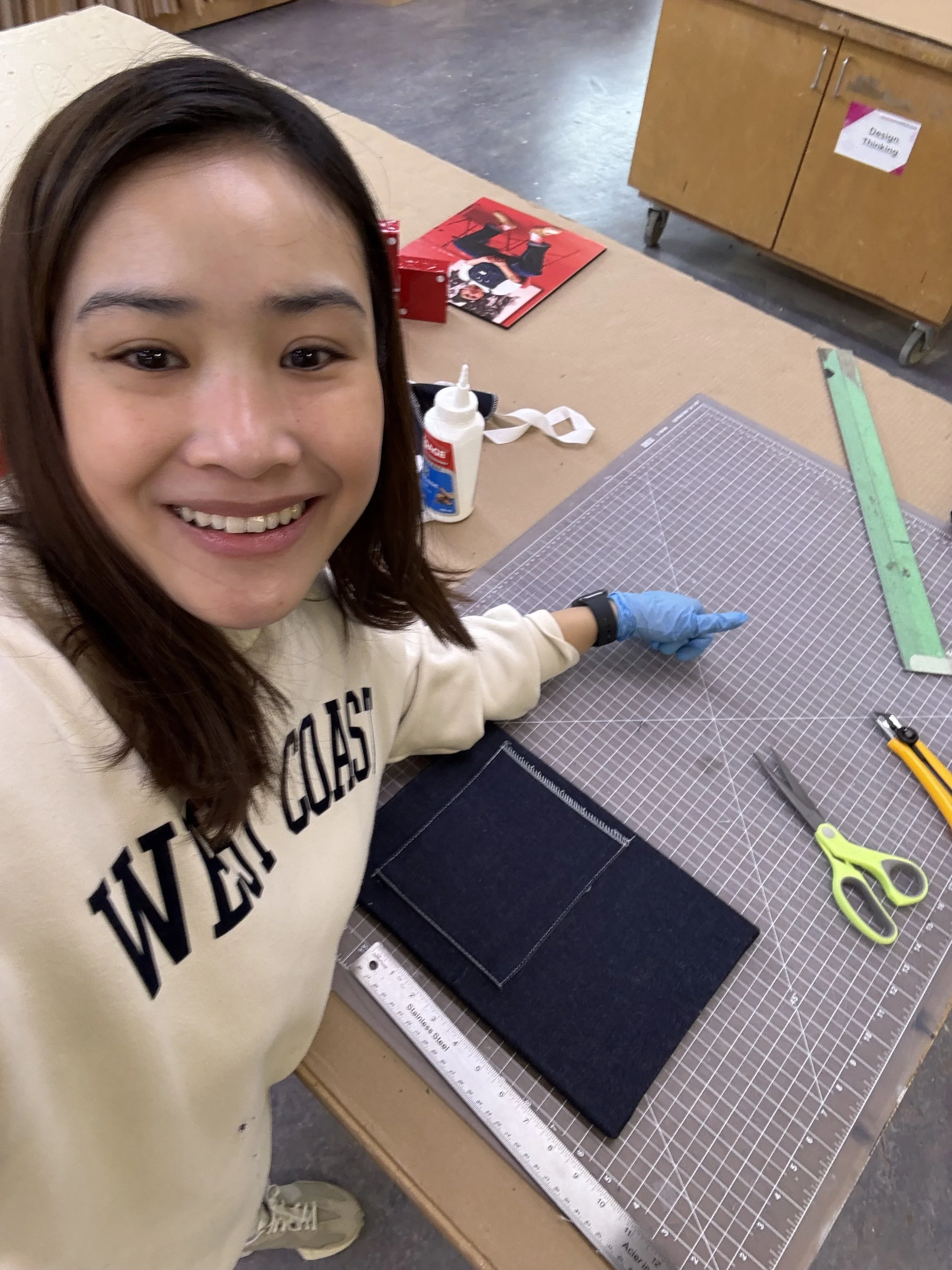
I was given three random magazine images as a starting point. I chose the portrait of the man against the vibrant red background to anchor my visual aesthetic and colour palette.
Repurposing Textiles: To mimic the denim overalls in my primary reference image, I repurposed a denim apron, carefully retaining the pocket detail to add a tactile, functional element to the board.
Fabricating 3D Elements: I built custom wooden blocks and wrapped them in red vinyl with white sticker dots to create stylized dominoes.
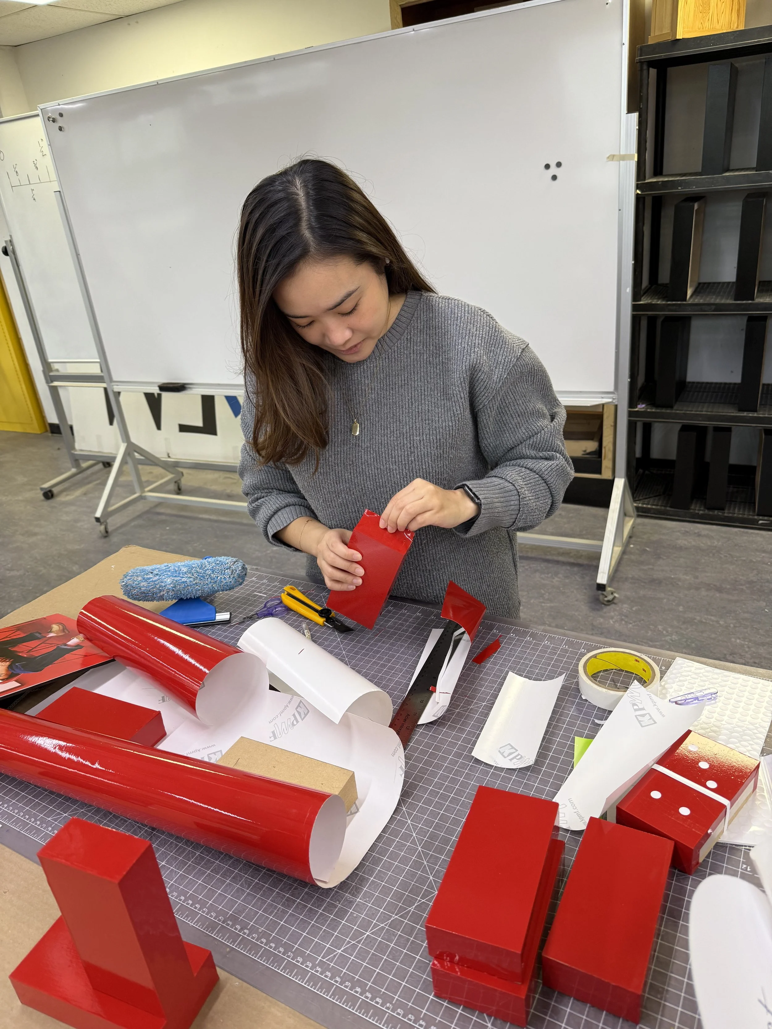
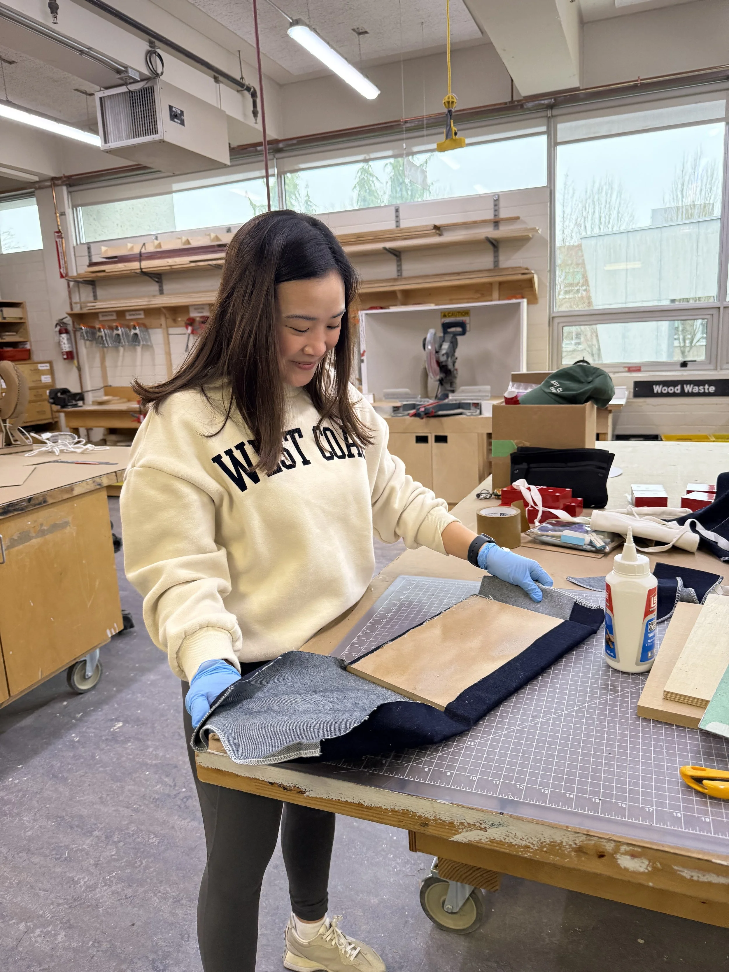
Interactive Assembly: Using 3M Super 77 spray adhesive, I bonded the denim and photography to an MDF substrate. I kept the domino blocks movable, making the piece interactive and allowing it to be constantly redesigned or played with.
Package Design
Communication Design
Objective
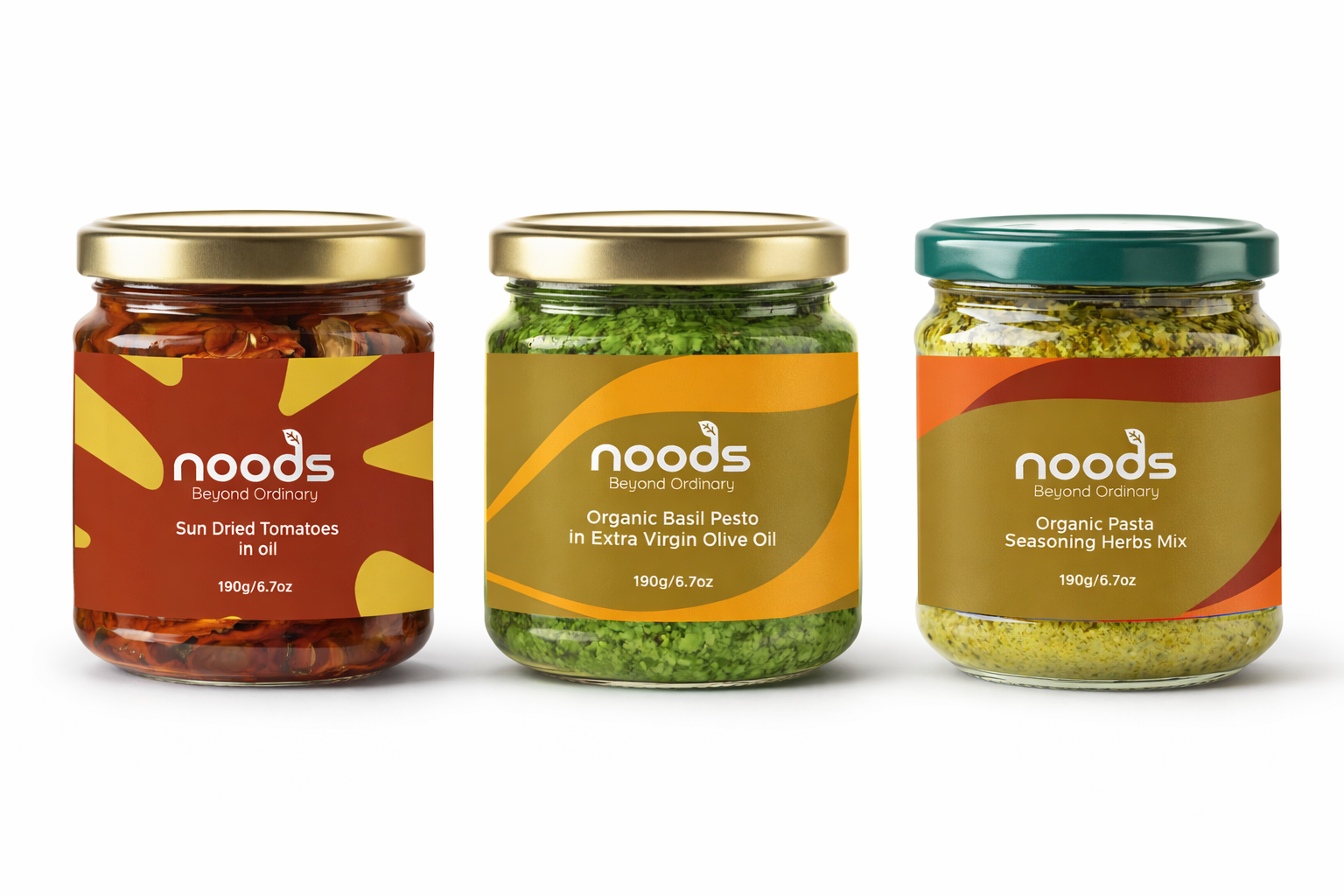
Design a brand and packaging to introduce a new line of locally produced organic products, targeted at a young and urban audience.
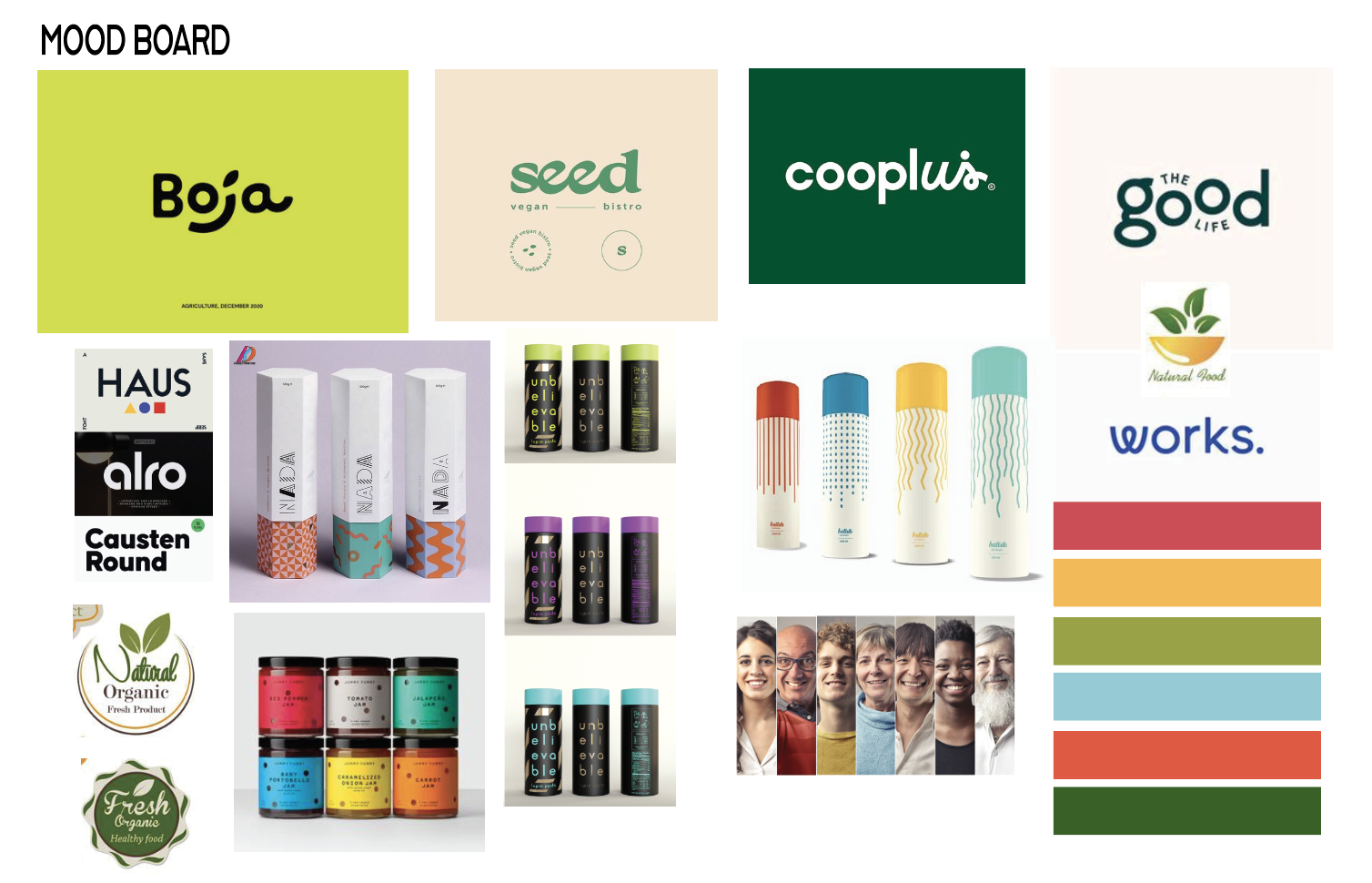
Strategy & Moodboard
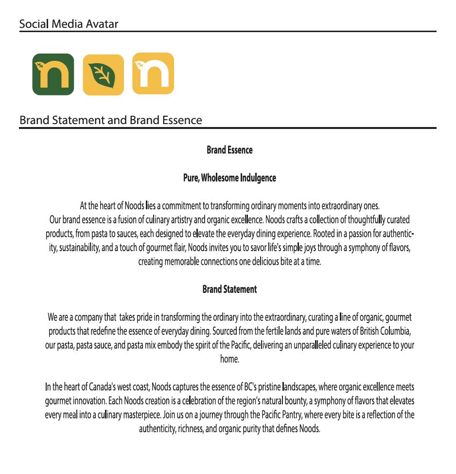
The project began by defining the Brand Essence and Brand Statement. I curated a moodboard focused on organic shapes and a vibrant, nature-centric color palette to establish a modern, healthy aesthetic that aligns with our "Beyond Ordinary" tagline.
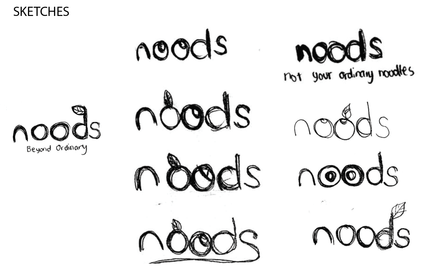
Conceptual Sketching
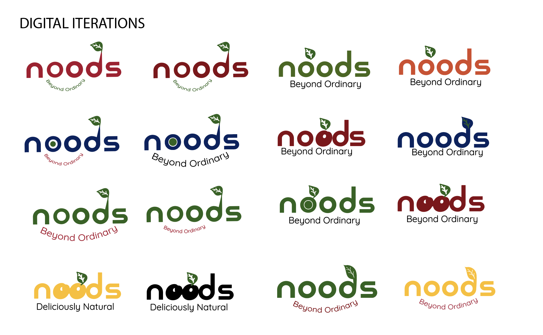
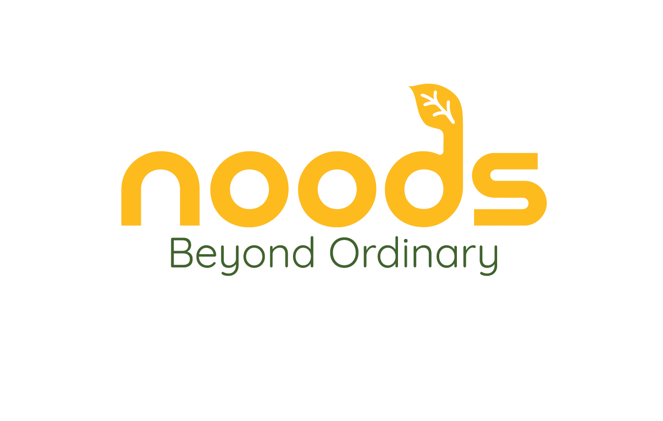
I moved to manual sketching to explore the relationship between typography and symbolism. I experimented with integrating leaf motifs into the wordmark, eventually identifying the lowercase "d" as the strongest anchor for the brand’s signature leaf icon.
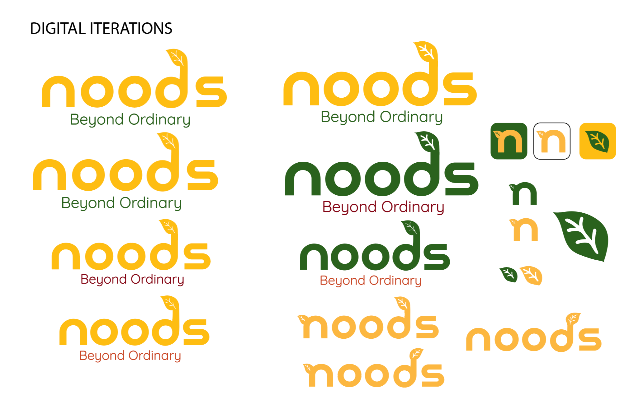
Digital Iteration In the digital phase, I refined the sketches into vectors using Adobe Illustrator. I iterated through various weights and color stories, testing deep forest greens and marigold yellows, to find the perfect balance of energy and organic roots.
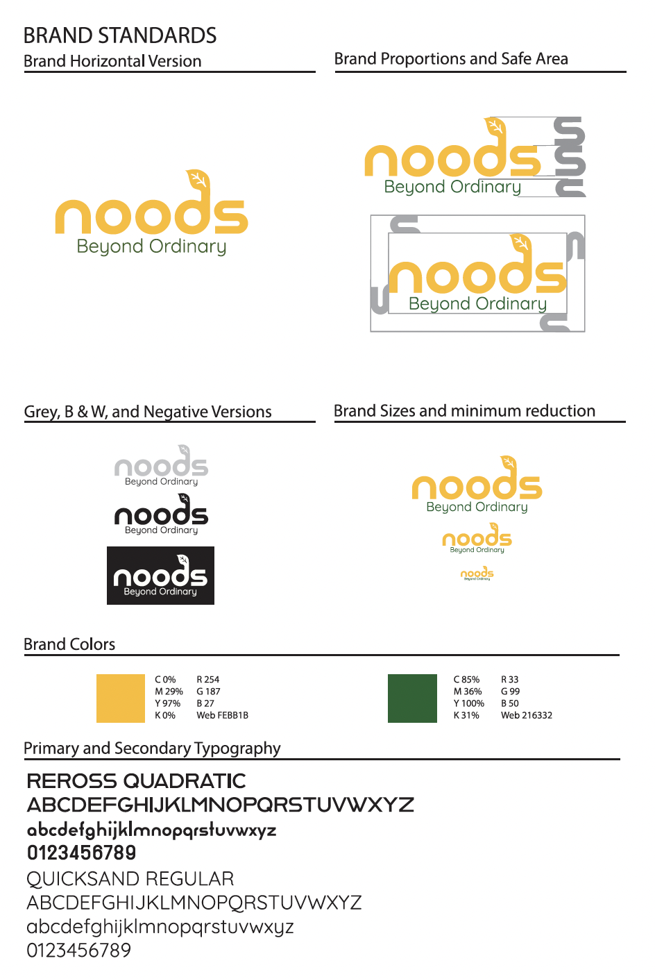
Brand Standards
To ensure consistency, I developed a comprehensive brand guidelines sheet. This included:
Typography: Pairing the structural Reross Quadratic with the friendly Quicksand Regular.
Systemization: Establishing a "Safe Area," minimum reduction sizes, and specific color values to maintain logo integrity across all platforms.
Final Mockups
Lastly, to breathe life into the design, I applied the identity to physical touchpoints. Creating these mockups demonstrated how the brand scales from a small digital icon to a full retail packaging presence.