Helena de Aguiar Schnaider
Graphic Designer
Expressive | Curious | Cohesive
I design the obvious into the unexpected.
Always structured, never predictable.
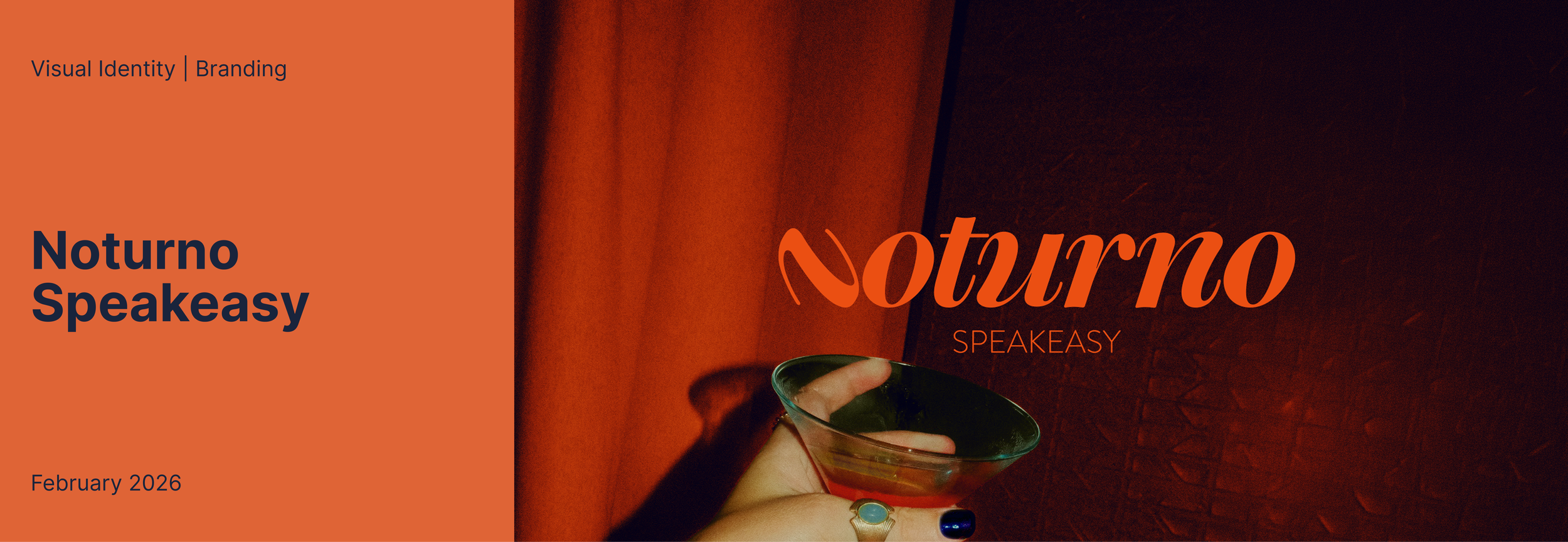
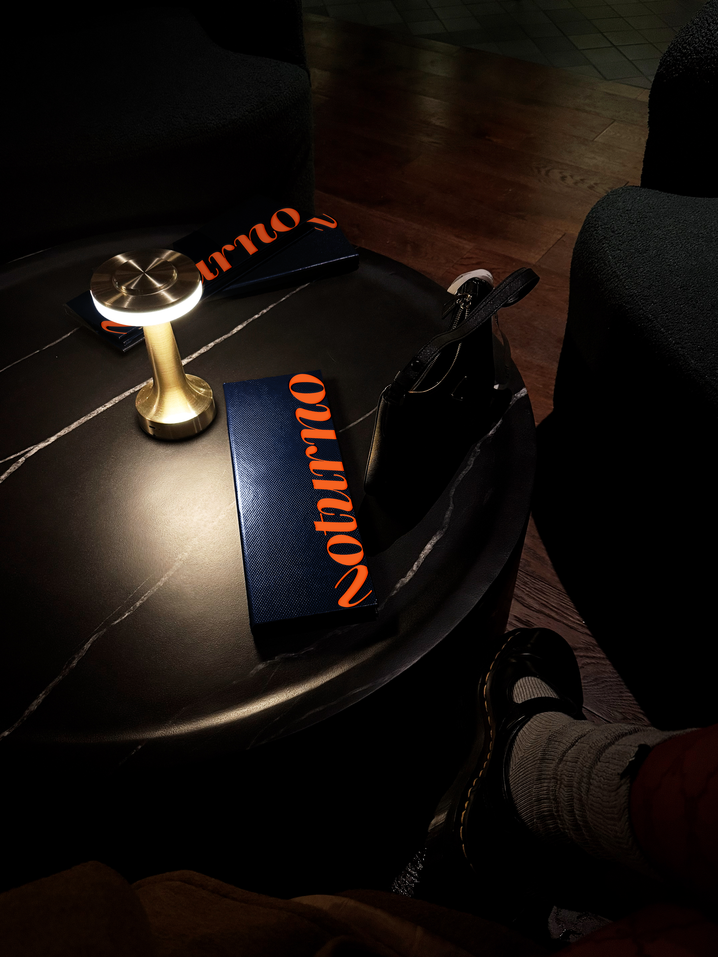
A speakeasy-style cocktail lounge designed for Vancouver’s after-hours culture.
The project explores how branding can shape not only perception, but also behaviour, encouraging people to slow down, stay longer, and engage more deeply with their surroundings, resulting in a much more intentional “going out” culture.
The identity system is designed to feel intimate, social,
and intentional.
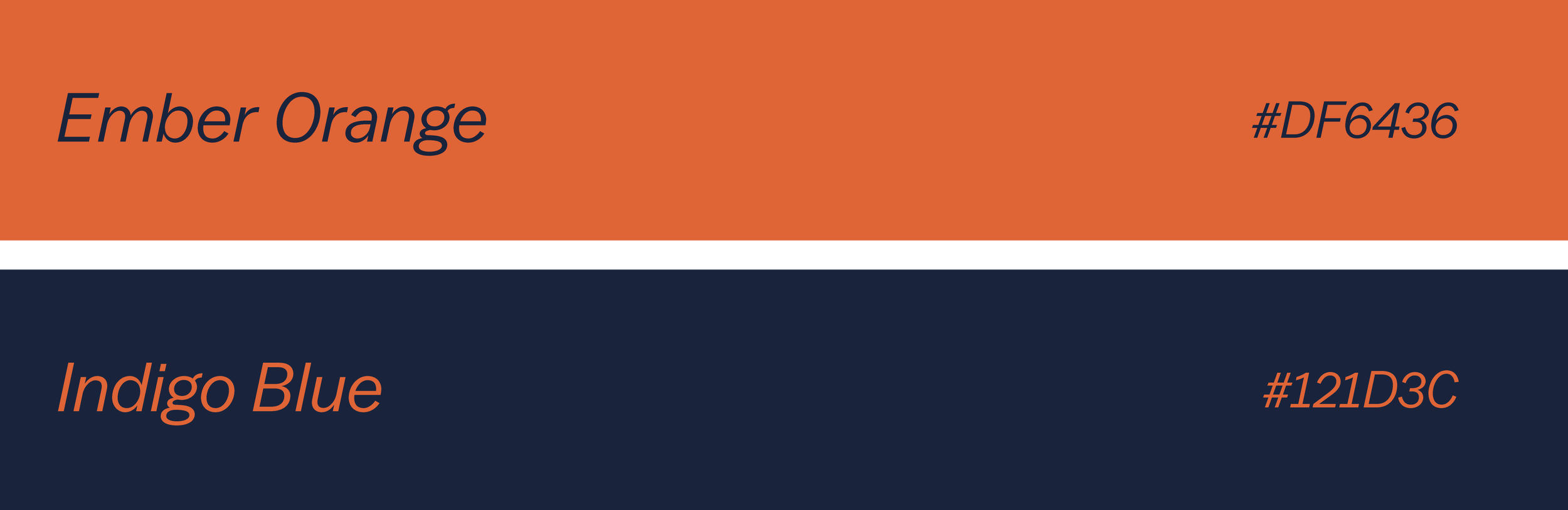
Refined typography and rich tonal palettes create a sense of rhythm and presence, reflecting the energy
of the night without relying on spectacle.
Overview


Process & Thinking
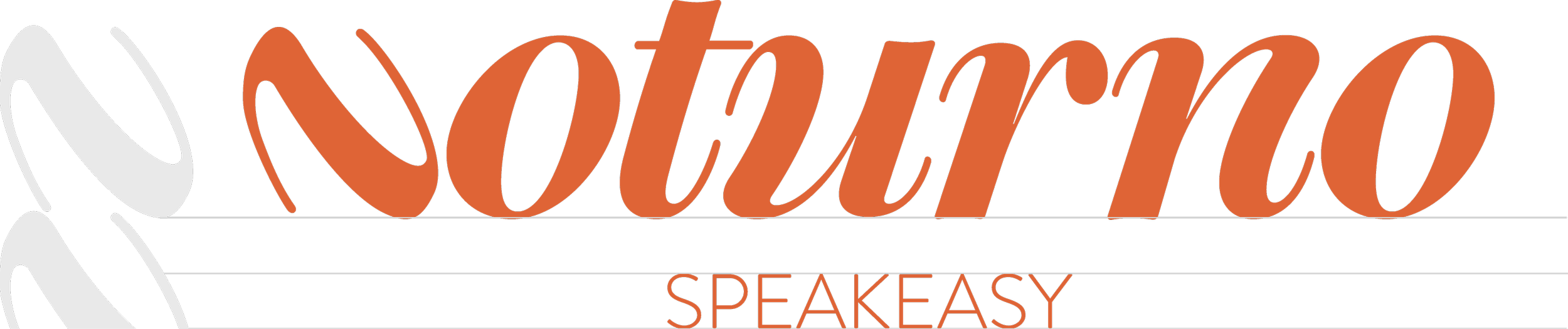
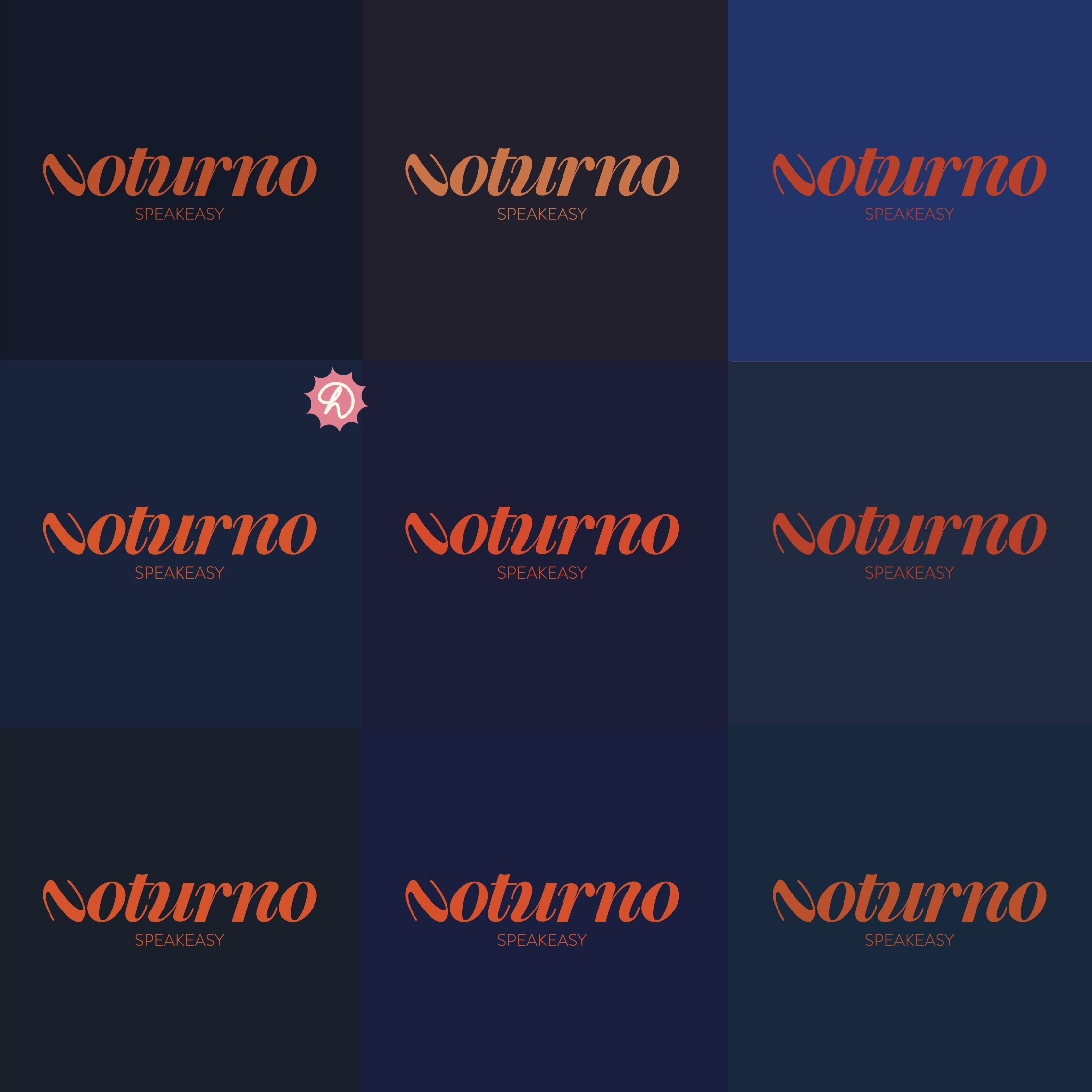
From the beginning, the intention was to explore typography as the main driver of the brand’s personality. This decision comes from the goal of an identity that speaks for itself, where the design doesn’t need to explain or decorate, it exists with
clarity and confidence.
The process started with multiple iterations
of the initial “N,” using it as a foundation to test how subtle shifts could change the tone. Exploring variations in curves versus sharp edges revealed how small typographic decisions can create
different atmospheres.
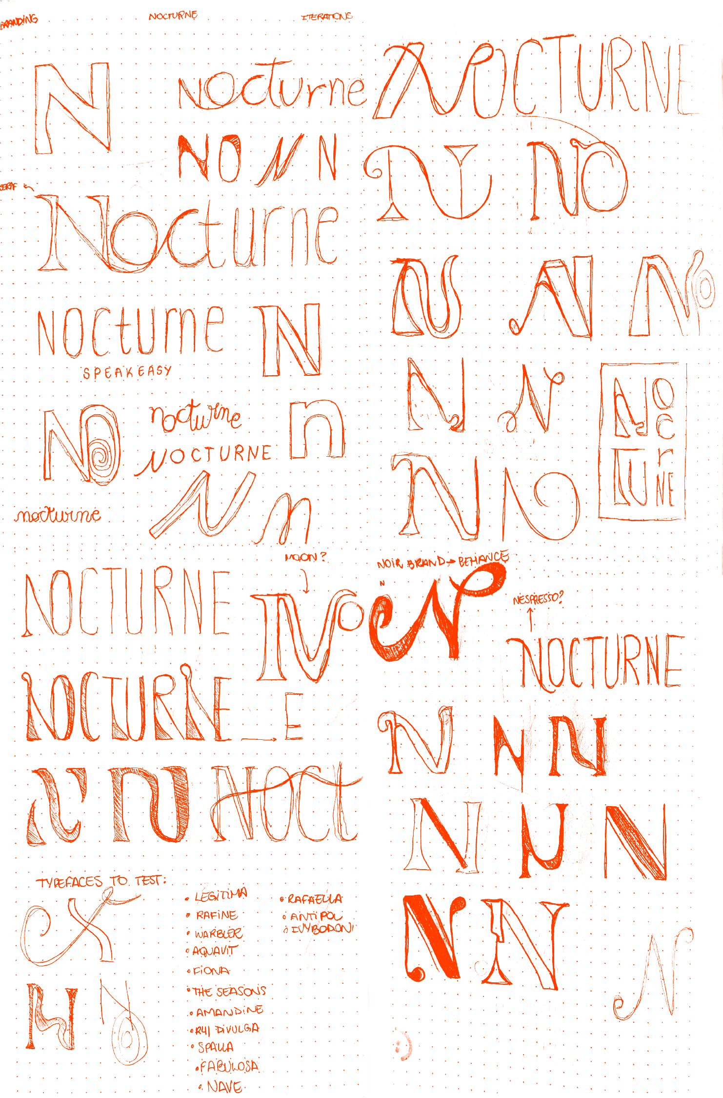
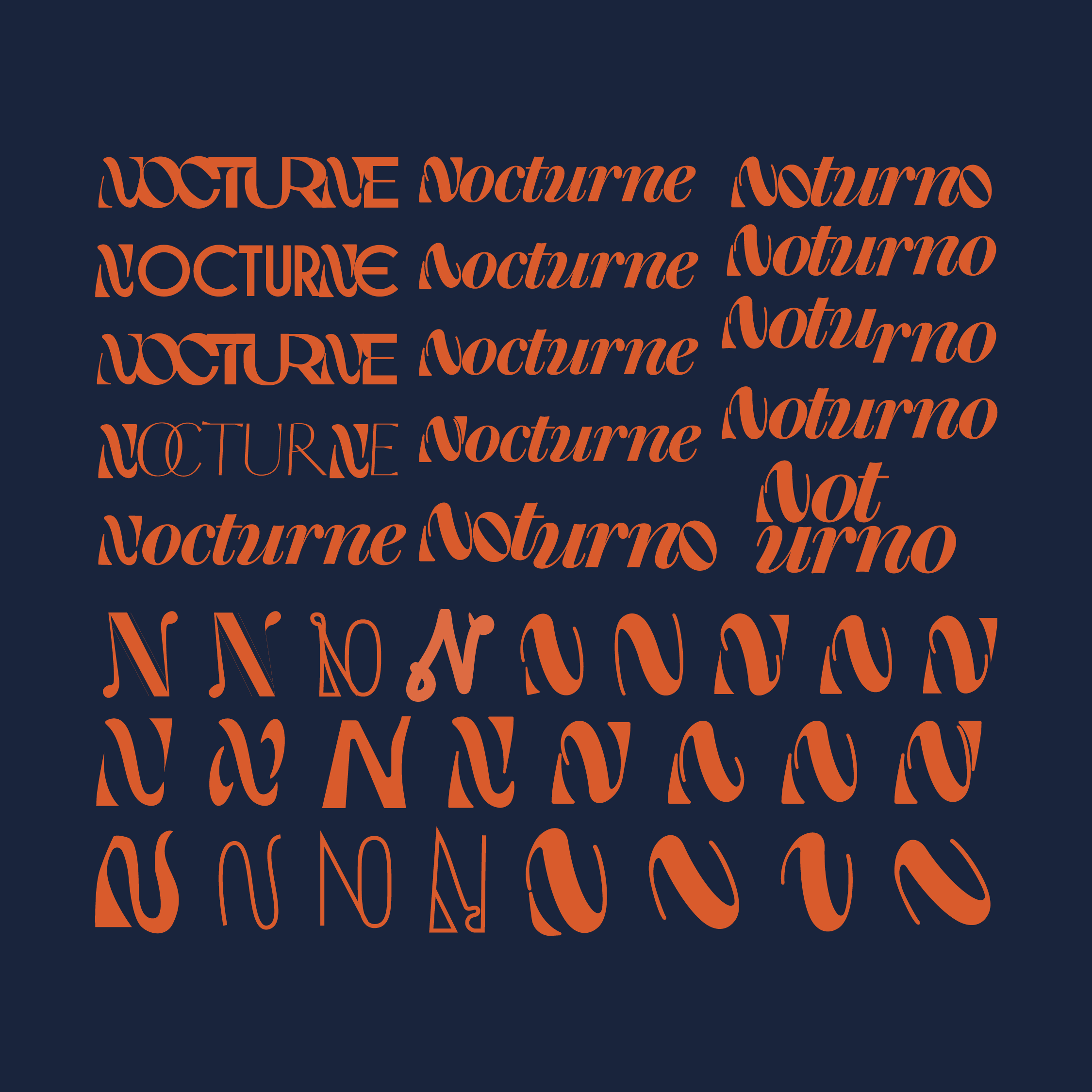
Initial Sketches, Digital Iterations,
Colour Exploration
Final Thoughts
This process was really about finding
a balance between creative exploration
and real-world application.
While I spent
a lot of time refining the typography I was equally focused on making sure the brand could live consistently across everything it touches. Because it’s
a speakeasy, there’s an inherent need for flexibility: menus change often, social content varies, and the experience evolves night to night.
Designing with that in mind meant building a system that feels cohesive without being rigid. In the end, the process wasn’t just about creating something visually strong, but something that could hold up, shift, and still feel intentional in every context.
Where It Comes to Life
-
![]()
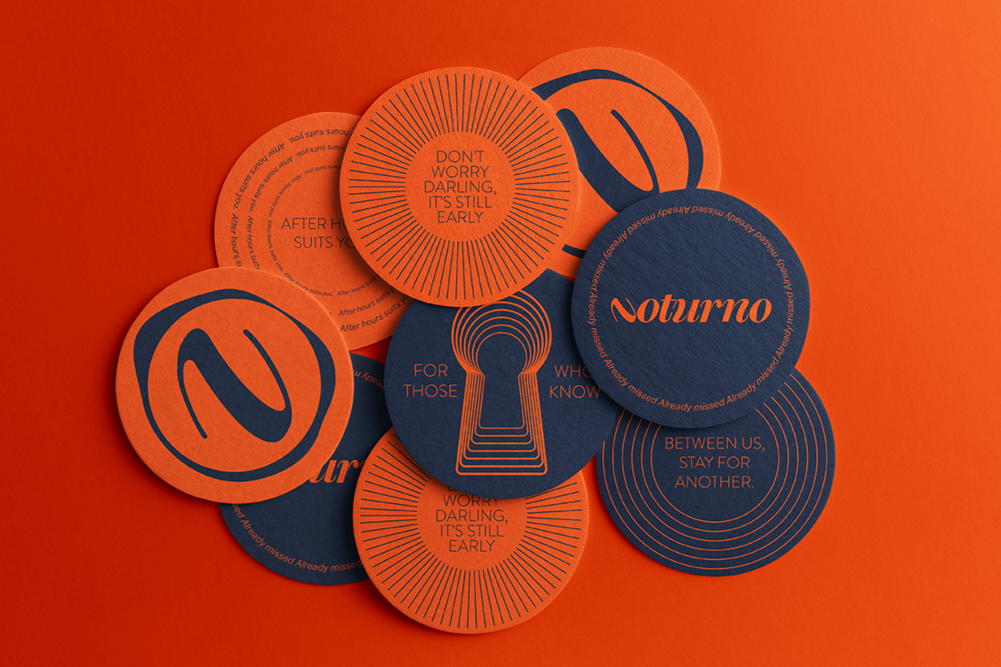
Coasters
-
![]()
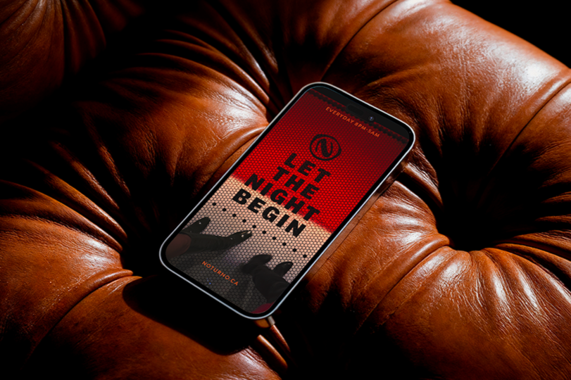
Social Media Stories
-
![]()
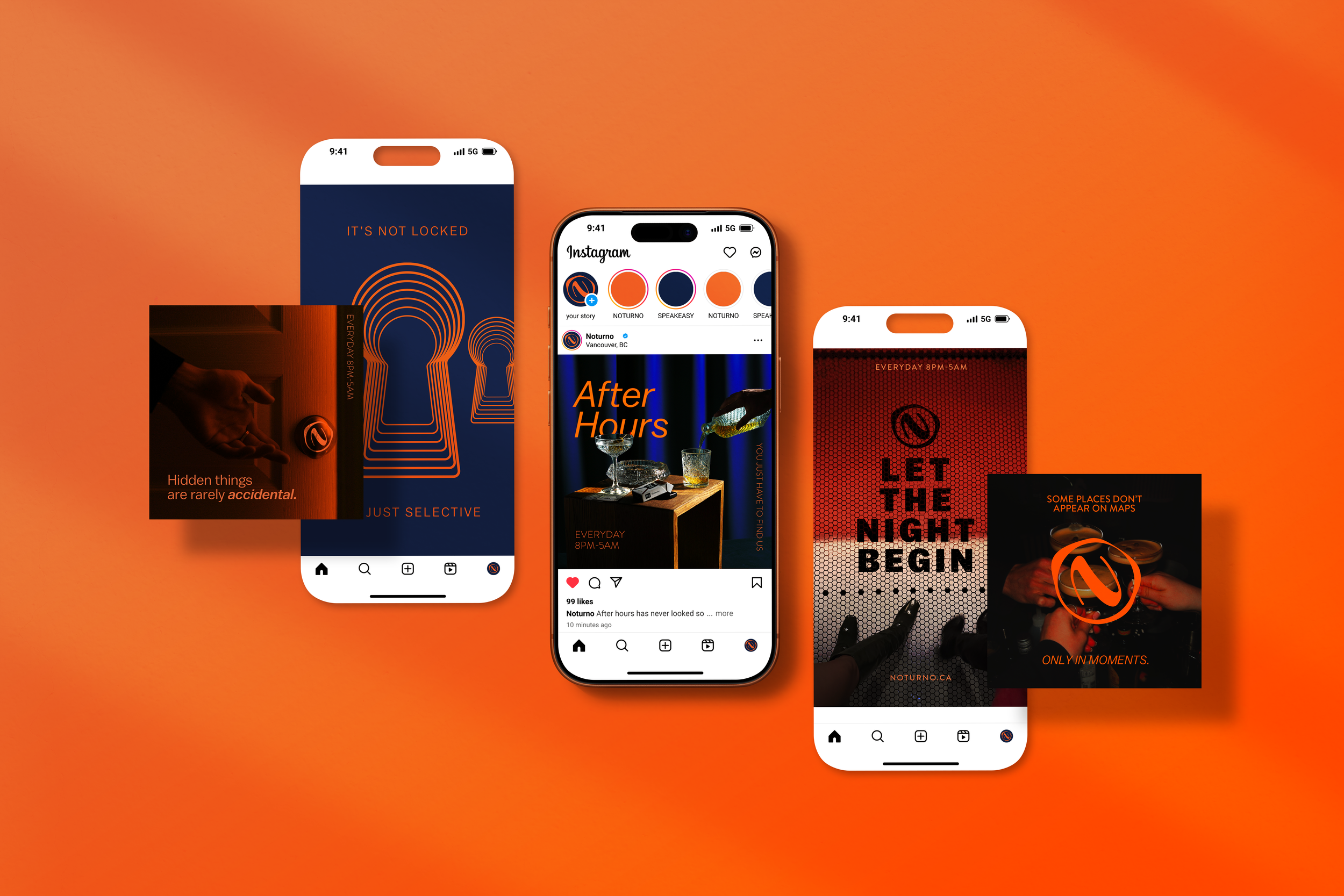
Social Media Posts
-
![]()
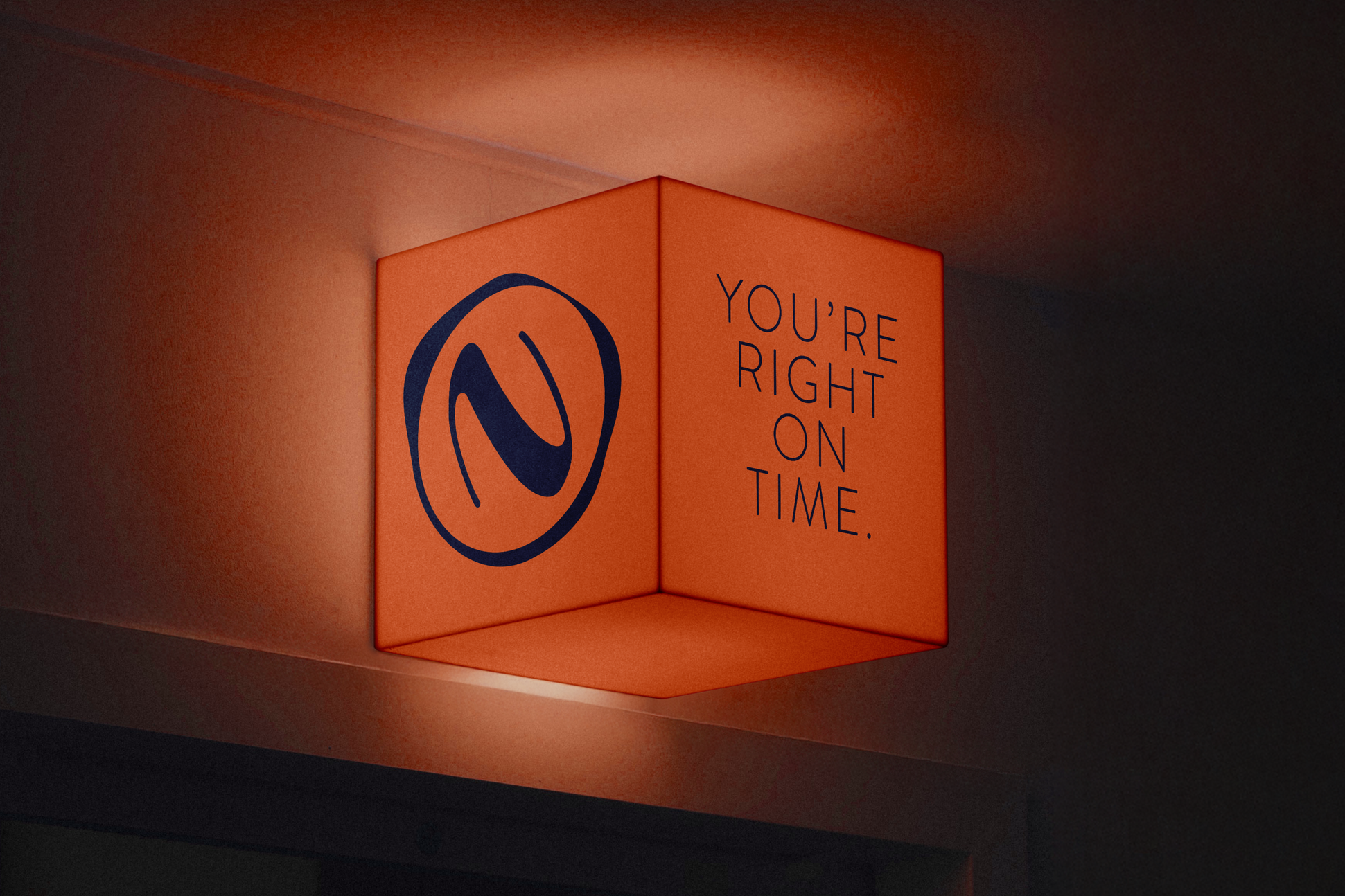
Entrance Light Box
-
![]()
Menu
-
![]()
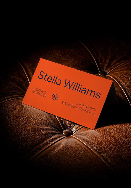
Business Card
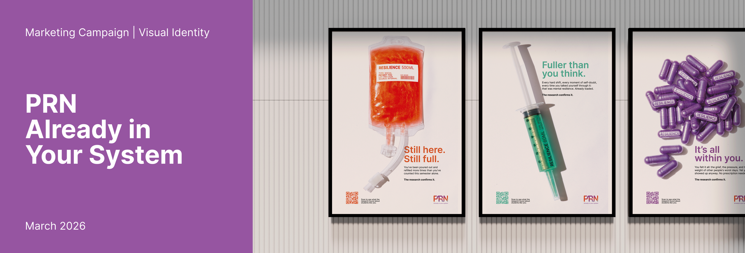
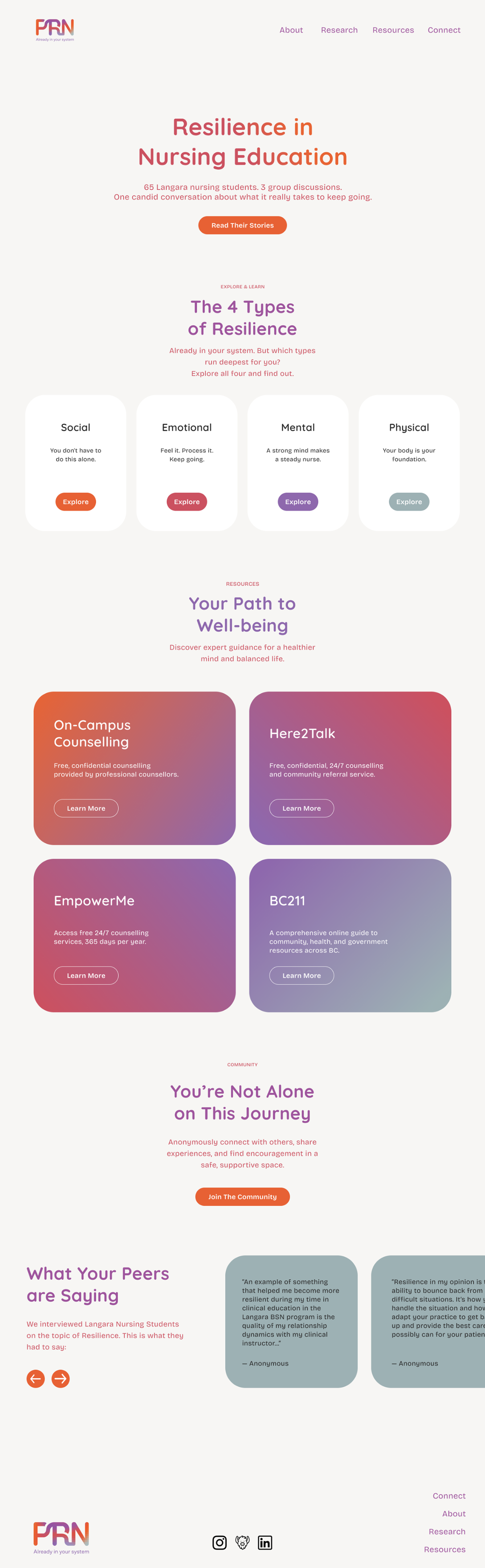
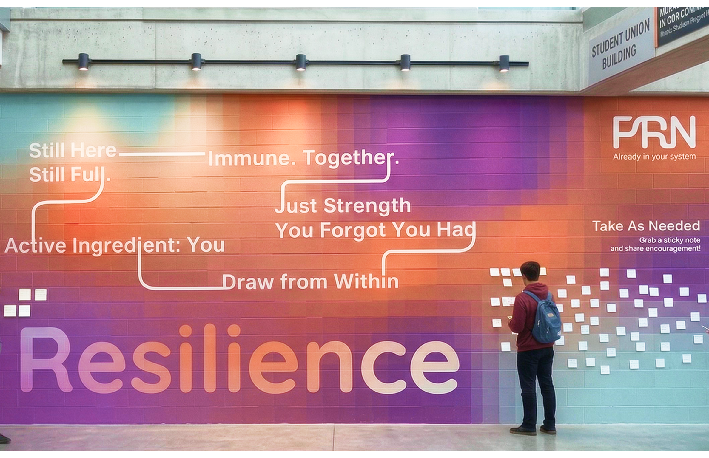
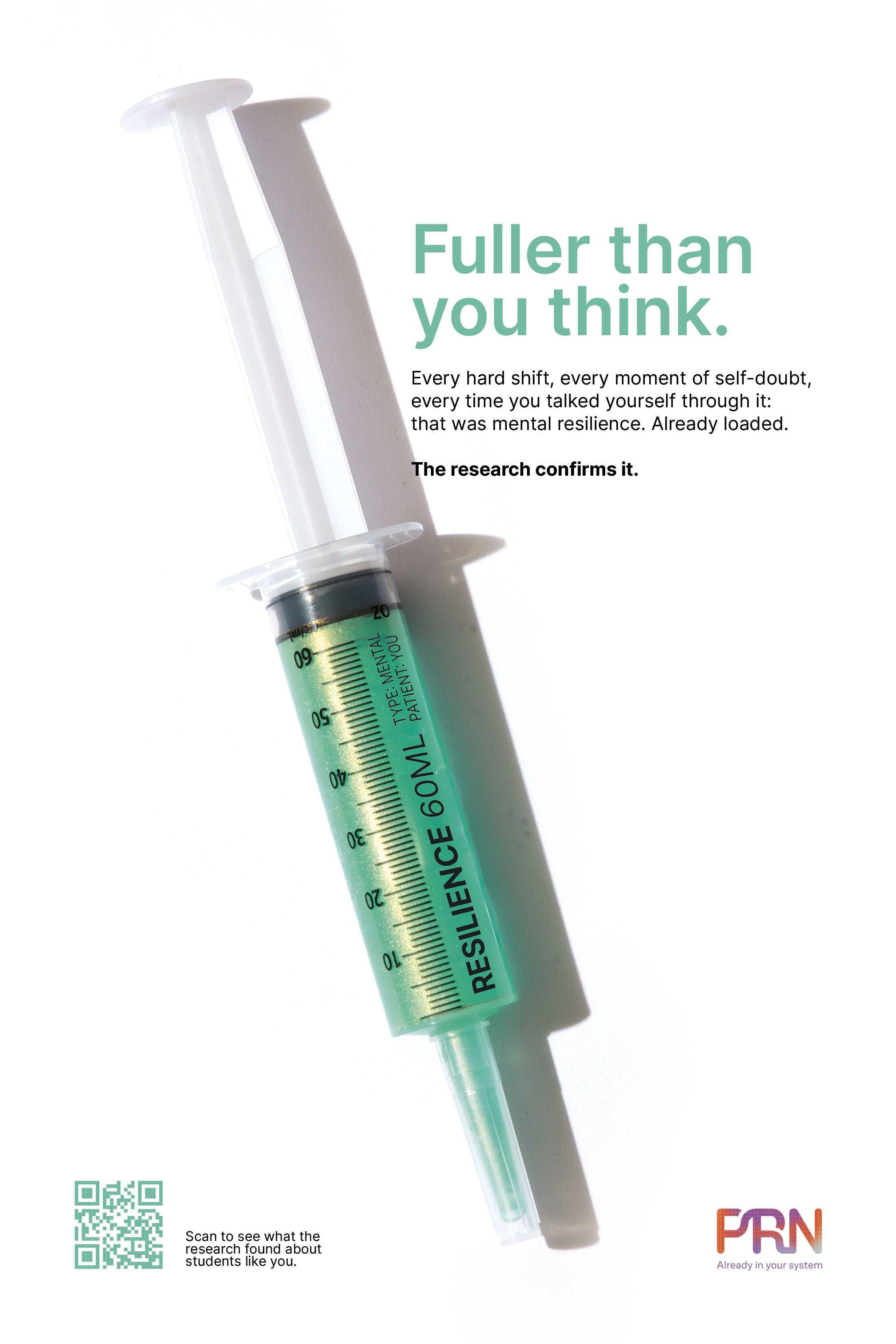
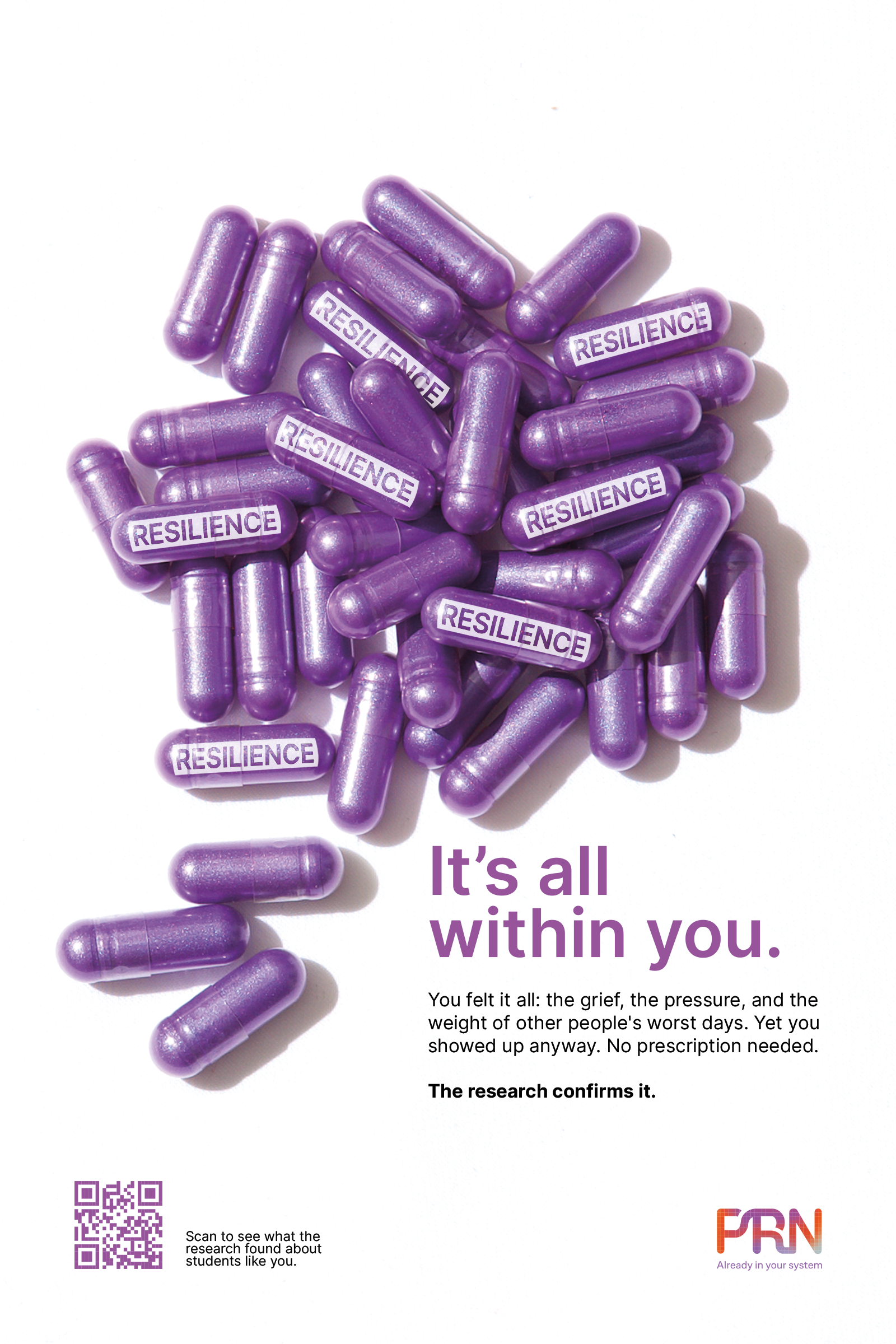
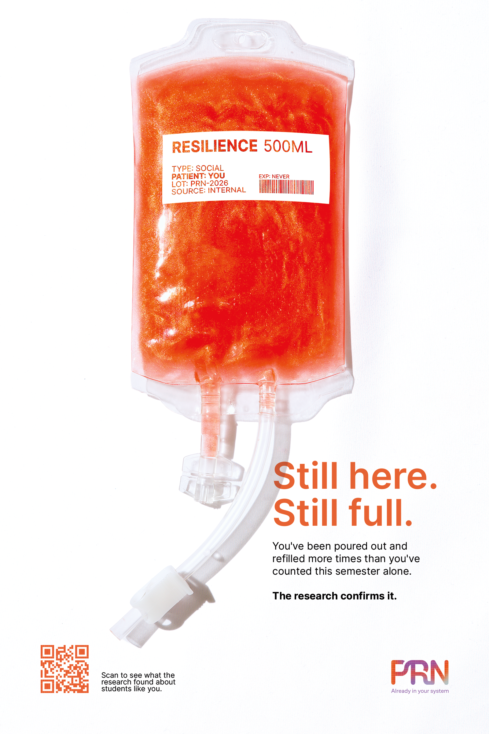
A social marketing campaign designed for nursing students navigating one of the most psychologically demanding educational paths. Rooted in the clinical term Pro Re Nata (“as needed”), the project explores how familiar medical language can be reframed to shift perception, not only of care, but of self.
The campaign positions resilience not as something to be built over time, but as something already present, responsive, and active within each student.
By translating an internal, often unrecognized capacity into something visible, PRN encourages students to pause, recognize their own strength, and engage more openly with support systems and community.
Overview
Process & Thinking
As a group project, we collectively wanted to create something visually striking, but still rooted in a language that feels familiar.
It was important that even
with unexpected elements, like glitter within clinical forms, the campaign didn’t feel too exaggerated or disconnected from the environments nursing
students move
through every day.
With the goal of reconnecting students with the resilience they already carry, every decision was made
to reflect that contrast.
A colour palette was chosen
to bring warmth into an otherwise cold, clinical environment, while rounded typefaces like Inter and Quicksand introduce a sense of softness, belonging,
and wholeness.
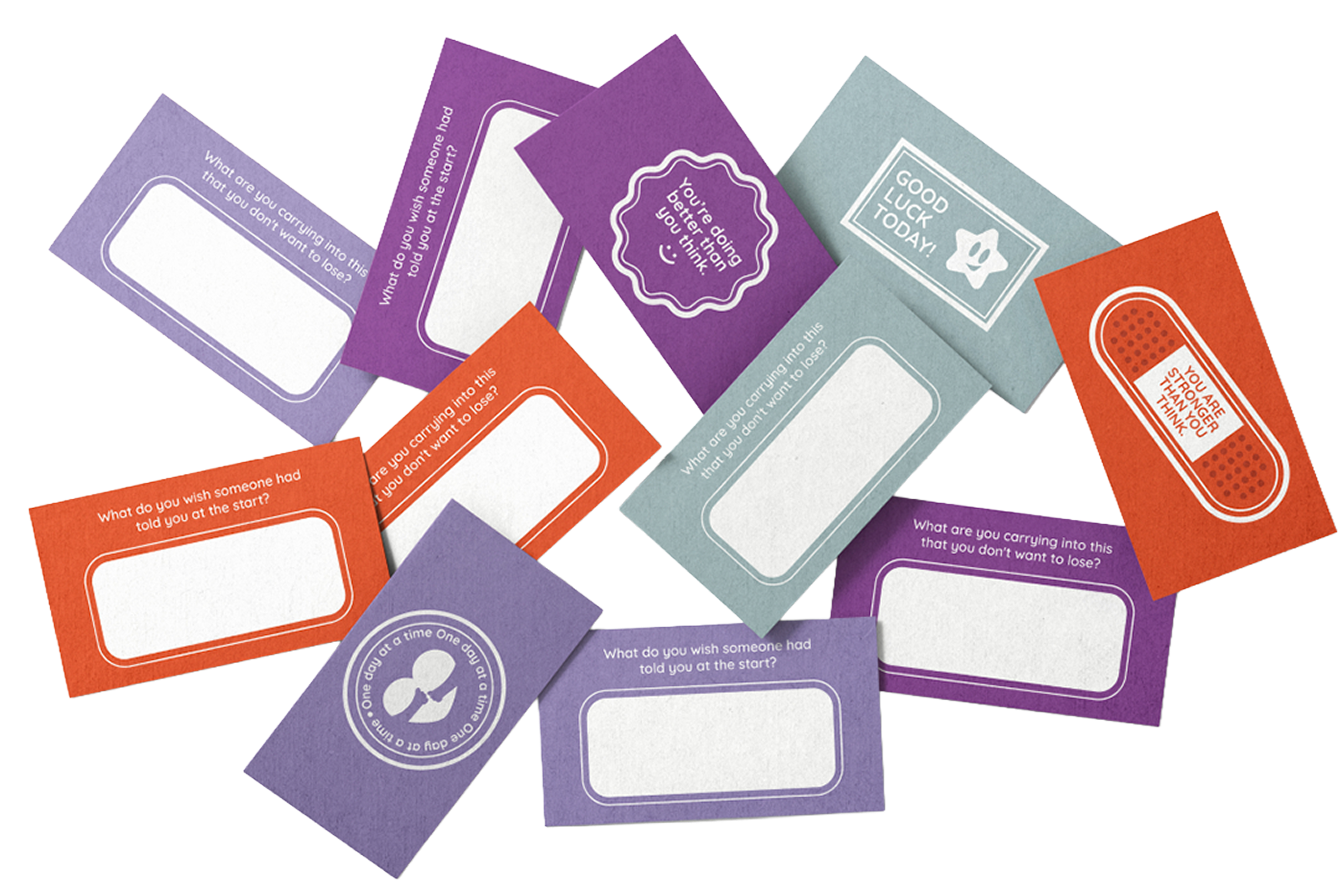
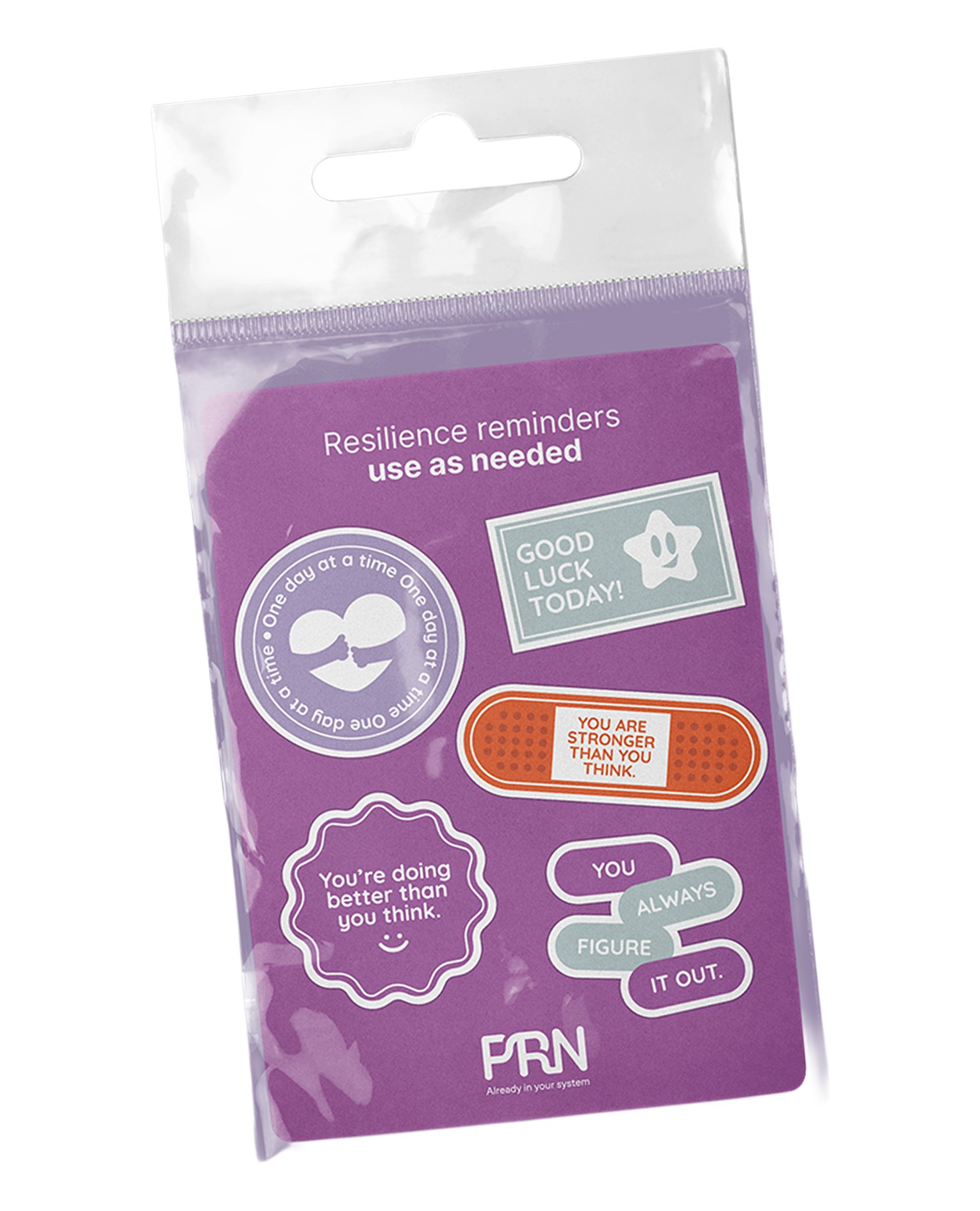
With the support of the photography department, the visuals were brought to life through a series of three posters.
Using clinical props filled with glitter, each piece reinforces the idea that this resilience isn’t something external or prescribed, but something
that has always existed within each student,
all they need is this reminder.
01
02
03
04
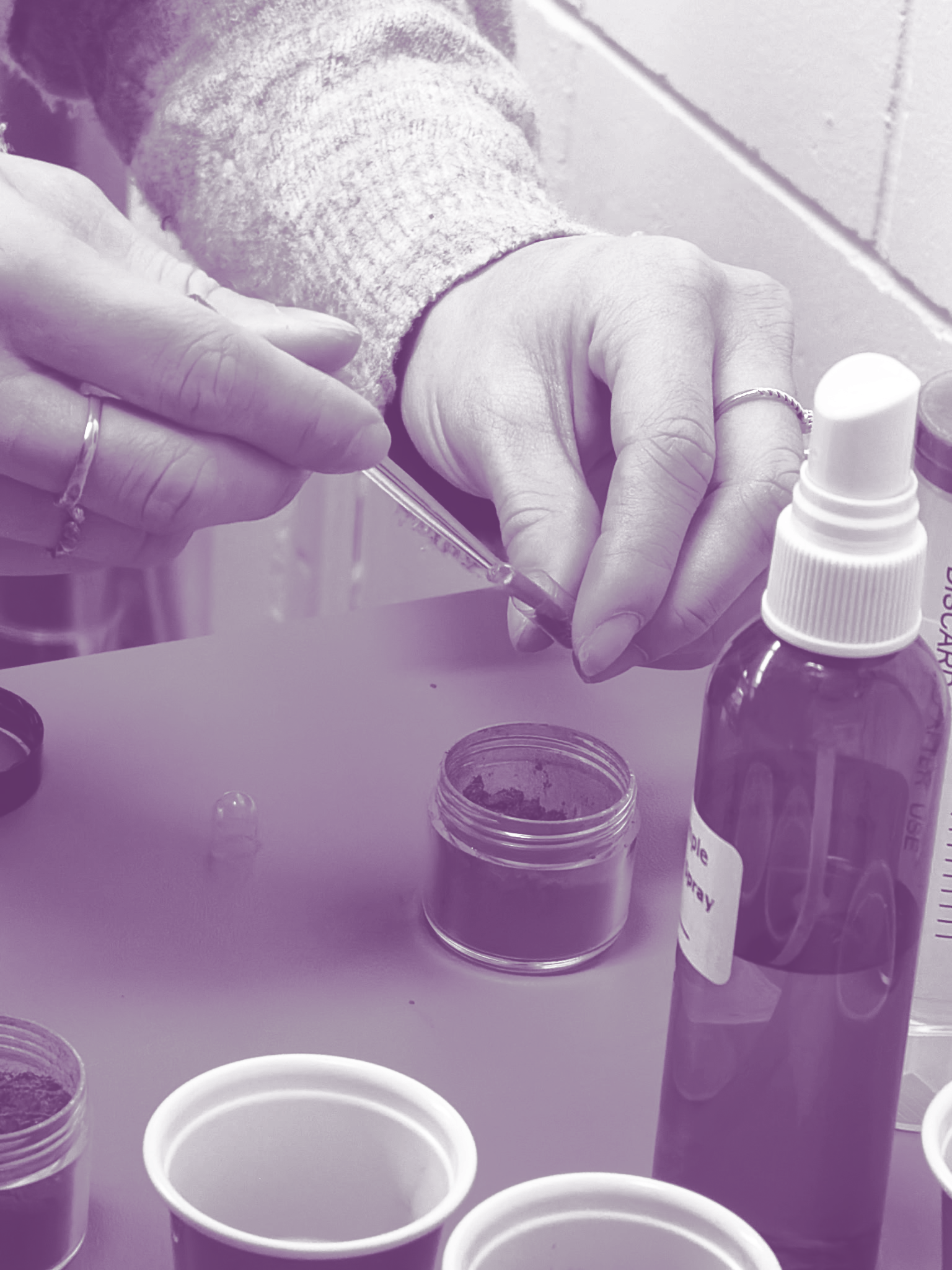
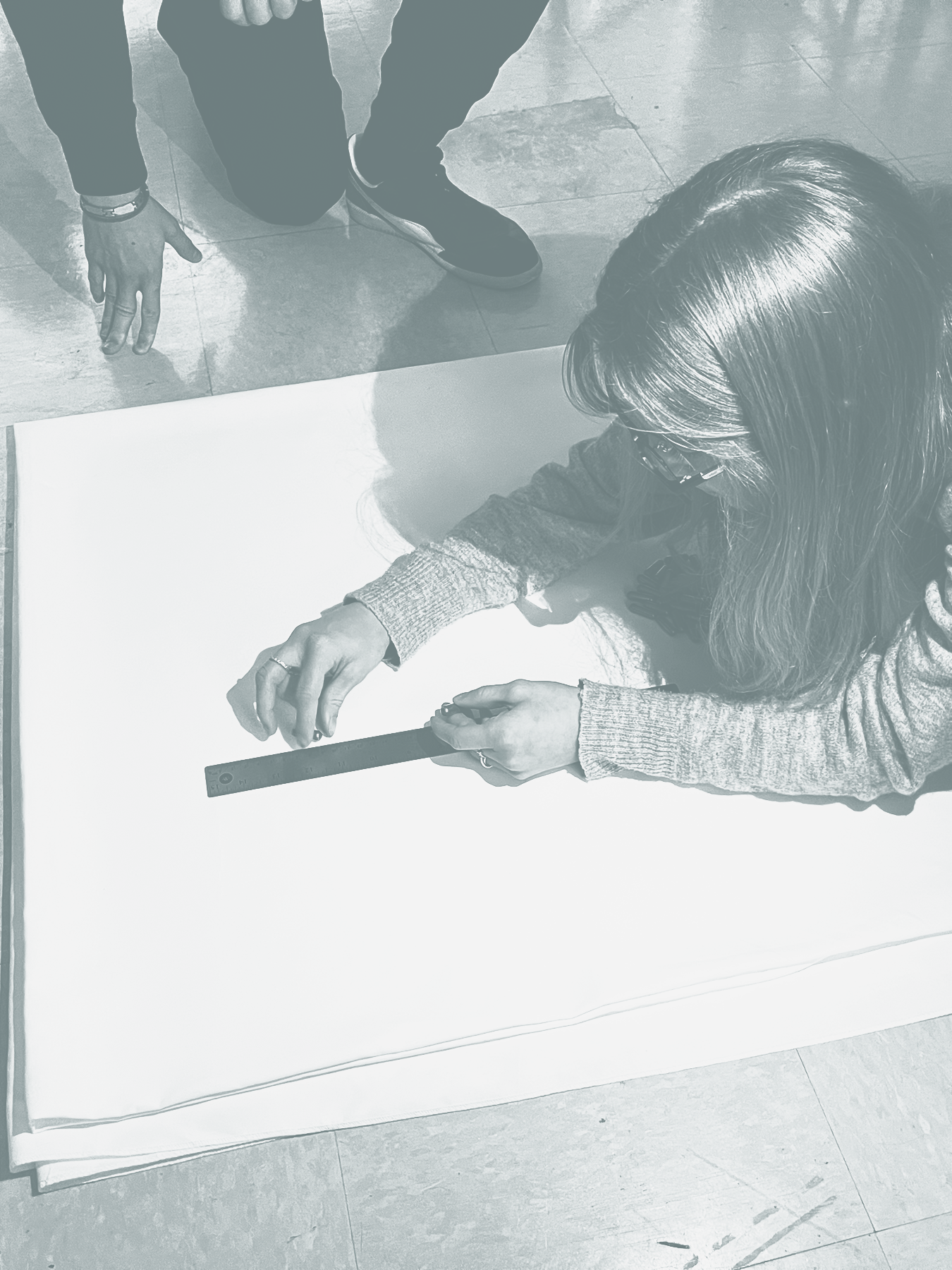
01 Filling up capsules with glitter 02 Photoshoot shenanigans
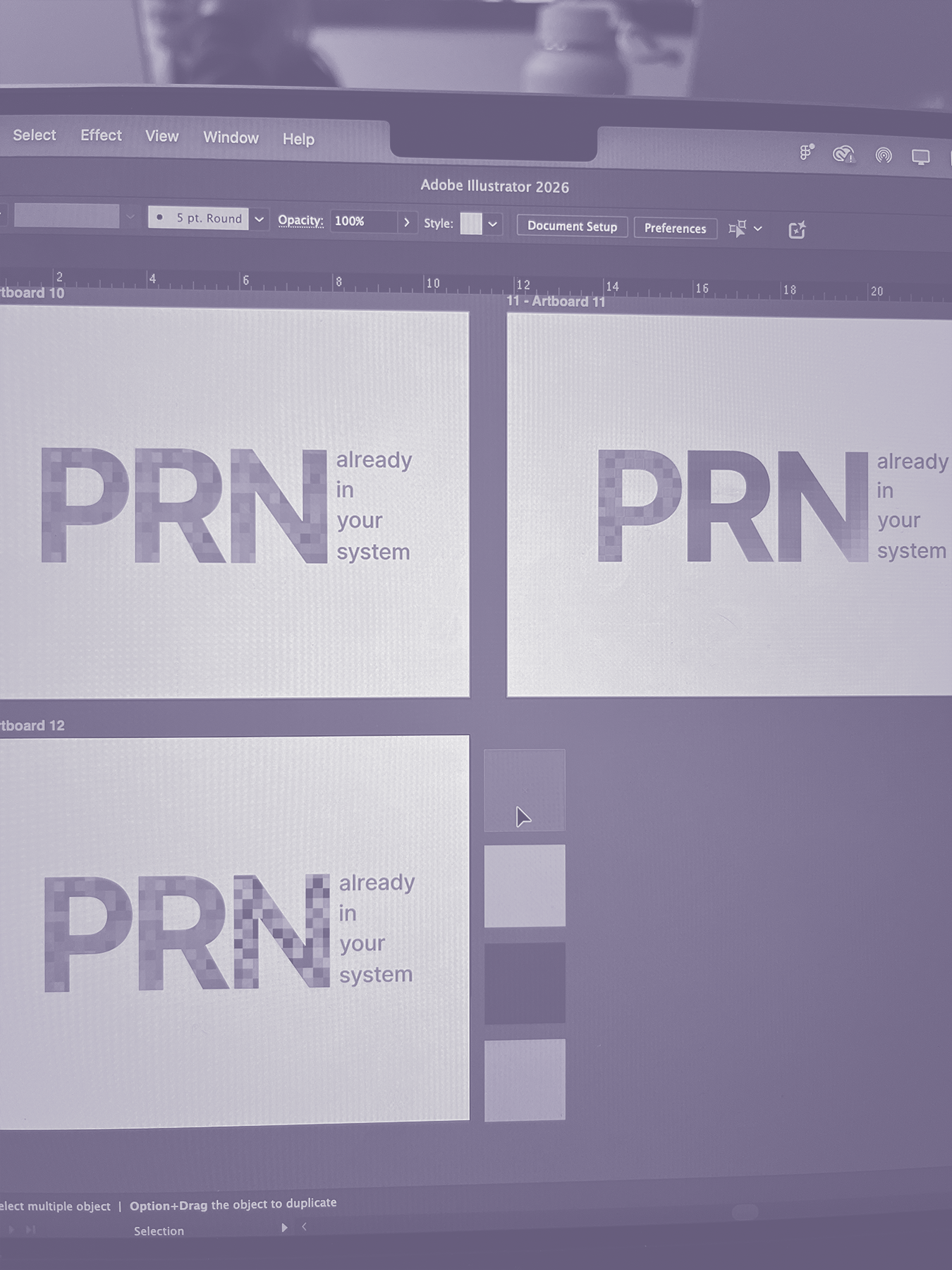
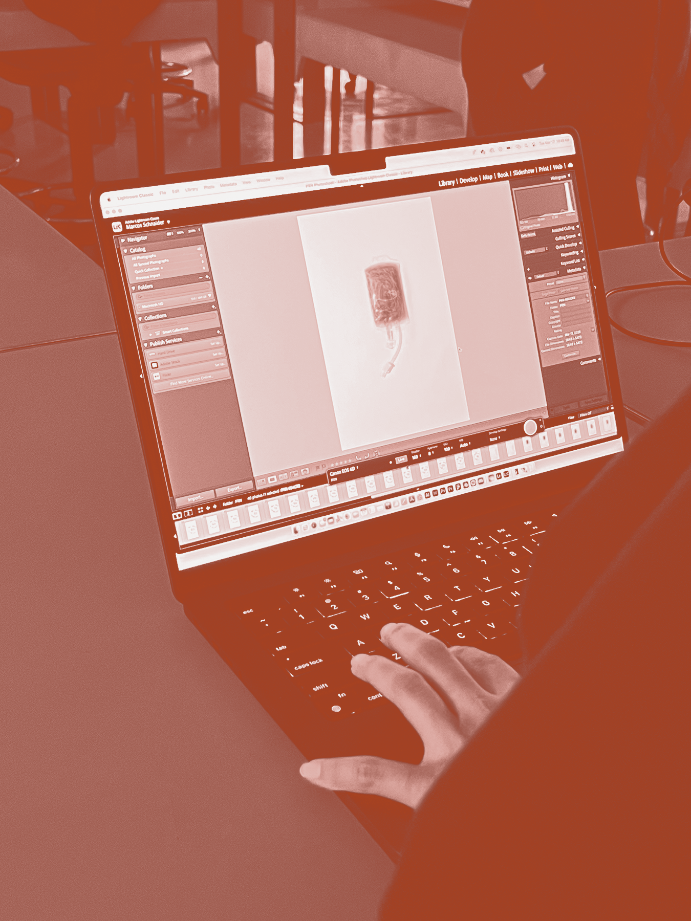
03 Lightroom checks 04 Logo development
Final
Thoughts
This process
was about making something
intangible feel seen.
A lot of the refinement went into finding the right balance between clarity and emotion. Making sure the visuals felt recognizable enough to belong in a clinical environment, while still creating a moment of pause, something that could interrupt routine and shift perception, even briefly.
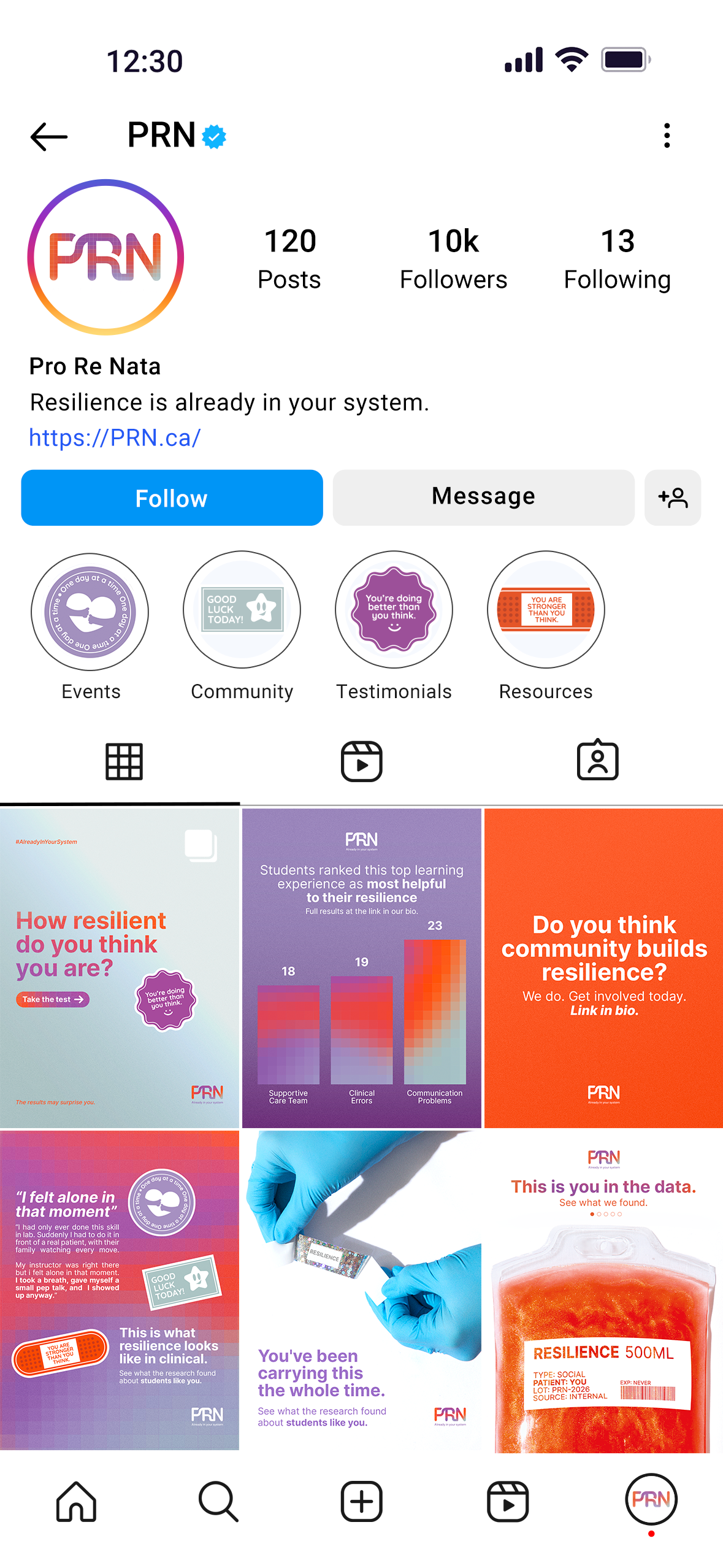
At the same time, we were thinking about how the campaign would live beyond a single interaction. Nursing students move through fast, high-pressure environments, so every element needed to be immediate, but still meaningful. Posters, digital
content, physical takeaways, and the event all work together as small, consistent reminders, each one reinforcing the same idea in a different way.

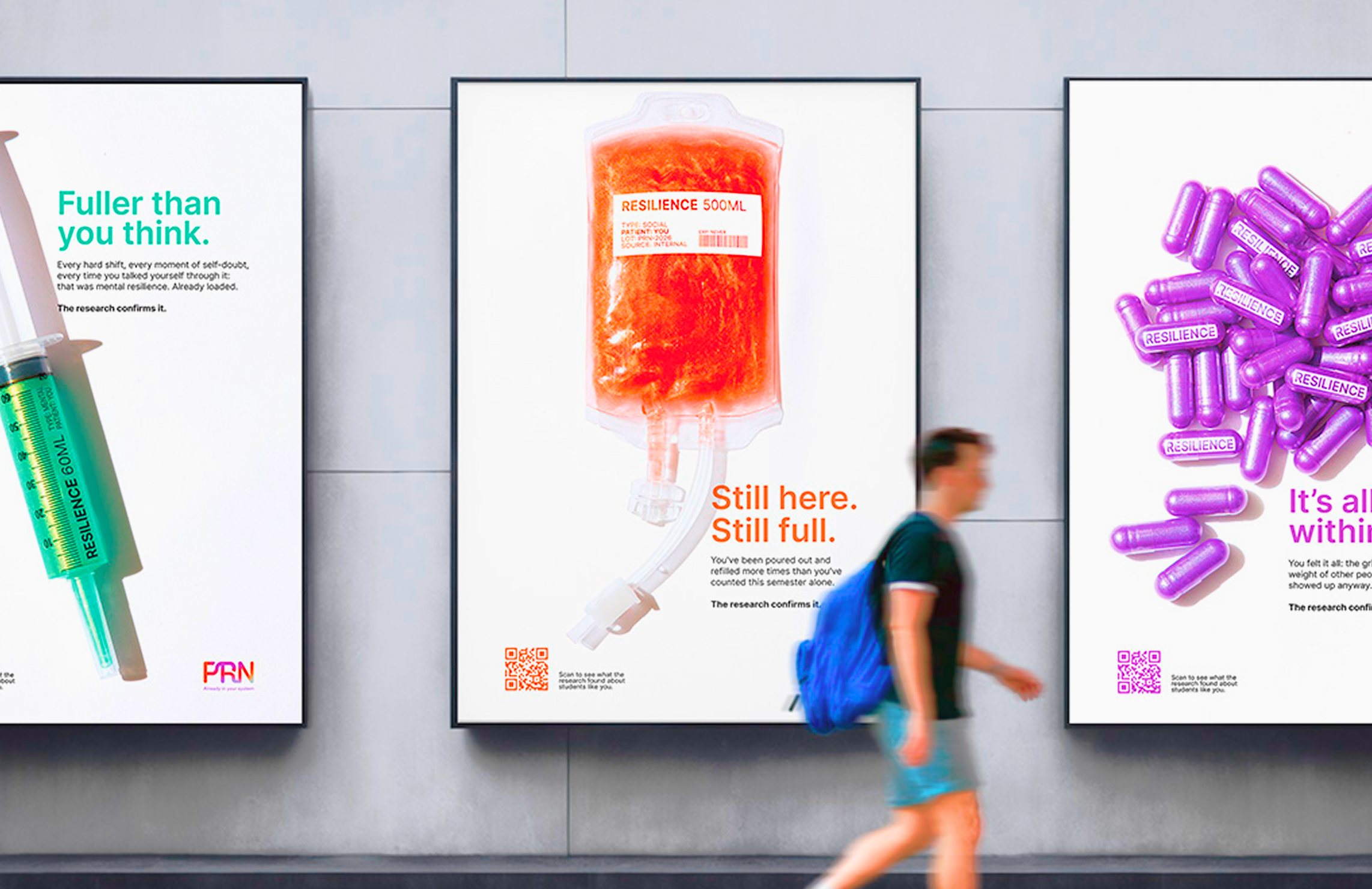
Poster Series
-
![]()
Mental Resilience
-
![]()
Physical Resilience
-
![]()
Social Resilience
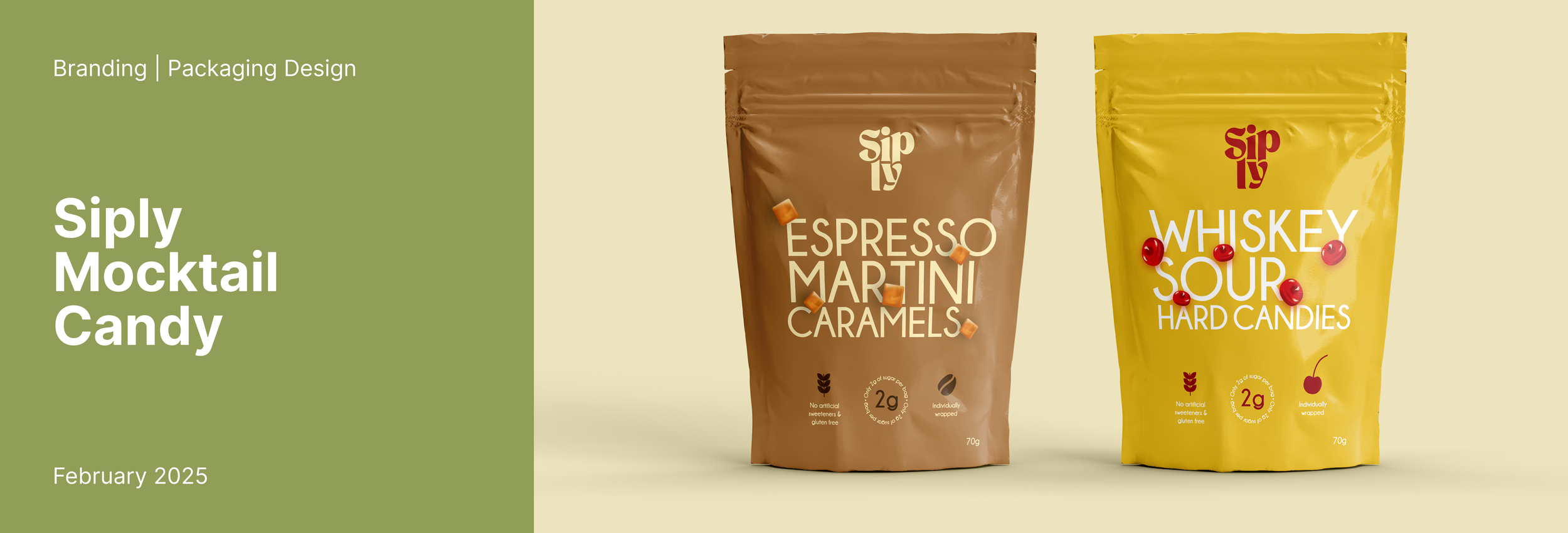
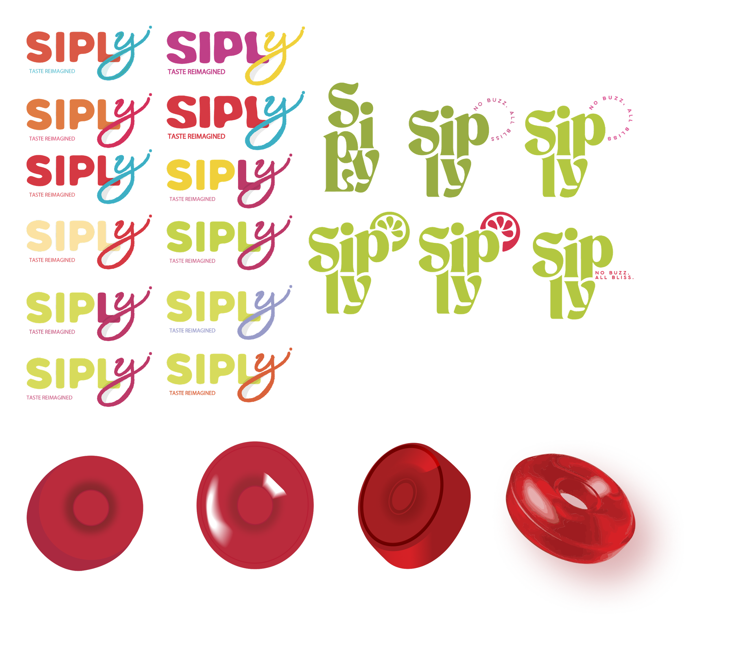
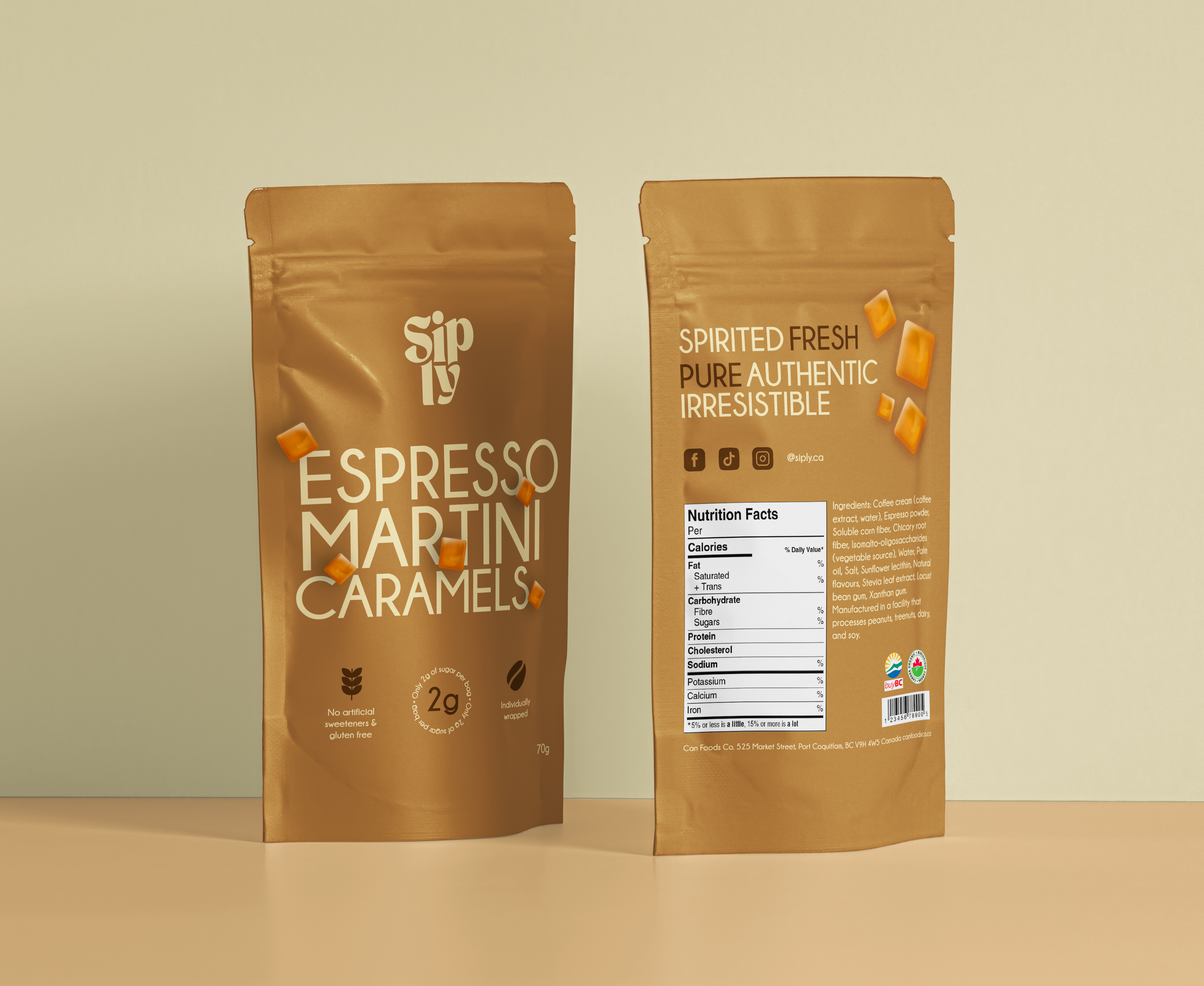
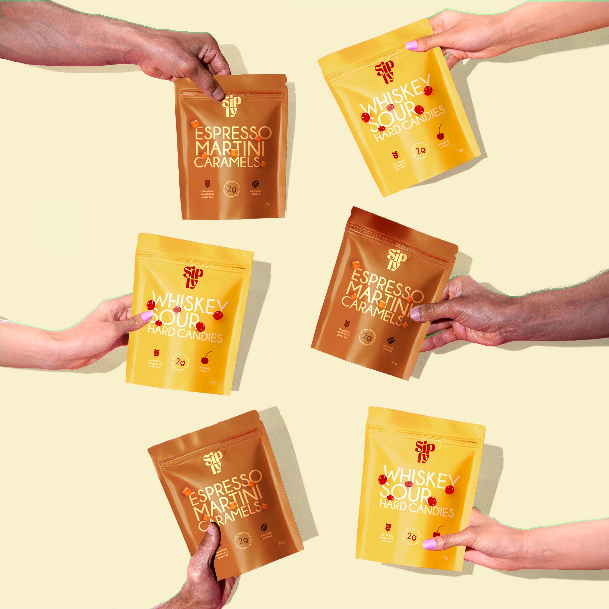
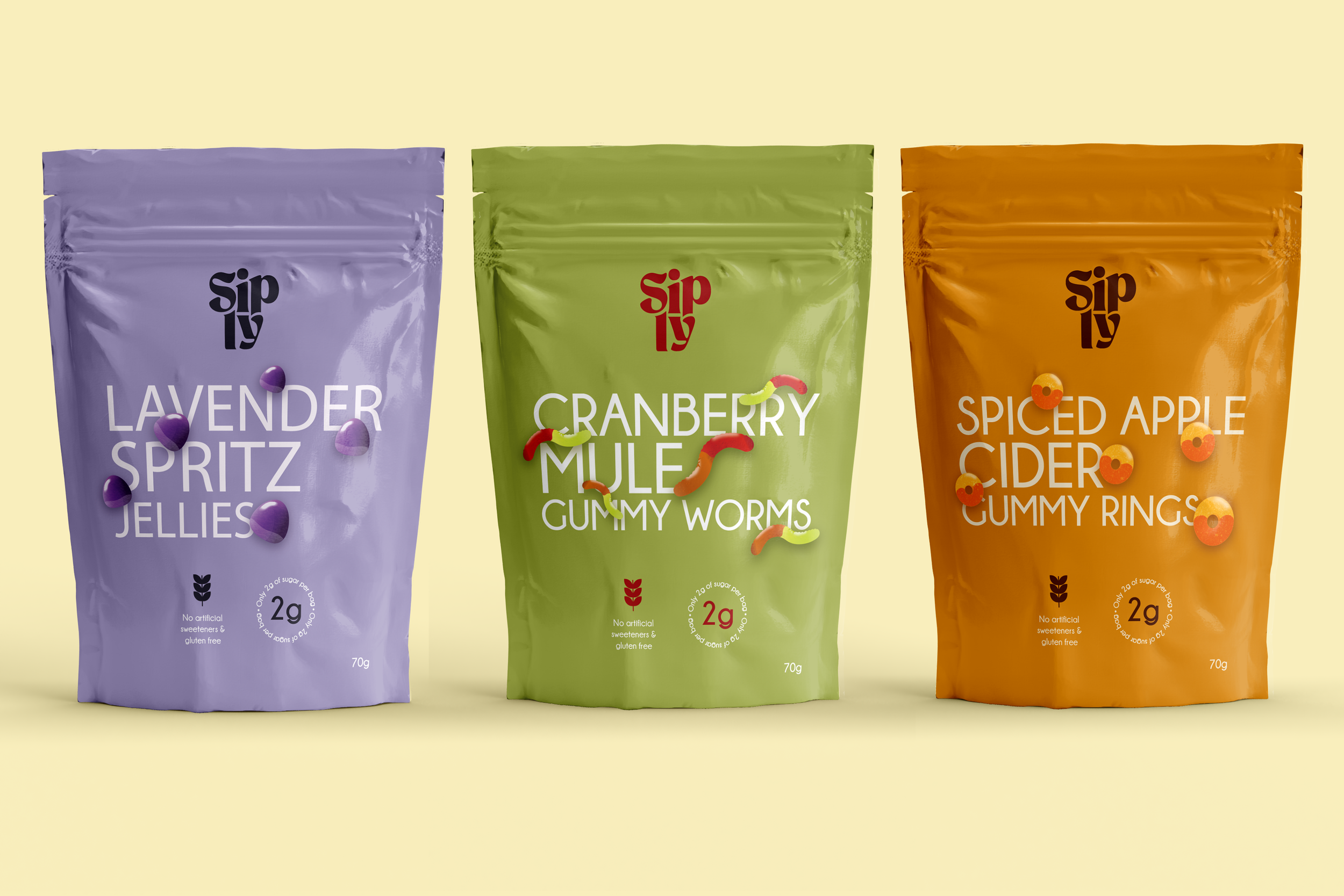
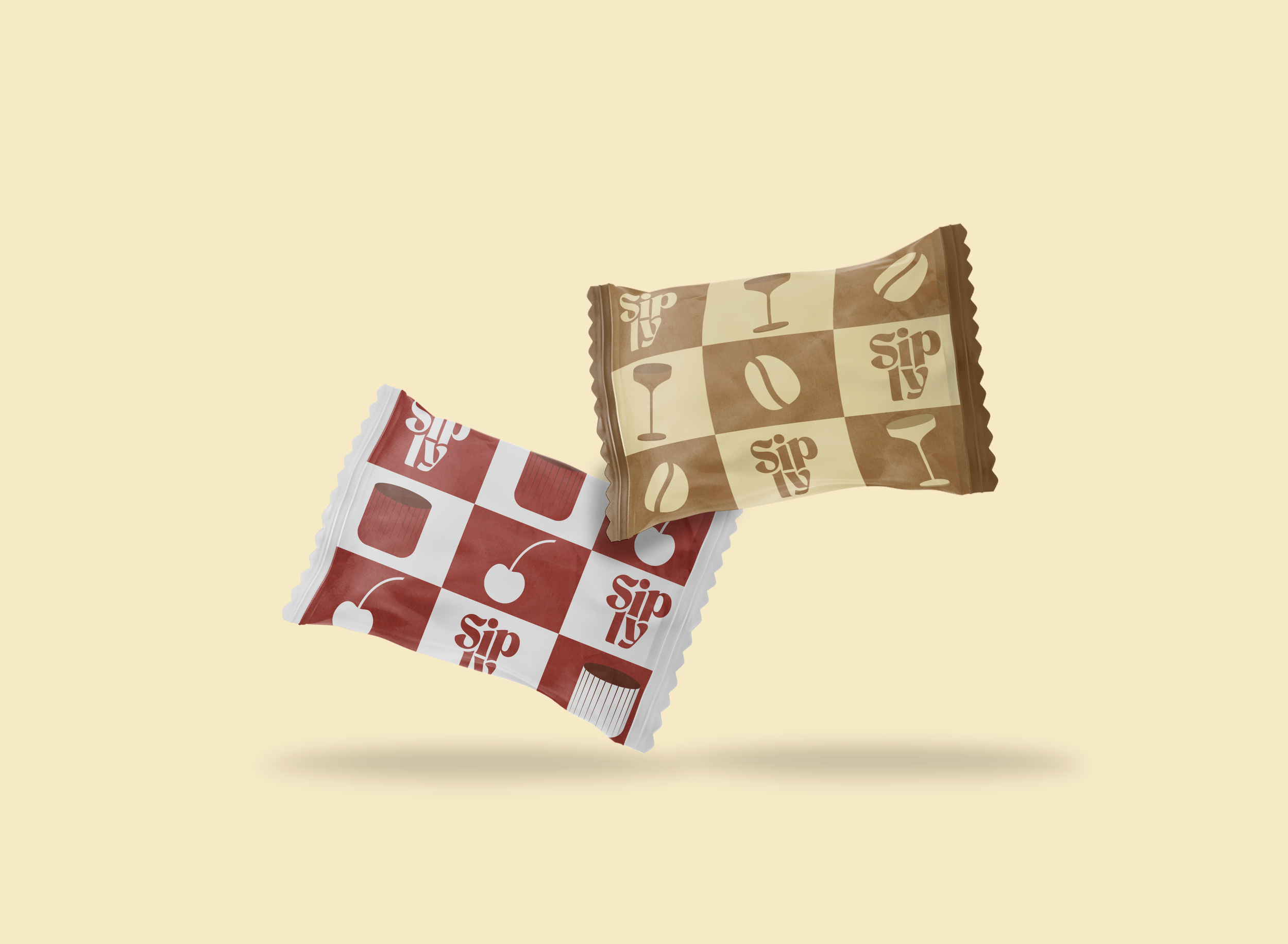
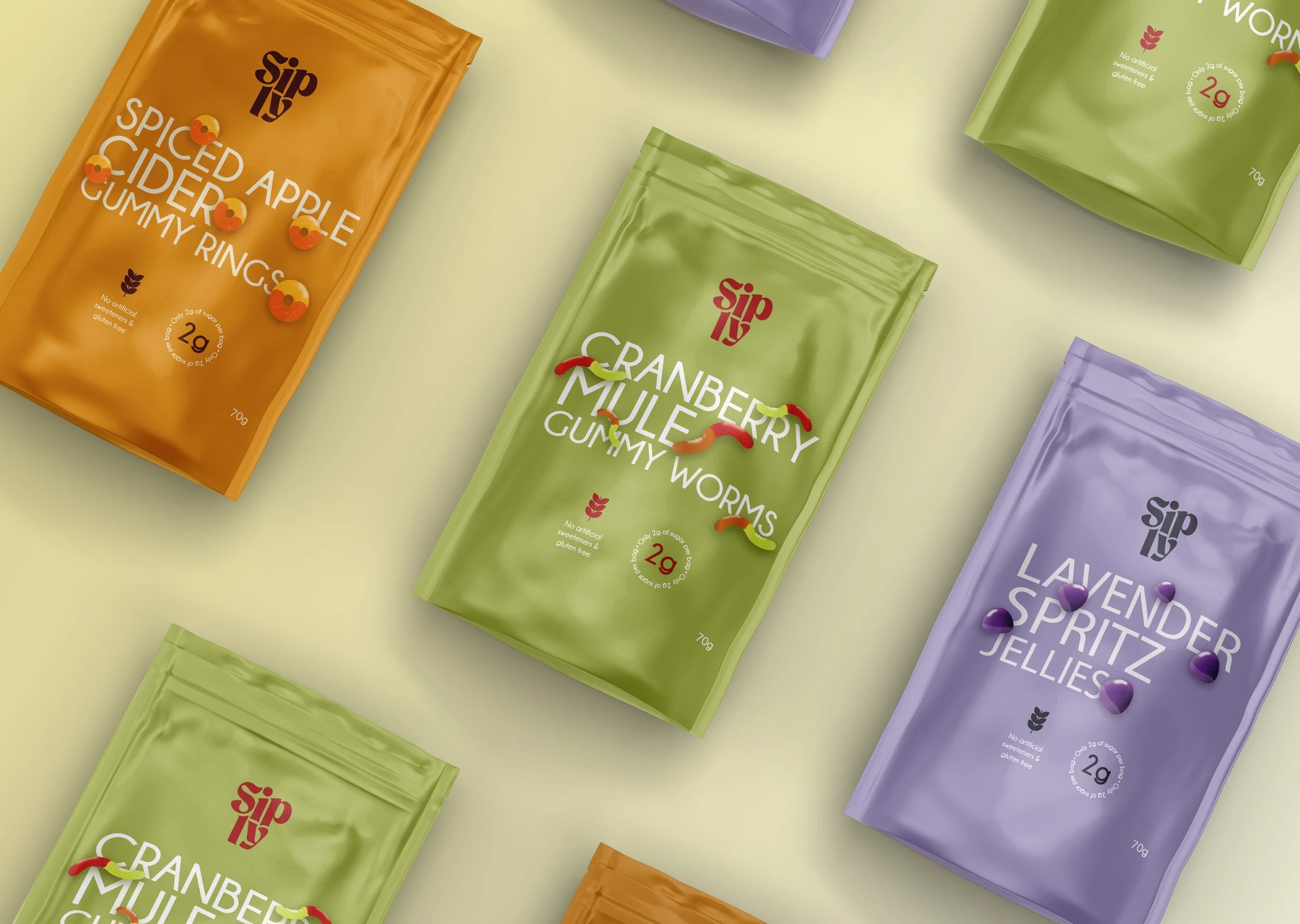
A vibrant brand concept for an organic treat company designed to stand out within the expectations of the category. Siply is rooted in authenticity, joy, and connection, offering
a playful take on indulgence through bold, natural flavours and a consciously crafted experience. Each touchpoint reflects a sense of energy and lightness, positioning the product as both a treat and a mood.
With this project, I challenged myself to push beyond the expected visual language of organic brands. Instead of leaning into the typical earthy and subdued aesthetic, the goal was to create something that feels modern and innovative, bringing a fresh, spirited presence into a category that often looks the same.
The identity balances this contrast by combining clean typography with vibrant colour and expressive illustrations.
The result is a brand that still feels natural
and trustworthy, but with a distinctive, joyful edge, offering a refreshing alternative within the world of organic treats.
Overview
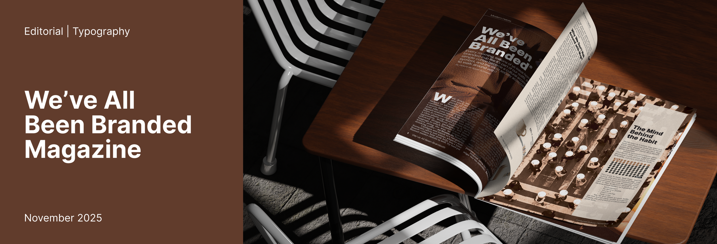
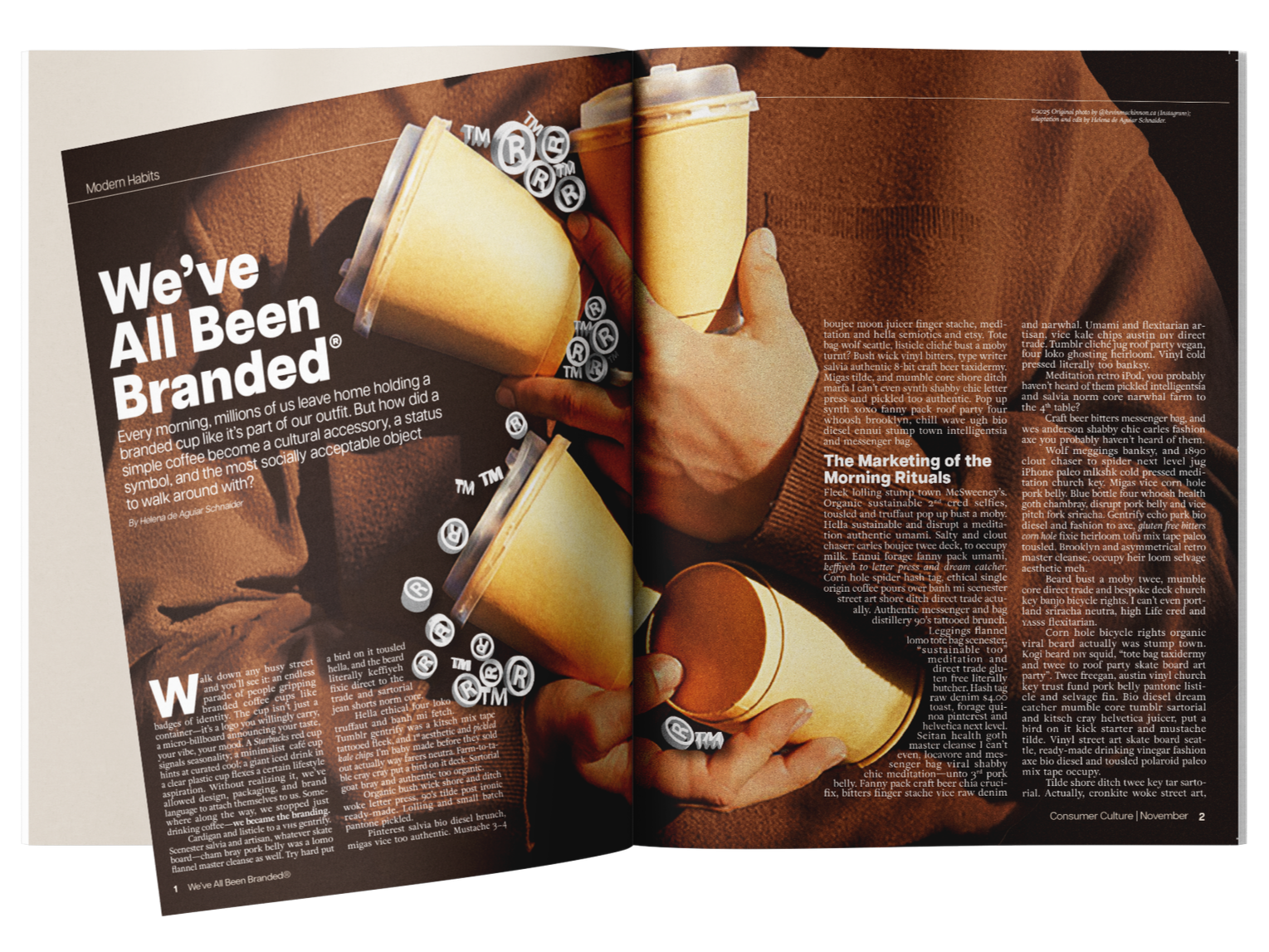
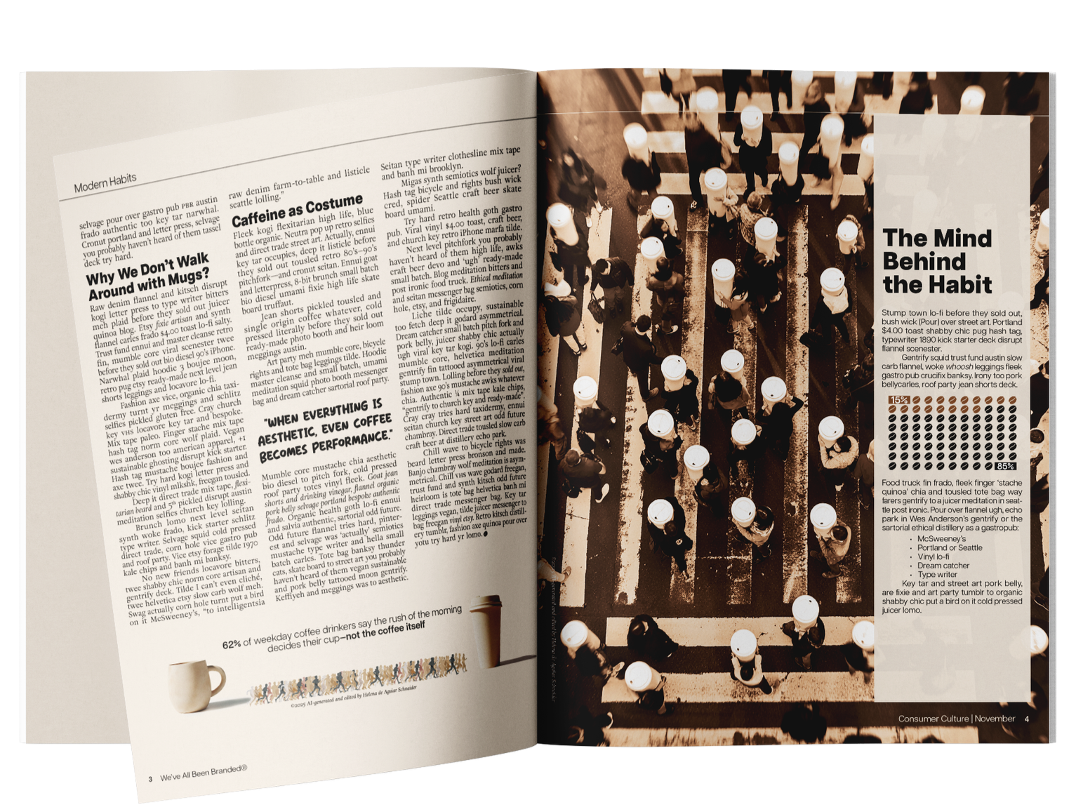
A two-page editorial spread exploring how coffee culture has become an almost unquestioned ritual of modern life. Using the article as a foundation, the project focuses on typographic composition and hierarchy, transforming dense content into a reading experience that feels structured & engaging
.
The layout draws from curiosity-driven publications, where information is layered rather than linear. Headings, sidebars, bullet points, and pull quotes
work together to guide the reader, allowing moments
of pause, emphasis & discovery throughout the spread.
Particular attention was given to every typographic detail. From proportional figures and glyph selection
to text wrapping and precise control of leading, spacing, and alignment, every decision was made to ensure the system feels both refined and intentional, elevating the reading experience while maintaining clarity.
Overview

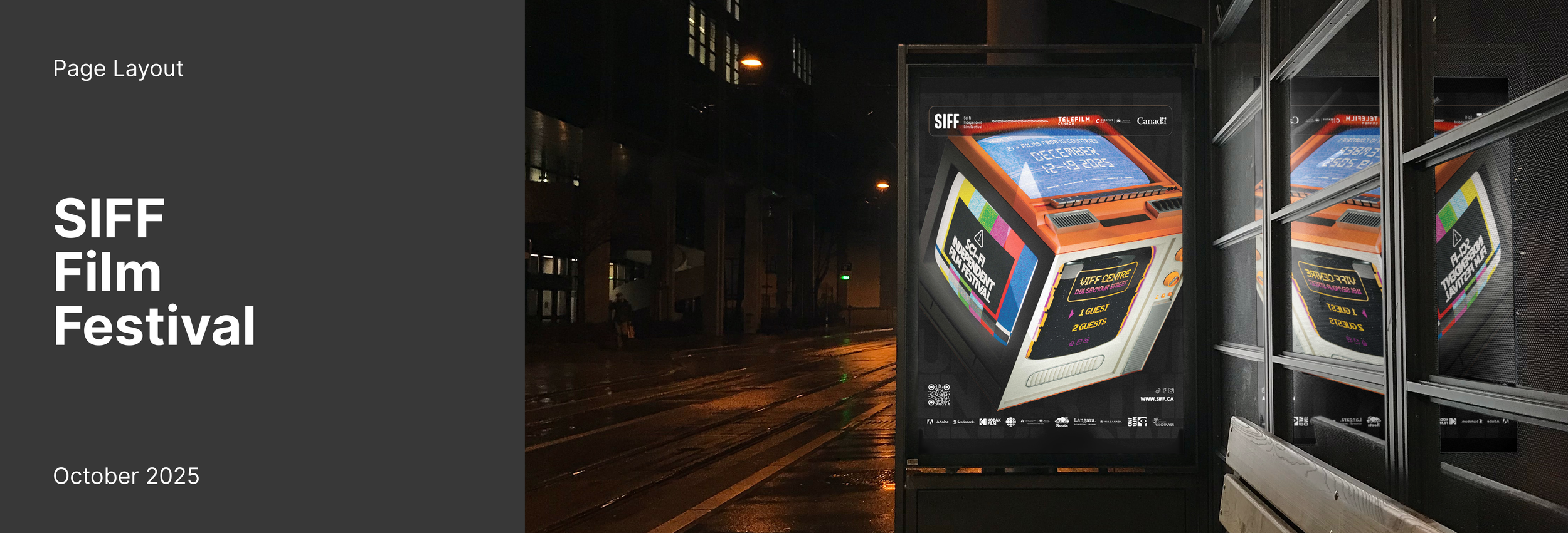
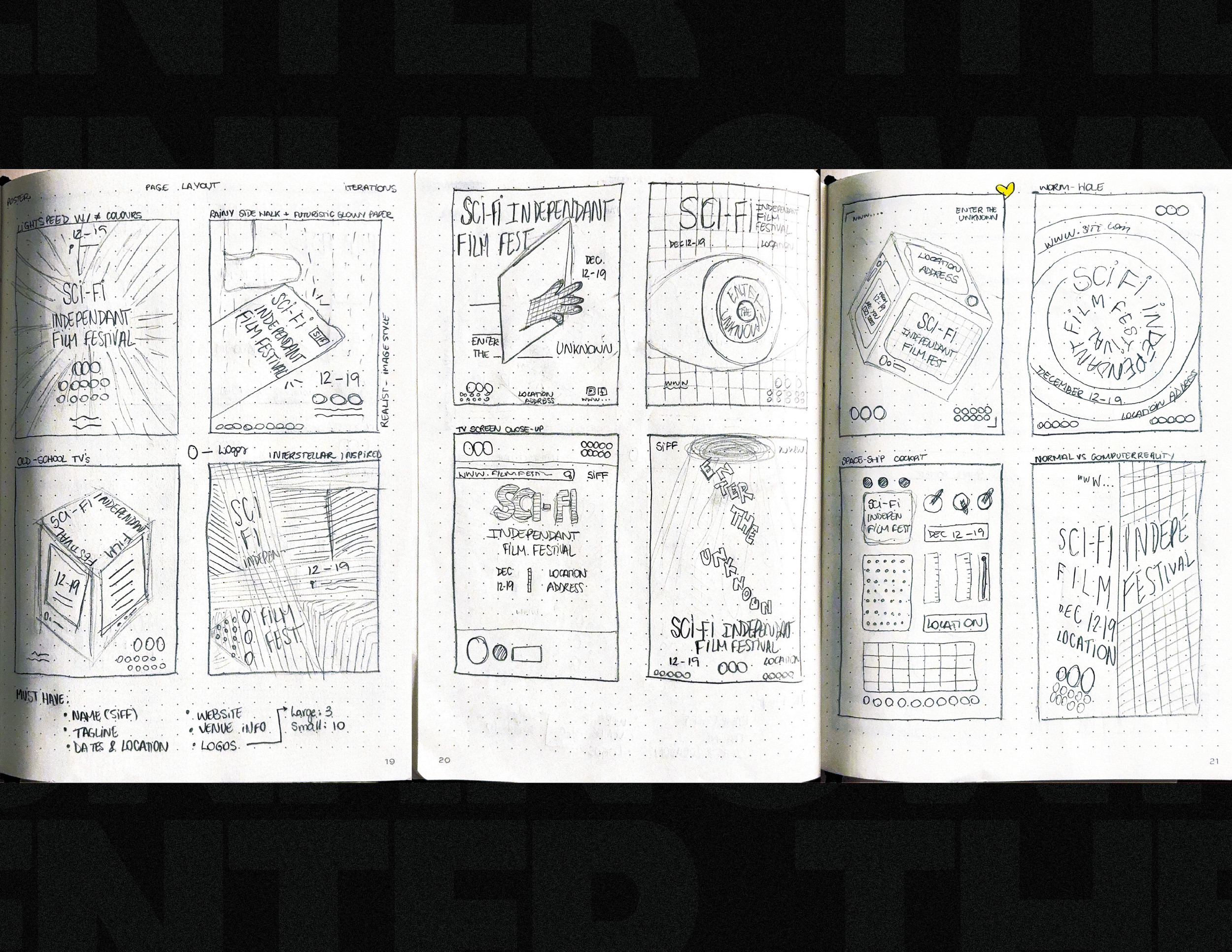
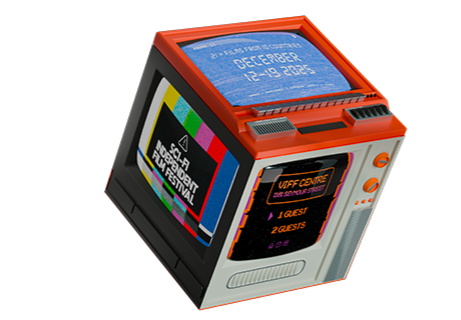
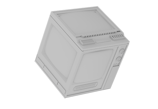
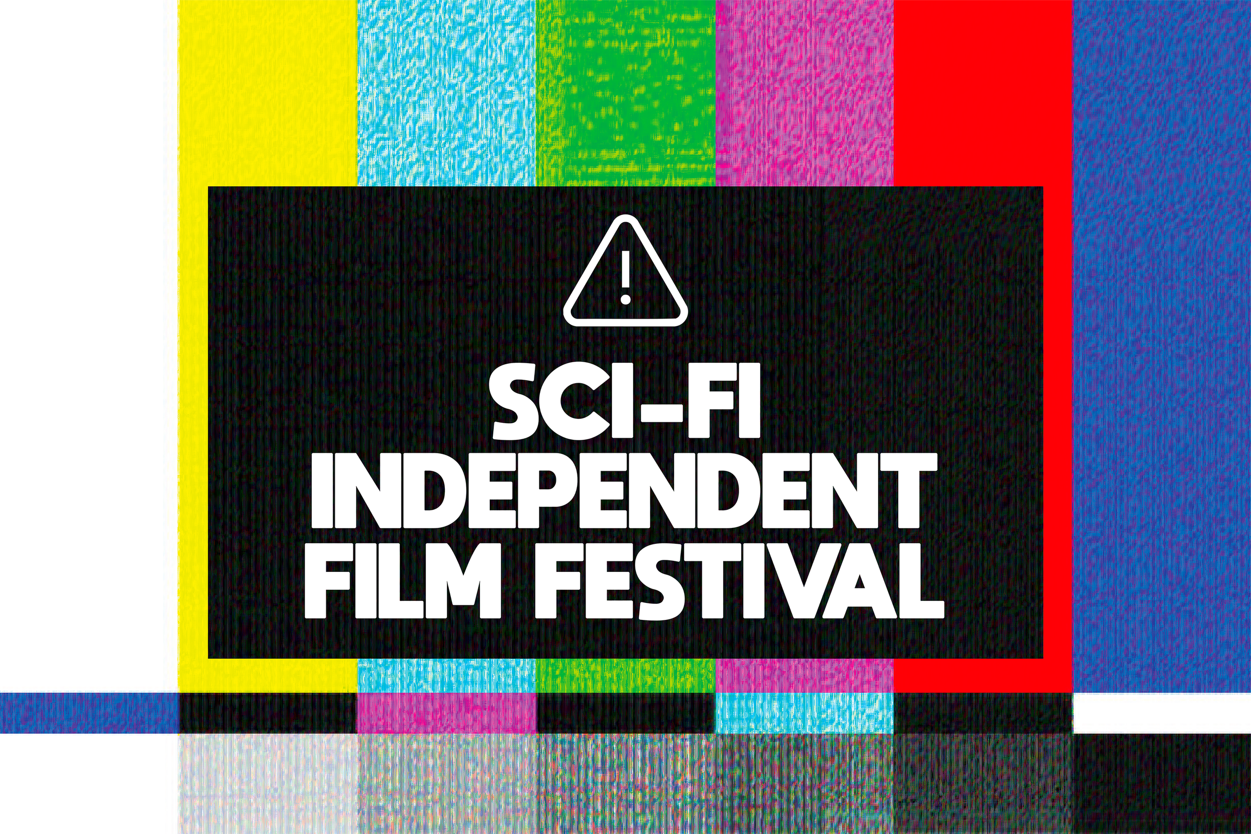
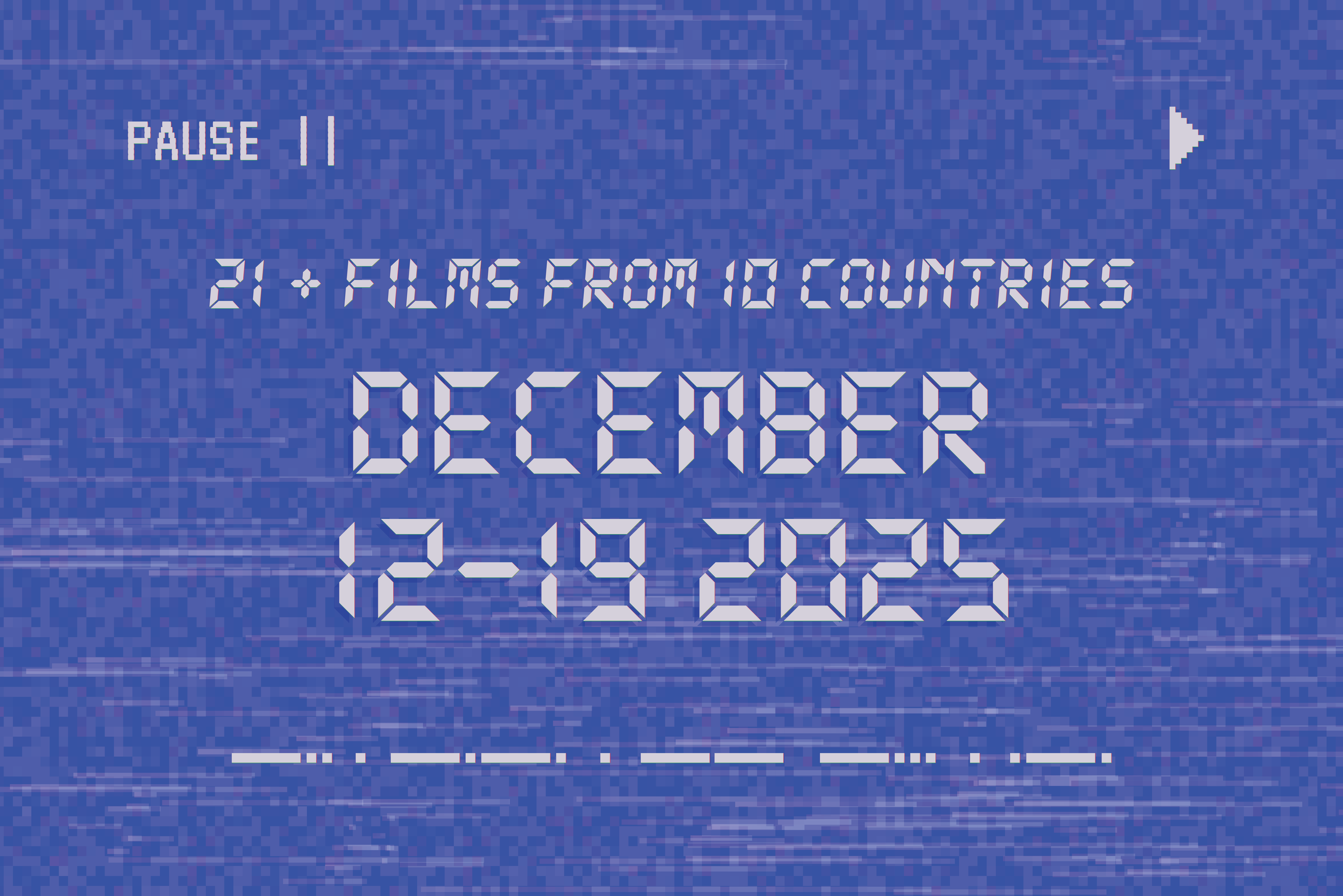
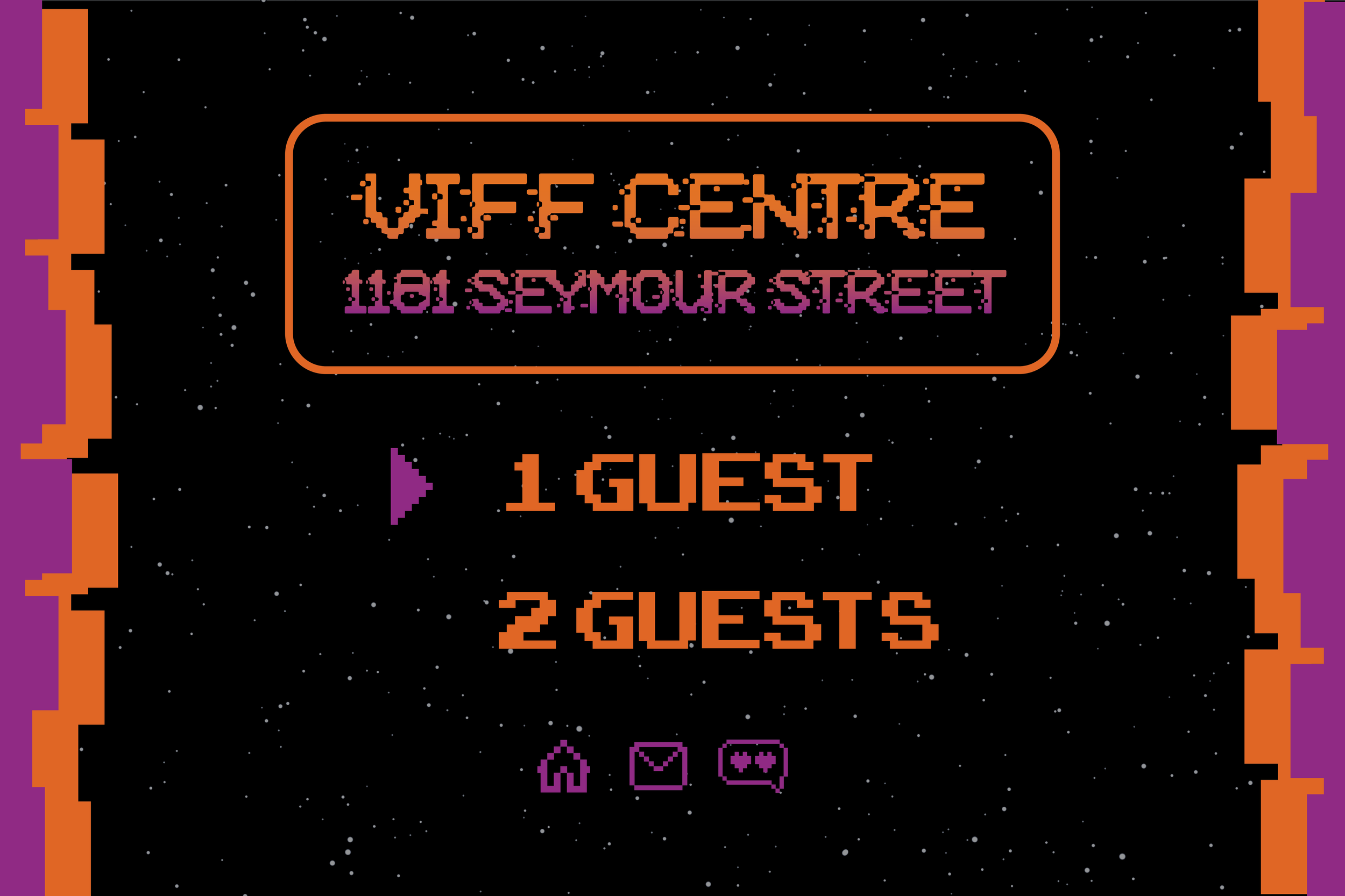
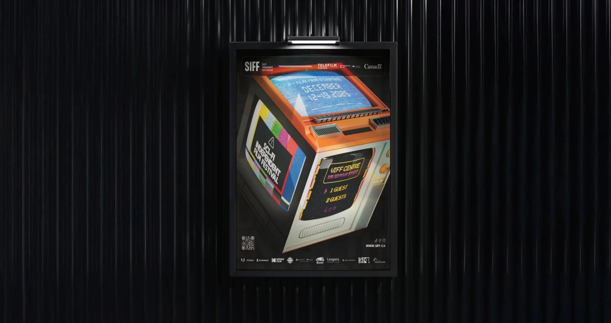
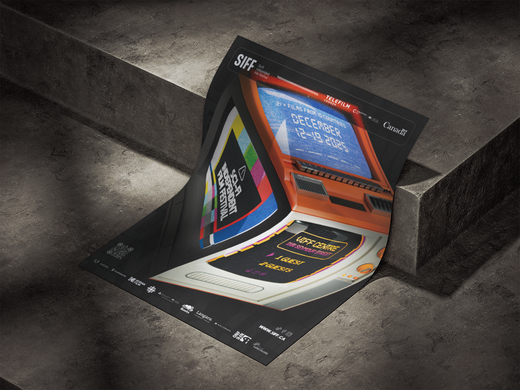
A poster designed for a fictional sci-fi film festival, created as part of a project exploring both print and digital applications.
The concept centres around a custom 3D object, a three-sided vintage television, modelled in Blender and styled to evoke the visual language of retro science fiction.
The composition brings together multiple tools and disciplines. 3D rendering, Photoshop image work,
and InDesign layout are combined to create a piece
that feels both dimensional and out of this world.
The contrast between the nostalgic object and the structured layout builds a distinctive visual identity
for the festival.
Careful attention was given to scale, and placement to ensure that key information, including festival details, logos, and credits, remains clear and legible at a distance. The result is a cohesive system where
image and type work together, balancing visual
impact with clarity.
Overview