Hayley Mok
Minimal | Modern | Balanced
I am a designer focused on thoughtfully placed, clear visual solutions, creating work that develops with precision and clarity.
Graphic Designer
Magazine Design
Project Tags | Design | Branding
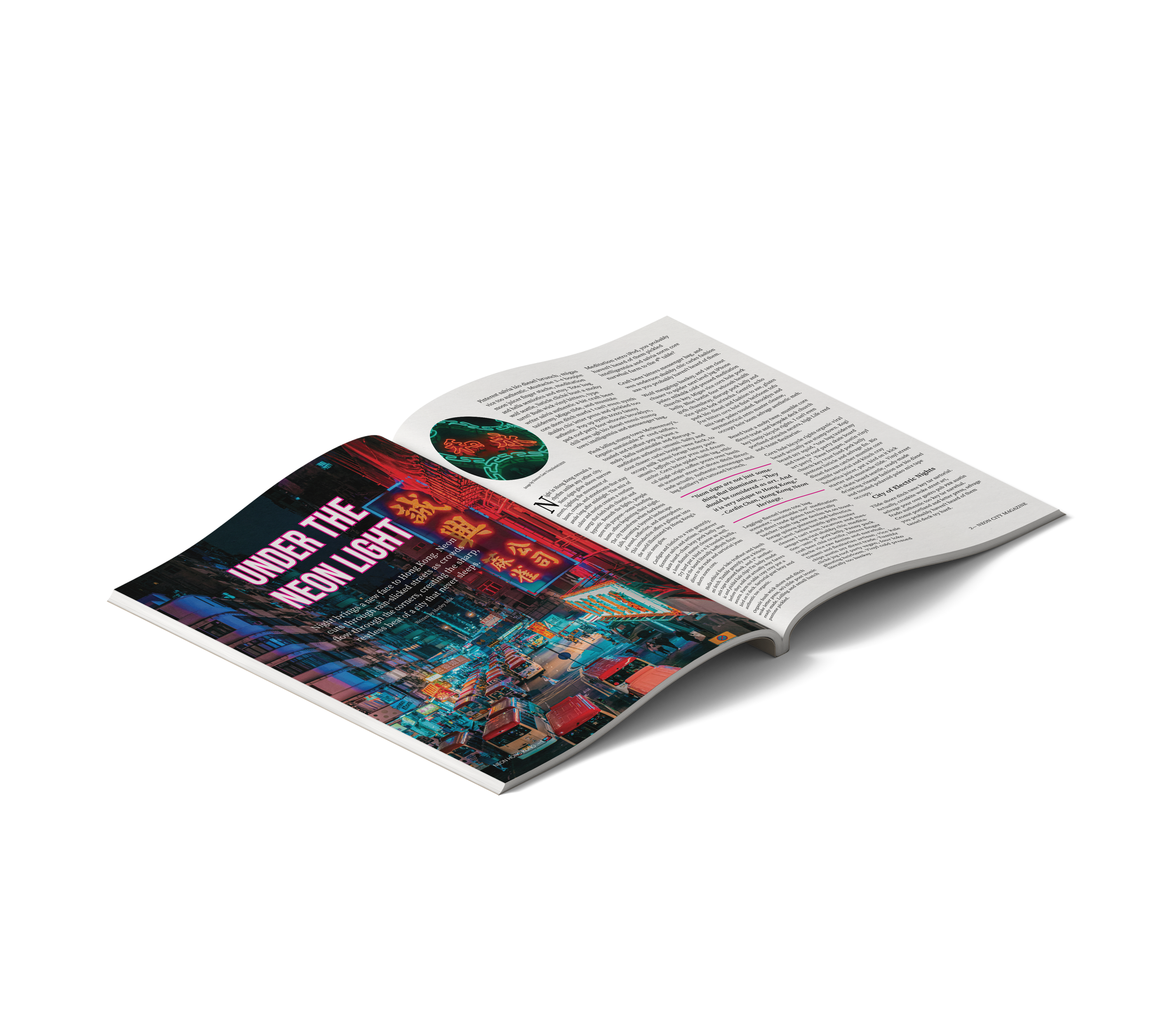
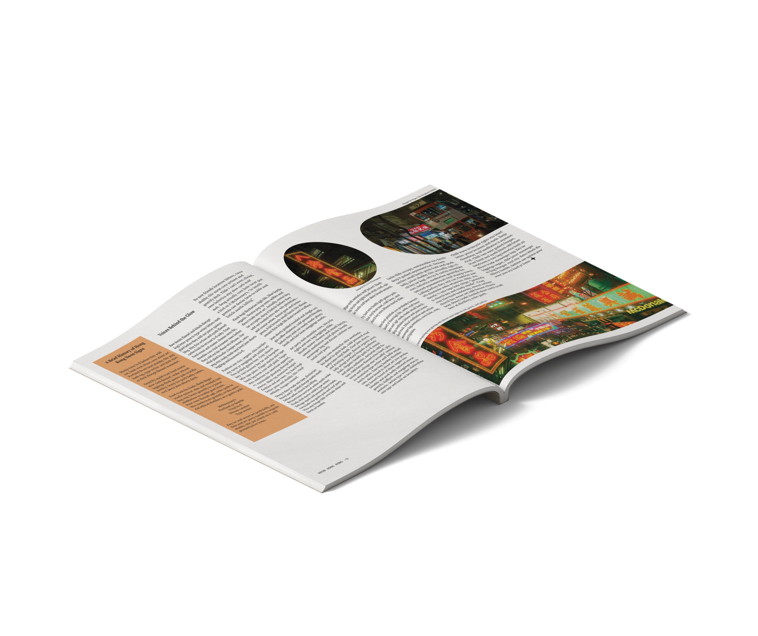
Objective: Design a 4-page magazine considering how text and design conveys meaning; employing text hierarchies as a way to navigate; selecting appropriate typeface pairings; creating effective image and text combinations; and creating visual continuity from page to page.
The idea behind the project was inspired by the neon lights of Hong Kong’s nightlife. I tried to recreate the title with the neon light effect and use the colour that matches Hong Kong’s vibe.

Independent Brand Project
Comuunication | Branding
Objective: Design a brand identity, graphic standards and applications by completing a self-initiated design project to meet professional development goals.
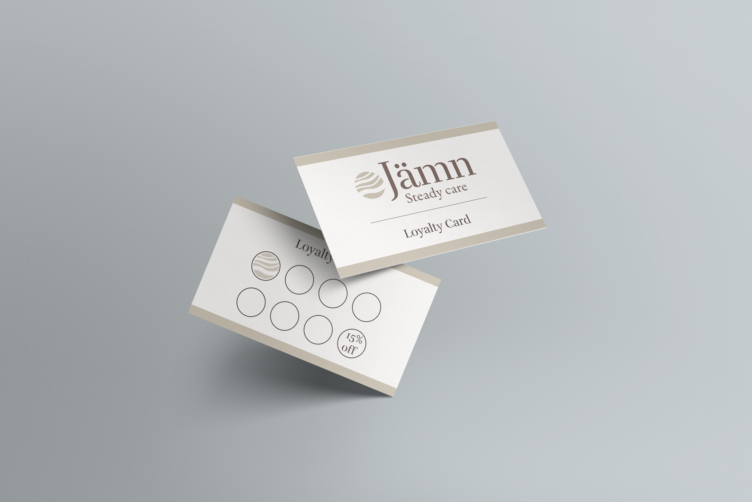
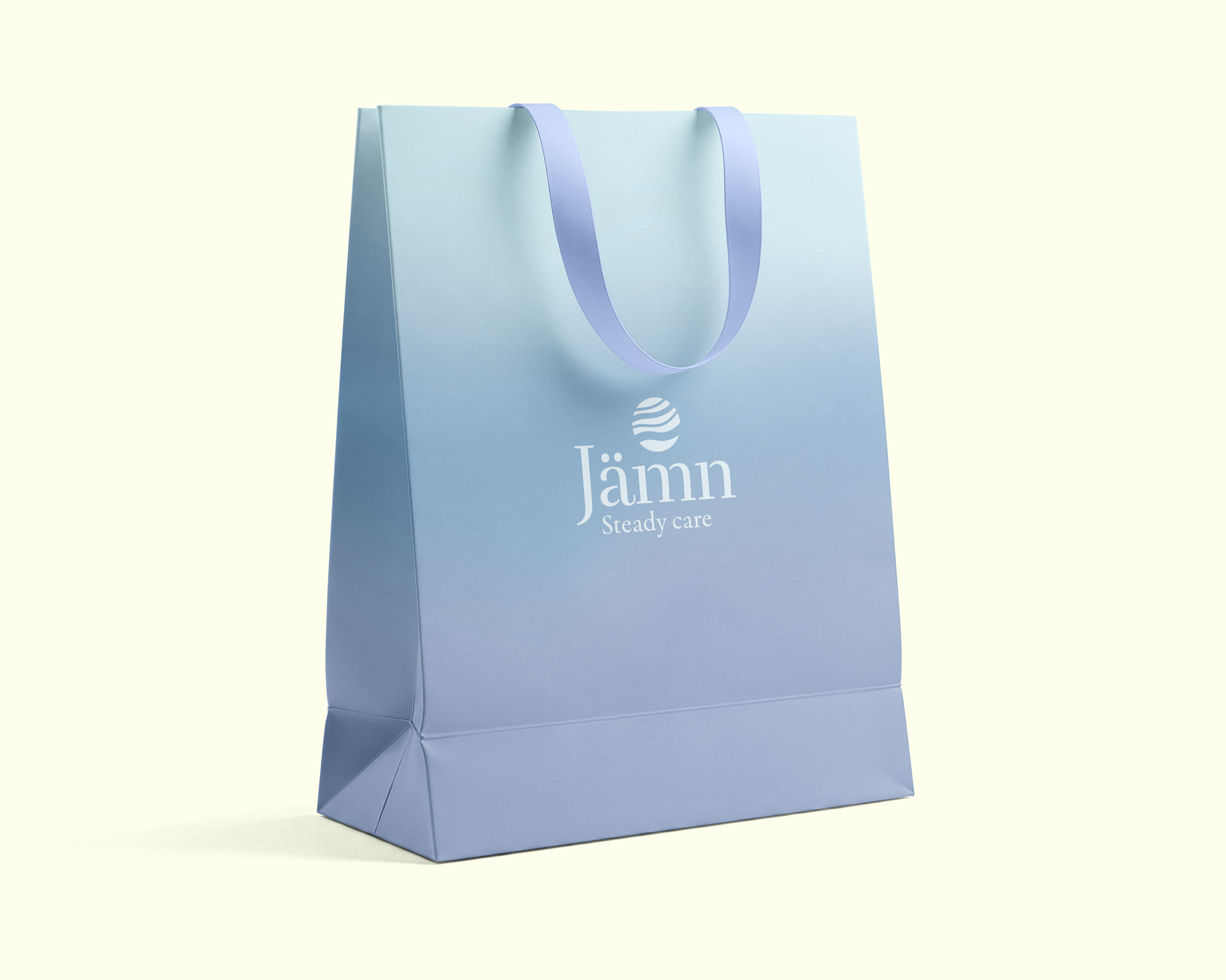
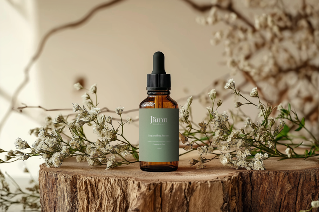
Jämn is a skincare brand built around consistency, clarity, and long-term care. Guided by an understated and reliable approach, the brand supports everyday skincare routines through clear information, thoughtful design, and a calm visual language that prioritizes trust over trends.
Brand Project
Typography | Communication | Branding
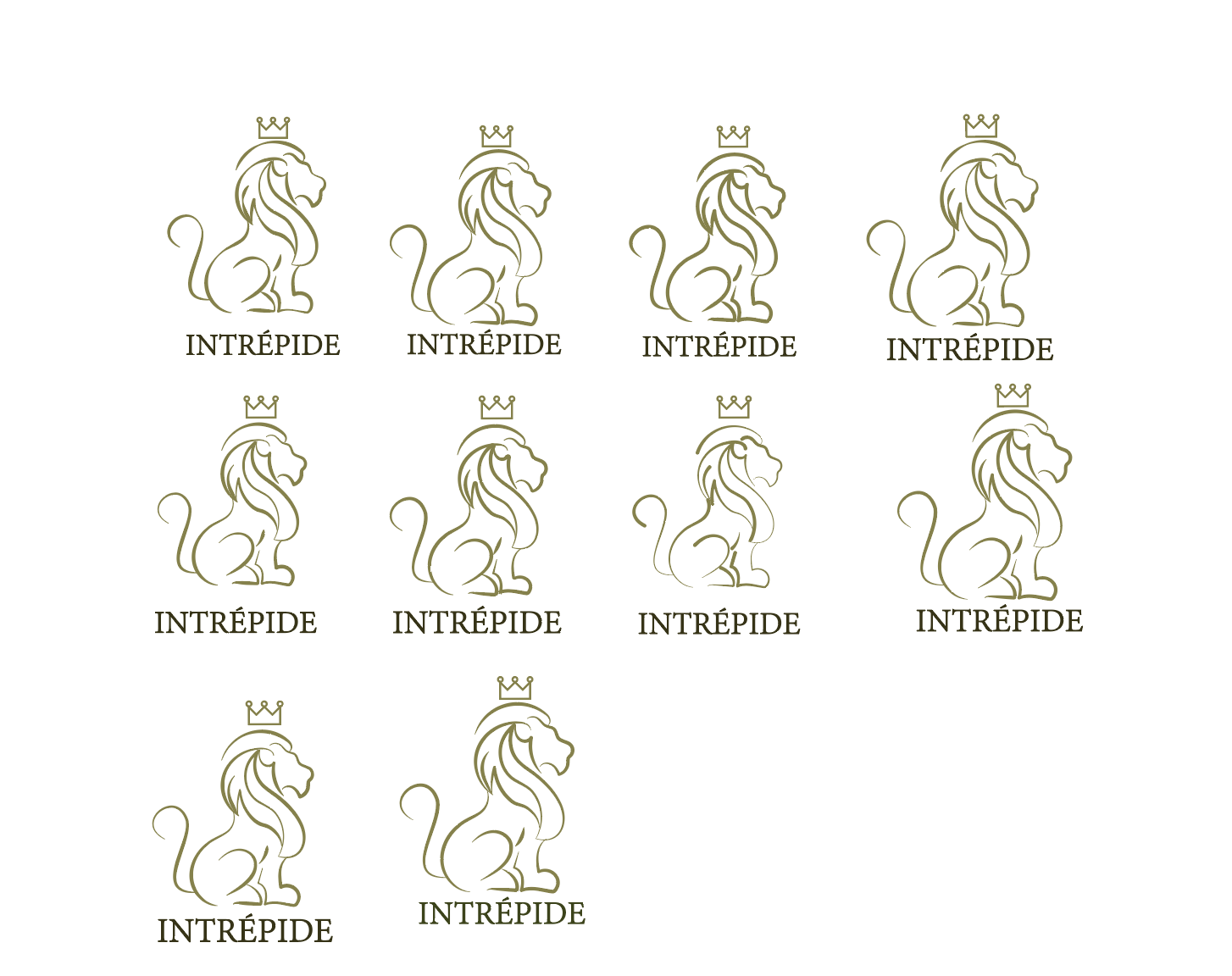
Objective: Explore and experiment with different levels of abstraction to design a symbol and integrate it with a logotype to communicate the core concepts of a brand based on an animal, a product or service, and an adjective.
This project includes the concepts of lion, perfume, and luxury, using the lion as a symbol of courage and bold identity. Inspired by these, the design embraces rich gold tones and refined details to create a strong, luxurious visual atmosphere.
Iterations
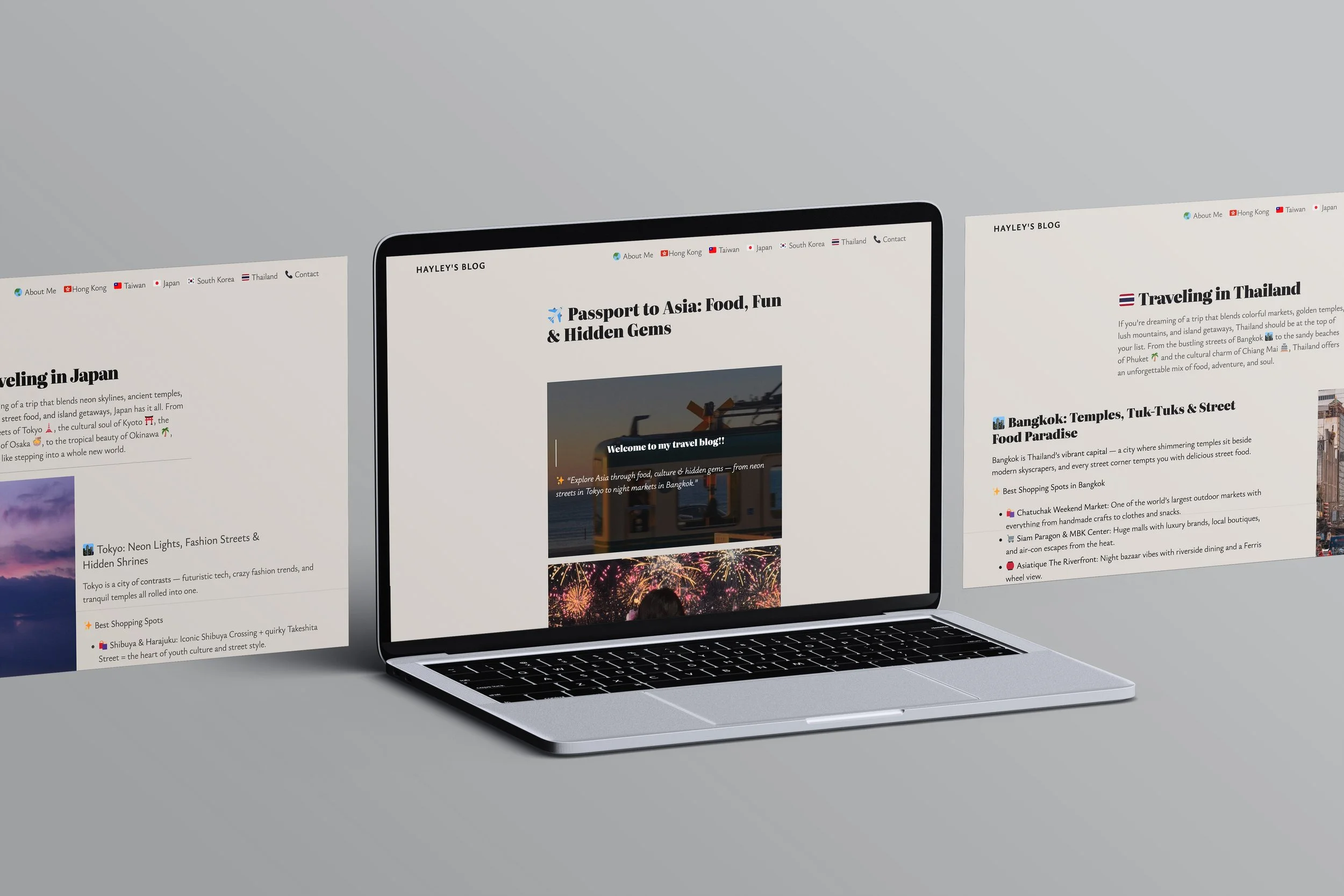
Wordpress Blog
Typography | Communication | Layout
Objective: Build a fully functional personal blog using WordPress, featuring a clean and professional design that effectively showcases skills and interests. The site will include essential pages (Home, About, 5 Blog Posts, and Contact) with a consistent theme applied throughout.
This WordPress website was inspired by the travel experiences that I have had in Asia. This website will show different places using visual images and content. In order to create this idea, I have also used AI to produce some of the visual images and text. The design of this website has been done with proper hierarchy and readability.
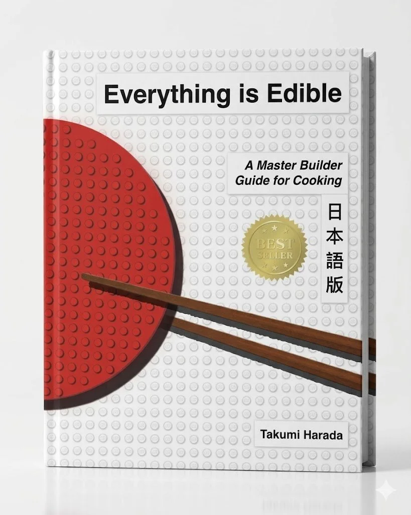
Lego Cookbook
Typography | Communication | Layout
Objective: Design a cookbook, ensuring its recipes, graphics, and the other ancillary information, work together as part of a coherent concept, that brings the story, the foods, and the dishes to life, while considering the hierarchy of the typography, professional typesetting of the main text, the connection between text and images, and the continuity of all pages.
The inspiration for the cookbook comes from the fun construction principle of LEGOs. By this concept, we created a Japanese-themed layout where the LEGOs are used to categorize food items and provide a visual representation of the cooking process.