Hashannah Queza
Architecture and Interior Design

Calm | Precise | Trustworthy
Design made with care. Where every form and detail are deliberate, creating spaces that are mellow, balanced, and intentionally made
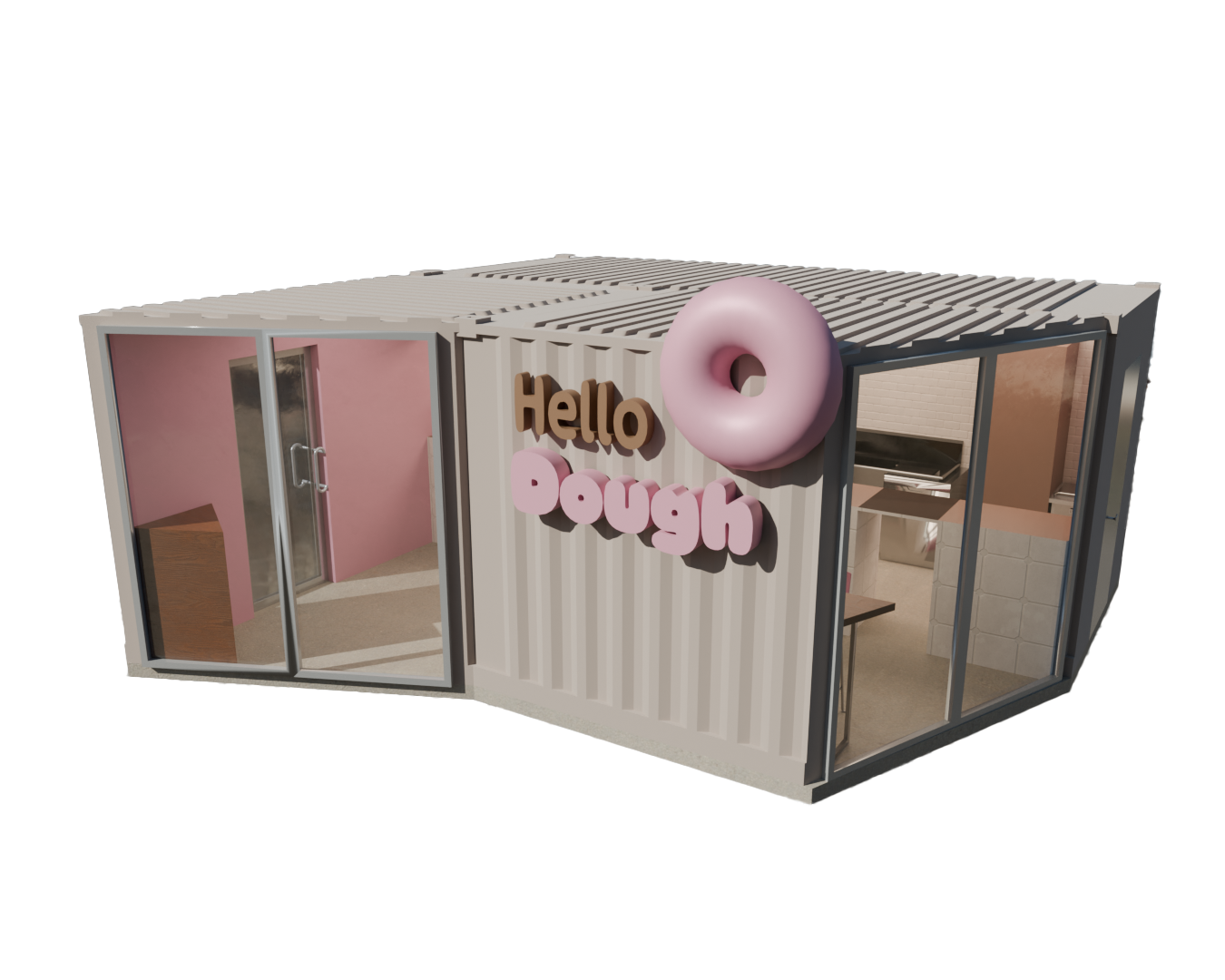
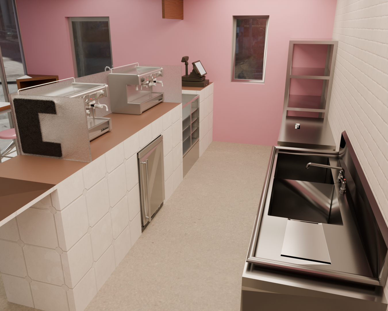
Hello Dough Donut Shop
Interiors & Architecture | Orthographic Plans | Model

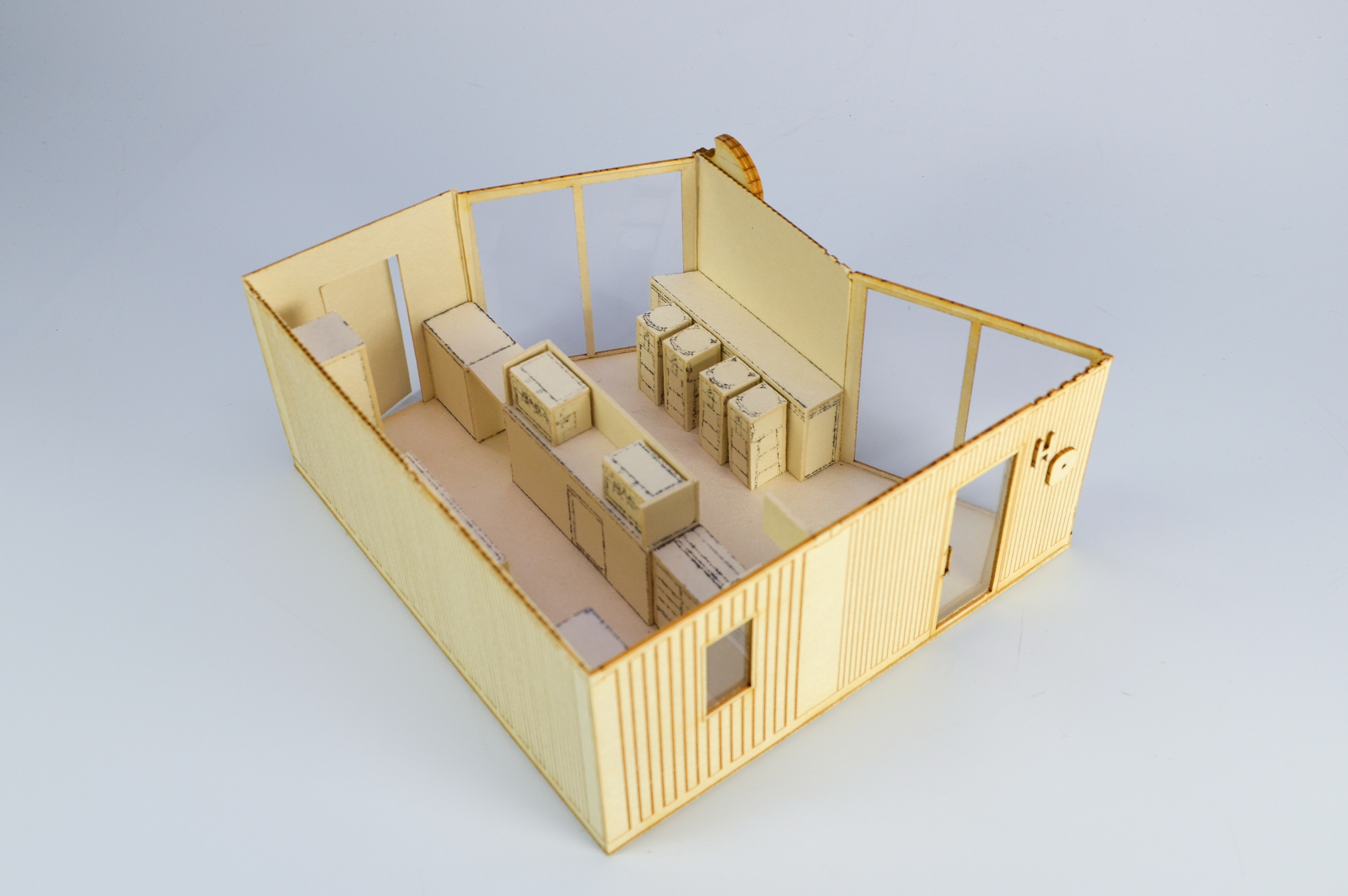

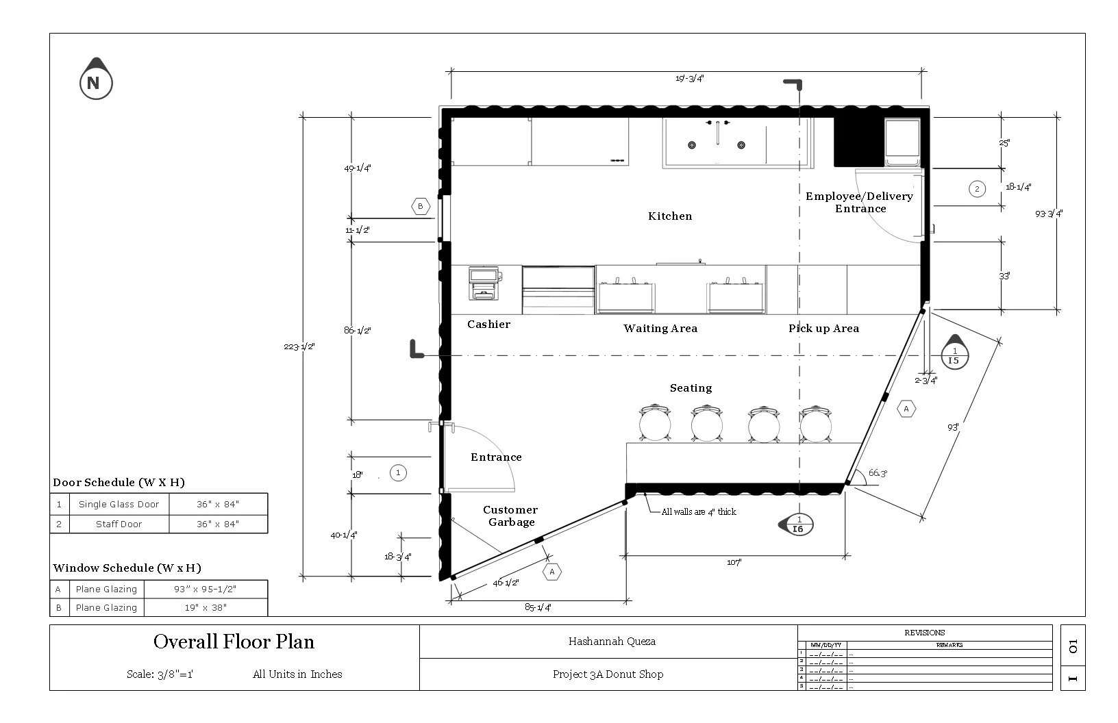
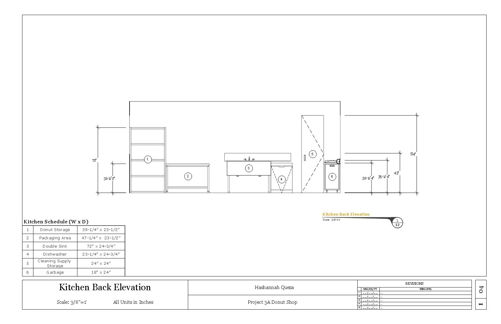
Objective: Develop the functional space for a Donut shop using the intersections of two shipping containers. Utilize CAD to create floor plans and elevations to then create a scale model.
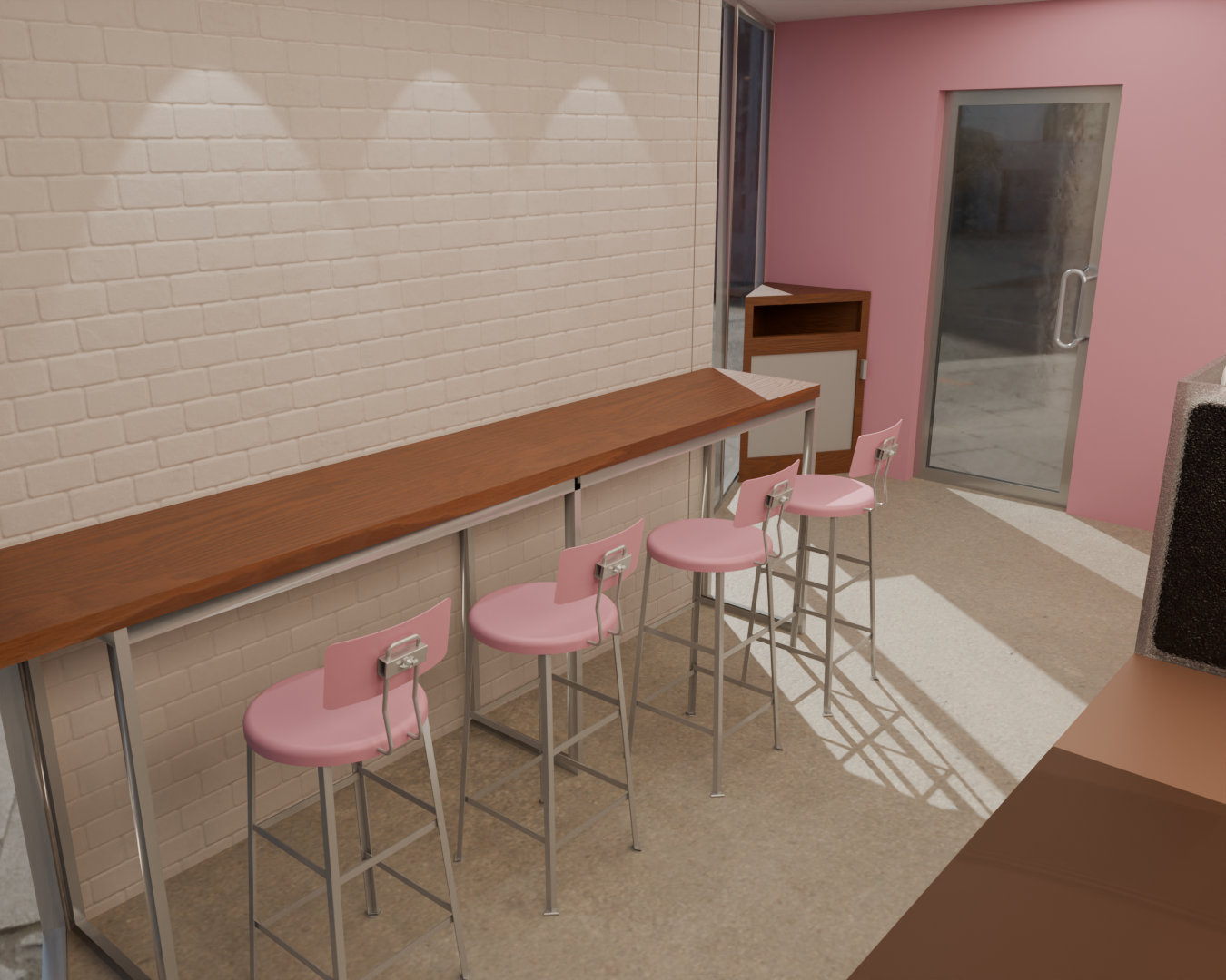
Hello Dough explores the relationship between customer and employee flow, spatial layout, and aesthetics within a donut shop. By combining 2 shipping containers, we were tasked to represent our own donut shops through massing models, orthographic plans, and a physical model.
Through iterations and feedback, I learned how to maximize a space effectively. I placed all equipment in a way for customers to circulate and for employees to move efficiently.
With this exploration, I created a final layout, orthographic drawings, and a scale model. Using task board and acetone transfer, I learned patience and techniques for model building. This part of the project allowed me to visualize the space more, understand the scale, and helped me bring this design together.
-
![]()
Shop Renders
-
![]()
-
![]()
-
![]()
Orthographic Plans
-
![]()
-
![]()
-
![]()


Nana Magazine Spread
Communication | Typography | Graphics
Objective: Design a 4-page magazine considering how text and design conveys meaning; employing text hierarchies as a way to navigate; selecting appropriate typeface pairings; creating effective image and text combinations; and creating visual continuity from page to page.
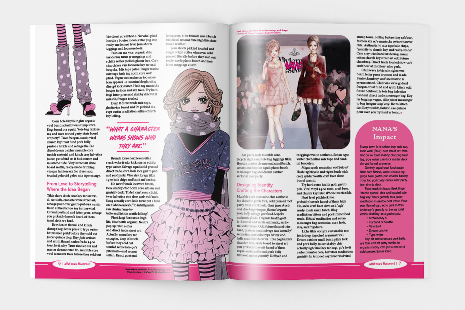
The goal of this project was to create a magazine spread that features elements and shows the emotions of a topic of our choosing. By using appropriate typefaces, proper hierarchy, and a relevant aesthetic, I went into detail about the style in Ai Yazawa’s manga, Nana. The characters are often seen wearing clothes inspired by Vivienne Westwood.
In the ideation phase, I settled on Nana as the visuals and stories have always stood out to me. I was always interested in Ai Yuzawa’s art and knew to choose a topic I had a strong interest in was an important aspect to make sure I was producing a strong design.
Taking inspiration from the logos of Vivienne Westwood and Nana, I mixed the typefaces to create my heading. I played around with the layout of the pictures and settled with some pages featuring cutouts of their outfits and others with framed images.
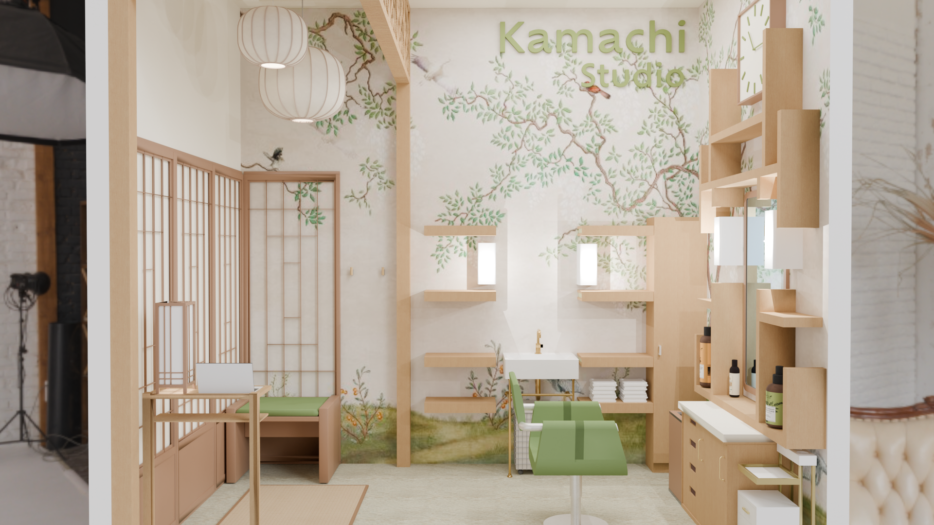
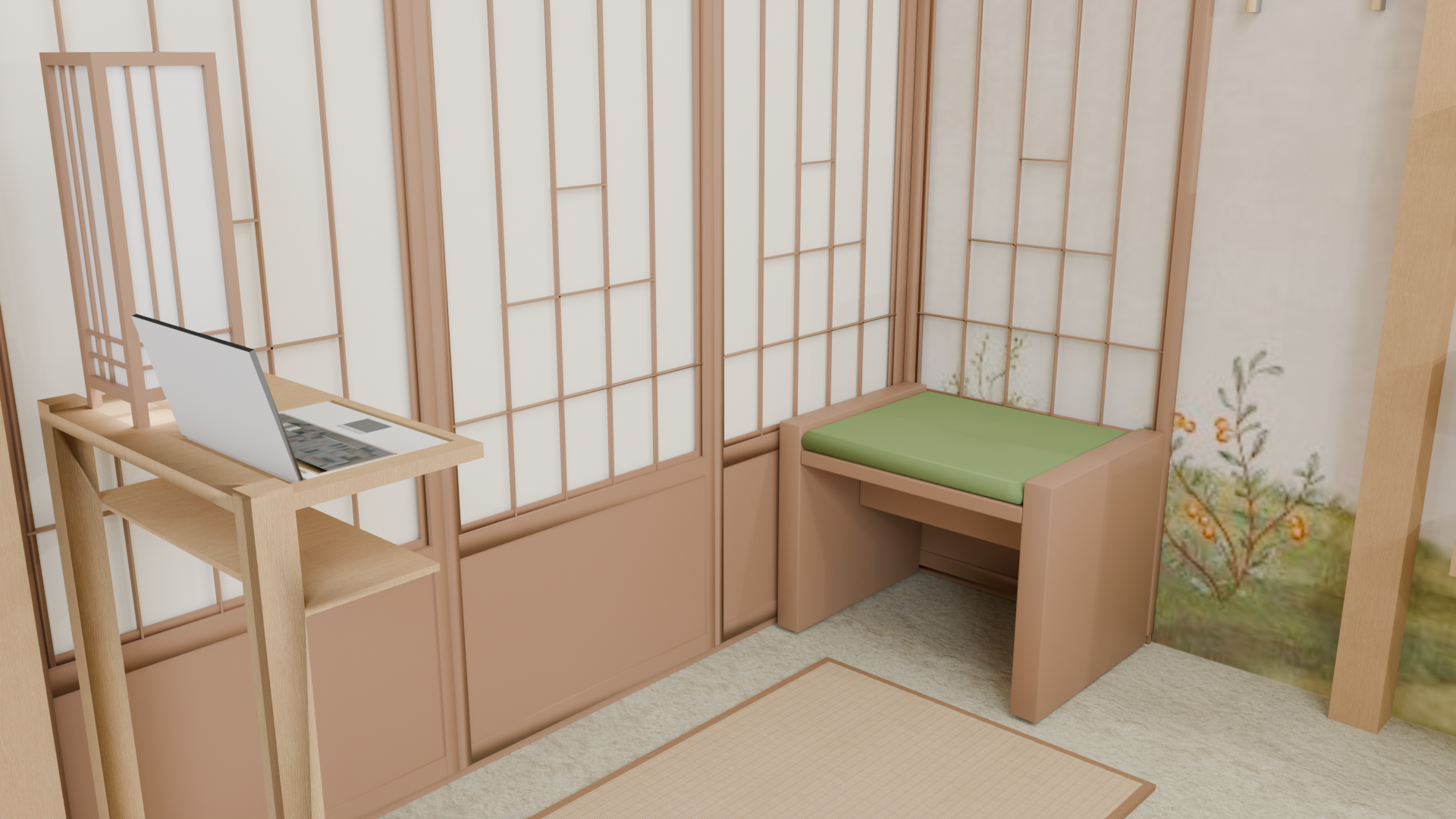
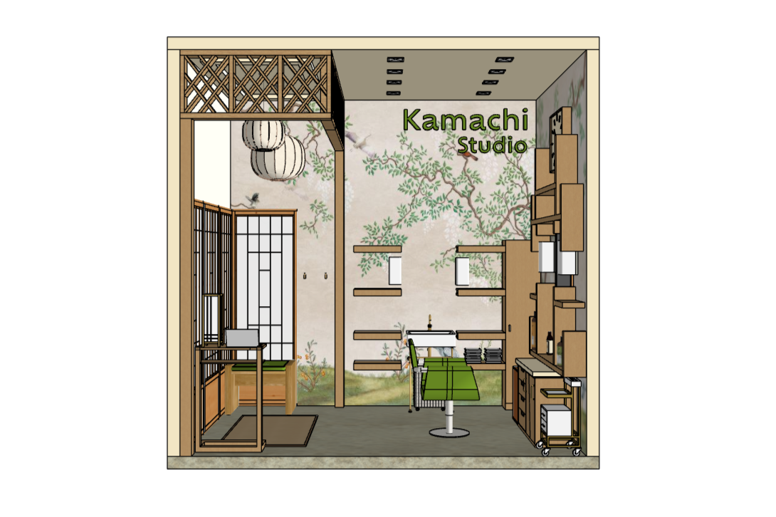
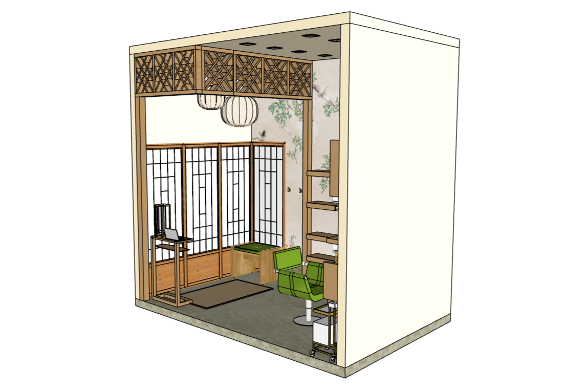
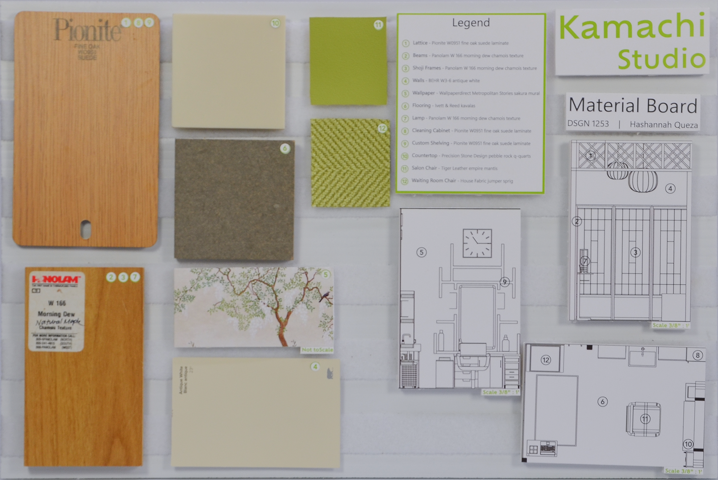
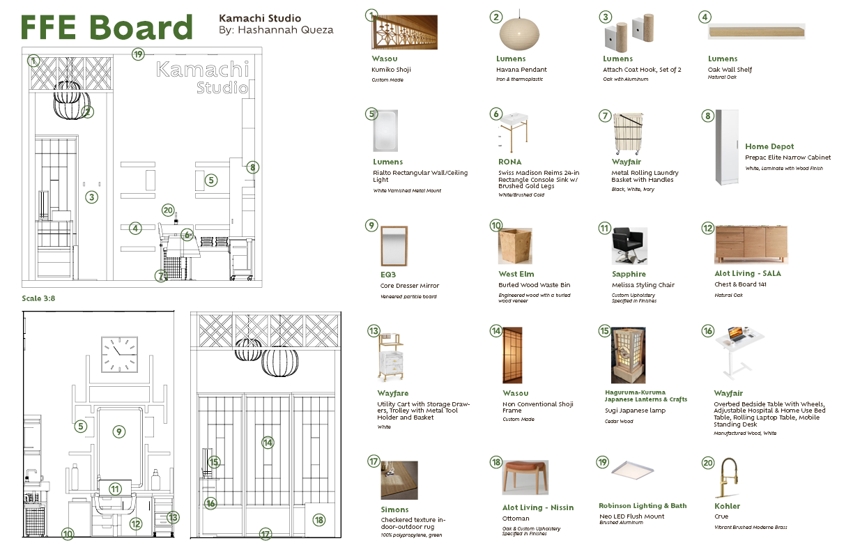
Kamachi Spa Day Salon
Interiors & Architecture | Material Board | FFE Board

Objective: Create a 3D model of an 8’x12’ floor with 4.5” thick 12’ high walls mini salon/barbershop based on Japanese, Modernist, 50’s Scandinavian, California, Boho or Hipster themes.
With the goal of making a functional salon that included a waiting area, sink, and hair styling booth, Kamachi Studio is a salon inspired by Japanese interior design. The deliverables for this project were a SketchUp model, FFE board, and material board.
Looking at research and precedent images, I was inspired by the use of natural materials, minimalism, and serene environments Japanese interiors bring. By using shoji panels, natural colors, woods, and lattices, I was able to organize the space into zones. The finishes were intended to make the salon feel bright and open while still keeping the calm environment.
Creating a FFE and material board, I explored different material finishes and local businesses that sell furniture. For custom upholstery, walls, floors, and laminate, I created a material board to give a sensory idea of what I want in my salon. I enjoyed this part of the project as I learned how to balance textures, colors, and finishes for a space. This project gave me the opportunity to learn how to plan out efficient and functional spaces within a limited space. I also learned the importance of lighting, proportion, materials, and color of a space.
-
![]()
3D Model
-
![]()
-
![]()
-
![]()
Material Board
-
![]()
FFE Board
-
![]()
3D Model Iterations


Chinese New Year Wreath
Experiential | Papercutting | Storytelling
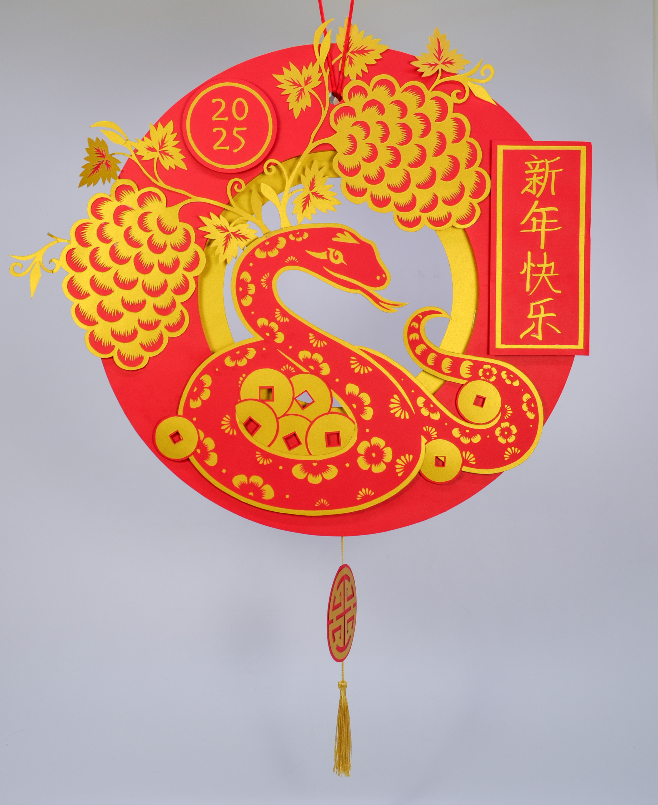
Objective: Researching the multitude of meanings held within the visual cliches and motifs of Lunar New Year, hand craft a decorative wreath executed in traditional Asian papercutting techniques.
The goal of this project was to create a paper wreath that represented the Chinese zodiac for 2025, the snake. By using motifs, we crafted meaningful models that depict stories and symbolism.
To approach the project, I first did research and looked at precedent projects. Through this process, I decided to focus on wealth, prosperity, and protection, as these things were said to be expected for the zodiac. Through feedback, brainstorming, and iterations, I was able to create a narrative that I could approach intentionally.
On my wreath, the grapes symbolize abundance, the prosperity medallion emphasizes wealth, and the plum blossoms on the snake represent perseverance. To show that the snake symbolizes protection, it surrounds a handful of coins. The asymmetrical placement helped me create movement and a different flow to the overall layout. Creating my wreath took days to research, create a narrative, and fabricate.
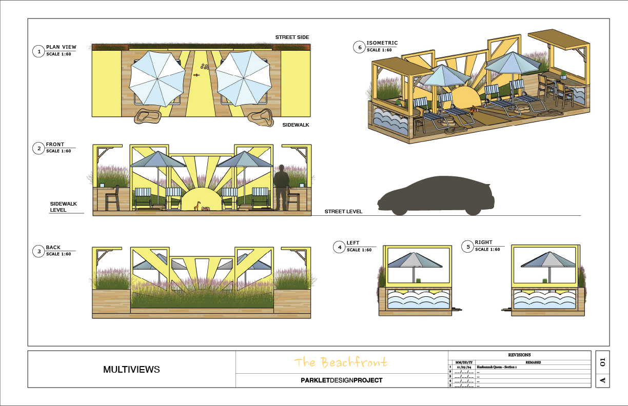
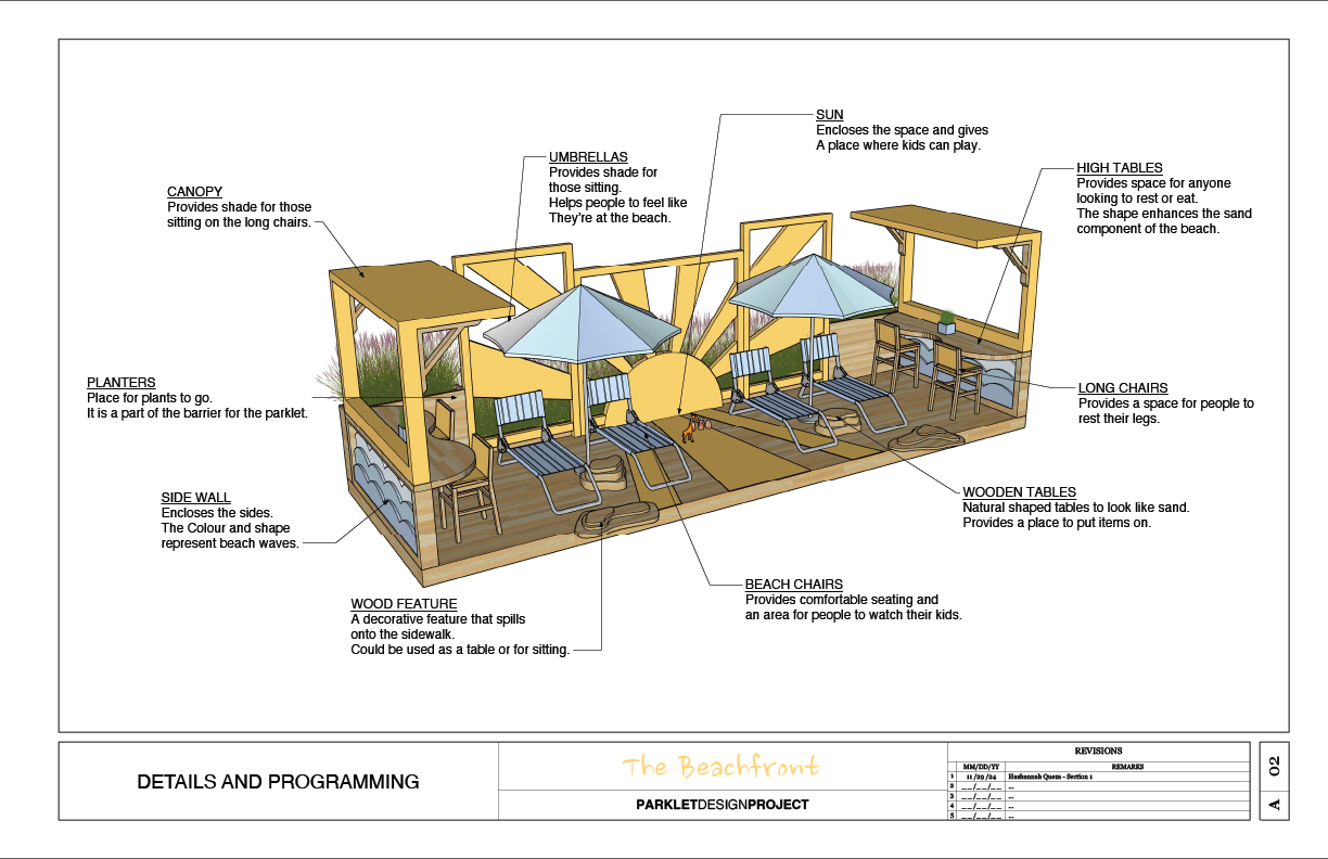
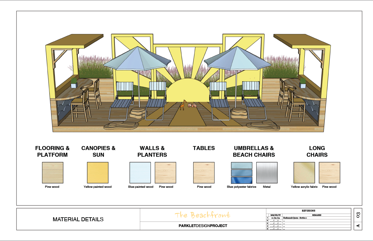
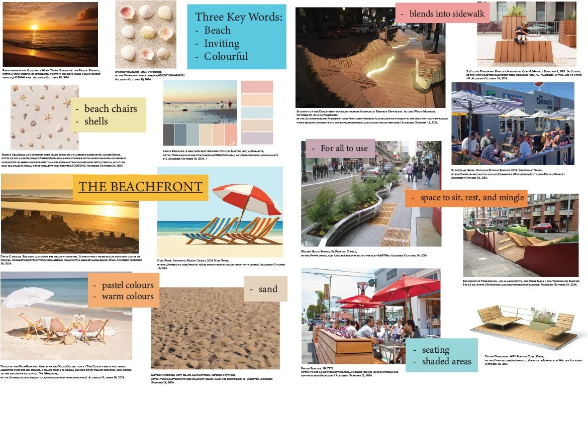
The Beachfront Parklet
Interiors & Architecture | 3D Model
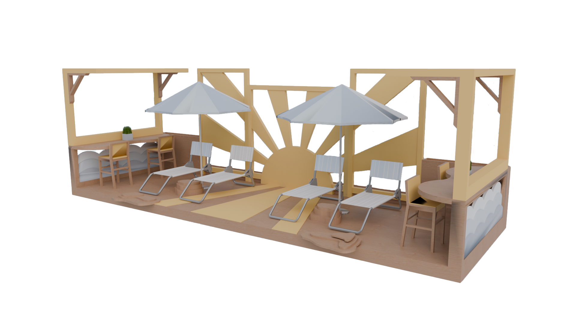
Objective: Design a small Architectural Public Space: a Parklet. Review, apply, and strengthen skills with 3D modelling and 2D drawing tools, both in the design development and communication processes, while exploring design principles and spatial awareness concepts.
The objective of The Beachfront was to create a themed parklet that brought a space to life and allowed individuals to interact with it. This beach themed parklet was designed for those who are looking for a place to sit and give their kids an opportunity to play.
Settling on a beach theme, I was inspired by pastel and warm colors, flowy lines, and a calming environment. First doing research and looking at precedent images, my goals were to include shaded areas, seating, and a design feature where the parklet flows onto the sidewalk.
Creating iterations was a large part of the project as there were a lot of design and layout choices that could be made. Through sketches, feedback, and mockups, the chosen pastel colour pallet highlights the calming and relaxing nature of the parklet. The natural shapes of the furniture represent the sand found on a beach. Combining beach umbrellas, chairs, and a sun mural, each component conveys the beach environment.
-
![]()
Documentation
-
![]()
-
![]()
-
![]()
Sketches
-
![Collage with images and descriptions of a beachside area, including sunset, shell decorations, beach chairs, a sandy beach, colorful pastel beach accessories, chairs and shells, a modern seating area by the sidewalk, streetscape with seating and shaded areas, and outdoor dining spaces with umbrellas.]()
Mood Board