Gursimar Tatter
Multidisciplinary Designer

Authentic | Sincere | Creative
I create thoughtful and meaningful designs balancing aesthetics and functionality, guided by community and the human experience.
Spa Day
Interior Design | Space Planning | Interior Design Specifications
Objective: Create a 3D model of an 8’x12’ floor with 4.5” thick 12’ high
walls mini salon/barbershop based on Japanese, Modernist, 50’s
Scandinavian, California, Boho or Hipster themes.
In the constraints of the given parameters and style options, I choose the Mid-century modern interior style for my salon. I named it “Starburst: Hair and makeup salon” after one of the most recognizable elements of MCM, the starburst. Not only is it present in the name, but the furniture also has starburst fixtures for a cohesive design throughout the space. All cabinet and storage are custom made alongside the clock as part of the MCM concept. The materials and colours are carefully chosen to bring out the warmth and coziness of Mid-century modern spaces.
Model: The SketchUp model features characteristics commonly associated with MCM; clean lines, natural materials paired with man-made materials, geometric shapes, neutral colour palette with vibrant accents. Wood is used as one of the main materials to maintain the natural feel to the space.
Furniture, Fixtures, and Equipment (FFE) Board: The FFE board shows where the elements used in the SketchUp model would be sourced from. Most of the sources are Canadian to help promote and buy from local businesses.
Material Board: The material board showcases which materials would be used in the space and gives an overview of the materials would work together. Fabrics and materials to get seating upholstered are included alongside the fixtures for furniture.
Renders: The model was imported to Blender to make 3D rendering of the spa day salon to help visualize and communicate the design of the space.
Software used: SketchUp, Blender, Miro, Illustrator, Photoshop.
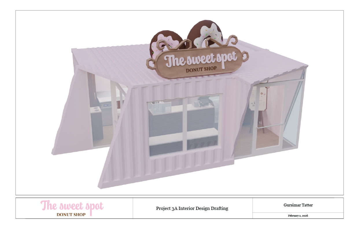
Donut Shop
Interior Design | Architecture | Drafting Plans | Space Planning
Objective: Develop the functional space for a Donut shop using the intersections of two shipping containers. Utilize CAD to create floor plans and elevations to then create a scale model.
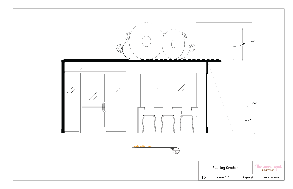
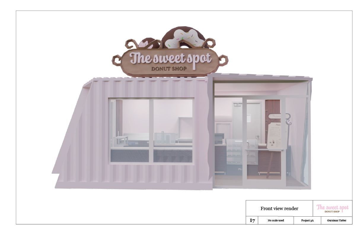
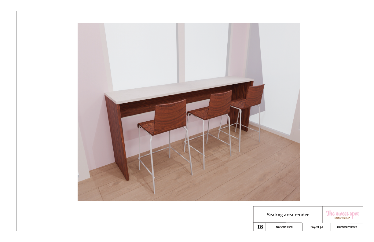
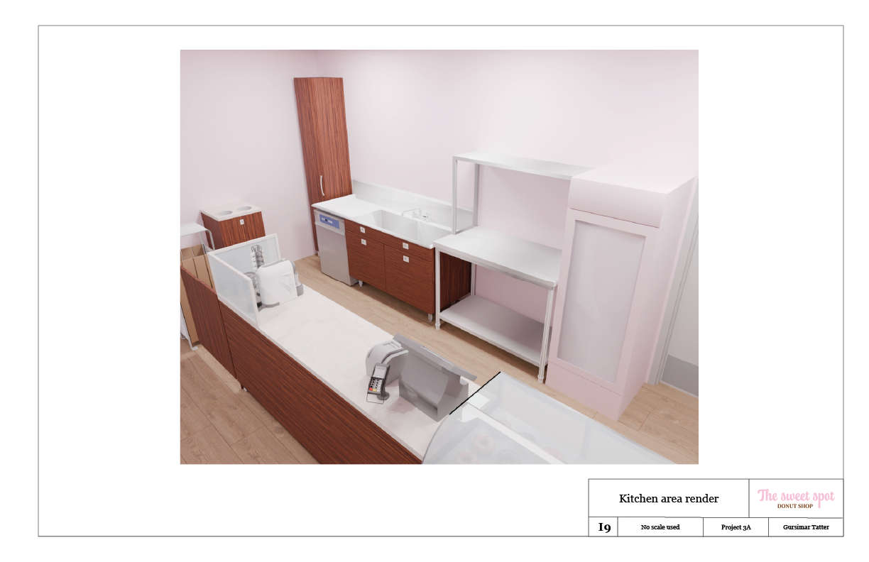
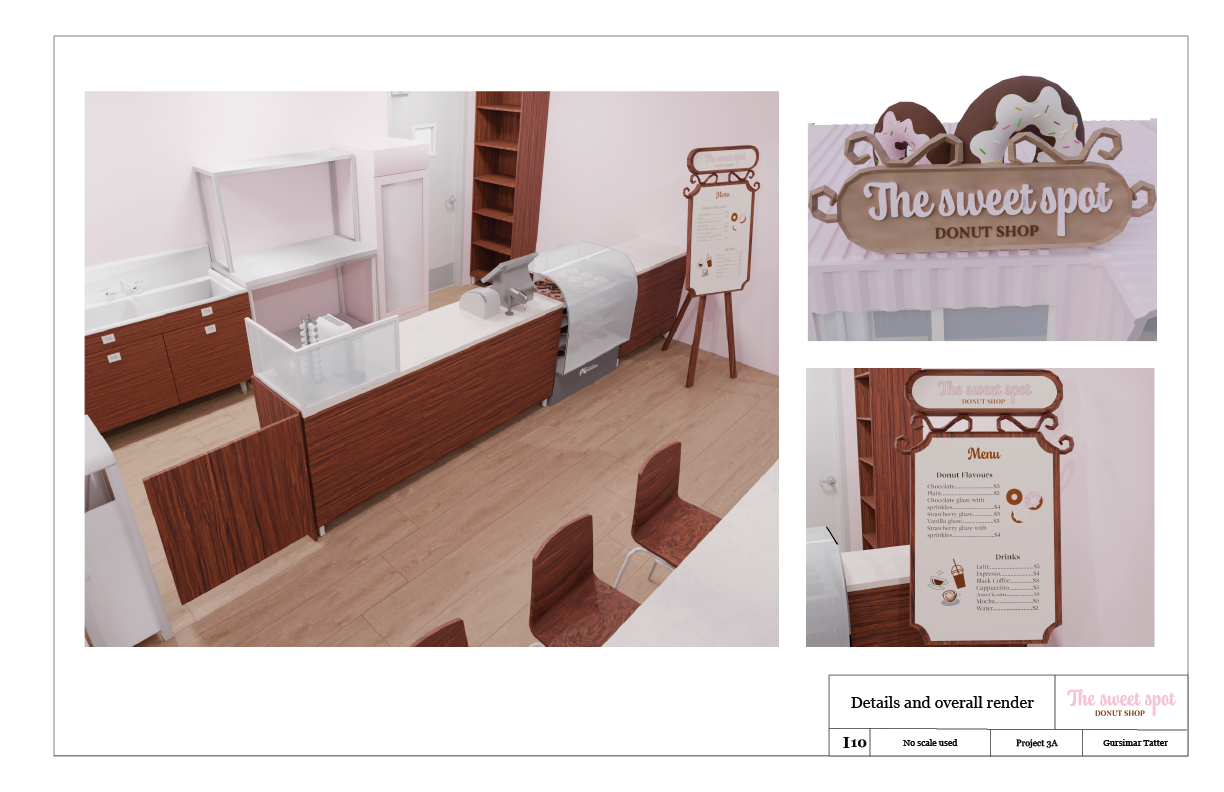
Inspired by the Neapolitan ice cream, I designed “The Sweet Spot” using pink, white, and brown as the primary colours of the donut shop and the elements present in it. I merged the two provided shipping containers in a way that maximizes the space inside while keeping the outside of the space look interesting. The space is essentially divided into customer and employee areas that are almost equally divided so that employees get maximum workspace and flow and customers can keep moving around the space easily.
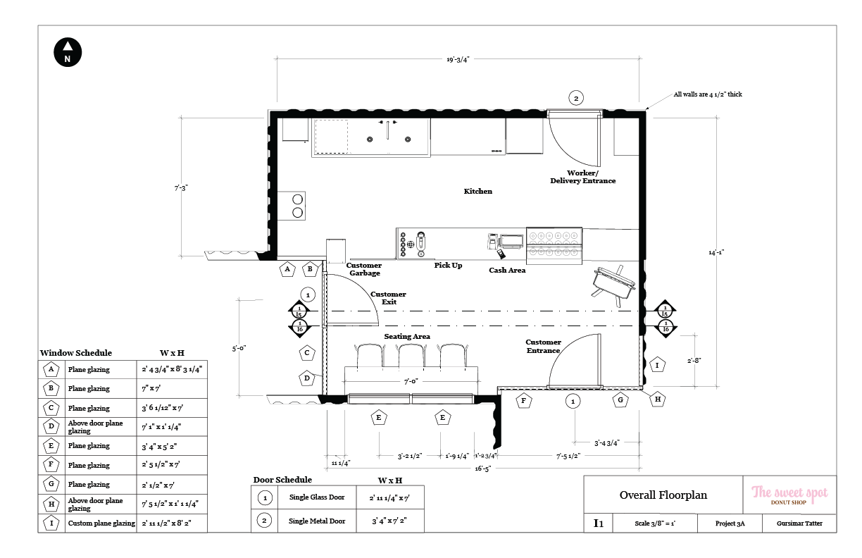
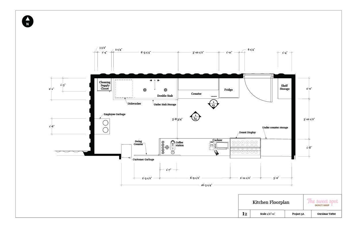
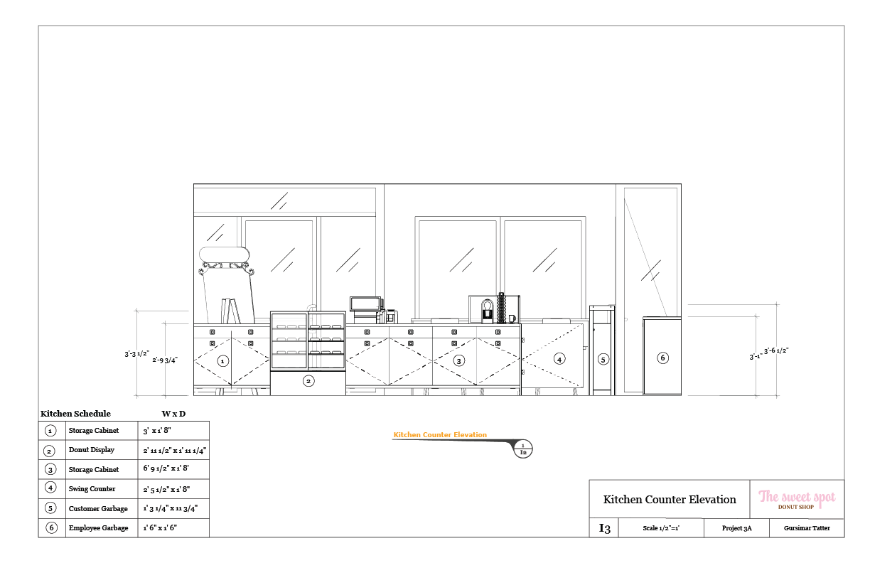
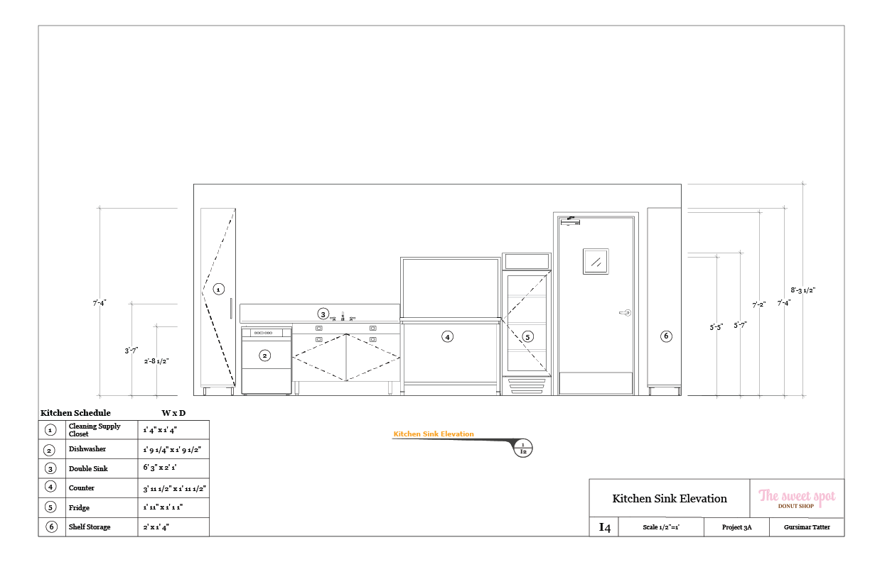
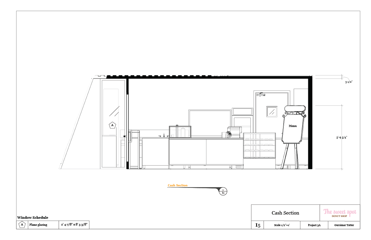
Plans: The drafting plans help understand the space in a technical way that is easy to understand for functionality and purpose. They include floorplans, sections, elevations, as well as door and window schedules for fabrication communication.
Scale Model: The scale model was made with taskboard that was cut and engraved using Trotec laser cutter available in makerspace. The file for laser cutting was made in illustrator using dwg files of the donut shop from layout and SketchUp. The donuts and name of the shop was 3D printed and spraypainted to match the colour of the taskboard.
Renders: I added the renders done in Blender for Experiential IV in the previous orthographic plans. It was done for a better understanding of the space and to help visualization the complete and realized donut shop.
Software used: SketchUp for modelling, Layout for orthographic plans, Illustrator for menu, branding, and laser cut file for the scale model.
Software used: SketchUp, Layout, Illustrator, Blender, CorelDraw, Blender.
Cookbook
Graphic Design | Illustrations
Objective: Design a cookbook, ensuring its recipes, graphics, and the other ancillary information, work together as part of a coherent concept, that brings the story, the foods, and the dishes to life, while considering the hierarchy of the typography, professional typesetting of the main text,
the connection between text and images, and the continuity of all pages.
For this project, my group (Jeena, Yash, and I) chose to make a SpongeBob themed cookbook that has easy recipes that kids can make with little supervision when they get hungry late at night. It has vibrant colours and graphic style matching much of the style used in SpongeBob.
I was in charge of making the inside page background illustrations which I got the inspiration from the background graphics of episode titles in SpongeBob. I chose a clean graphic style with outlines as it matched the design that we were going for. After many iterations, I added the lamp light at top of each page to truly tie in the nighttime aspect of the cookbook. There are also details I took into consideration when making the background graphics. One of the biggest details was the flower colours represent the background tile colours of the following page. This was a crucial step to make the design cohesive and flow well into the next pages easily.
Software used: InDesign, Illustrator, Photoshop.
Extraordinary Object
Experiential Design | Storytelling | Exhibit design | Papercutting
Objective: From a lottery selection of random objects, identify, research and then design an engaging presentation that expresses the experience of an object in only white paper.
For my extraordinary object I got a maiko doll, which I found after researching that it is a geisha
in training. There were visual cues about the doll being of Japanese culture and as I researched and found more about geishas, I found more information about it. At first, I was planning the exhibit to be the story and lifestyle of the maiko. But as I iterated and had discussions, I leaned more into the literal aspect of it being a prized décor piece. I added elements that are décor to convey a stronger visual story. I made a Japanese style console table to place the doll on. I also made an ikebana vase with eucalyptus, cherry blossom branch, and rose that was placed next to the doll. In addition to the table and vase, I also made a three-dimensional landscape scroll to place in the back to represent it being hang on the wall. For the façade, I made an Engawa (veranda) and open screen doors on either side of the box.
Exhibit: The exhibit explores the story of the maiko doll as an object used as culturally significant décor. The façade elements are made in a way that represent the exhibit as a room, of which the onlooker is catching a glimpse of the elements placed inside the room from the garden.
Flip Model: The flip model explores the story of the full space of a teahouse with the garden and it leans more into the story of maiko as people and their lifestyle. It includes the traditional Japanese teahouse with garden all around and a stone pathway. It also has green mats most often seen in those spaces. Inside are pictures of what maiko do and who they are.
Luminous Object
Industrial Design | Fabrication | Materiality
Objective: Design, Document, and Fabricate a small Luminous Object, while exploring the relationship between Narrative, Form, Materiality, and Value— from concept to fabrication.
The butterfly lamp is inspired by stained glass butterfly lamps that I saw on Pinterest. My goal was to make the lamp look like a stained-glass piece without using glass or other heavy materials. The elements of the butterfly lamp were cut using a laser cutter. The coloured stained glass look was achieved with gel filters sandwiched between two thin wings. The staining of the wood to a darker shade was to help the focus be on the wing cut out when illuminated in dark spaces as well as to represent the black colour in butterfly wings. The placement of the butterflies is to showcase movement and flight that are associated with butterflies.
Software used: SketchUp, Layout, Illustrator, CorelDraw.
Candy Box
Experiential Design | Storytelling
Objective: In a lottery choice of un-marked candy, snacks or beverage, explore the sensory experience and express it in spray paint and paper cutting, while including a 3-letter adjective in suitable typography
The candy I got in the lottery were Haribo rainbow strips. When I first took a bite of the candy I was hit with the sour flavour and gradually as the sourness went away, the flavour that remained was rich and fruity. The fruity flavour was something I felt myself getting lost in, in a good way. Considering my experience and feelings when first eating the candy, I wanted to convey the same feeling of eating the candy with just visuals. To achieve that, I used the word ZAP as the initial flavour that hit with a bright attention catching colour combo. Followed by the fruity flavour represented by the quilling art in the back made with the colours of the rainbow strips. The shape and placement of the elements is inspired by classic comic book punch scenes to represent the initial “punch” of flavour followed by repeating patterns of fruit flavour that come after.