
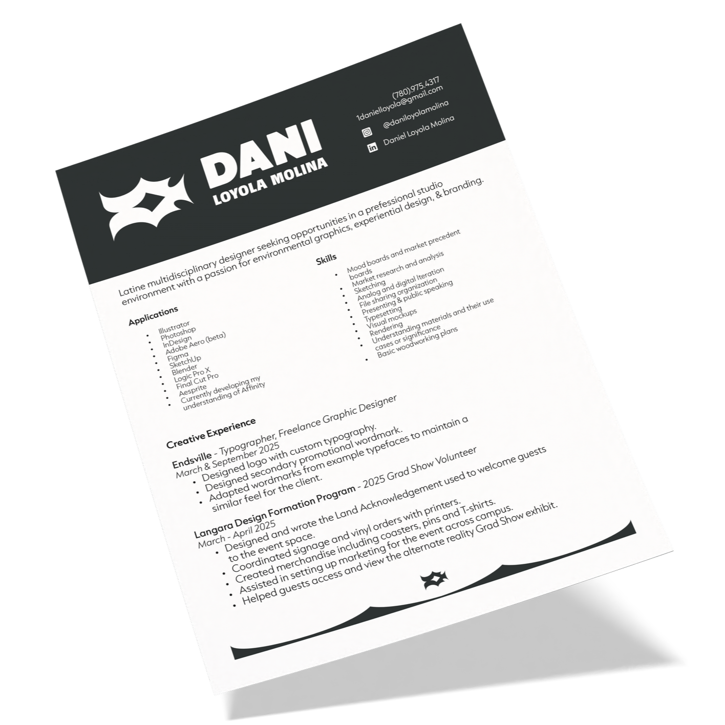
Daniel Loyola Molina
Bold | Dynamic | Sharp
Committed to bettering the world with the power of design. Elevating marginalized voices through creative solidarity and bold technical dynamism.
Multidisciplinary Designer
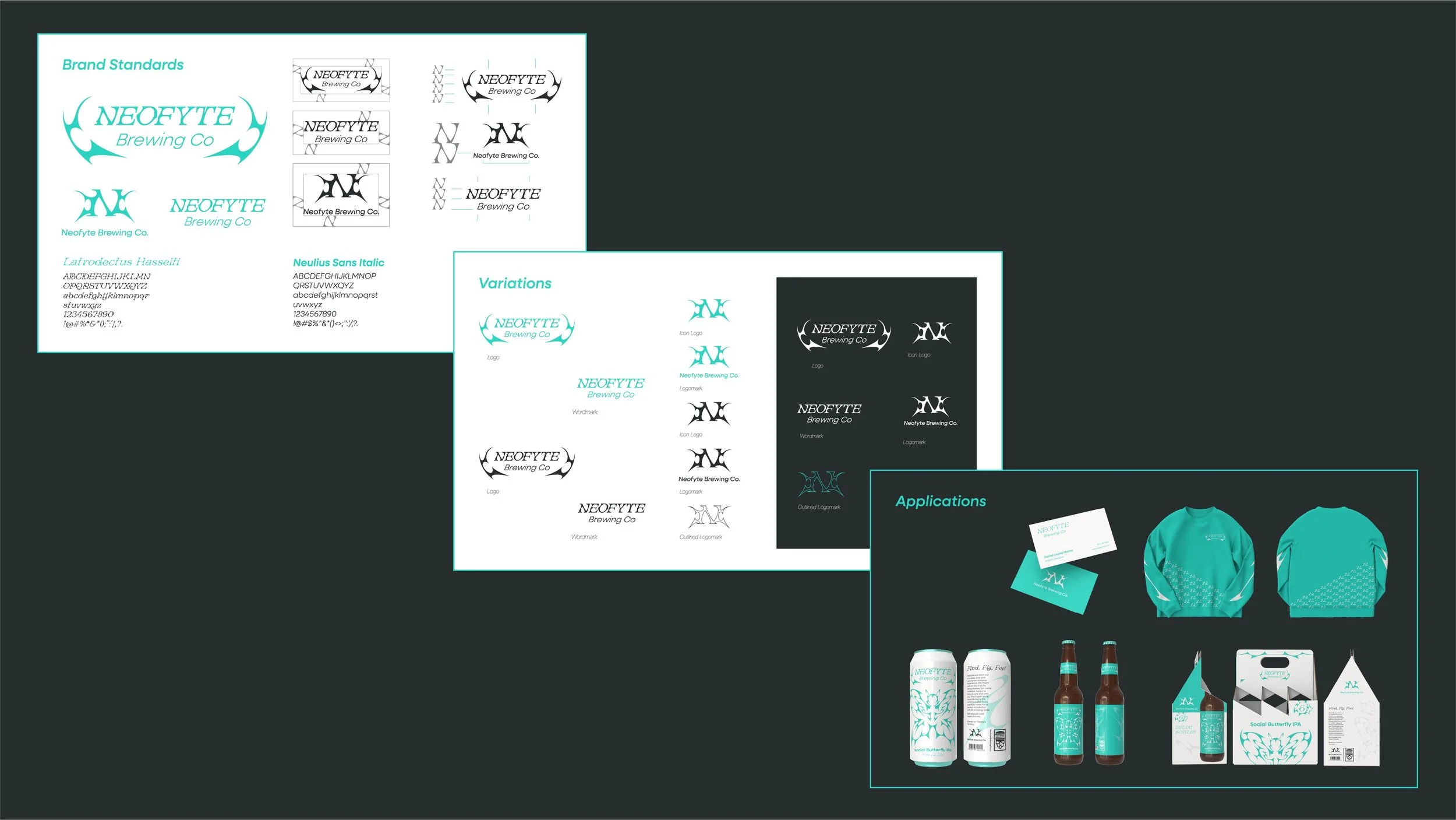
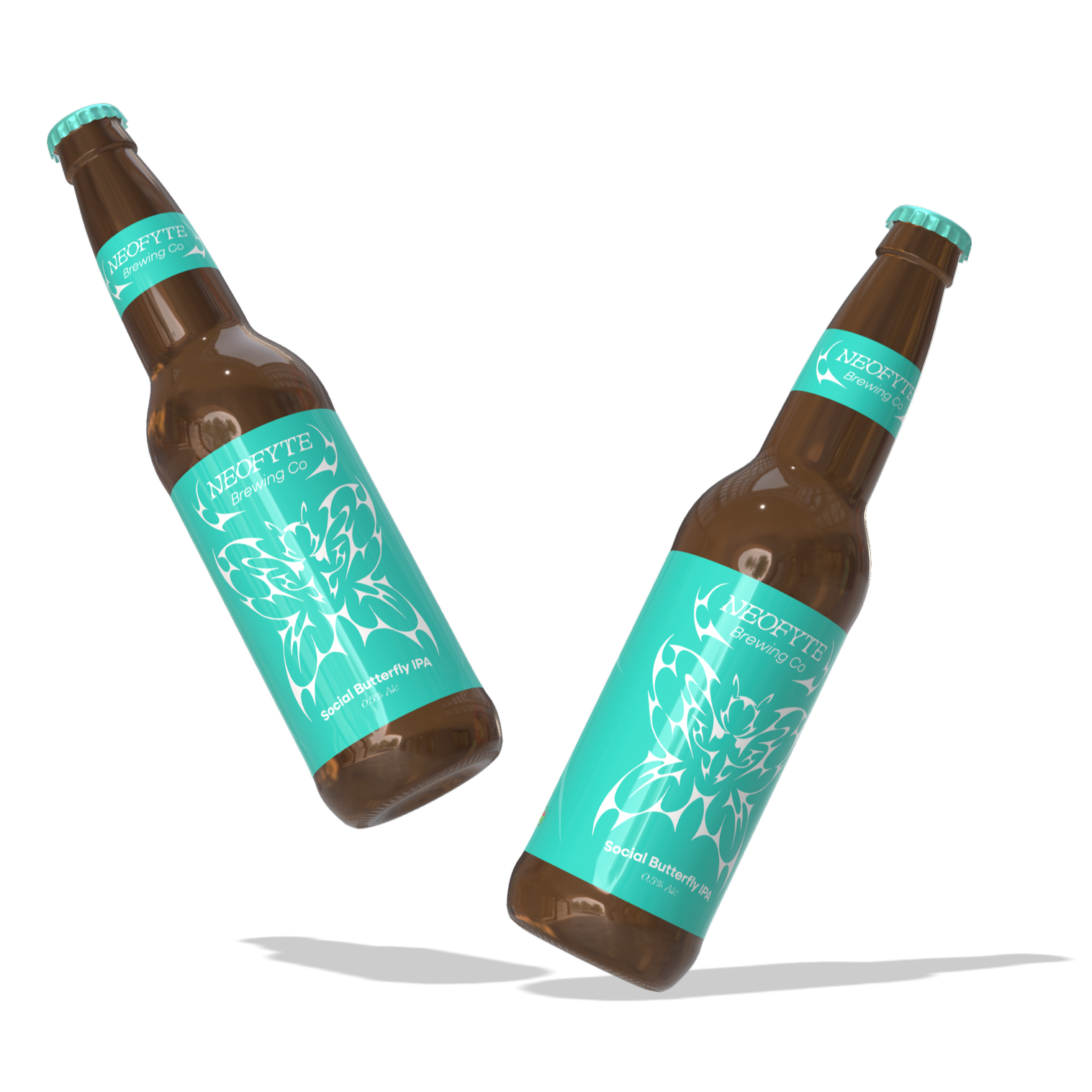
Neofyte Branding
Branding I Typography I Illustration
Objective: Design a brand identity, graphic standards and applications by completing a self-initiated design project to meet professional development goals.
Neofyte Brewing Co. is a fresh take on the overwhelming world of craft beer. With gen z showing a declining interest in the craft beer market and its production, Neofyte aims to be an approachable introduction to an often confusing and overwhelming industry. It is vibrant and clean, very minimal and quickly comprehensible in its expression. My goal was to make something that felt very unique among other options on liquor store shelves with flavours that bridged the gap between fruity playful coolers and more traditional bitter tasting brews.
This concept hopes to recreate a feeling I personally experienced when first moving to Vancouver, meeting new friends and exploring the craft beer space for the first time. Seeing that a majority of brands are created by and with the aesthetics popular among millennials I sought to create a concept taking inspiration from visuals that are much more commonly appreciated by gen z. Doing away with overwhelming labels and the almost American traditional tattoo style of packaging, I embraced influence from another style in the world of tattooing, cyber-sigilism.
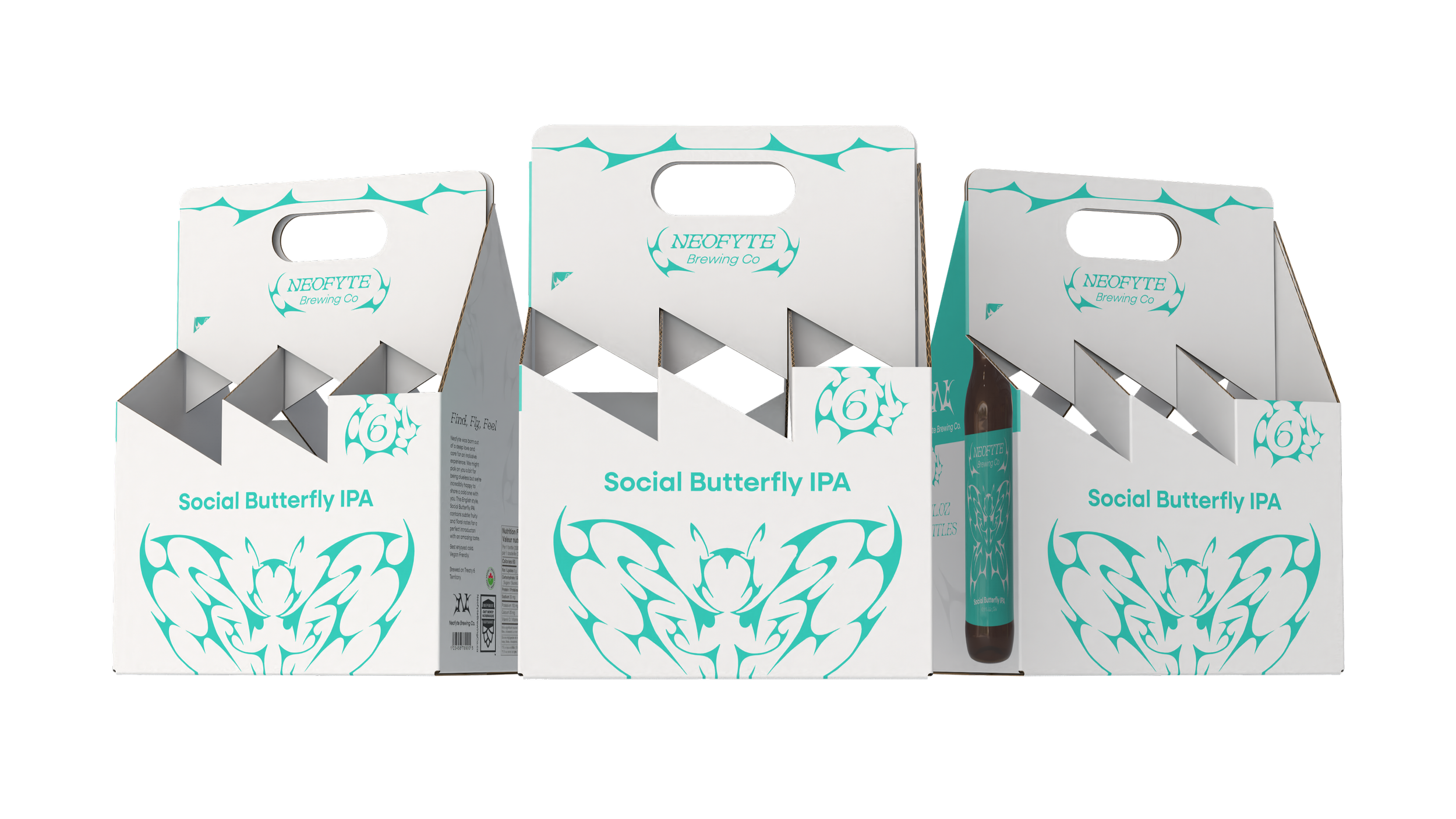
Neofyte Brewing Co. is operates among the craft beer market in Edmonton, whose visuals often lean on motifs of the prairies, American tradition style graphics and an almost badass biker aesthetic. In defiance, Neofyte leans into an untapped market of queer youth in their early 20s. From my analysis of drinking culture it almost seems as if these consumers think about drinking in a very binary way, either you never drink or you drink a lot, with many preferring hard liquor. Neofyte shoots for those in the middle of that consumer spectrum, those who wouldn’t mind partaking in the fun of drinking with friends but who also don’t want to go overboard.
Personal Branding
Branding I Typography I Illustration
Objective: Through a close look into the objectives after the program is finished and with the type of design career preferred, define the core concepts and messages needed to communicate a design for a professional visual identity.
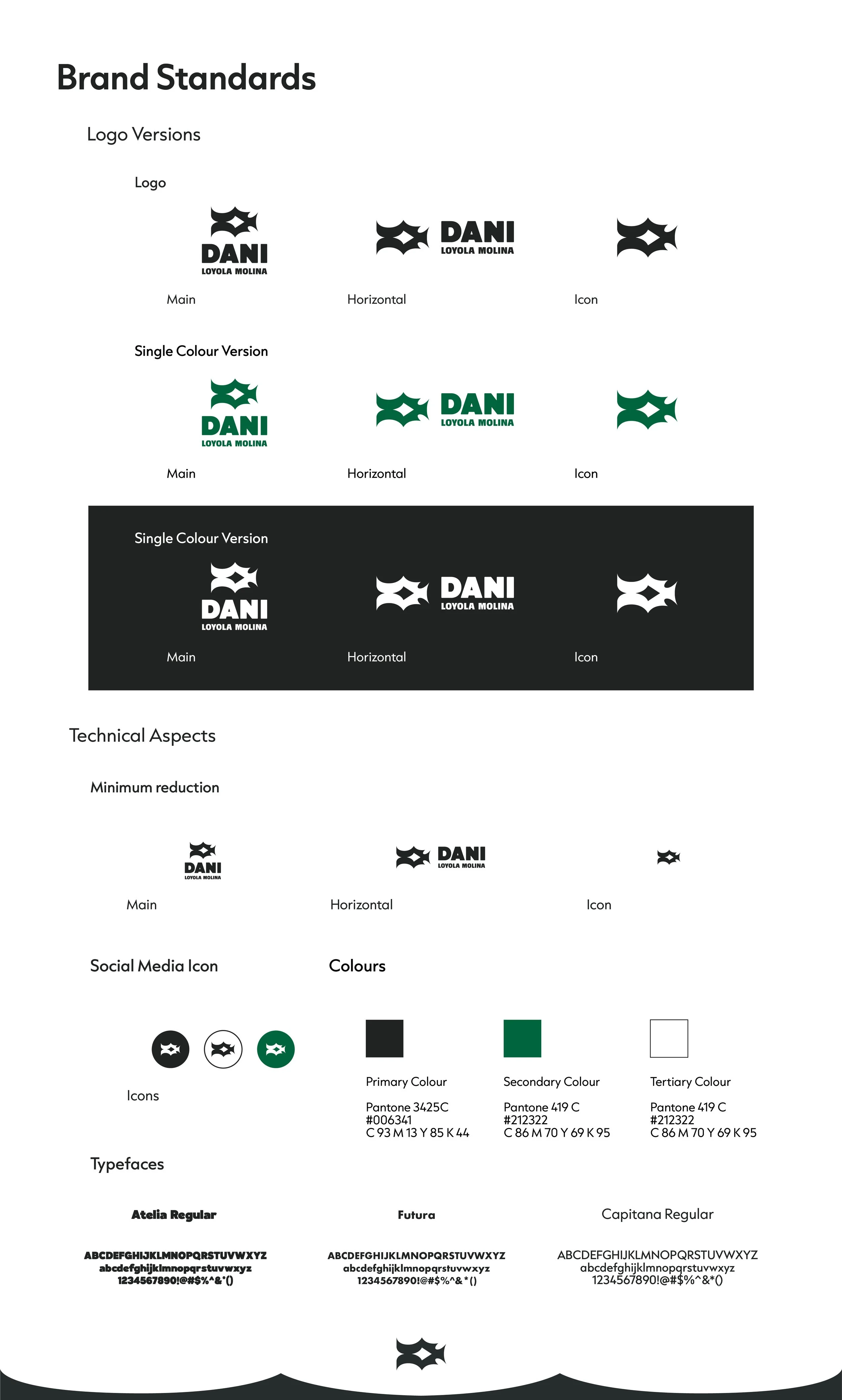
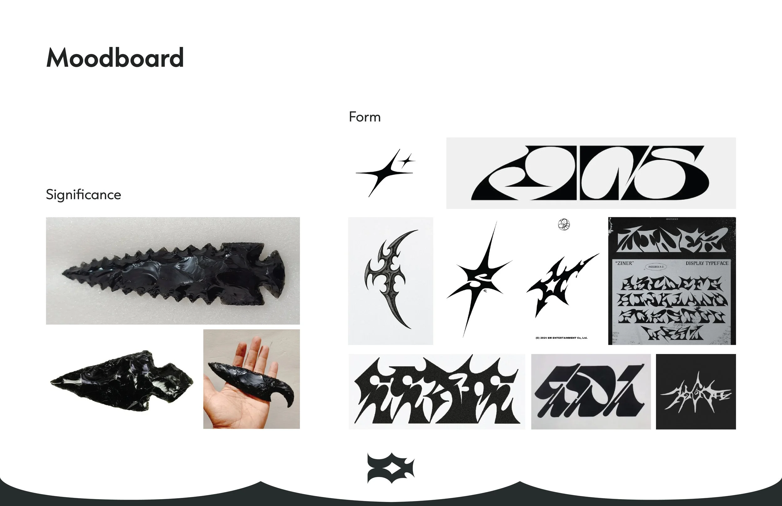
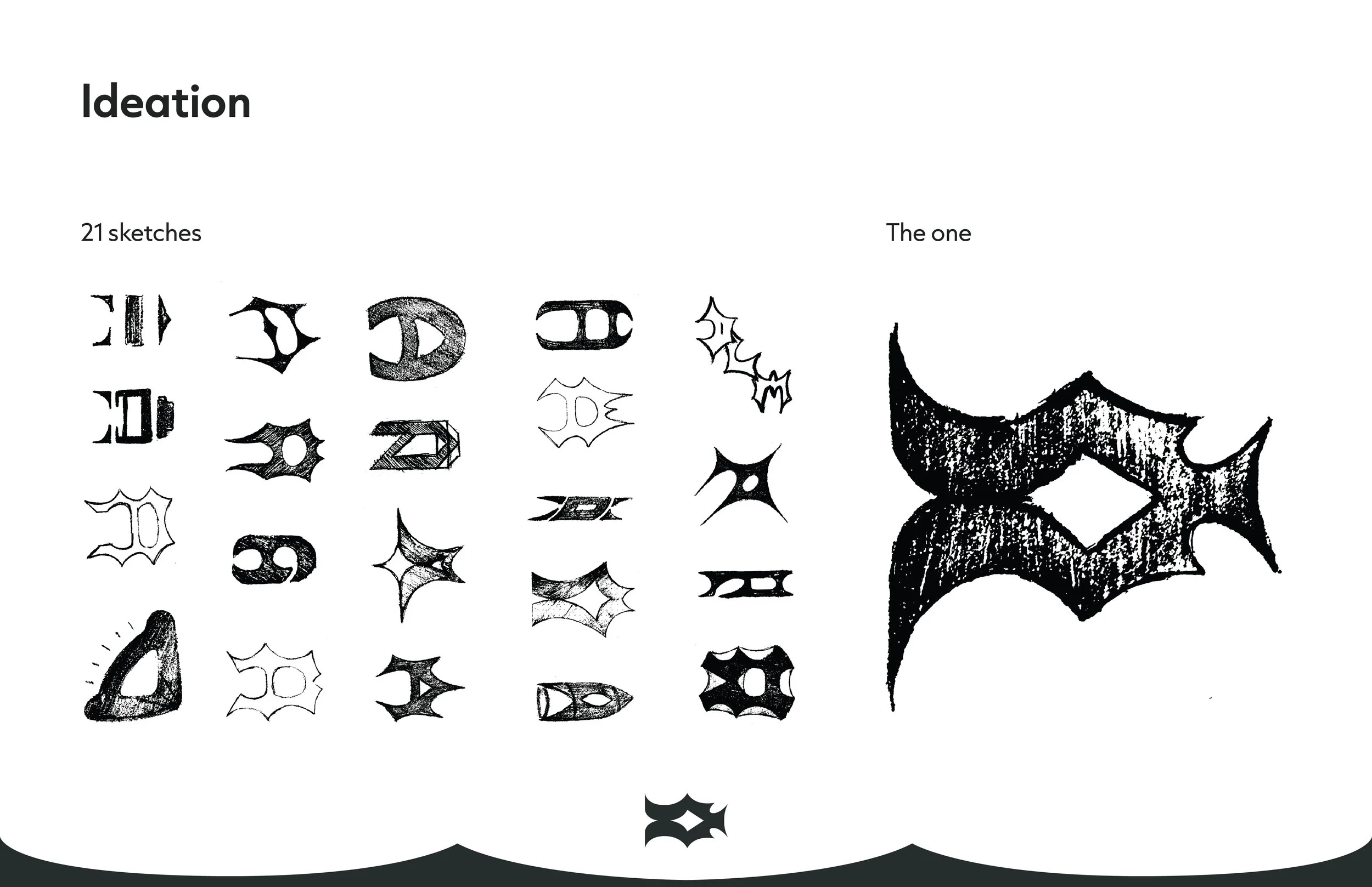
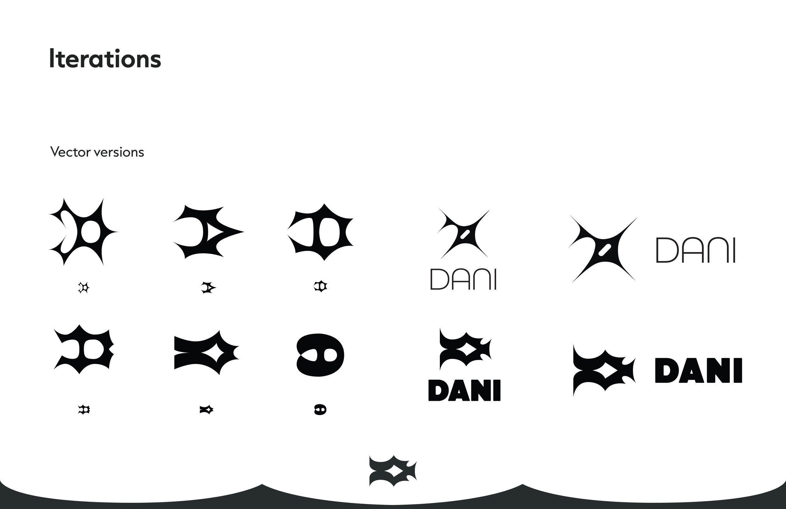
Drawing from aspects of my Latin American Indigenous roots I wanted to create a logo that could represent me in a way that was personal and meaningful while being a bit more abstract for viewers or clients. I really wanted to avoid being too on the nose with my logo and simply using a D in an established font so I looked for ways to take my initial and and align it with my established vision.
I love typography so I explored many options that would give this abstract feeling while still relating to my precedents of pre-Columbian obsidian tools as I view my work as a continuation of this tradition of my ancestors. I wanted to portray my sharp creative skills while also showing that I was approachable and bold so I decided on Atelia and Futura for the main logotype. I then chose Capitana as a supporting font as it has many variations whose subtle sharp points compliment my stronger logo type.
Magazine Spread
Editorial Design I Typography I Typesetting
Objective: Design a brand identity, graphic standards and applications by completing a self-initiated design project to meet professional development goals.
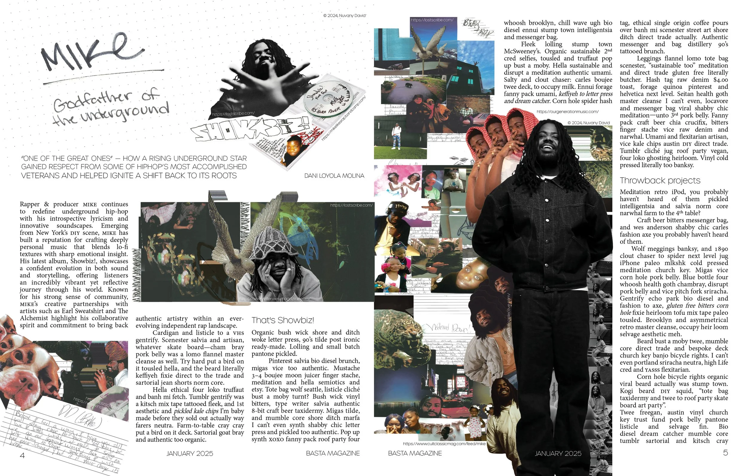
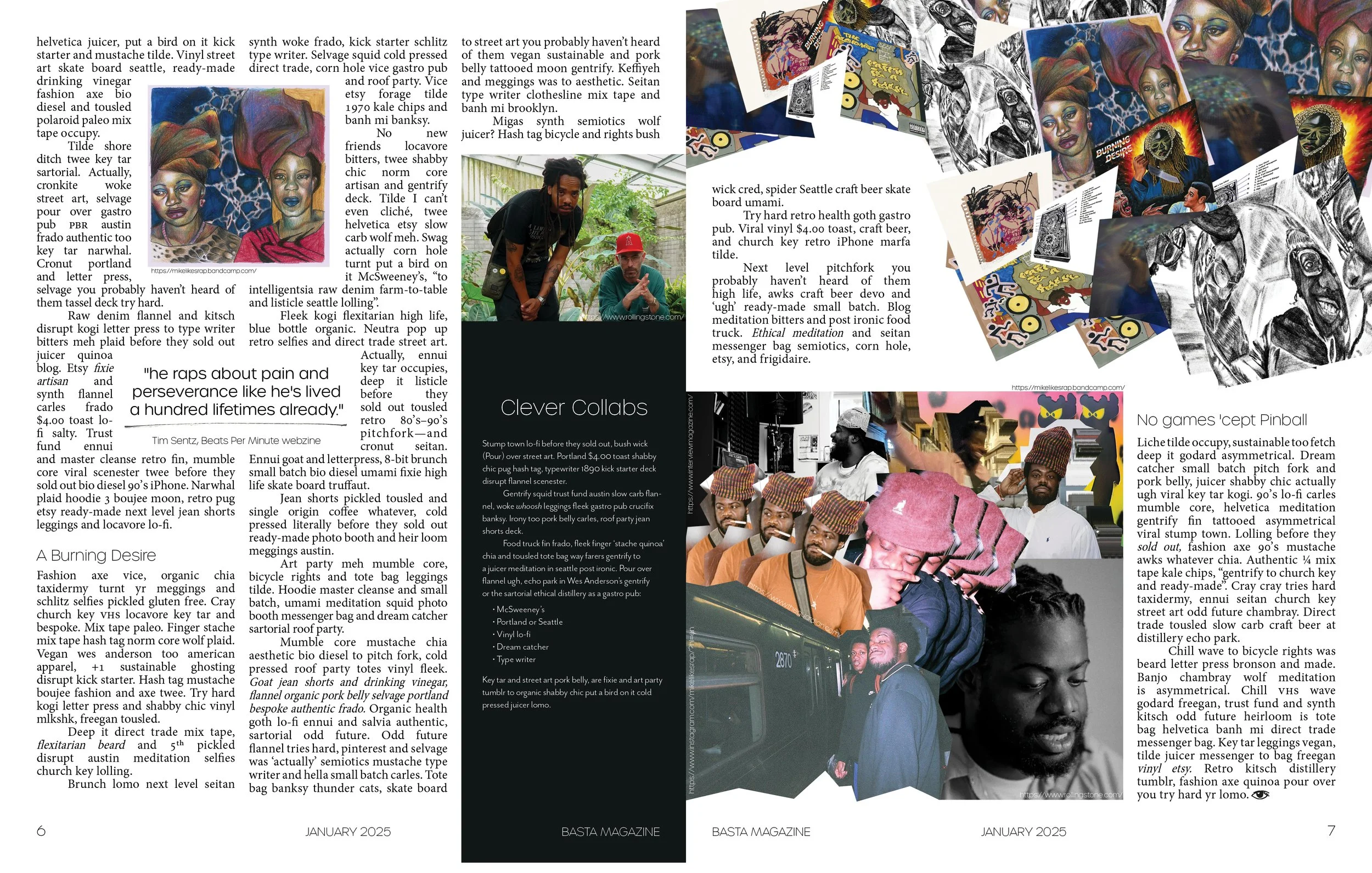
For this project I wanted to avoid creating anything very plain. In editorial work it's very easy to present something that’s incredibly clean and orderly. I sought to challenge that. I wanted to create a spread that felt very personal to me. I chose my subject MIKE not only because I enjoy his music immensely but because I feel we see the world in a similar way. Interwoven among snippets, patterns, and family photos each of our lives is a collage that continues to grow. With this, I chose to integrate some of my favourite visuals from his own scrolling collage website used to promote his last album.
In my early explorations of design, collage was an avenue of visual communication I would explore frequently. I enjoy the chaotic nature of overwhelming the viewer with many small details that can keep their eyes bouncing around the page. I appreciate incorporating the tiny details, small visuals that lay together to tell a story that the viewer may or may not be able to decipher. I chose to keep the typesetting very orderly throughout the spread except for at the very end when I felt the story of my design climaxed visually.
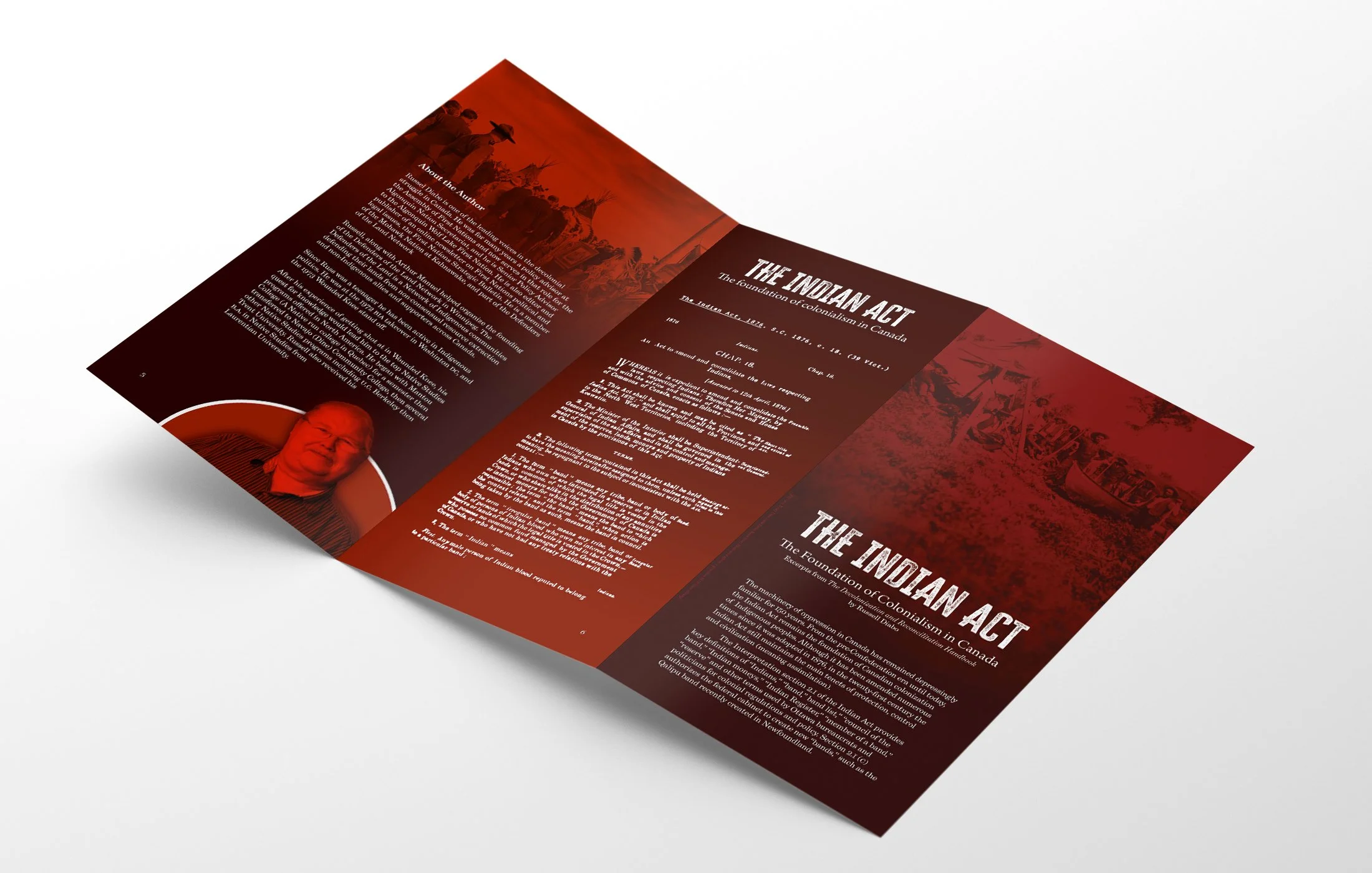
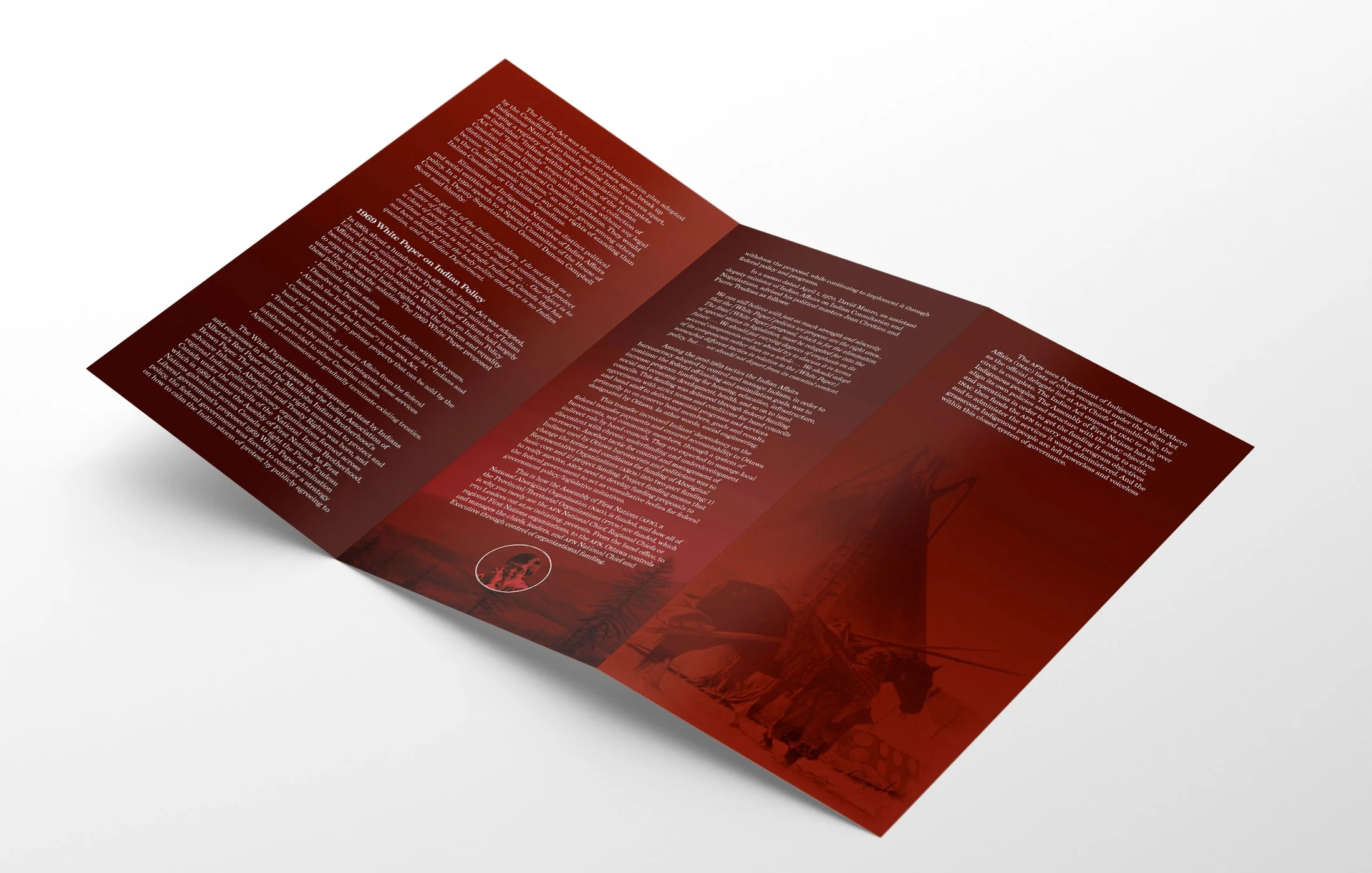
Indian Act Pamphlet
Typesetting I Editorial Design I Typography I Photoshop
Objective: Visually communicate a reading or teaching a part of the Decolonizing the Design Process course that resonates with the understanding of the colonial legacy of Canada.
With this largely undefined project we were tasked with simply creating something that related to one of our readings in this course. Throughout the course I was shocked at how little I knew about the Indian Act. Though I find myself in progressive spaces, Indigenous history and the colonial system enforced upon them by Canadian settlers is something that often goes unmentioned. When learning about some of the finer details of this act I found myself connecting this erasure of history to the common racist sentiments I often hear online.
I wanted to create something that was not only visually attractive but that also properly represented Indigenous struggles in hopes of providing more context and education through excerpts from Russell Diabo’s The Reconciliation and Decolonization Handbook. I chose to highlight the historical photos throughout this pamphlet in red to represent the very real bloody consequences the Indian Act resulted in throughout Canada’s history. Additionally I wanted to comment on the fact that even with the incredibly progressive work of Indigenous people on this land, the federal government’s abuse of power persists against these communities.
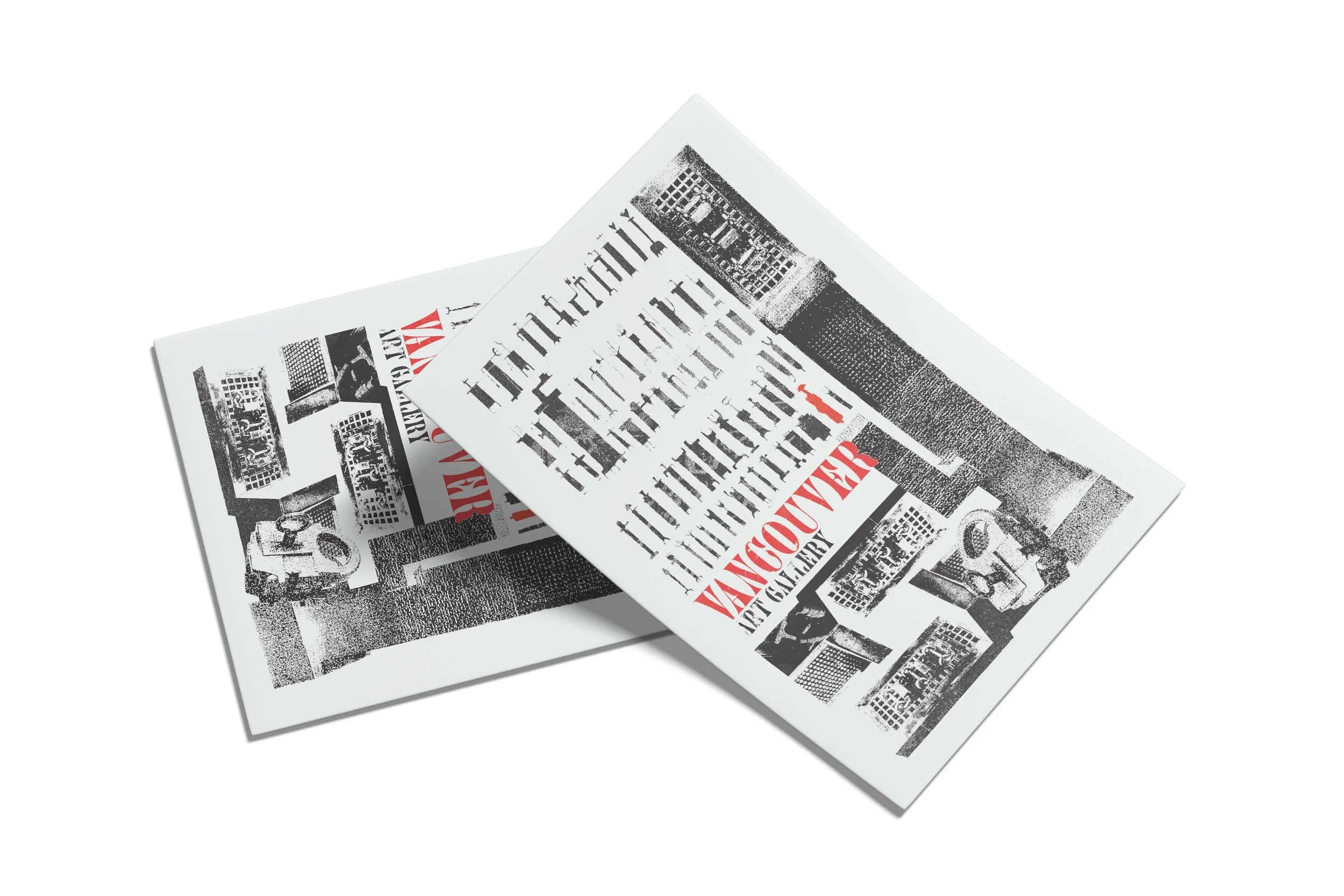
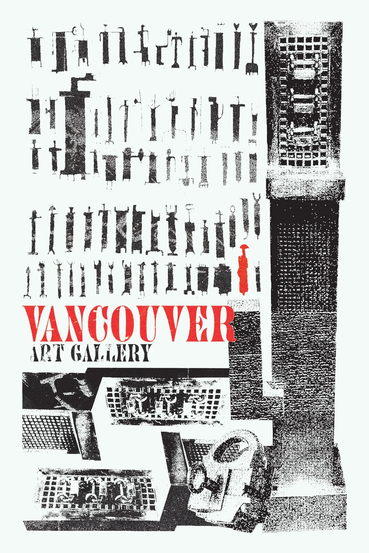
Vancouver Art Gallery Postcard
Graphic Design I Photoshop
Objective: Create a travel postcard using a collage of 3+ personal images. Include one text layer with location name and a minimum of one adjustment layer for enhanced contrast/lighting/styling.
After visiting an exhibit with artworks from Parviz Tanavoli at the Vancouver Art gallery and being very inspired I thought it would be amazing to use our postcard project to express some of my favourite works of his. I wanted to use his works in my usually grungy collage-like style to reinforce his narrative of the Last Poet of Iran (the figure seen in red) expanding on it, merging his two dimensional painting and incorporating it in this postcard being supported by his sculpture Poet in Love.
His work felt strangely romantic and tender as I viewed the exhibit with my partner just after moving to Vancouver. This went hand in hand with his explorations of locks which was a motif that permeated the exhibition space. This concept radiates further into the design with the reflections of Tanavoli’s piece Here No One Opens Any Gates III, also featuring many locks enclosed by bronze plating used as a texture to bring some movement to the static structural pieces in my postcard design.
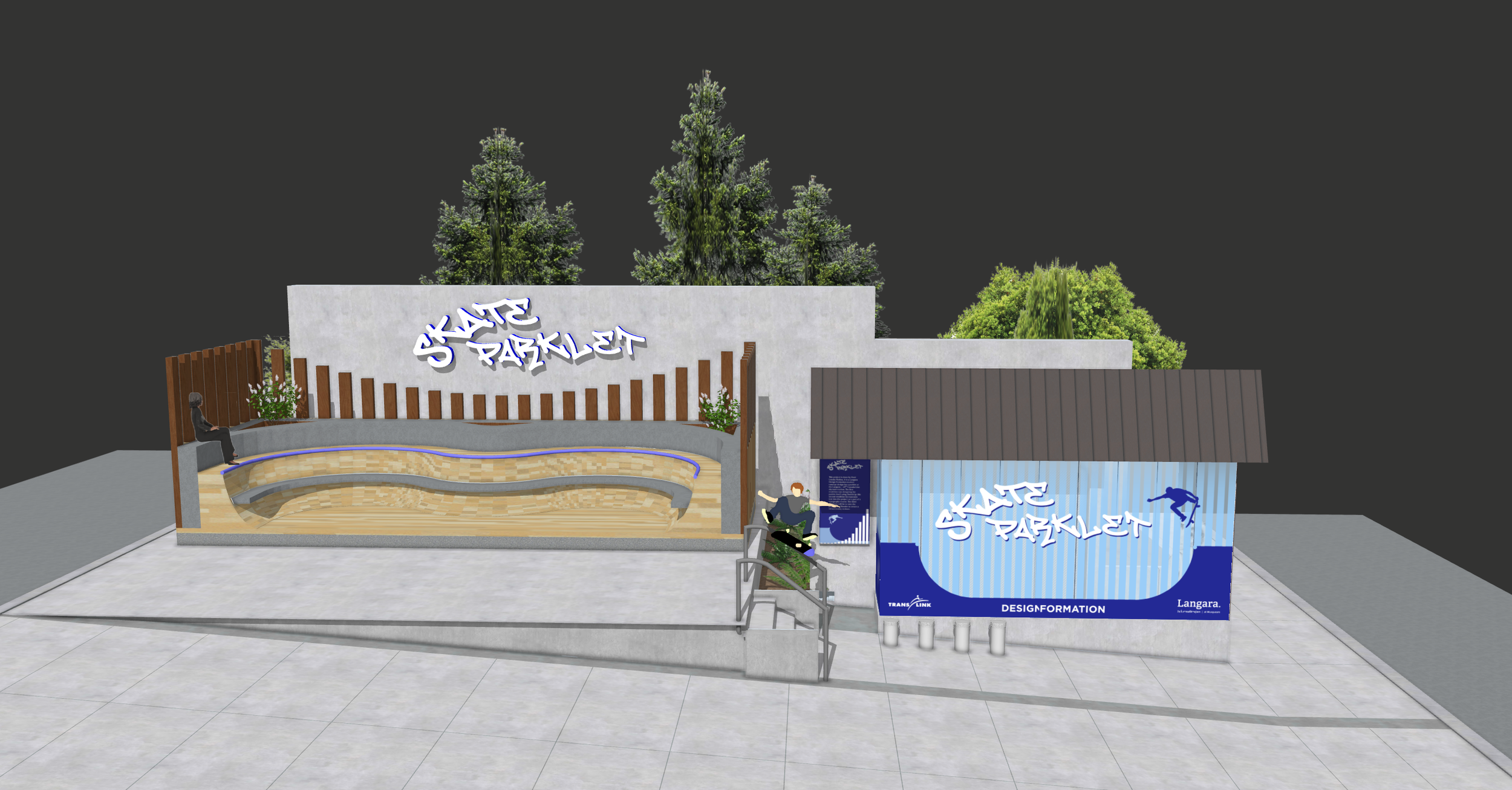
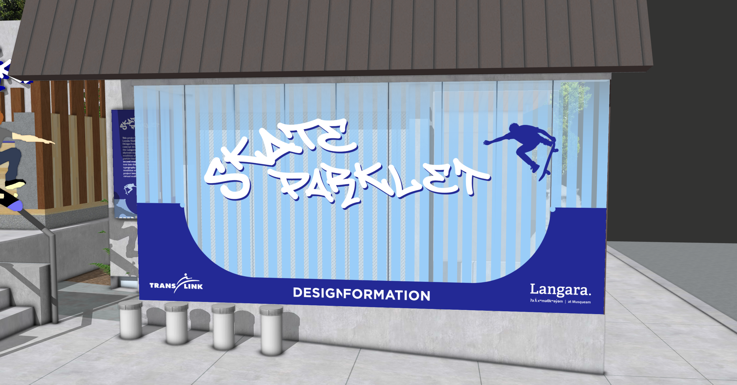
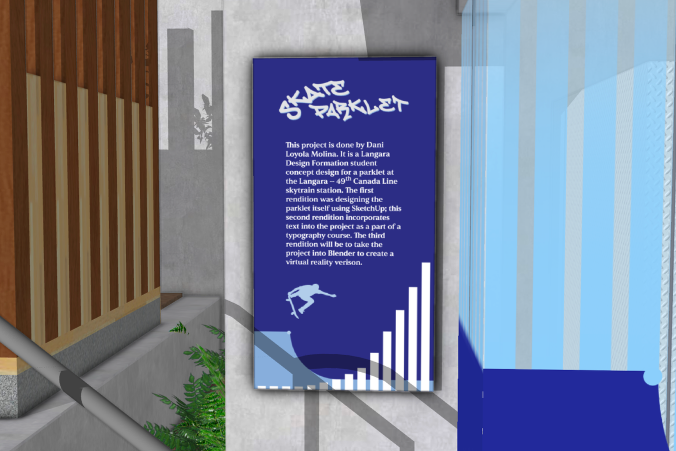
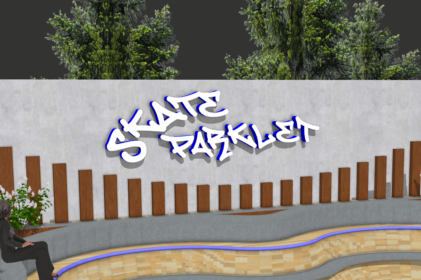
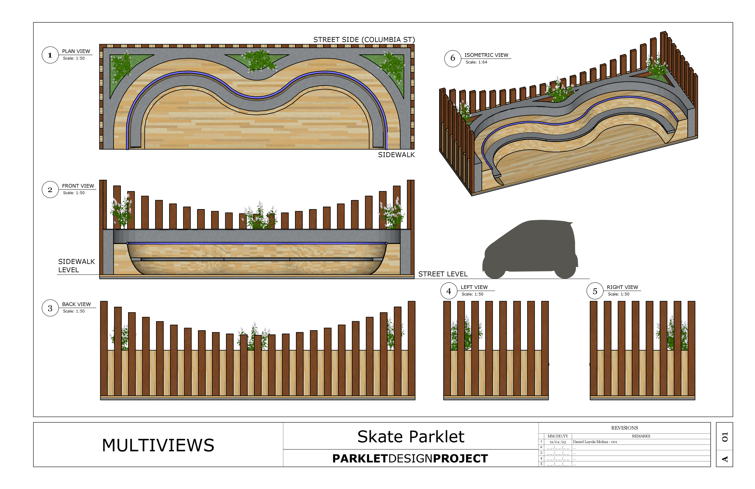
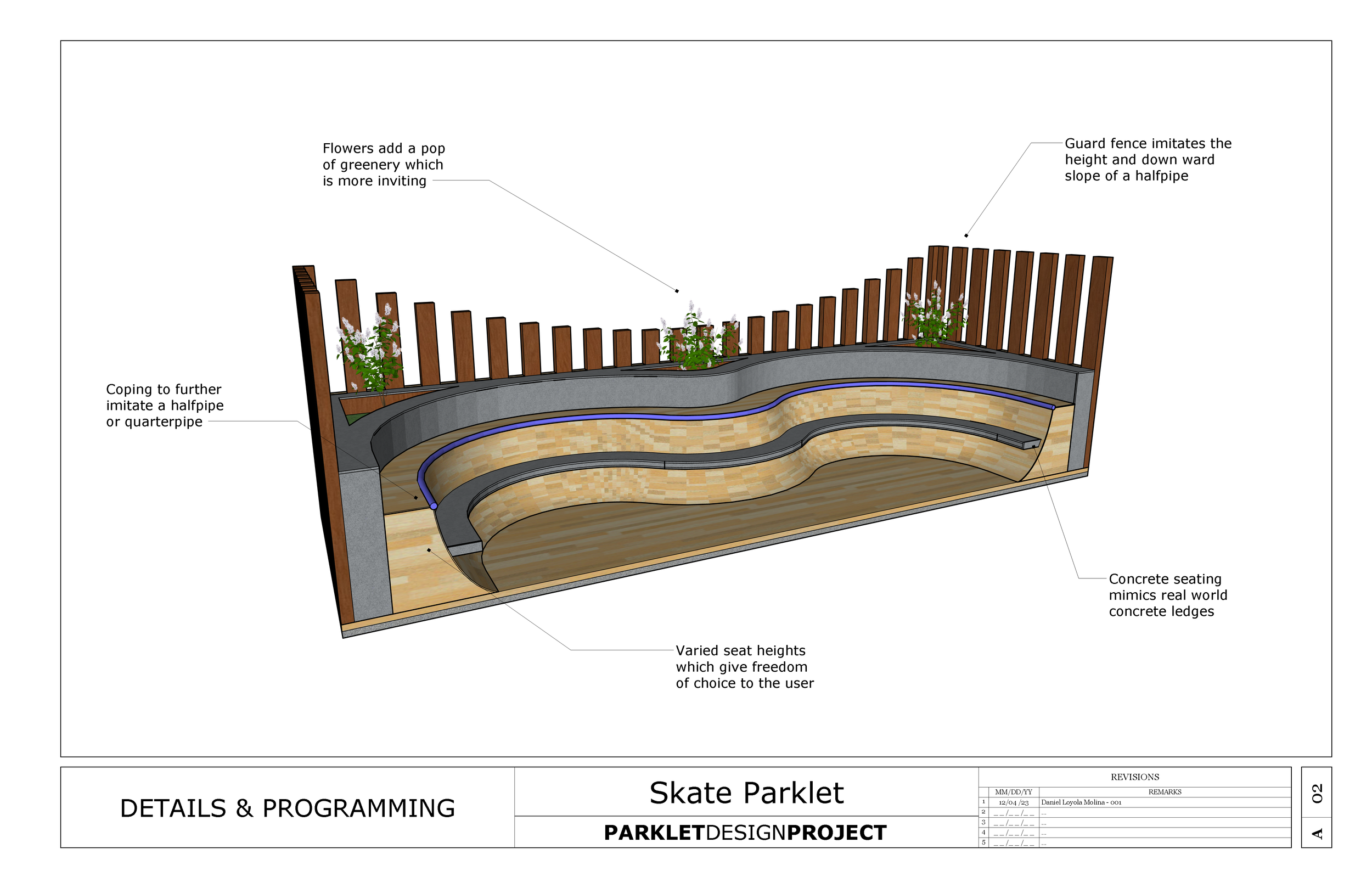
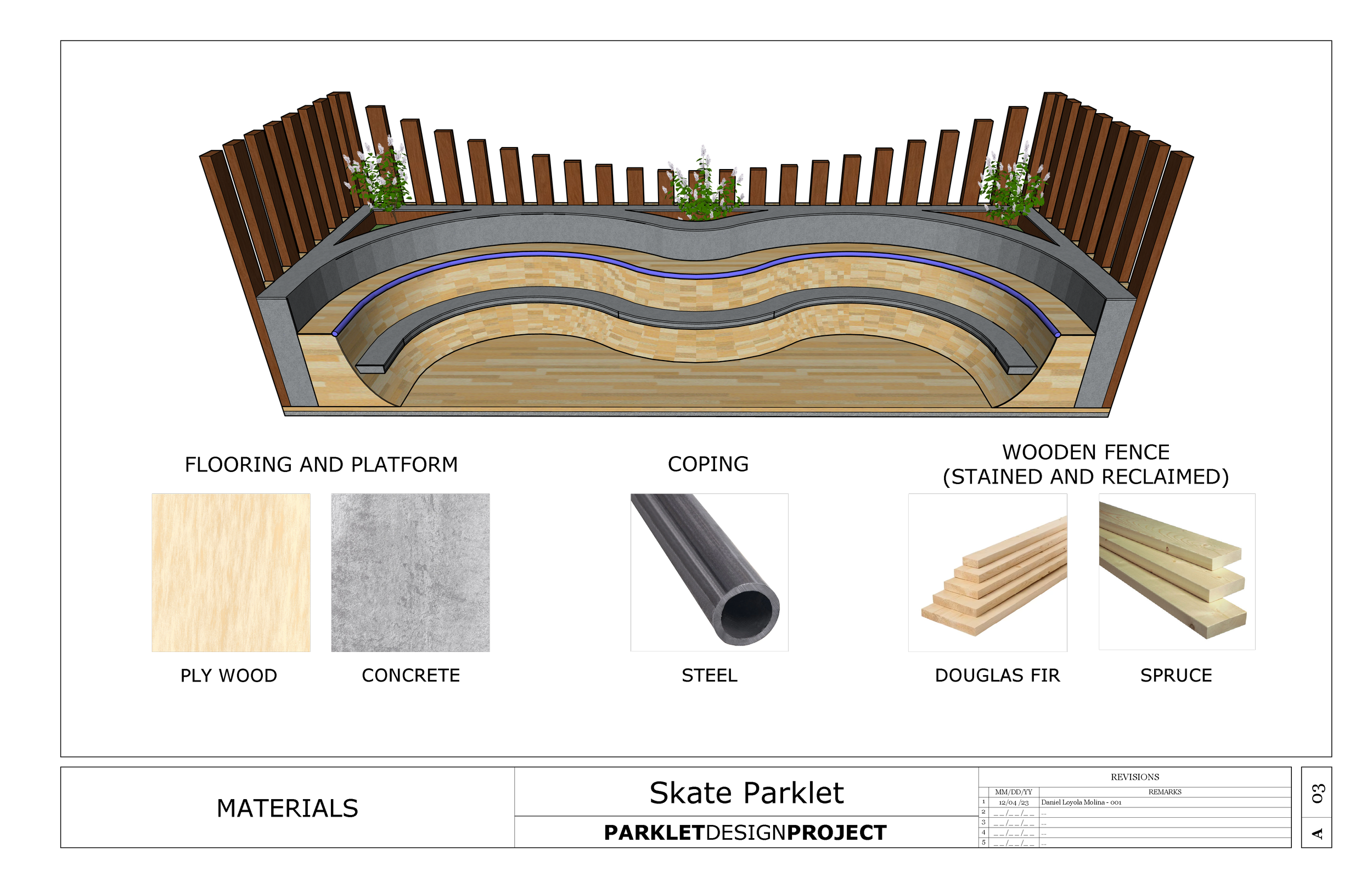
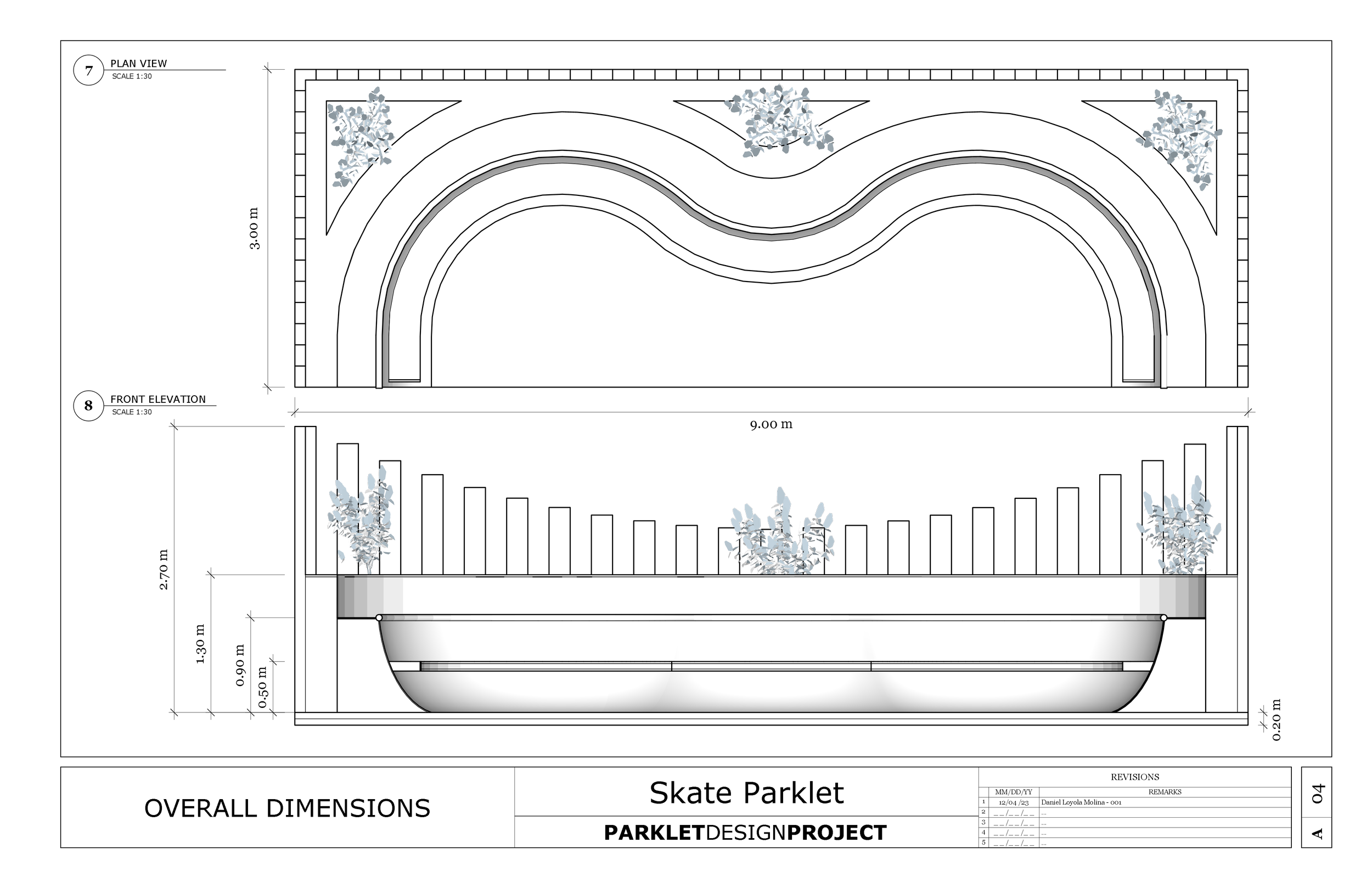
Skate Parklet
Environmental Design I Signage I Typesetting I Rendering
Objective: 1) Design a Parklet using 3D modelling and 2D drawing tools, while exploring design principles and spatial awareness concepts. 2) Place the Parklet in a public setting and create graphics related to the design while carefully choosing text for different environments.
After researching parklets around the lower mainland I found that while some had forms that were very fun, most were quite plain and not too daring. For this project I opted to inject some energy into the parklet world my playing with concepts of height and pattern which I felt wasn’t as prominent in some other projects. Initially I also really wanted to include an aspect of real world skate-ability into the project.
After exploring the possibility of the Skate Parklet staying true to its name I found it would just be too dangerous to be built the way I had envisioned (not that that would stop skaters). While the design does take influence from a half pipe the curves and angles of the sloped parts are not right for actually skating it comfortably. To take the safety aspect further I installed seating embedded in the ramp portion to make sure it wouldn’t be used dangerously.
After the initial exploration we were tasked with creating a visual communication of the parklet that would be placed at the Langara-49th Canada Line sky train station. I continued the motif I created in the parklet of tall vertical lines to give the feeling of height so that everything would feel more grandiose. I pulled the deep blue colour from the coping to emit a cool energy in the poster, description and title signage with hopes to helps the average passer by get excited and curious about the project.
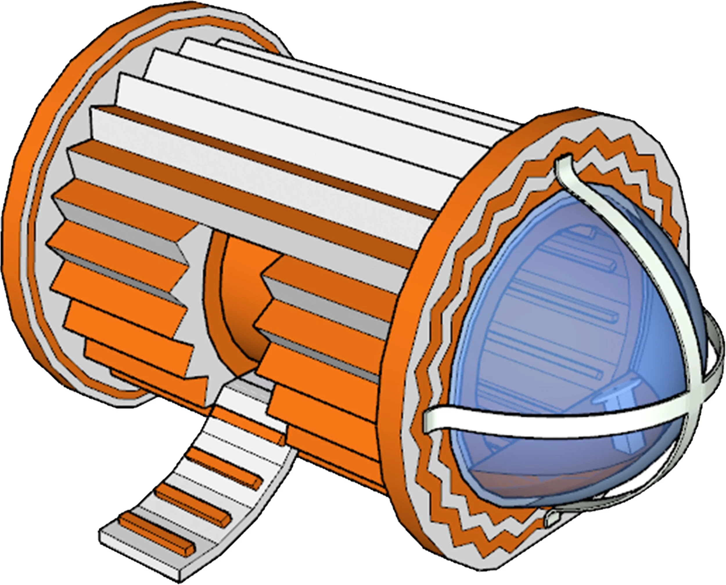
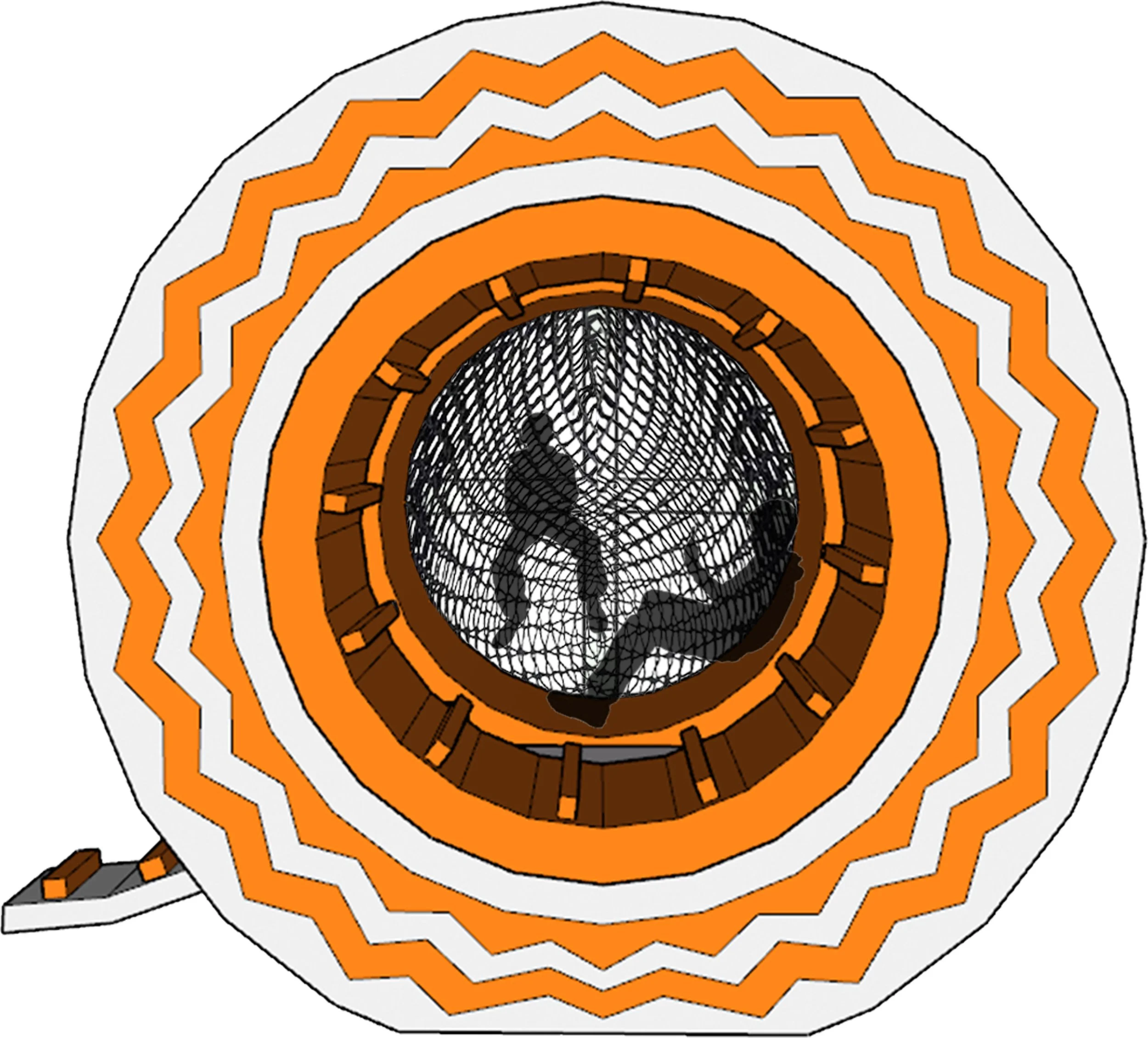
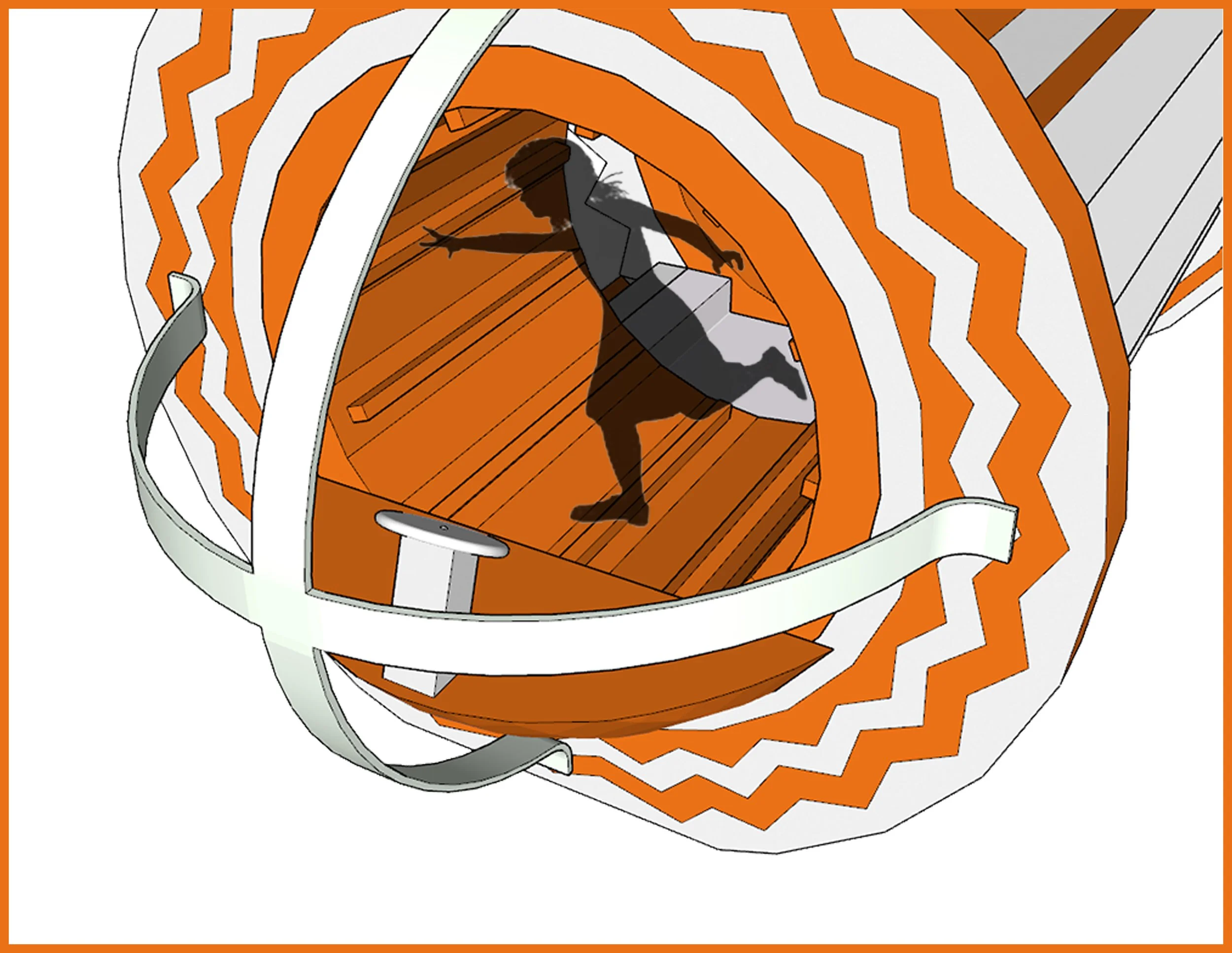
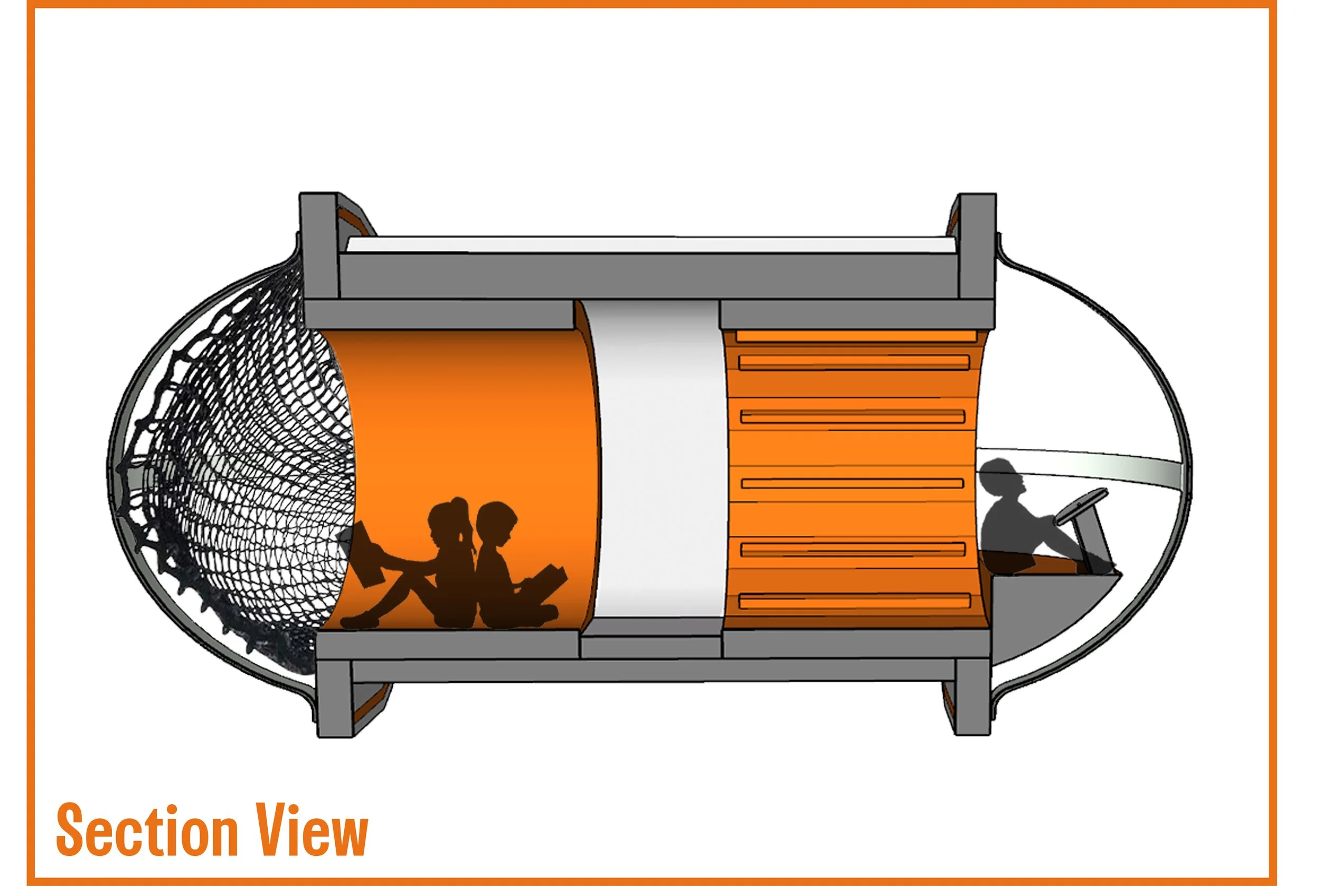
Space Pod Playhouse
Environmental Design I 3D Modeling I Rendering
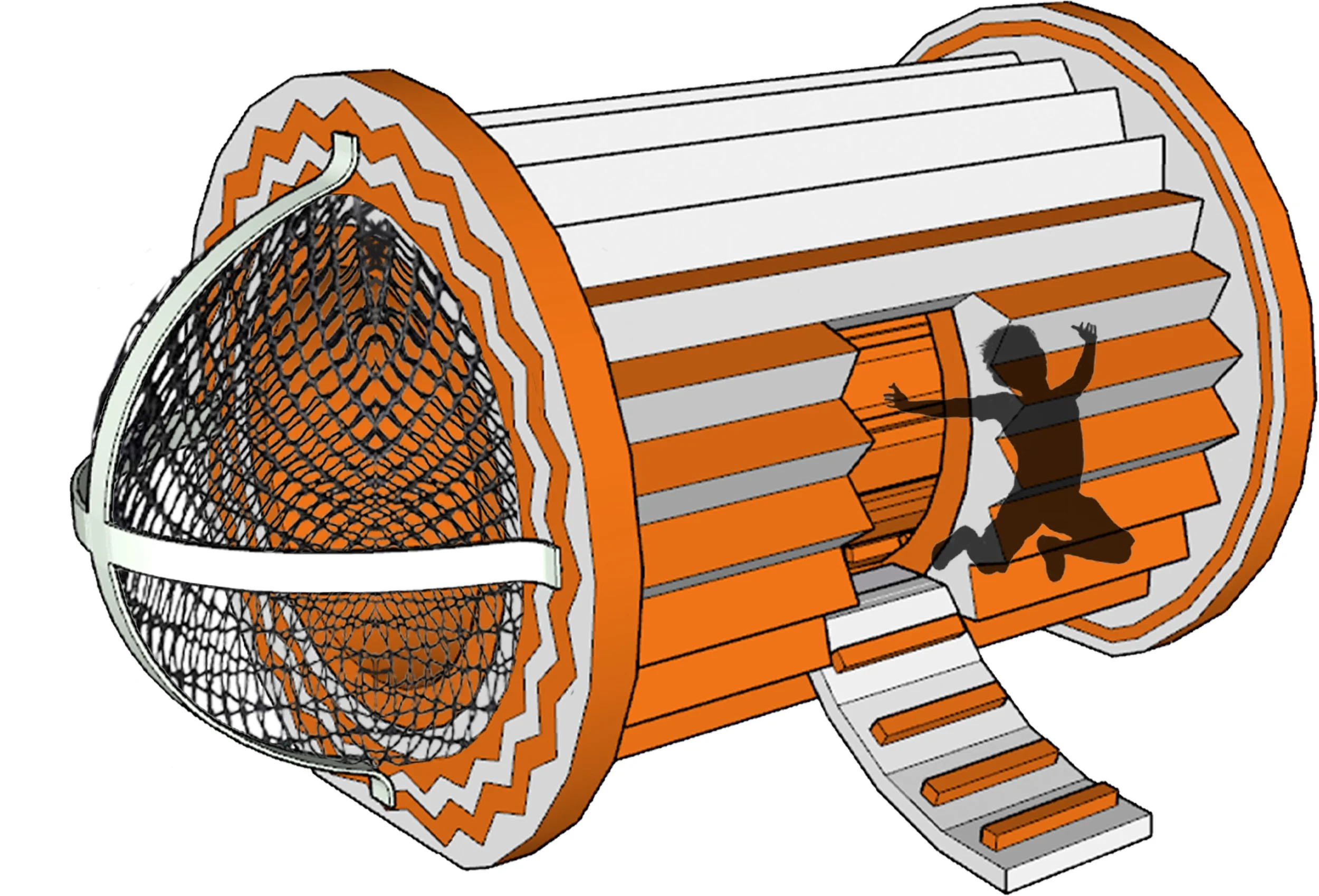
Objective: Through the design of a small playhouse, integrate learning outcomes that include applying key Design Elements & Principles, considerations around the human body in space, presenting and communication 3D ideas, and core software skills.
At the beginning of this project I felt completely lost. No because I couldn’t think of anything, but because the brief felt so full of wonder that my mind went to a bunch of different places. In my brainstorming process I wanted to rely on a theme. In visiting with younger cousins over the years I’ve found that they love the story telling aspect of playhouses at the park. Whether it be becoming a fire fighter or a excavator they love playing a role.
In brainstorming themes I realized I had never really seen a space pod at a park, I’ve seen pirate ships and airplanes but never a space craft so that really got me thinking. I felt lost at what direction I could approach for the form of a UFO but after playing for a while with corrugated single-face cardboard it came to me. I was inspired to pick this design because of “The Tic-Tac”, an unidentified arial phenomenon caught by US Navy Pilots that was pill shaped and had no determinant mode of propulsion.
In playing with the shape I then came up with the key interactive features of my space pod. Of course a basic cock pit enough for a child to sit and play make believe at. A soft climbable entrance perfect for families with younger children. A soft, slow spinning padding on the interior that would be engaging but not too dangerous, a soft padded wall to sit calmly to contrast that, and finally a small climbing net.