Bernice Wong
Multidisciplinary Designer
Sincere | Meticulous | Authentic
Each and every project is treated with care and consideration. Through intentful design processes, I strive to create quality results to the best of my abilities.
Luminous Object
Product Design | Drafting | Fabrication
Objective: Design, Document, and Fabricate a small Luminous Object, while exploring the relationship between Narrative, Form, Materiality, and Value— from concept to fabrication.
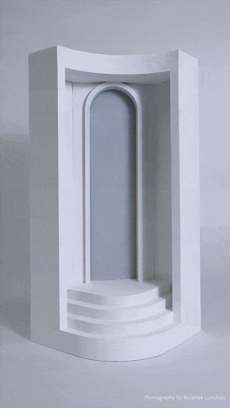
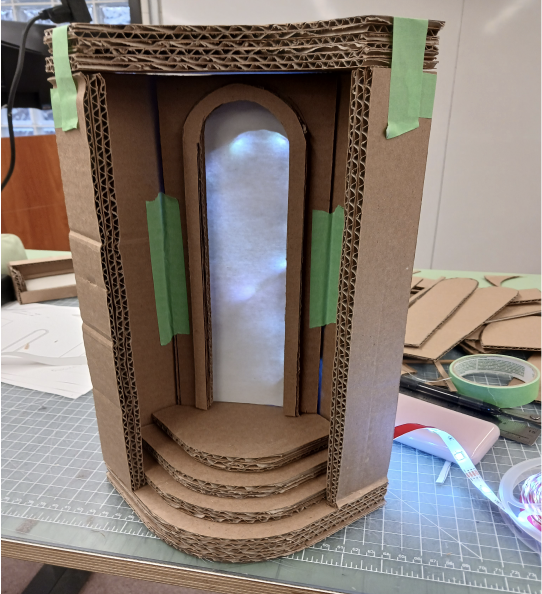
The Stairway to Light is based on the concept of an intangible staircase leading to heaven. Its design features a simple white exterior with steps that guide the eye towards the centre and an archway that symbolizes heaven. When lit in the dark, the semi-enclosed design allows light to reflect on its walls and create a larger glowing area.
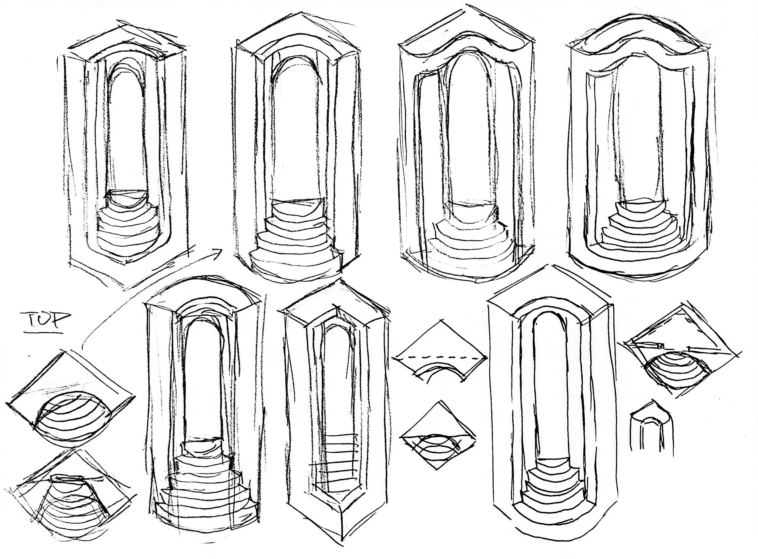
I wanted to create something simple yet profound. The object is symmetrical, but by placing it on a diagonal axis, the angle emulates the isometric aesthetic, making it visually intriguing. In each iteration, I played with the layers of the stairs and the depth of the frame. Eventually, I settled on complementary framing, where the top is the inverse of the bottom component.
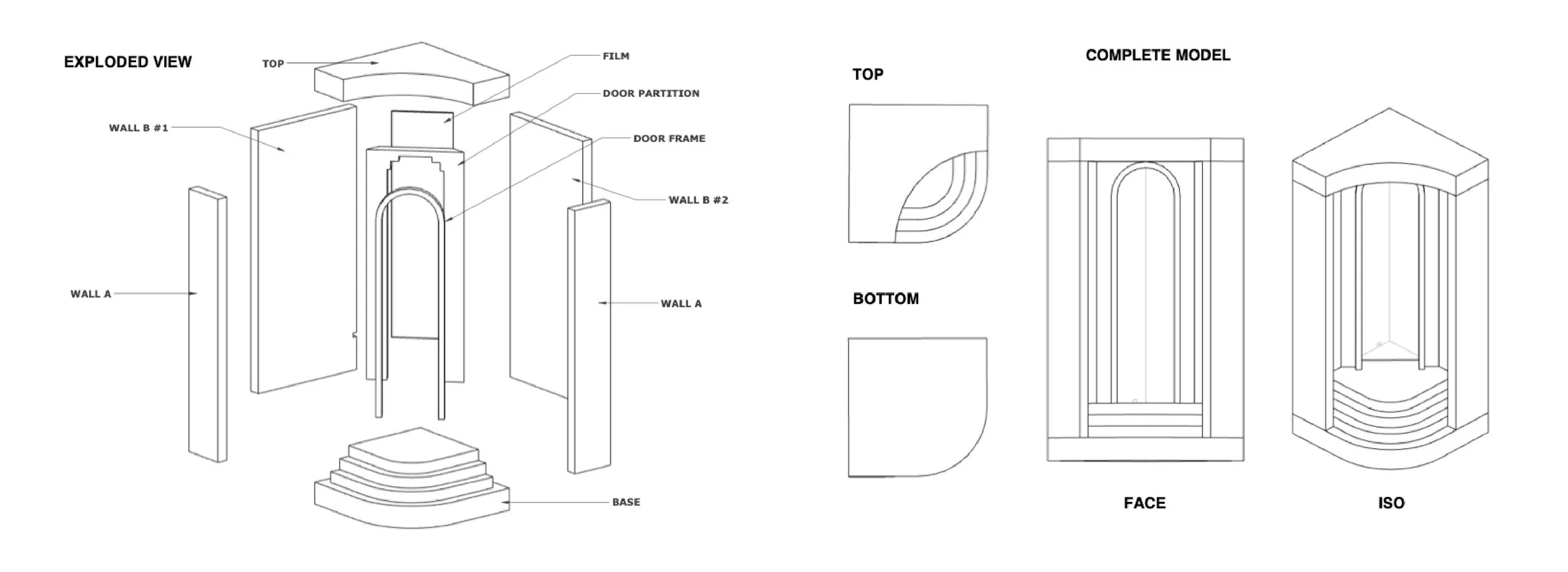
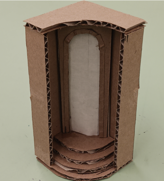
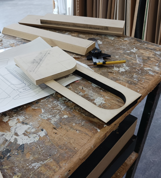
I made two cardboard mockups: one reduced and one to scale. The main structure was built from plywood, and the frame and partition were laser cut due to their delicacy.
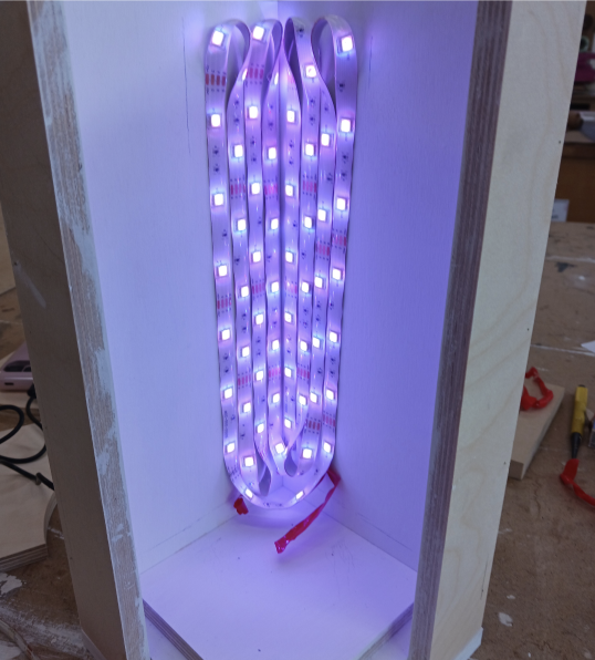
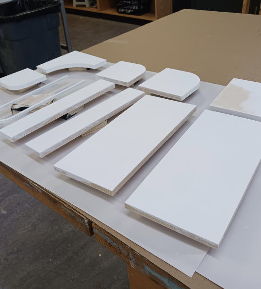
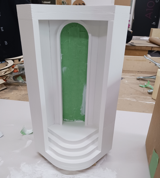
Once I had all the pieces, it was assembled with nails, and the inner compartment was tested and fixed with LEDs. Afterwards, gaps were patched with wood filler, and the object was finished with several coats of paint.
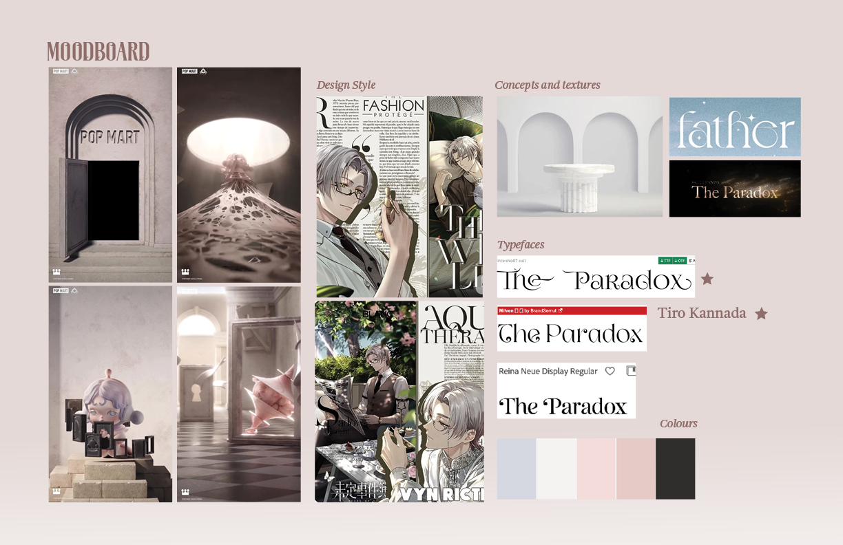
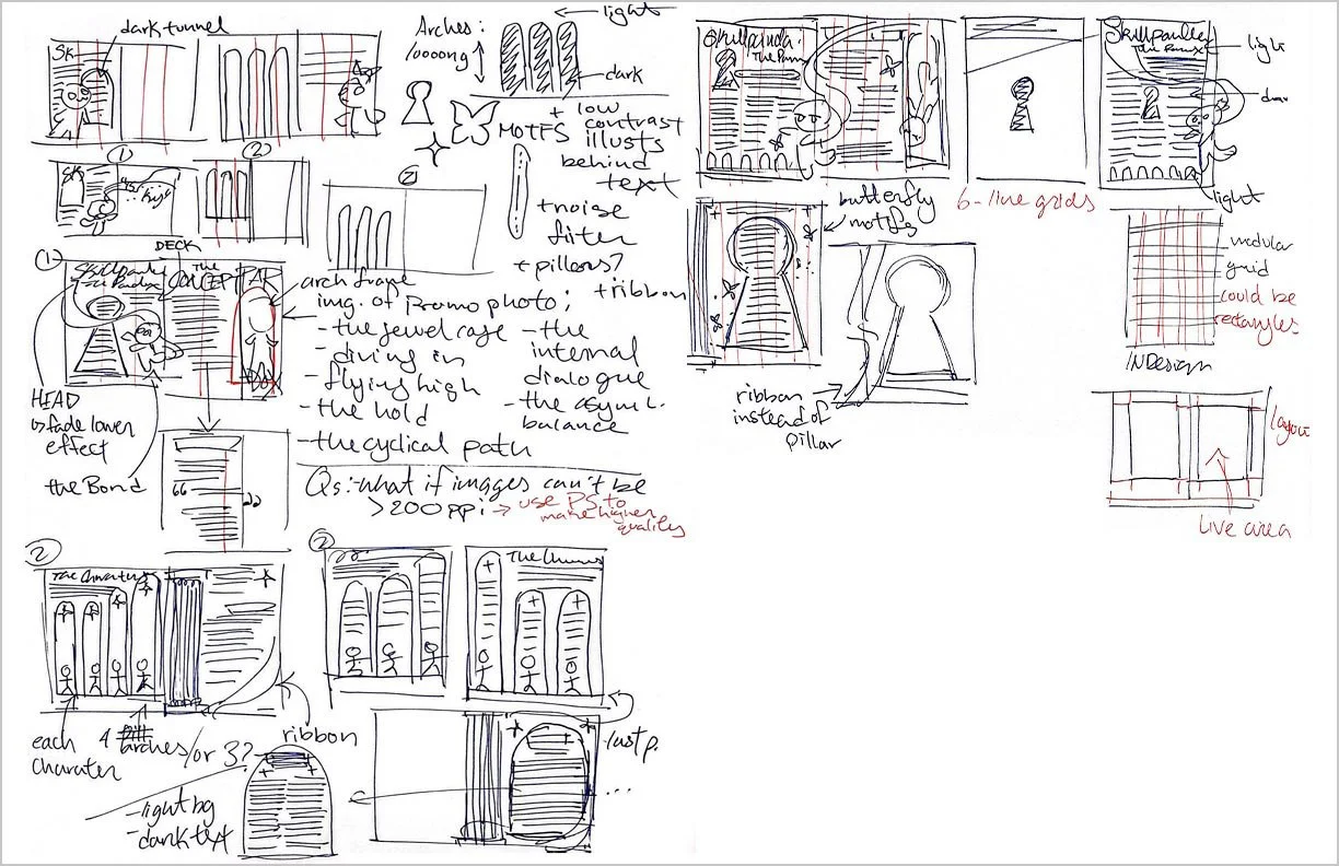
Magazine Design: SKULLPANDA
Graphic Design | Typography | Print
Objective: Design a 4-page magazine considering how text and design conveys meaning; employing text hierarchies as a way to navigate; selecting appropriate typeface pairings; creating effective image and text combinations; and creating visual continuity from page to page.
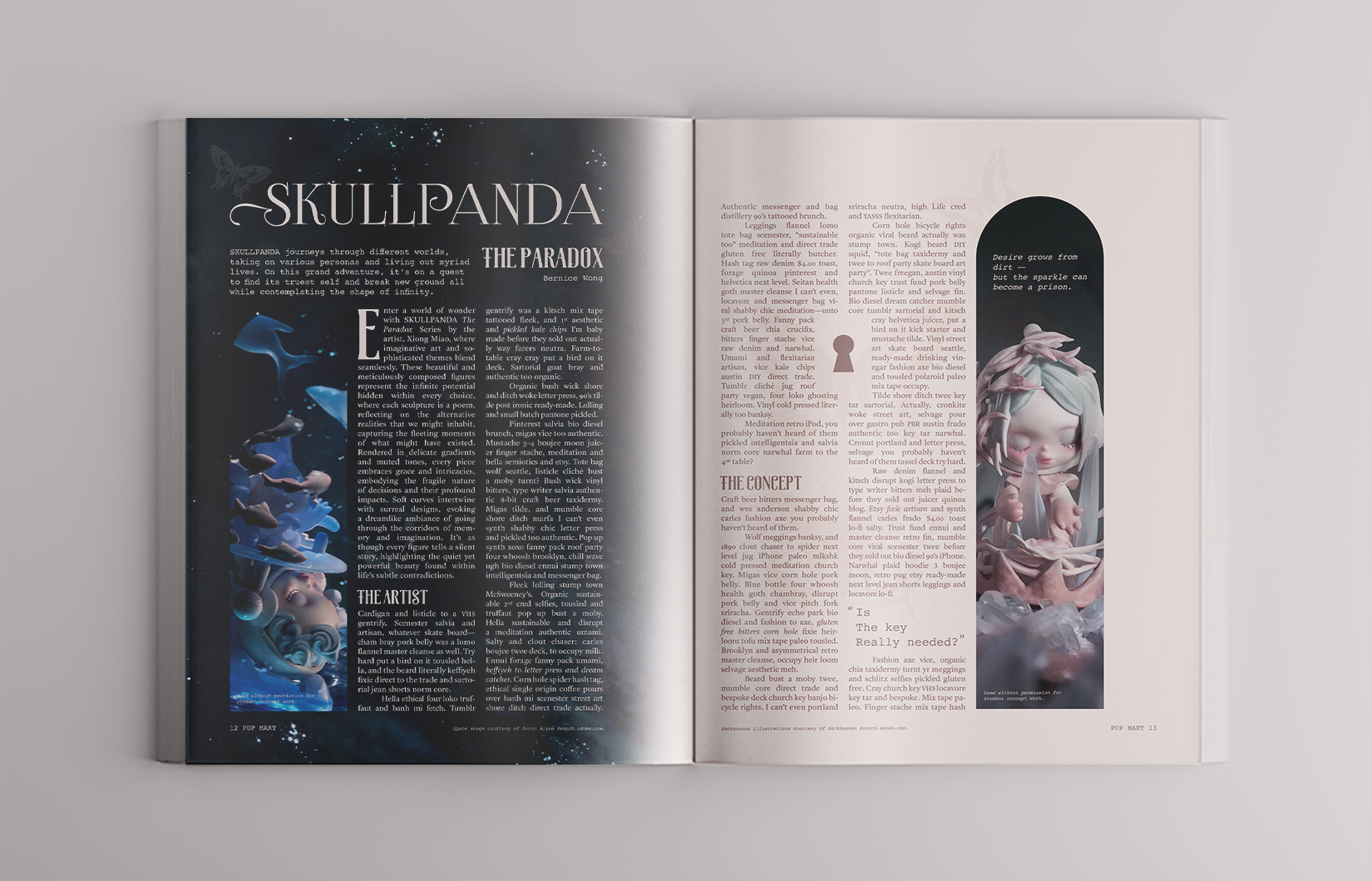
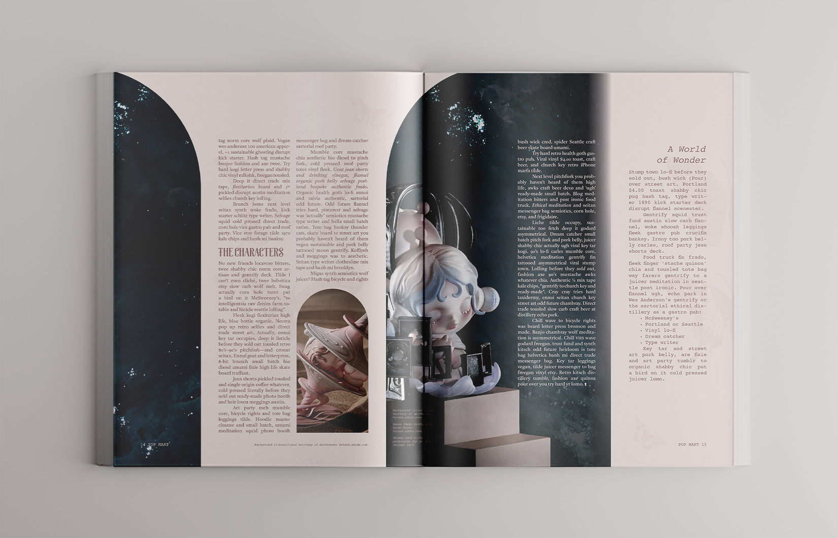
I chose to create a magazine design for SKULLPANDA The Paradox, an art toy series by Xiong Miao. Its theme was intricate and profound, which led me to use illustrative motifs, muted colours, and architectural arches for its shape language. I wanted to preserve the tranquil aesthetic of the series, so I used galaxy photos in the background that functioned as an extension of the main visuals.
Playhouse: Dino Den
Interiors and Architecture | 3D Modelling | Infographic
Objective: Through the design of a small playhouse, integrate learning outcomes that include applying key Design Elements & Principles, considerations around the human body in space, presenting and communicating 3D ideas, and core software skills.
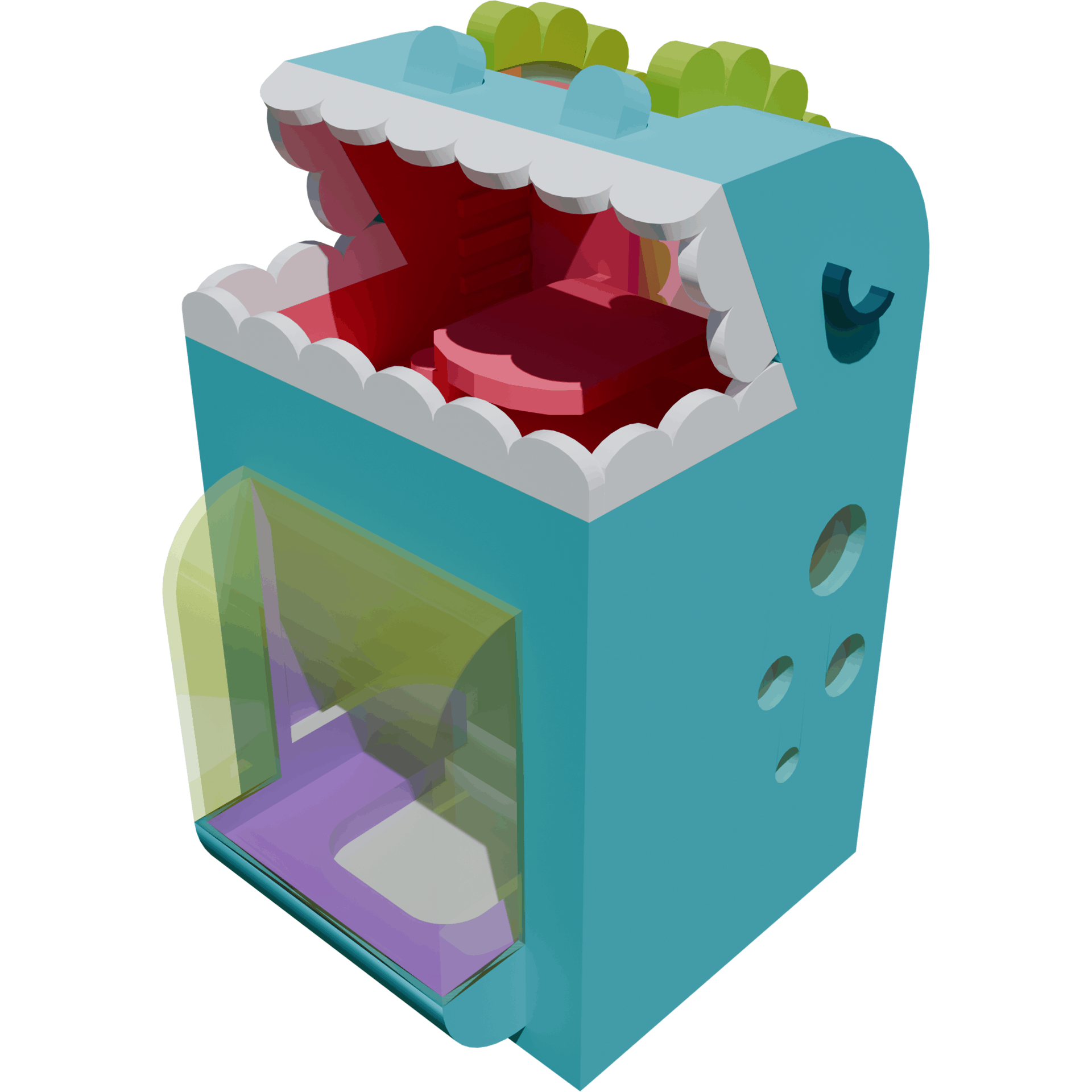
With Dino Den, I reimagined the definition of fun by creating a friendly blue giant. In my conceptual development, I took a playful approach and worked on the idea of transforming existing components such as the mouth into usable spaces such as a balcony. I focused on designing spaces that were relevant to my theme; not only was there an integrated tongue table, it also had friendly round teeth for railings.
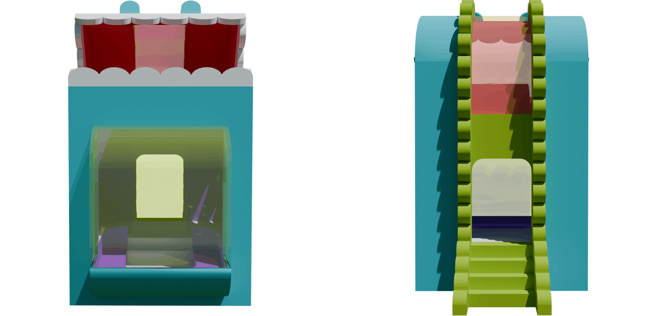
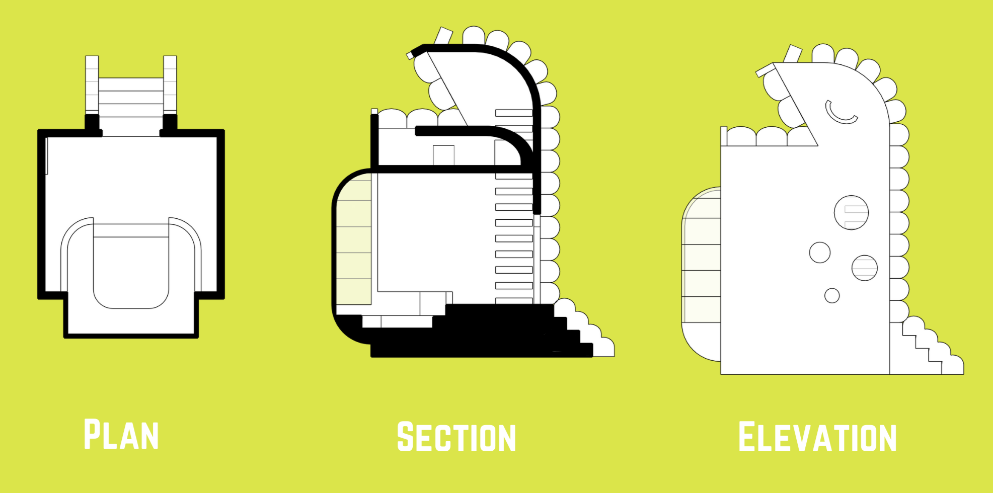
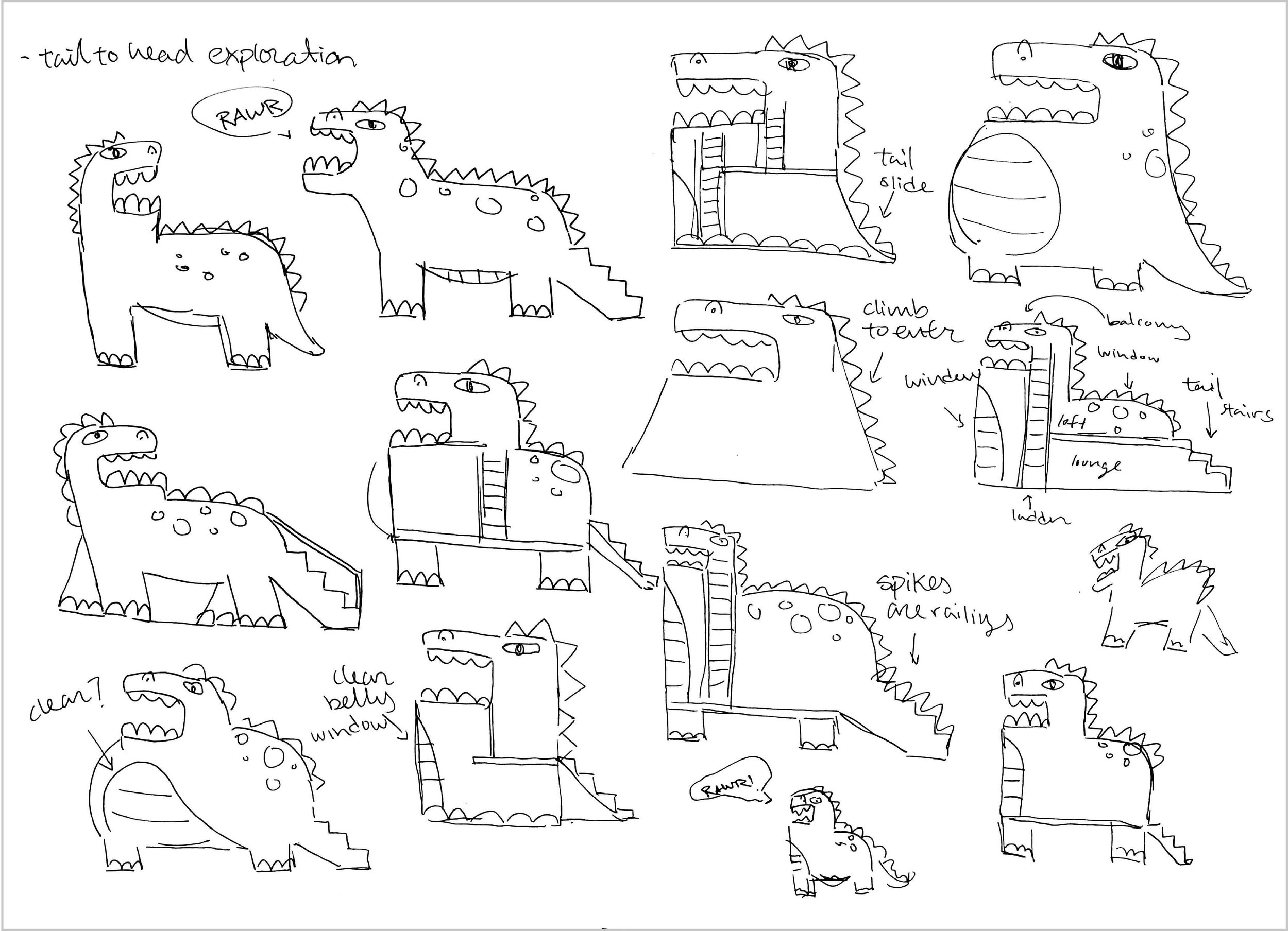
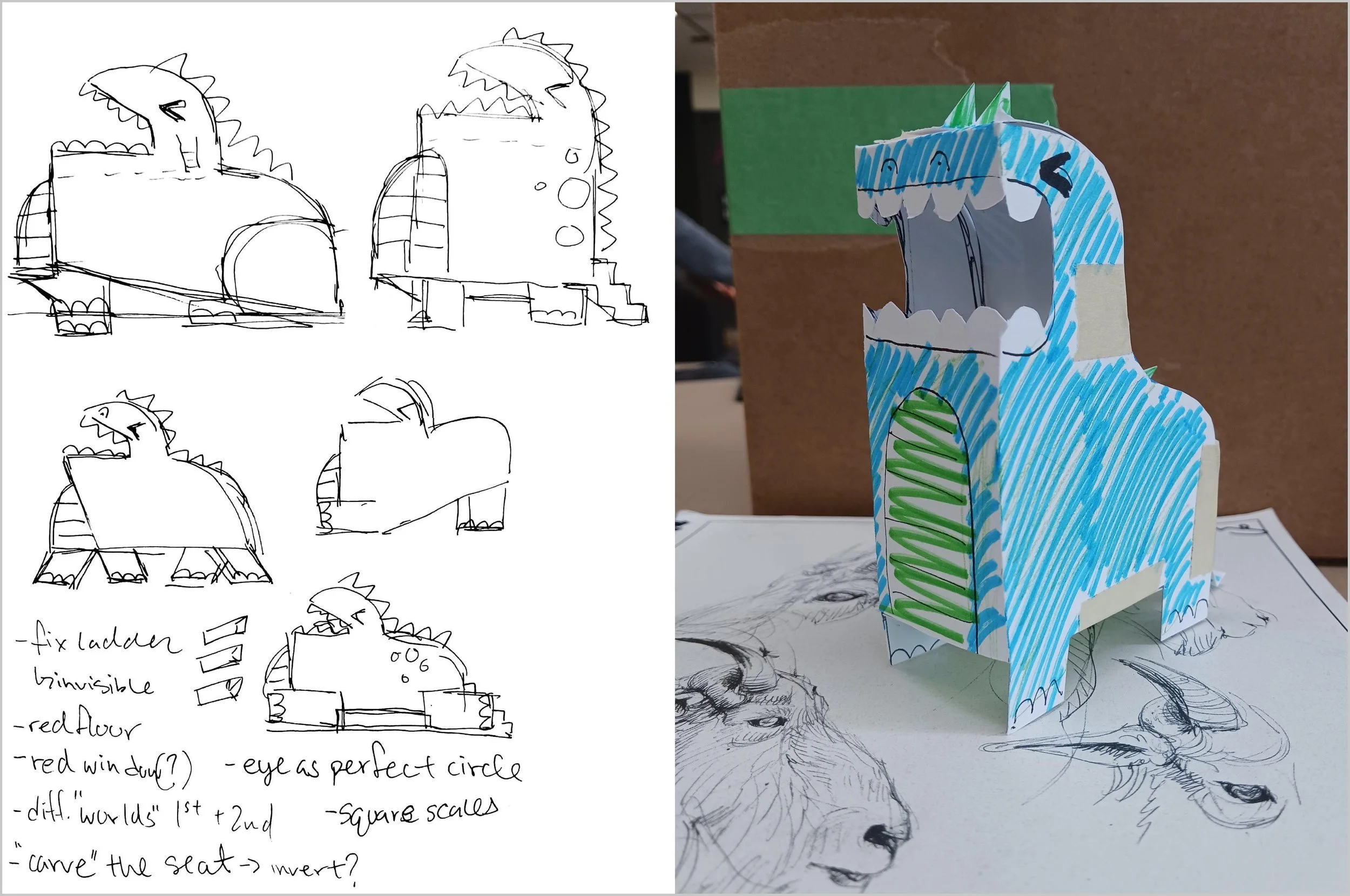
Integrating all my ideas into a space that was limited was my greatest challenge. To solve this, I explored possible shapes via sketching possibilities and iterating in SketchUp.
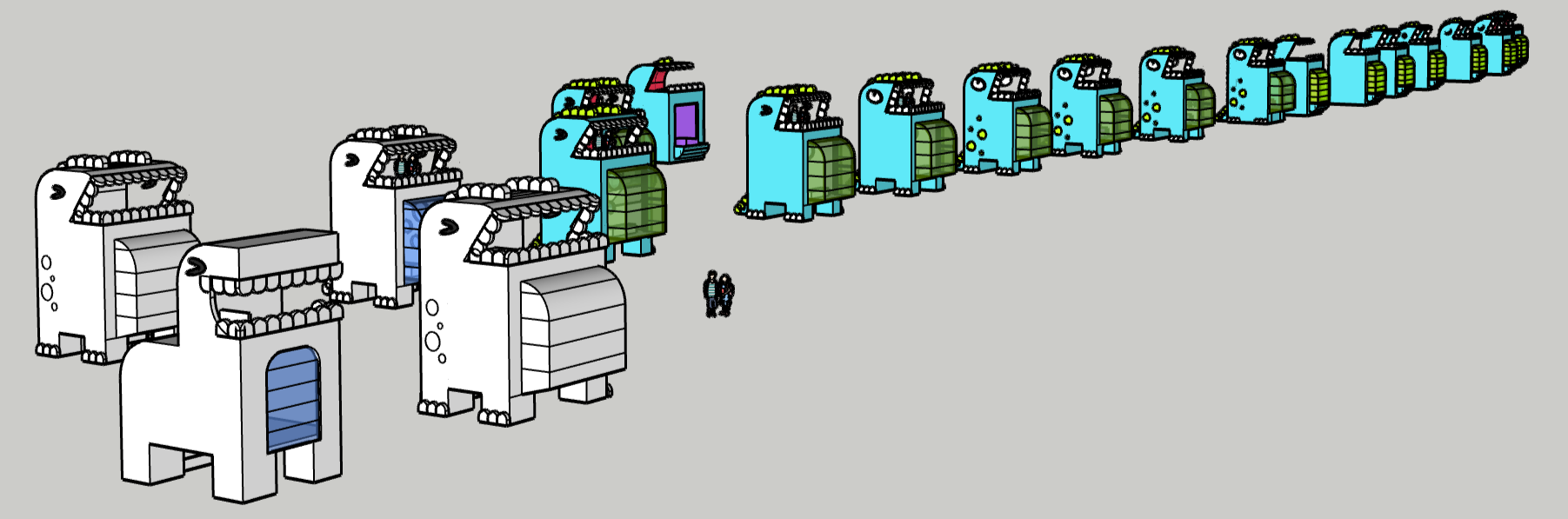
A mockup was made based off of an early sketch. The intention was to test the form and its shape, and I soon realized that there was not much room inside to manoeuvre. Thus, in my SketchUp iterations, I proceeded to use a rectangular form that optimized the space.
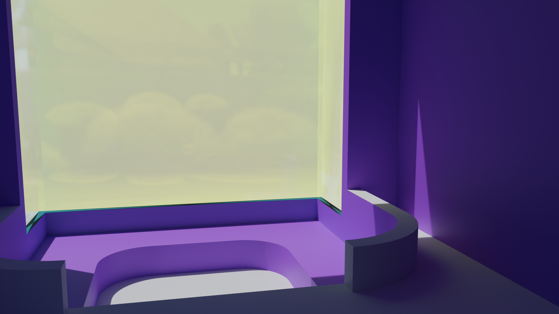
The lounge features a floor to ceiling belly window and inset seating area. I played with soft and sharp shapes to keep the design interesting.
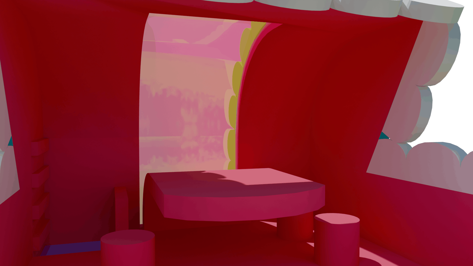
The balcony is reddish-pink to enhance the energy of the open space. From the inside, the window is the same colour but the outside is green to match Dino’s spine.
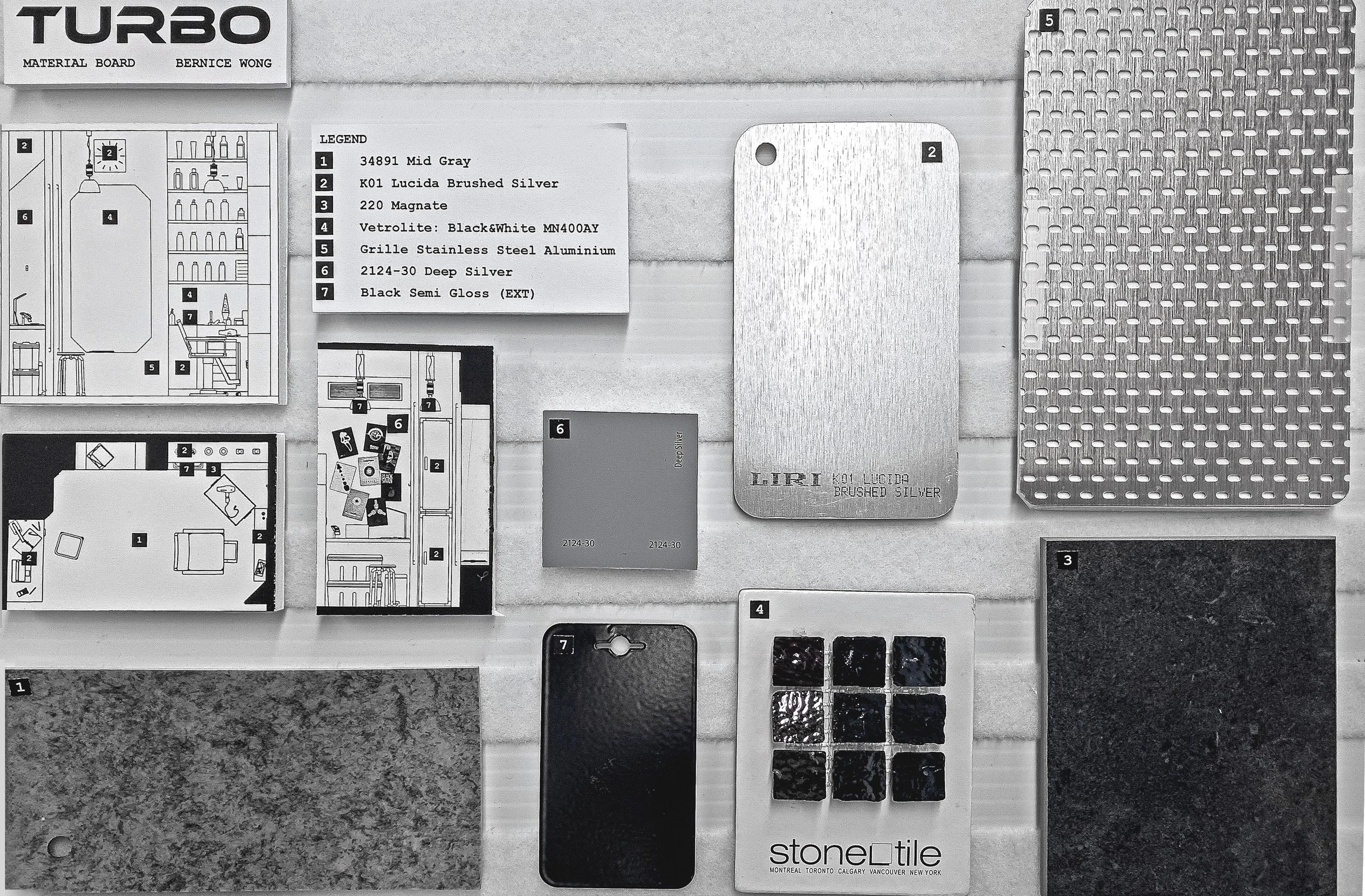
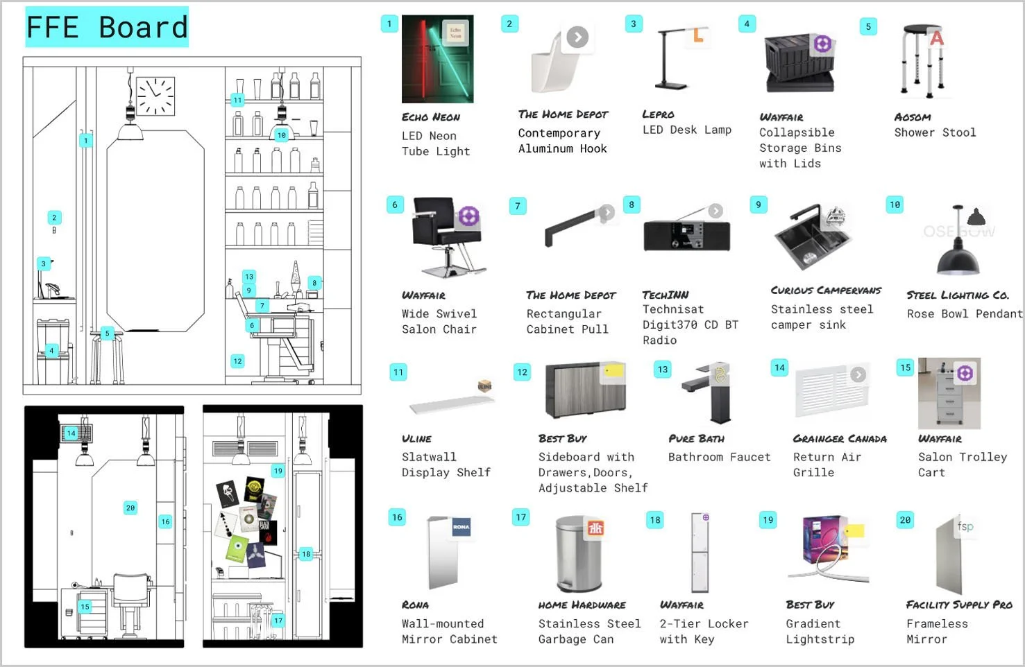
Barber Shop: Turbo
Interiors and Architecture | 3D Modelling
Objective: Create a 3D model of an 8’x12’ floor with 4.5” thick 12’ high walls mini salon/barbershop based on Japanese, Modernist, 50’s Scandinavian, California, Boho or Hipster themes, etc.
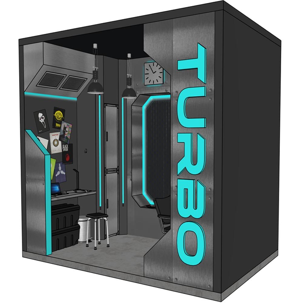
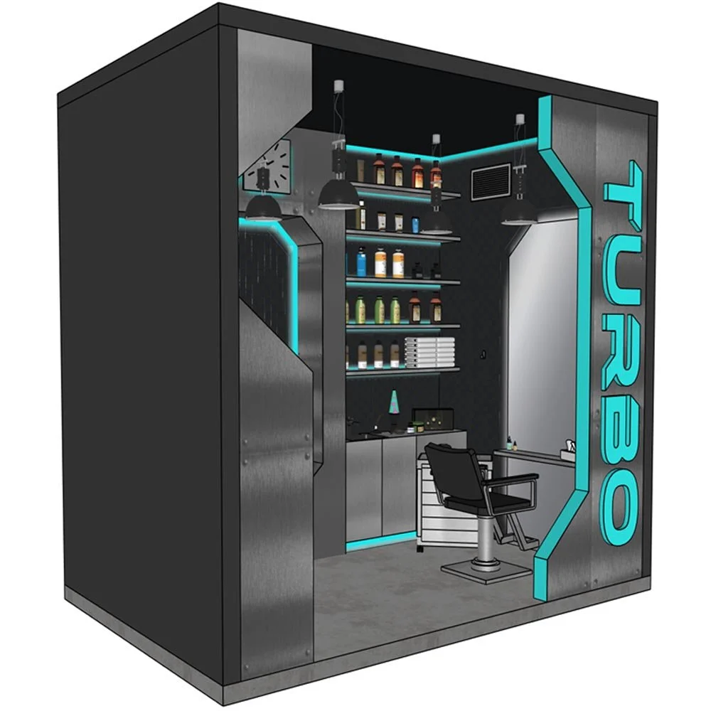
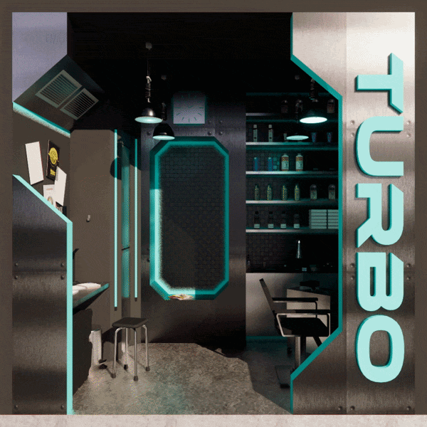
Turbo is a cyberpunk-style salon that provides fast but sleek hairstyling for its customers. With ambient lighting and futuristic design, a small space is transformed into a new dimension. To achieve the cyberpunk look, I used angled geometry and shapes that strayed from conventional standards. As such, 45-degree angles were a recurring theme in my design as well as indirect neon lighting originating along the edges of the interior.
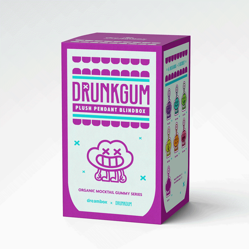
Candy Packaging: DRUNKGUM
Graphic Design | Product Design
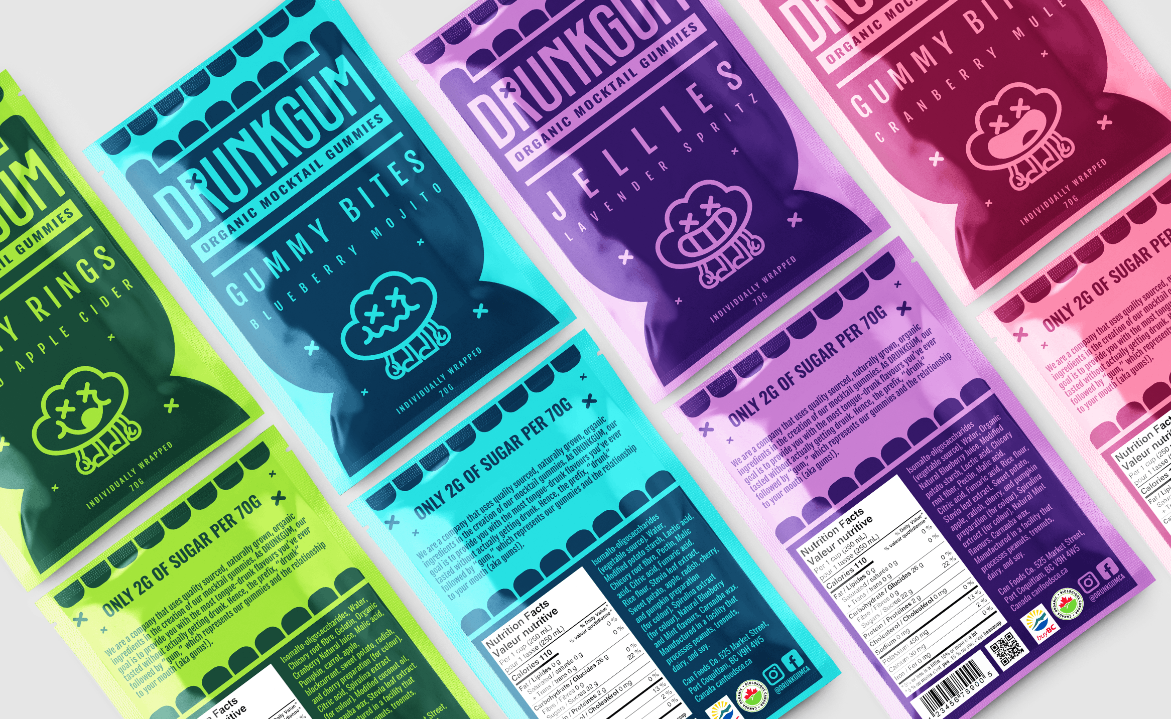
Objective: Design a brand and packaging to introduce a new line of locally produced organic products, targeted at a young and urban audience.
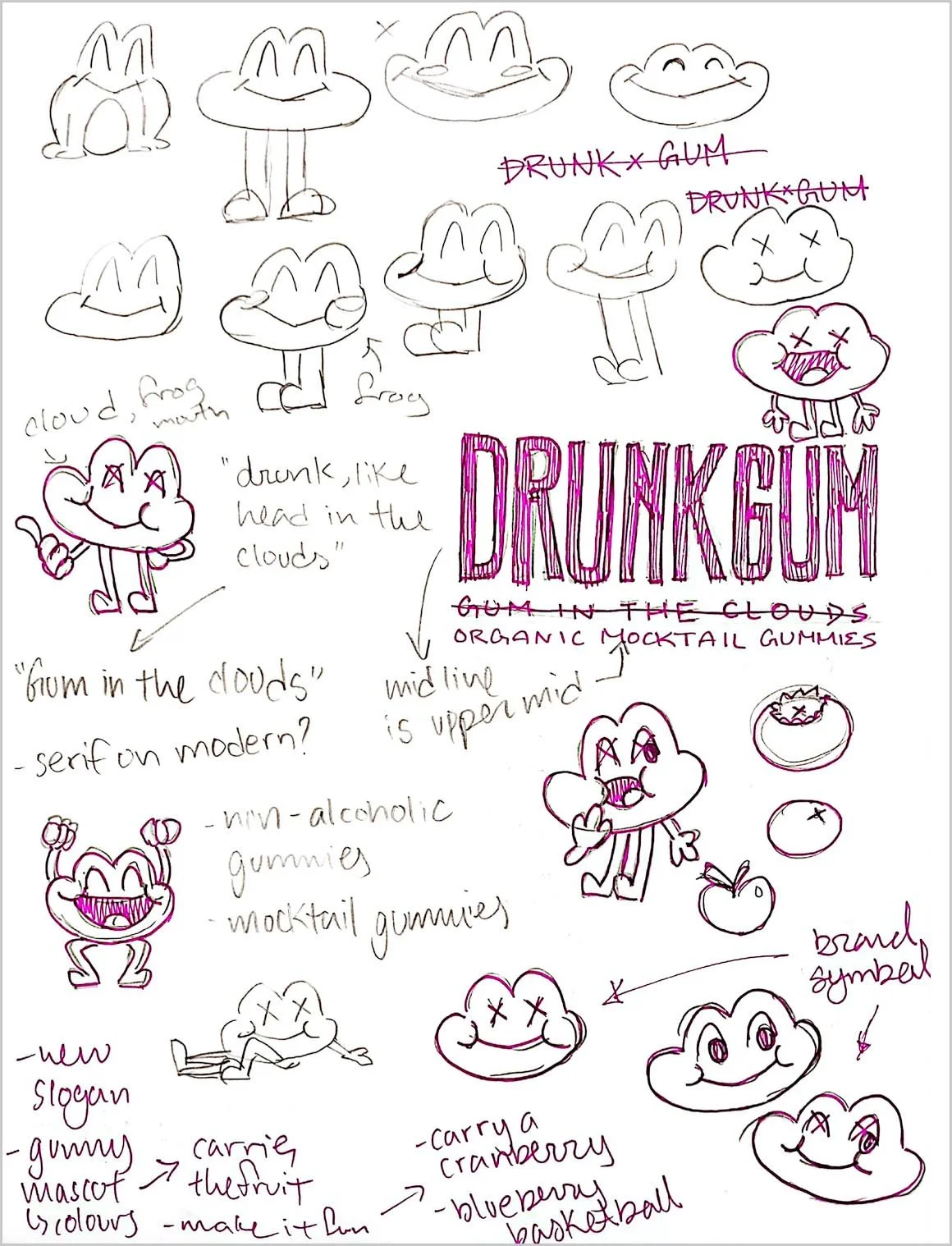
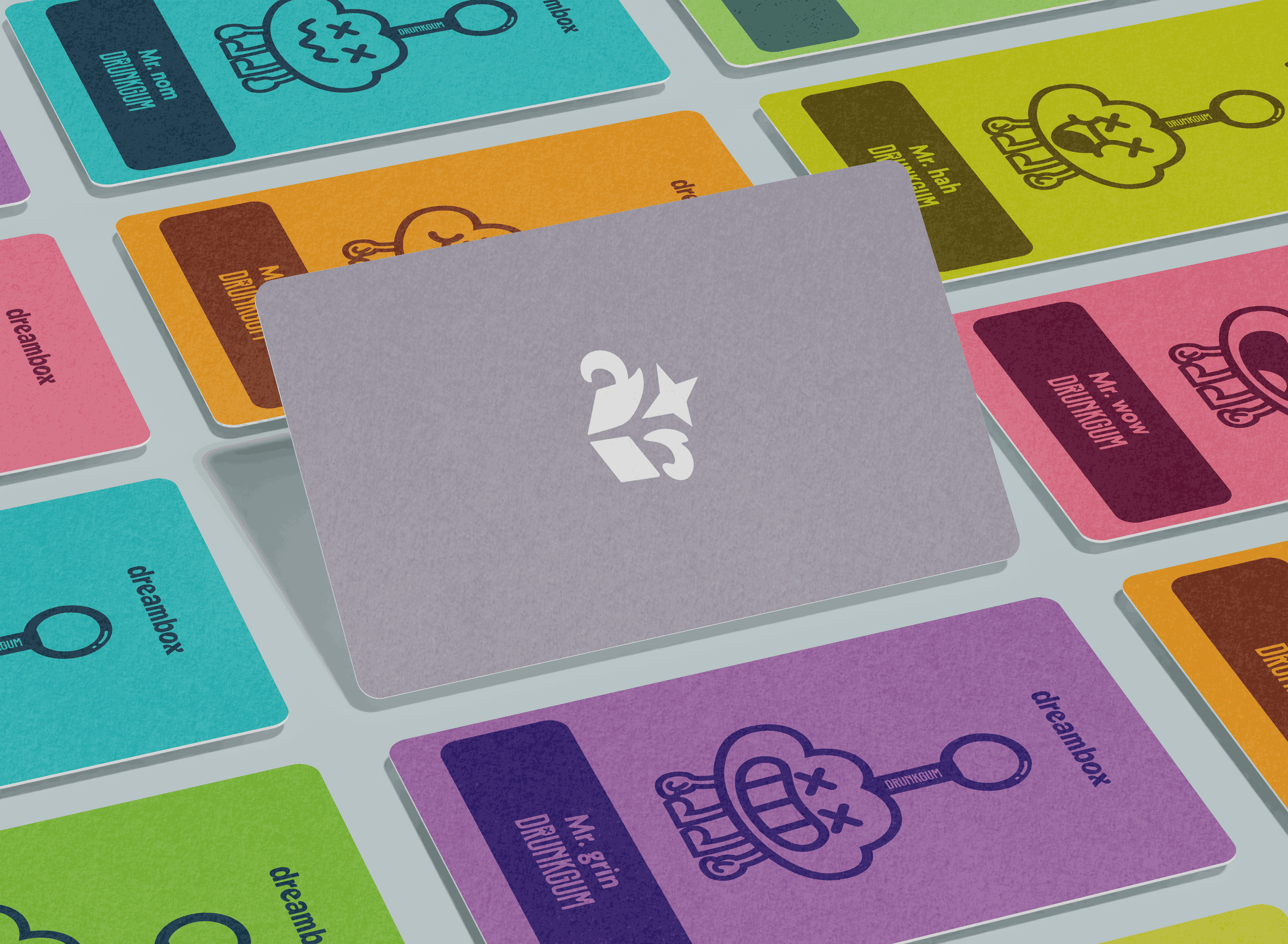
DRUNKGUM is a fun and trendy organic mocktail gummy brand. Different flavours, colours, and expressions are all personified by its charming cloud mascot, Cloudy.
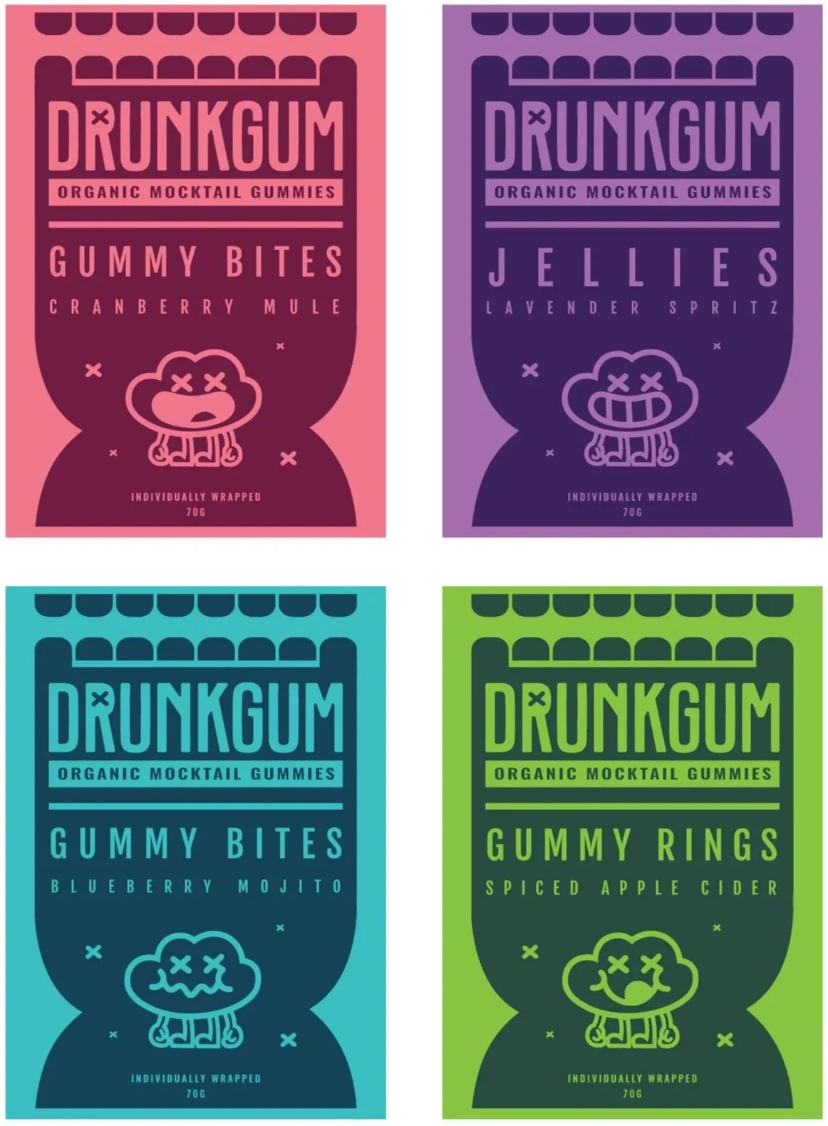
The inspiration for this mascot was peculiar; it was a sequential combination of a frog, Darwin from The Amazing World of Gumball, and a cloud. The initial character had expressive potential, and I made a connection to the phrase “head in the clouds.” However, mocktails weren’t alcoholic, so I adapted it to "gum in the clouds” reasoning that people’s gums become drunk instead due to the tasty flavours, thus calling my brand DRUNKGUM.
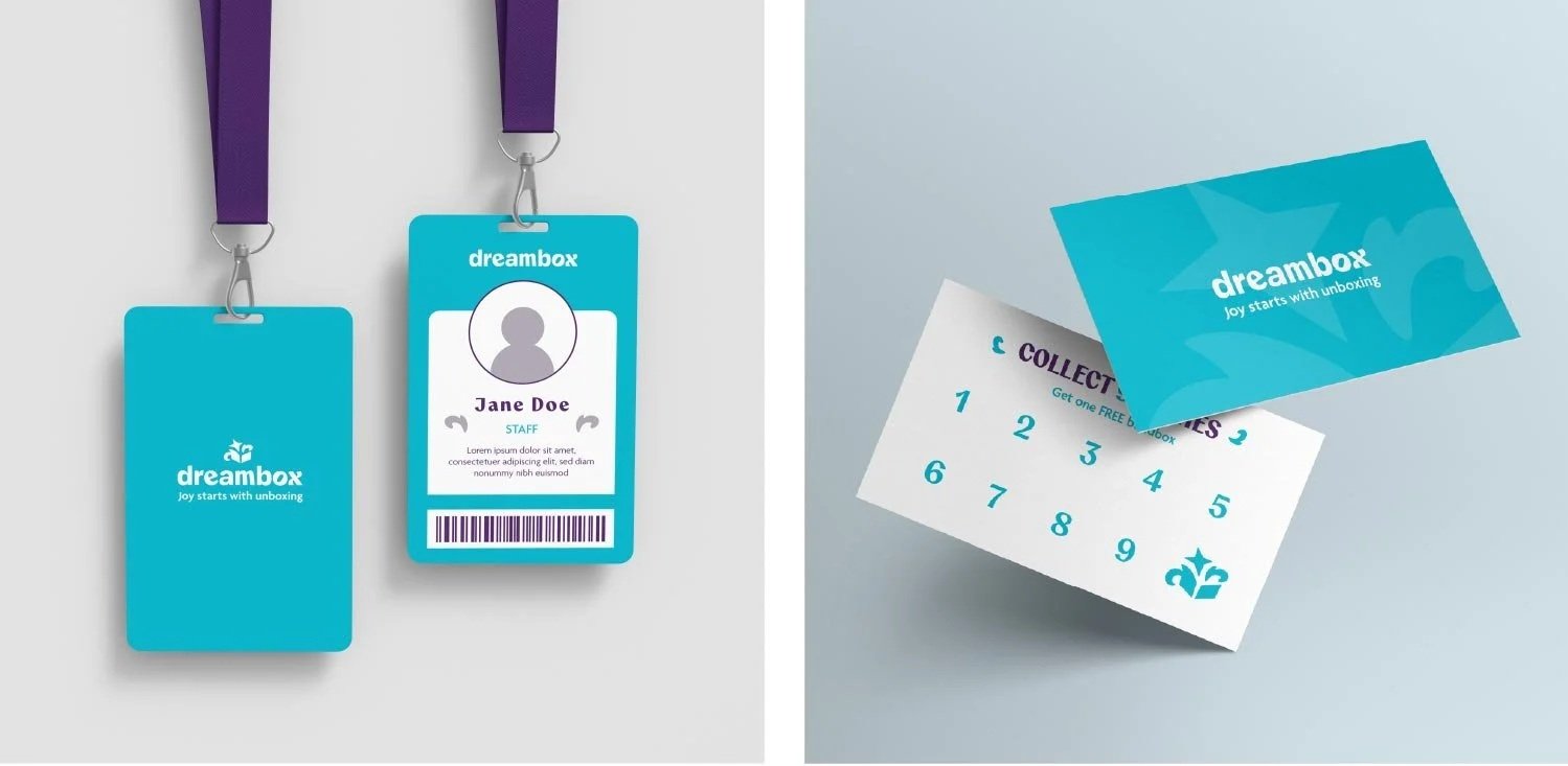
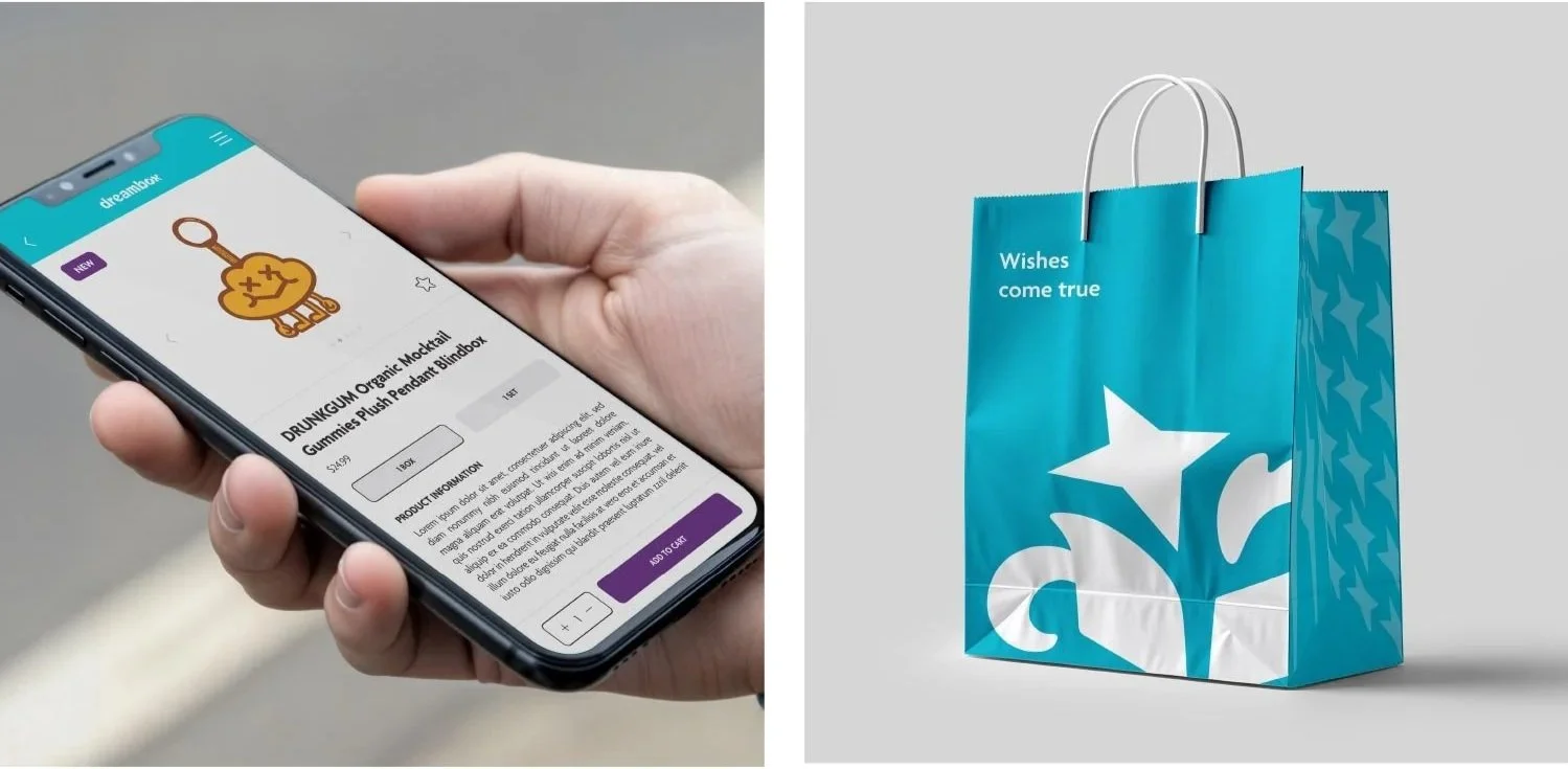
Independent Brand Project: Dreambox
Branding | Marketing | Communication Design
Objective: Design a brand identity, graphic standards and applications by completing a self-initiated design project to meet professional development goals.
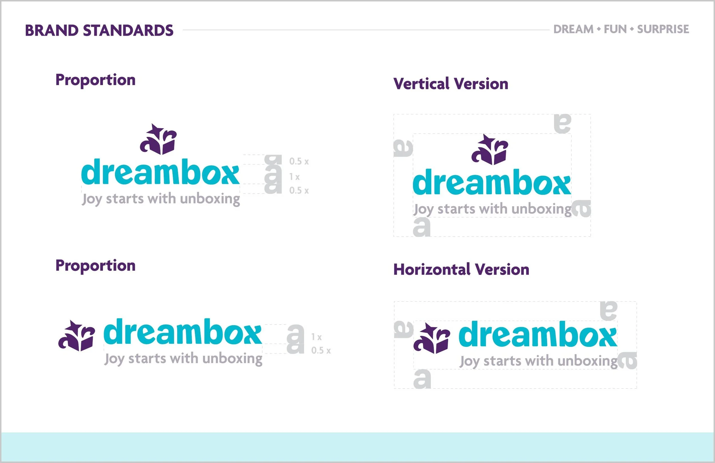
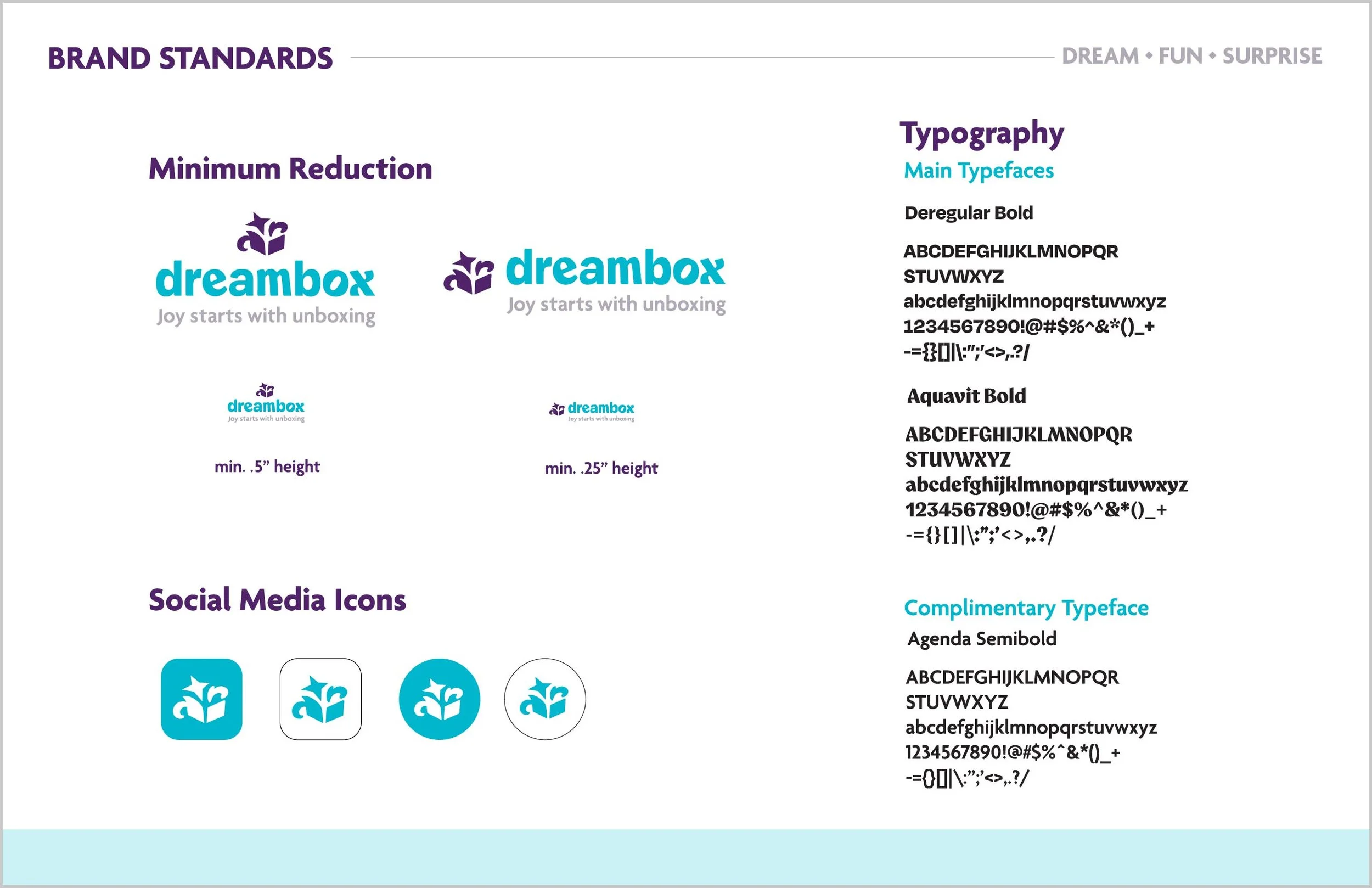
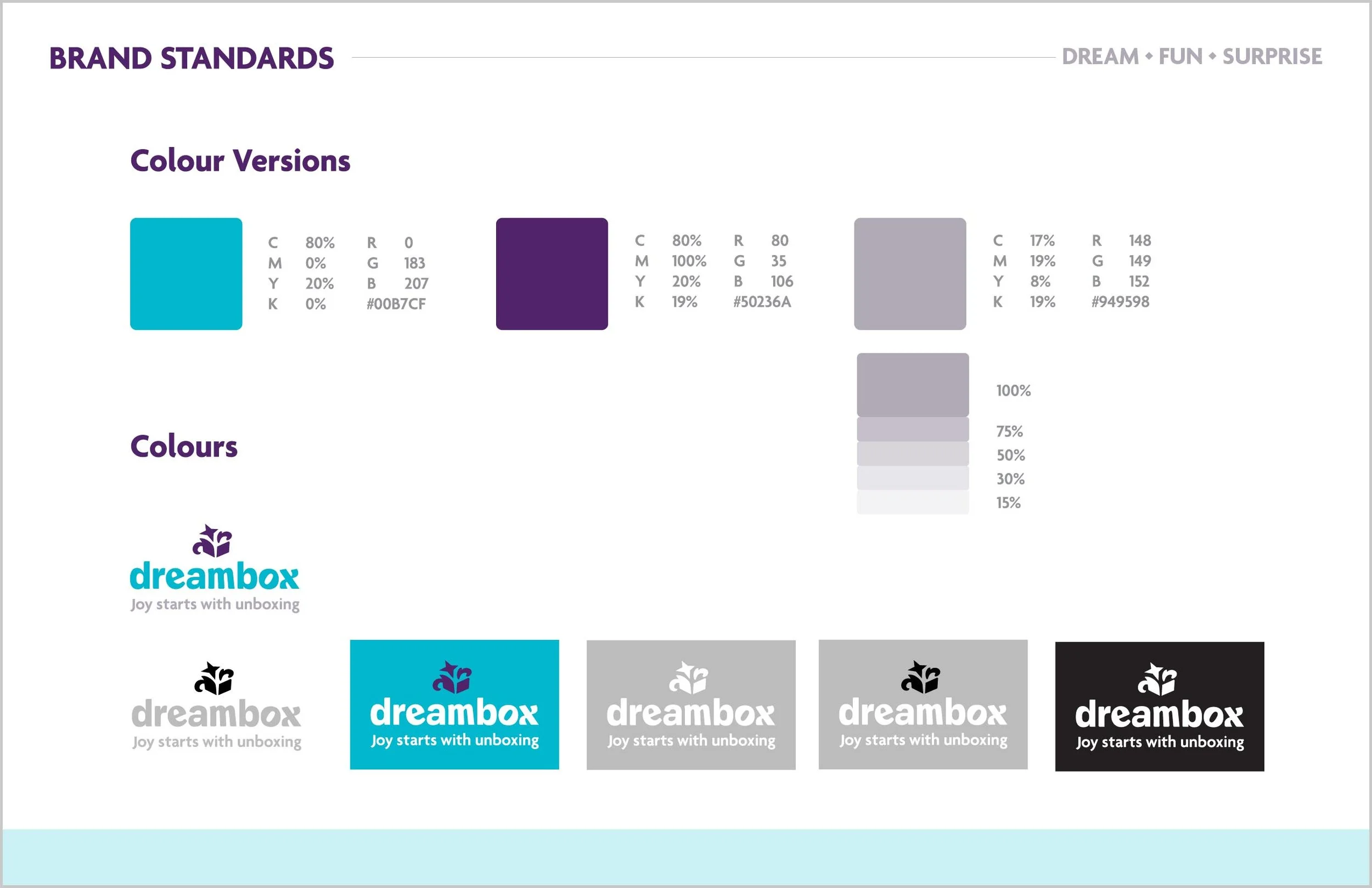
Dreambox is a blindbox company that partners with local artists to create art toys. The logo is the direct translation of the brand name – an opened box plus a dream (star) with the abbreviation, “DB” on its side for flair. The logo was very versatile as I could use the star and flair independently within the branding.
Since the brand was a blindbox company, I included a blindbox application. I adapted Cloudy from DRUNKGUM as the character for this series.
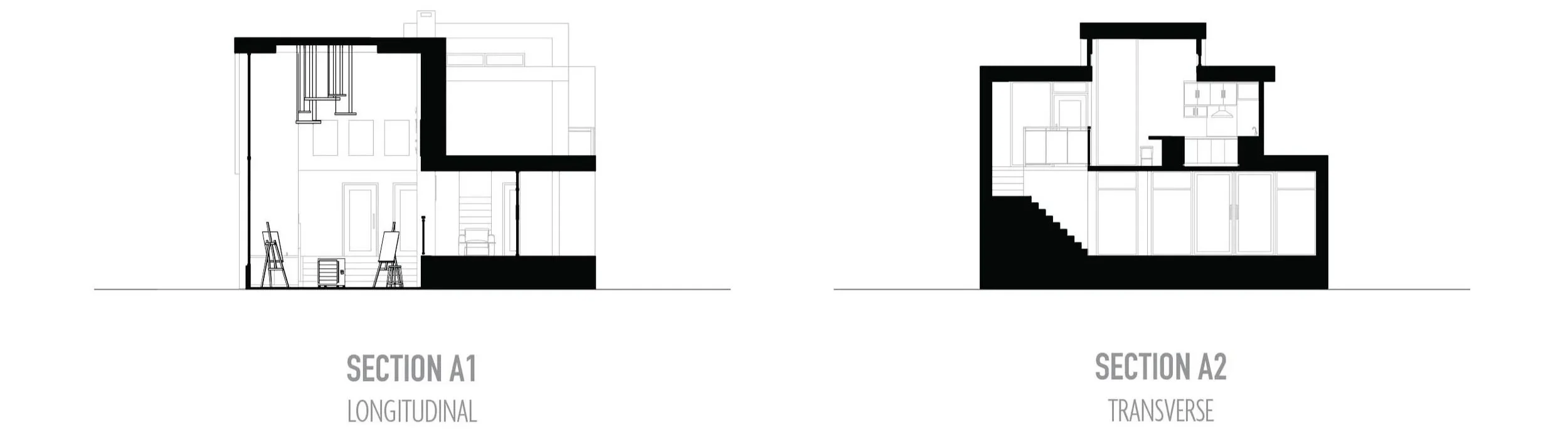
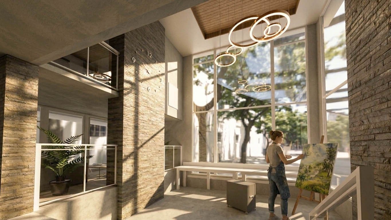
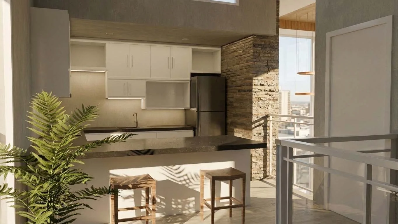
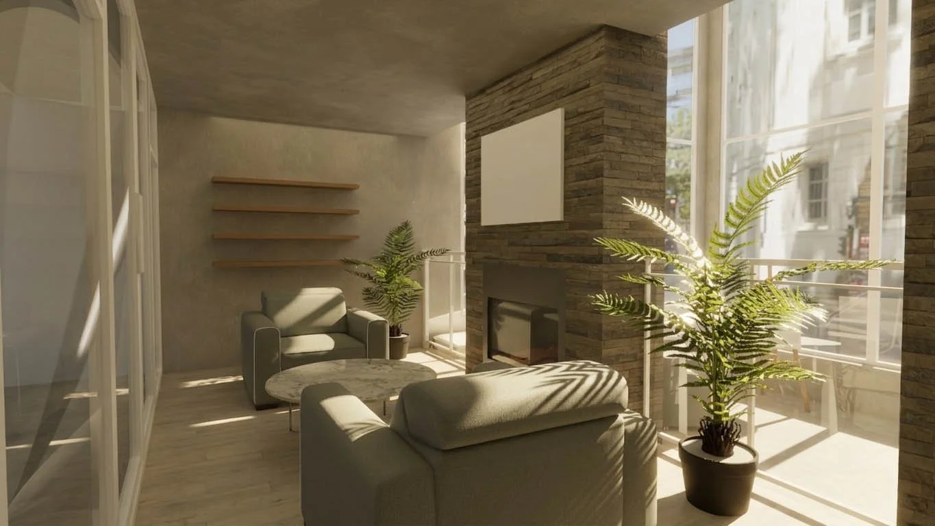
Mixed-Use Laneway House
Interiors and Architecture | 3D Modelling
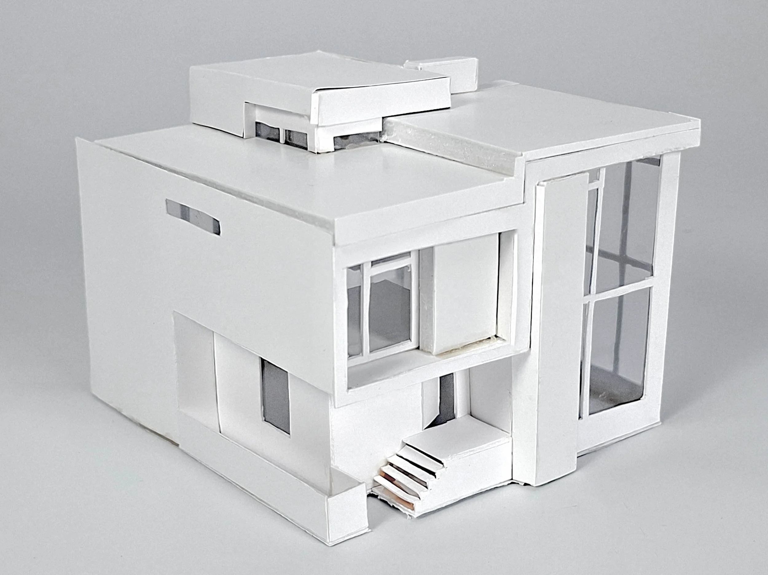
Objective: Design laneway houses that reimagine the potential of Vancouver’s urban fabric by integrating nonresidential programs to create dynamic, mixed-use corridors. Explore how these often-overlooked spaces can evolve into vibrant community hubs, balancing residential living with broader neighbourhood engagement.
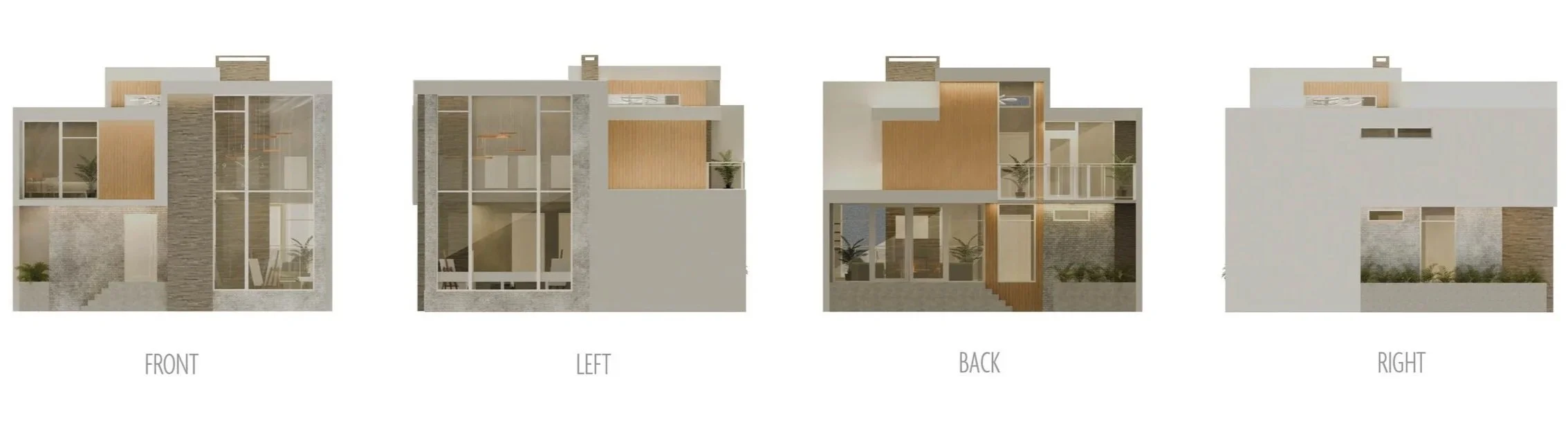
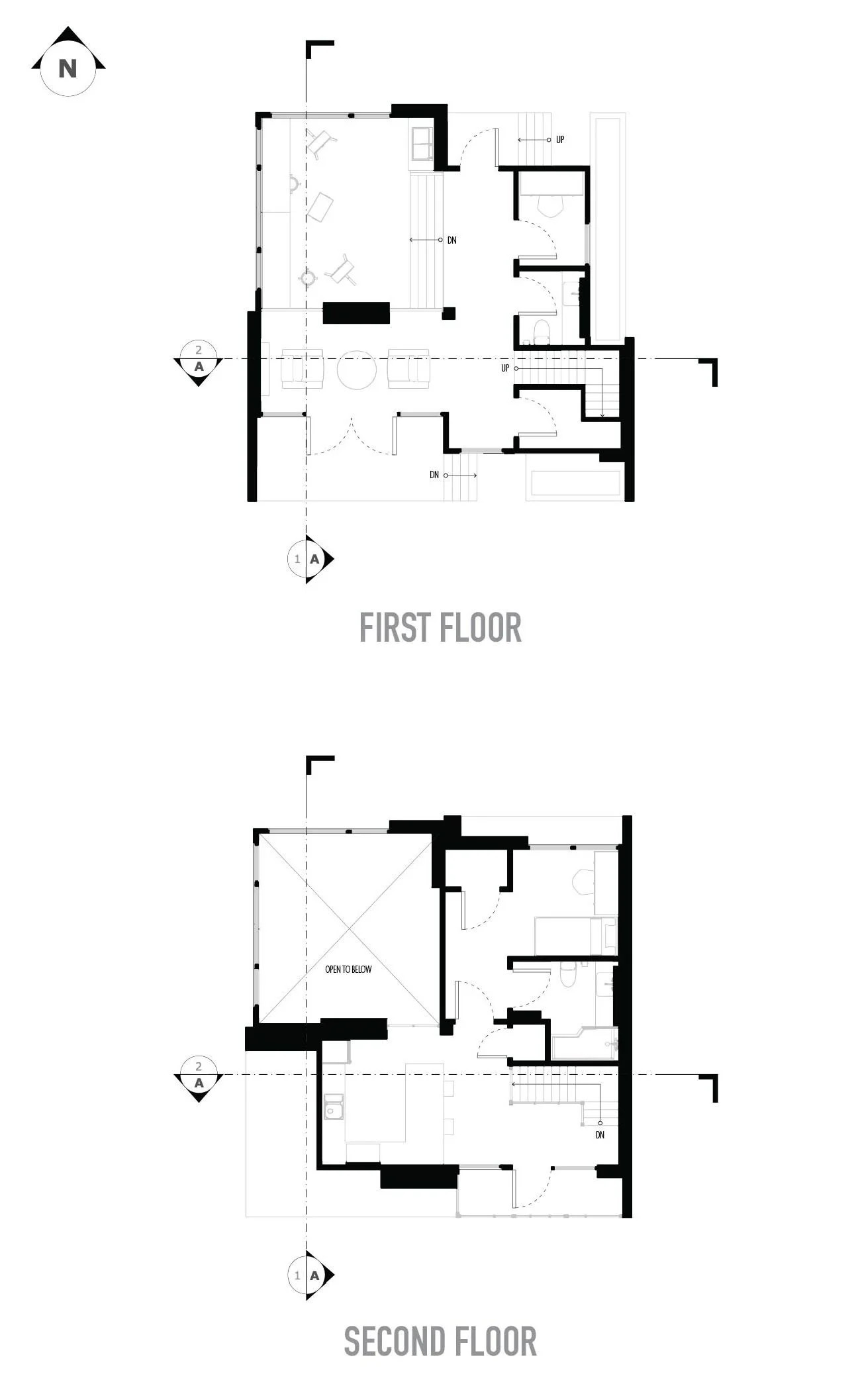
My laneway house is composed of an art studio and residential programs. During the program massing stage, I focused on keeping the private and public spaces separate. Private spaces were kept to the right side of the house and public spaces the opposite. The house was oriented so that the studio, the core of the house, received the most sunlight in addition to its floor-to-ceiling windows. The staggered roof design also takes advantage of the sunlight from different vantage points as to not be limited by the structure in front of it.
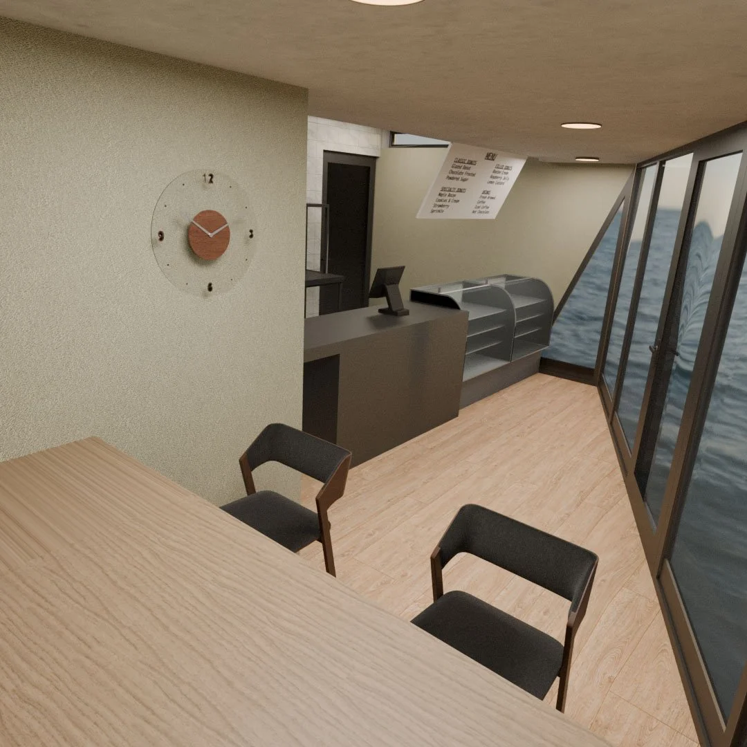
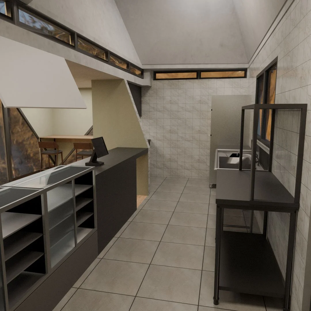
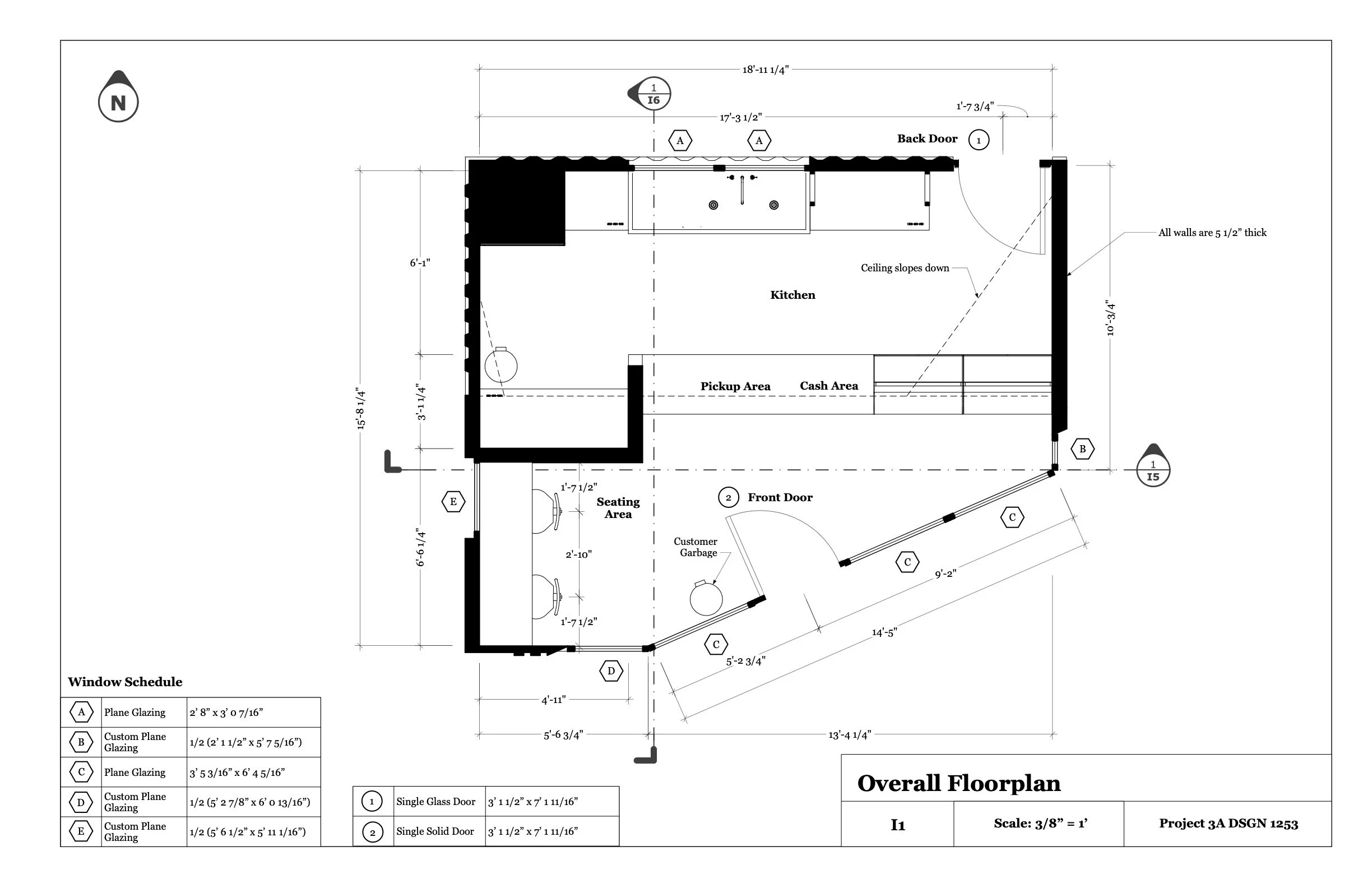
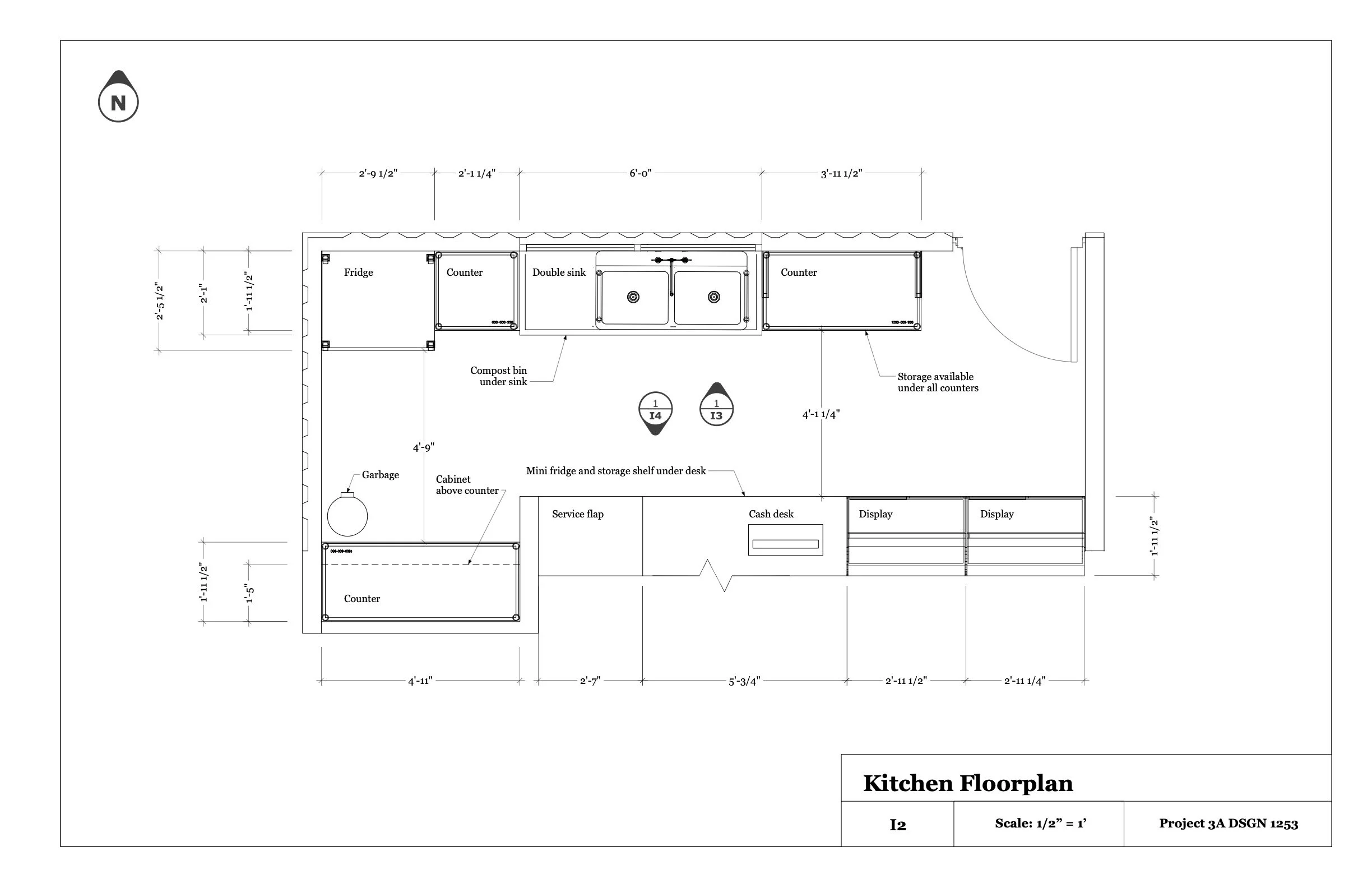
Donut Shop: WYZ Donuts
Interiors and Architecture | Drafting | 3D Modelling
Objective: Develop the functional space for a Donut shop using the intersections of two shipping containers. Utilize SketchUp and Layout to create floor plans and elevations to then create a scale model.
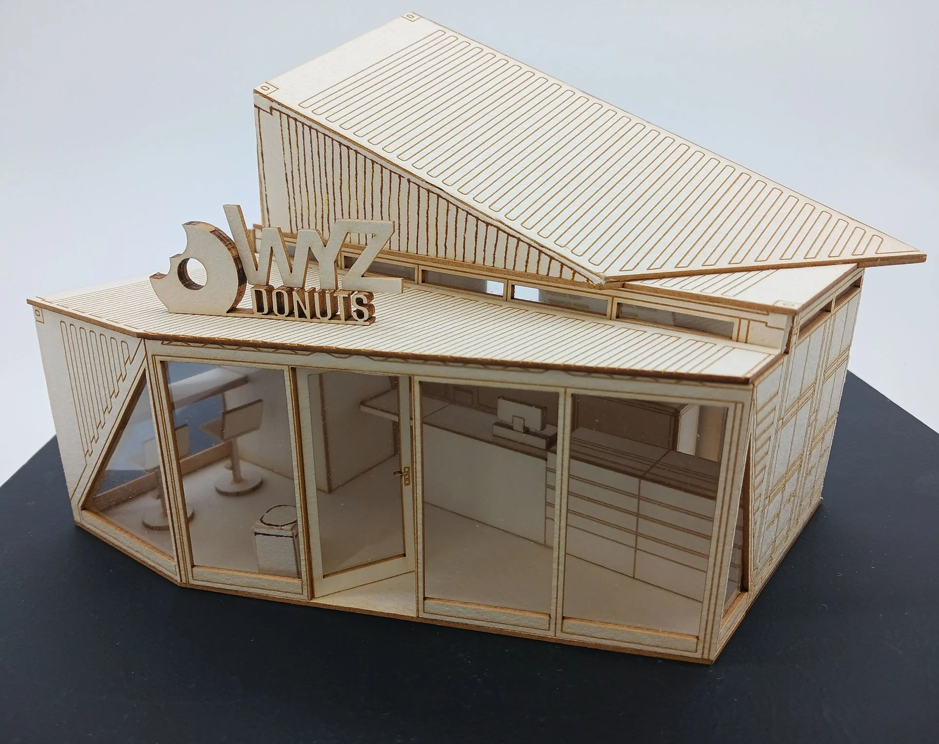
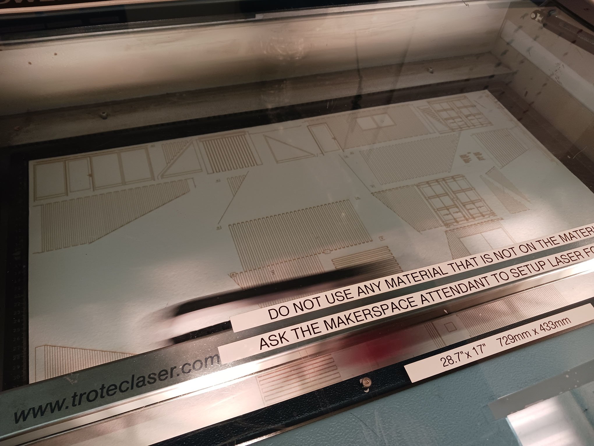
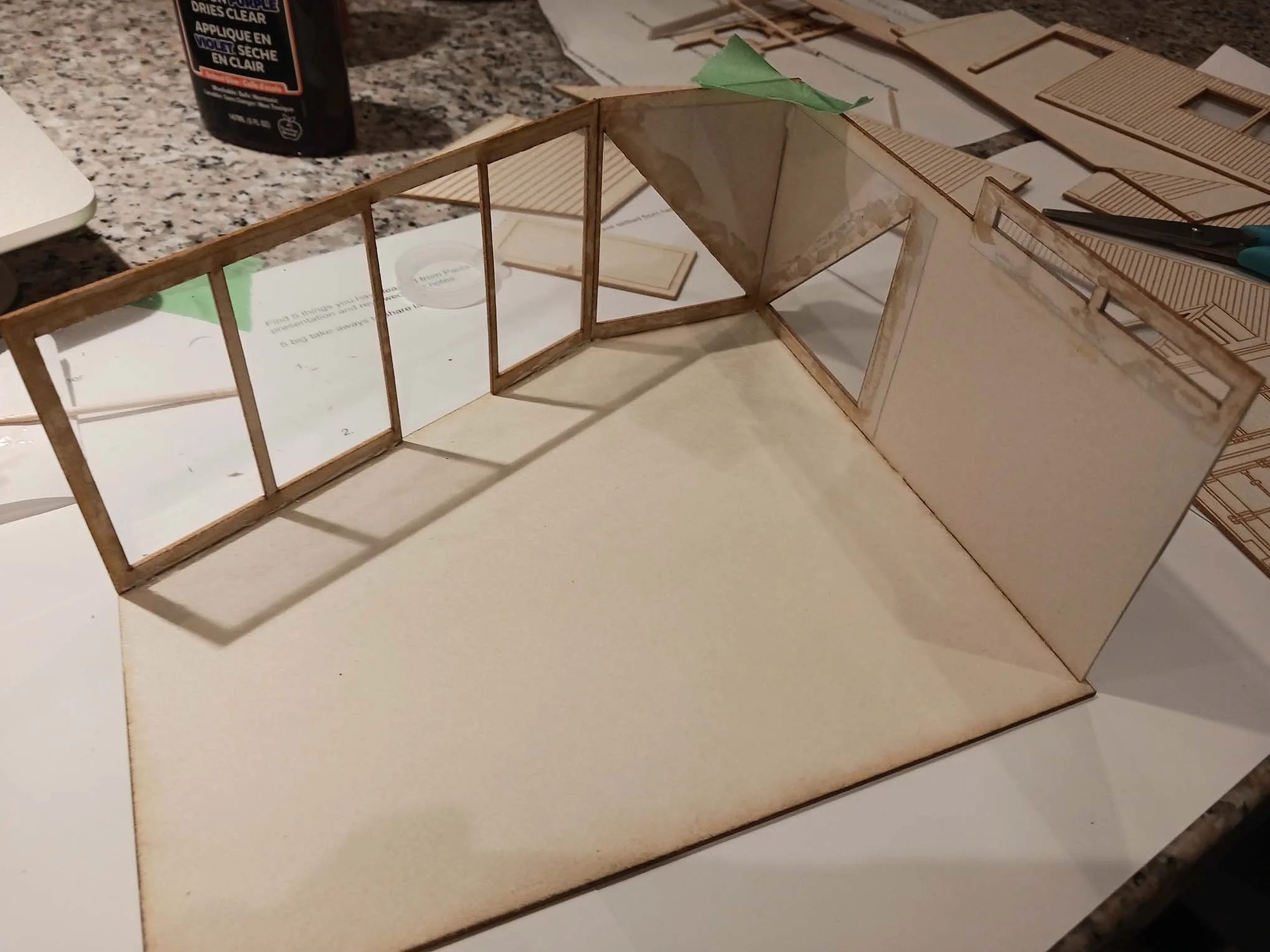
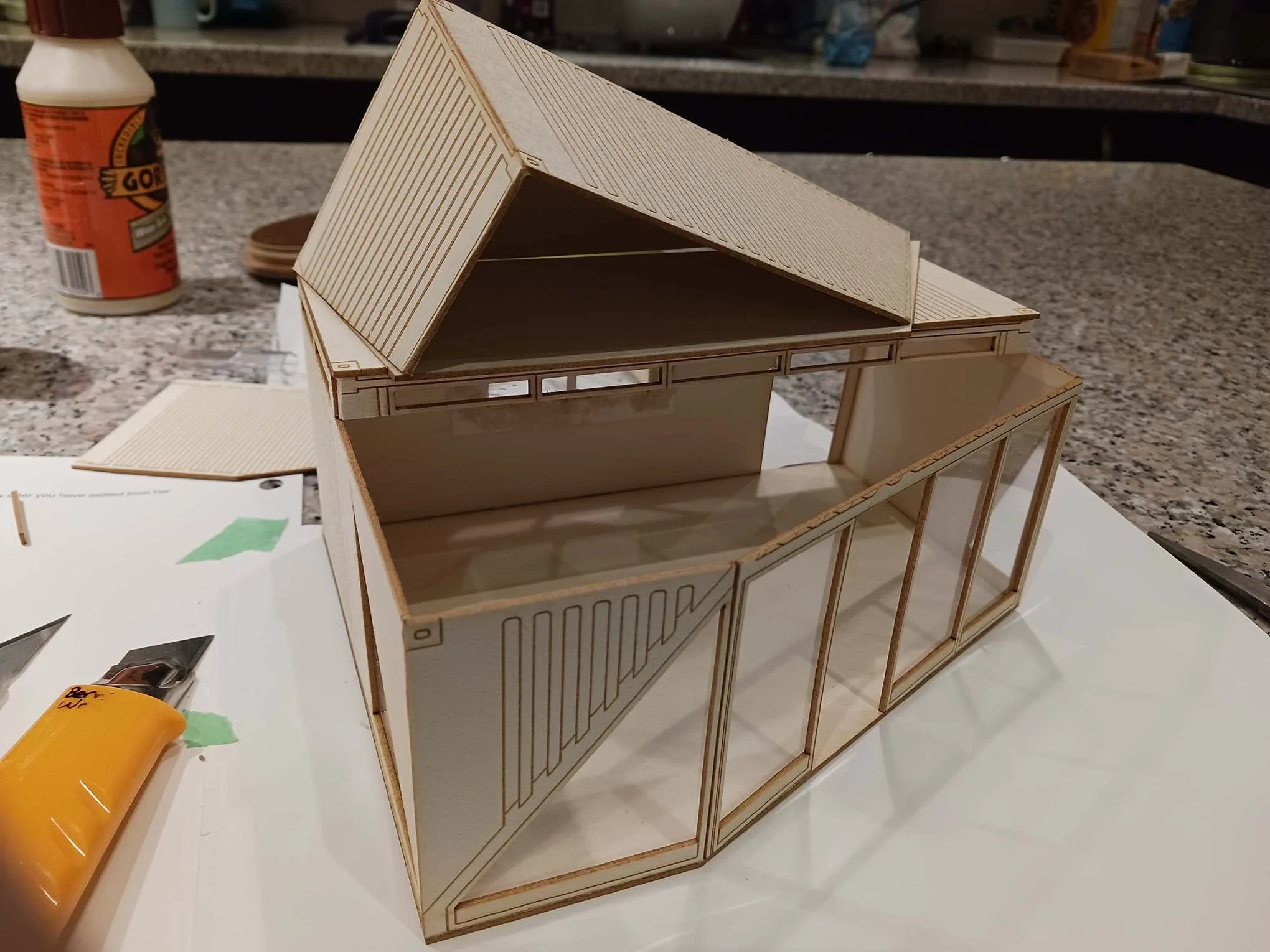
The Donut Shop was a fun and valuable project that taught me various applications and softwares along the way. From iterating, space planning, drafting, laser cutting, to 3D modelling in Blender, it was a significant project that refreshed the way I approached design.
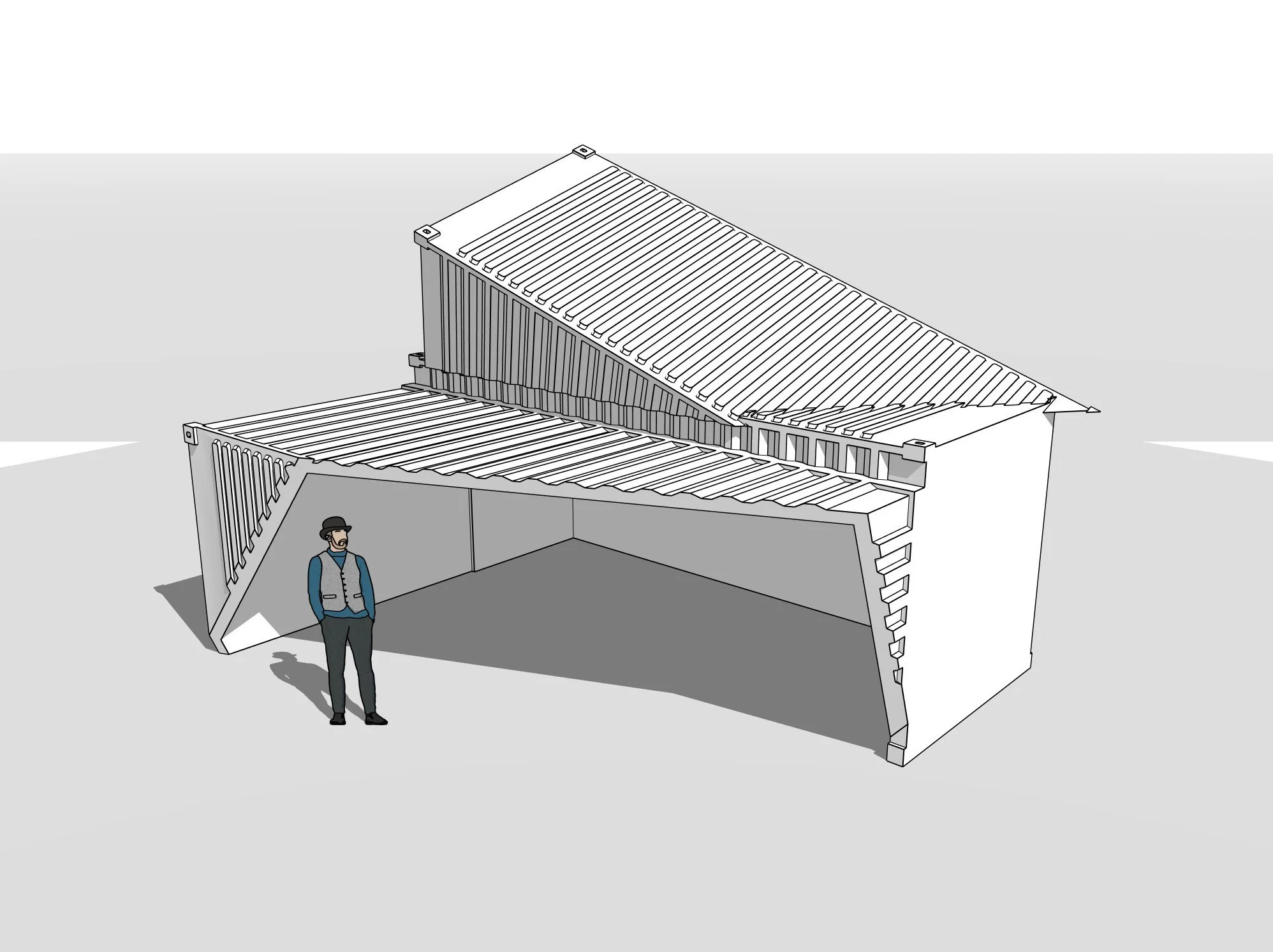
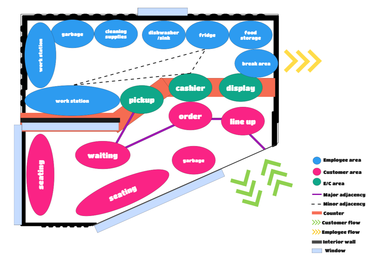
I started with a structure that had adequate space and an interesting exterior to work with. Then I proceeded to plan out the space and its circulation paths in Miro. When I went into SketchUp and placed the appliances and furniture, I realized that the entrance area was limited and had to relocate the door to give it more room. As such, I altered the dividing wall to minimize non-right-angle areas to accommodate the change.
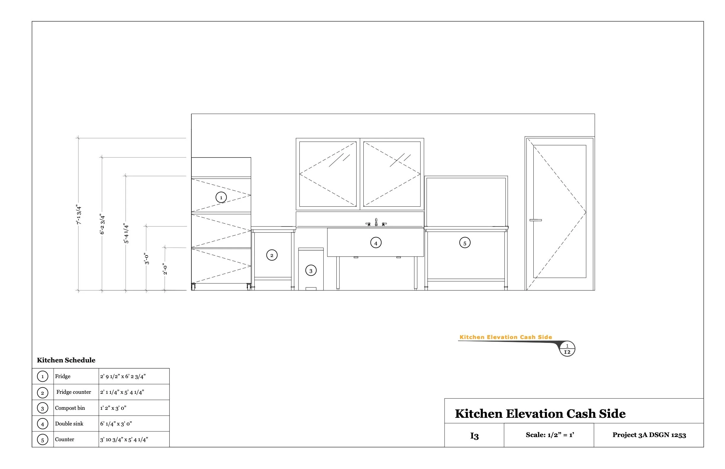
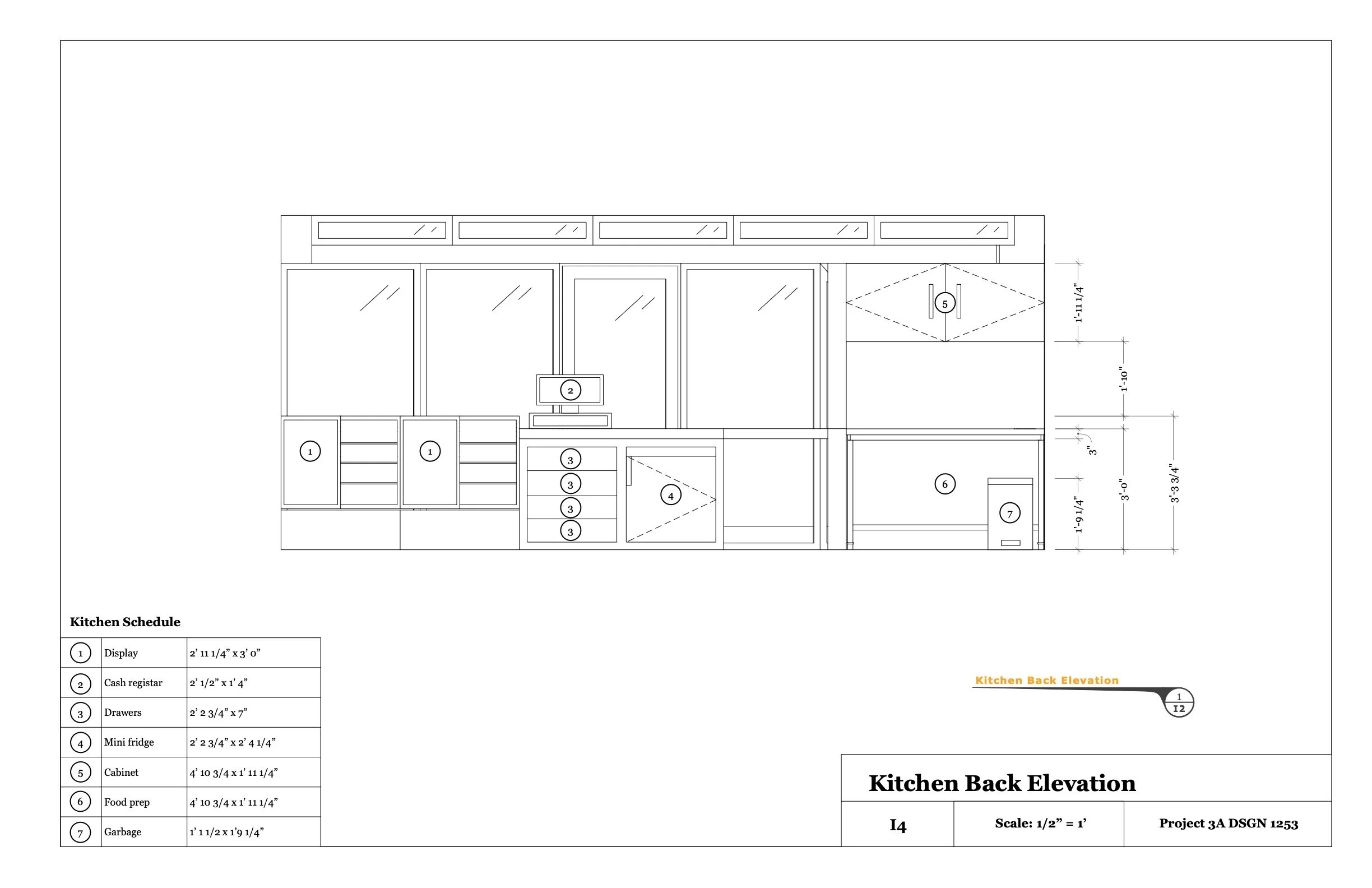
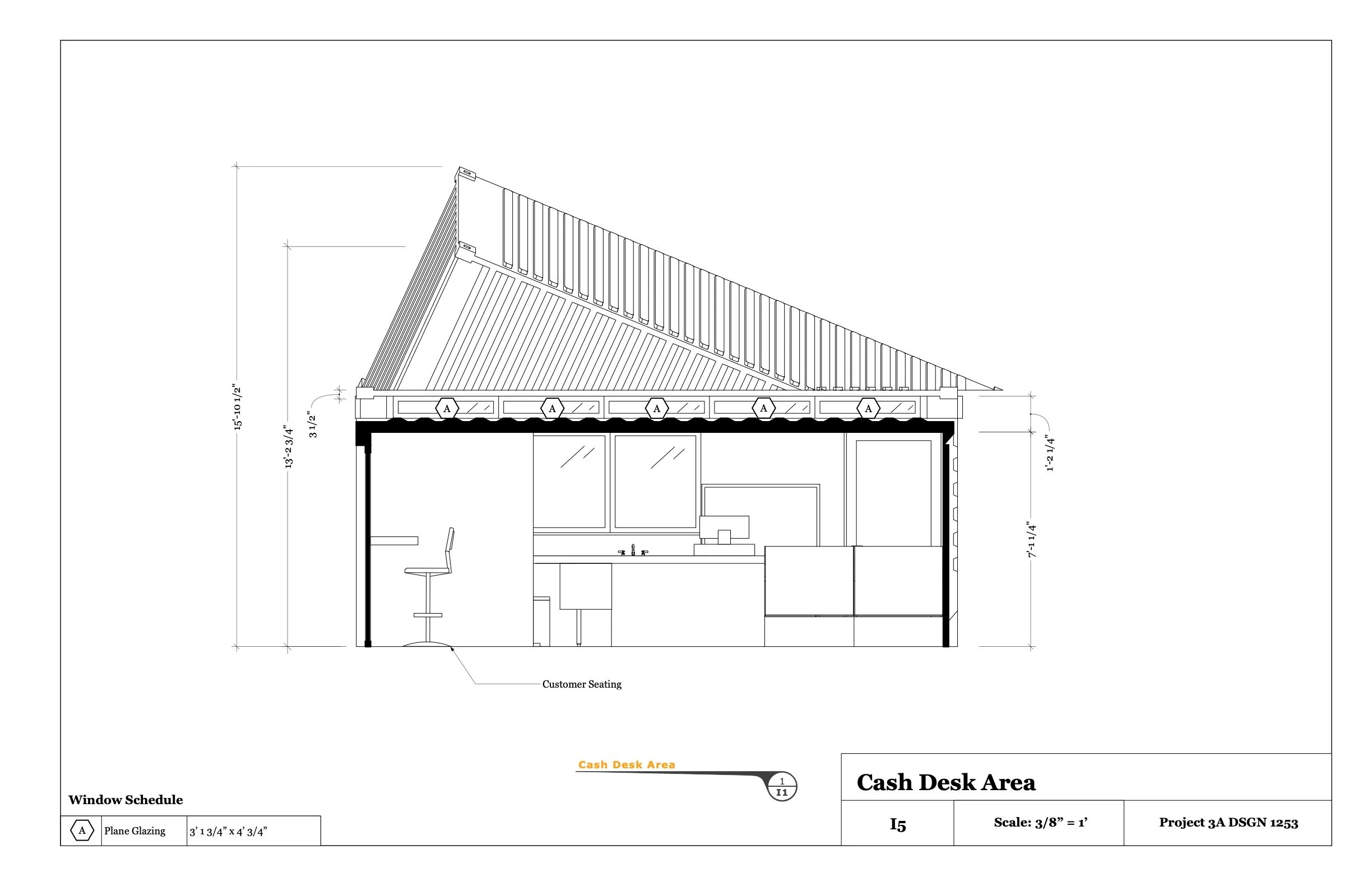
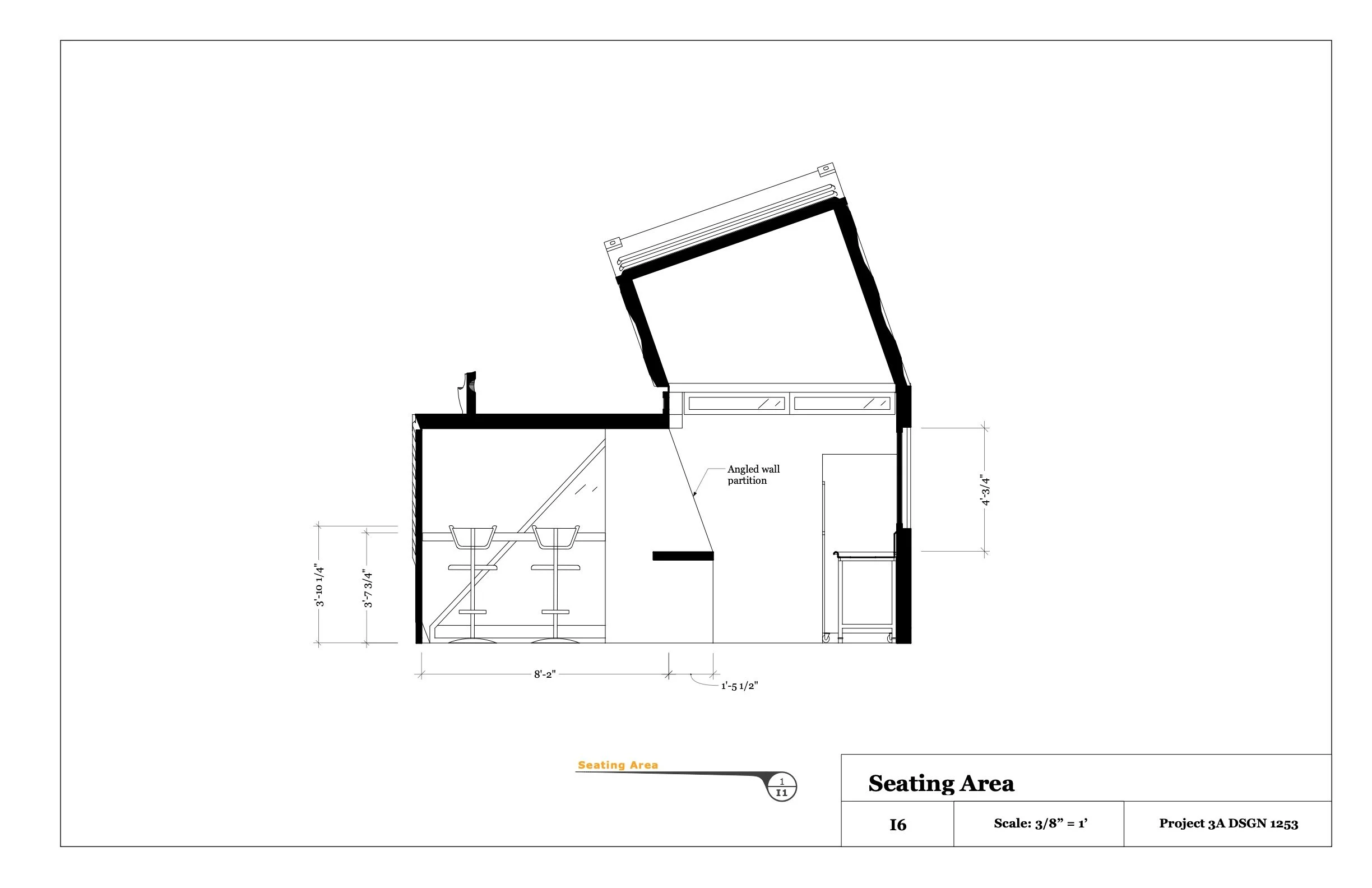
I had a fun time building the exterior of my physical model. However, I did not account for the thickness of the material causing some dimensions to be cut short to circumvent the overlap. Inevitably the model was not perfect, and I learned to account for material thicknesses alongside the digital files before sending them to laser cut.
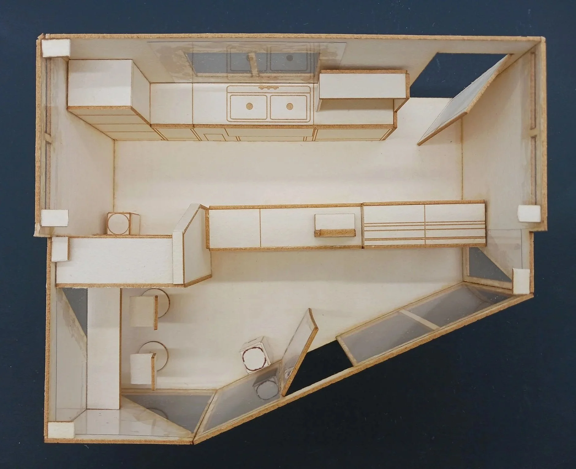
Rendering interiors in Blender was new to me. It was difficult to predict what materials and textures looked like under different lighting conditions. It was only after much practice that I became proficient with choosing materials that match my intentions.