Avery Moya
Architecture & Interior Design

Ambitious | Genuine | Distinctive
I design intentional, functional, and sustainable spaces that reflect identity and prioritize human experience.
Laneway House
Architecture | Interiors | Schematic Design
For this project, each person was to design a laneway house that accommodates both residential and non-residential uses for an actual Vancouver lot. My chosen non-residential program was an intimate lounge space, featuring a bar and a small platform for solo performers. The goal was to create a balance between a social atmosphere and a private living space while maintaining a cohesive overall design.
The first floor features a sunken lounge that defines the separation between areas while preserving an open layout. Large wooden doors open the space and promote airflow during warmer weather. The second floor offers residential living with more defined rooms and enclosed spaces for privacy. Expansive windows and skylights bring in natural light, creating an airy atmosphere.
The final design fosters social interaction, while the residential area features an efficient layout, optimized with intentional massing, sectional placement, and abundant natural light.
Donut Shop
Architecture | Interiors
For this project, I worked alongside other designers assigned to make a donut shop using two shipping containers. The goal was to arrange them so that the interior remains a functional space while limiting the use of a single slice for one of the two containers.
The limitation of using only two shipping containers was challenging. To avoid overcomplicating the layout with narrow walkways, optimizing the available space was the priority. The slanted roof serves as a skylight, helping break up the structure’s uniform height. Additionally, the windows make the space feel larger and bring in natural light, creating a more open and inviting interior. To bring the model to life, I utilized the laser cutter for precise cuts and to engrave the shipping container details.
As a result, I learned to design within strict constraints. I analyzed spacing, circulation, and kitchen-to-customer flow. This project taught me that effective design is not about building complexity, but about maximizing space efficiency and functionality.
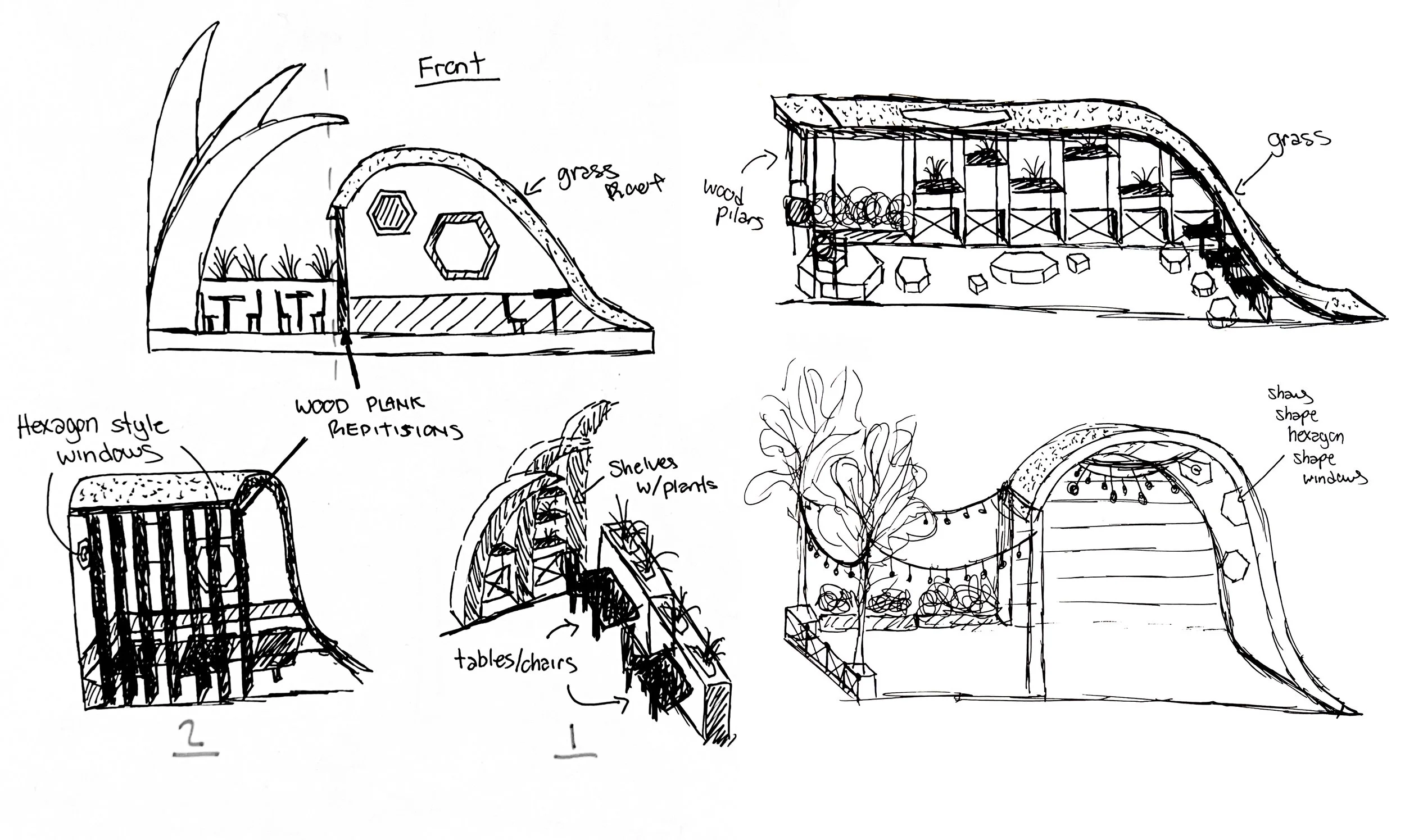
Parklet
Architecture | Interiors
I designed a small gathering space to replace street parking and extend the sidewalk. My concept unites modern structure with sustainability and nature.
The idea was to invite people to gather and connect in a space that embodies nature. The parklet will be in the middle of the city, so, in a way, I wanted it to be a fresh sight, with natural materials and tones, to encourage people to seek out more connections with nature. The curved roof mimics a hut/hobbit house under a hill, creating a unique, intimate space that also serves as shelter on Vancouver’s rainy days. Plants are placed around the parklet to lighten and freshen the air, while dark wool colours surround it.
The Parklet design sparks curiosity about nature and offers a welcome break from the city’s noise. I hope it encourages great conversations and prompts pedestrians to stop and take a moment to relax. The spaces feature earthy tones and pair well with natural sunlight.
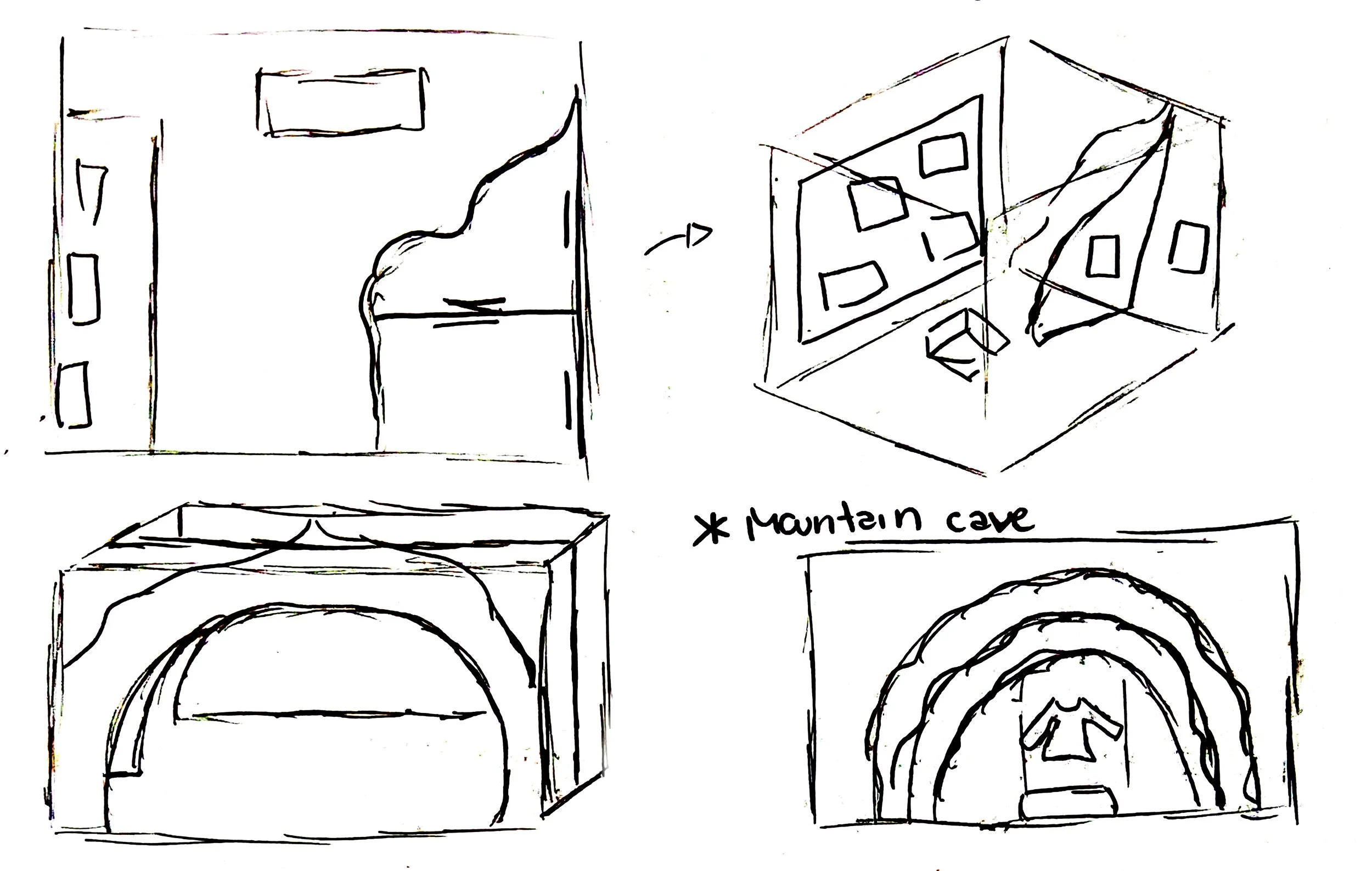
Arc’teryx Exhibit
Experiential Design
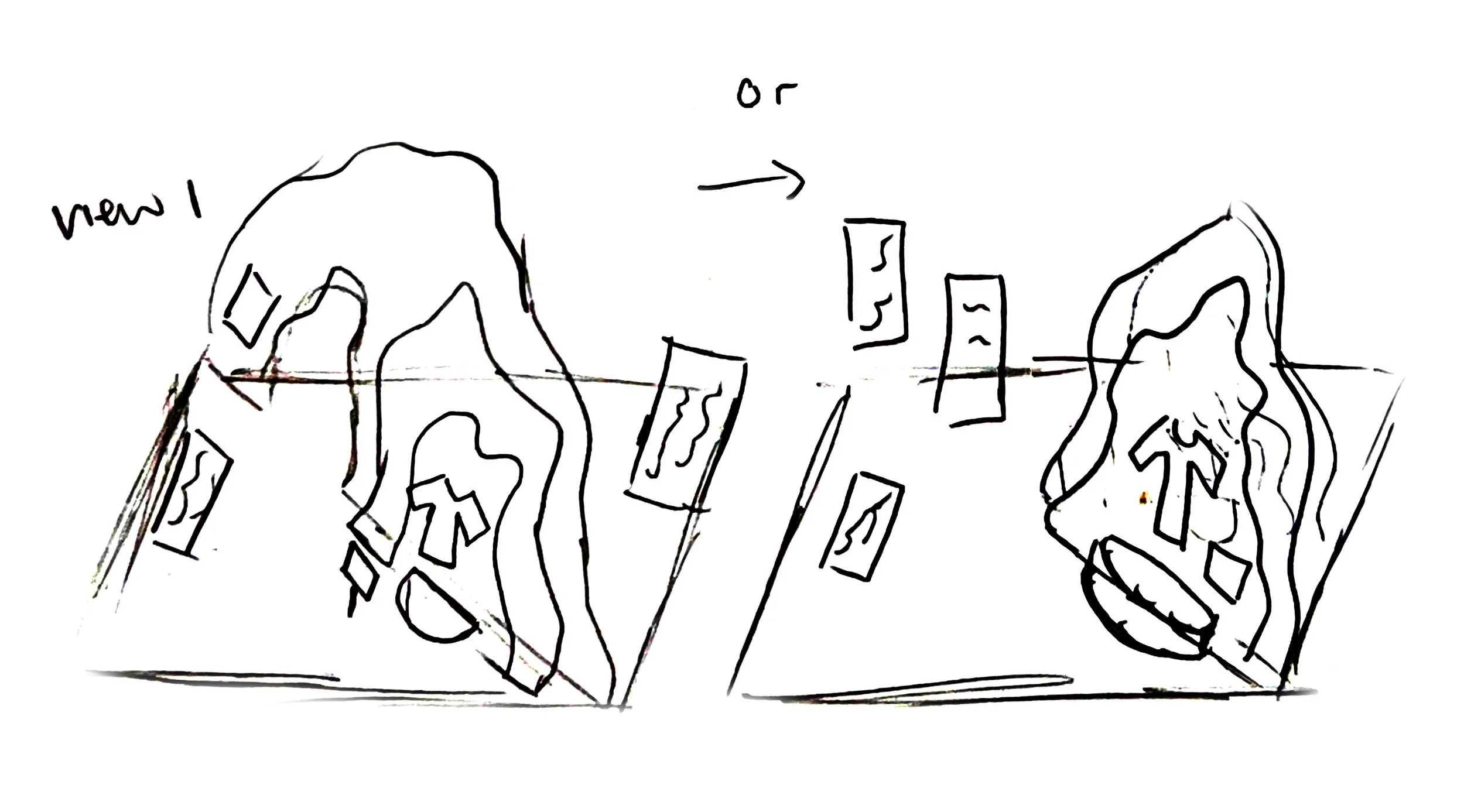
For this project, the team and I were assigned to create an exhibit model showcasing the Arc’teryx brand values, with the focus product being the Alpha SV Jacket.
The exhibit features a realistic snowy summit with an archway that visitors traverse, leading into a gallery envisioned as a cove. I aimed to create a strong contrast between two spatial conditions: the severe, bright, stormy summit and the tranquil, dark, moody gallery.
Overall, the exhibit effectively embodies Arc’teryx’s brand through an immersive, contrasting spatial experience. The exhibit resonates with Arc’teryx’s core users—enthusiasts of climbing and extreme-weather sports, making the environment a true reflection of the brand and the conditions its products address.
Candy Box
Experiential Design
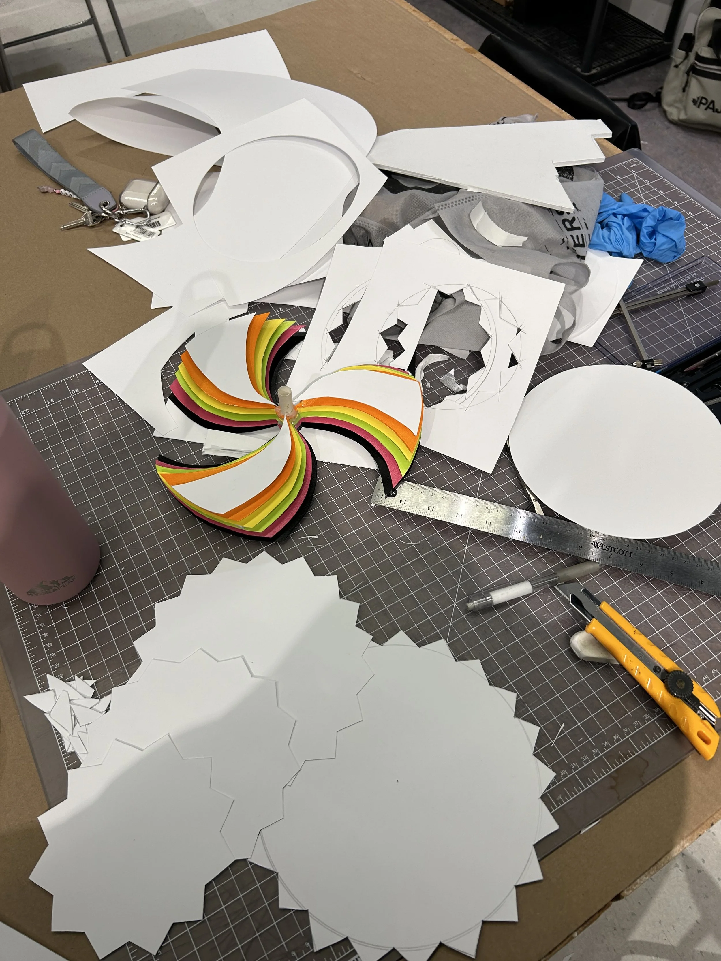
For this project, each person was given a mystery snack with no name or label and asked to create a physical representation of our emotional reaction, along with a three-letter sound that represented our response. My snack was RJ’s Licorice Allsorts, and the flavour felt confusing. It was sweet and creamy with a slight bitterness and hints of vanilla. This led me to focus on confusion as my main concept. The three-letter sound I chose was “oOo,” which represents my reaction of surprise and uncertainty.
To represent confusion, I arranged multiple layers of forms in a circular wheel. Their overlap adds chaos and uncertainty. I connected the wheel to a spinning lazy Susan, inspired by hypnotic spin wheels, to create a disorienting visual effect. Conveying confusion through form and movement, the final model intrigues.
As the wheel spins, layers and colours blend, and the model constantly changes, making it difficult to fully understand at once. My emotional reaction to the snack is mirrored here; since the flavour was complex and unclear, that confusion translates into a physical and visual experience.
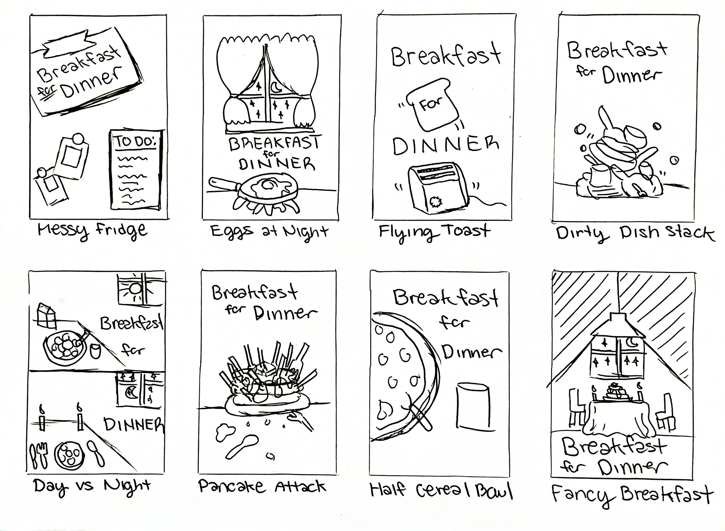
Cookbook
Communication Design | Typography | Prints
For this team project, we were tasked to develop a themed cookbook. Our group created the concept of “Breakfast for Dinner”, inspired by the spontaneity and unpredictability of young adulthood.
As a team, we brainstormed the cookbook’s theme, recipes, and visual direction. My main responsibility was layout design and iterating on all the pages. We ensured the book used similar, affordable ingredients across recipes, reinforcing flexibility and accessibility for young adults.
The final outcome was a cohesive cookbook that combines storytelling and functionality. The simple visual design allows users to add notes directly to the pages, making them more personal and interactive. This theme reflects young adults learning and improving over time, positioning the cookbook as something that grows with the user as their skills, confidence, and overall life experiences.