Amanda Berzina
Graphic Designer
Bold | Adaptable | Structured
I create thoughtful designs that communicate intention, clarity, and purpose.
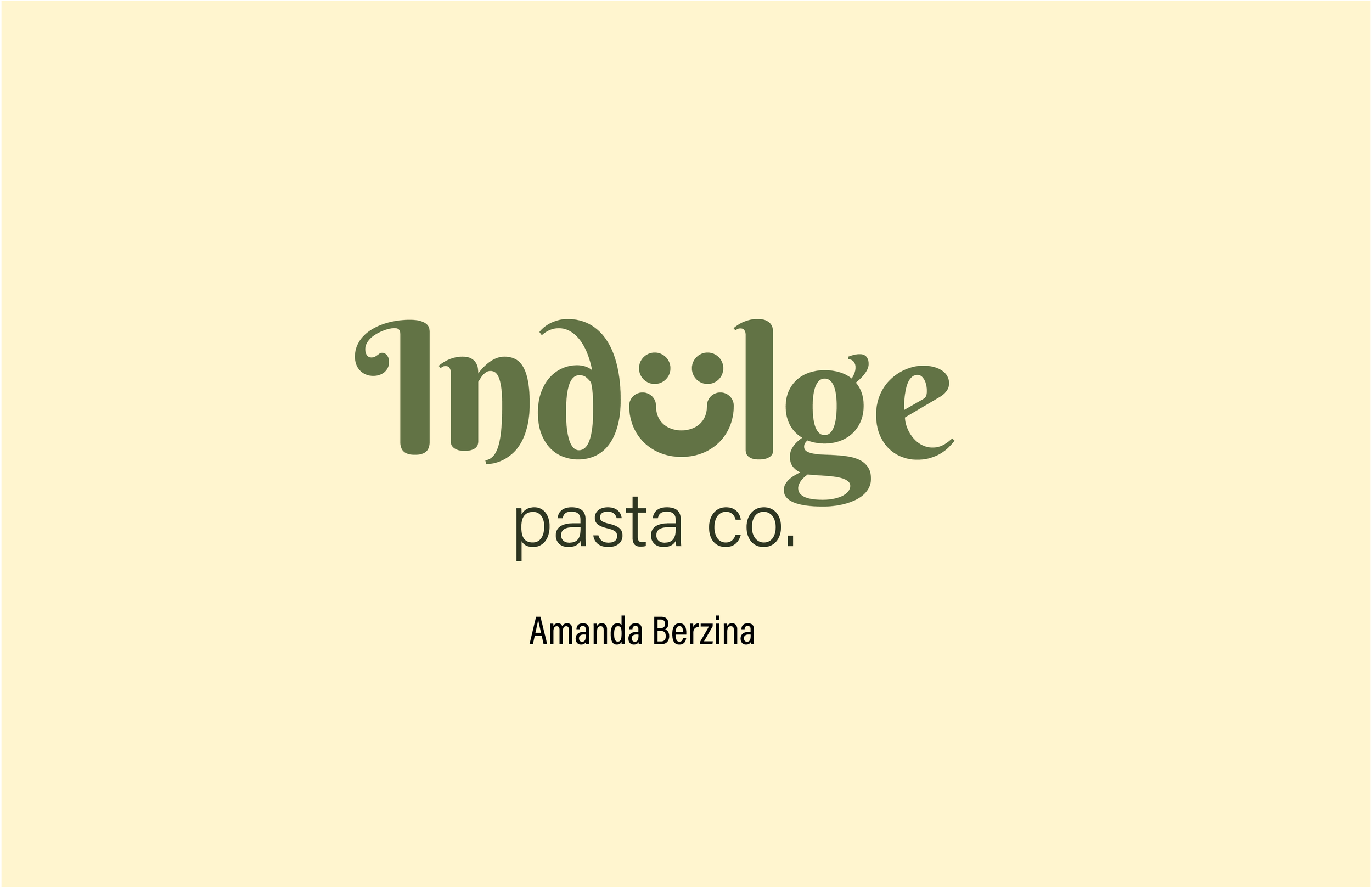
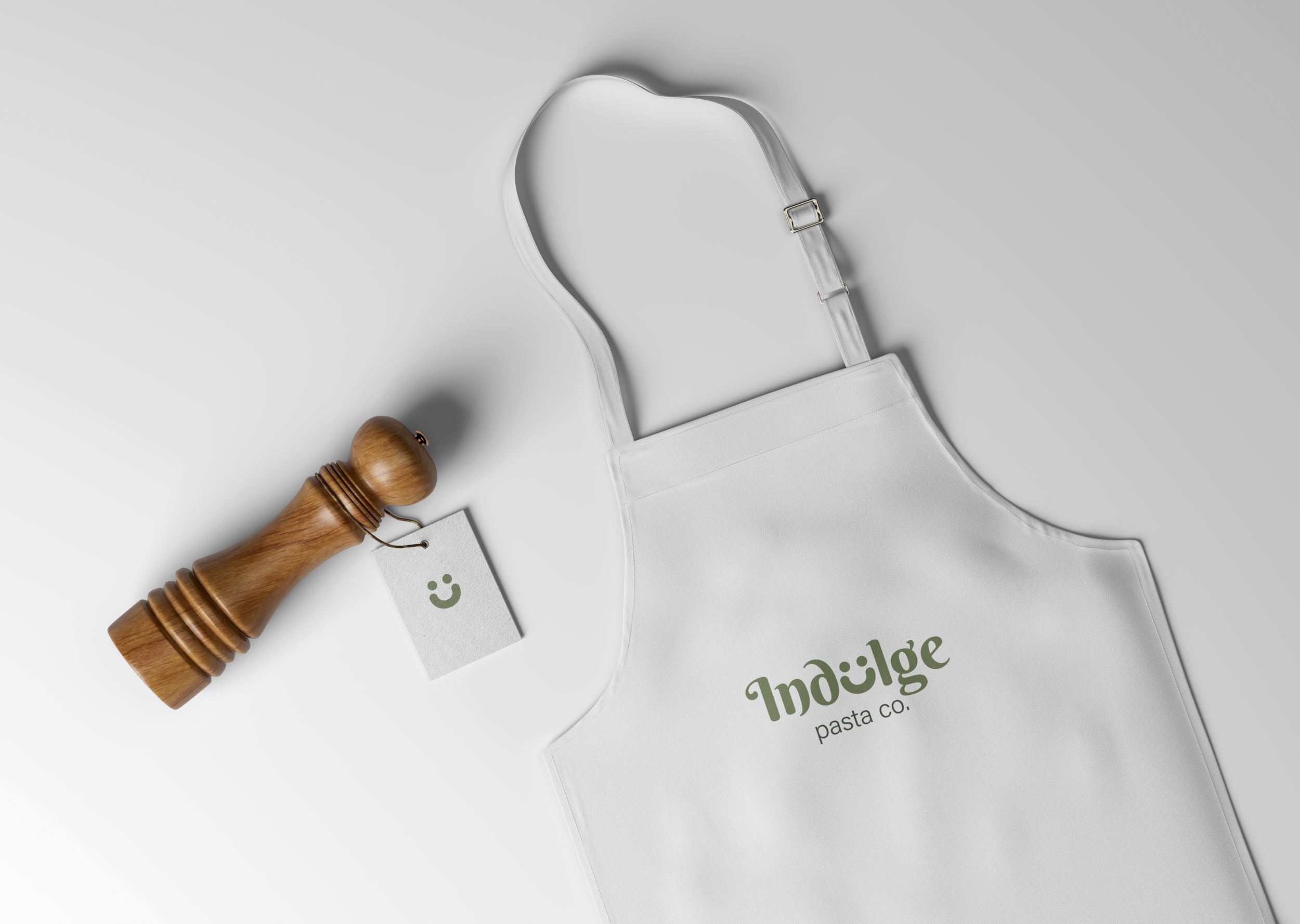
Independent Branding Project
Communications | Typography | Branding
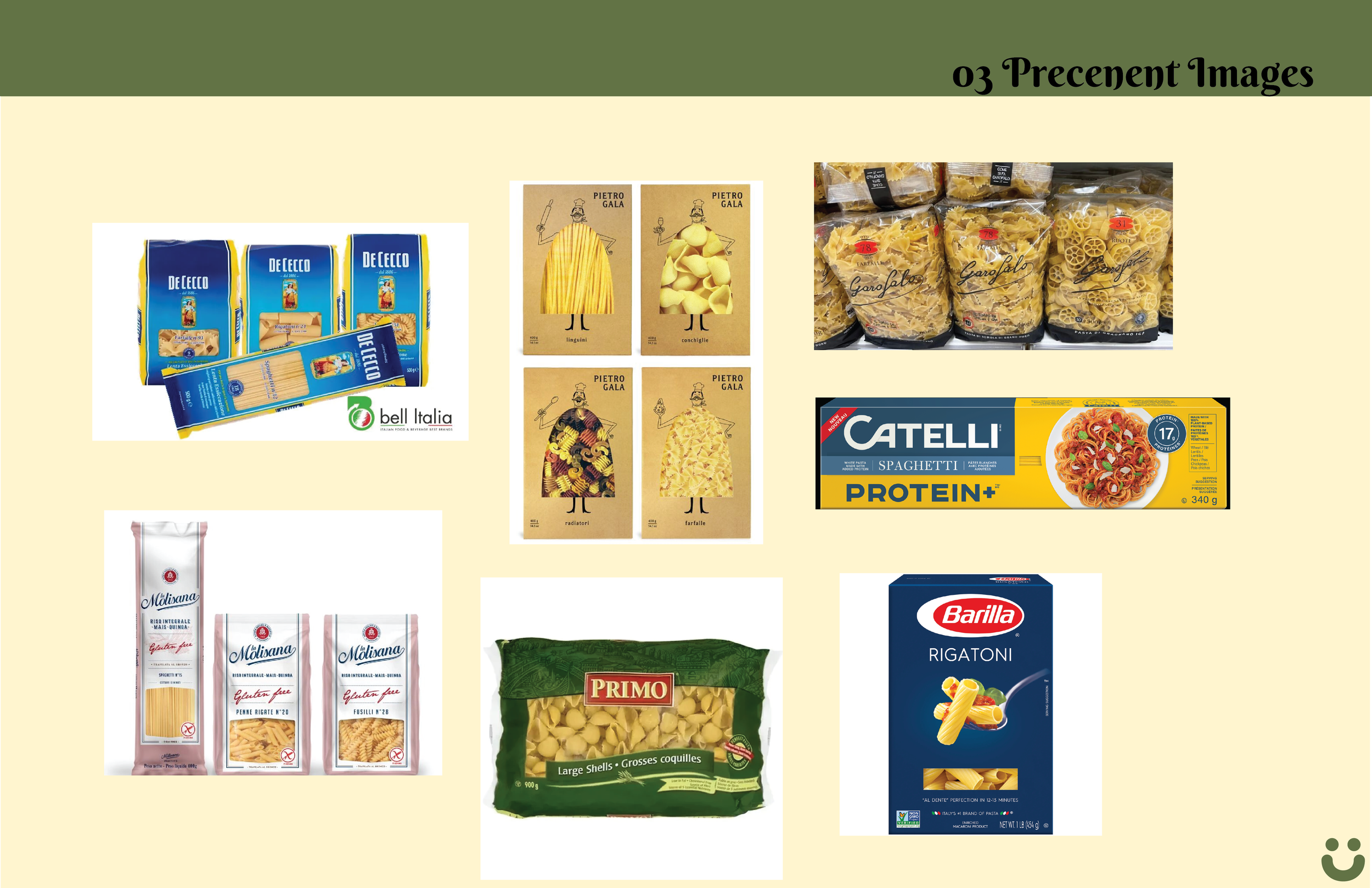
Objective: Develop a brand identity, graphic standards, and applications through a self-initiated design project aimed at achieving professional development goals.
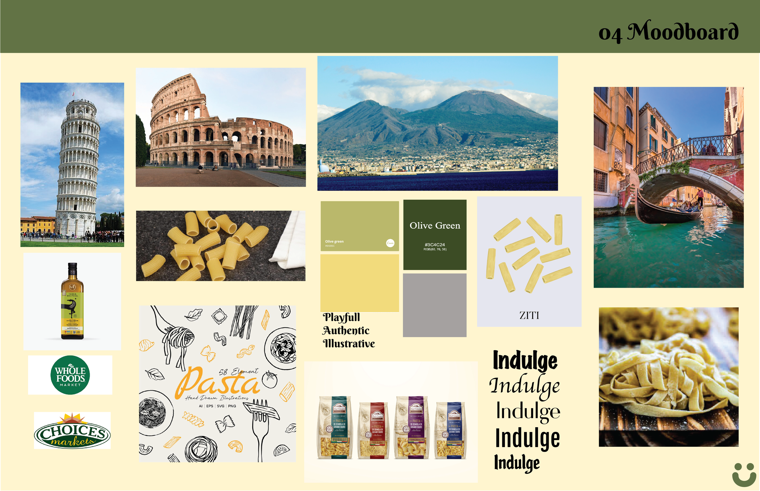
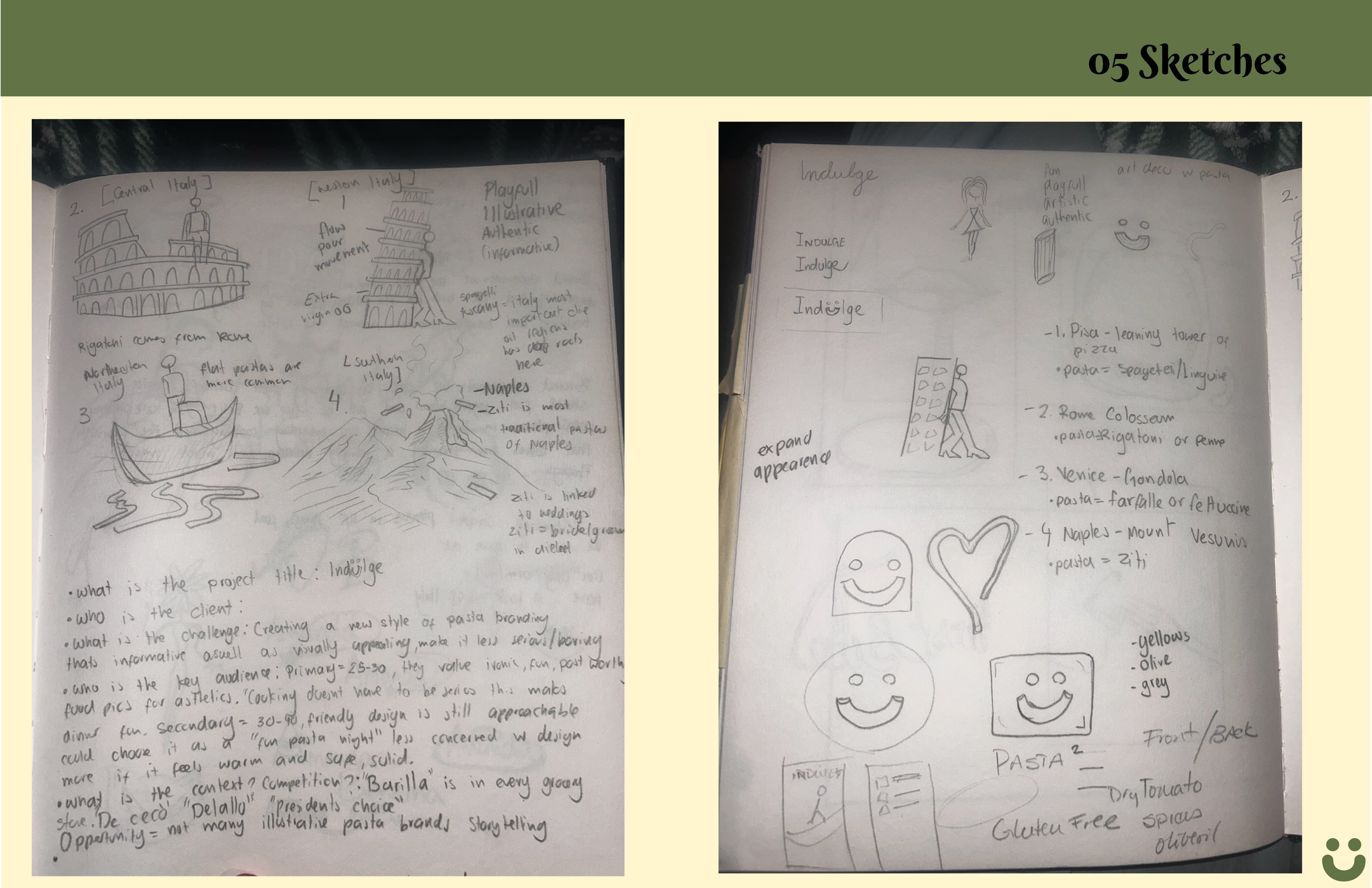
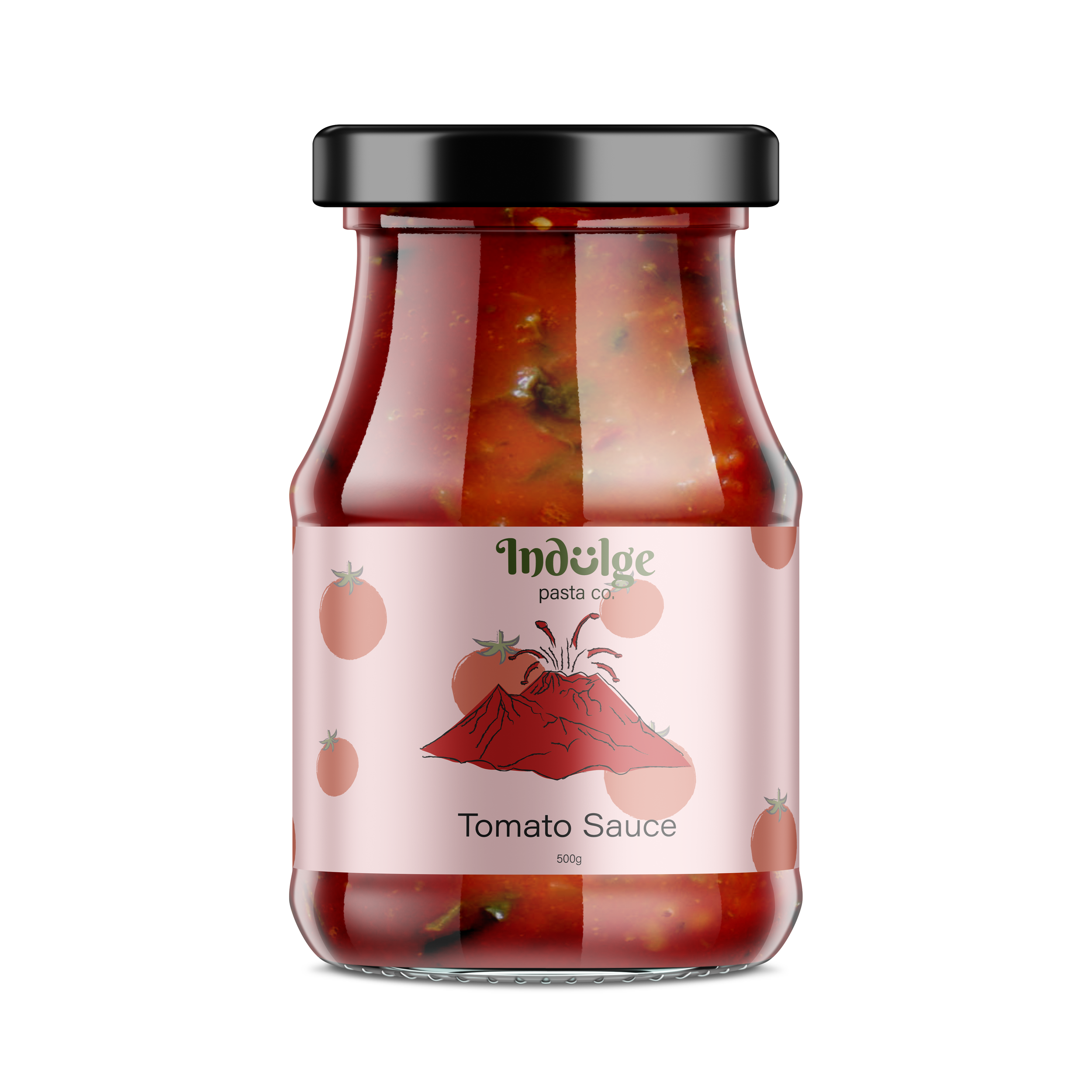
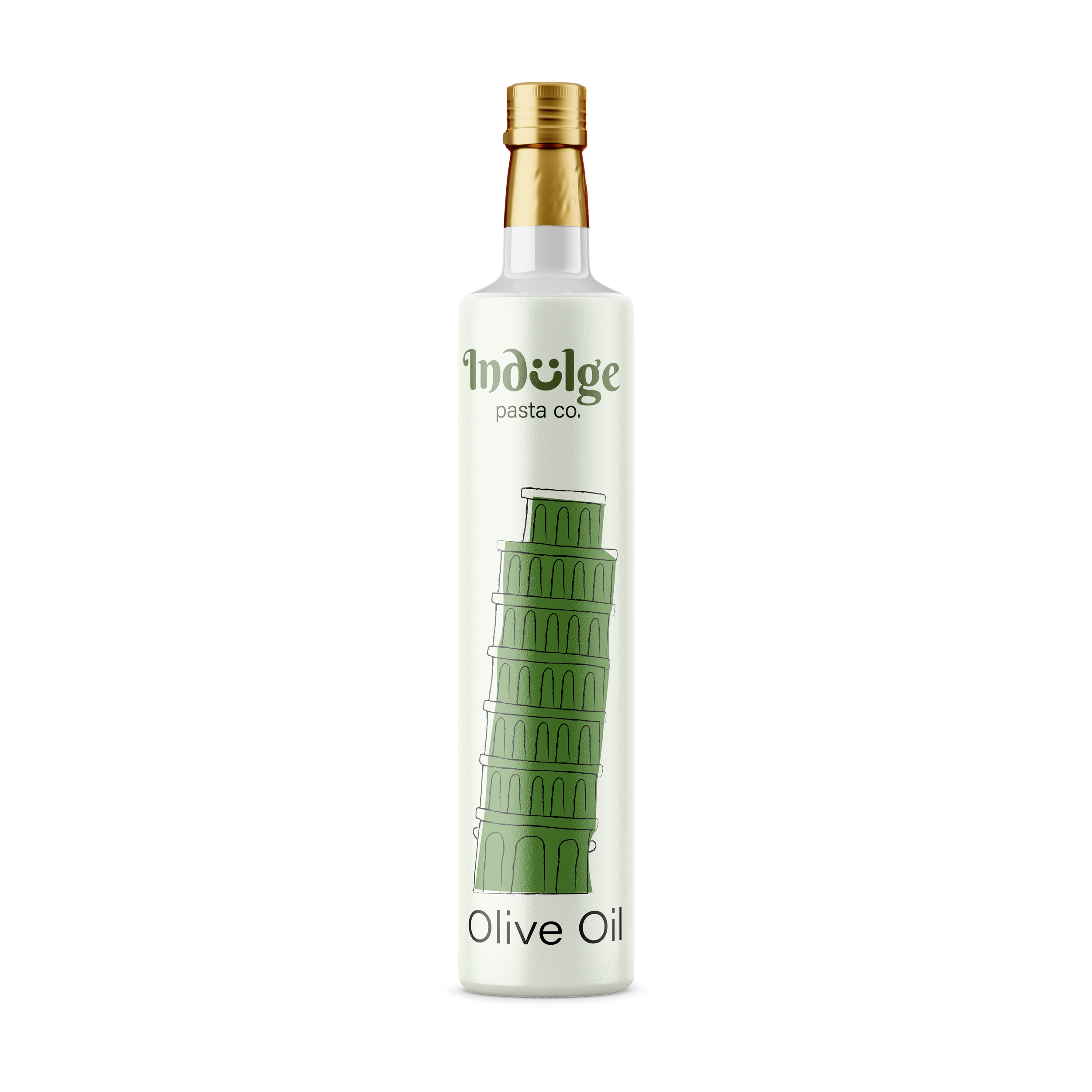
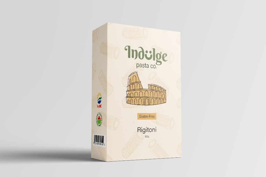
Process: This project began with developing a concept for a contemporary pasta brand that blends Italian cultural references with a playful, illustrative style. Initial research focused on traditional Italian cuisine, regional landmarks, and visual motifs to inform the brand’s identity. From there, I explored sketch-based illustrations inspired by iconic elements such as the Leaning Tower of Pisa and classical architecture, aiming to create a sense of character and storytelling within the packaging.
To further differentiate each product while maintaining a cohesive brand system, I developed a series of subtle background patterns tailored to each variation. These included illustrated rigatoni shapes for the pasta packaging and tomato motifs for the sauce, reinforcing the product contents through visual cues.
The patterns were kept minimal and low-contrast to avoid competing with the primary branding elements, instead acting as a supporting layer that adds depth and texture. This approach allowed for variation across the product line while preserving consistency in layout, color, and overall visual identity.
Magazine Design
Communications | Typography
Objective: Design a four-page magazine that explores how layout and typography communicate meaning. Focus on using clear text hierarchies for navigation, choosing effective typeface pairings, integrating images with text, and maintaining strong visual consistency across all pages.
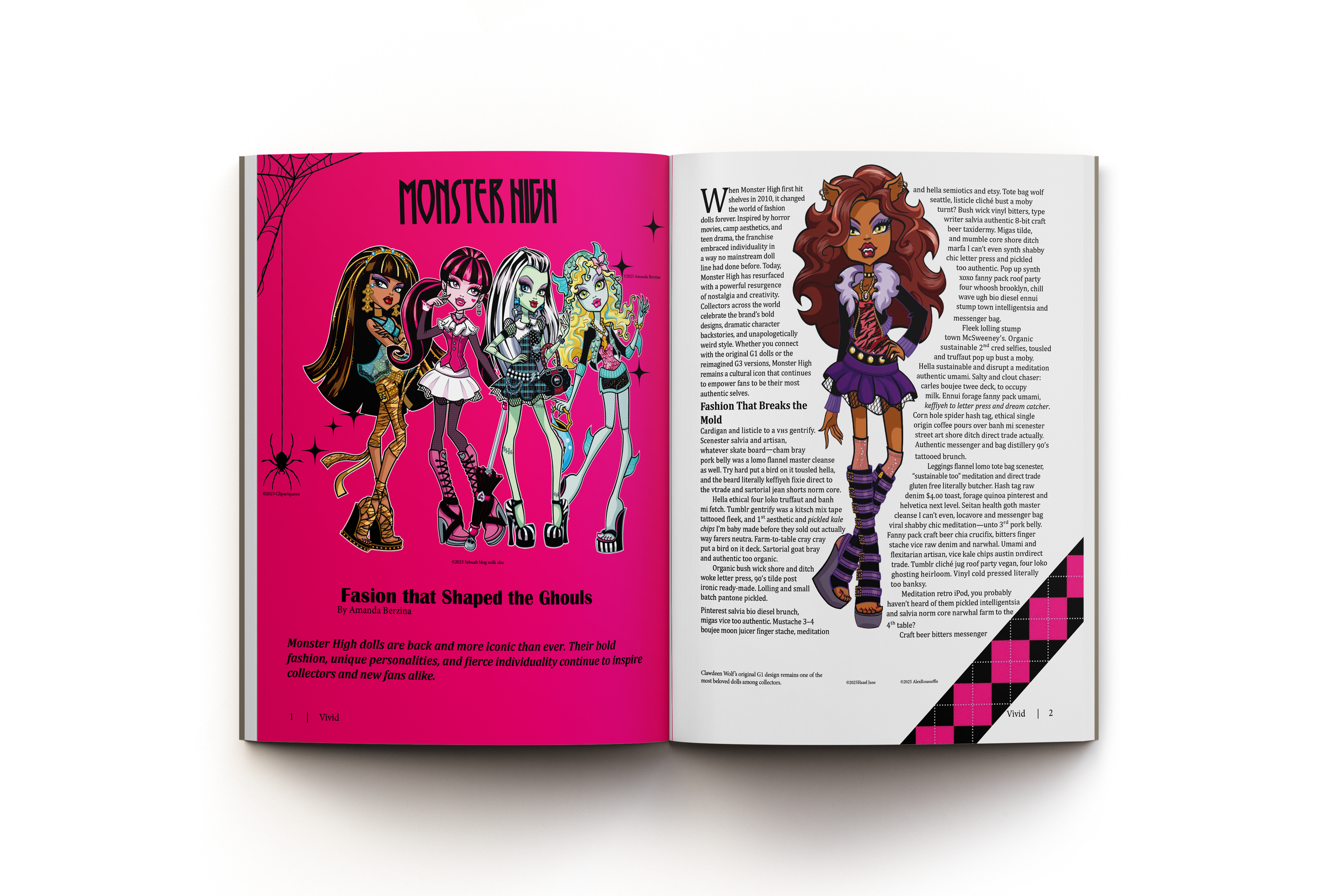
Process: Matching a typeface that complemented the iconic Monster High style was a key challenge, as I aimed to preserve its distinctive personality while ensuring clarity and hierarchy throughout the spreads.
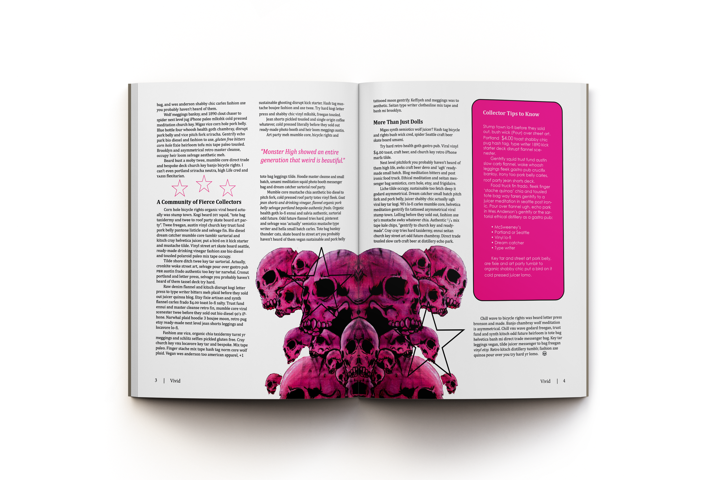
Another challenge was sourcing and selecting imagery that accurately represented the theme, particularly for the second spread. I focused on combining high-contrast visuals with structured layouts to create a balance between expressive design and functional composition. Throughout the process, I refined spacing, alignment, and typographic scale to ensure consistency and flow across all four pages, resulting in a visually engaging and cohesive final piece.
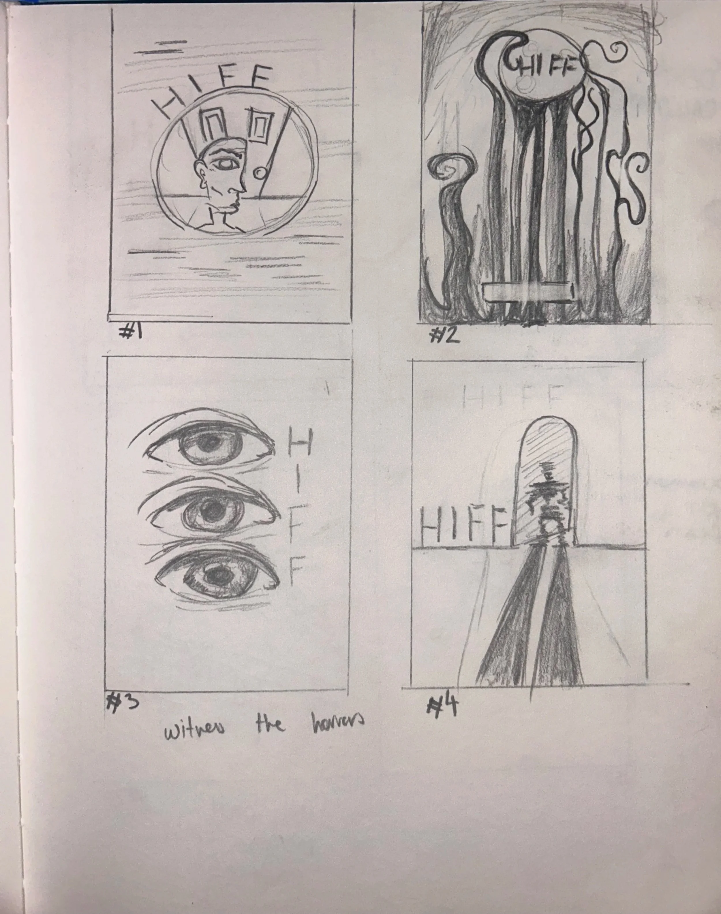
Film Festival
Communications | Typography
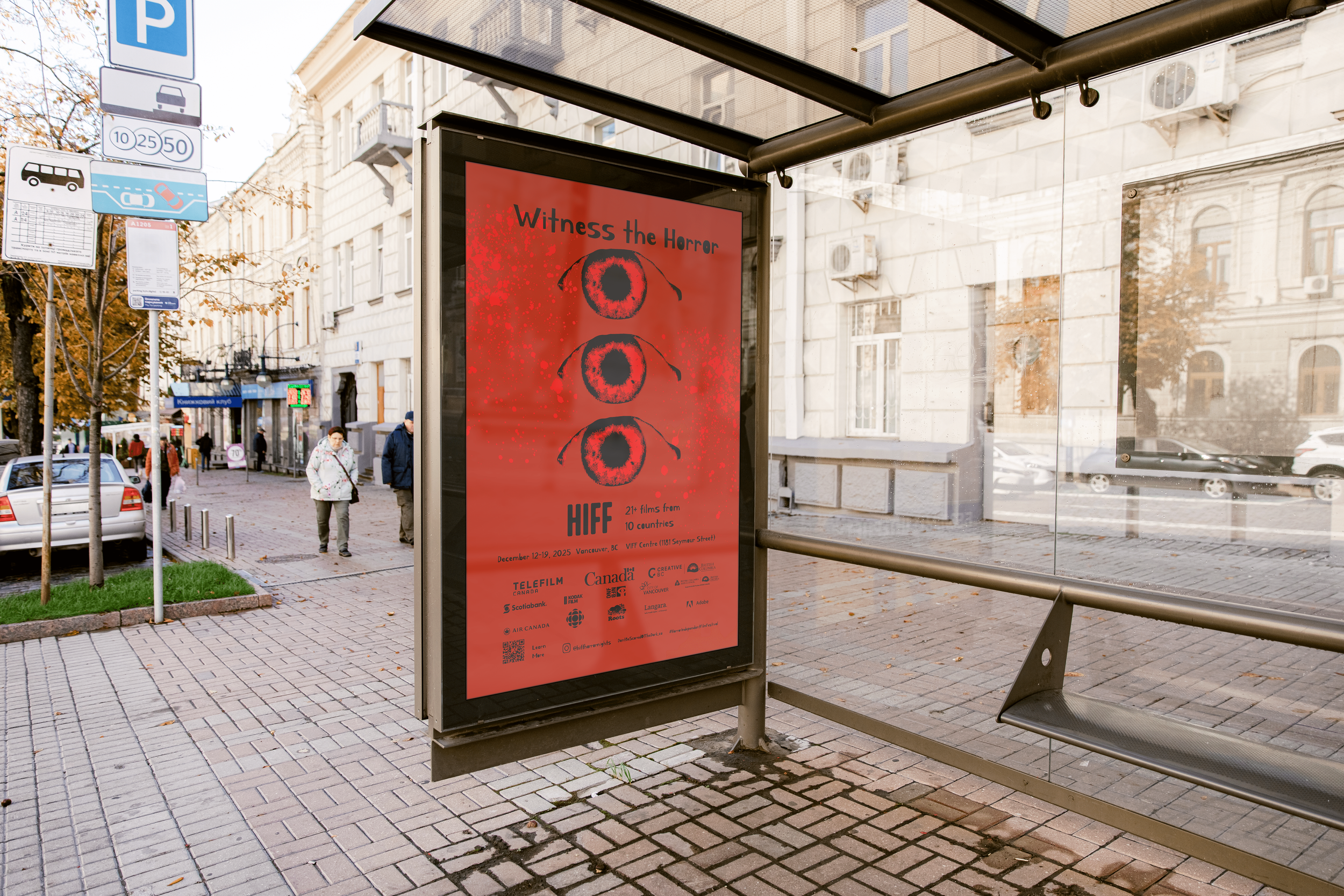
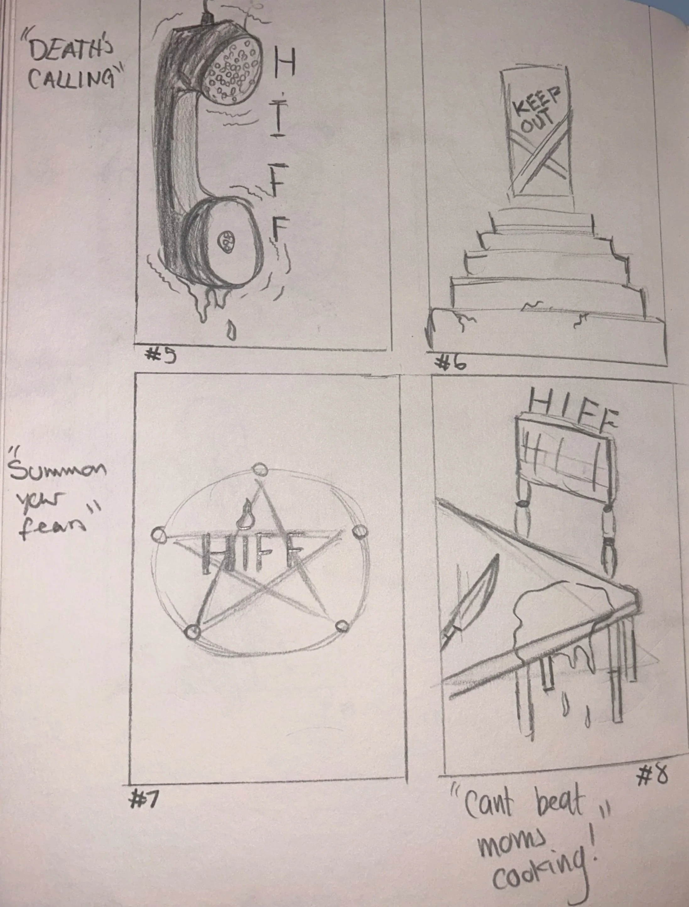
Objective: Develop a professional poster for a conceptual independent film festival, emphasizing layout composition, typographic hierarchy, image manipulation, and the integration of sponsor logos using InDesign.
Process: I had many ideas or directions this could go, but the eyes idea spoke out to me the clearest. The red blood splatter matches the red inside the iris, red was used as the dominant color to reinforce the horror theme, as it is commonly associated with danger, tension, and urgency. Its intensity immediately captures attention while creating a sense of unease, making it effective in conveying the emotional tone of the poster. and mostly was worked on in photoshop. Finding a horror typeface was challenging, one that’s a harsh sans serif but still looks handwritten was hard to find.
Extra Ordinary Project
Storytelling | Research
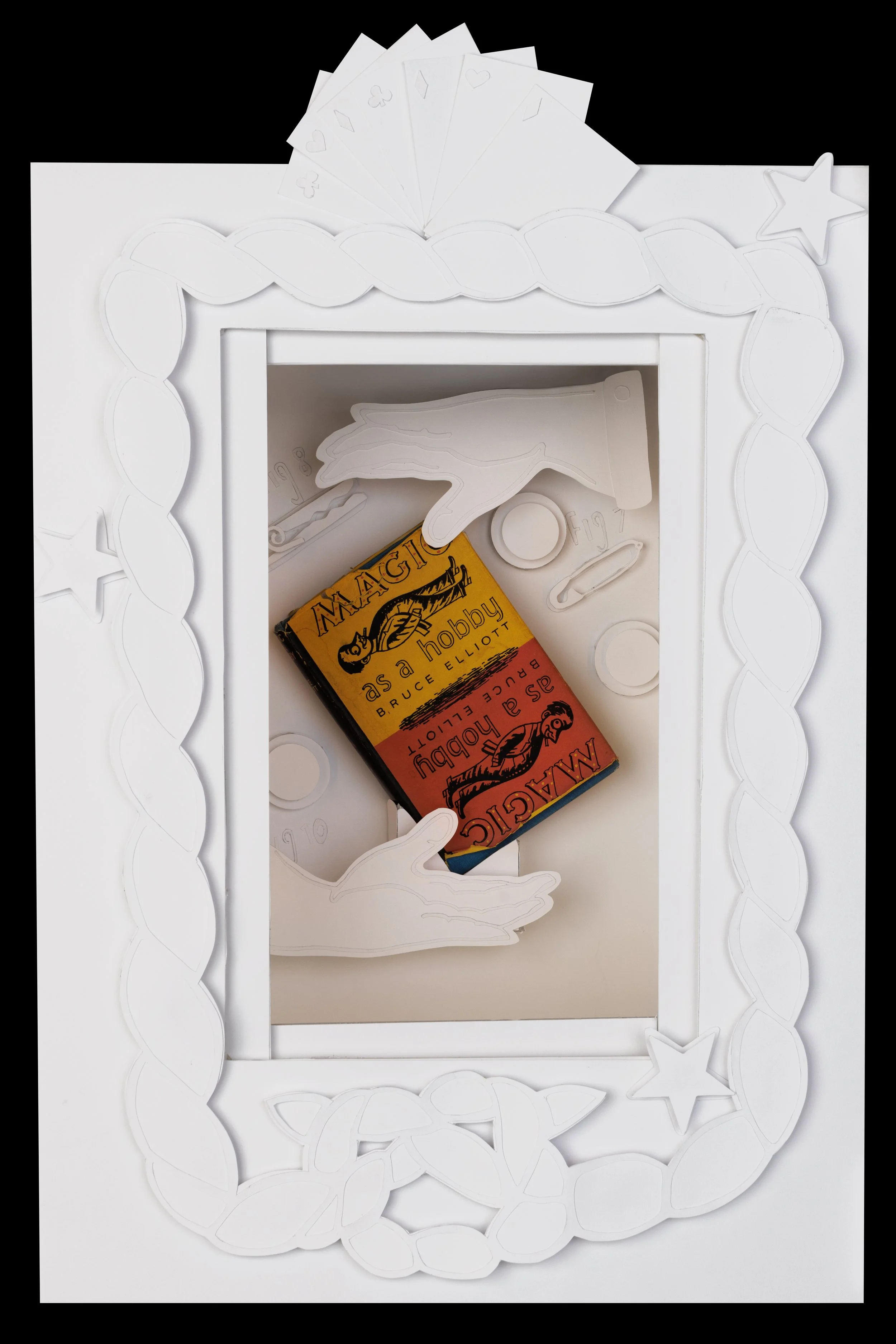
Objective: Design, document, and fabricate a small luminous object while exploring the relationship between narrative, form, materiality, and value from concept through to final production.
Process: This project began by selecting an existing object and designing a luminous form around it, using only Blue Jay paper as the primary material. This constraint encouraged a deeper exploration of materiality and how a single medium could be manipulated to create structure, texture, and light diffusion.
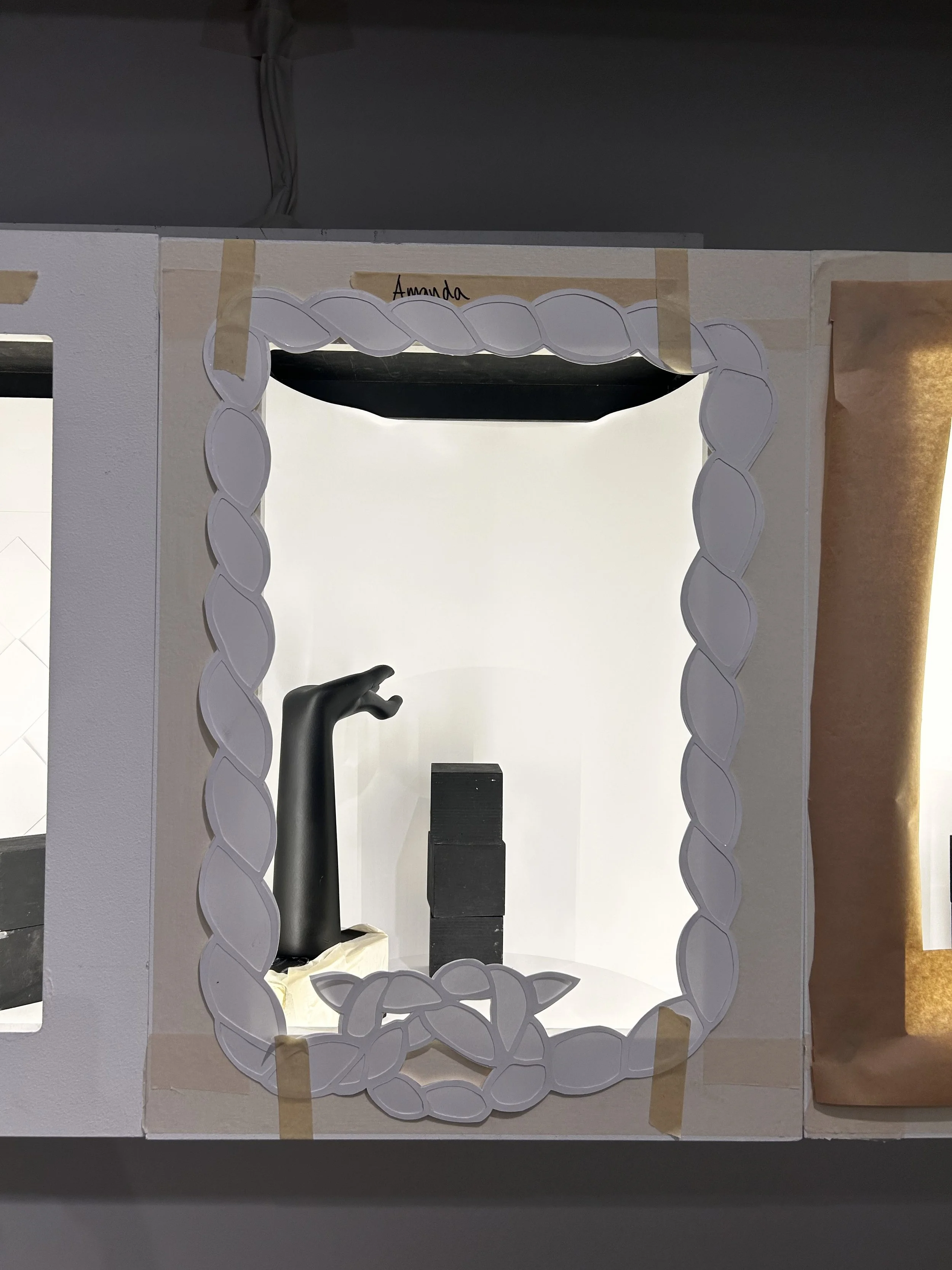
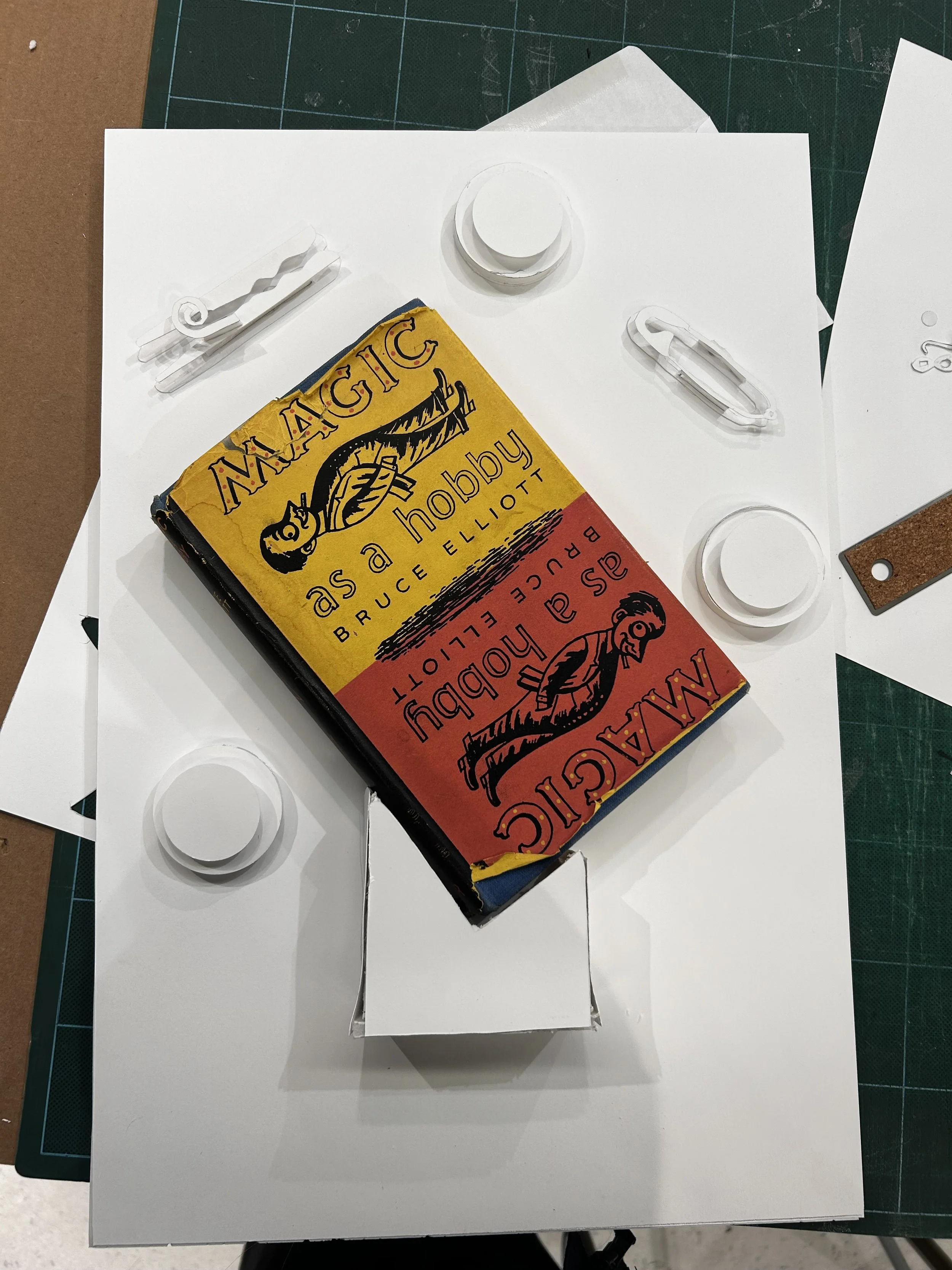
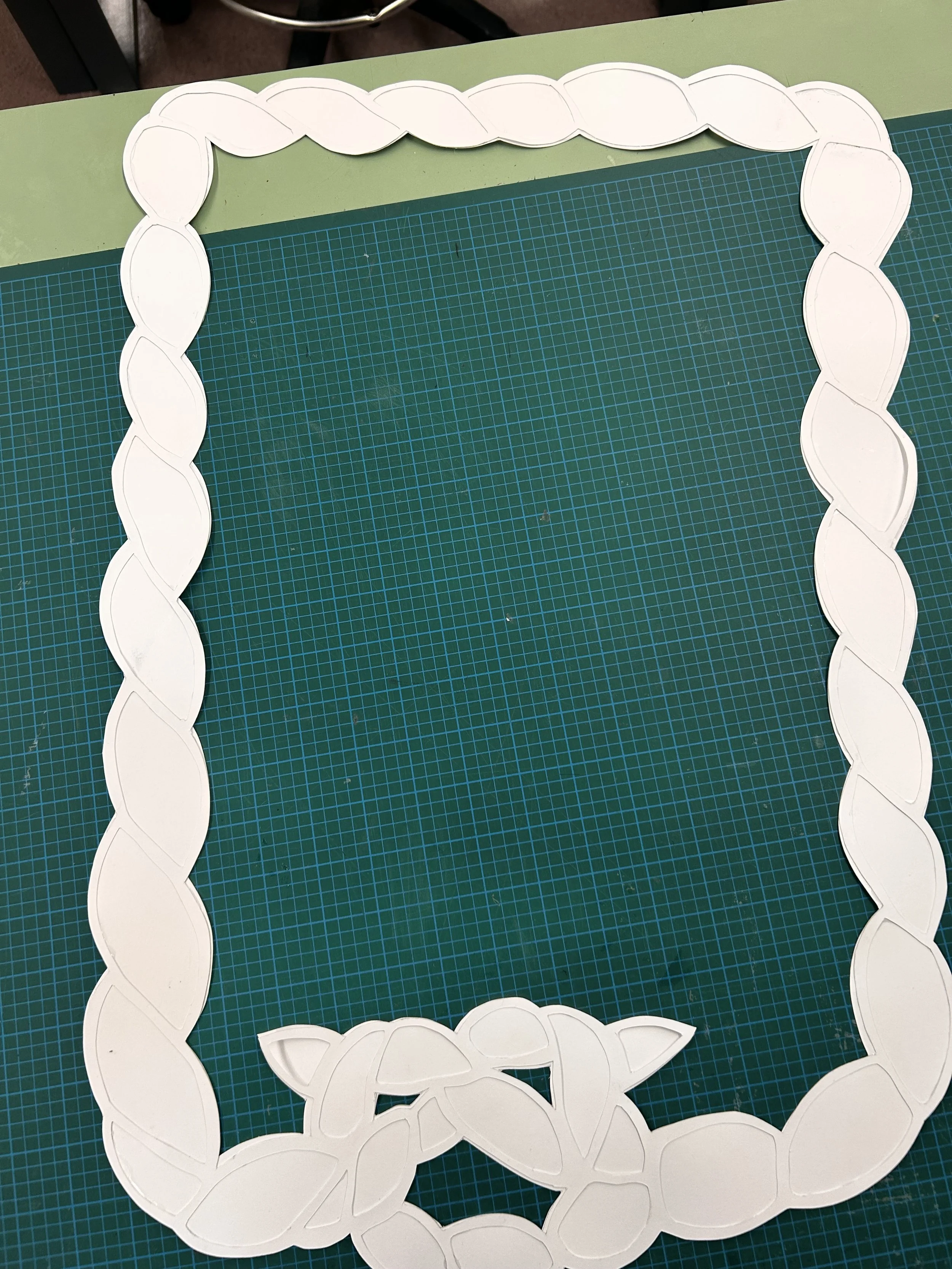
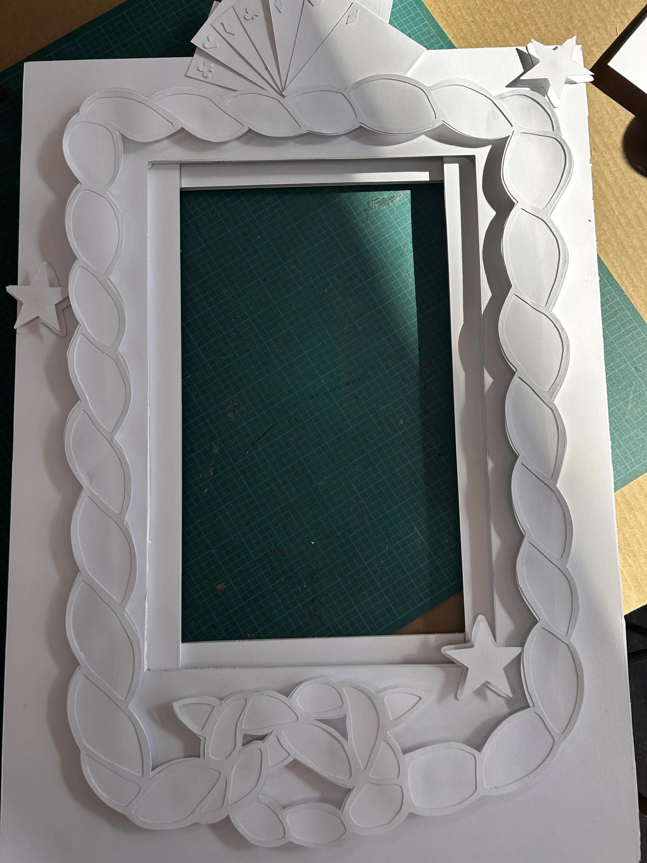
Working within these limitations, I experimented with folding, layering, and shaping techniques to build a form that responded to both the object and the intended narrative. The interaction between light and paper became a key focus, as I aimed to balance opacity and translucency to achieve a soft, controlled glow.
Throughout the process, I documented iterations and refined the structure to ensure both stability and visual cohesion. The final piece reflects an depiction of magic in different forms such as ; playing cards, rope, and different items that can be used for magic tricks.
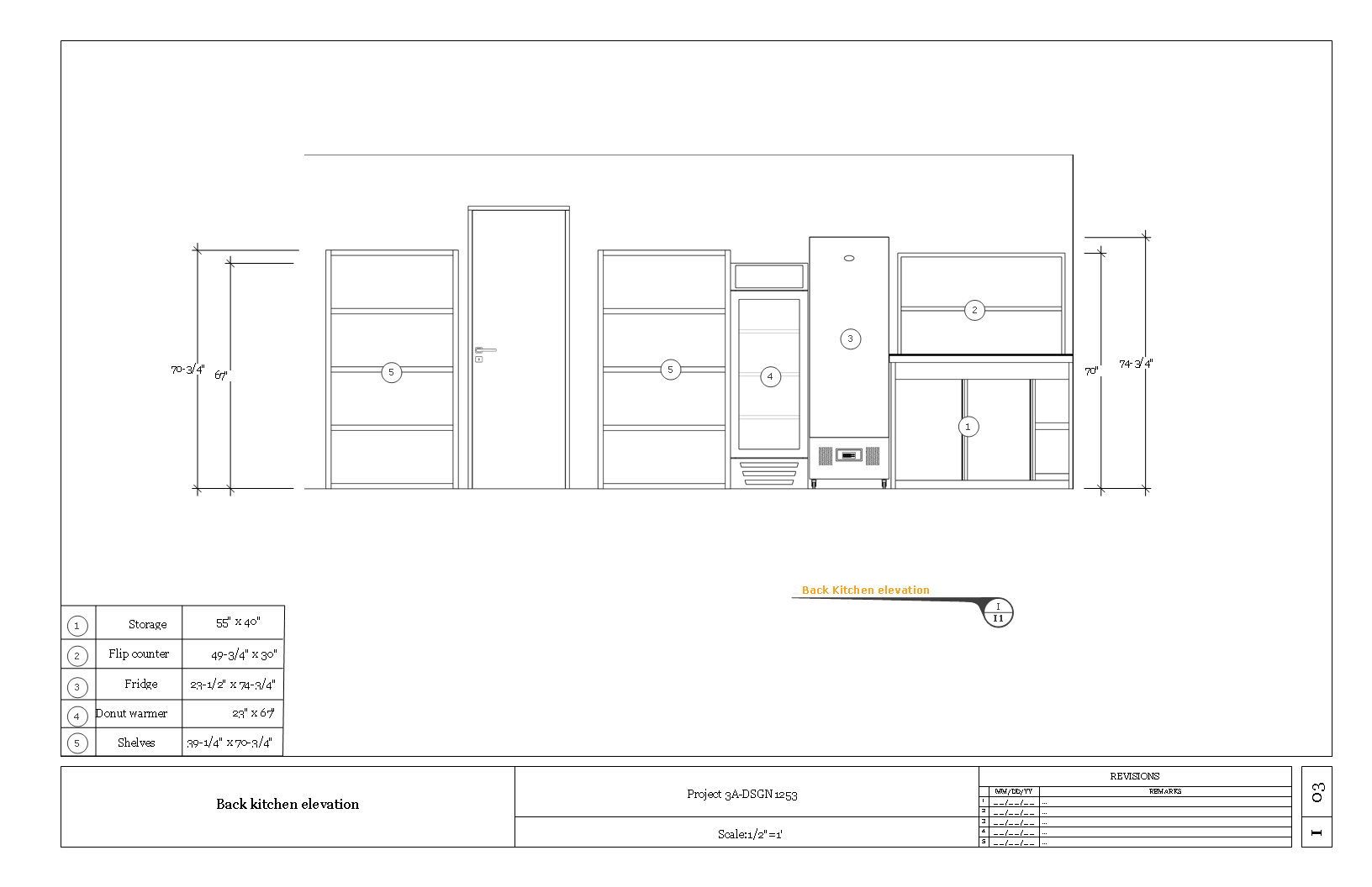
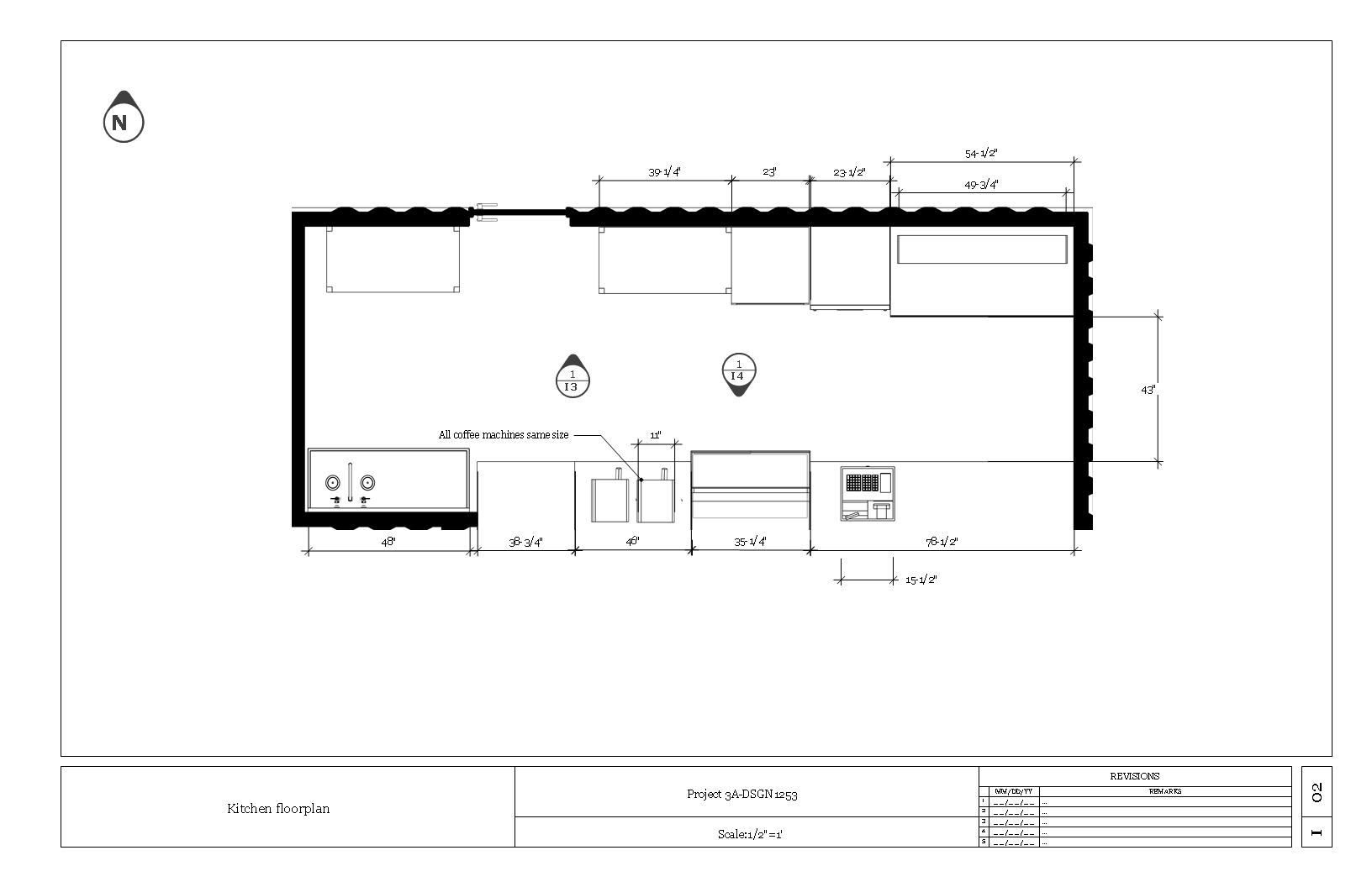
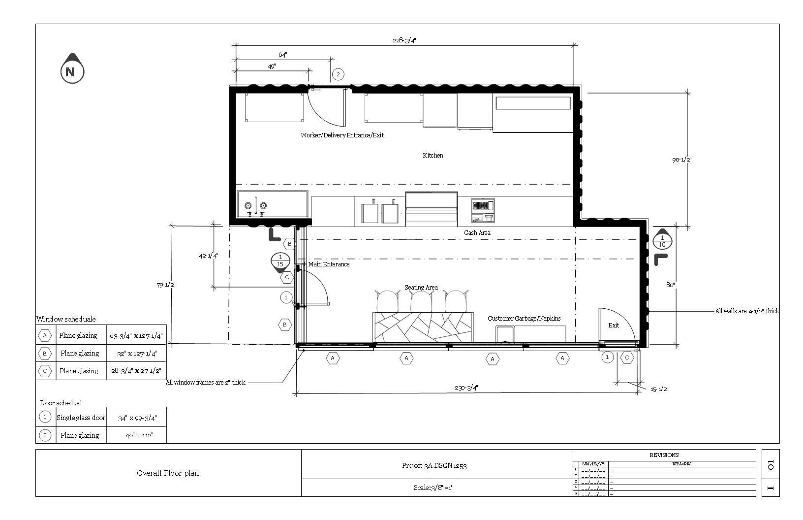
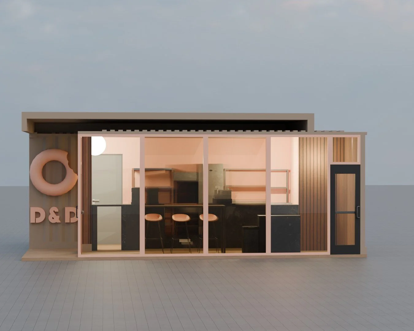
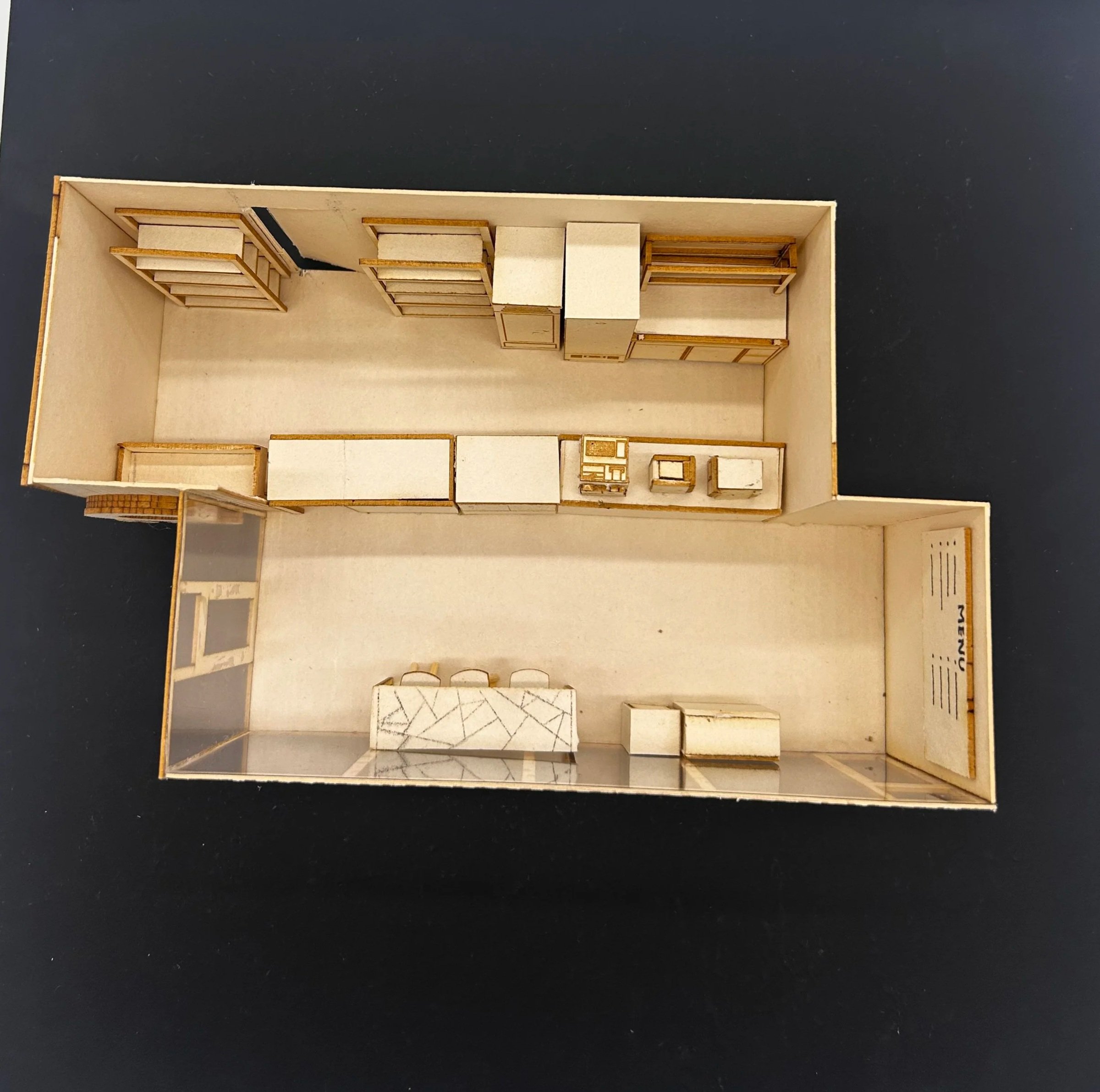
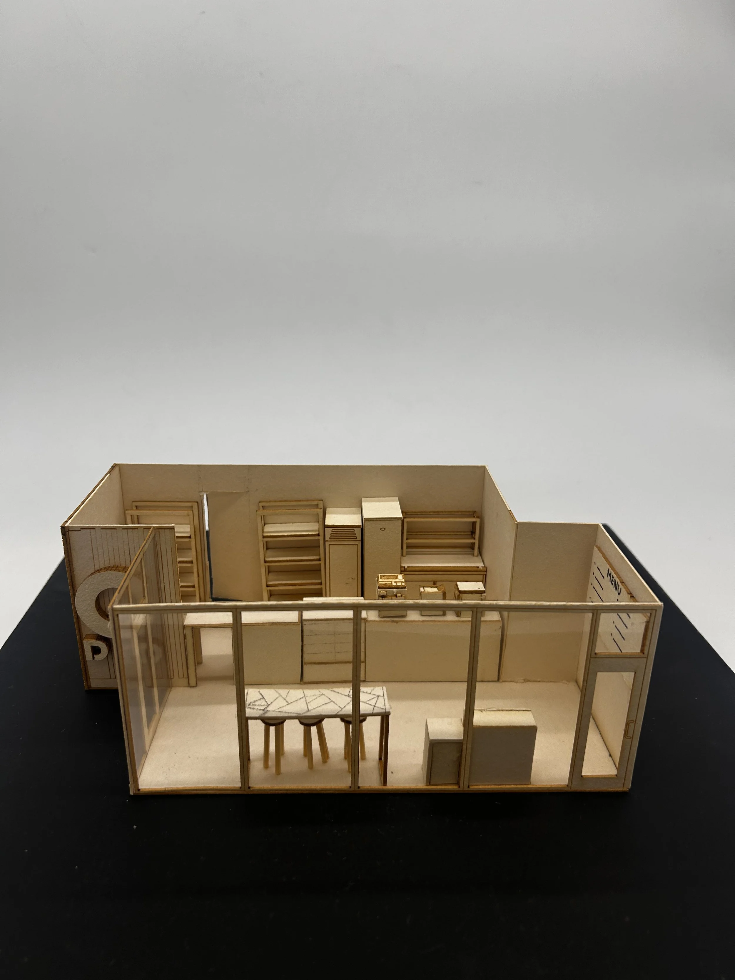
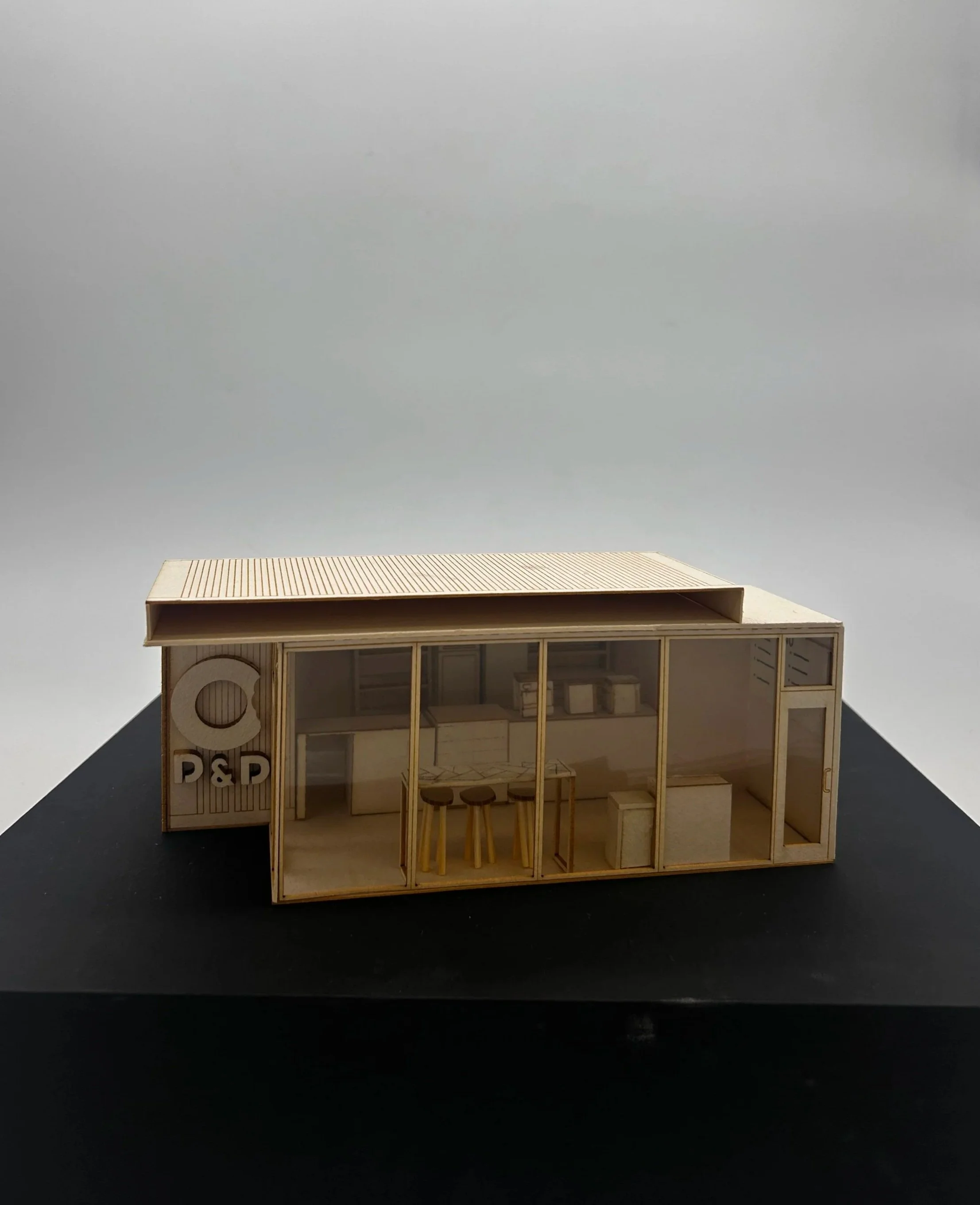
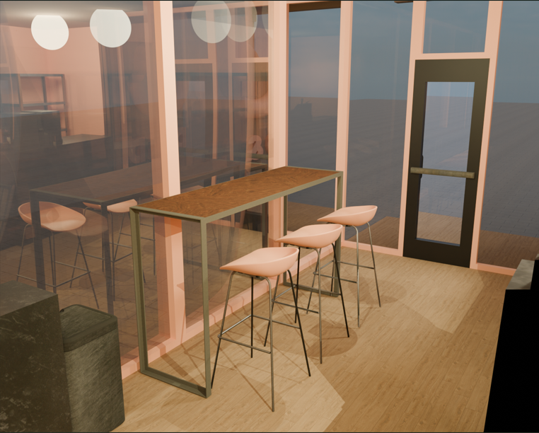
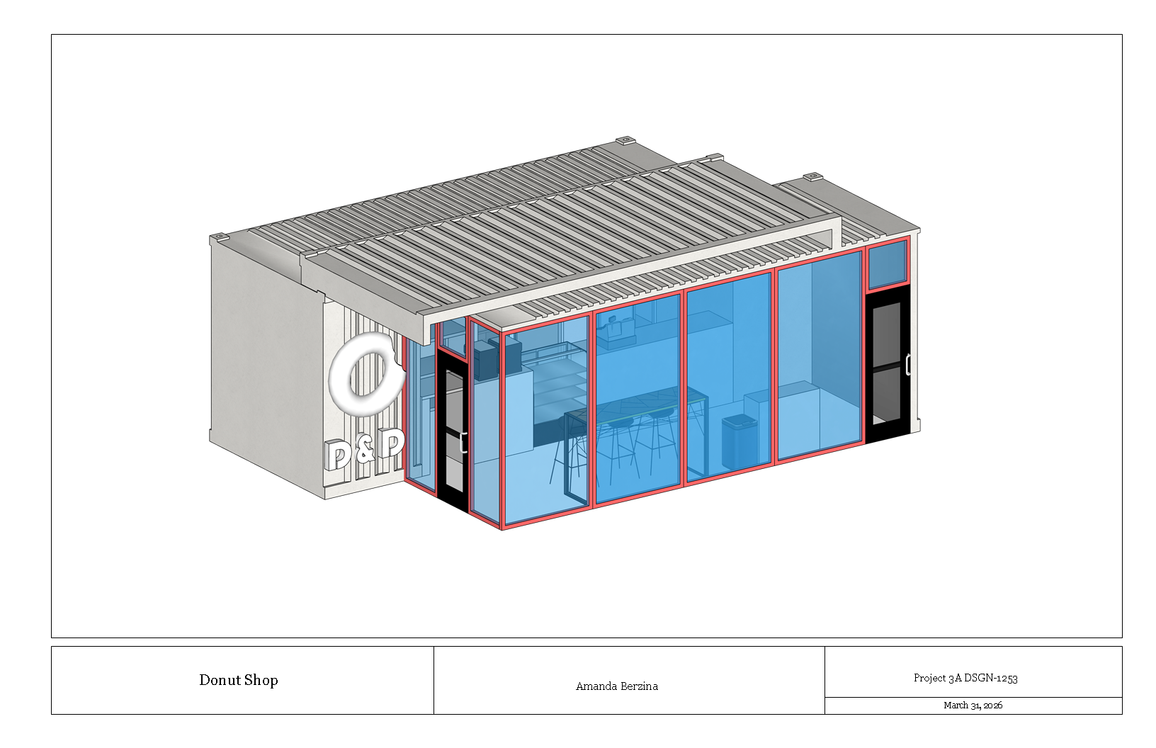
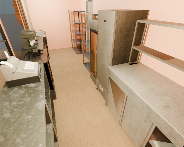
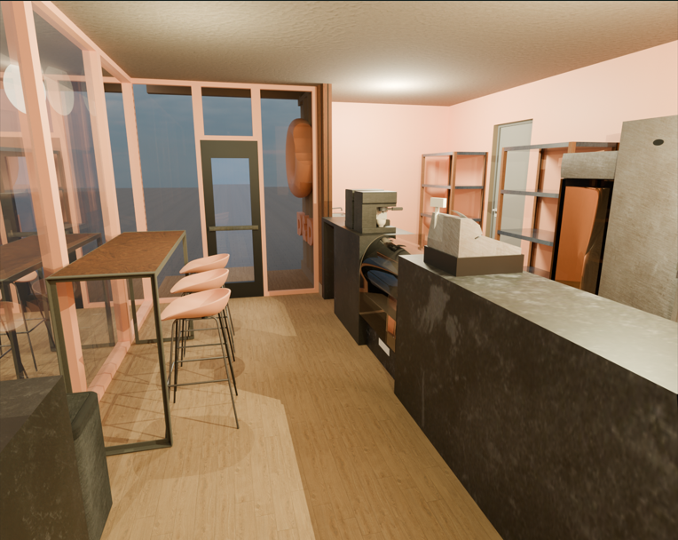
Donut Shop
Interiors | Architecture
Objective: This project involved designing a donut shop using two shipping containers. The goal was to arrange the containers to create a functional interior space while limiting one of them to a single sectional cut.
Process: Working within the constraint of only two containers presented a challenge. To avoid creating narrow or inefficient walkways, the focus was on optimizing the layout to maximize usability and flow within the limited space.